KMeans as a classifier for the WIFI and MNIST datasets – I – Cluster analysis of the WIFI example

In the November and December 2021 editions of the German “Linux Magazin” R. Pleger discussed a simple but nevertheless interesting example for the application of a cluster algorithm. His test case was based on a dataset of the UCI Irvine. This dataset contains 2000 samples with (fictitious?) data describing WIFI signals which stemmed from seven WLAN spots around a building. The signal strength of each source was measured at varying positions in four different rooms. I call the whole setup the “WIFI example” below.

One objective of the articles in the Linux Magazin was to demonstrate how simple it is today to apply basic Machine Learning methods. In a first step the author used a ML classifier algorithm to determine the location (i.e. the room) of a measuring instrument just from the strengths of the different WIFI signals. This task can be solved by a variety of algorithms – e.g. by a Decision Tree, SVM/SVC or a simple Multilayer Perceptron. The author used Sklearn’s RandomForestTree. This method is a good example for the powerful “Ensemble Learning” technique. When applied to the simple and well structured WIFI example it predicts the rooms for test samples with an accuracy of more than 98%.

The author afterward performed a deeper analysis of the WIFI data via Kmeans, MiniBatchKMeans and PCA. His second article underlined a major question, which sometimes is not taken seriously enough:

Do the data, which we feed into ML algorithms, really cover all aspects of the problem? Is the set of target labels complete or sufficient in the sense that the separation of the samples into labeled groups really reflects the problem’s internal structure? Or do the data contain more information than the labels reveal?

Unfortunately, in my opinion, the Linux Magazine covered an important point, namely the relation of the results of a PCA analysis to a 2-dimensional cluster visualization, in an incomplete and also slightly misleading way. In addition another interesting question was not discussed at all:

Can we use KMeans also as a classifier? How would we do this?

In this series of posts I want to dig a bit deeper into these topics – both for the WIFI example and also for the MNIST dataset. For MNIST we will not be able to visualize clusters as easily as for the WIFI example. Therefore, we should have a clear idea about what we do when we use clusters for classifying.

In this first post I focus on the results of a cluster analysis for the WIFI example. In a second article I will discuss the relation of cluster results to a PCA analysis. A third post will then present a very simple method of how to turn a cluster algorithm into a classifier algorithm. In later articles we shall transfer our knowledge to the MNIST data. More precisely: We shall combine a PCA analysis with a cluster classifier to predict the labels of handwritten digit images. We will use the PCA technique to reduce the dimensions of the MNIST feature space from 784 down to below 80. It will be interesting to see what accuracy we can reach with a relatively crude clustering approach on only about 30 main PCA components. As a side aspect we shall also have a look at standardization and normalization of the MNIST data.

I do not present any code in the first three posts as the required Python programs can be build relatively straight-forward and most of the core statements were already given in the Linux Magazin. You unfortunately have to buy the articles of the magazine; but see https://www.linux-magazin.de/ausgaben/2021/11/maschinenlernen/. However, as soon as we turn to MNIST I shall provide a Jupyter notebook.

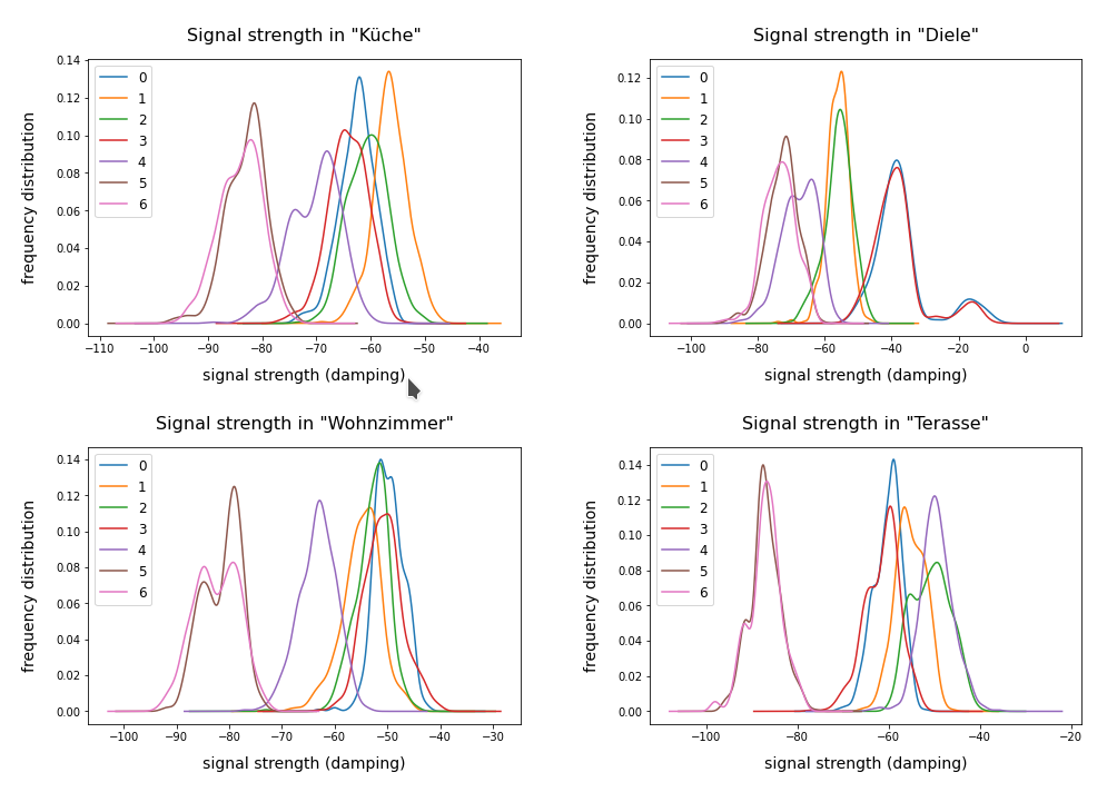
The WIFI example: Two thousand samples, each with data for the signal strength of seven WLAN sources measured in four rooms

You can download the data WIFI data set from the following address:
https://archive.ics.uci.edu/ml/machine-learning-databases/00422/wifi_localization.txt

The feature space of this is example is 7-dimensional: 7 WLAN spots provide WIFI signals in the building. We have 2000 samples. Each sample provides the signal strength of each of the WLAN sources measured at different times and positions within a specific room. An integer number in [1,4] is provided as a label which identifies the room. The following plot shows the interpolated frequency distribution over the signal strength for each of the 7 signals in the four rooms:

Cluster analysis of the WIFI data – more than four rooms?

The original label-data of the WIFI example imply the existence of four rooms. But can we trust this information? The measurements in the room, which we called “Diele” in the plots above, indicate a consistent second peak for both the signals 0 and 3. Is this due to an opening into another room?

A simple method to analyze the inner structure of the distribution of data points in a configuration or feature space is a “cluster analysis”. The KMeans algorithm provides such an analysis for an assumed number of clusters.

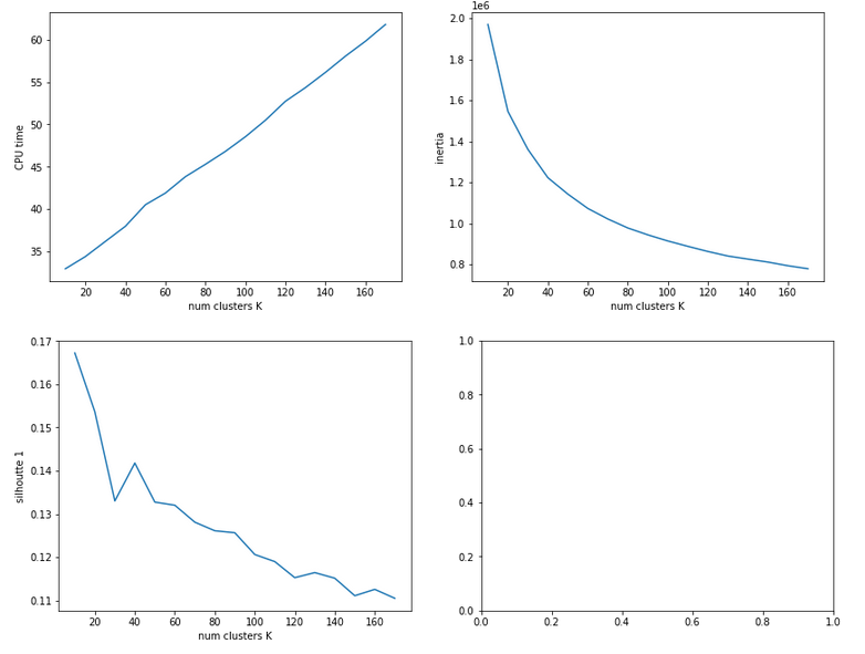
KMeans is a basic but important ML method which reveals a lot about the data distribution in feature space and indirectly about the complexity of hyperplanes required to separate data according to their labels. Among other things KMeans determines the positions of cluster centers – the so called centroids – by measuring and systematically optimizing distances of samples to assumed centroids. Actually, the sum over all intra-cluster variances, i.e. the summed quadratic distances of the associated samples to their cluster’s centroid, is minimized. The respective quantity is called “inertia” of the cluster distribution. See e.g. the excellent book of P. Wilmott, Machine learning – an applied mathematics introduction” on this topic.

A simple method to find out into how many clusters a distribution probably segregates is to look for an elbow in the variation of the inertia with the number of clusters. When we look at the variation of inertia values with the number of potential clusters “k” for the WIFI example we get the following curve:

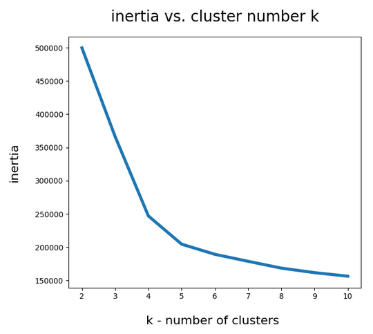
This indicates an elbow at k=4,5.

Another method to identify the most probable number of distinct clusters in a multi dimensional data point distribution is the so called “silhouette analysis”. See the book of A. Geron “Hands-On Machine Learning with Scikit-Learn, Keras and Tensorflow”, 2n edition, for a description. For the WIFI example the plots of the silhouette score data support the result of the elbow analysis:

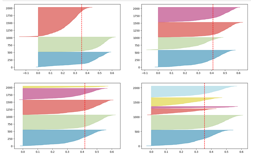
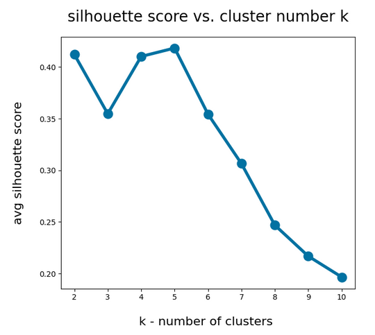
The second plot shows ordered silhouette data for k = 3,4,5,6 clusters. Again, we get the most consistent pictures for k=4 and k=5.

So, the data indicate a fragmentation into 4 or 5 clusters. How can we visualize this with respect to the feature space?

Scatter plots for 2-dim sub-spaces of the feature space

A general problem with the visualization of cluster data for multidimensional data is that we are limited to 2, maximal 3 dimensions. And a projection down to two dimensions may not reflect the real cluster separation in the multidimensional feature space in a realistic way. But sometimes we are lucky.

We shall later see that there are two primary components which dominate the data and signal distributions in the WIFI example. A major question, however, is whether we will also find that only a few original features contribute dominantly to these major components. A PCA analysis does not mean that a “primary component” only depends on the same number of features!

As I did not know the relation of “primary components” to features I just plotted the results of “KMeans” for a variety of 2-dim signal combinations. I used Sklearn’s version of KMeans; due to the very small data ensemble KMeans is applicable without consuming too much CPU time (this will change with MNIST; there we need to invoke MiniBatchKMeans):

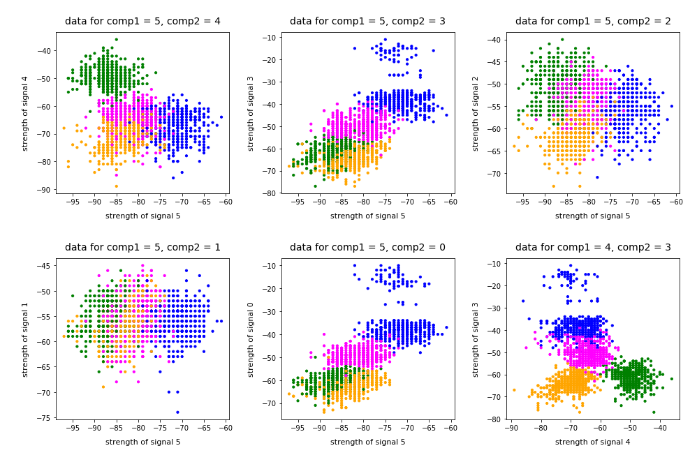
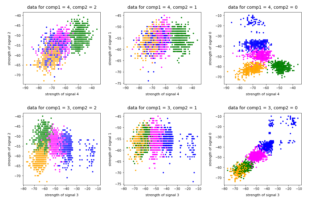
Note that the colorization of the data points in all plots was done with respect to the cluster number predicted by KMeans for the samples – and not with respect to their labels.

It is interesting that the projections onto two special feature combinations – namely WLAN-4/WLAN 0 and WLAN-3/WLAN-0 signal – show a very distinct separation of the clusters.

Four or five clusters ?

The data displayed above depend a bit on the initial distribution of cluster centers as an input into the KMeans algorithm. But for 4 and 5 clusters we get very consistent results. The next plots show the positions of the centroids:

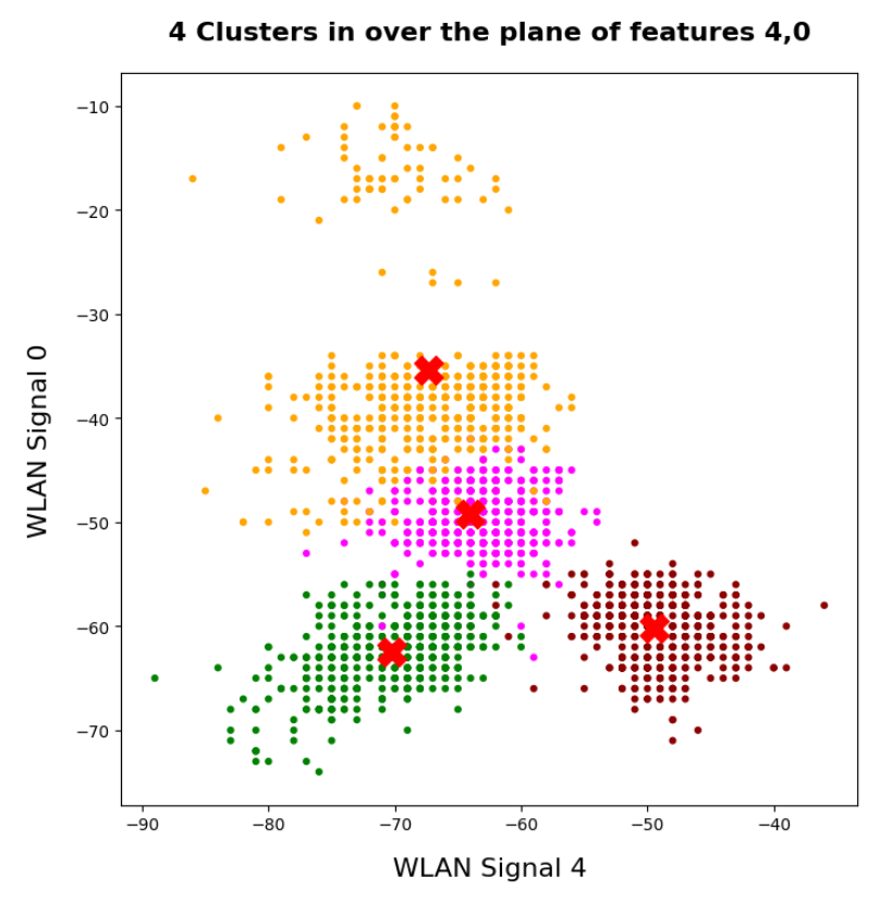
This time the colorization was done with respect to the labels. What we see is: Five clusters represent the situation a bit better than only 4 clusters.

When we align this with the rooms: Five “rooms” may describe the signal variation better than only 4 rooms. The reason for this might be that one of the four rooms has a wall which partially separates different areas from another. We often find this in “entrances” [German: “Diele”] to houses. Sketches of the rooms in the Linux Magazin article actually show that this is the case. And, of course, such a wall or an opening into another room would have an impact on the damping of the WLAN signals.

Addendum 19.03.2022: Comparing clusters with groups of labeled data points

An important question which we have not answered yet by the images shown above is the following:

How well do clusters coincide with groups of data points having a specific label?

Note that in general you can not be sure that clusters reflect data points of the same label. Actually, a cluster is only a way to describe a close spatial vicinity of data points in some region of the multidimensional feature space. I.e. some kind of clumping of the data points around some centroids. But spatial vicinity does not necessarily reflect a label: A label border may often separate data points which are very close neighbors. And a cluster may contain a mixture of samples with different labels ….

Well, in the case of the WIFI example the identified 4 to 5 clusters match the groups of data points with different labels quite well. Below I superimposed the sample’s data points with different colors: First I colorized the data points according to their label. On top of the resulting scatter plot I placed the same data points again, but this time with a different and transparent colorization according to their cluster association. In addition I shifted the second data layer a bit to get a better contrast:

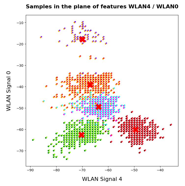
You see that the areas are not completely identical, but they overlap quite well. Obviously, I used 5 clusters. Also the fifth cluster fits well into a region characterized by just one label.

Conclusion

The simple WIFI example shows that a cluster analysis may give you new insights into the structure of ML data sets which a simple classifier algorithm can not provide. In the next article

KMeans as a classifier for the WIFI and MNIST datasets – II – PCA in combination with KMeans for the WIFI-example

we shall link the information contained in the “clusters” to the results of a PCA analysis of the WIFI example.

Stay tuned …

Ceterum censeo: The most important living fascist which must be denazified is the Putler.

A simple Python program for an ANN to cover the MNIST dataset – XIV – cluster detection in feature space

We extend our studies of a program for a Multilayer perceptron and gradient descent in combination with the MNIST dataset:

A simple Python program for an ANN to cover the MNIST dataset – XIII – the impact of regularization
A simple Python program for an ANN to cover the MNIST dataset – XII – accuracy evolution, learning rate, normalization
A simple Python program for an ANN to cover the MNIST dataset – XI – confusion matrix
A simple Python program for an ANN to cover the MNIST dataset – X – mini-batch-shuffling and some more tests
A simple Python program for an ANN to cover the MNIST dataset – IX – First Tests
A simple Python program for an ANN to cover the MNIST dataset – VIII – coding Error Backward Propagation
A simple Python program for an ANN to cover the MNIST dataset – VII – EBP related topics and obstacles
A simple Python program for an ANN to cover the MNIST dataset – VI – the math behind the „error back-propagation“
A simple Python program for an ANN to cover the MNIST dataset – V – coding the loss function
A simple Python program for an ANN to cover the MNIST dataset – IV – the concept of a cost or loss function
A simple Python program for an ANN to cover the MNIST dataset – III – forward propagation
A simple Python program for an ANN to cover the MNIST dataset – II – initial random weight values
A simple Python program for an ANN to cover the MNIST dataset – I – a starting point

In this article we shall work a bit on the following topic: How can we reduce the computational time required for gradient descent runs of our MLP?

Readers who followed my last articles will have noticed that I sometimes used 1800 epochs in a gradient descent run. The computational time including

  • costly intermediate print outs into Jupyter cells,
  • a full determination of the reached accuracy both on the full training and the test dataset at every epoch

lay in a region of 40 to 45 minutes for our MLP with two hidden layers and roughly 58000 weights. Using an Intel I7 standard CPU with OpenBlas
support. And I plan to work with bigger MLPs – not on MNIST but other data sets. Believe me: Everything beyond 10 minutes is a burden. So, I have a natural interest in accelerating things on a very basic level already before turning to GPUs or arrays of them.

Factors for CPU-time

This introductory question leads to another one: What basic factors beyond technical capabilities of our Linux system and badly written parts of my Python code influence the consumption of computational time? Four points come to my mind; you probably find even more:

  • One factor is certainly the extra forward propagation run which we apply to all samples of both the test and training data seat the end of each epoch. We perform this propagation to make predictions and to get data on the evolution of the accuracy, the total loss and the ratio of the regularization term to the real costs. We could do this in the future at every 2nd or 5th epoch to save some time. But this will reduce CPU-time only by less than 22%. 76% of the CPU-time of an epoch is spent in batch-handling with a dominant part in error backward propagation and weight corrections.
  • The learning rate has a direct impact on the number of required epochs. We could enlarge the learning rate in combination with input data normalization; see the last article. This could reduce the number of required epochs significantly. Depending on the parameter choices before by up to 40% or 50%. But it requires a bit of experimenting ….
  • Two other, more important factors are the frequent number of matrix operations during error back-propagation and the size of the involved matrices. These operations depend directly on the number of nodes involved. We could therefore reduce the number of nodes of our MLP to a minimum compatible with the required accuracy and precision. This leads directly to the next point.
  • The dominant weight matrix is of course the one which couples layer L0 and layer L1. In our case its shape is 784 x 70; it has almost 55000 elements. The matrix for the next pair of layers has only 70×30 = 2100 elements – it is much, much smaller. To reduce CPU time for forward propagation we should try to make this matrix smaller. During error back propagation we must perform multiple matrix multiplications; the matrix dimensions depend on the number of samples in a mini-batch AND on the number of nodes in the involved layers. The dimensions of the the result matrix correspond to the those of the weight matrix. So once again: A reduction of the nodes in the first 2 layers would be extremely helpful for the expensive backward propagation. See: The math behind EBP.

We shall mainly concentrate on the last point in this article.

Reduction of the dimensions of the dominant matrix”requires a reduction of input features

The following numbers show typical CPU times spend for matrix operations during error back propagation [EBP] between different layers of our MLP and for two different batches at the beginning of gradient descent:

Time_CPU for BW layer operations (to L2) 0.00029015699965384556
Time_CPU for BW layer operations (to L1) 0.0008645610000712622
Time_CPU for BW layer operations (to L0) 0.006551215999934357

Time_CPU for BW layer operations (to L2) 0.00029157400012991275
Time_CPU for BW layer operations (to L1) 0.0009575330000188842
Time_CPU for BW layer operations (to L0) 0.007488838999961445

The operations involving layer L0 cost a factor of 7 more CPU time than the other operations! Therefore, a key to the reduction of the number of mathematical operations is obviously the reduction of the number of nodes in the input layer! We cannot reduce the numbers in the hidden layers much, if we
do not want to hamper the accuracy properties of our MLP too much. So the basic question is

Can we reduce the number of input nodes somehow?

Yes, maybe we can! Input nodes correspond to “features“. In case of the MNIST dataset the relevant features are given by the gray-values for the 784 pixels of each image. A first idea is that there are many pixels within each MNIST image which are probably not used at all for classification – especially pixels at the outer image borders. So, it would be helpful to chop them off or to ignore them by some appropriate method. In addition, special significant pixel areas may exist to which the MLP, i.e. its weight optimization, reacts during training. For example: The digits 3, 5, 6, 8, 9 all have a bow within the lower 30% of an image, but in other regions, e.g. to the left and the right, they are rather different.

If we could identify suitable image areas in which dark pixels have a higher probability for certain digits then, maybe, we could use this information to discriminate the represented digits? But a “higher density of dark pixels in an image area” is nothing else than a description of a “cluster” of (dark) pixels in certain image areas. Can we use pixel clusters at numerous areas of an image to learn about the represented digits? Is the combination of (averaged) feature values in certain clusters of pixels representative for a handwritten digit in the MNIST dataset?

If the number of such pixel clusters could be reduced below lets say 100 then we could indeed reduce the number of input features significantly!

Cluster detection

To be able to use relevant “clusters” of pixels – if they exist in a usable form in MNIST images at all – we must first identify them. Cluster identification and discrimination is a major discipline of Machine Learning. This discipline works in general with unlabeled data. In the MNIST case we would not use the labels in the “y”-data at all to identify clusters; we would only use the “X”-data. A nice introduction to the mechanisms of cluster identification is given in the book of Paul Wilcott (see Machine Learning – book recommendations for the reference). The most fundamental method – called “kmeans” – iterates over 3 major steps [I simplify a bit :-)]:

  • We assume that K clusters exist and start with random initial positions of their centers (called “centroids”) in the multidimensional feature space
  • We measure the distance of all data points to he centroids and associate a point with that centroid to which the distance is smallest
  • We determine the “center of mass” (according to some distance metric) of the identified data point groups and assume it as a new position of the centroids and move the old positions (a bit) in this direction.

We iterate over these steps until the centroids’ positions hopefully get stable. Pretty simple. But there is a major drawback: You must make an assumption on the number “K” of clusters. To make such an assumption can become difficult in the complex case of a feature space with hundreds of dimensions.

You can compensate this by executing multiple cluster runs and comparing the results. By what? Regarding the closure or separation of clusters in terms of an appropriate norm. One such norm is called “cluster inertia“; it measures the mean squared distance to the center for all points of a cluster. The theory is that the sum of the inertias for all clusters drops significantly with the number of clusters until an optimal number is reached and the inertia curve flattens out. The point where this happens in a plot of inertia vs. number of clusters is called “elbow“.
Identifying this “elbow” is one of the means to find an optimal number of clusters. However, this recipe does not work under all circumstances. As the number of clusters get big we may be confronted with a smooth decline of the inertia sum.

What data do we use for gradient descent after cluster detection?

How could we measure whether an image shows certain clusters? We could e.g. measure distances (with some appropriate metric) of all image points to the clusters. The “fit_transform()”-method of KMeans and MiniBatchKMeans provide us with with some distance measure of each image to the identified clusters. This means our images are transformed into a new feature space – namely into a “cluster-distance space”. This is a quite complex space, too. But it has less dimensions than the original feature space!

Note: We would of course normalize the resulting distance data in the new feature space before applying gradient descent.

Application of “KMeansBatch” to MNIST

There are multiple variants of “KMeans”. We shall use one which is provided by SciKit-Learn and which is optimized for large datasets: “MiniBatchKMeans“. It operates batch-wise without loosing too much of accuracy and convergence properties in comparison to KMeans (or a comparison see here). “MiniBatchKMeans”has some parameters you can play with.

We could be tempted to use 10 clusters as there are 10 digits to discriminate between. But remember: A digit can be written in very many ways. So, it is much more probable that we need a significant larger number of clusters. But again: How to determine on which K-values we should invest a bit more time? “Kmeans” and methods alike offer another quantity called “silhouette” coefficient. It measures how well the data points are within, at or outside the borders of a cluster. See the book of Geron referenced at the link given above on more information.

Variation of CPU time, inertia and average silhouette coefficients with the number of clusters “K”

Let us first have a look at the evolution of CPU time, total inertia and averaged silhouette with the number of clusters “K” for two different runs. The following code for a Jupyter cell gives us the data:

    
# *********************************************************
# Pre-Clustering => Searching for the elbow 
# *********************************************************
from sklearn.cluster import KMeans
from sklearn.cluster import MiniBatchKMeans
from sklearn.preprocessing import StandardScaler
from sklearn.metrics import silhouette_score
X = np.concatenate((ANN._X_train, ANN._X_test), axis=0)
y = np.concatenate((ANN._y_train, ANN._y_test), axis=0)
print("X-shape = ", X.shape, "y-shape = ", y.shape)
num = X.shape[0]

li_n = []
li_inertia = []
li_CPU = []
li_sil1 = []

# Loop over the number "n" of assumed clusters 
rg_n = range(10,171,10)
for n in rg_n:
    print("\nNumber of clusters: ", n)
    start = time.perf_counter()
    kmeans = MiniBatchKMeans(n_clusters=n, n_init=500, max_iter=1000, batch_size=500 )  
    X_clustered = kmeans.fit_transform(X)
    sil1 = silhouette_score(X, kmeans.labels_)
    #sil2 = silhouette_score(X_clustered, kmeans.labels_)
    end = time.perf_counter()
    dtime = end - start
    print('Inertia = ', kmeans.inertia_)
    print('Time_CPU = ', dtime)
    print('sil1 score = ', sil1)
    li_n.append(n)    
    li_inertia.append(kmeans.inertia_)    
    li_CPU.append(dtime)    
    li_sil1.append(sil1)    

    
# Plots         
# ******
fig_size = plt.rcParams["figure.figsize"]
fig_size[
0] = 14
fig_size[1] = 5
fig1 = plt.figure(1)
fig2 = plt.figure(2)

ax1_1 = fig1.add_subplot(121)
ax1_2 = fig1.add_subplot(122)

ax1_1.plot(li_n, li_CPU)
ax1_1.set_xlabel("num clusters K")
ax1_1.set_ylabel("CPU time")

ax1_2.plot(li_n, li_inertia)
ax1_2.set_xlabel("num clusters K")
ax1_2.set_ylabel("inertia")

ax2_1 = fig2.add_subplot(121)
ax2_2 = fig2.add_subplot(122)

ax2_1.plot(li_n, li_sil1)
ax2_1.set_xlabel("num clusters K")
ax2_1.set_ylabel("silhoutte 1")

 
You see that I allowed for large numbers of initial centroid positions and iterations to be on the safe side. Before you try it yourself: Such runs for a broad variation of K-values are relatively costly. The CPU time rises from around 32 seconds for 30 clusters to a little less than 1 minute for 180 clusters. These times add up to a significant sum after a while …

Here are some plots:

The second run was executed with a higher resolution of K_(n+1) – K_n 5 = 5.

We see that the CPU time to determine the centroids’ positions varies fairly linear with “K”. And even for 170 clusters it does not take more than a minute! So, CPU-time for cluster identification is not a major limitation.

Unfortunately, we do not see a clear elbow in the inertia curve! What you regard as a reasonable choice for the number K depends a lot on where you say the curve starts to flatten. You could say that this happens around K = 60 to 90. But the results for the silhouette-quantity indicate for our parameter setting that K=40, K=70, K=90 are interesting points. We shall look at these points a bit closer with higher resolution later on.

Reduction of the regularization factor (for Ridge regularization)

Now, I want to discuss an important point which I did not find in the literature:
In my last article we saw that regularization plays a significant but also delicate role in reaching top accuracy values for the test dataset. We saw that Lambda2 = 0.2 was a good choice for a normalized input of the MNIST data. It corresponded to a certain ratio of the regularization term to average batch costs.
But when we reduce the number of input nodes we also reduce the number of total weights. So the weight values themselves will automatically become bigger if we want to get to similar good values at the second layer. But as the regularization term depends in a quadratic way on the weights we may assume that we roughly need a linear reduction of Lambda2. So, for K=100 clusters we may shrink Lambda2 to (0.2/784*100) = 0.025 instead of 0.2. In general:

Lambda2_cluster = Lambda2_std * K / (number of input nodes)

I applied this rule of a thumb successfully throughout experiments with clustering befor gradient descent.

Reference run without clustering

We saw at the end of article XII that we could reach an accuracy of around 0.975 after 500 epochs under optimal circumstances. But in the case I presented ten I was extremely lucky with the statistical initial weight distribution and the batch composition. In other runs with the same parameter setup I got smaller accuracy values. So, let us take an ad hoc run with the following parameters and results:
Parameters: learn_rate = 0.001, decrease_rate = 0.00001, mom_rate = 0.00005, n_size_mini_batch = 500, n_epochs = 600, Lambda2 = 0.2, weights at
all layers in [-2*1.0/sqrt(num_nodes_layer), 2*1.0/sqrt(num_nodes_layer)]
Results: acc_train: 0.9949 , acc_test: 0.9735, convergence after ca. 550-600 epochs

The next plot shows (from left to right and the down) the evolution of the costs per batch, the averaged error of the last mini-batch during an epoch, the ratio of regularization to batch costs and the total costs of the training set, respectively .

The following plot summarizes the evolution of the total costs of the traaining set (including the regularization contribution) and the evolution of the accuracy on the training and the test data sets (in orange and blue, respectively).

The required computational time for the 600 epochs was roughly 18,2 minutes.

Results of gradient descent based on a prior cluster identification

Before we go into a more detailed discussion of code adaption and test runs with things like clusters in unnormalized and normalized feature spaces, I want to show what we – without too much effort – can get out of using cluster detection ahead of gradient descent. The next plot shows the evolution of a run for K=70 clusters in combination with a special normalization:

and the total cost and accuracy evolution

The dotted line marks an accuracy of 97.8%! This is 0.5% bigger then our reference value of 97.3%. The total gain of %gt; 0.5% means however 18.5% of the remaining difference of 2.7% to 100% and we past a value of 97.8% already at epoch 600 of the run.

What were the required computational times?

If we just wanted 97.4% as accuracy we need around 150 epochs. And a total CPU time of 1.3 minutes to get to the same accuracy as our reference run. This is a factor of roughly 14 in required CPU time. For a stable 97.73% after epoch 350 we were still a factor of 5.6 better. For a stable accuracy beyond 97.8% we needed around 600 epochs – and still were by a factor of 3.3 faster than our reference run! So, clustering really brings some big advantages with it.

Conclusion

In
this article I discussed the idea of introducing cluster identification in the (unnormalized or normalized) feature space ahead of gradient descent as a possible means to save computational time. A preliminary trial run showed that we indeed can become significantly faster by at least a factor of 3 up to 5 and even more. This is just due to the point that we reduced the number of input nodes and thus the number of mathematical calculations during matrix operations.

In the next article we shall have a more detailed look at clustering techniques in combination with normalization.