In the last article I explained the code to visualize patterns which trigger a chosen feature map of a trained CNN strongly. In this series we work with the MNIST data but the basic principles can be modified, extended and applied to other typical data sets (as e.g. the Cifar set).
A simple CNN for the MNIST dataset – VIII – filters and features – Python code to visualize patterns which activate a map strongly
A simple CNN for the MNIST dataset – VII – outline of steps to visualize image patterns which trigger filter maps
A simple CNN for the MNIST dataset – VI – classification by activation patterns and the role of the CNN’s MLP part
A simple CNN for the MNIST dataset – V – about the difference of activation patterns and features
A simple CNN for the MNIST dataset – IV – Visualizing the activation output of convolutional layers and maps
A simple CNN for the MNIST dataset – III – inclusion of a learning-rate scheduler, momentum and a L2-regularizer
A simple CNN for the MNIST datasets – II – building the CNN with Keras and a first test
A simple CNN for the MNIST datasets – I – CNN basics
We shall now apply our visualization code for some selected maps on the last convolutional layer of our CNN structure. We run the code and do the plotting in a Jupyter environment. To create an image of an OIP-pattern which activates a map after passing its filters is a matter of a second at most.
Our algorithm will evolve patterns out of a seemingly initial “chaos” – but it will not do so for all combinations of statistical input data and a chosen map. We shall investigate this problem in more depth in the next articles. In the present article I first want to present you selected OIP-pattern images for very many of the 128 feature maps on the third layer of my simple CNN which I had trained on the MNIST data set for digits.
Initial Jupyter cells
I recommend to open a new Jupyter notebook for our experiments. We put the code for loading required libraries (see the last article) into a first cell. A second Jupyter cell controls the use of a GPU:
Jupyter cell 2:
gpu = True
if gpu:
    GPU = True;  CPU = False; num_GPU = 1; num_CPU = 1
else:
    GPU = False; CPU = True;  num_CPU = 1; num_GPU = 0

config = tf.compat.v1.ConfigProto(intra_op_parallelism_threads=6,
                        inter_op_parallelism_threads=1,
                        allow_soft_placement=True,
                        device_count = {'CPU' : num_CPU,
                                        'GPU' : num_GPU},
                        log_device_placement=True

                       )
config.gpu_options.per_process_gpu_memory_fraction=0.35
config.gpu_
options.force_gpu_compatible = True
B.set_session(tf.compat.v1.Session(config=config))
In a third cell we then run the code for the myOIP-class definition with I discussed in my last article.
Loading the CNN-model
A fourth cell just contains just one line which helps to load the CNN-model from a file:
# Load the CNN-model
myOIP = My_OIP(cnn_model_file = 'cnn_best.h5', layer_name = 'Conv2D_3')
The output looks as follows:
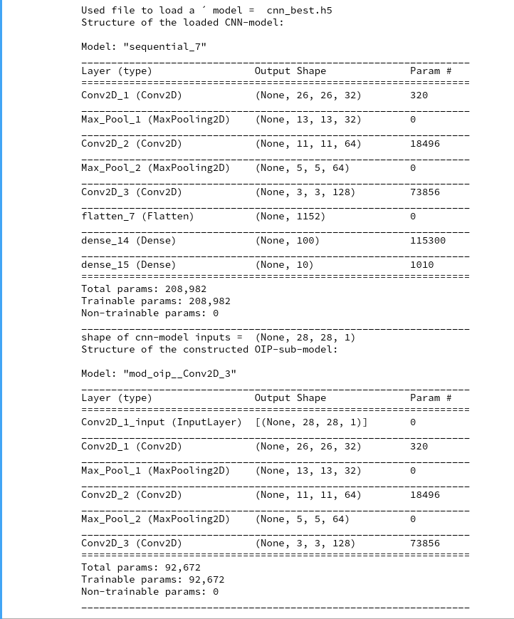
You clearly see the OIP-sub-model which relates the input images to the output of the chosen CNN-layer; in our case of the innermost layer “Conv2d_3”. The maps there have a very low resolution; they consist of only (3×3) nodes, but each of them covers filtered information from relatively large input image areas.
Creation of the initial image with statistical fluctuations
With the help of fifth Jupyter cell we run the following code to build an initial image based on statistical fluctuations of the pixel values:
# build initial image
# *******************

# figure
# -----------
#sizing
fig_size = plt.rcParams["figure.figsize"]
fig_size[0] = 10
fig_size[1] = 5
fig1 = plt.figure(1)
ax1_1 = fig1.add_subplot(121)
ax1_2 = fig1.add_subplot(122)

# OIP function to setup an initial image
initial_img = myOIP._build_initial_img_data(   strategy = 0,
                                 li_epochs    = (20, 50, 100, 400),
                                 li_facts     = (0.2, 0.2, 0.0, 0.0),
                                 li_dim_steps = ( (3,3), (7,7), (14,14), (28,28) ),
                                 b_smoothing = False)
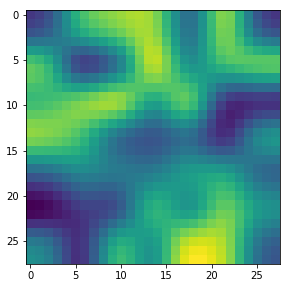
Note that I did not use any small scale fluctuations in my example. The reason is that the map chosen later on reacts better to large scale patterns. But you are of course free to vary the parameters of the list “li_facts” for your own experiments. In my case the resulting output looked like:
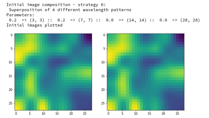
The two displayed images should not show any differences for the current version of the code. Note that your initial image may look very differently as our code produces random fluctuations of the pixel values. I suggest that you play a bit around with the parameters of “li_facts” and “li_dim_steps”.
Creation of a OIP-pattern out of random fluctuations
Now we are well prepared to create an image which triggers a selected CNN-map strongly. For this purpose we run the following code in yet another Jupyter cell:
# Derive a single OIP from an input image with statistical fluctuations of the pixel values
# ******************************************************************
# figure
# -----------
#sizing
fig_size = plt.rcParams["figure.figsize"]
fig_size[0] = 16
fig_size[1] = 8
fig_a = plt.figure()
axa_1 = fig_a.add_subplot(241)
axa_2 = fig_a.add_subplot(242)
axa_3 = fig_a.add_subplot(243)
axa_4 = fig_a.add_subplot(244)
axa_5 = fig_a.add_subplot(245)
axa_6 = fig_a.add_subplot(246)
axa_7 = fig_a.add_subplot(247)
axa_8 = fig_a.add_subplot(248)
li_axa = [axa_1, axa_2, axa_3, axa_4, axa_5, axa_6, axa_7, axa_8]
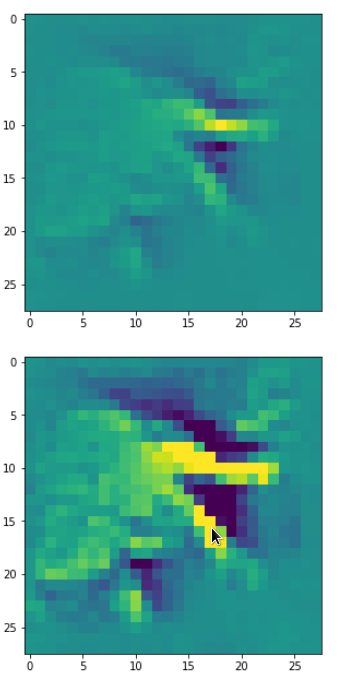
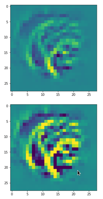
map_index = 120 # map-index we are interested in
n_epochs = 600 # should be divisible by 5
n_steps = 6 # number of intermediate reports
epsilon = 0.01 # step size for
gradient correction
conv_criterion = 2.e-4 # criterion for a potential stop of optimization
myOIP._derive_OIP(map_index = map_index, n_epochs = n_epochs, n_steps = n_steps,
epsilon = epsilon , conv_criterion = conv_criterion, b_stop_with_convergence=False )
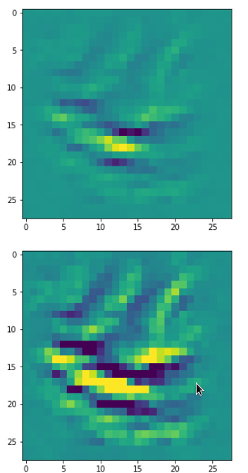
The first statements prepare a grid of maximum 8 intermediate axis-frames which we shall use to display intermediate images which are produced by the optimization loop. You see that I chose the map with number “120” within the selected layer “Conv2D_3”. I allowed for 600 “epochs” (= steps) of the optimization loop. I requested the display of 6 intermediate images and related printed information about the associated loss values.
The printed output in my case was:
Tensor("Mean_10:0", shape=(), dtype=float32)
shape of oip_loss =  ()
GradienTape watch activated
*************
Start of optimization loop
*************
Strategy: Simple initial mixture of long and short range variations
Number of epochs =  600
Epsilon =   0.01
*************
li_int =  [9, 18, 36, 72, 144, 288]

step 0 finalized
present loss_val =  7.3800406
loss_diff =  7.380040645599365

step 9 finalized
present loss_val =  16.631456
loss_diff =  1.0486774

step 18 finalized
present loss_val =  28.324467
loss_diff =  1.439024align

step 36 finalized
present loss_val =  67.79664
loss_diff =  2.7197113

step 72 finalized
present loss_val =  157.14531
loss_diff =  2.3575745

step 144 finalized
present loss_val =  272.91815
loss_diff =  0.9178772

step 288 finalized
present loss_val =  319.47913
loss_diff =  0.064941406

step 599 finalized
present loss_val =  327.4784
loss_diff =  0.020477295
Note the logarithmic spacing of the intermediate steps. You recognize the approach of a maximum of the loss value during optimization and the convergence at the end: the relative change of the loss at step 600 has a size of 0.02/327 = 6.12e-5, only.
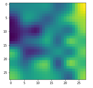
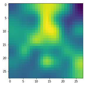
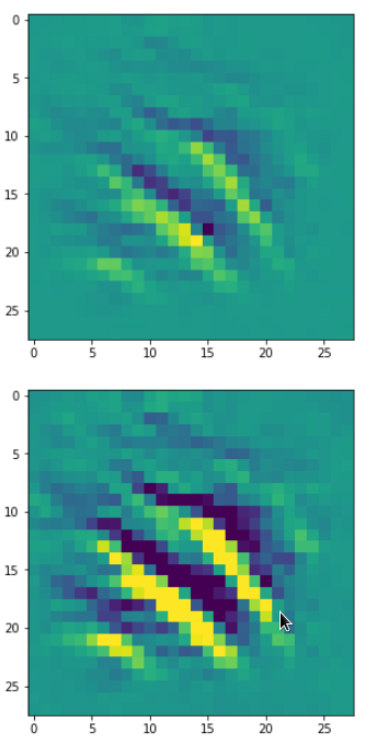
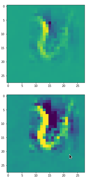
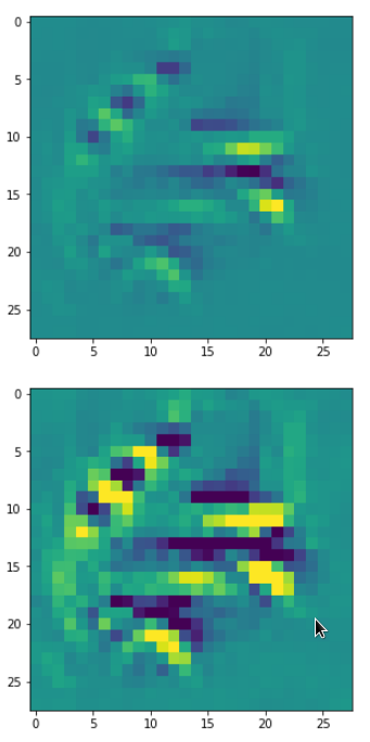
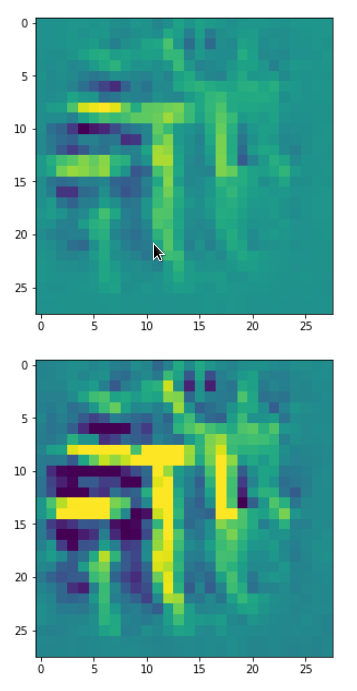
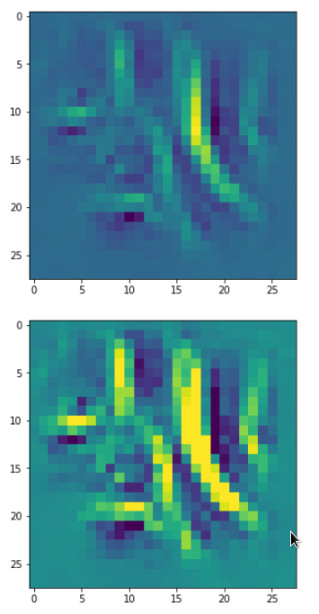
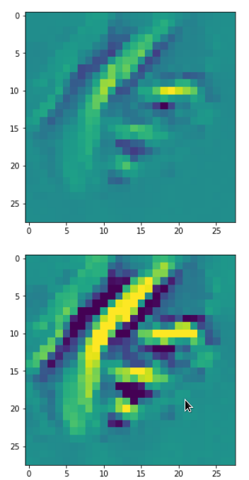
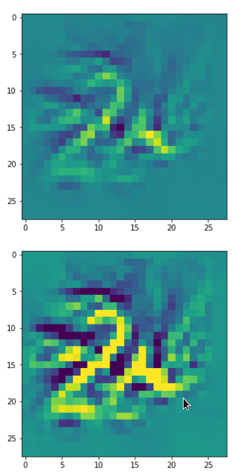
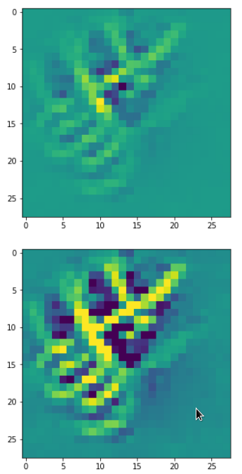
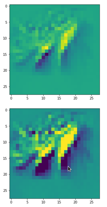
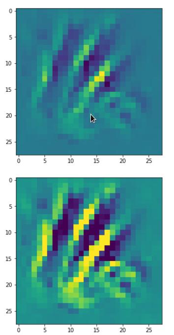
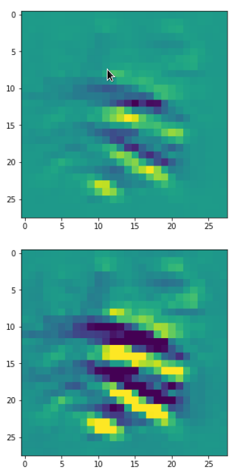
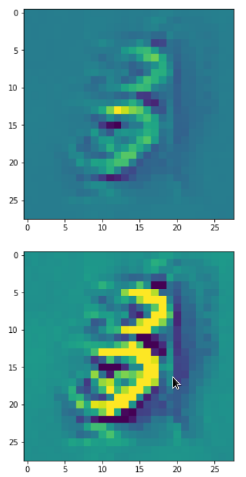
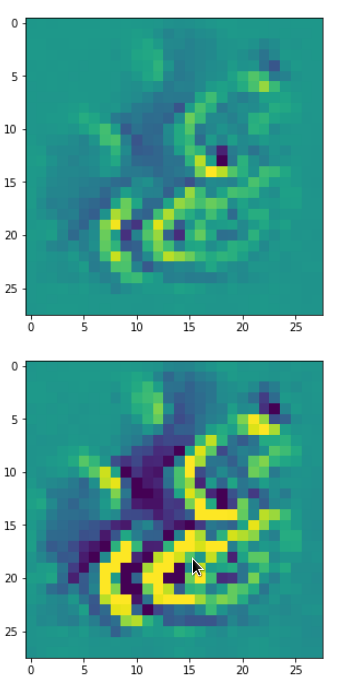
The intermediate images produced by the algorithm are displayed below:
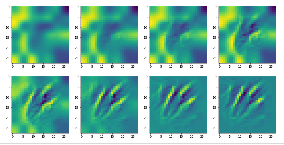
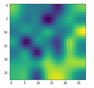
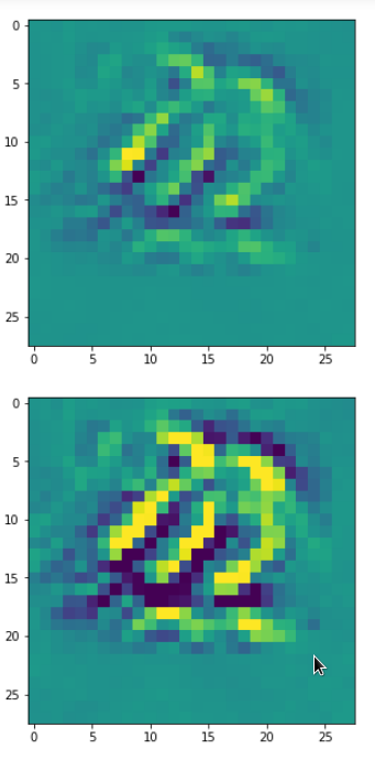
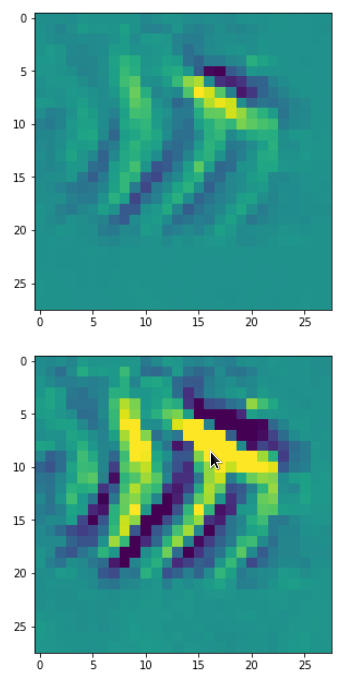
The systematic evolution of a pattern which I called the “Hand of MNIST” in another article is clearly visible. However, you should be aware of the following facts:
- For a map with the number 120 your OIP-image may look completely different. Reason 1: Your map 120 of your trained CNN-model may represent a different unique filter combination. This leads to the interesting question whether two training runs of a CNN for statistically shuffled images of one and the same training set produce the same filters and the same map order. We shall investigate this problem in a forthcoming article. Reason 2: You may have started with different random fluctuations in the input image.
- Whenever you repeat the experiment for a new input image, for which the algorithm converges, you will get a different output regarding details – even if the major over-all features of the “hand”-like pattern are reproduced.
- For quite a number of trials you may run into a frustrating message saying that the loss remains at a value of zero and that you should try another initial input image.
The last point is due to the fact that some specific maps may not react at all to some large scale input image patterns or to input images with dominating fluctuations on small scales only. It depends …
Dependency on the input images and its fluctuations
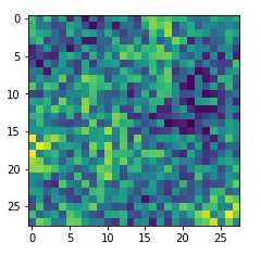
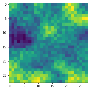
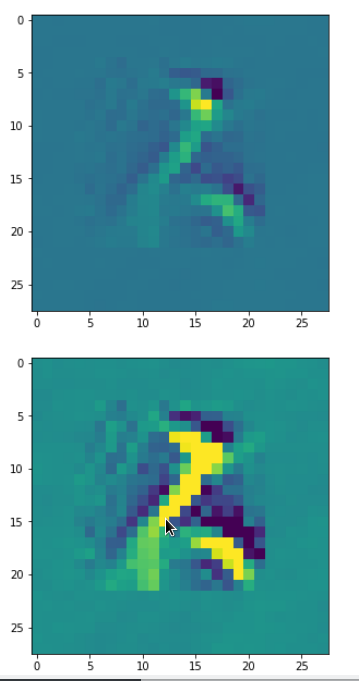
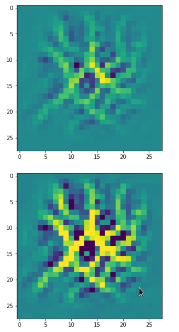
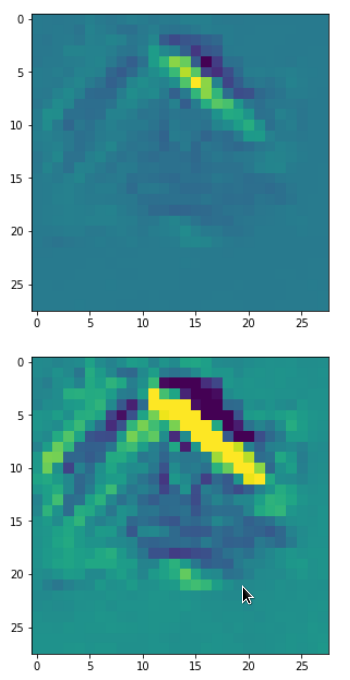
Already in previous articles of this series I discussed the point that there may be a relatively strong dependency of our output pattern on the mixture of long range and short range fluctuations of the pixel values in the initial input image. With respect to all possible statistical input images – which are quite many ( 255**784 ) – a specific image we allow us only to approach a local maximum of the loss hyperplane – one maximum out of many. But only, if the map reacts to the input image at all. Below I give you some examples of input images to which my CNN’s map with number 120 does not react:
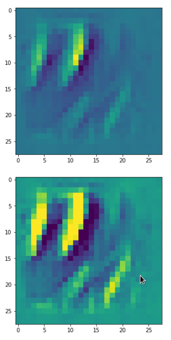
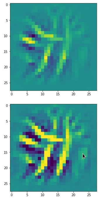
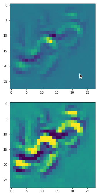
If you just play around a bit you will see that even in the case of a successful optimization the final OIP-images differ a bit and that also the eventual loss values vary. The really convincing point for me was that I did get a hand like pattern all those times when the algorithm did converge – with variations and differences, but structurally similar. I have demonstrated this point already in the article
Just for fun – the „Hand of MNIST“-feature – an example of an image pattern a CNN map reacts to
See the images published there.
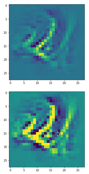
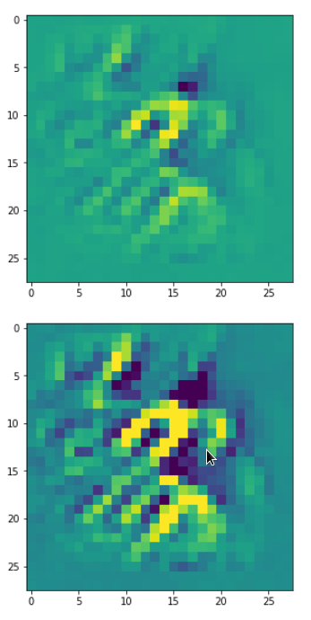
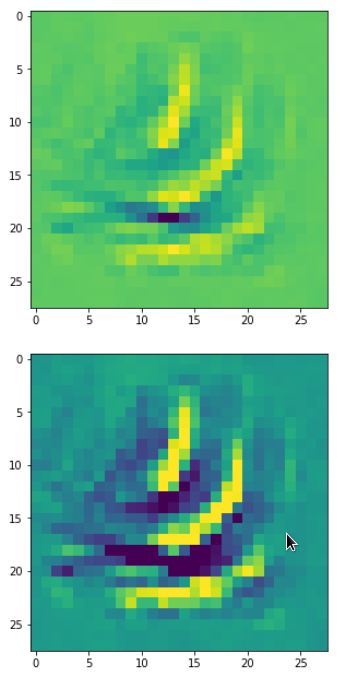
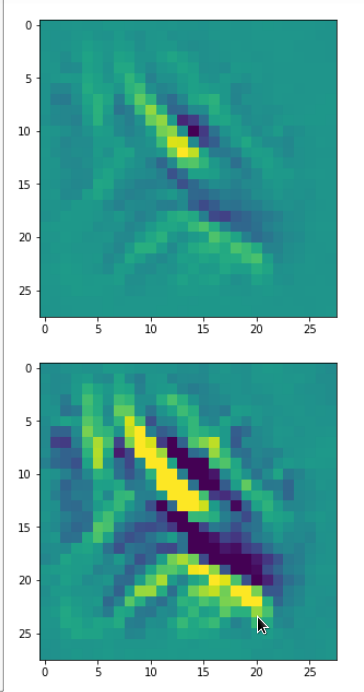
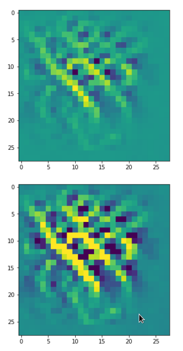
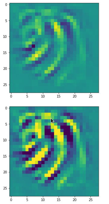
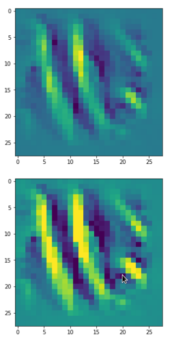
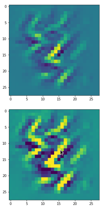
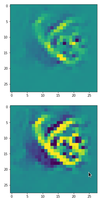
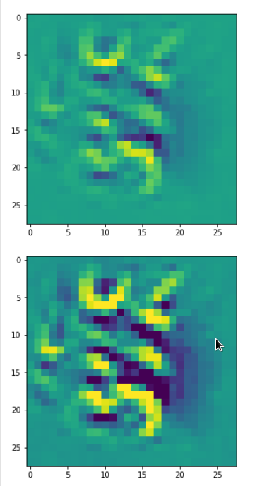
Patterns that trigger the other maps of our CNN
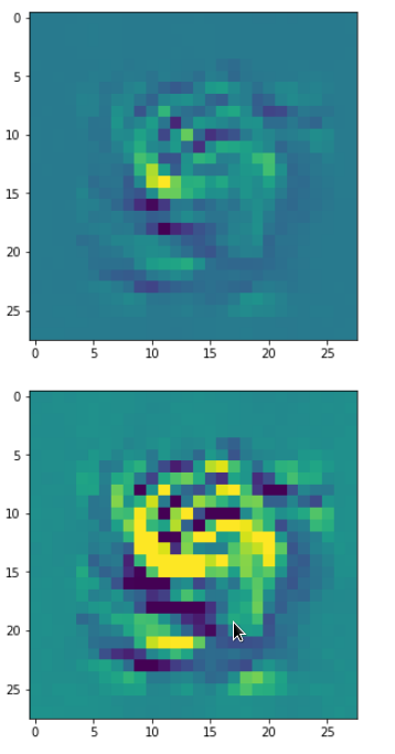
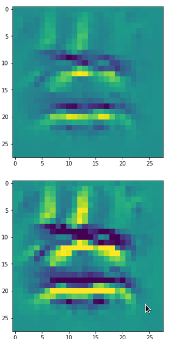
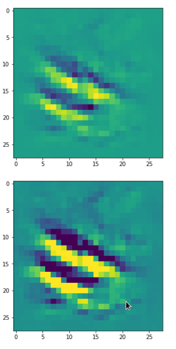
Eventually I show you a sequence of images which OIP-patterns for the maps with indices
0, 2, 4, 7, 8, 12, 17, 18, 19, 20, 21, 23, 27, 28, 30, 31, 32, 33, 34, 36, 39, 41, 42, 45, 48, 52, 54, 56, 57, 58, 61, 62, 64, 67, 68, 71, 72, 76, 80, 82, 84, 85, 86, 87, 90, 92, 102, 103, 105, 106, 107, 110, 114, 115, 117, 119, 120, 122, 123, 126, 127.
Each of the images is displayed as calculated and with contrast enhancement.
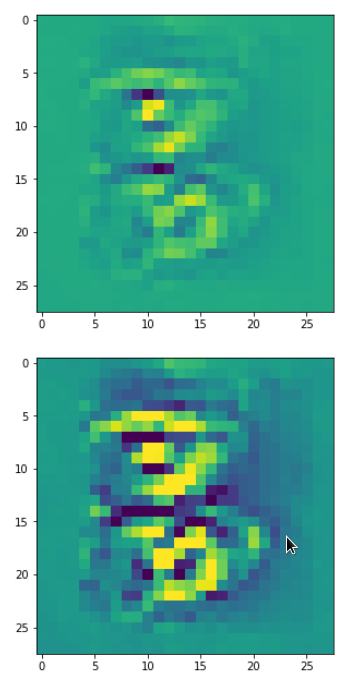


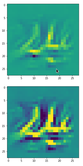
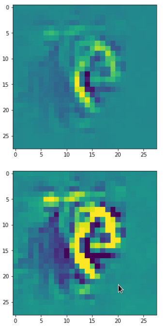
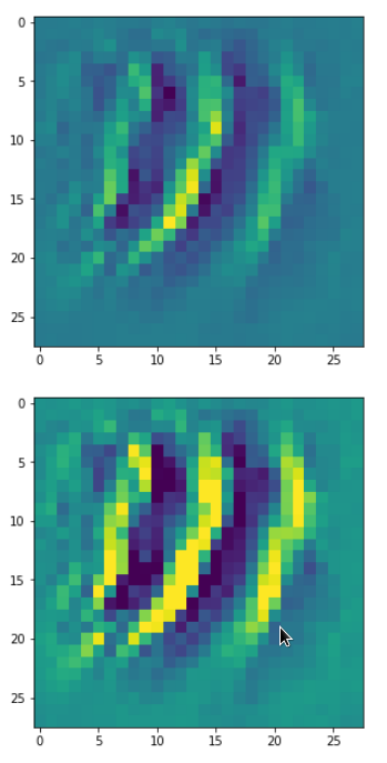
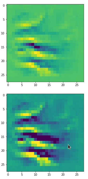
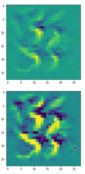
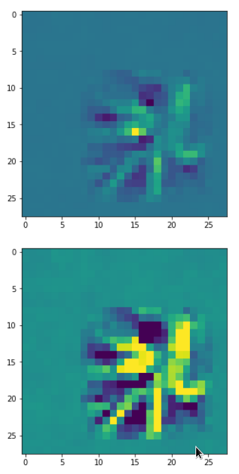

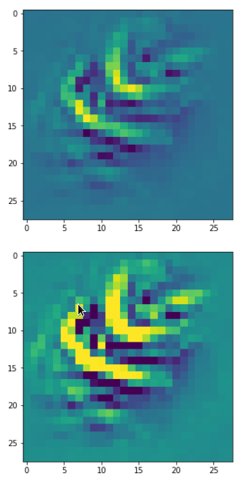
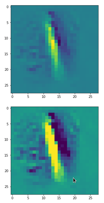
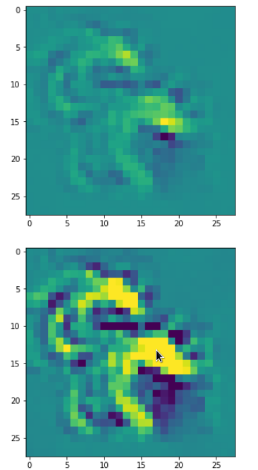
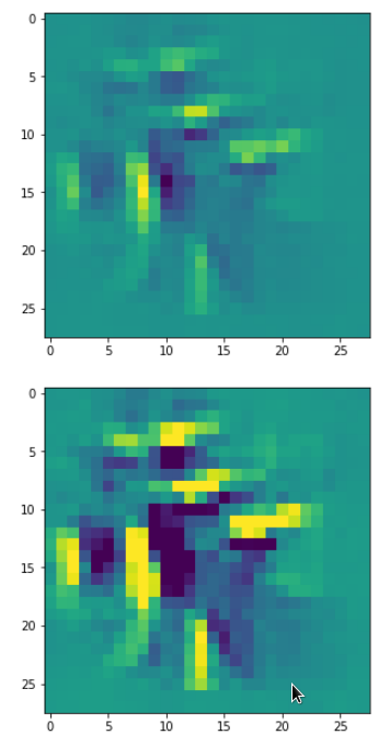

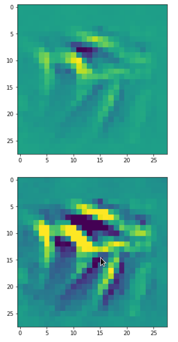
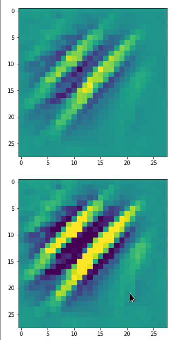
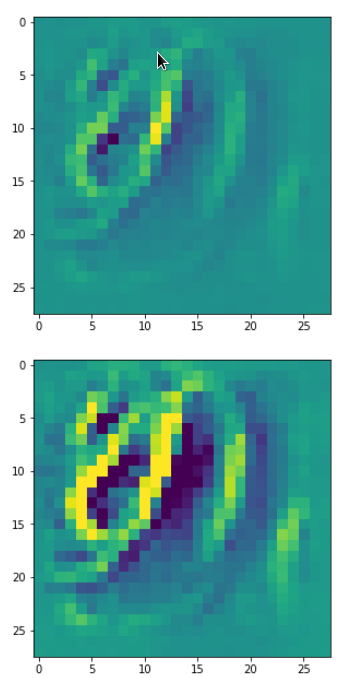
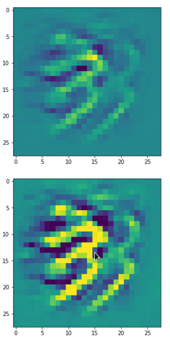


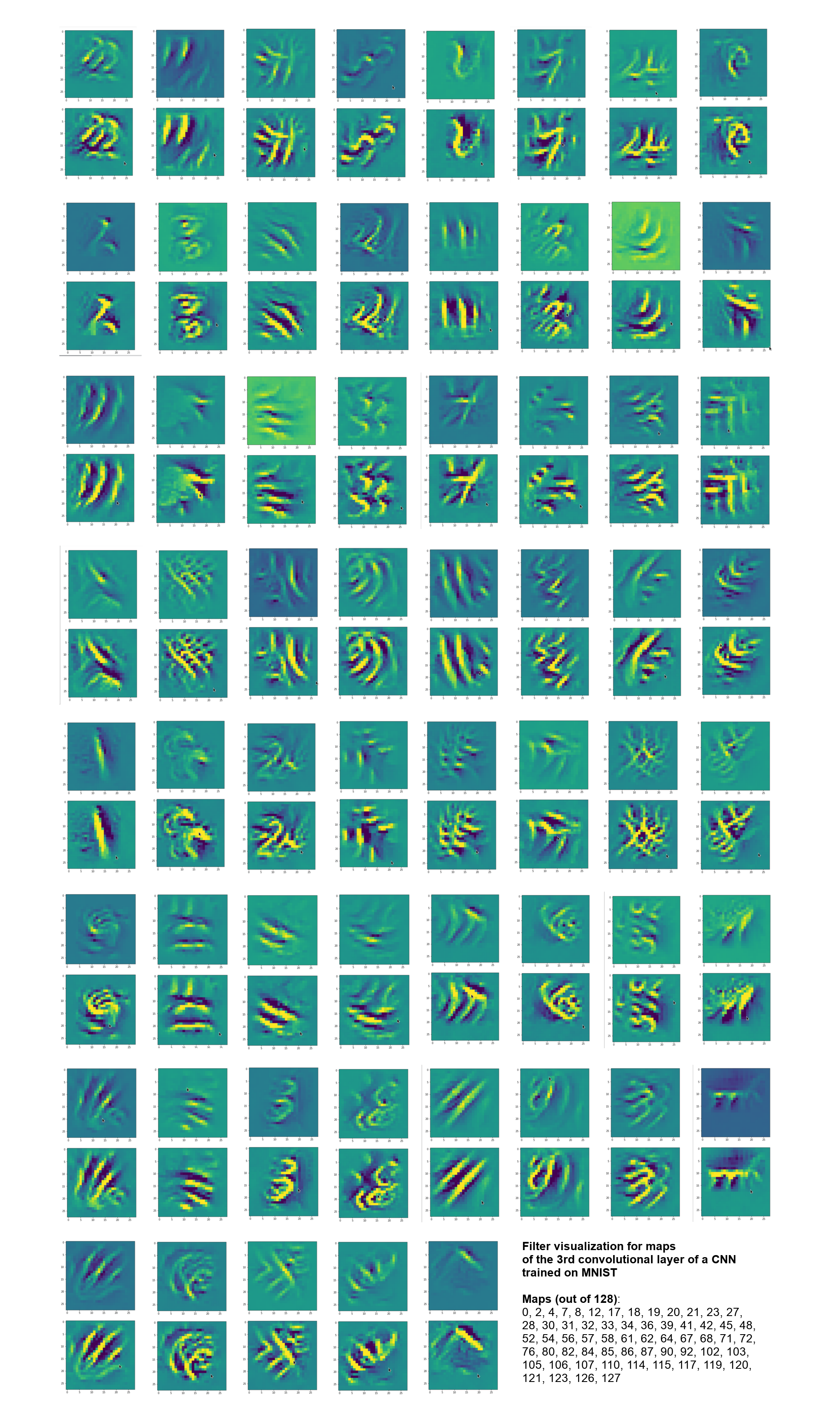
So, this is basically the essence of what our CNN “thinks” about digits after a MNIST training! Just joking – there is no “thought” present in out simple static CNN, but just the application of filters which were found by a previous mathematical optimization procedure. Filters which fit to certain geometrical pixel correlations in input images …
You certainly noticed that I did not find OIP patterns for many maps, yet. I fiddled around a bit with the parameters, but got no reaction of my maps with the numbers 1, 3, 5, 6, 9, 10, 11 …. The loss stayed at zero. This does not mean that there is no pattern which triggers those maps. However, it may a very special one for which simple fluctuations on short scales may not be a good starting point for an optimization.
Therefore, it would be good to have some kind of precursor run which investigates the reaction of a map towards a sample of (long scale) fluctuations before we run a full optimization. The next article
A simple CNN for the MNIST dataset – X – filling some gaps in filter visualization
describes a strategy for a more systematic approach and shows some results. A further article will afterwards discuss the required code.