Responsive fluid multi-column layouts – the DIV order problem – III

In the previous articles of this series

Responsive fluid multi-column layouts – the DIV order problem – I
Responsive fluid multi-column layouts – the DIV order problem – II

we discussed a problem that may arise when you want to make a fluid design responsive.

In order

  • to both use a fluid design with multiple content columns in horizontal direction and
  • and to control the vertical heights of optical background elements for the different columns

you need to encapsulate floated page elements in a container.

Such floated content elements could be a vertical navigation column, a main information block with text and a right column with teaser text elements. In your HTML code you would define and describe the tags of the floated container elements in just this natural sequence. The CSS properties of the containers require no special attention – everything is straightforward. However, the natural tag order may lead to conflicts when you want to reposition the column like page elements in a fluid and additionally responsive approach to our multi-column layout.

Typically, in a responsive approach you rearrange the content columns into a vertical order instead of the original horizontal sequence, because you want to make use of a maximum of the view port width for each of the information and navigation containers. For reasons of coding efficiency the vertical rearrangement of previously horizontally distributed containers should be achieved just by changing some CSS properties like “position”, “margin” or “float” when the view port gets smaller than some predefined values. Under normal circumstances you do NOT want to create major HTML block elements twice and switch them alternately on and off just to become responsive.

For getting the right vertical ordering effect you would e.g. make use of the automatic handling of floated elements by the browser for situations when the horizontal viewport space gets too small for displaying all floated elements in just one row. In such a situation, however, the last tag (of the sequence of floated elements) in the code represents the element which is moved downwards in the browser’s viewport first.

In the second article of this series we therefore discussed a special situation for which we required a specific vertical reordering of existing elements. We showed how we could re-nest and rearrange the DIV-container tags into the required code order – without changing the original optical and fluid layout. Of course we had to compensate by more complicated CSS definitions.

Among other things we used negative margin definitions to optically place floated elements where we needed them to be on the screen – despite an unusual tag position in the HTML code. With a bit of abstraction the discussed recipe will in general allow for any required tag order for the DIV-containers in the code. What we have achieved is that by using some compensating CSS tricks we can now choose a certain – unusual, but in a responsive context required – tag order in the HTML code without destroying the optical features and the fluidity of our multi-column page layout.

We have demonstrated how to handle a first responsive transition in viewport width by moving one of the columns downward and adapt our content areas in width – without loosing fluidity. In the last article we also discussed some additional, conventional measures to make the different content column blocks appear as separate optical elements floating above a common background (picture).

We have, however, not yet shown how to manage a second – and more
important – transition to a range of significant smaller view port widths. For small view port widths we would like to move our left sided vertical menu directly below the text area – an objective we had already defined in the first article and which will be met by the measures discussed in the present article.

We shall see in this article that our achievements now allow for almost trivial measures to gain the correct aspired responsiveness: You just need to change a few “float” and “margin” properties.

To make everything a bit more challenging we shall also show how one can add transparent background layers to each column of the original fluid layout and how we manage such transparency layers together with responsive width adaptions of the web page.

Extending the HTML code by tags for transparency layers

We firstly define DIV containers which serve us as transparent background stripes of all column elements of our fluid design. To be able to keep up the transparency during a later responsive element reordering we need to insert such background layer (DIV) elements

  • into the defined outmost container “div#outer_cont” and the additionally introduced internally nested container “div#main_cont”,
  • and as well as into each of the floated DIV-elements representing the text column blocks.

Due to some simple CSS rules already presented in the previous articles the absolutely positioned background layers will adapt automatically to the height of their encapsulating DIV containers (via “position: absolute; top:0; bottom:0;” settings).

The height of the encapsulating containers is in turn dynamically defined by the maximum height of their enclosed relatively positioned, but floated text containers – i.e. according to the available horizontal space, the text content length and the height of other enclosed inner elements.

The modified HTML code is here:

<!DOCTYPE html>
<html>
<head>
<meta charset="UTF-8">
<meta name="viewport" content="width=device-width, initial-scale=1">
<title>fluid standard 2</title>
<link href="css/fluid_standard2.css" rel="stylesheet">
</head>

<body>
<!-- 3 spalten layout -->
<div id="all">
	<div id="head">
		<div id="hmen_knapp_cont" class="hmen_knapp_cont">
			<a id="hmen_knapp"></a>
		</div>
		<div id="hmen_cont" class="hmen_cont">
			<ul>
				<li><div class="hmen_pkt">h-menu 1</div></li>
				<li><div class="hmen_pkt">h-menu 2</div></li>
				<li><div class="hmen_pkt">h-menu 3</div></li>
				<li><div class="hmen_pkt">h-menu 4</div></li>
				<li><div class="hmen_pkt">h-menu 5</div></li>
				<li><div class="hmen_pkt"><a id="but2" href="#"></a></div></li>
				<li class="floatstop"></li>
			</ul>
		</div>
	</div>
	
	<div id="outer_cont">
		<div id="bg_left0"></div>
		<div id="bg_right0">
			<!-- do not remove ! -->
			<div id="bg_right_inner0"></div>
		</div>
		<div id="bg_info0"></div>
		
		<div id="float_cont">
			<div id="main_cont">
				<div id="bg_left1"></div>
				<div id="bg_info1"></div>
				
				<div id="info_cont">
					<div id="float_info">
						<div id="bg_info2"></div>
						<div 
id="info"> 
							<p>Lorem ipsum .....</p>
							<p> </p>
							<p>Lorem ipsum ....</p>
							<p> </p>
							<p>This is the end, my friend<br> </p>
						</div>
					</div>
					<div id="left_nav">
						<div id="bg_left2"></div>
						<div id="left_inner">
							<ul>
								<li><p><a href="#">sub menu point 1</a></p></li>
								<li><p><a href="#">sub menu point 2</a></p></li>
								<li><p><a href="#">sub menu point 3</a></p></li>
							</ul>
						</div>
					</div>
					<p class="floatstop"> </p>
				</div>
			</div>
			
			<div id="right">
				<div id="bg_right2"></div>
				<div id="right_inner">
					<p>Some stupid text - just to show something</p>
					<p> </p>
					<p>Some stupid text - just to show something</p>
					<p>Some stupid text - just to show something</p>
				</div>
			</div> 
			
			<p class="floatstop"> </p>

		</div>
	</div>
</div>
</body>
</html>

 
Note: If you want to test our example in some smartphone do not forget a reasonable meta-tag like

<meta name=”viewport” content=”width=device-width, initial-scale=1″>

to the header of the HTML file. You may adapt the metatag given in the above code to your needs. For more information see e.g.:
https://css-tricks.com/snippets/html/responsive-meta-tag/

The reader may have noticed that we have changed some element names in comparison to the HTML code discussed in the last article – but this not be a big obstacle as we kept up the basic tag nesting structure.

The multiple defined internal background layers (bg_left0, bg_left1, bg_left2, bg_info0, bg_info1, bg_info2, bg_right0, bg_right2) MUST be switched/on off at certain width values for the viewport. See below.

Extending the CSS definitions to cover a second transition of the view port width – and transparency effects

We need to adapt the CSS definitions to handle the transparency layers properly – for all view port width transitions. In the 1st article we had defined 3 ranges of view port widths – therefore we have to cover 2 transitions. In the last article we have shown the definitions for the first transition from Range III to Range II.

In addition, we now need to take care of a second width transition from Range II to Range I. At this second transition we want to move the left sided menu area downwards – right below the main text area and on top of the originally right column area (see the 2nd article). All 3 text areas ( i.e. our original columns) shall use all the width of the view port – we only leave small border areas transparent.

You find the necessary, adapted CSS definitions here:

@CHARSET "UTF-8";

html {
	font-size:10px;
}

body {
	margin-left:0; 
	margin-right:0;
	margin-top: 0; 
	background-image: url(../image/hg_straa_mp.jpg);
	background-repeat:no-repeat; 
	background-position:top center;
}

p { 
	font-size: 1.6rem; 
	line-height: 1.4;
	margin: 0;
}
	

div#all { 
	position:relative; 
	width:100%; 
	padding-bottom: 1.0rem;
	padding-top: 1.0rem;

}

/* The header region */	

div#head { 
	position:relative; 
	width:100%; 
	min-
height: 3.0rem;
}

/* The main contents container */
/* *************************** */
	
div#outer_cont { 
	position:relative; 
	width:100%; 
	min-height: 10.0rem;
	margin-top:1.0rem;
}
	

/* some elementary width definitions */
/* --------------------------------  */
div#left_nav, 
div#bg_left0, 
div#bg_left1  {
	width: 14rem;
}

div#left_nav {
	margin-left: 1.0rem;
	
}

div#right,
div#bg_right0 {
	width: 27%;
}


/* background elements for all columns in range I */

div#bg_left0, 
div#bg_left1,
div#bg_left2,
div#bg_right0,
div#bg_right_inner0,
div#bg_right2,
div#bg_info0,
div#bg_info1,
div#bg_info2  {
	position: absolute;
	top:0;
	bottom:0;
	border-radius: 0.8rem;
}

div#bg_left0 {
	left:1.0rem;
	background-color: #FFF;
	opacity: 0.5;
	border: 0px solid #F00;
	z-index:1;
}

div#bg_info0 {
	position: absolute;
	left:16.0rem;
	right:27%; 
	background-color: #FFF;
	opacity: 0.85;
	border: 0px solid #00F;
	z-index:1;
}

div#bg_right0 {
	right: 0;
	border: 0px solid #F00;
	z-index:1;
}

div#bg_right_inner0 {
	left: 1.0rem;
	right: 1.0rem;
	background-color: #FEEEBB;
	opacity:0.80;
}


/* The float container and its basic elements */	
/* ****************************************** */

div#float_cont { 
	position:relative; 
	width: 100%; 
	border: 0px solid #FF0000;
	z-index:5;
}

/* floated left main container and 
 * its background elements for range II*/

div#main_cont { 
	position: relative;
	float: left; 
	width:100%;
	min-height: 2.0rem;
	border: 0px solid #009900;
	z-index:1;
}


div#bg_left1 {
	display: none;     
	left:1.0rem;
	background-color: #FFF;
	opacity: 0.75;
	border: 0px solid #F00;
	z-index:1;
}

div#bg_info1 {
	display: none; 
	left:16.0rem;
	right:1.0rem; 
	background-color: #FFF;
	opacity: 0.9;
	border: 0px solid #00F;
	z-index:1;
}


/* The main column */
/* --------------- */


div#info_cont {
	position: relative; 
	width:100%; 
	border:0px #F00 solid;
}

div#float_info { 
	position:relative; 
	float:left;
	width: 100%; 
	/*background-color: #99e;*/ 
	border: 0px solid #FF0000;
	z-index:2;
}


div#info { 
	position: relative; 
	margin: 0 27% 0 16rem;
	width:auto;
	/*background-color: #0f0;*/ 
	padding:0.8rem;
	/*height:200px;*/
	z-index: 1;
}

div#bg_info2 {
	display: none; 
	left:1.0rem;
	right:1.0rem; 
	background-color: #FFB;
	background-color: #FFF;
	opacity: 0.95;
	border: 0px solid #00F;
	z-index:1;
}


/* left column */
/* ----------- */

div#left_nav { 
	position:relative; 
	float:left;
	border: 0px solid #009900;
	margin-left: -100%;
	padding-left: 1.0rem;
	z-index:5;
}

div#left_inner {
	position: relative; 
	width:auto;
	padding: 0.8rem;
	z-index: 2; 
}

div#bg_left2 {
	display: none;     
	left:1.0rem;
	right:1.0rem; 
	border: 0px solid #F00;
	background-color: #FFF;
	opacity: 0.9;
	z-index:1; 
}


/* right column */
/* ------------ */

div#right { 
	float:left;
	position:relative; 
	margin-left: -27%;
	min-height: 2.0rem;
	/*min-width: 15.2rem;*/ 
	/*background-color: #eee;*/ 
	border: 0px solid #009900;
	z-index:2;
}

div#right_inner {
	position:relative;
	width:auto;
	margin-left: 1.0rem;
	margin-right: 1.0rem;
	padding: 0.8rem;
	z-index: 2;
}

div#bg_right2 {
	display: none;     
	left:1.0rem;
	right:1.0rem; 
	border: 0px solid #F00;
	background-color: #FEEEBB;
	opacity: 0.85;
	z-index:1; 
}


/* Support elements */ 	

p.floatstop {
	clear:both;
	height:0;
	margin:
0;
	line-height:0;
	padding: 0;
	font-size: 0;
}


/* contents of the upper horizontal menu */

div.hmen_cont {
	display: block; 
	position: relative;
	min-height: 3.0rem;
	width: auto;
	margin-right:0.8rem;
	margin-left:0.8rem;
	background-color: #EEE;
	border-radius: 1.0rem;
}

div.hmen_cont ul {
	position: relative;
	list-style-type: none;
	width: 100%;
	margin: 0;
	padding: 0;
}

div.hmen_cont ul li {
	float: left;
	padding: 0.2rem 4.0rem 0.2rem 4.0rem;
	/*border-left: #ffffff 1px solid;*/
	border-right: #a90000 0.2rem solid;
	min-height: 2.0rem;
	font-size: 1.6rem;
}
	
div.hmen_cont ul li.floatstop {
	float:none;
	clear:both;
	min-height: 0;
	margin:0;
	line-height:0;
	padding: 0;
	font-size: 0;
}

div#hmen_knapp_cont {
	display: none;
	position: absolute;
	right:0;
	top:10px;
	width: 50%;
	height: 2.4rem;
	border: 1px #A90000 solid;
}

a#hmen_knapp {
	display: block;
	width: 100%;
	height: 100%;
	background-color: #009999;		
}

a#but2 {
	display: block;
	width: 1.8rem;
	height: 1.8rem;
	background-color: #A90000;
	border-top: 0.2rem #CCC solid; 
	border-right: 0.2rem #CCC solid; 
	border-left: 0.2rem #AAA solid; 
	border-bottom: 0.2rem #AAA solid; 
}


/* contents of the left vertical menu */

#left_inner ul {
	width:100%;
	min-height: 2.2rem;
	list-style-type: none;
	padding: 0;
	margin: 0;
}

#left_inner ul li {
	width:100%; 
}

#left_inner ul li a, 
#left_inner ul li a:visited {
	color: #990000;
	
}
#left_inner ul li a:hover {
	color: #FFF;     
}
    
    
/* ---------------------------------------------- */    
    

/* @media screen decision and settings for range II */

@media screen and (min-width : 540px) and (max-width :828px) {
    
	div#info { 
		margin: 0 2.0rem 0 16rem;
		background-color:transparent;
	}
   
	div#right { 
		float:left;
		margin-top:1.0rem;
		margin-left: 0;
		margin-right: 0; 
		width:100%;
	 }
    
	div#right_inner {
		margin-left: 1.0rem; 
		margin-right: 1.0rem;
		width: auto; 
		/* background-color: #FEEEBB; */
		border-radius: 0.8rem;
	}
    
	/*
	 * Switch OFF backgrounds after 1st viewport width transition 
	 */
	div#bg_left0 {
		display: none;  
	}
	div#bg_info0 {
		display:none;  
	}
	div#bg_right0 {
		display: none; 
	}
    
    
	 /*
	  * Switch ON backgrounds after first viewport width transition 
	 */
	 
	 div#bg_left1 { 
		display: block; 
	 } 
	   
	 div#bg_info1 { 
		display: block; 
	 }
	 div#bg_right2 { 
		display: block; 
		opacity: 0.9;
	 }

}


/* ---------------------------------------------- */    
    

/* @media screen decision and settings for range I */


@media screen and (max-width : 539px)  {
    
	
	div#info { 
		margin: 0 1.0rem 0 1.0rem;
		/* background-color: #FFB; */
		border-radius: 0.8rem;
	}
	
	
	div#left_nav { 
		margin-top:1.0rem;
		margin-left: 0;
		width:100%;
		padding:0;
	}
	  
	div#left_inner {
		width:auto;
		padding: 0.8rem;
		margin: 0 1.0rem 0 1.0rem;
		/*  background-color: #DDDDDD; */
		border-radius: 0.8rem;
		z-index: 2; 
	}
	
	div#right { 
		float:left;
		margin-top:1.0rem;
		margin-left: 0;
		margin-right: 0; 
		width:100%;
	 }
	
	div#right_inner {
		margin-left: 1.0rem; 
		margin-right: 1.0rem;
		width: auto; 
		/* background-color: #FEEEBB;*/
		border-radius: 0.8rem;
	}


	/*
	 * Switch OFF backgrounds after 2nd viewport width transition 
	 */
	
	div#bg_info0 { 
		display: none; 
	 }
	div#bg_info1 { 
		display: none; 
	 }
	 
	div#bg_right0 {
		display: 
none;  
	}
	 
	div#bg_left0 {
		display: none; 
	}
	div#bg_left1 { 
		display: none; 
	}   
	
	/*
	 * Switch ON backgrounds after 2nd viewport width transition 
	*/
	div#bg_info2 { 
		display: block; 
		opacity: 0.95; 
	}
	div#bg_left2 { 
		display: block; 
		opacity: 0.95; 
	}   
	div#bg_right2 { 
		display: block; 
		opacity:0.9; 
	}

}    


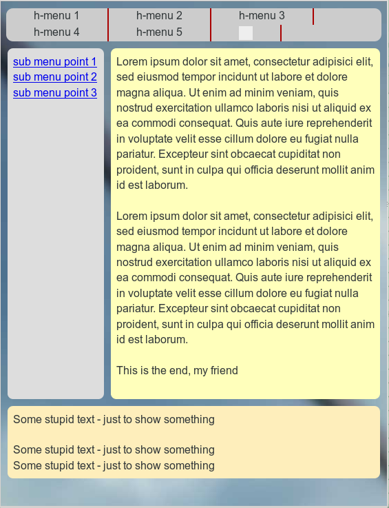
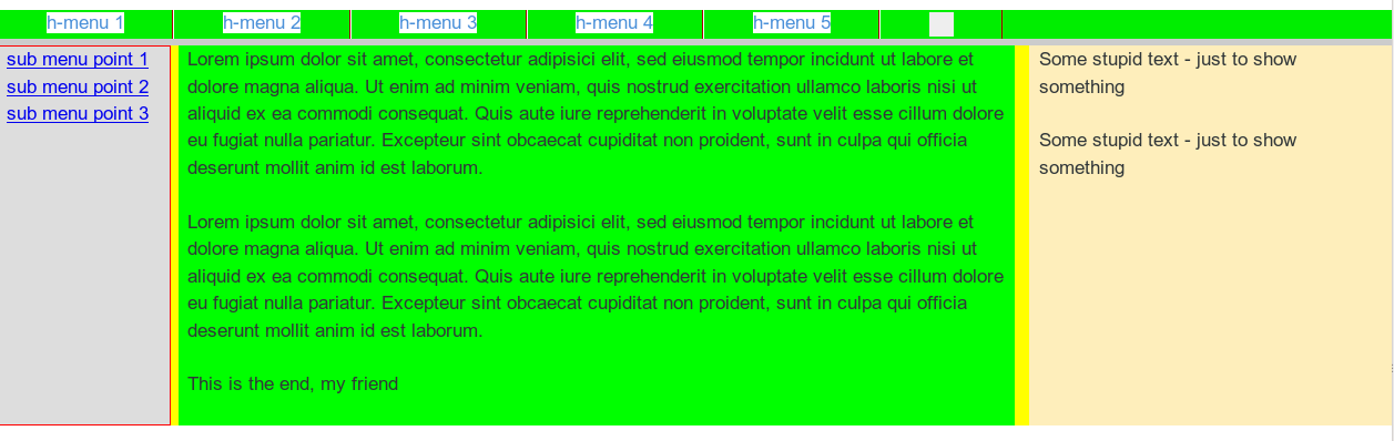
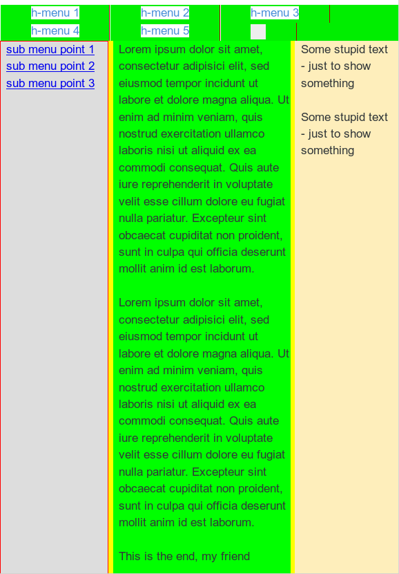
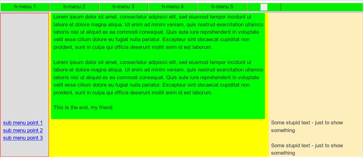
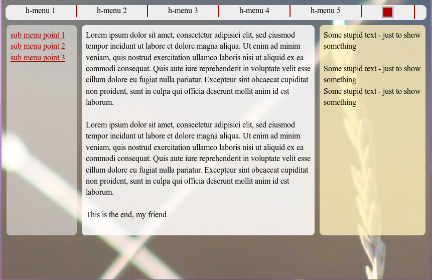
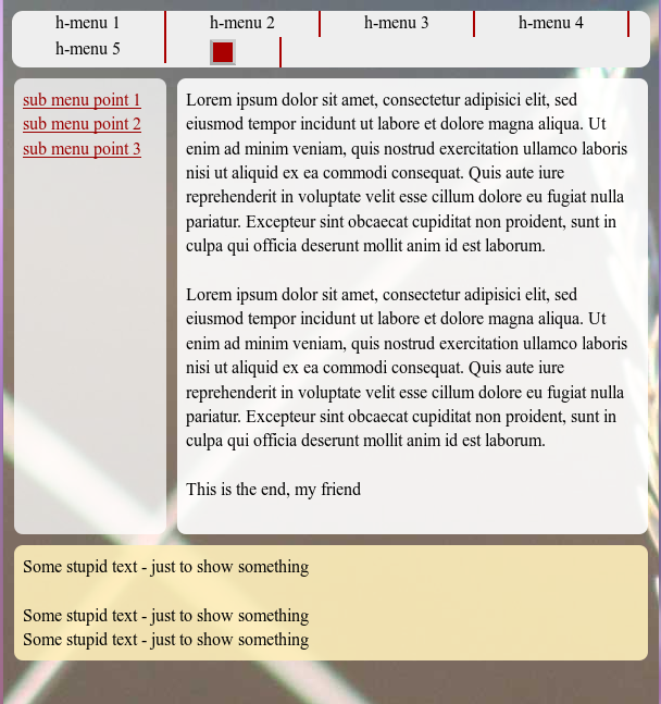
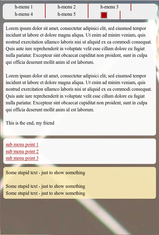
Before we discuss some details let us look at the visual results:

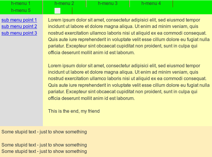
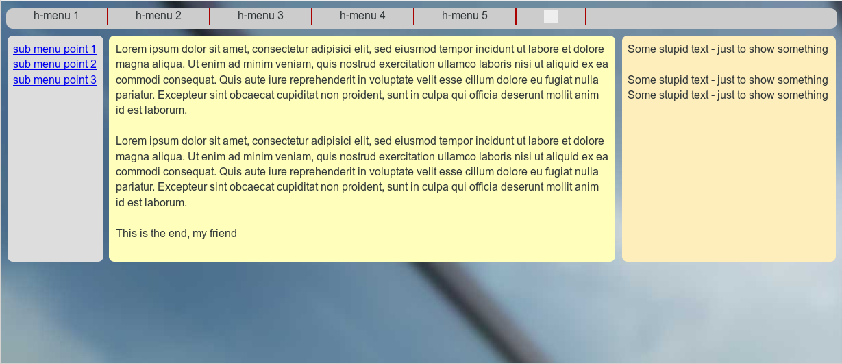
Range III: Starting point
responsive1

Range III: Fluidity when reducing viewport width
responsive3

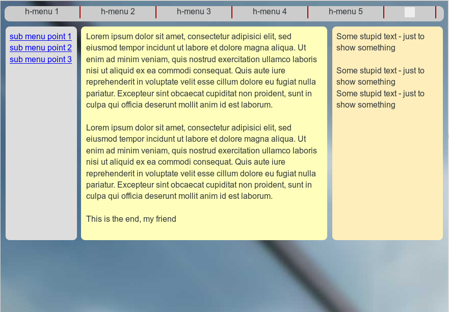
Range II: Move the rightmost column to the bottom
responsive4

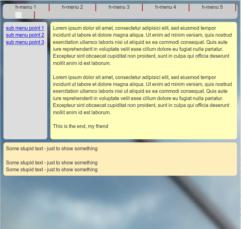
Range I: Move the leftmost column right below the text box and over the initially right column
responsive5

A closer look may reveal that we changed the transparency a bit during the transitions between the viewport width ranges.

Some CSS hints

We switch some of the transparency layers off and on during the range transitions by using the “display” property. This is somewhat saver than just changing the visibility.

As soon as a major content element is moved downwards during a responsive action we switch off the corresponding background element in its encapsulating container. Instead, we switch on the respective background layer in that container which becomes relevant for the correct height of the background layer after the vertical repositioning.

Thus, in Range III bg_left0, bg_info0, bg_right0 are the active background layers. In Range II, however, we use
bg_left1, bg_info1 and bg_right2. In Range I we activate the innermost layers bg_left2, bg_info2, bg_right2.

The height of these absolutely positioned background containers layers is defined by the height of their outer encapsulating container. The height of the latter is defined by the highest of its inner relatively positioned content containers. This type of indirect height control of absolutely positioned layers via relatively positioned boxes on the same code level inside one and the same encapsulating container is basic CSS2.

The transition between Range II and Range I is done by mainly 2 adaptions in the section

@media screen and (max-width : 539px) {}

of the CSS code:

  • We adapt the margins of “div#info” to a full extension over the viewport width -i.e by setting both “margin-left” and “margin-right” to small values. ( Small values to keep some optical distance of the contents to the viewport edges …). This change of margins is already enough to vertically reposition “div#left_nav” if we at the same time change the property “left-margin” of “div#left_nav” (from -100%) to zero.
  • n

  • We set the width of “div#left_nav” to 100%.

Pretty simple, isn’t it?

All the rest is cosmetics. Note, that the opacity values are adapted during the transitions, too. Such an adaption may be helpful if elements of the background image started to disturb the readability of your text during the repositioning of the web page’s text containers.

What if we had wanted to move the left sided navigation column above the main text box in Range I?

This is a relevant question. But after what we have learned so far the answer is extremely trivial. So, I leave this up to the reader.

Addendum 25.08.2015:
As I got a question regarding this point I give a hint. The most simple solution builds on the following steps: Change the tag order of the floated “div#left_nav” and “div#float_info” in the HTML code. Adapt the margins of div#left_nav (no loner a negative margin-left, but a negative margin-right!). Change widths and margins – also margin-top – at the responsive transition as required.

Note that turning “div#float_info” a right floated div would not help much. The tag that is the last one in the code for floated elements of a container represents the first element which is moved downwards by the browser as soon as the widths of the floated elements collide. By performing such an experiment we would again see that the div-order in the code is of major importance. However, we are now able to adapt such an order quickly to our requirements regarding the final responsive outcome.

What about “inline-block” instead of floated elements?

Also a good point. With inline block elements [CSS property “display:inline-block;”] we can indeed replace floated elements in their containers. However, the tag order plays the same role for the behavior of inline-block elements as for floated elements when the space for a horizontal presentation becomes insufficient. The last tags are moved downwards. So we would have to work with the same type of tricks as discussed in this and the last article.

What is still missing?

Although we have harvested

  • control over the DIV order in the code required for an easily manageable responsiveness,
  • control over responsive adaptions of the position and width of content containers and their transparent background layers

there are of course still things to improve. E.g.:

  • The upper horizontal main menu could be collapsed to a button with a switch ON/OFF functionality on the upmost area of the web page.
  • The vertical navigation sub-menu could also be collapsed to a kind of button available on the left side of the viewport.

A full “Switch ON/OFF” functionality for such menu button requires Javascript. However, there is a well defined – though limited – solution also for users which have Javascript deactivated. These new objectives will be topics of forthcoming articles.

In the next article of this series

Responsive fluid multi-column layouts – with a responsive horizontal menu – IV

we shall describe a handling of the horizontal main menu line at small viewport widths – without involving Javascript.

Responsive fluid multi-column layouts – the DIV order problem – II

In the last article of this series

Responsive fluid multi-column layouts – the DIV order problem – I

I discussed a standard 3 column fluid design. HTML and CSS codes for a simple example were presented. Our solution depended on a certain order of DIV tags in the HTML code. The tag of the DIV container for the main content “div#main_content” got the last tag position and the CSS property “position:relative;” inside our outer container “div#float_cont”, where the container for 2 of the visible outer left and right “columns” were floated. By setting proper margins for the main content container we gained fluidity and at the same time automatic control over the apparent visual heights of all containers.

In this second article we make a first step towards a responsive design. We assume that the reader is already familiar with the definitions of the major DIV elements of our example page. As in the first article we shall identify the DIVs by their CSS ID representation.

We shall need to overcome some obstacles whilst getting responsive. Because this is a Linux blog we do not care if older and not W3C compliant MS IE browsers can reproduce our suggested CSS recipes for a solution. Code examples given below were tested with Firefox for Linux.

Responsiveness based on viewport width intervals

To start with responsiveness we first define some view port width intervals, for which we want to rearrange major (HTML) elements of our test page. We choose the width intervals a bit arbitrarily below. You may adapt them for your needs:

  • Range III: width range beyond 800px and larger
  • Range II: width range between 540px and 800px
  • Range I: width range below 540px

What are our objectives for the page layout in these ranges?

I shall set up some requirements and conditions for which the DIV order problem gets obvious. What I want to show is that when you deal with responsiveness you may have to align your initial standard HTML/CSS layout with what you want to achieve in view port ranges below certain width thresholds. Some people claim that one should always start designing for the narrow view port situation. My point of view is that with fluid layouts you need to consider both ends of your ranges right from the beginning.

Objectives for Range III:

In range III we just use our (or an improved) initial fluid design.

Objectives for Range II:

In range II the left column shall remain where it is. However, we remove the information in the right column to get more space for the main contents. Instead of omitting “div#right” completely we want to move it to the bottom of the page – and change its width at the same time to 100%. The optical and real height of “div#right” shall be determined by its contents. The “div#main_cont”, however, should keep its position, but use all the space being available at the right of the left column to the right edge of the view port. At the same time “div#main_cont” shall determine the optical (not necessarily the css) height of its own and the left column – if it is the longest. Otherwise the contents of the left column shall determine the height of the upper part on the page.

Objectives for Range I:

We set up an even more complicated scenario for range I:
The “div#main_cont” originally positioned in
the middle shall become dominant now and take the whole width offered. In addition we want to move the left side menu (div#left_nav”) from its original position. To make things tricky we want it to move to the bottom of the expanded DIV container “div#main_cont)” and give it a 100% width, too – so that if someone read and scrolled to the bottom of the “div#main_cont” he would see the available link options. The originally right column “div#right” shall move further down below the repositioned “div#left_nav”.

In addition we want to stop a further shrinking of the displayed main DIV container by a minimum width of 200px.

Later on

  • we shall in addition take care of a better treatment of the horizontal menu placed at the top of our test page in range I
  • and offer additional options to deal with the side menu originally placed left with vertical orientation.

Additional assumptions and requirements:

To make things really difficult, we want to achieve the transitions between Range III and Range II as well as between Range II and Range I without changing the HTML code defined for Range III. In addition we want to avoid Javascript/jQuery involvement to change the node order in the HTML tree during transitions. The reordering of the DIV containers defined above shall be achieved by CSS measures only.

Objective of this article – let us cover range II

We take these challenges step by step. For this article our goal is to cover Range II correctly – we do not care about Range I, yet. Already this limited objective will require some fundamental changes of our initial HTML code for Range III – and some interesting CSS tricks. But it will result in a solution which can also be used for Range I later on.

The order of the DIV tags prevents the repositioning of the DIV containers

We shall of course try to add some width dependent statements to our CSS file:

@media only screen and (min-width: 540px) and (max-width: 800px) { … }

But, what CSS directives could help us to move the container “div#right” to the bottom, i.e. below “div#main_cont” – without loosing our design achievements described in the last article? The frustrating result of many trials and errors was:

Given our assumptions above: none, actually. At least I was too stupid to find a reasonable solution.

You may play around a bit yourself. Even if you introduced some additional (floated) helper DIVs which would only be displayed in range II: Whatever you do to move the “div#right” – some of our requirements would be broken and/or the flow of the text in “div#main_cont” would be affected.

The first ugly thing is the following:
If we floated all major elements of the “div#float_cont” container “left” or “right” the final visible vertical order would not be correct. “div#main_cont” comes at the bottom of the original HTML code – so it moves to the bottom – whatever else happens. The same thing would happen if you turned off floating completely and used only relative positioning. You do not get the final order right.

So, what if we moved “div#main_cont” in our original HTML code and floated it instead of working with margins? Well, you cannot just float “div#main_cont” after (!) “div#left_nav” and keep up the adaptivity to any further width reduction of the viewport. This is mainly due to the fact that our left column container shall keep up a fixed width! You could solve
the adaptivity by changing “div#main_cont” to “position:absolute;” (and use “left:16rem; right:0;”) but then again you would loose any height control for “div#float_cont” and its external DIV containers. A loss of height control would also happen if you changed “div#info” to “position:absolute;” or if you floated it.

Now, you may think about additional floated helper DIVs which you switched on in the background of “div#main_cont” only after you passed a width threshold. But such a background floated DIV would have an impact onto any text written in “div#main_cont” ! Now, you could solve this by moving the text to an absolutely positioned inner container – and again loose height control. And so on, and so on …

What do we need?

From all my own experiments I could conclude 2 things which one needs to meet the adaptivity scenarios posed above:

  1. You need the HTML tag of “div#main_cont” as the first one inside the “div#float_cont” tag – more precise: before the other floated DIVs, which define the other columns.
  2. You sooner or later need “div#main_cont” to float itself.

However, as we have already seen at the end of our last article: Just moving the “div#main_cont” tag to the top and keeping up “position:relative;” will not work. However, if we floated it we would loose width adaptivity and/or would not get “div#left_cont” at the correct position with a fixed width. Is the last statement really true?

Negative margins to the rescue

We need to dig a bit deeper in our box of dirty CSS tricks. Let us assume that “div#main_cont” really were the first element of “div#float_cont”:

<div id="outer_cont">
	<div id="nav_left_bg"></div>
	<div id="right_bg"></div>
	<div id="info_bg"></div>
	<div id="float_cont">
		<div id="main_cont">
			<div id="info"> ... </div>
		</div>
		<div id="left_nav">
			<div id="left_inner"> ... </div>
		</div> 
		<div id="right">
			<div id="right_inner"> ... </div>
		</div> 
		<p class="floatstop"> </p>
	</div>
</div>

And let us further assume that we really floated “div#main_cont”. How could we regain width adaptivity and our text of “div#info” at the right position? Actually, this is pretty easy:

div#main_cont {
	position: relative; 	
	float: left;
	margin: 0; 
	width:100%;  /*adaptivity to the port view width!*/
}
div#info {
	/* height control: the contents defines the height of all parents */ 
	position: relative; 
	margin: 0 27% 0 16rem;
	padding: 0 0.8rem 0 0.8rem;
}

Note the “width:100%;” definition! It guarantees width adaptivity despite floating! To reserve enough pace at the left and right side of the main contents, we just use the same margin trick for “div#info” inside its container which we previously used for “div#main_cont” itself. Nice!

But, how do we get “div#left_nav” to its left position, now? We could use “position:absolute;” for this element. But, by doing this, we could no longer control container heights in case that the left column due to more contents ever became the longest of all columns. However, if we floated “div#left_nav”, it would move it downwards because “div#main_cont” already consumes all of the view port’s width.

Wait a second: What if we used negative margins? This could lead to a solution, because successive float elements can move across and over each other.
So, lets try it:

div#left_nav { 
	position:relative; 
	float:left;
	width: 14.2rem;
	margin-left: -100%;
}
div#right { 
	position:relative; 
	float:left;
	margin-left: -26%;
	width: 26%;
}

Some experiments with your browser would prove that this really works! After corresponding changes to the HTML and CSS codes we find that we more or less have come back to our original fluid scenario – but now the initial order of the HTML tags has changed fundamentally. Everything is floated – but by applying some tricky margins to our central containers we achieved the requested fluid layout again. How can we make use of the new tag order and the floating in range II ?

Elementary settings for range II

As soon as we reach the view port width threshold for range II, only some minor CSS changes are required for our new basic HTML/CSS layout:

@media only screen and (min-width: 540px) and (max-width: 800px) {
	div#right {
        	margin-left: 0;
		margin-top:1.0rem;
		width:100%;
		background-color: #FEEEBB;
	}
	div#info { 
		margin: 0 0 0 16rem;
	}
	div#right_bg {
		visibility: hidden; 
	}
	div#info_bg {
		right:0;
	}
}

This is pretty cool, isn’t it? We use our 100%-width of “div#main_cont”, change only one “left-margin” statement – and we have moved the “div#right” down. In addition we change the “right-margin” of “div#info” to use the total (adaptive!) width to the right for our main text information. The rest of the CSS changes just repairs some small gaps in the “optical appearance”:

fluid4

How to improve the optical appearance in Range III and Range II substantially?

As a developer, I thought I had achieved something and deserved a beer. However, I met strong criticism from my wife, who cares much more for optical design aspects than me. She pretty soon detected a major drawback of my HTML/CSS design:

The repositioned “div_right” still extends the height of the container “div#float_cont”. Thus, the heights of our colored background stripes “nav_left_bg”, “info_bg” and “right_bg” get bigger, too. The horizontally enlarged and moved “div_right” just overlaps and hides the background stripes.

Note, that we defined a “margin-top:10px;” for the repositioned “div#right;” in the CSS code above. Nevertheless, you see that our background stripes stretch down without any visible gap. As a result, I was confronted with a new requirement:

New additional requirement

What if you wanted to decouple the repositioned “div#right” from the 2 floated DIV containers above throughout Range II – in a clear optical way by a vertical gap – and also in the sense of HTML? And provide a region or stripe of transparency in between – i.e. in the gap opened by the margin-top definition)? Transparency, to allow the user e.g. to look at a background image of the whole page?

This requirement gave me some headache. But I understood the related objective very well. Web pages with seemingly floating areas (with rounded corners) above background images do look fancy, true enough. The eventual solution required additional changes to our initial HTML setup. I had to implement a kind of repetition of our new basic approach in a more convoluted way. Decoupling inevitably leads to more
containers …

Before looking at the code, let us first have a look at the result. As a starting point the new page appearance within Range III:

fluid5

A comparison with the next picture provides an impression of “width fluidity” in Range III:

fluid6

Now, let us have a look at the transition to Range II:

fluid7

And the width fluidity again:

fluid8

Even my wife accepted this – though, of course, she did not like the chosen background colors and the spacing of my test example. But related changes are within the reach of her work domain, now.

The new HTML code

Here are the resulting HTML and CSS codes for our test example. In comparison to our first article the statements may look a bit more complex. But, we only apply already discussed recipes at additional nested tag levels:

New HTML code:

<!DOCTYPE html>
<html>
<head>
<meta charset="UTF-8">
<title>fluid standard 2</title>
<link href="css/fluid_standard2.css" rel="stylesheet">
</head>

<body>
<!-- 3 spalten layout -->
<div id="all">
	<div id="head">
		<div id="hmen_knapp_cont" class="hmen_knapp_cont">
			<a id="hmen_knapp"></a>
		</div>
		<div id="hmen_cont" class="hmen_cont">
			<ul>
				<li><div class="hmen_pkt">h-menu 1</div></li>
				<li><div class="hmen_pkt">h-menu 2</div></li>
				<li><div class="hmen_pkt">h-menu 3</div></li>
				<li><div class="hmen_pkt">h-menu 4</div></li>
				<li><div class="hmen_pkt">h-menu 5</div></li>
				<li><div class="hmen_pkt"><a id="but2" href="#"></a></div></li>
				<li class="floatstop"></li>
			</ul>
		</div>
	</div>
	
	<div id="outer_cont">
		<div id="nav_left_bg"></div>
		<div id="right_bg">
			<!-- do not remove ! -->
			<div id="right_inner_bg"></div>
		</div>
		<div id="info_bg"></div>
		
		<div id="float_cont">
			<div id="main_cont">
				<div id="bg_left"></div>
				<div id="bg_info"></div>
				
				<div id="info_cont">
					<div id="float_info">
						<div id="info"> 
							<p>Lorem ipsum dolor .... </p>
							<p> </p>
							<p>Lorem ipsum dolor .... </p>
							<p> </p>
							<p>This is the end, my friend<br> </
p>
						</div>
					</div>
					<div id="left_nav">
						<div id="left_inner">
							<p><a href="#">sub menu point 1</a></p>
							<p><a href="#">sub menu point 2</a></p>
							<p><a href="#">sub menu point 3</a></p>
						</div>
					</div>
					<p class="floatstop"> </p>
				</div>
			</div>
			
			<div id="right">
				<div id="right_inner">
					<p>Some stupid text - just to show something</p>
					<p> </p>
					<p>Some stupid text - just to show something</p>
					<p>Some stupid text - just to show something</p>
				</div>
			</div> 
			
			<p class="floatstop"> </p>

		</div>
	</div>
</div>
</body>
</html>


You see that I took the decoupling of the left navigation area and the main contents container from the “div#right” container seriously. Actually, we reproduced the very same solution found above – but now inside an additional container “div#info_cont”, which itself resides inside the now floated container “div#main_cont”. Note, that by applying “position: relative;” for the container “div#info_cont” we can keep up full height control. Of course, in addition the floating inside the new additional float container “div#info_cont” has to be stopped to guarantee the dynamical propagation of height information to the outer enclosing DIVs.

As you can see, we placed some new and additional (colored) background DIVs inside the (now floated) “div#main_cont”. But throughout Range III we keep these elements hidden! However, in Range II we hide the original background stripes and activate the new ones instead.

The positioning of the container “div#right” works exactly as before – as log as we arrange for proper margins of “div#info”. To get a really nice padding of the background stripes in both ranges and to keep a constant distance of the contents of “div#right” to the contents of “div#info”, we need to include some more internal DIV containers – “div#right_inner_bg”, “div#left_inner”, “div#right_inner”. They provide some required “optical cosmetics”.

The new CSS code

The required new CSS statements for our example are the following:

   
@CHARSET "UTF-8";

html {
	font-size:10px;
}

body {
    margin-left:0; 
    margin-right:0;
    margin-top: 0; 
    background-image: url(../image/hg_drm_ap_7_1.jpg);
    background-repeat:no-repeat; 
    background-position:top center;
}

p { 
	font-size: 1.6rem; 
	line-height: 1.4;
	margin: 0;
}
	

div#all { 
	position:relative; 
	width:100%; 
	padding-bottom: 1.0rem;
	padding-top: 1.0rem;

}

/* The header region */	

div#head { 
	position:relative; 
	width:100%; 
	min-height: 3.0rem;
}

/* The main contents container */
	
div#outer_cont { 
	position:relative; 
	width:100%; 
	min-height: 10.0rem;
	margin-top:1.0rem;
}
	

/* some elementary width definitions */

div#left_nav,
div#nav_left_bg,
div#bg_left {
    width: 14rem;
    margin-left: 1.0rem;
}

div#right,
div#right_bg {
    width: 27%;
}


/* background elements for all columns in range I */

div#nav_left_bg, 
div#right_bg,
div#info_bg,
div#bg_left,
div#bg_info,
div#right_inner_bg {
    position: absolute;
    top:0;
    bottom:0;
    border-radius: 0.8rem;
}

div#nav_left_bg {
    position: absolute;
    left:0;
    
background-color: #DDD;
    border: 0px solid #F00;
    z-index:1;

}

div#info_bg {
    position: absolute;
    left:15.8rem;
    right:27%; 
    background-color: #FFB;
    border: 0px solid #00F;
    z-index:1;
}

div#right_bg {
    right: 0;
    border: 0px solid #F00;
    z-index:1;

}

div#right_inner_bg {
    left: 1.0rem;
    right: 1.0rem;
    background-color: #FEEEBB;
}


/* The float container and its basic elements */	

div#float_cont { 
    position:relative; 
    width: 100%; 
    border: 0px solid #FF0000;
    z-index:5;
}

/* floated left main container and 
 * its background elements for range II*/

div#main_cont { 
    position: relative;
    float: left; 
    width:100%;
    min-height: 2.0rem;
    border: 0px solid #009900;
    z-index:2;
}


div#bg_left {
    visibility: hidden; 
    position: absolute;
    left:0;
    background-color: #DDD;
    border: 0px solid #F00;
    z-index:1;

}

div#bg_info {
    visibility: hidden; 
    left:16.0rem;
    right:27%; 
    background-color: #FFB;
    border: 0px solid #00F;
    z-index:1;
}


/* The main column */

div#info_cont {
    position: relative; 
    width:100%; 
    border:0px #F00 solid;
}

div#float_info { 
    position:relative; 
    float:left;
    width: 100%; 
    border: 0px solid #FF0000;
    z-index:2;
}

div#info { 
    position: relative; 
    margin: 0 27% 0 16rem;
    width:auto;
    padding:0.8rem;
    min-height:2.0rem;
    z-index: 1;
}


/* right column */

div#right { 
    position:relative; 
    float:left;
    margin-left: -27%;
    min-height:2.0rem;
    border: 0px solid #009900;
    z-index:2;
}

div#right_inner {
    position:relative;
    width:auto;
    margin-left: 1.0rem;
    margin-right: 1.0rem;
    padding: 0.8rem;
}


/* left column */

div#left_nav { 
    position:relative; 
    float:left;
    border: 0px solid #009900;
    margin-left: -100%;
    padding-left: 1.0rem;
    z-index:5;
}

div#left_inner {
    width:auto;
    padding: 0.8rem;
}


/* Support elements */ 	

p.floatstop {
	clear:both;
	height:0;
	margin:0;
	line-height:0;
	padding: 0;
	font-size: 0;
}


/* contents of the upper horizontal menu */

div.hmen_cont {
	display: block; 
	position: relative;
	min-height: 3.0rem;
	width: auto;
	margin-right:0.8rem;
	margin-left:0.8rem;
	background-color: #ccc;
	border-radius: 1.0rem;
}

div.hmen_cont ul {
	position: relative;
	list-style-type: none;
	width: 100%;
	margin: 0;
	padding: 0;
}

div.hmen_cont ul li {
	float: left;
	padding: 0.2rem 4.0rem 0.2rem 4.0rem;
	border-right: #a90000 0.2rem solid;
	min-height: 2.0rem;
	font-size: 1.6rem;
}
	
div.hmen_cont ul li.floatstop {
	float:none;
	clear:both;
	min-height:0;
	margin:0;
	line-height:0;
	padding: 0;
	font-size: 0;
}

div#hmen_knapp_cont {
	display: none;
	position: absolute;
	right:0;
	top:10px;
	width: 50%;
	height: 2.4rem;
	border: 1px #A90000 solid;
}

a#hmen_knapp {
	display: block;
	width: 100%;
	height: 100%;
	background-color: #009999;		
}

a#but2 {
	display: block;
	width: 2.0rem;
	height: 2.0rem;
	background-color: #EEE;
}


/* @media screen decision and settings for range II */

@media screen and (min-width : 540px) and (max-width :800px) {
    
    div#info { 
        margin: 0 1.0rem 0 16rem;
        background-color:transparent;
    
    }
   
    div#right { 
        position:relative; 
        float:left;
        margin-top:1.0rem;
        margin-left: 0;
        margin-
right: 0; 
        width:100%;
     }
    
    div#right_inner {
        margin-left: 1.0rem; 
        margin-right: 1.0rem;
        width: auto; 
        background-color: #FEEEBB;
        border-radius: 0.8rem;
    }
    
    
    div#right_bg {
        visibility: hidden; 
    }

    div#info_bg {
        right:0;
    }

    div#nav_left_bg {
        visibility: hidden; 
    }

    div#info_bg {
        visibility: hidden; 
    }
    
    div#bg_left { 
        visibility: visible;
    } 
  
    div#bg_info { 
        visibility: visible;
        right: 1.0rem;
    }
}

 
Of course, you should replace the background image by your own.

Whilst studying the CSS statements, you may find that we extended the width of the right column to 27% of the view port width (instead of 26% before). Thus, physically “div#right” now connects directly to “div#info” at its left side. We did this to build up a seemingly constant (and not percentage dependent) visual distance between the middle and the right container contents. This may sound contradictory at first – but by using the additional inner DIV containers mentioned above and by applying proper margin/padding definitions we do achieve this objective.

At the bottom of the CSS file you find the necessary “@media screen” decisions and settings for range II. Because we set the negative left margin for “div#right” to zero this container moves down. The display of its contents requires some cosmetics; but the related CSS statements are very elementary.

One of the more interesting tricks is that we obviously hide the original (absolutely positioned and colored) background stripe containers and activate the new inner colored background stripe containers instead as soon as we perform the transition to Range II. This allows for a transparent gap between the visible upper part and the lower part of the web page in Range II – without loosing any height control for the visual columns in the upper part.

What have we achieved for our view port Ranges III and II?

Actually, all we wanted. We keep up optical height control where necessary in Range III and II. The CSS height of each of the container DIVs which represent the columns is completely determined by its contents (which we could change at any time, e.g. by a CMS). The longest of the three columns stirs the apparent visual height of all three columns in Range III.

In Range II we detach “div#right” and move it to the bottom of the page. Although we now create a gap between “div#right” and the upper part of the web page, full height control remains in place both for the floating 2 upper DIVs containers and their enclosing containers.

Fluidity is completely fulfilled in accordance with our objectives both for Range III and Range II.

The transition between Range III and Range II requires only some minor and obvious CSS changes. We did not have to change the HTML code at all during transition. We did not involve any Javascript so far.

Enough for today. We have not done anything, yet, to cover the objectives for Range I. I shall describe some appropriate measures in the next article:

Responsive fluid multi-column layouts – the DIV order problem – III

A good question the reader may consider in the meantime is:
What needs to be changed if we wanted to move the third column of Range III upwards instead of downwards during the transition to Range II?

Responsive fluid multi-column layouts – the DIV order problem – I

My wife works on a web project in Norway. As it is typical these days, functionality gets more weight than design when displaying web pages on mobile devices. Especially after Google’s decisions to explicitly require responsiveness. [Which was in my opinion mostly driven by their own interests to promote Android driven devices and their own development tools. And then maybe by general market and selling requirements. But this is a different story… ]

IT and communication in Norway is all about smart phones and tablets. So, of course, our Norwegian customer wanted to get some “responsive design”. OK … Although not really interested, I do take some challenges when my wife asks me for assistance …

As I am getting pretty IT-conservative with growing age my starting point with “responsiveness” was a fluid layout combined with “@media screen” CSS decisions – and a reluctance to use Javascript [JS] and jQuery. (This reluctance, of course, reflects the nagging question: What do we do when a customer has deactivated JS?)

My opinion was: In a certain range of browser window width – or more generally viewport width – the fluidity of the web design should predominantly govern the responsive reaction to a width change or a small target screen. I regard such a careful JS-free approach to responsive web design as reasonable – it helps already with different browser sizes on standard desktop screens – completely independent of mobile devices.

More extreme measures as removing visible parts of the layout or rearranging the positions, sizes and vertical order of whole HTML DIV container blocks would in this approach only be involved below certain viewport width thresholds via “@media” decisions. All in all, no big deal, I thought …. (In the first articles of this series we do not look at more detailed things as image resizing or font size adaptions).

What I underestimated is the fact that “old fashioned” fluid layouts may require a certain HTML tag order when we define its multiple columns”. However, in a responsive design approach you may eventually stumble across situations where the natural DIV element order you are used to is NOT suitable below some viewport width limits – i.e. when you want to rearrange the position and size of these DIV containers in a certain way. It took me some time to realize that there was a kind of contradiction between fluidity and responsiveness.

At this point I felt tempted again to use jQuery to freely rearrange the order of nodes of container DIVs in the HTML node tree or to use CSS flex boxes. However, flexboxes are not really standardized yet – and once you start with jQuery and responsiveness you must take care to align your Javascript conditions with the CSS @media decisions in a precise and non contradictory way. In addition I thought it better to understand JS free options and possibilities first before implementing some parametrizable JS machinery.

Whilst experimenting I all the time had the feeling that with some dirty CSS trick one should be able to gain control over the DIV element order – without destroying the optical appearance – and become able to adapt it to any predefined responsive reordering requirements for small viewport widths. I needed some hours to figure out how I could overcome at least some of the problems. I had some fun with this and maybe others find tweaking CSS interesting, too.

In this first article of a series I like to describe a standard flexible 3 column fluid layout and the CSS directives behind it. In a second article I shall add some elementary responsiveness and deduct the problem of the DIV order. Then I shall describe some CSS “trick” which will enable us to (manually) change or adapt the required DIV order in the HTML code without loosing fluidity and without loosing the optical appearance of the inital horizontal sequence of our columns. This will help us to achieve the pursued responsive and
vertical container rearrangement with a few very simple CSS changes below some width threshold of the viewport.

In other words: Our first objective is find CSS manipulations which enable us to code any required DIV order for the column grid in HTML such

  • that we optically do not change the column order or layout,
  • that we do not disturb the ability of our 3 column layout to adapt optically to the height of its largest (= highest) column,
  • that we can produce any predefined vertical content order of the column contents during a responsive reaction to view port width changes
  • and that we at the same time can realize responsiveness easily by basically changing some float or position statements in @media screen based decisions in our CSS file.

Note that the second point may impose additional difficulties!

Note further that even if we fulfilled our list of objectives we still would have to plan ahead our HTML code and its DIV order for the specific responsive layout we want to achieve. But being able to choose the required DIV order for our HTML code would already gives us the chance to create templates for different responsive reactions required by customers. In combination e.g. with PHP such templates would give us the freedom to switch any horizontal column order into any desired vertical order during responsive reactions – without involving JS.

Nevertheless, later in this series I want to show how we can use Javascript/jQuery to enforce a predefined responsive vertical order of the column contents from a basic 3-column layout we develop in the next two articles. But, at least I myself need some learning curve to get there.

We shall concentrate our efforts on a fluid 3-column layout.

Study example: A fluid/fixed layout with 3 columns

Below, we construct a simple example of a 3 column layout, where you arrange

  • a kind of navigation column on the left web page side,
  • a main contents area in the middle
  • and some column like area, e.g. for teaser elements, on the right page side.

Your fluidity objectives for a certain range of viewport widths would e.g. be

  • that the left column keeps up a fixed width,
  • whereas the middle main column changes its width adaptively with the viewport width
  • and that the right column adapts its width to a defined percentage of the viewport width.

Thus we have defined a combination of fixed/fluid elements which provides a good insight into the basic CSS techniques. Generalizations will be obvious. You require of course that the width adaption happens automatically whilst resizing the viewport width in the given range. All this should be governed by CSS statements, only. Imagine now, that you want to tweak things a bit further in the form that the longest of the three defined “columns” determines the height of the whole page and the apparent “visible” height of the other (not so high) columns, too. Above a responsiveness width threshold at least.

Typically, the main content column may become largest in size (height), whereas e.g. the left column may contain only some few menu points. Nevertheless, you want to create an appearance as if all 3 columns got the same height as the largest one with respect to height – and this should work automatically even if you changed the text and image contents of the content column significantly (e.g. via an CMS). This means that in case you add many lines of new text to the middle column the whole page and its right and left areas should somehow
optically adapt in height.
And: Everything should work analogously in case either the left or right column becomes the largest in height on some pages.

There is of course a simple, “conservative” CSS solution for this problem which I shall discuss a bit below. However, the requirement of fluidity in width in combination with the requirement of extending the web pages height automatically will unavoidably lead to a certain order of the HTML DIV containers.

Some details of our conventional fluid approach

The HTML file is pretty simple:

<!DOCTYPE html>
<html>
<head>
<meta charset="UTF-8">
<title>fluid standard</title>
<link href="css/fluid_standard.css" rel="stylesheet">
</head>

<body>
<!-- 3 spalten layout -->
<div id="all">
	<div id="head">
		<div id="hmen_knapp_cont" class="hmen_knapp_cont">
			<a id="hmen_knapp"></a>
		</div>
		<div id="hmen_cont" class="hmen_cont">
			<ul>
				<li><div class="hmen_pkt">h-menu 1</div></li>
				<li><div class="hmen_pkt">h-menu 2</div></li>
				<li><div class="hmen_pkt">h-menu 3</div></li>
				<li><div class="hmen_pkt">h-menu 4</div></li>
				<li><div class="hmen_pkt">h-menu 5</div></li>
				<li><div class="hmen_pkt"><a id="but2" href="#"></a></div></li>
				<li class="floatstop"></li>
			</ul>
		</div>
	</div>
	
	<div id="outer_cont">
		<div id="nav_left_bg"></div>
		<div id="right_bg"></div>
		<div id="info_bg"></div>
		
		<div id="float_cont">
			<div id="left_nav">
				<p><a href="#">sub menu point 1</a></p>
				<p><a href="#">sub menu point 2</a></p>
				<p><a href="#">sub menu point 3</a></p>
			</div> 
			<div id="right">
				<div id="right_inner">
					<p>Some stupid text - just to show something</p>
					<p> </p>
					<p>Some stupid text - just to show something</p>
				</div>
			</div> 
			<div id="main_cont">
				<div id="info"> 
					<p>Lorem ipsum .... </p>
					<p> </p>
					<p>Lorem ipsum ....</p>
					<p> </p>
					<p>This is the end, my friend<br> </p>
				</div>
			</div>
			<p class="floatstop"> </p>
		</div>
	</div>
</div>
</body>
</html>

The central DIV that shall contain most of the information of our web page is “div#info”. Why we have placed it inside an extra container “div#main_cont” may become clear in the next article. In the pure fluid approach it would not really have been necessary. You clearly detect the “left” sided DIV for e.g. a column with navigation points and the “right” sided DIV, which may contain something else. Note that there are “background” DIVs (with an ID like “…_bg”) that provide the impression of colored columns with exactly the length of the “outer_cont” DIV.

To understand the fluid behavior let us have a look at the CSS :

@CHARSET "UTF-8";

html {
	font-size:10px;
}

body {
    margin-left:0; 
    margin-right:0;
}

p { 
	font-size: 1.6rem; 
	line-height: 1.4;
	margin: 0;

}

div#all { 
	position:relative; 
	width:100%; 
	background-color: #000; 
}

/* The header region */	

div#head { 
	position:relative; 
	width:100%; 
	background-color: #FF0; 
	min-height: 3.0rem;
}

/* The main contents container */
	
div#outer_cont { 
	position:relative; 
	width:100%; 
	background-color: #FF0; 
	min-height: 10.0rem;
}
	
/* background elements for all columns */

div#left_nav,
div#nav_left_bg {
    width: 14.2rem;
}

div#right,
div#right_bg {
    width: 26%;
}

div#nav_left_bg, 
div#right_bg,
div#info_bg {
    top:0;
    bottom:0;
}

div#nav_left_bg {
    position: absolute;
    left:0;
    background-color: #DDD;
    z-index:1;
    border: 1px solid #F00;
}

div#right_bg {
    position: absolute;
    right: 0;
    background-color: #FEEEBB;
    z-index:1;
    border: 0px solid #F00;
}

	
/* The float container and its basic elements */	

div#float_cont { 
	position:relative; 
	width: 100%; 
	/*background-color: #99e;*/ 
	border: 0px solid #FF0000;
	z-index:5;
}


/* left column */

div#left_nav { 
    position:relative; 
    float:left;
    border: 0px solid #009900;
    padding-left:8px;
    /*margin-left: -320px;*/
    z-index:2;
}

/* middle column */

div#main_cont { 
	position: relative;
	margin: 0 27% 0 15rem;
	/*width:74%;*/
	/*min-width: 462px;*/
	/*background-color: #fff;*/ 
	border: 0px solid #009900;
	z-index:2;
}

div#info { 
	position: relative; 
	/*margin: 0 2px 0 160px;*/  
	width:auto;
	background-color: #0f0; 
	padding-left:8px;
	/*height:200px;*/
}

/* right column */

div#right { 
	position:relative; 
	float:right;
	/*min-width: 15.2rem;*/ 
	width: 26%;
	/*background-color: #00f;*/ 
	border: 0px solid #009900;
}

div#right_inner {
    width:auto;
    padding: 0 0.8rem 0 0.8rem;
}


/* Other elements */ 	

p.floatstop {
	clear:both;
	height:0;
	margin:0;
	line-height:0;
	padding: 0;
	font-size: 0;
}

/* contents of the upper horozontal menu */
div.hmen_cont {
	display: block; 
	position: relative;
	min-height: 3.0rem;
	width: 100%;
	background-color: #ccc;
}

div.hmen_cont ul {
	position: relative;
	list-style-type: none;
	width: 100%;
	margin: 0;
	padding: 0;
	background-color: #00EE00;
}

div.hmen_cont ul li {
	float: left;
	padding: 2px 40px 2px 40px;
	border-left: #ffffff 1px solid;
	border-right: #a90000 1px solid;
	min-height: 2.0rem;
	font-size: 1.6rem;
}
	
div.hmen_cont ul li.floatstop {
	float:none;
	clear:both;
	min-height:0;
	margin:0;
	line-height:0;
	padding: 0;
	font-size: 0;
}

div#hmen_knapp_cont {
	display: none;
	position: absolute;
	right:0;
	top:10px;
	width: 50%;
	height: 2.4rem;
	border: 1px #A90000 solid;
}

a#hmen_knapp {
	display: block;
	width: 100%;
	height: 100%;
	background-color: #009999;		
}

a#but2 {
	display: block;
	width:20px;
	height: 20px;
	background-color: #eee;
}

Note that all of the DIVs

  • div#all,
  • div#outer_cont,
  • div#float_cont,
  • div#main_cont,
  • div#info

got a “position: relative;”, but none got any defined height. Actually, as we stop the floating at the end of “div#float_cont” via an artificial p-element, the “div#float_cont” container responds dynamically to the maximum height of one of its inner floated elements or relatively positioned elements and imposes its own height on the surrounding DIV container “div#outer_cont”. The resulting height of this container can be used to indirectly define the height of absolutely positioned background
DIV elements which “simulate” a colored virtual height of all columns – at least as long as we do not rearrange DIV containers due to responsiveness.

Whereas the width adaptivity of the right column is understandable from its CSS width statement, the adaptivity of the “div#main_cont” results from its relative positioning with left and right margins on top of the vertical level which is automatically defined by the floated elements inside the “div#float_cont”. The margins guarantee that we leave enough space on the left and right side not to cover the floated columns contents there.

This fluid design is quite adaptive already – see the following images taken with Firefox.

fluid1

and

fluid2

But, of course, the column adaptivity will not be of much use on small smart phone displays: First there comes an end to shrinking as soon as some words get too large to fit into their column width. And on a smart phone we would appreciate very much to use all of the available width for the text in the main column. We shall look at related measures in the next article.

For now, I want you to realize that the above fluid design relies totally on the order of the DIVs inside the “div#float_cont”. See, what happens, if we changed the order of the DIVs to

<div id="float_cont">
	<div id="main_cont"> ... </div>
	<div id="left_nav">..</div>
	<div id="right"> ... </div>
	<p class="floatstop"> </p>
</div>

fluid3

Then the first DIV spans a region with height that defines the position of the layer for the floated elements – namely below the “div#main_cont”. So our nice fluid design would be doomed to fail in case we needed some other DIV order.

Outlook on forthcoming posts

In the next post

Responsive fluid multi-column layouts – the DIV order problem – II

we introduce some elementary responsiveness and discuss, why the defined DIV order in the HTML code may conflict with a responsive rearrangement. We shall present a responsive solution where some few CSS tricks allow us to (manually) change the DIV order in the HTML code in whatever required way to maintain an easy realization of responsiveness. See also

Responsive fluid multi-column layouts – the DIV order problem – III

for a full discussion.

In the articles
Responsive fluid multi-column layouts – with a responsive horizontal menu – IV
and
Responsive fluid multi-column layouts – with a responsive horizontal menu – V
we discuss menu adaptions without and with Javascript.

Our final objective is to use JS to switch the DIV tag order in the HTML node tree for
a basic 3 column layout in accordance with the required DIV order for a defined responsiveness – in a parametrized way.


Spam-Schutz von E-Mail-Adressen im Web-Impressum ?

Gestern erhielten wir eine Kundenanfrage: Was man denn tun könne, um eine in der Kunden-Webseite enthaltene E-Mail-Adresse vor Spam-Mißbrauch zu schützen?

Das ist eine Frage, die sich keineswegs so eindeutig und einfach beantworten ließe, wie man zunächst meinen könnte. Gräbt man sich erst einmal in die Thematik ein, umso schwieriger stellt sie sich dar. Man gelangt zudem schnell in rechtliche Grauzonen – besonders in Hinblick auf die genaue Form der Angabe der E-Mail-Adresse auf der Impressum-Seite einer Website.

Ich nehme es vorweg:

Ich beleuchte in diesem Artikel zwar die Thematik des Spam-Schutzes von E-Mail-Adressen in Websites unter verschiedenen Blickwinkeln – aber eine explizite Vorgehensempfehlung für Impressum-Webseiten spreche ich nicht aus. Ich rate diesbzgl. vielmehr zu rechtlicher Beratung.
Mein letztliches Fazit wird sein: Investiert lieber in gute Spamfilter !

Wem das als Ergebnis zu wenig ist, erspare sich einfach die weitere Lektüre. Andere Leser werden aber hoffentlich den einen oder anderen erwägenswerten Gedanken finden. Zumindest habe ich versucht, die Grenzen bestimmter Maßnahmen aufzuzeigen und plausibel zu machen.

Rechtliche Aspekte im Zusammenhang mit der E-Mail-Adresse auf der Impressum-Seite einer Web-Präsenz

Meine erste reflexartige Frage an den erwähnten Kunden war, ob er denn die E-Mail-Adresse auf der Impressum-Seite meinen würde und ob er sich über die rechtlichen Vorgaben in Deutschland im Klaren sei. Soweit man sich denn als juristischer Laie darüber überhaupt klar werden kann.

Die gesetzliche Vorgabe und den formalen Maßstab für die erforderliche E-Mail-Angabe auf der Impressumseite einer Website liefert das Telemediengesetz (“TMG”; http://www.gesetze-im-internet.de/bundesrecht/tmg/gesamt.pdf). Wie viele andere Gesetze ist auch dieses interpretationsfähig. Am Ende des Artikels habe ich deshalb Links zu Webseiten zusammengestellt, in denen sich Andere – z.T. Juristen – mit dem Thema auseinandergesetzt haben.

Dem aufmerksamen Leser wird bei der Lektüre solcher und anderer Beiträge zur Rechtssituation kaum entgehen, dass z.B. der Einsatz von elektronischen Grafiken anstelle einer E-Mail-Adresse im Klartext auf der Impressumseite durchaus umstritten ist. Sehen Sie hierzu u.a.: http://www.datenschutzbeauftragter-info.de/impressum-spam-schutz-grafik-e-mail/
Bzgl. der Zulässigkeit von Verfremdungen der E-Mail-Adresse als Anti-Spam-Maßnahme wird die rechtlich verlässliche Information für Impressum-Seiten schnell noch weniger als dünn.

Meine laienhafte Interpretation und Zusammenfassung der im Web zusammengestellten Kommentare oder Empfehlungen ist folgende:

Die Angabe der E-Mail-Adresse ist bis auf wenige Ausnahmen, die auf unsere Kunden i.d.R. nicht zutreffen, grundsätzlich Pflicht. Eine einfache elektronische Kontaktaufnahme soll möglich sein. Auch ein kurzfristiges Beantworten von Fragen muss ermöglicht werden. Ein Kontaktformular allein reicht dazu nicht aus. Nicht nur im Impressum kommerziellen Sites müssen Telefonnummer und/oder Faxnummer daher zusätzlich zur E-Mail-Adresse angegeben werden.
 
Mit großer Wahrscheinlich gilt ferner, dass ein Besucher der Website die E-Mail-Adresse auch bei Benutzung nichtgrafischer Browser oder von Screen-Readern herausfinden können muss. Hier zieht aus meiner Sicht ein Verbot der Benachteiligung von Mitbürgern mit einer Sehbehinderung.

Sollte diese Interpretation stimmen, dann ergibt sich fast zwangsläufig:

  • Elektronische Bilder statt (ggf. leicht verfremdeter)
    Klartext-Adressen auf der Impressum-Seite sind zu vermeiden.
  • Bestimmten Verfremdungen der E-Mail-Adresse durch CSS-Verfahren oder durch den Einsatz javascript-basierter Mechanismen sind auf der Impressumseite mit hoher Wahrscheinlichkeit Grenzen gesetzt.

Dazu unten mehr.

Schutz vor was?

Eine weitere Fragen an den Kunden ist:
Welche Aktion eines Spammers zur Erlangung einer E-Mail-Adresse genau willst du denn abwehren? Das Erfassen durch Hinschauen? Oder das Erfassen durch maschinelle Analyse des HTML-Codes und/oder von Javascript-Programmen? Und zu welchem Preis willst du das verhindern?

Wenn man die E-Mail-Adresse auf der Impressum-Seite mal außer Acht lässt, könnte man ja auf den Gedanken kommen, auf bestimmten Seiten der Web-Präsenz Web-Formulare zur Kontaktaufnahme einzusetzen, um so die Angabe einer E-Mail-Adresse ganz zu vermeiden. Ist das wirklich so einfach, wie es sich anhört? Sind Web-Formulare problemfrei?

Als Maßnahme gegen automatisierte Auswertung des HTML-Codes werden im Web auch auch mehr oder weniger aufwändige Methoden zur Verfremdung von E-Mail-Adressen diskutiert. Dabei hegt man die Hoffnung, das eine solche Hürde wenigstens einen Teil der Spammer abhält. Wie berechtigt ist diese Hoffnung eigentlich ?

Schutz gegen Hinschauen?

Oftmals will man seine E-Mail-Adresse auf einer Webseite gar nicht visuell verbergen. Denn eine Kontaktmöglichkeit für ernsthafte Besucher der Webseite oder gar Kunden soll ja ermöglicht werden! Und auf der Impressum-Seite ist die Angabe der E-Mail-Adresse in Deutschland ja in der überwiegenden Anzahl der Fälle sowieso ein Muss (s.o.).

Die oft beschworene Methode, zum Schutz vor Spam ein elektronisches Bild statt Klartext auf der Webseite einzusetzen, entspricht genau dieser Motivation. Geschützt wird die E-Mail-Adresse dabei bewusst nur gegen maschinelle Programme wie Spam-Bots/Crawler und eben nicht gegen den Blick eines neugierigen Betrachters.

Dies bedeutet umgekehrt, dass natürlich auch ein Spammer die E-Mail-Adresse auf der Webseite durch schlichtes Hinschauen erfassen kann. Vor dem “Hingucken” und “Verstehen” eines Angreifers schützen tatsächlich die allerwenigsten adressbezogenen Anti-Spam-Verfahren. Im “Hingucken” des Spammers finden auch alle Verfahren zur Verfremdung der E-Mail-Adresse ihre Grenze. Hierbei meine ich nicht mal allein das Hinschauen mit den Augen – mafiös organisierte Spammer werden auch den Aufwand mit Bild- und OCR-ähnlichen Auswertemethoden nicht unbedingt scheuen.

Nun könne man meinen, OCR-Verfahren und Hingucken seien ineffektiv. Aber es gilt:

Ist eine E-Mail-Adresse erst einmal bekannt, kann sie direkt als Teil einer wachsenden Adressliste in den einschlägigen Spammer-Kreisen vermarktet werden.

Damit dreht sich die Diskussion im Kern eigentlich um die Frage nach dem Verhältnis von Nutzen zu Aufwand auf der Seite des Spammers. Lohnt es sich für Spammer im Einzelfall, physisch “hinzuschauen” statt die Ergebnisse von Bot- und Crawler-Programmen heranzuziehen? Ich persönlich glaube leider, dass diese Frage zunehmend mit ja zu beantworten ist.

Diese Einschätzung nährt sich aus der Analyse der Spam-Angriffe auf eine von uns betreute Website, auf der Captcha-Verfahren zum Einsatz kommen. Hier zeigt sich, dass immer wieder Aktionen vorkommen, bei denen der begründete Verdacht naheliegt, dass der Spammer (oder ein von ihm abhängiger Billiglohn-Arbeiter?) eine manuelle Eingabe des Captcha-Codes durchgeführt hat und nicht ein Programm. Nun könnte man weiter vermuten, dass solche manuellen Schritte primär dem Austesten des Captcha-Verfahrens dienten. Aber das ist ja genau der Punkt:

Wenn sich im Einzelfall ein solcher manueller Test lohnt, dann
lohnt sich das Hinschauen auf E-Mail-Adressen ggf. auch. Man darf dabei nicht vergessen, dass es weltweit traurigerweise sehr viele sehr billige Arbeitskräfte gibt, die “professionelle” Spammer-Organisationen einsetzen können. Geht man von einer bis zwei manuell erfassbaren Adressen pro Minute aus, so kann bereits eine einzelne Person viele hundert Adressen pro Tag in guter Qualität “ernten”.

Stimmt diese Mutmaßung, so relativiert das den Sinn aufwändiger Anti-Spam-Maßnahmen doch sehr. Geld und größere Anstrengungen sollten dann eher in die Auswahl und Implementierung guter Spam-Filter für die E-Mail-Systeme fließen – nicht nur beim Endverbraucher sondern in der gesamten E-Mail-Transfer-Kette, auf die man einen Einfluss hat.

Einsatz elektronischer Bilder statt einer E-Mail-Adressangabe im Klartext?

Bilder sind im Zusammenhang mit Webseiten vor allem eines: sie sind nicht barrierefrei !

Dies benachteiligt Menschen mit Sehbehinderung bei der Kontaktaufnahme eindeutig. Auf der Impressumseite einer Web-Präsenz ist der Einsatz eines Bildes für die Angabe der E-Mail-Adresse deshalb wohl als sehr kritisch einzustufen. Siehe hierzu u.a. folgenden interessanten Artikel:
http://www.shopbetreiber-blog.de/2011/02/24/abmahnung-impressum-grafik/.
Ich finde die dortigen Argumente nachvollziehbar und denke wie der Verfasser, dass man eine Bild-“Lösung” aus rechtlichen Gründen in Deutschland eher vermeiden sollte.

Ferner gibt es auch kosmetische Nachteile von Bildern: Man bekommt die Schrift im Bild trotz des Leistungsvermögens von Bildbearbeitungsprogrammen manchmal nicht genau so hin, dass sie aussieht wie die vom Browser generierte Schrift. (Etliche Nutzer erlauben eine Darstellung im Browser sowieso nur mit vorgegebenen Fonts anstelle derjenigen, die der Webseiten-Code vorsieht.) Linienartige Inhalte bestimmter elektronischer Bildformate werden beim Skalieren der Web-Seite durch den Anwender ggf. verzerrt – hier sind gerade ältere Browser anfällig. Die krakeligen Schriften sehen dann halt nicht schön aus.

Einsatz von Kontaktformularen ?

Will man seine E-Mail-Adresse auf bestimmten Web-Seiten visuell absolut nicht preisgeben und trotzdem eine elektronische Kontaktaufnahme jenseits von Telefon und Fax ermöglichen, so kann man alternativ serverbasierte Kontakt- und Anfrage-Formulare auf der Webseite anbieten. Dabei betone ich nochmals folgende Einschränkung:

Auf einer Impressum-Seite ist gem. TMG ein Kontaktformular allein nicht hinreichend ! Selbst als Ersatz für eine Telefonummer muss die interne Handhabung des Kontaktformulars offenbar bestimmten Anforderungen genügen. U.a. soll eine maximalen Weiterleitungs- und Reaktionszeit von 60 Minuten gewährleistet sein. Sehen Sie hierzu bitte die Links am Ende des Artikels.

Ferner muss man sich die Frage stellen: Welche Schwierigkeiten bringt denn der Einsatz elektronischer Kontaktformulare auf Webseiten ggf. mit sich? Sind diese denn gegen Spam gefeit?

Nein, das sind sie natürlich nicht! Kontakt-Formulare, die ohne E-Mail-Adressangabe im HTML- oder einem Javascript-Code auskommen, beruhen meist auf einer Server-Skript-Sprache wie PHP. Ein Skript wertet die per POST- oder GET-Verfahren übergebenen Daten aus. Daten lassen sich aber mit Schad- und Spamcode befrachten. Auch Web-Formulare müssen deshalb natürlich gegen die Übergabe von Spam und gegen andere elektronische Angriffe geschützt werden! Formulare sind ohne Zusatzmaßnahmen geradezu ideale und prädestinierte Ziele für maschinelle, elektronische Angriffe! Davon können gerade Administratoren von Blogs und Foren ein Lied singen!

Erforderlich ist zum einen eine rigorose Prüfung der übergebenen Daten, um XSS-Angriffe und andere Angriffsvektoren, die auf die
Datenhaltung am Server zielen, zu vermeiden. Diese Thematik ist nicht gänzlich trivial. Entsprechende Maßnahmen schließen aber übergebene Spaminhalte noch nicht aus. Als Anti-Spam-Schutzmaßnahme werden in Web-Formularen deshalb zusätzlich sog. Captcha-Verfahren eingesetzt. Captcha-Programme stellen dem Besucher einer Website Aufgaben oder erfordern eine Analyse visueller Bilder mit verzerrten alphanumerischen Zeichensequenzen. Die Hoffnung dabei ist die, dass diese Aufgaben nur von Menschen und nicht von einer Maschine oder einem Programm gelöst werden können. Das mag im Einzelfall ja so sein. Es hat sich in unserer Praxis aber auch gezeigt, dass bei unzureichend programmmierten Captcha-Verfahren die statistische Verteilung der generierten Zeichen oder Aufgabenbestandteile keineswegs so zufällig ist, wie vom Laien oder Gelegenheitsprogrammierer oft angenommen. Es gibt durchaus Beispiele, in denen die von Pseudo-Zufallszahlengeneratoren (PRNG) erzeugten Catcha-Sequenzen vorhersagbar sind. Hierzu mehr in einem anderen, separaten Artikel. Beim Einsatz von Web-Formularen muss man also sehr auf die Qualität der verwendeten Captcha-Verfahren achten.

Ein grundsätzlicher Nachteil rein visueller Captcha-Verfahren ist in jedem Falle die nicht gegebene Barrierefreiheit! Das schließt deren Einsatz auf Impressum-Seiten aus meiner Sicht aus.

Zudem kann man darüber streiten, ob das Lösen einer Captcha-Aufgabe der Anforderung einer leichten Kontaktaufnahme nicht im Wege steht. Die angeführten Punkte gelten übrigens gleichermaßen für den Einsatz von Verfahren, bei denen der visuelle Zugang zu einer E-Mail-Adresse erst nach der Lösung einer Captcha-Aufgabe freigegeben wird.

Fazit zum Einsatz von Web-Formularen:
Der Einsatz von elektronischen Kontaktformularen verschiebt das Problem von Spamangriffen und anderen ggf. noch gefährlicheren elektronischen Angriffsverfahren nur auf andere elektronische “Schlachtfelder”. Auf Impressum-Seiten kann ein Formular die Angabe der E-Mail-Adresse sowieso nicht ersetzen.

Schutzmaßnahmen gegen eine automatisierte Auswertung des HTML-Codes ?

Das, was auf einer Webseite sichtbar ist, ist in der Regel auch im HTML-Code oder im Javascript-Code, der an den Browser übermittelt wurde, in lesbarer Form hinterlegt. Solche Inhalte können dann durch Bot- und Crawler-Programme automatisiert erfasst werden. Das gilt i.d.R. auch für Mail-Adressen.

Im Laufe der Zeit wurden verschiedene Ansätze ausprobiert, die auf einer Webseite bzw. im Impressum angegebene E-Mail-Adresse entweder schon im Klartext oder zumindest im HTML-Code zu “verfremden” und dadurch schützen. Eine gute Übersicht zu den eingesetzten Methoden liefert folgende Web-Seite unter “drweb.de”:
http://www.drweb.de/magazin/wirklich-wirksamer-schutz-fr-e-mail-adressen/

Unter den dort diskutierten Varianten spricht der sehr geringe Realisierungsaufwand, der zudem keine Spezialkenntnisse voraussetzt, für CSS-basierte Verfremdungsansätze in Kombination mit folgenden zusätzlichen Verfahren:

  • Klartext-Verfremdung nach dem Muster “renate (dot) musterfrau [at] gmx (dot) de” (oder Teilen dieses Musters)
  • HTML-Code-Verfremdung mit Hilfe des Ersatzes von Klartext durch UTF8-Zeichencode-Nummern.

Zur Umsetzung des letzten Ansatzes helfen im Netz zugängliche UTF8-Übersetzer; siehe etwa:
http://www.internetende.com/mailadresse.htm”>http://www.internetende.com/mailadresse.htm

Zwei gängige CSS-basierte Verfahren – nämlich die “Umkehrung der Zeichenreihenfolge” und die “Integration von im Browser nicht dargestellten Tags” –
sind im oben zitierten Dr.Web-Artikel explizit ausgeführt. Ich erspare mir deshalb eine explizite Beschreibung des Codings an dieser Stelle.

All diese Ansätze sind jedoch kritisch zu würdigen – sowohl unter dem Gesichtspunkt der technischen Umgehung als auch in Bezug auf ihren Einsatz auf Impressum-Seiten:

Kritikpunkt 1 – Leichte Umgehbarkeit durch Spam-Bots
Ich arbeite auch als Entwickler. Meiner begründeten Meinung nach gilt grundsätzlich, dass alle (!) genannten Ansätze programmtechnisch mit relativ geringem Aufwand ausgehebelt werden können. Das ist sogar so einfach, dass ein Spam-Bot-Programmierer, der diese Möglichkeit nicht nutzt, eher als faul zu bezeichnen wäre. CSS-basierte Schutzmaßnahmen können durch ein Minimum an Tag- und CSS-Analyse und Aufhebung der CSS-Anweisungen unwirksam gemacht werden. Noch einfacher geht es durch Auswerten eines bereinigten Zeichenstroms, der von einem hinreichenden HTML/CSS-Interpreter ausgespuckt wird. Noch simpler ist es, UTF8-Zeichencodes zu erkennen und zu übersetzen. Gleiches gilt für den Einsatz von verfremdenden Blanks, Klammern und verschiedenen Formen eines ausgeschriebenen “at”, “Ät” etc.. Wir sind hier wieder mal bei der Frage gelandet: Welcher Aufwand lohnt sich für die Spam-Mafia?

Dennoch: Da der Aufwand zur Implementierung dieser Hürden auch auf unserer Seite klein ist, sehe ich keinen prinzipiellen Grund, diese minimalen Barrieren gegen Spammer nicht zu nutzen. Aber man muss sich über Folgendes im Klaren sein:

Verfremdungen durch eingesetzte Blanks, Klammern und Ausschreiben von “@” als “at” bieten gegen hinreichend programmierte Spam-Bots keinerlei wirksamen Schutz ! Das Gleiche gilt für den Einsatz von ISO- oder UTF8-Zeichensatz-Nummern. Weiterführende CSS- und javascript-basierte Verfahren können mit mehr oder weniger geringem Aufwand unwirksam gemacht werden.

Mit dieser Meinung stehe ich keinesfalls alleine da. Siehe etwa den folgenden Link:
http://www.cedis.fu-berlin.de/cms/doc/faq/allgemein/email-adressen.html.
Doch es gibt noch mehr Gegenargumente.

Kritikpunkt 2 – Eventuelle Verletzung der Barrierefreiheit
Bzgl. des Einsatzes auf Impressum-Seiten vermute ich, dass der Verfremdung dort Grenzen gesetzt, wo sie sich ggf. negativ auf die Barrierefreiheit für Sehbehinderte auswirkt. Intuitiv würde ich zwar annehmen, dass moderne Screen-Reader UTF8-Zeichen-Nummern korrekt umsetzen, aber wer weiß …..

Ein Fragezeichen ist auch bei der Interpretation einer umgedrehten Zeichenreihenfolge zu setzen. Ich muss zu meiner Schande gestehen, dass ich schlicht nicht weiß, wie Screenreader für Blinde sich hier verhalten. Für Hinweise bin ich dankbar. Ein getesteter Befund macht mich aber schon mal sehr misstrauisch:

In einem rein textbasierten Browser wie Lynx wirkt die CSS-Anweisung zur Umkehrung der Textreihenfolge nicht:
<span style=”unicode-bidi:bidi-override; direction: rtl;”>CBA</span>
wird in Lynx nicht als “ABC” sondern als “CBA” dargestellt.

Das macht diese Methode meiner Meinung nach für den Einsatz auf Impressum-Seiten ungeeignet.

Ähnliches gilt für das Hinzufügen von angeblich “nicht sichtbaren Tags” auf der Basis der CSS-Anweisung “display:none;”. Der Inhalt dieser Tags taucht nämlich in rein textbasierten Browsern wie Lynx dennoch auf ! Damit verbietet sich bei Anwendung dieser Methode ein anderer Text innerhalb des Tags als ein schlichtes “Blank” (&nbsp;). Ein Blinder hätte ansonsten erhebliche Mühe, sich die E-Mail-Adresse zusammen zu reimen. Ein “Spamschutz” der Art “renate (dot) mustermann   [at] gmx (dot) de” ist dann aber kaum mehr wert als die Variante ganz ohne das “unsichtbare Tag”.

Grundsätzlich würde ich mal sagen:

Alles was in Lynx so dargestellt werden würde, dass es beim Leser zu Verwirrung führen könnte, ist beim Einsatz von Screenreadern für Sehbehinderte sicher als noch problematischer einzustufen. Unter diesem Gesichtspunkt sollten deshalb alle Verfremdungsmaßnahmen grundsätzlich mit einem textbasierten Browsern ausgetestet werden. Das dies natürlich vor allem für die Impressum-Seite gelten muss, versteht sich nach der bisherigen Lektüre von selbst.

Demnach fällt die Umkehrung der Schreibrichtung für Impressum-Seiten aus. Und die Methode mit der Ergänzung unsichtbarer Tags reduziert sich letztlich auf das Einfügen von “Blanks” auf eine komplexe Weise.

Kritikpunkt 3 – Umgehung CSS-basierter Maßnahmen durch Auswertung eines Textstroms aus einem HTML-Interpreter
Da wir gerade schon Lynx ansprachen: Spammer, die einen geringen Aufwand nicht scheuen, werden den HTML-Code evtl. gar nicht direkt auswerten, sondern zuvor durch einen HTML-Interpreter wie den Kern von Lynx schicken. Der interpretiert dann HTML, CSS, ggf. auch Javascript und setzt das Ergebnis schließlich in einen bereinigten ASCII/ANSI-Textstrom um, der wieder voll lesbar und maschinell auswertbar ist. Bei einer solchen Vorgehensweise, die auf bereits interpretiertem HTML-Code aufsetzt, versagen die diskutierten CSS-basierten Verfremdungen natürlich völlig. (Übrigens auch ein Teil an Javascript-Verfremdungen).

Kritikpunkt 4 – Die große Ungewißheit: Sind Verfremdungen der E-Mail-Adresse auf Impressum-Seiten überhaupt zulässig ?
Ich bin wirklich kein Jurist. Es erscheint mir aber plausibel, dass eine Verfremdung zumindest auf verständliche, nachvollziehbare und leicht korrigierbare Effekte begrenzt bleiben muss. Wenn ich die juristischen Texte zum Impressum richtig einschätze, so ist es wohl zumutbar, dass jemand die E-Mail-Adresse zur Kontaktaufnahme abtippt. Als Unbedarfter stellt man sich dann die Frage: Vielleicht ist es dann ja auch zumutbar, dass der Besucher der Impressumseite im Zuge des Abtippens kleine verständliche Korrekturen vornimmt, wie etwa das Entfernen von “Blanks” (“Leerzeichen”) und den Ersatz eines “at” durch ein “@”?

Allerdings sollte man dies dem User dann auf der Webseite wohl auch explizit mitteilen. Genau so verfahren heute viele Webseiten – als Beispiel sei etwa die Webseite eines Services der Sparkassen genannt:
http://www.siz-service.de/index.php?id=44 (Stand: 04.03.2013)

Man beachte im genannten Beispiel aber auch die Feinheiten: Der Verfremdungseffekt ist wirklich minimal ! Hier werden ausschließlich Blanks zur Abgrenzung des “@” benutzt. Der Benutzer wird zudem explizit auf die Verfremdung aufmerksam gemacht und es wird gesagt, was er tun muss, um eine funktionierende E-Mail-Adresse zu erhalten. Hier spürt man regelrecht das Unbehagen der Seitenersteller !

Der Leser sei deshalb gewarnt:

Ich habe zum diskutierten Thema viel gegoogelt. Man findet meiner Ansicht nach im Moment keine vertrauenswürdige Seite mit juristischer Kompetenz im Hintergrund, die explizit feststellen würde, dass eine Verfremdung nach dem oben angegebenen Muster auf einer Impressum-Seite zulässig sei ! Das halte ich für wirklich bemerkenswert !

Sieht man sich dann mal bei den Webseiten großer deutscher Unternehmen und/oder öffentlichen Verwaltungen um, so wird man feststellen, dass praktisch alle dieser Organisationen Verfremdungen auf der Impressum-Seite vermeiden! Dort findet man überall direkt kopierfähige E-Mail-Adressen in schönster Klartextform – ganz ohne zwischengeschobene Blanks und ohne ausgeschriebenes “at”. Anders ist dies dagegen bei mittelständischen Firmen, besonders bei den kleinen.

Nun kann der Leser spekulieren: Ist die Ursache die, dass große Unternehmen bessere Rechtsberater haben und sich nicht trauen, Verfremdungen der E-Mail-Adresse vorzunehmen? Oder gab schlicht das Vertrauen in die
sicher üppigen Anti-Spam-Maßnahmen dieser Groß-Unternehmen den Ausschlag, auf Verfremdungen zu verzichten?

Ich traue mich nicht, das zu beurteilen. Und so spreche ich deshalb explizit keine Empfehlung aus und rate jedem, sich rechtlich in puncto Verfremdung der E-Mail-Adresse auf der Impressum-Seite beraten zu lassen!

Verfremdungs- und Schutzmaßnahmen auf Basis von Javascript

Es gibt im Web eine ganze Reihe von Seiten, die Schutzmaßnahmen für E-Mail-Adressen auf der Basis von Javascript anbieten. Ich stehe dem skeptisch gegenüber. Ausschlaggebend sind 3 Punkte:

  • Javascriptcode kann am Browser eingesehen und verstanden werden. Dann brechen die Schutzmaßnahmen zusammen.
  • Javascript setzt im Browser einen aktivierten Javascript-Interpreter voraus. Das ist in manchen textbasierten Browsern von Haus aus nicht gegeben. Aber auch in vielen Firmen ist Javascript aus Sicherheitsgründen abgeschaltet.
  • Javascript ist auf älteren Mobil-Geräten nicht voll umfänglich verfügbar oder fehlerhaft implementiert.
  • Javascript ist nicht behindertenfreundlich und steht einer Barrierefreiheit in der Regel im Weg.

Aus diesen Gründen scheiden für mich auch Javascript-basierte Maßnahmen für Impressum-Seiten aus. Hier erscheint mir die Möglichkeit, mit dem TMG in Konflikt zu geraten,doch relativ groß zu sein.

Fazit: Was bleibt von den beschrieben Maßnahmen eigentlich übrig?

Aufwandsorientierung
Nach den von mir dargestellten Argumenten ist die Luft für sinnvolle, sicher zulässige und zugleich wirksame Schutzmaßnahmen ziemlich dünn. Grundsätzlich bin ich aber der Meinung, dass man auch kleine Hürden nicht verschmähen soll. Und da orientiere ich mich dann schlicht am zu betreibenden Aufwand. Für gewöhnliche Webseiten einer Web-Präsenz kann man vor allem an einfache Verfremdungsmaßnahmen denken. UTF8-Einsatz schadet nicht, der Einsatz von unsichtbaren Zusatztags mit ” ” als Inhalt wohl auch nicht. Das Einfügen von Blanks und Klammern finde ich auch für Laien erkenn- und nachvollziehbar.

Auf einer Impressumseite ist die rechtliche Lage dabei für mich nicht wirklich abschätzbar. Ob man hier geringfügige Verfremdungen, die auch Sehbehinderte auf ihren Geräten erkennen und auflösen können, vornehmen will, muss jeder also selber entscheiden. Wenn man es denn tatsächlich tun will, sind explizite Hinweise an die Besucher der Seite sicher angebracht und hilfreich.

Einsatz spezifischer und leicht austauschbarer Mailadressen
Unabhängig von Schutzmaßnahmen: Ich denke, bei Webseiten ist der Einsatz spezifischer und vor allem leicht ersetzbarer Email-Adressen und zugehöriger Mailboxen sinnvoll. Die Vorteile sind:

  • Man erkennt sehr einfach, dass der Kontakt über die Webseiten-Info hergestellt wurde.
  • Man kann die Mails leicht in bestimmte Bearbeitungs-, Filter- und Empfangskanäle oder Mailboxen lenken.
  • Man kann die Adresse schnell austauschen, wenn die Spamflut trotz aller Filter überhand nimmt.

Kontaktformulare auf Nicht-Impressumseiten nur dann, wenn andere Gründe als die Spamabwehr dafür sprechen
Auf Nicht-Impressumseiten sind Kontakt-Formulare eventuell eine sinnvolle Lösung. Aber ich sehe hier viel eher fachliche Gründe als den Grund der Spamabwehr. Die Daten der Kunden kann man in eine Datenbank überführen, man kann sie in Form von Mails aufbereiten und viele andere schöne Dinge machen. Wie oben bereits festgestellt: Die Spam- und XSS-Abwehr bei Web-Formularen ist dagegen kompliziert und technisch anspruchsvoll. Das fängt bei ganz trivialen Fragen an: Soll man
z.B. Quittungsmails an den Nutzer des Formulars verschicken? Und wenn ja mit welcher eigenen Adresse? Ggf. schickt man dadurch ja einem Spammer eine schöne Antwort und bestätigt, dass er durchgekommen ist. Und die zu berücksichtigenden Themen hören bei der Auswahl guter PRNG-Verfahren als Grundlage der Captcha-Generierung keineswegs auf.

Spam-Filter als primäre Maßnahme
Bzgl. noch komplexerer Abwehr-Maßnahmen finde ich, dass man sich den Aufwand einfach sparen und lieber in eine gute Spamlösung investieren sollte. Wegen der Vorgaben des Gesetzgebers für die Impressum-Seiten wird man ein gewisses Spam-Aufkommen wohl nie los werden. Also muss man filtern. Bei uns hat sich eine Kombination aus Spamfiltern

  • beim Internet- oder Web-Provider,
  • auf unserem eigenen Mail-Server (spamassassin),
  • auf einigen Mail-Clients

bewährt. Einzige Nachteile: Spamassassin muss immer mal wieder ein Ham/Spam-Training durchlaufen. Und man muss regelmäßig einen Blick auch in die Spam-Verzeichnisse für den Fall werfen, dass doch mal eine Mail falsch einsortiert wurde.

Also: Es bleibt nur, viel Spaß beim Filtern der Spams zu wünschen, die wegen der verpflichtenden E-Mail-Adress-Angabe auf der Impressum-Seite sicherlich früher oder später eintrudeln werden.

Links

http://www.online-werberecht.de/impressumspflicht.html
http://www.linksandlaw.info/Impressumspflicht-45-kontaktformular.html
http://linksandlaw.info/Impressumspflicht-Notwendige-Angaben.html
http://www.impressum-recht.de/abmahnung-bei-verstoss-gegen-impressum-pflicht.html
http://irights.info/schutz-der-eigenen-webseite-vor-abmahnungen/7047
http://www.jurawelt.com/aufsaetze/8588

http://www.datenschutzbeauftragter-info.de/impressum-spam-schutz-grafik-e-mail/
http://www.shopbetreiber-blog.de/2011/02/24/abmahnung-impressum-grafik/
http://rechtsanwalt-schwenke.de/abmahnung-wegen-impressums-als-bilddatei/
http://www.shopbetreiber-blog.de/2008/05/15/lg-essen-kontaktformular-statt-e-mail-adresse-im-impressum-unzureichend/
http://www.ferner-alsdorf.de/2010/09/olg-naumburg-email-adresse-muss-leserlich-in-das-impressum/

http://www.impressum-generator.de/tag/internetportal/
http://www.leipzig.ihk.de/inhalt/geschaeftsfeld/Recht-Fair-Play/Wettbewerbsrecht/Angabe-der-E-Mail-Adresse-im-Impressum-ist-ausreichend.aspx/
http://www.it-recht-kanzlei.de/5/Viertes_Thema_Rechtsprechungsuebersicht_2008-2010/impressum.html

PHP-Applikationen und Caching – II

Im letzten Beitrag dieser Serie zu verschiedenen Caching-Verfahren für PHP-Applikationen hatte ich bereits einige Verfahrensansätze theoretisch vorgestellt und deren Vor- und Nachteile diskutiert. Bevor ich in weiteren Beiträgen einzelne Verfahren betrachte, erscheint es mir in einem Linux-Blog sinnvoll, kurz auf die Voraussetzungen einer Linux-Testumgebung – im besonderen eines Apache2-Servers – einzugehen.

LAMP

Aus meiner Sicht ist zum Testen vpn PHP-Caching-Verfahren eine typische, lokal installierte LAMP-Umgebung mit phpMyAdmin völlig ausreichend. Man muss nicht unbedingt ein Netzwerk zur Verfügung haben. Unter der Rubrik “LAMP / Webentwicklung” habe ich bereits früher ein paar Beiträge zusammengestellt, die beschreiben, man sich die Komponenten einer LAMP-Umgebung unter Opensuse lokal auf einem Entwicklungs-PC oder einem Laptop einrichten kann. Die Grundaussagen der Artikel

https://linux-blog.anracom.com/category/php-und-mysql/apache/
https://linux-blog.anracom.com/2010/08/28/lokale-mysql-phpmyadmin-installation/

gelten im wesentlichen auch unter Opensuse 12.2.

Testapplikation

Ein PHP-Entwickler, der sich mit Caching befassen will, hat sicher auch die eine oder andere datenbankgestützte PHP-Applikation parat,

  • deren Einsatz den Server belastet und messbar Serverzeit kostet,
  • die Webseiten als Output liefert
  • und deren Datenbestand gepflegt werden kann.

Falls nicht, empfehle ich, sich eine einfache Applikation zu basteln, die eine Datenbanktabelle abfragt und das Listenergebnis schlicht in formatierter Form auf einer HTML-Seite ausdruckt. Durch einfach Loops mit “sinnlosen” aber zeitintensiven Operationen für unsere Tests erzeugt man Serverlast in einem spürbaren Bereich. Z.B. kann man ja die Datenbank-Tabelle Liste nicht nur einmal sondern 100 mal abfragen :-). Das reicht, um die Grundlagen zu studieren. Hat man keine eigene Applikation zur Datenbestandspflege, so greift man für gezielte Modifikationen einiger Datenbankeinträge eben auf phpMyAdmin zurück.

Auswertungstools am Browser

Bzgl. der Anzeige und des Auswertens von Caching-Informationen am Browser lohnt sich ein Blick auf die Entwicklertools von Firefox und im besonderen von Chromium/Chrome.

Die Chrome-Browser bringen für die Darstellung der Transferzeiten zum/vom Server, zur Cache-Nutzung und zu lokalen Aufbauzeiten für eine Webseite sehr schöne Grafik-Tools mit, die ich persönlich sehr schätze. Man erreicht die Tools über den Menüpunkt
“Tools  >>  Entwicklertools  >>  Network”.

Im Firefox sollte man sich folgende AddOns installieren und sich auch mit der “Web-Konsole” vertraut machen:

  • Firebug – (akt. Vers.: 1.11.1) – hier erhält man auch grafische Tools zur Analyse der Transferzeiten von und zum Server
  • Web Developer – (akt. Vers.: 1.2.2) – ziemlich umfassende Toolpalette für Web-Entwickler, die per Menü oder Toolbar zugänglich ist
  • ggf. : Toggle Web Developer Toolbar 4 – ein Button zum An/Abschalten des Developer-Toolbars

Die AddOn-verwaltung findet sich im Linux-FF unter dem Menüpunkt “Extras  >>  Entwicklertools  >>  AddOns ”

Vergleichsweise muss man die Wirkung des Cachings aber auch auf dem MS IE 8/9
nachvollziehen. Dazu nutzt man die sog. “Windows Internet Explorer Developer Tools” und im besonderen das “Network Capture”-Tool. Ich gehe auf deren Verwendung nicht genauer ein. Mehr Informationen erhält man aber unter

http://msdn.microsoft.com/de-de/library/ie/gg589512%28v=vs.85%29.aspx
und im besonderen unter
http://msdn.microsoft.com/de-de/library/ie/gg130952%28v=vs.85%29.aspx

Voraussetzungen für Experimente auf einem eigenen Apache 2-Server

Zur Grundeinrichtung eines Apache-Serves siehe
http://doc.opensuse.org/documentation/html/openSUSE/opensuse-reference/cha.apache2.html
http://thomas-huehn.de/web/caching-tutorial/#impl-server
oder
https://linux-blog.anracom.com/category/php-und-mysql/apache/

Welche Einstellungen man nach der Grundkonfiguration eines eigenen Apache2-Server eigentlich für Caching-Experimente verwenden? Einerseits müssen Header-Anweisungen für den Einsatz der verschiedenen Caching-Verfahren vom Web-Server für eine gegebene (virtuelle) Web-Domaine unterstützt werden. Andererseits muss der Server Anfragen von Clients mit Bezug zum Ablaufdatum von Seiten korrekt abhandeln und die richtigen Header-Antworten für die Clients generieren.

Auf einem Apache-Server müssen dazu bestimmte Module geladen sein, nämlich:

  • header
  • expires

Siehe hierzu:
http://httpd.apache.org/docs/2.2/mod/mod_headers.html
http://httpd.apache.org/docs/2.2/mod/mod_expires.html

Diese Module fügt man unter Opensuse entweder händisch in die Konfigurationsdatei “/etc/sysconfig/apache2” ein, oder benutzt YaST oder aber verwendet “a2enmod” auf der Kommandozeile zur Apache-Konfiguration. Zu “a2enmod” siehe die man-Seiten oder
http://www.mediamill.de/blog/2008/04/22/aktivieren-und-deaktivieren-von-apache2-modulen-a2enmod-a2dismod/
http://linuxpoison.blogspot.de/2010/07/how-to-enable-disable-modules-into.html
http://doc.opensuse.org/documentation/html/openSUSE/opensuse-reference/cha.apache2.html

Ferner muss (!) für die auf dem Server unterstützten virtuellen Domainen oder aber global angegeben werden, dass “Expiration”-Hinweise unterstützt werden sollen. Hierfür ist die Anweisung

ExpiresActive On

zuständig. Sie ist in den globalen Konfigurationsdateien des Apache-Servers und/oder in den Dateien/Konfigurationsabschnitten für die virtuellen Domainen zu setzen.

Dann findet sich ggf. noch das spezielle Thema eines lokalen Apache2 auf einem Entwicklungs-PC mit SSL. Wie und wo man ein Dummy-Zertifikat anlegt, steht unter
https://linux-blog.anracom.com/category/php-und-mysql/apache/.

Ich gebe zur Orientierung nachfolgend ein paar Auszüge aus relevanten Dateien für den lokalen Apache2-Server an, den ich auf meinem Opensuse 12.2-betriebenen Entwicklungs-Laptop mit mir rumschleppe:

Auszug “/etc/sysconfig/apache2”:

APACHE_MODULES=”actions alias auth_basic authn_file authz_host authz_groupfile authz_default authz_user autoindex cgi dir env expires include log_config mime negotiation setenvif ssl suexec status userdir asis imagemap php5 perl proxy proxy_ajp deflate headers rewrite proxy_balancer"
 
APACHE_SERVER_FLAGS=”SSL”

Auszug listen.conf:

Listen 80
 
# RMO 443: SSL richtet sich nach den Suse Sysconfig-Variablen und dem entsprechenden Startup-Script
<IfDefine SSL>
  <IfDefine !NOSSL>
    <IfModule mod_ssl.c>
      Listen 443
    </IfModule>
  </IfDefine>
</IfDefine>
 
ExpiresActive   On

Die letzte Zeile wirkt global. Will man das nicht, muss man die Zeile weglassen.

Auszug aus “/etc/apache2/vhosts.d/vhost-ssl.conf”:

<VirtualHost *:443>
 
  # General setup for the virtual host
    DocumentRoot “/srv/www/htdocs/Entwicklung/myproject/main/”
    ServerName myproject
    ServerAdmin admin@mymaindomain.com
    ErrorLog /var/log/apache2/error_log
    TransferLog /var/log/apache2/access_log
 
    ExpiresActive   On
 
    #   SSL Engine Switch:
    SSLEngine   on
 
 
    # SSL Cipher Suite:
    SSLCipherSuite ALL:!ADH:!EXPORT56:RC4+RSA:+HIGH:+MEDIUM:+LOW:+SSLv2:+EXP:+eNULL
    # Server Certificate:
    SSLCertificateFile /etc/apache2/ssl.crt/server.crt
    # Server Private Key:
    SSLCertificateKeyFile /etc/apache2/ssl.key/server.key
    # SSL Engine Options:
    #SSLOptions +FakeBasicAuth +ExportCertData +CompatEnvVars +StrictRequire
    <Files ~ “\.(cgi|shtml|phtml|php3?)$”>
       SSLOptions +StdEnvVars
    </Files>
    <Directory “/srv/www/cgi-bin”>
       SSLOptions +StdEnvVars
    </Directory>
    # SSL Protocol Adjustments:
      SetEnvIf User-Agent “.*MSIE.*” \
         nokeepalive ssl-unclean-shutdown \
         downgrade-1.0 force-response-1.0
    # Per-Server Logging:
    CustomLog /var/log/apache2/ssl_request_log ssl_combined
 
</VirtualHost>

Hier wird die für Caching-Tests wichtige Option “ExpiresActive On” explizit für die Test-Domaine namens “myproject” gesetzt.

Damit haben wir nun alle Voraussetzungen beieinander, um im nächsten Beitrag mit spezifischen PHP-Caching-Verfahren und zugehörigen Tests zu beginnen.