The moons dataset and decision surface graphics in a Jupyter environment – VI – Kernel-based SVC algorithms

We continue with our article series on the moons dataset as an entry point into “Machine Learning”:

The moons dataset and decision surface graphics in a Jupyter environment – I
The moons dataset and decision surface graphics in a Jupyter environment – II – contourplots
The moons dataset and decision surface graphics in a Jupyter environment – III – Scatter-plots and LinearSVC
The moons dataset and decision surface graphics in a Jupyter environment – IV – plotting the decision surface
The moons dataset and decision surface graphics in a Jupyter environment – V – a class for plots and some experiments

The moons dataset and the related classification problem posed interesting challenges for us as beginners in ML:

Most people starting with ML have probably studied the topic of linear classification to separate distinct data sets by a linear decision surface (hyperplane) on data (y, X) with X=(x1,x2) defining points in a 2-dim space.

The SVM-approach studied in this article series follows a so called “soft-margin” classification: It tries to maximize the distances of the decision surface to the data points whilst it at the same time tries to reduce the number of points which violate the separation, i.e. points which end up on the wrong side of the decision hyperplane. This approach is controlled by so called hyper-parameters as a parameter “C” in the LinearSVC algorithm. If we just used LinearSVC on the original (x1,x2) data plane the hyperplane would be some linear line.

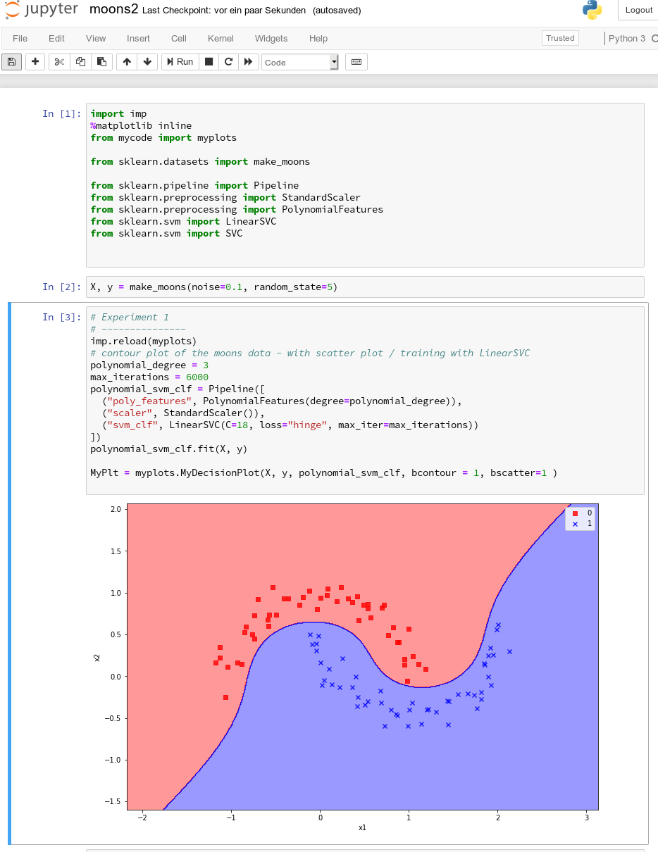
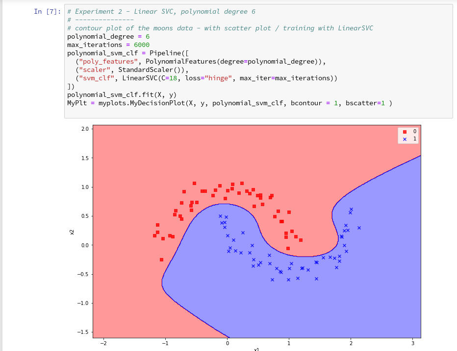
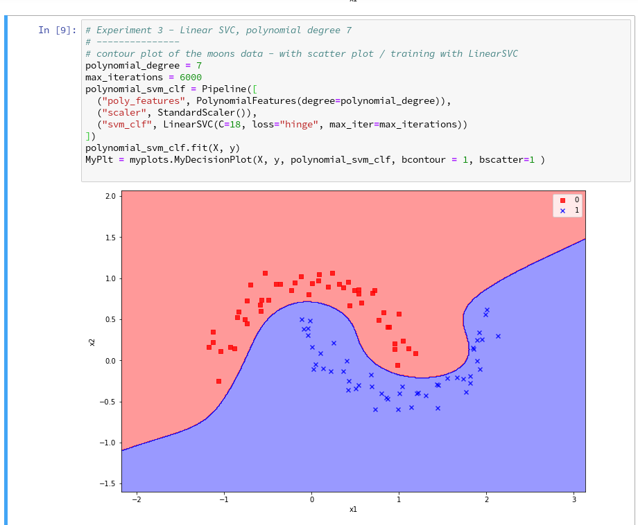
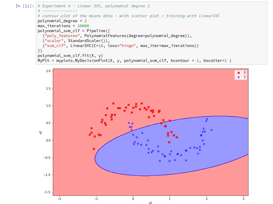
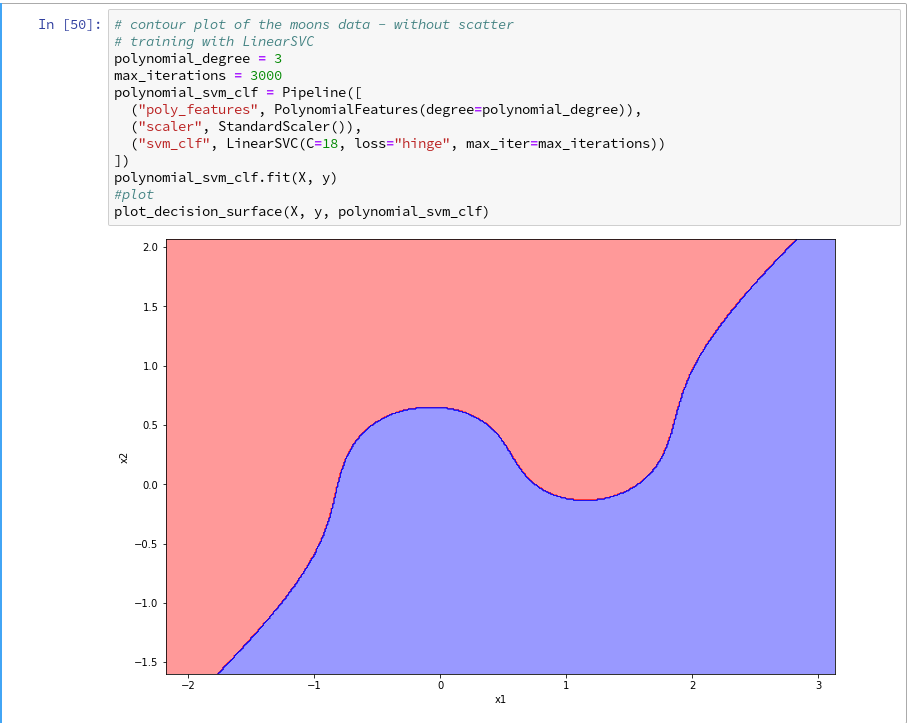
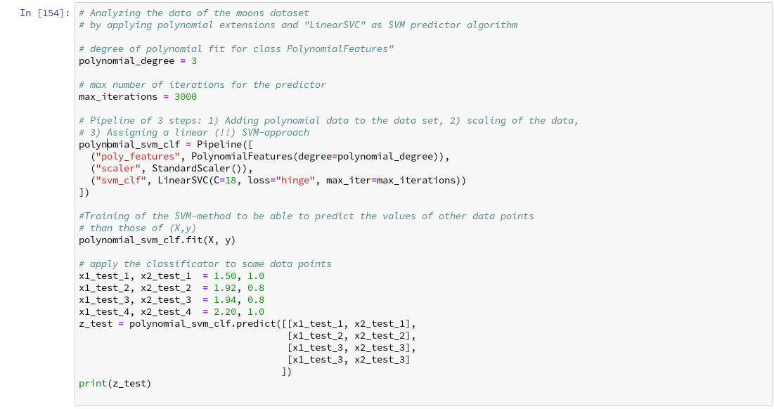
Unfortunately, for the moons dataset we must to overcome the fundamental problem that a linear classification approach to define a decision surface between the two data clusters is insufficient. (We have confirmed this in our last article by showing that even a quadratic approach does not give any reasonable decision surface.) We circumvented this problem by a trick – namely a polynomial extension of the parameter space (x1,x2) via a SciKit-Learn function “PolynomialFeatures()”.

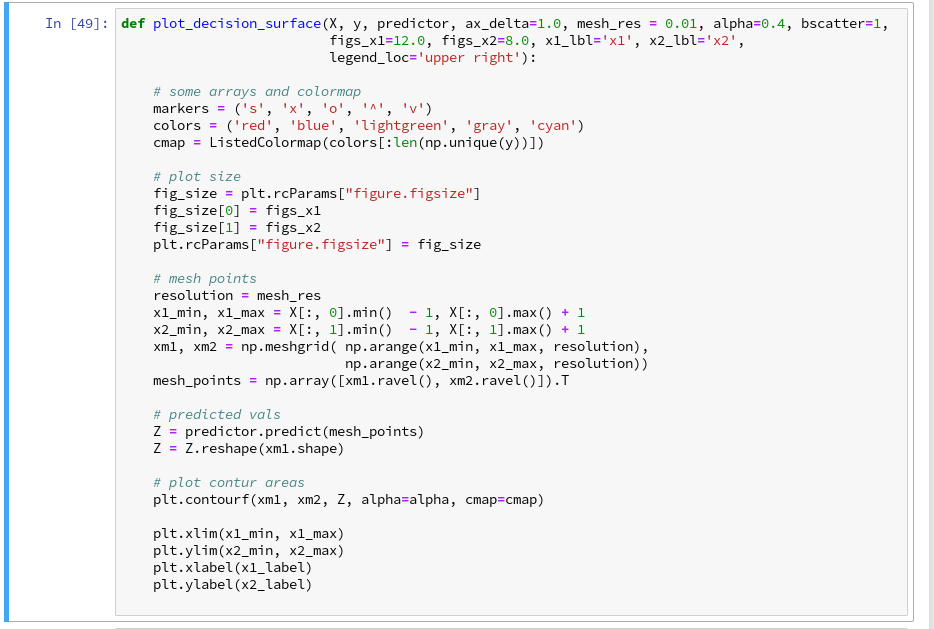
We also had to tackle the technical problem of writing a simple Python class for creating plots of a decision surface in a 2 dim parameter space (x1,x2). After having solved this problem in the last articles it became easy to apply different or differently parameterized algorithms to the data set and display the results graphically. The functionalities of the SciKit and numpy libraries liberated us from dealing with complicated mathematical tasks. We also saw that using the “Pipeline” function helped to organize the sequential operations on the data sets – here transforming data, scaling data and training of a chosen algorithm on the data – in a very comfortable way.

In this article we want to visualize results of some other SVM approaches, which make use of the called “Kernel trick”. We shall explain this briefly and then use functions provided by SciKit to perform further experiments. On the Python side we shall learn, how to measure required computational times of the different algorithms.

Artificial polynomial feature extension

So far we moved
around the hurdle of non-linearity in combination with LinearSVC by a costly trick: We have extended the original 2-dimensional parameter space X(x1, x2) of our data points [y, X] artificially by more X-dimensions. We proclaimed that the distribution of data points is actually given in a multidimensional space constructed by a polynomial transformation: Each new and additional dimension is given by a term f*(x1**n)*(x2**m) with n+m = D, the degree of a polynomial function of x1 and x2.

This works as if the results “y” depended on further properties expressed by polynomial combinations of x1 and x2. Note that a 2-dim space (x1,x2) thus may be transformed into a 5-dimensional space with axes for x1, x2, x1**2, a*x1*x2, x**2. A data point (x1,x2) is transformed to a vector P(x1,x2) = [p_1=x1, p_2=x2, p_3=x1**2, p_4=a*x1*x2, p_5=x2**2]. Actually, for a broad class of problems it is enough to look at the 3-dim transformation space P([x1,x2])=[p_1=x1**2, p_2=f*x1*x2, p_3=x2**2].

In such a higher dimensional space we might actually find a “linear” hyperplane which allows for a suitable separation for the data clusters belonging to 2 different values of y=y(x1,x2) – here y=0 and y=1. The optimization algorithm then determines a suitable parameter vector (Theta= [theta_0, theta_1, … theta=n]), describing an optimal linear surface with respect to the distance of the data points to this surface. If we omit details then the separation surface is basically described by some scalar product of the form

theta_0*1 + theta1*p_1 + theta2*p_2 + … + theta_D * p_D = const.

Our algorithm calculates and optimizes the required theta-values.

Note that the projection of this hyperplane into the original (x1,x2)-feature-space becomes a non-linear hyperplane there. See the book of S. Raschka “Python machine Learning”, 20115, PACKT Publishing, chapter 3 for a nice example).

I cannot go into mathematical details in this article series. Nevertheless, this is a raw description of what we have done so far. But note, that there are other methods to extend the parameter space of the original data points to higher dimensions. The extension by the use of polynomials is just one of many approaches.

Why is a dimensional extension by polynomials computationally costly?

The soft margin optimization is a so called quadratic problem with linear constraints. To solve it you have both to transform all points into the higher dimensional space, i.e. to determine point coordinates there, and then determine distances in this space to a hyperplane with varying parameters.

This means we have at least to perform 2*D different calculations of the powers of the individual original coordinates of our input data points. As the power operation itself requires CPU-time depending on D the coordinate transformation operations vary with the

CPU-time ∝ number of points x the dimension of the original space x D**2

The “Kernel Trick”

In a certain formulation of the optimization problem the equation which determines the optimal linear separation hyperplane is governed by scalar products of the transformed vectors T(P(a1,a2)) * P(b1,b2) for all given data points a(x1=a1, x2=a2) and b(x1=b1,x2=b2), with T representing the transpose operation.

Now, instead of calculating the scalar product of the transformed vectors we would like to use a simpler “kernel” function

K(a, b = T(P(a)) * P(b)

It can indeed be shown that such a function K, which only operates on the lower dimensional space (!), really exists under fairly general conditions.

Kernel functions, which
are typically used in classification problems are:

  • Polynomial kernel : K(a, b) = [ f*P(a) * b + g]**D, with D = polynomial degree of a polynomial transformation
  • Gaussian RBF kernel: K(a, b) = exp(- g * || ab ||**2 ), which also corresponds to an extension into a transformed parameter space of very high dimension (see below).

You can do the maths for the number and complexity operations for the polynomial kernel on your own. It is easy to see that it costs much less to perform a scalar product in the lower dimensional space and calculate the n-the power of the result just once – instead of transforming two points by around 2*D different power operations on the individual coordinates and then performing a scalar product in the higher dimensional space:

The difference in CPU costs between a non-kernel based polynomial extension and a kernel based grows quadratically, i.e. with D**2.

All good ?
Although it seems that the kernel trick saves us a lot of CPU-time, we also have to take into account convergence of the optimization process in the higher dimensional space. All in all the kernel trick works best on small complex datasets – but it may get slow on huge datasets. See for a discussion in the book “Hands on-On Machine Learning with Scikit-Learn and TensorFlow” of A.Geron,(2017, O’Reilly), chapter 5.

Gaussian RBF kernel

The Gaussian RBF kernel transforms the original feature space (x1,x2) into an extended multidimensional by a different approach: It looks at the similarity of a target point with selected other points – so called “landmarks”:

A new feature (=dimension) value is calculated by the Gaussian weight of the distance of a data point to one of the selected landmarks.

The number of landmarks can be chosen to be equal to the number N of all (other) data points in the training set. Thus we would add N-1 new dimensions – which would be a large number. The transformations operations for the coordinates of the data points in the original space (x1,x2) would, therefore, be numerous, too.

However, the Gaussian kernel enhances computational efficiency by large factors: it works on the lower dimensional parameter space, only, and determines the distance of data point pairs there! And still gives the correct results in the higher dimensional space for a linear separation interface there.

It is clear that the width of the Gaussian function is an important ingredient in this approach; this is controlled by the hyper-parameter “g” of the algorithm.

How to measure computational time?

This is relatively simple. We need to import the module “time”. It includes a suitable function “perf_counter()”. See: docs.python.org – perf_counter

We have to call it before a statement whose duration we want to measure and afterwards. The difference gives the CPU-time needed in fractions of a second. See below for the application.

Quadratic dependency of CPU time on the polynomial degree without the kernel trick

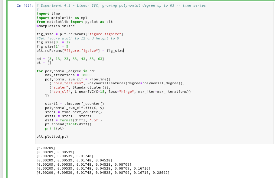
Let us measure a time series fro our standard polynomial approach. In our moons-notebook from the last session we add a cell and execute the following code:

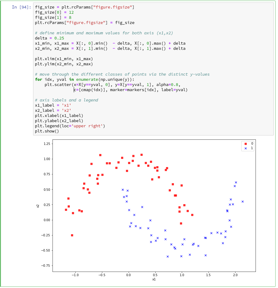
And the plot looks like :

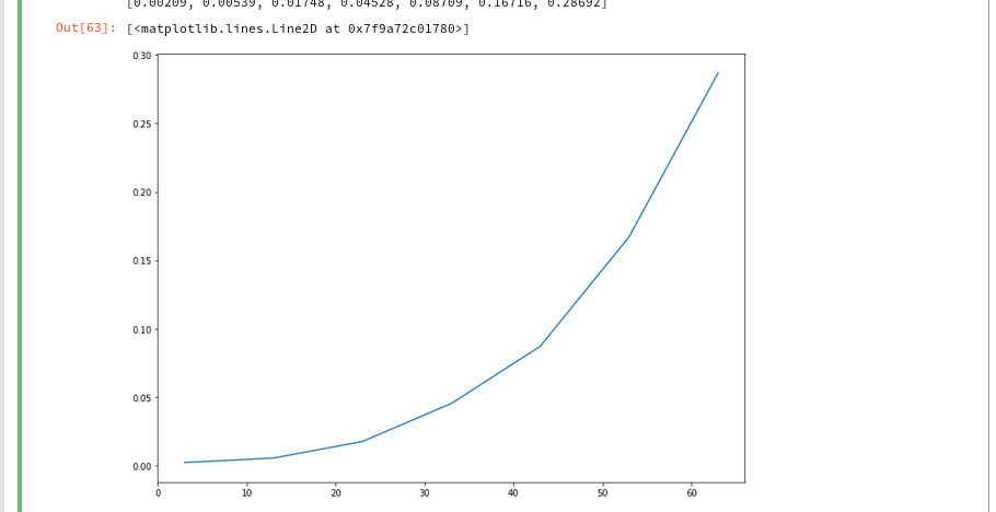
We recognize the expected quadratic behavior.

Polynomial kernel – almost constant low CPU-time independent of the polynomial degree

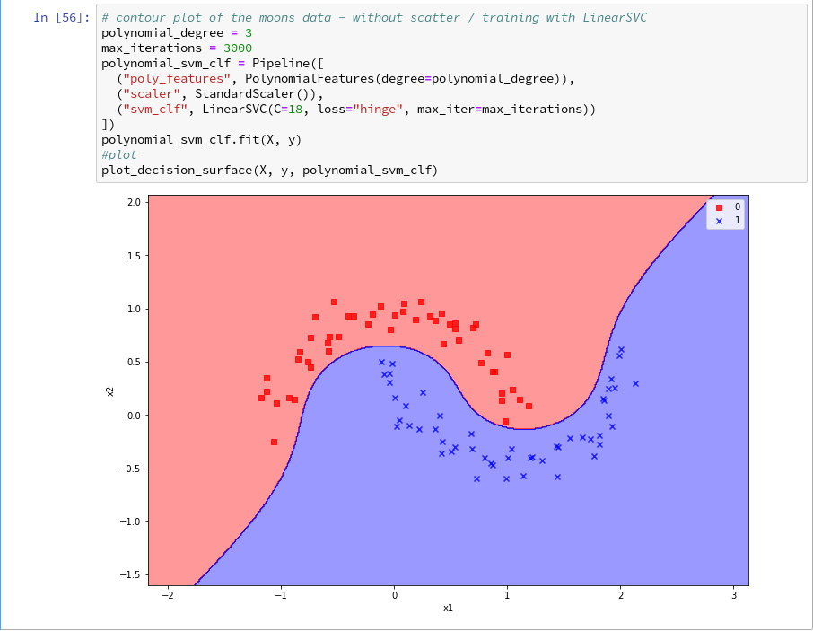
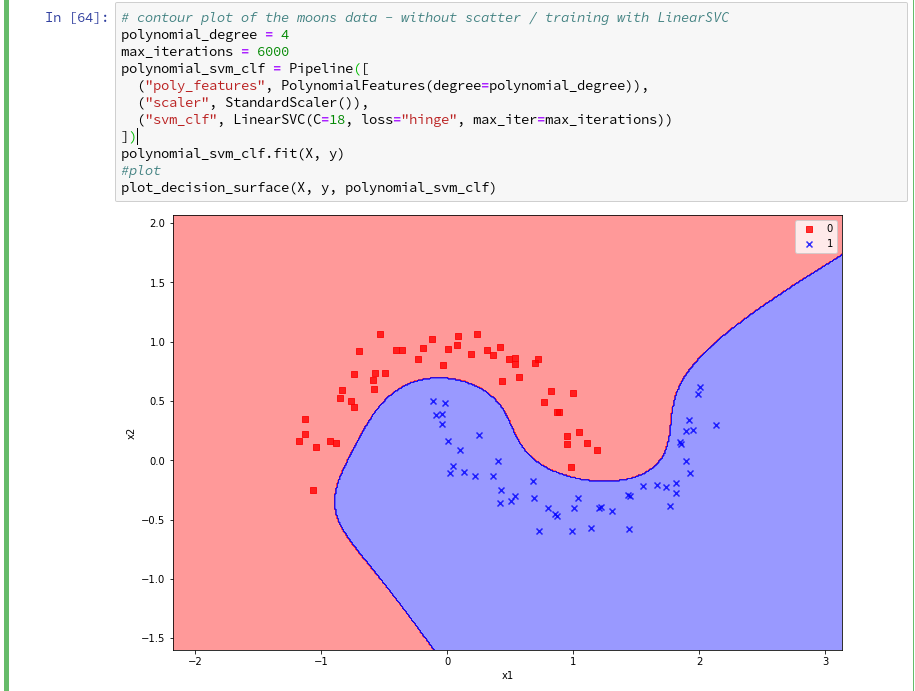
Let us now compare the output of the approach PolynomialsFeature + LinearSVC to an approach with the polynomial kernel. SciKit-learn provides us with an interface “SVC” to the kernel based algorithms. We have to specify the type of kernel besides other parameters. We execute the code in the following 2 cells to get a comparison for a polynomial of degree 3:

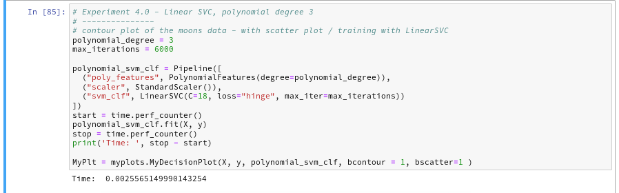
You saw that we specified a kernel-type “poly” in the second cell ?
The plots – first for LinearSVC and then for the polynomial kernel look like

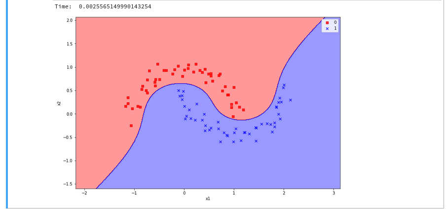
We see a difference in the shape of separation line. And we notice already a slightly better performance for the kernel based algorithm.

Now let us prepare a similar time series for the kernel based approach:

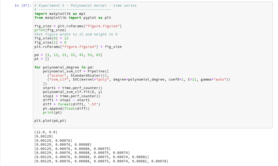
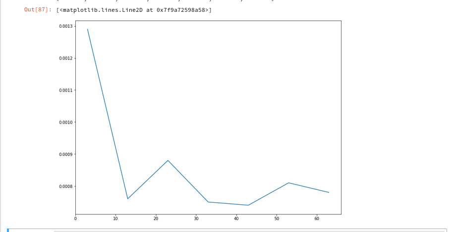
The time series looks wiggled – but note that all numbers are below 1.3 msec ! What a huge difference!

Plot for the Gaussian RBF Kernel

Just to check how the separation surface looks like for the Gaussian kernel, we do the following experiment; note that we specify a kernel named “rbf“:

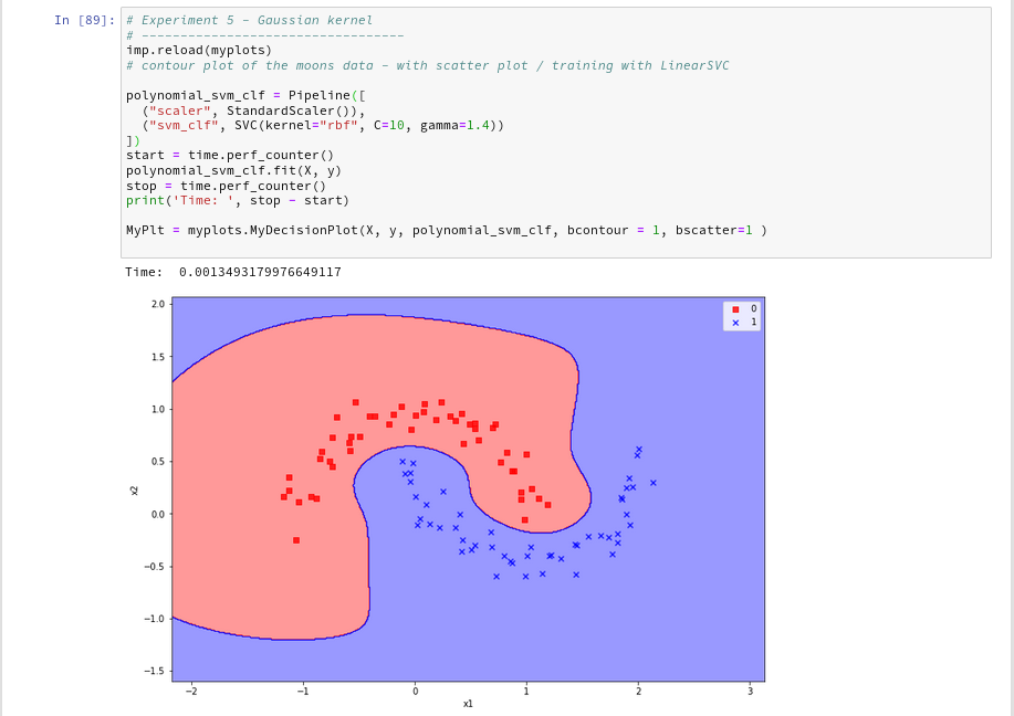
Oops, a very different surface in comparison to what we have seen before.
But: Even a minimum change of gamma gives us yet another surface:

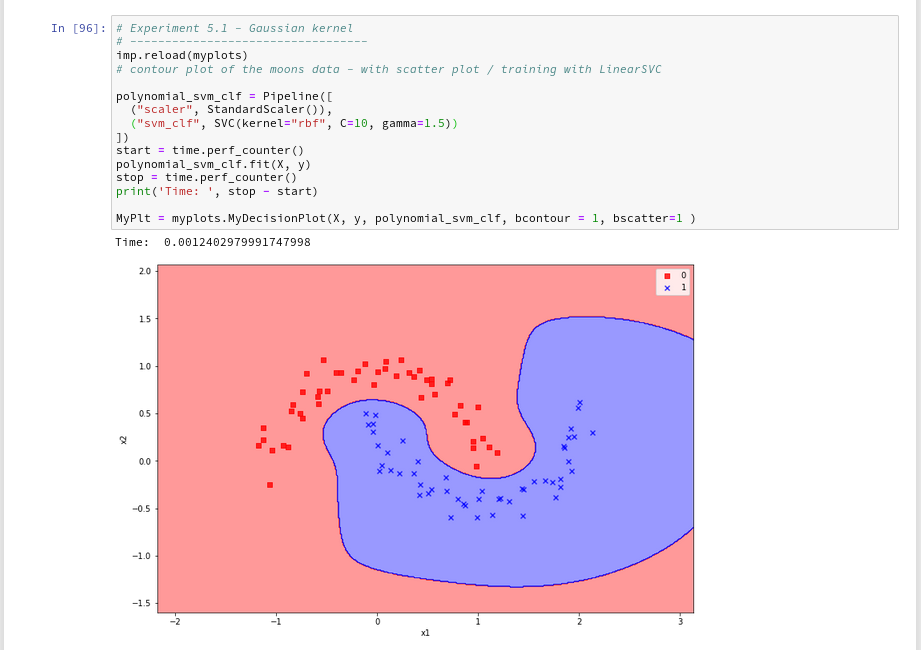
Funny, isn’t it? We learn again that algorithms are sensitive!

Enough for today!

Conclusion

We have learned a bit about the so called kernel trick in the SVM business. Again, SciKit-Learn makes it very simple for us to make use of kernel based algorithms via an SVC-interface: different kernels and related feature space extension methods can be defined as a parameter.

We saw that a ”
poly”-kernel based approach in comparison to LinearSVC saves a lot of CPU-time when we use high order polynomials to extend the feature space to related higher dimensions.

The Gaussian RBF-kernel which extends the feature space by adding dimension based on weighted distances between data points proved to be interesting: It constructs a very different separation surface in comparison to polynomial approaches. We saw that RBF-kernel reacts sensitively to its configuration parameter “gamma” – i.e the width of the Gaussian weighing the similarity influence of other points.

Again we saw that in regions of the (x1,x2)-plane where no test data were provided the algorithms may predict very different memberships of new data points to either of the two moon clusters. Such extrapolations may depend on (small) parameter changes for the algorithms.


The moons dataset and decision surface graphics in a Jupyter environment – V – a class for plots and some experiments

We proceed with our exercises on the moons dataset. This series of articles is intended for readers which – as me – are relatively new both to Python and Machine Learning. By working with examples we try to extend our knowledge about the tools “Juypter notebooks” and “Eclipse/PyDev” for setting up experiments which require plots for an interpretation.

We have so far used a Jupyter notebook to perform some initial experiments for creating and displaying a decision surface between the moons dataset clusters with an algorithm called “LinearSVC”. If you followed everything I described in the last articles

The moons dataset and decision surface graphics in a Jupyter environment – I
The moons dataset and decision surface graphics in a Jupyter environment – II – contourplots
The moons dataset and decision surface graphics in a Jupyter environment – III – Scatter-plots and LinearSVC
The moons dataset and decision surface graphics in a Jupyter environment – IV – plotting the decision surface

you may now have gathered around 20 different cells with code. Part of the cells’ code was used to learn some basics about contour and scatter plots. This code is now irrelevant for further experiments. Time to consolidate our plotting knowledge.

In the last article I promised to put plot-related code into a Python class. The class itself can become a part of a Python module – which we in turn can import into the code of Jupyter notebook. By doing this we can reduce the number of cells in a notebook drastically. The importing of external classes is thus helpful for concentrating on “real” data analysis experiments with different learning and predicting algorithms and/or a variation of their parameters.

I assume that you have some basic knowledge on how classes are build in Python. If not please see an introductory book on Python 3.

A class for plotting simple decision surfaces in a 2-dimensional space

In the articles

Eclipse, PyDev, virtualenv and graphical output of matplotlib on KDE – I
Eclipse, PyDev, virtualenv and graphical output of matplotlib on KDE – II
Eclipse, PyDev, virtualenv and graphical output of matplotlib on KDE – III

I had shown how to set up Eclipse PyDev to be used in the context of a Python virtual environment. In our special environment “ml1” used by our Jupyter notebook “moons1.ipynb” we have the following directory structure:

“ml1” has a sub-directory “mynotebooks” which contains notebook files as our “moons1.ipynb”. To provide a place for other general code there we open up a directory “mycode“. In it we create a file “myplots.py” for a module
myplots“, which shall comprise our own Python classes for plotting.

We distribute the code discussed in the last 2 articles of this series into methods of a class “MyDecisionPlot“; we put the following code into our file “myplots.py” with the Pydev editor.

'''
Created on 15.07.2019
Module to gather classes for plotting
@author: rmo
'''
import numpy as np
import sys
from matplotlib import pyplot as plt
from matplotlib.colors import ListedColormap
import matplotlib.patches as mpat 
#from matplotlib import ticker, cm
#from mpl_toolkits import mplot3d

class MyDecisionPlot():
    '''
    This class allows for 
    1) decision surfaces in 2D (x1,x2) planes 
    2) plotting scatter data of datapoints 
    '''


    def __init__(self, X, y, predictor = None, ax_x_delta=1.0, ax_y_delta=1.0, 
                 mesh_res=0.01, alpha=0.4, bcontour=1, bscatter=1, 
                 figs_x1=12.0, figs_x2=8.0, 
                 x1_lbl='x1', x2_lbl='x2',   
                 legend_loc='upper right'
                 ):
        '''
        Constructor of MyDecisionPlot
        Input: 
            X: Input array (2D) for learning- and predictor-algorithm as VSM 
            y: result data for learning- and predictor-algorithm
            ax_x_delta, ax_y_delta : delta for extension of both axis beyond the given X, y-data
            mesh_res: resolution of the mesh spanned in the (x1,x2)-plane (x_max-x_min) * mesh_res
            alpha:  transparency  of contours 
            bcontour: 0: Do not plot contour areas 1: plot contour areas 
            bscatter: 0: Do not plot scatter points of the input data sample 1: Plot scatter plot of the input data sample 
            figs_x1: plot size in x1 direction 
            figs_x2: plot size in x2 direction 
            x1_lbl, x2_lbl : axes lables 
            legend_loc : position of a legend
        Ouptut:
            Internal: self._mesh_points (mesh points created) 
            External: Plots - shoukd cone up automatically in Jupyter notebooks 
        '''
        
                
        # initiate some internal variables 
        self._x1_min = 0.0
        self._x1_max = 1.0
        self._x2_min = 0.0
        self._x2_max = 1.0
        
        # Alternatives to resize plots 
        # 1: just resize figure  2: resize plus create subplots() [figure + axes] 
        self._plot_resize_alternative = 2 
                
        # X (x1,x2)-Input array 
        self.__X = X
        self.__y = y 
        self._Z  = None
        
        # predictor = algorithm to create y-values for new (x1,x2)-data points 
        self._predictor = predictor 
        
        # meshdata
        self._resolution = mesh_res   # resolution of the mesh 
        self.__ax_x_delta = ax_x_delta 
        self.__ax_y_delta = ax_y_delta
        self._alpha = alpha
        self._bscatter = bscatter
        self._bcontour = bcontour 
        
        self._xm1 = None
        self._xm2 = None
        self._mesh_points = None 
        
        # set marker array and define colormap 
        self._markers = ('s', 'x', 'o', '^', 'v')
        self._colors = ('red', 'blue', 'lightgreen', 'gray', 'cyan')
        self._cmap = ListedColormap(self._colors[:len(np.unique(y))])
        
        self._x1_lbl = x1_lbl
        self._x2_lbl = x2_lbl
        self._legend_loc = legend_loc
        
        # Plot-sizing
        self._figs_x1 = figs_x1
        self._figs_x2 = figs_x2
        self._fig = None
        self._ax  = None 
                # alternative 2 does resizing and (!) subplots() 
        self.initiate_and_resize_plot(self._plot_resize_alternative) 
               
        
r
        # create mesh in x1, x2 - direction with mesh_res resolution 
        # meshpoint-array will be creted with right dimension for plotting data 
        self.create_mesh()
        # Array meshpoints should exist now 
        
        if(self._bcontour == 1):
            try:
                if self._predictor == None:
                    raise ValueError
            except ValueError:
                print ("You must provide an algorithm = 'predictor' as parameter")
                #sys.exit(0)   
                sys.exit()   
            
            self.make_contourplot()
        else:
            if (self._bscatter == 1):
                self.make_scatter_plot() 


    # method to create a dense mesh in the (x1,x2)-plane 
    def create_mesh(self):
        '''
        Method to create a dense mesh in an (x1,x2) plane 
        Input: x1, x2-data are constructed from array self.__X
        Output: A suitable array of meshpoints is written to self._mesh_points()
        '''
        try:
            self._x1_min = self.__X[:, 0].min()
            self._x1_max = self.__X[:, 0].max()
        except ValueError: # as e: 
            print ("cannot determine x1_min = X[:,0].min() or x1_max = X[:,0].max()")
        try:
            self._x2_min = self.__X[:, 1].min()
            self._x2_max = self.__X[:, 1].max()
        except ValueError: # as e: 
            print ("cannot determine x2_min =X[:,1].min()) or x2_max = X[:,1].max()")
            
        self._x1_min, self._x1_max = self._x1_min - self.__ax_x_delta, self._x1_max + self.__ax_x_delta
        self._x2_min, self._x2_max = self._x2_min - self.__ax_x_delta, self._x2_max + self.__ax_x_delta
        
        #create mesh data (x1, x2) 
        self._xm1, self._xm2 = np.meshgrid( np.arange(self._x1_min, self._x1_max, self._resolution), 
                                            np.arange(self._x2_min, self._x2_max, self._resolution))
        
        #print (self._xm1)
        # for hasattr the variable cannot be provate ! 
        #print ("xm1 is there: ", hasattr(self,'_xm1' ) )
                          
        # ordering and transposing of the mesh-matrix   
        # for understanding the structure and transpose requirements see linux-blog.anracom.con          
        self._mesh_points = np.array([self._xm1.ravel(), self._xm2.ravel()]).T
        
        try:
            if( hasattr(self, '_mesh_points') == False ):
                raise ValueError
        except ValueError:
            print("The required array mesh_points has not been created!")
            exit

    # -------------
    # Some helper functions to change valus on the fly if necessary 
              
    def set_mesh_res(self, new_mesh_res): 
        self._resolution = new_mesh_res
        
    def change_predictor(self, new_predictor):
        self._predictor = new_predictor
        
    def change_alpha(self, new_alpha):    
        self._alpha = new_alpha
    
    def change_figs(self, new_figs_x1, new_figs_x2):    
        self._figs_x1 = new_figs_x1
        self._figs_x2 = new_figs_x2
    
    
    # -------------
    # method to get subplots and resize the figure       
    # -------------
    def initiate_and_resize_plot(self, alternative=2 ):
        
        # Alternative 1 to resize plots - works afte rimports to Jupyter notebooks, too
        if alternative == 1:
            self._fig_size = plt.rcParams["figure.figsize"]
            self._fig_size[0] = self._figs_x1
            self._fig_size[1] = self._figs_x2
            plt.rcParams["figure.figsize"] = self._fig_size
        
        # Not working for sizing if plain subplots() is used 
        #plt.figure(figsize=(self._figs_x1 , self._figs_x2))
        #self._fig, self._ax = plt.subplots()
        # instead you have to 
put the figsize-parameter into the subplots() function 
        
        # Alternative 2 for resizing plots and using subplots()
        # we use this alternative as we may need the axes later for 3D plots 
        if alternative == 2:
            self._fig, self._ax = plt.subplots(figsize=(self._figs_x1 , self._figs_x2))
    
    
    # ***********************************************
    
    # -------------
    # method to create contour plots      
    # -------------
    def make_contourplot(self):
        '''
        Method to create a contourplot based on a dense mesh of points in an (x1,x2) plane 
        and a predictor algorithm which allows for value calculations
        '''
        
        try:
            if( not hasattr(self, '_mesh_points') ):
                raise ValueError
        except ValueError:
            print("The required array mesh_points has not been created!")
            exit
        
        # Predict values for all meshpoints 
        try:
            self._Z = self._predictor.predict(self._mesh_points)
        except AttributeError: 
            print("method predictor.predict() does not exist") 
        
        #reshape     
        self._Z = self._Z.reshape(self._xm1.shape)
        #print (self._Z)
        
        # make the plot
        plt.contourf(self._xm1, self._xm2, self._Z, alpha=self._alpha, cmap=self._cmap)     
        
        # create a scatter-plot of data sample as well 
        if (self._bscatter == 1):
            self.make_scatter_plot()
            
        self.make_plot_legend()


    # -------------
    # method to create a scatter plot of the data sample 
    # -------------
    def make_scatter_plot(self):
        alpha2 = self._alpha + 0.4 
        if (alpha2 > 1.0 ):
            alpha2 = 1.0
        for idx, yv in enumerate(np.unique(self.__y)): 
            plt.scatter(x=self.__X[self.__y==yv, 0], y=self.__X[self.__y==yv, 1], 
                        alpha=alpha2, c=[self._cmap(idx)], marker=self._markers[idx], label=yv)
        
        if self._bscatter == 0:
            self._bscatter = 1
        
        self.make_plot_legend()
          
        
    # -------------
    # method to add a legend  
    # -------------
    def make_plot_legend(self):
        plt.xlim(self._x1_min, self._x1_max)
        plt.ylim(self._x2_min, self._x2_max)
        plt.xlabel(self._x1_lbl)
        plt.ylabel(self._x2_lbl)
        
        # we have two cases 
        #     a) for a scatter plot we have array values where the legend is taken from automatically
        #     b) For apure contourplot we need to prepare a legend with "patches" (kind og labels) used by pyplot.legend() 
        if (self._bscatter == 1):
            plt.legend(loc=self._legend_loc)
        else:
            red_patch  = mpat.Patch(color='red',  label='0', alpha=0.4)
            blue_patch = mpat.Patch(color='blue', label='1', alpha=0.4)
            plt.legend(handles=[red_patch, blue_patch], loc=self._legend_loc)


This certainly is no masterpiece of superior code design; so you may change it. However, the code is good enough for our present purposes.

Note that we have to import basic Python modules into the namespace of this module. This is conventionally done at the top of the file.

Note also the 2 alternatives offered for resizing a plot! Both work also for “inline” plotting in a Jupyter environment; see the text below.

Using the module “myplots” in a Jupyter notebook

In a terminal we move to our example directory “/projekte/GIT/ai/ml1” and start our virtual Python environment:

myself@mytux: /projekte/GIT/ai/ml1> source bin/activate    
(ml1) myself@mytux:/projekte/GIT/ai/ml1> 
jupyter notebook
[I 11:46:14.687 NotebookApp] Writing notebook server cookie secret to /run/user/1999/jupyter/notebook_cookie_secret
[I 11:46:15.942 NotebookApp] Serving notebooks from local directory: /projekte/GIT/ai/ml1
[I 11:46:15.942 NotebookApp] The Jupyter Notebook is running at:
....
....

We then open our old notebook “moons1” and save it under the name “moons2”:

We delete all old cells. Then we change the first cell of our new notebook to the following contents:

import imp
%matplotlib inline
from mycode import myplots

from sklearn.datasets import make_moons
from sklearn.pipeline import Pipeline
from sklearn.preprocessing import StandardScaler
from sklearn.preprocessing import PolynomialFeatures
from sklearn.svm import LinearSVC
from sklearn.svm import SVC

You see that we imported the “myplots” module from the “package” directory “mycode”. The Jupyter notebook will find the path to “mycode” as long as we have opened the notebook on a higher directory level. Which we did … see above.

Note the statement with a so called “magic command” for our notebook:

%matplotlib inline

There are many other “magic commands” and parameters which you can study at
Ipython magic commands

The command “%matplotlib inline” informs the notebook to show plots created by any imported modules “inline”, i.e. in the visual context of the affected cell. This specific magic directive should be issued before matplotlib/pyplot is imported into any of the external python modules which we in turn import into the cell code.

A call of plt.show() in our class’s method “make_contourplot()” is no longer necessary afterwards.

If we, however, want to resize the plots in comparison to Jupyter standard values we have to control this by parameters of our plot class. Such parameters are offered already in the interface of the class; but they can be changed by a method “change_figs(new_figs_x1, new_figs_x2)), too.

In a second cell of our new notebook we now prepare the moon data set

X, y = make_moons(noise=0.1, random_state=5)

Further cells will be used for quick individual experiments with the moons dataset. E.g.:

imp.reload(myplots)
X, y = make_moons(noise=0.1, random_state=5)

# contour plot of the moons data - with scatter plot / training with LinearSVC 
polynomial_degree = 3
max_iterations = 6000
polynomial_svm_clf = Pipeline([
  ("poly_features", PolynomialFeatures(degree=polynomial_degree)),
  ("scaler", StandardScaler()),
  ("svm_clf", LinearSVC(C=18, loss="hinge", max_iter=max_iterations))
])
#training
polynomial_svm_clf.fit(X, y)

#plotting 
MyPlt = myplots.MyDecisionPlot(X, y, polynomial_svm_clf, bcontour = 1, bscatter=1 )

The last type of cell just handles the setup and training of our specific algorithm “LinearSVC” and delegates plotting to our class.

Testing the new notebook

A test of the 3 cells in their order gives

All well! This is exactly what we hoped to achieve.

Three experiments with a varying polynomial degree

As we now have a simple and compact cell template for experiments we add three
further cells where we vary the degree of the polynomials for LinearSVC. Below we show the results for degree 6, 7 and for comparison also for a degree of 2.

On a modern computer it should take almost no time to produce the results. (We shall learn how to measure CPU-time in the next article).

We understand that we at least need a polynomial of degree 3 to separate the data reasonably. However, polynomials with an even degree (>= 4) separate the 2 data regions very differently compared to polynomials with an uneven degree (>=3) in outer areas of the (x1,x2)-plane (where no training data were placed):

Depending on the polynomial degree our Linear SVC algorithm obviously extrapolates in different ways to regions without such data. And we have no clue which of the polynomials is the better choice …

This poses a warning for the use of AI in general:

We should be extremely careful to trust predictions of any AI algorithm in parameter regions for which the algorithm must extrapolate – as long as we have no real data points available there to discriminate between multiple solutions that all work equally well in regions with given training data.

Would general modules be imported twice in a Jupyter cell – via the import of an external module, which itself includes import statements, and a direct import statement in a Jupyter cell?

The question posed in the headline is an interesting one for me as a Python beginner. Coming from other programming languages I get a bit nervous when I see the possibility for import statements referring to a specific module both in another already imported module and by a direct import statement afterwards in a Jupyter cell. E.g. we import numpy indirectly via our “myplots” module, but we could and sometimes must import it in addition directly in our Jupyter cell.

Note that we must make the general modules as numpy, matplotlib, etc. available in the namespace environment of our private module “myplots”. Otherwise the functions cannot be used there. The Jupyter cell, however, corresponds to an independent namespace environment. So, an import may indeed be required there, too, if we plan to handle numpy arrays via code in such a cell.

Reading a bit about the Python import logic on the Internet reveals that a double import or overwriting should not take place; instead an already imported piece of code only gets multiple references in the various specific namespaces of different code environments.

We can test this with the following code in a Jupyter cell:

Note that numpy is also imported by our “myplots”. However, the length of the list produced by sys.modules.keys(), which enumerates all possible module reference points (including imports) does not change.

Reloading modules in Jupyter cells

What if we in the
course of or experiments need to change the code of our imported module? Then we need to reload the module in a Jupyter cell before we run it again. In our case (Python 3!) this can be done by the command

imp.reload(myplots)

As the code of our first cell reveals, the general package “imp” must have been imported before we can use its reload-function.

Conclusion

We saw that it is easy to use our own modules with Python class code, which we created in an Eclipse/PyDev environment, in a Jupyter notebook. We just use Python’s standard import mechanism in Jupyter cells to get access to our classes. We applied this to a module with a simple class for preparing decision surface plots based on contour and scatter plot routines of matplotlib. We imported the module in a new Jupyter notebook.

Plots created by our imported class-methods were displayed correctly within the cell environment as soon as we used the magic directive “%matplotlib inline” within our notebook.

In addition we used our new notebook with its compact cell structure for some quick experiments: We set different values for the polynomial degree parameter of our LinearSVC algorithm. We saw that the results of algorithms should be interpreted with caution if the predictions refer to data points in regions of the representation or feature space which were not at all covered by the data sets for training.

The prediction results (= extrapolations) of even one and the same algorithm with different parameters may deviate strongly in such regions – and we may not have any reliable indications to decide which of the predictions and their basic parameter setting are better.

In the next article of this series

The moons dataset and decision surface graphics in a Jupyter environment – VI – Kernel-based SVC algorithms

we shall have a look at what kind of decision surface some other SVM algorithms than LinearSVC create for the moons dataset. In addition shall briefly discuss kernel based algorithms.


The moons dataset and decision surface graphics in a Jupyter environment – IV – plotting the decision surface

In this article series

The moons dataset and decision surface graphics in a Jupyter environment – I
The moons dataset and decision surface graphics in a Jupyter environment – II – contourplots
The moons dataset and decision surface graphics in a Jupyter environment – III – Scatter-plots and LinearSVC

we used the moons data set to build up some basic knowledge about using a Jupyter notebook for experiments, Pipelines and SVM-algorithms of SciKit-Sklearn and plotting functionality of matplotlib.

Our ultimate goal is to write some code for plotting a decision surface between the moon shaped data clusters. The ability to visualize data sets and related decision surfaces is a key to quickly testing the quality of different SVM-approaches. Otherwise, you would have to run some kind of analysis code to get an impression of what is going on and possible deficits of the determined separation surface.

In most cases, a visual impression of the separation surface for complexly shaped data sets will give you much clearer information. With just one look you get answers to the following questions:

  • How well does the decision surface really separate the data points of the clusters? Are there data points which are placed on the wrong side of the decision surface?
  • How reasonable does the decision surface look like? How does it extend into regions of the representation space not covered by the data points of the training set?
  • Which parameters of our SVM-approach influences what regarding the shape of the surface?

In the second article of this series we saw how we would create contour-plots. The motivation behind this was that a decision surface is something as the border between different areas of data points in an (x1,x2)-plane for which we get different distinct Z(x1,x2)-values. I.e., a contour line separating contour areas is an example of a decision surface in a 2-dimensional plane.

During the third article we learned in addition how we could visualize the various distinct data points of a training set via a scatter-plot.

We then applied some analysis tools to analyze the moons data – namely the “LinearSVC” algorithm together with “PolynomialFeatures” to cover non-linearity by polynomial extensions of the input data.

We did this in form of a Sklearn Pipeline for a step-wise transformation of our data set plus the definition of a predictor algorithm. Our LinearSVC-algorithm was trained with 3000 iterations (for a polynomial degree of 3) – and we could predict values for new data points.

In this article we shall combine all previous insights to produce a visual impression of the decision interface determined by LinearSVC. We shall put part of our code into a wrapper function. This will help us to efficiently visualize the results of further classification experiments.

Predicting Z-values for a contour plot in the (x1,x2) representation space of the moons dataset

To allow for the necessary interpolations done during contour plotting we need to cover the visible (x1,x2)-area relatively densely and systematically by data points. We then evaluate Z-values for all these points – in our case distinct values, namely 0 and 1. To achieve this we build a mesh of data points both in x1-
and x2-direction. We saw already in the second article how numpy’s meshgrid() function can help us with this objective:

resolution = 0.02
x1_min, x1_max = X[:, 0].min()  - 1, X[:, 0].max() + 1
x2_min, x2_max = X[:, 1].min()  - 1, X[:, 1].max() + 1
xm1, xm2 = np.meshgrid( np.arange(x1_min, x1_max, resolution), 
                        np.arange(x2_min, x2_max, resolution))

We extend our area quite a bit beyond the defined limits of (x1,x2) coordinates in our data set. Note that xm1 and xm2 are 2-dim arrays (!) of the same shape covering the surface with repeated values in either coordinate! We shall need this shape later on in our predicted Z-array.

To get a better understanding of the structure of the meshgrid data we start our Jupyter notebook (see the last article), and, of course, first run the cell with the import statements

import numpy as np
import matplotlib
from matplotlib import pyplot as plt
from matplotlib import ticker, cm
from mpl_toolkits import mplot3d

from matplotlib.colors import ListedColormap
from sklearn.datasets import make_moons

from sklearn.pipeline import Pipeline
from sklearn.preprocessing import StandardScaler
from sklearn.preprocessing import PolynomialFeatures
from sklearn.svm import LinearSVC
from sklearn.svm import SVC

Then we run the cell that creates the moons data set to get the X-array of [x1,x2] coordinates plus the target values y:

X, y = make_moons(noise=0.1, random_state=5)
#X, y = make_moons(noise=0.18, random_state=5)
print('X.shape: ' + str(X.shape))
print('y.shape: ' + str(y.shape))
print("\nX-array: ")
print(X)
print("\ny-array: ")
print(y)

Now we can apply the “meshgrid()”-function in a new cell:

You see the 2-dim structure of the xm1- and xm2-arrays.

Rearranging the mesh data for predictions
How do we predict data values? In the last article we did this in the following form

z_test = polynomial_svm_clf.predict([[x1_test_1, x2_test_1], 
                                     [x1_test_2, x2_test_2], 
                                     [x1_test_3, x2_test_3],
                                     [x1_test_3, x2_test_3]
                                    ])      

“polynomial_svm_clf” was the trained predictor we got by our pipeline with the LinearSVC algorithm and a subsequent training.

The “predict()”-function requires its input values as a 1-dim array, where each element provides a (x1, x2)-pair of coordinate values. But how do we get such pairs from our strange 2-dimensional xm1- and xm2-arrays?

We need a bit of array- or matrix-wizardry here:

Numpy gives us the function “ravel()” which transforms a 2d-array into a 1-d array AND numpy also gives us the possibility to transpose a matrix (invert the axes) via “array().T“. (Have a look at the numpy-documentation e.g. at https://docs.scipy.org/doc/).

We can use these options in the following way – see the test example:

The involved logic should be clear by now. So, the next step should be something like

Z = polynomial_svm_clf.predict( np.array([xm1.ravel(), xm2.ravel()] ).T)

However, in the second article we already learned that we need Z in the same
shape as the 2-dim mesh coordinate-arrays to create a contour-plot with contourf(). We, therefore, need to reshape the Z-array; this is easy – numpy contains a method reshape() for numpy-array-objects : Z = Z.reshape(xm1.shape). It is sufficient to use xm1 – it has the same shape as xm2.

Applying contourf()

To distinguish contour areas we need a color map for our y-target-values. Later on we will also need different optical markers for the data points. So, for the contour-plot we add some statements like

markers = ('s', 'x', 'o', '^', 'v')
colors = ('red', 'blue', 'lightgreen', 'gray', 'cyan')
# fetch unique values of y into array and associate with colors  
cmap = ListedColormap(colors[:len(np.unique(y))])

Z = Z.reshape(xm1.shape)

# see article 2 for the use of contourf()
plt.contourf(xm1, xm2, Z, alpha=0.4, cmap=cmap)  

Let us put all this together; as the statements to create a plot obviously are many, we first define a function “plot_decision_surface()” in a notebook cell and run the cell contents:

Now, let us test – with a new cell that repeats some of our code of the last article for training:

Yeah – we eventually got our decision surface!

But this result still is not really satisfactory – we need the data set points in addition to see how good the 2 clusters are separated. But with the insights of the last article this is now a piece of cake; we extend our function and run the definition cell

def plot_decision_surface(X, y, predictor, ax_delta=1.0, mesh_res = 0.01, alpha=0.4, bscatter=1,  
                          figs_x1=12.0, figs_x2=8.0, x1_lbl='x1', x2_lbl='x2', 
                          legend_loc='upper right'):

    # some arrays and colormap
    markers = ('s', 'x', 'o', '^', 'v')
    colors = ('red', 'blue', 'lightgreen', 'gray', 'cyan')
    cmap = ListedColormap(colors[:len(np.unique(y))])

    # plot size  
    fig_size = plt.rcParams["figure.figsize"]
    fig_size[0] = figs_x1 
    fig_size[1] = figs_x2
    plt.rcParams["figure.figsize"] = fig_size

    # mesh points 
    resolution = mesh_res
    x1_min, x1_max = X[:, 0].min()  - 1, X[:, 0].max() + 1
    x2_min, x2_max = X[:, 1].min()  - 1, X[:, 1].max() + 1
    xm1, xm2 = np.meshgrid( np.arange(x1_min, x1_max, resolution), 
                            np.arange(x2_min, x2_max, resolution))
    mesh_points = np.array([xm1.ravel(), xm2.ravel()]).T

    # predicted vals 
    Z = predictor.predict(mesh_points)
    Z = Z.reshape(xm1.shape)

    # plot contur areas 
    plt.contourf(xm1, xm2, Z, alpha=alpha, cmap=cmap)

    # add a scatter plot of the data points 
    if (bscatter == 1): 
        alpha2 = alpha + 0.4 
        if (alpha2 > 1.0 ):
            alpha2 = 1.0
        for idx, yv in enumerate(np.unique(y)): 
            plt.scatter(x=X[y==yv, 0], y=X[y==yv, 1], 
                        alpha=alpha2, c=[cmap(idx)], marker=markers[idx], label=yv)
            
    plt.xlim(x1_min, x1_max)
    plt.ylim(x2_min, x2_max)
    plt.xlabel(x1_label)
    plt.ylabel(x2_label)
    if (bscatter == 1):
        plt.legend(loc=legend_loc)

Now we get:

So far, so good ! We see that our specific model of the moons data separates the (x1,x2)-plane into two areas – which has two wiggles near our data points, but otherwise asymptotically approaches almost a diagonal.

Hmmm, one could bet that this is model specific. Therefore, let us do a quick test for a polynomial_degree=4 and max_iterations=6000. We get

Surprise, surprise … We have already 2 different models fitting our data.

Which one do you believe to be “better” for extrapolations into the big (x1,x2)-plane? Even in the vicinity of the leftmost and rightmost points in x1-direction we would get different predictions of our models for some points. We see that our knowledge is insufficient – i.e. the test data do not provide enough information to really distinguish between different models.

Conclusion

After some organization of our data we had success with our approach of using a contour plot to visualize a decision surface in the 2-dimensional space (x1,x2) of input data X for our moon clusters. A simple wrapper function for surface plotting equips us now for further fast experiments with other algorithms.

To become better organized, we should save this plot-function for decision surfaces as well as a simpler function for pure scatter plots in a Python class and import the functionality later on.

We shall create such a class within Eclipse PyDev as a first step in the next article:

The moons dataset and decision surface graphics in a Jupyter environment – V – a class for plots and some experiments

Afterward we shall look at other SVM algorithms – as the “polynomial kernel” and the “Gaussian kernel”. We shall also have a look at the impact of some of the parameters of the algorithms. Stay tuned …