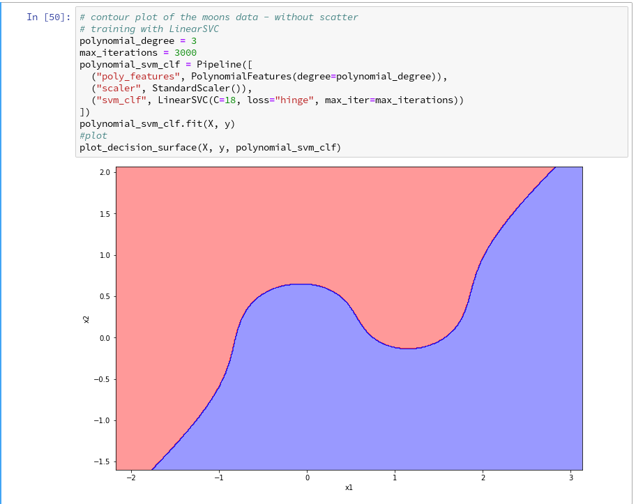
Readers who follow my series on a Python program for a “Multilayer Perceptron” [MLP] have noticed that I emphasized the importance of a normalization of input data in my last article:
A simple Python program for an ANN to cover the MNIST dataset – XII – accuracy evolution, learning rate, normalization
Our MLP “learned” by searching for the global minimum of the loss function via the “gradient descent” method. Normalization seemed to improve a smooth path to convergence whilst our algorithm moved into the direction of a global minimum on the surface of the loss or cost functions hyperplane over the weight parameter space. At least in our case where we used the sigmoid function as the activation function of the artificial neurons. I indicated that the reason for our observations had to do with properties of this function – especially for neurons in the first hidden layer of an MLP.
In case of the 4-layer MLP, which I used on the MNIST dataset, I applied a special form of normalization namely “standardization“. I did this by using the StandardScaler of SciKit-Learn. See the following link for a description: Sklearn preprocessing StandardScaler
We saw the smoothing and helpful impact of normalization on the general convergence of gradient descent by the help of a few numerical experiments. The interaction of the normalization of 784 features with mini-batches and with a complicated 4 layer-MLP structure, which requires the determination of several hundreds of thousands weight values is however difficult to grasp or analyze. One understands that there is a basic relation to the properties of the activation function, but the sheer number of the dimensions of the feature and weight spaces and statistics make a thorough understanding difficult.
Since then I have thought a bit about how to set up a really small and comprehensible experiment which makes the positive impact of normalization visible in a direct and visual form. I have come up with the following most simple scenario, namely the training of a simple perceptron with only one computing neuron and two additional “stupid” neurons in an input layer which just feed input data to our computing neuron:
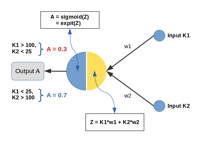
Input values K1 and K2 are multiplied by weights w1 and w2 and added by the central solitary “neuron”. We use the sigmoid function as the “activation function” of this neuron – well anticipating that the properties of this function may lead to trouble.
The perceptron has only one task: Discriminate between two different types of input data by assigning them two distinct output values.
- For K1 > 100 and K2 < 25 we want an output of A=0.3.
- For K1 &l; 25 and K2 > 100 we, instead, want an output of A=0.7
We shall feed the perceptron only 14 different pairs of input values K1[i], K2[i] (i =0,1,..13), e.g. in form of lists:
li_K1 = [200.0,   1.0, 160.0,  11.0, 220.0,  11.0, 120.0,  22.0, 195.0,  15.0, 130.0,   5.0, 185.0,  16.0]
li_K2 = [ 14.0, 107.0,  10.0, 193.0,  32.0, 178.0,   2.0, 210.0,  12.0, 134.0,  15.0, 167.0,  10.0, 229.0]
(The careful reader detects one dirty example li_K2[4] = 32 (> 25), in contrast to our setting. Just
to see how much of an impact such a deviation has …)
We call each pair (K1, K2)=(li_K1[i], li_K2[i]) for a give “i” a “sample“. Each sample contains values for two “features“: K1 and K2. So, our solitary computing neuron has to solve a typical classification problem – it shall distinguish between two groups of input samples. In a way it must learn the difference between small and big numbers for 2 situations appearing at its input channels.
Off topic: This morning I listened to a series of comments of Mr. Trump during the last weeks on the development of the Corona virus crisis in the USA. Afterwards, I decided to dedicate this mini-series of articles on a perceptron to him – a person who claims to “maybe” be “natural talent” on complicated things as epidemic developments. Enjoy (?) his own words via an audio compilation in the following news article:
https://www.faz.net/aktuell/politik/trumps-praesidentschaft/usa-zehn-wochen-corona-in-den-worten-von-trump-16708603.html
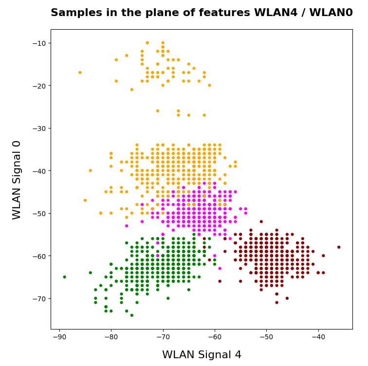
Two well separable clusters
In the 2-dim feature space {K1, K2} we have just two clusters of input data:
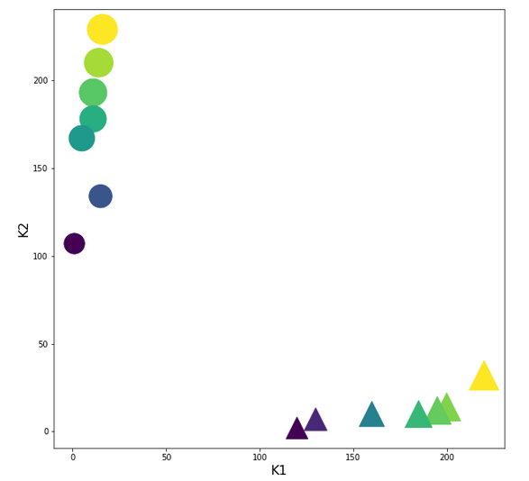
Each cluster has a long diameter along one of the feature axes – but overall the clusters are well separable. A rather good separation surface would e.g. be a diagonal line.
For a given input sample with K-values K1 and K2 we define the output of our computing neuron to be
A(w1, w2) = expit( w1*K1 + w2*K2 ) ,
where expit() symbolizes the sigmoid function. See the next section for more details.
Corresponding target-values for the output A are (with at1 = 0.3 and at2 = 0.7):
li_a_tgt = [at1, at2, at1, at2, at1, at2, at1, at2, at1, at2, at1, at2, at1, at2]
With the help of these target values our poor neuron shall learn from the 14 input samples to which cluster a given future sample probably belongs to. We shall use the “gradient descent” method to train the neuron for this classification task. o solve the task our neuron must find a reasonable separation surface – a line – in the {K1,K2}-plane; but it got the additional task to associate two distinct output values “A” with the two clusters:
A=0.7 for data points with a large K1-value and A=0.3 for data points with a small K1-value.
So, the separation surface has to fulfill some side conditions.
Readers with a background in Machine Learning and MLPs will now ask: Why did you pick the special values 0.3 and 0.7? A good question – I will come back to it during our experiments. Another even more critical question could be: What about a bias neuron in the input layer? Don’t we need it? Again, a very good question! A bias neuron allows for a shift of a separation surface in the feature space. But due to the almost symmetrical nature of our input data (see the positions and orientations of the clusters!) and the target values the impact of a bias neuron on the end result would probably only be small – but we shall come back to the topic of a bias neuron in a later article. But you are free to extend the codes given below to account for a bias neuron in the input layer. You will notice a significant impact if you change either the relative symmetry of the input or of the output data. But lets keep things simple for the next hours …
The sigmoid function and its
saturation for big arguments
You can import the sigmoid function under the name “expit” from the “scipy” library into your Python code. The sigmoid function is a smooth one – but it quickly saturates for big negative or positive values:
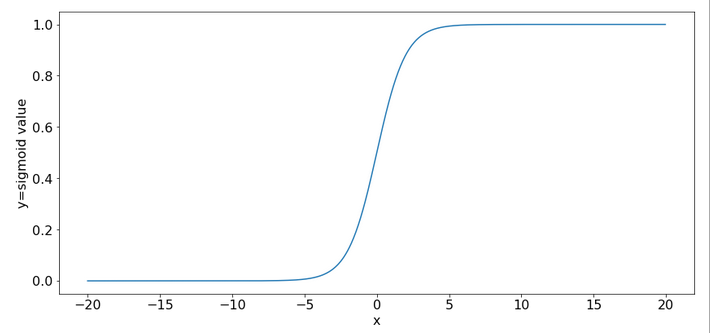
So, output values get almost indistinguishable if the absolute values of the arguments are bigger than 15.
What is interesting about our input data? What is the relation to MNIST data?
The special situation about the features in our example is the following: For one and the same feature we have a big number and a small number to work with – depending on the sample. Which feature value – K1 or K2 – is big depends on the sample.
This is something that also happens with the input “features” (i.e. pixels) coming from a MNIST-image:
For a certain feature (= a pixel at a defined position in the 28×28 picture) in a given sample (= a distinct image) we may get a big number as 255. For another feature (= pixel) the situation may be totally different and we may find a value of 0. In another sample (= picture) we may get the reverse situation for the same two pixels.
What happens in such a situation at a specific neuron in the first hidden neuron layer of a MLP when we start gradient descent with a statistical distribution of weight values? If we are unlucky then the initial statistical weight constellation for a sample may lead to a big number of the total input to our selected hidden neuron with the effect of a very small gradient at this node – due to saturation of the sigmoid function.
To give you a feeling: Assume that you have statistical weights in the range of [-0.025, 0.025]. Assume further that only 4 pixels of a MNIST picture with a value of 200 contribute with a local maximum weight of 0.25; then we get a a minimum input at our node of 4*0.25*200 = 20. The gradient of expit(20) has a value of 2e-9. Even if we multiply by the required factor of 200 for a weight correction at one of the contributing input nodes we would would arrive at 4e-7. Quite hopeless. Of course, the situation is not that bad for all weights and image-samples, but you get an idea about the basic problem ….
Our simple scenario breaks the MNIST situation down to just two features and just one working neuron – and therefore makes the correction situation for gradient descent really extreme – but interesting, too. And we can analyze the situation far better than for a MLP because we deal with an only 2-dimensional feature-space {K1, K2} and a 2-dimensional weight-space {w1, w2}.
A simple quadratic cost function for our neuron
For given values w1 and w2, i.e. a tuple (w1, w2), we define a quadratic cost or loss function C_sgl for one single input sample (K1, K2) as follows:
C_sgl = 0.5 * ( li_a_tgt(i) – expit(z_i) )**2, with z_i = li_K[i]*w1 + li_K2[i]*w2
The total cost-function for the batch of all 14 samples is just the sum of all these terms for the individual samples.
Existence of a solution for our posed problem?
From all we theoretically know about the properties of a simple perceptron it should be able to find a reasonable solution! But, how do we know that a reasonable solution for a (w1, w2)-pair does exist at all? One line of reasoning goes like follows:
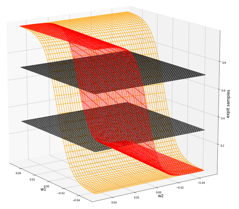
For two samples – each a member of either cluster – you can plot the hyperplanes of the related outputs “A(K1, K2) = expit(w1*K1+w2*K2)” over the (w1, w2)-space. These hyperplanes are almost orthogonal to each other. If you project the curves of a cut with the A=0.3-planes and the A=0.7-planes down to the (w1, w2)-plane at the center you get straight
lines – almost orthogonally oriented against each other. So, such 2 specific lines cut each other in a well defined point – somewhere off the center. As the expit()-function is a relatively steep one for our big input values the crossing point is relatively close to the center. If we choose other samples we would get slightly different lines and different crossing points of the projected lines – but not too far from each other.
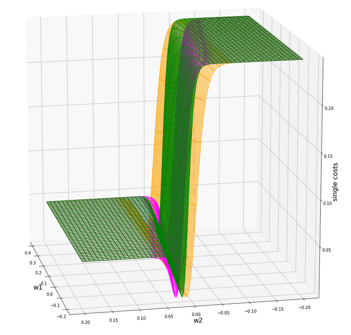
The next plot shows the expit()-functions close to the center of the (w1, w2)-plane for two specific samples of either cluster. We have in addition displayed the surfaces for A=0.7 and A=0.3.
The following plot shows the projections of the cuts of the surfaces for 7 samples of each cluster with the A=0.3-plane and the A=0.7, respectively.
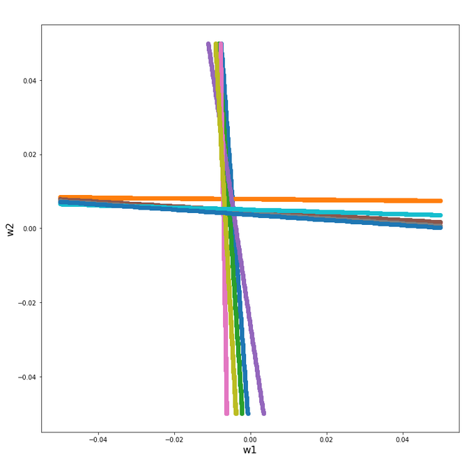
The area of crossings is not too big on the chosen scale of w1, w2. Looking at the graphics we would expect an optimal point around (w1=-0.005, w2=+0.005) – for the original, unnormalized input data.
By the way: There is also a solution for at1=0.3 and at2=0.3, but a strange one. Such a setup would not allow for discrimination. We expect a rather strange behavior then. A first guess could be: The resulting separation curve in the (K1, K2)-plane would move out of the area between the two clusters.
Code for a mesh based display of the costs over the weight-parameter space
Below you find the code suited for a Jupyter cell to get a mesh display of the cost values
import numpy as np
import numpy as np
import random
import math
import sys

from sklearn.preprocessing import StandardScaler
from sklearn.preprocessing import Normalizer
from sklearn.preprocessing import MinMaxScaler
from scipy.special import expit

import matplotlib as mpl
from matplotlib import pyplot as plt
from matplotlib.colors import ListedColormap
import matplotlib.patches as mpat
from mpl_toolkits import mplot3d
from mpl_toolkits.mplot3d import Axes3D

# total cost functions for overview
# *********************************
def costs_mesh(num_samples, W1, W2, li_K1, li_K2, li_a_tgt):
    zshape = W1.shape
    li_Z_sgl = []
    li_C_sgl = []
    C = np.zeros(zshape)

    rg_idx = range(num_samples)
    for idx in rg_idx:
        Z_idx      = W1 * li_K1[idx] + W2 * li_K2[idx]
        A_tgt_idx  = li_a_tgt[idx] * np.ones(zshape)
        C_idx = 0.5 * ( A_tgt_idx - expit(Z_idx) )**2
        li_C_sgl.append( C_idx )
        C += C_idx

    C /= np.float(num_samples)
    return C, li_C_sgl


# ******************
# Simple Perceptron
#*******************

# input at 2 nodes => 2 features K1 and K2 => there will be just one output neuron
li_K1 = [200.0,   1.0, 160.0,  11.0, 220.0,  11.0, 120.0,  14.0, 195.0,  15.0, 130.0,   5.0, 185.0,  16.0  ]
li_K2 = [ 14.0, 107.0,  10.0, 193.0,  32.0, 178.0,   2.0, 210.0,  12.0, 134.0,  7.0, 167.0,  10.0, 229.0 ]

# target values
at1 = 0.3; at2 = 0.7
li_a_tgt  = [at1,  at2,  at1,  at2,   at1,   at2,  at1,   at2,  at1,  at2,  at1,  at2,   at1,  at2 ]

# Change to np floats
li_K1 = np.array(li_K1)
li_K2 = np.array(li_K2)
li_a_tgt = np.array(li_a_tgt)

num_samples = len(li_K1)


# Get overview over costs on mesh
# *****************
**************
# Mesh of weight values
wm1 = np.arange(-0.2,0.4,0.002)
wm2 = np.arange(-0.2,0.2,0.002)
W1, W2 = np.meshgrid(wm1, wm2)
# costs
C, li_C_sgl  = costs_mesh(num_samples=num_samples, W1=W1, W2=W2, \
                          li_K1=li_K1, li_K2=li_K2, li_a_tgt = li_a_tgt)


# Mesh-Plots
# ********
fig_size = plt.rcParams["figure.figsize"]
print(fig_size)
fig_size[0] = 19
fig_size[1] = 19

fig1 = plt.figure(1)
fig2 = plt.figure(2)

ax1 = fig1.gca(projection='3d')
ax1.get_proj = lambda: np.dot(Axes3D.get_proj(ax1), np.diag([1.0, 1.0, 1, 1]))
ax1.view_init(15,148)
ax1.set_xlabel('w1', fontsize=16)
ax1.set_ylabel('w2', fontsize=16)
ax1.set_zlabel('single costs', fontsize=16)

#ax1.plot_wireframe(W1, W2, li_C_sgl[0], colors=('blue'))
#ax1.plot_wireframe(W1, W2, li_C_sgl[1], colors=('orange'))
ax1.plot_wireframe(W1, W2, li_C_sgl[6], colors=('orange'))
ax1.plot_wireframe(W1, W2, li_C_sgl[5], colors=('green'))
#ax1.plot_wireframe(W1, W2, li_C_sgl[9], colors=('orange'))
#ax1.plot_wireframe(W1, W2, li_C_sgl[6], colors=('magenta'))

ax2 = fig2.gca(projection='3d')
ax2.get_proj = lambda: np.dot(Axes3D.get_proj(ax2), np.diag([1.0, 1.0, 1, 1]))
ax2.view_init(15,140)
ax2.set_xlabel('w1', fontsize=16)
ax2.set_ylabel('w2', fontsize=16)
ax2.set_zlabel('Total costs', fontsize=16)
ax2.plot_wireframe(W1, W2, 1.2*C, colors=('green'))
The cost landscape for individual samples without normalization
Gradient descent tries to find a minimum of a cost function by varying the weight values systematically in the cost gradient’s direction. To get an overview about the cost hyperplane over the 2-dim (w1, w2)-space we make some plots. Let us first plot 2 the individual costs for the input samples i=0 and i=5.
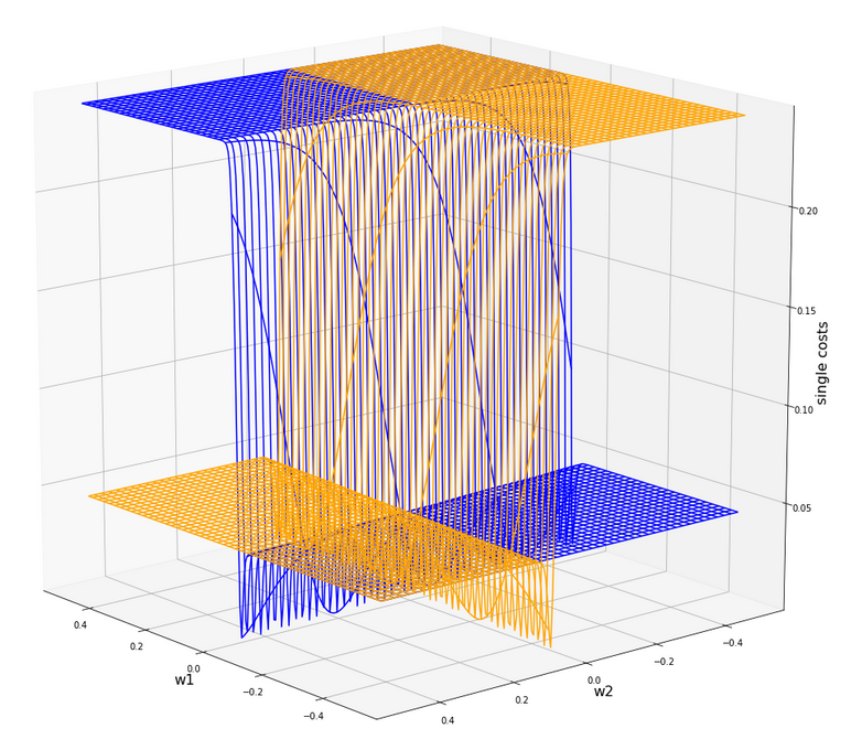
Actually the cost functions for the different samples do show some systematic, though small differences. Try it out yourself … Here is the plot for samples 1,5,9 (counted from 0!).
You see different orientation angles in the (w1, w2)-plane?
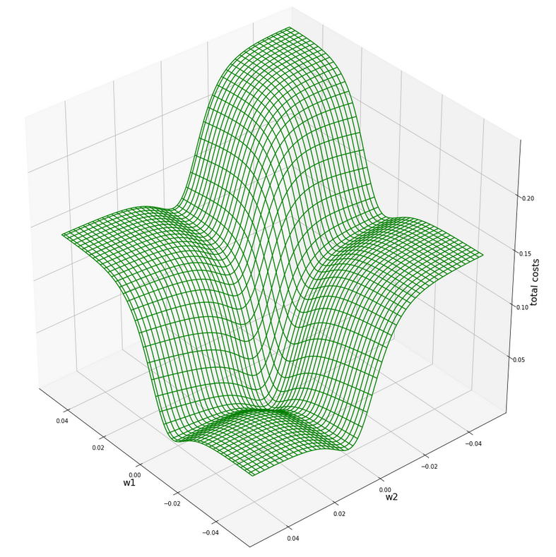
Total cost landscape without normalization
Now let us look at the total costs; to arrive at a comparable level with the other plots I divided the sum by 14:
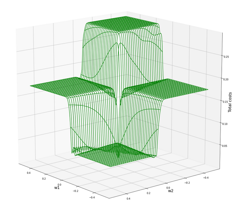
All of the above cost plots look like big trouble for both the “stochastic gradient descent” and the “batch gradient descent” methods for “Machine Learning” [ML]:
We clearly see the effect of the sigmoid saturation. We get almost flat areas beyond certain relatively small w1- and w2-values (|w1| > 0.02, |w2| > 0.02). The gradients in this areas will be very, very close to zero. So, if we have a starting point as e.g. (w1=0.3, w2=0.2) our gradient descent would get stuck. Due to the big input values of at least one feature.
In the center of the {w1, w2}-plane, however, we detect a steep slope to a global minimum.
But how to get there? Let us say, we start with w1=0.04, w2=0.04. The learning-rate “η” is used to correct the weight values by
w1 = w1 – &
eta;*grad_w1
w2 = w2 – η*grad_w2
where grad_w1 and grad_w2 describe the relevant components of the cost-function’s gradient.
In the beginning you would need a big “η” to get closer to the center due to small gradient values. However, if you choose it too big you may pass the tiny area of the minimum and just hop to an area of a different cost level with again a gradient close to zero. But you cannot decrease the learning rate fast as a remedy, either, to avoid getting stuck again.
A view at the center of the loss function hyperplane
Let us take a closer look at the center of our disastrous total cost function. We can get there by reducing our mesh to a region defined by “-0.05 < w1, w2 < 0.05”. We get :
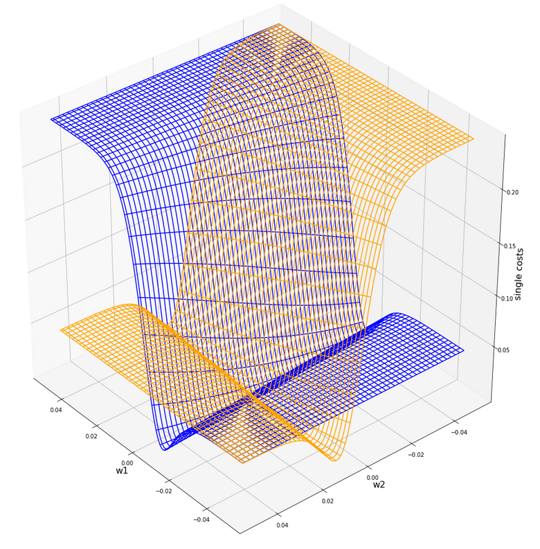
This looks actually much better – on such a surface we could probably work with gradient descent. There is a clear minimum visible – and on this scale of the (w1, w2)-values we also recognize reasonably paths into this minimum. An analysis of the meshdata to get values for the minimum is possible by the following statements:
print("min =", C.min())
pt_min = np.argwhere(C==C.min())
w1=W1[pt_min[0][0]][pt_min[0][1]]
w2=W2[pt_min[0][0]][pt_min[0][1]]
print("w1 = ", w1)
print("w2 = ", w2)
The result is:
min = 0.0006446277000906343
w1 = -0.004999999999999963
w2 = 0.005000000000000046
But to approach this minimum by a smooth gradient descent we would have had to know in advance at what tiny values of (w1, w2) to start with gradient descent – and choose our η suitably small in addition. This is easy in our most simplistic one neuron case, but you almost never can fulfill the first condition when dealing with real artificial neural networks for complex scenarios.
And a naive gradient descent with a standard choice of a (w1, w2)-starting point would have lead us to nowhere in our one-neuron case – as we shall see in a minute ..
Let us keep one question in mind for a while: Is there a chance that we could get the hyperplane surface to look similar to the one at the center – but for much bigger weight values?
Some Python code for gradient descent for our one neuron scenario
Here are some useful functions, which we shall use later on to perform a gradient descent:
# ****************************************
# Functions for stochastic GRADIENT DESCENT
# *****************************************
import random
import pandas as pd

# derivative of expit
def d_expit(z):
    exz = expit(z)
    dex = exz * (1.0 - exz)
    return dex


# single costs for stochastic descent
# ************************************
def dcost_sgl(w1, w2, idx, li_K1, li_K2, li_a_tgt):
    z_in  = w1 * li_K1[idx] + w2 * li_K2[idx]
    a_tgt = li_a_tgt[idx]
    c = 0.5 * ( a_tgt - expit(z_in))**2
    return c

# Gradients
# *********
def grad_sgl(w1, w2, idx, li_K1, li_K2, li_a_tgt):
    z_in  = w1 * li_K1[idx] + w2 * li_K2[idx]
    a_tgt = li_a_tgt[idx]
    gradw1 = 0.5 * 2.0 * (a_tgt - expit(z_in)) * (-d_expit(z_in)) * li_K1[idx]
    gradw2 = 0.5 * 2.0 * (a_tgt - expit(z_in)) * (-d_expit(
z_in)) * li_K2[idx]
    grad = (gradw1, gradw2)
    return grad

def grad_tot(num_samples, w1, w2, li_K1, li_K2, li_a_tgt):
    gradw1 = 0
    gradw2 = 0
    rg_idx = range(num_samples)
    for idx in rg_idx:
        z_in  = w1 * li_K1[idx] + w2 * li_K2[idx]
        a_tgt = li_a_tgt[idx]
        gradw1_idx = 0.5 * 2.0 * (a_tgt - expit(z_in)) * (-d_expit(z_in)) * li_K1[idx]
        gradw2_idx = 0.5 * 2.0 * (a_tgt - expit(z_in)) * (-d_expit(z_in)) * li_K2[idx]
        gradw1 += gradw1_idx
        gradw2 += gradw2_idx
    #gradw1 /= float(num_samples)
    #gradw2 /= float(num_samples)
    grad = (gradw1, gradw2)
    return grad


# total costs at given point
# ************************************
def dcost_tot(num_samples, w1, w2,li_K1, li_K2, li_a_tgt):
    c_tot  = 0
    rg_idx = range(num_samples)
    for idx in rg_idx:
        #z_in  = w1 * li_K1[idx] + w2 * li_K2[idx]
        a_tgt = li_a_tgt[idx]
        c_idx = dcost_sgl(w1, w2, idx, li_K1, li_K2, li_a_tgt)
        c_tot += c_idx
    ctot = 1.0/num_samples * c_tot
    return c_tot

# Prediction function
# ********************
def predict_batch(num_samples, w1, w2,ay_k_1, ay_k_2, li_a_tgt):
    shape_res = (num_samples, 5)
    ResData = np.zeros(shape_res)
    rg_idx = range(num_samples)
    err = 0.0
    for idx in rg_idx:
        z_in  = w1 * ay_k_1[idx] + w2 * ay_k_2[idx]
        a_out = expit(z_in)
        a_tgt = li_a_tgt[idx]
        err_idx = np.absolute(a_out - a_tgt) / a_tgt
        err += err_idx
        ResData[idx][0] = ay_k_1[idx]
        ResData[idx][1] = ay_k_2[idx]
        ResData[idx][2] = a_tgt
        ResData[idx][3] = a_out
        ResData[idx][4] = err_idx
    err /= float(num_samples)
    return err, ResData


def predict_sgl(k1, k2, w1, w2):
    z_in  = w1 * k1 + w2 * k2
    a_out = expit(z_in)
    return a_out

def create_df(ResData):
    ''' ResData: Array with result values K1, K2, Tgt, A, rel.err
    '''
    cols=["K1", "K2", "Tgt", "Res", "Err"]
    df = pd.DataFrame(ResData, columns=cols)
    return df
With these functions a quick and dirty “gradient descent” can be achieved by the following code:
# **********************************
# Quick and dirty Gradient Descent
# **********************************
b_scale_2 = False
if b_scale_2:
    ay_k_1 = ay_K1
    ay_k_2 = ay_K2
else:
    ay_k_1 = li_K1
    ay_k_2 = li_K2

li_w1_st = []
li_w2_st = []
li_c_sgl_st = []
li_c_tot_st = []

li_w1_ba = []
li_w2_ba = []
li_c_sgl_ba = []
li_c_tot_ba = []

idxc = 2

# Starting point
#***************
w1_start = -0.04
w2_start = -0.0455
#w1_start = 0.5
#w2_start = -0.5

# learn rate
# **********
eta = 0.0001
decrease_rate = 0.000000001
num_steps = 2500

# norm = 1
#eta = 0.75
#decrease_rate = 0.000000001
#num_steps = 100

# Gradient descent loop
# *********************
rg_j = range(num_steps)
rg_i = range(num_samples)
w1d_st = w1_start
w2d_st = w2_start
w1d_ba = w1_start
w2d_ba = w2_start

for j in rg_j:
    eta = eta / (1.0 + float(j) * decrease_rate)
    gradw1 = 0
    gradw2 = 0
    # loop over samples and individ. corrs
    ns = num_samples
    rg = range(ns)
    rg_idx = random.sample(rg, num_samples)
    #print("\n")
    for idx in rg_idx:
        #print("idx = ", idx)
        grad_st = grad_sgl(w1d_st, w2d_st, idx, ay_k_1, ay_k_2, li_a_tgt)
        gradw1_st = grad_st[0]
        gradw2_st = grad_st[1]
        w1d_st -= gradw1_st * eta
        w2d_st -= gradw2_st * eta
        li_w1_st.append(w1d_st)
        li_w2_st.append(w2d_st)


        # costs for special sample
        cd_sgl_st = dcost_sgl(w1d_st, w2d_st, idx, ay_k_1, ay_k_2, li_a_tgt)
        li_c_sgl_st.append(cd_sgl_st)

        # total costs for special sample
        cd_tot_st = dcost_tot(num_samples, w1d_st, w2d_st, ay_k_1, ay_k_2, li_a_tgt)
        li_c_tot_st.append(cd_tot_st)
        #print("j:", j, " li_c_tot[j] = ", li_c_tot[j] )

    # work with total costs and total gradient
    grad_ba = grad_tot(num_samples, w1d_ba, w2d_ba, ay_k_1, ay_k_2, li_a_tgt)
    gradw1_ba = grad_ba[0]
    gradw2_ba = grad_ba[1]
    w1d_ba -= gradw1_ba * eta
    w2d_ba -= gradw2_ba * eta
    li_w1_ba.append(w1d_ba)
    li_w2_ba.append(w2d_ba)
    co_ba = dcost_tot(num_samples, w1d_ba, w2d_ba, ay_k_1, ay_k_2, li_a_tgt)
    li_c_tot_ba.append(co_ba)


# Printed Output
# ***************
num_end = len(li_w1_st)
err_sgl, ResData_sgl = predict_batch(num_samples, li_w1_st[num_end-1], li_w2_st[num_end-1], ay_k_1, ay_k_2, li_a_tgt)
err_ba,  ResData_ba = predict_batch(num_samples, li_w1_ba[num_steps-1], li_w2_ba[num_steps-1], ay_k_1, ay_k_2, li_a_tgt)
df_sgl = create_df(ResData_sgl)
df_ba  = create_df(ResData_ba)
print("\n", df_sgl)
print("\n", df_ba)
print("\nTotal error stoch descent: ", err_sgl )
print("Total error batch descent: ", err_ba )

# Styled Pandas Output
# *******************
df_ba
Those readers who followed my series on a Multilayer Perceptron should have no difficulties to understand the code: I used two methods in parallel – one for a “stochastic descent” and one for a “batch descent“:
- During “stochastic descent” we correct the weights by a stepwise application of the cost-gradients of single samples. (We shuffle the order of the samples statistically during epochs to avoid cyclic effects.) This is done for all samples during an epoch.
- During batch gradient we apply the gradient of the total costs of all samples once during each epoch.
And here is also some code to perform some plotting after training runs:
# Plots for Single neuron Gradient Descent
# ****************************************
#sizing
fig_size = plt.rcParams["figure.figsize"]
fig_size[0] = 14
fig_size[1] = 5

fig1 = plt.figure(1)
fig2 = plt.figure(2)
fig3 = plt.figure(3)
fig4 = plt.figure(4)

ax1_1 = fig1.add_subplot(121)
ax1_2 = fig1.add_subplot(122)

ax1_1.plot(range(len(li_c_sgl_st)), li_c_sgl_st)
#ax1_1.set_xlim (0, num_tot+5)
#ax1_1.set_ylim (0, 0.4)
ax1_1.set_xlabel("epochs * batches (" + str(num_steps) + " * " + str(num_samples) + " )")
ax1_1.set_ylabel("sgl costs")

ax1_2.plot(range(len(li_c_tot_st)), li_c_tot_st)
#ax1_2.set_xlim (0, num_tot+5)
#ax1_2.set_ylim (0, y_max_err)
ax1_2.set_xlabel("epochs * batches (" + str(num_steps) + " * " + str(num_samples) + " )")
ax1_2.set_ylabel("total costs ")

ax2_1 = fig2.add_subplot(121)
ax2_2 = fig2.add_subplot(122)

ax2_1.plot(range(len(li_w1_st)), li_w1_st)
#ax1_1.set_xlim (0, num_tot+5)
#ax1_1.set_ylim (0, y_max_costs)
ax2_1.set_xlabel("epochs * batches (" + str(num_steps) + " * " + str(num_samples) + " )")
ax2_1.set_ylabel("w1")

ax2_2.plot(range(len(li_w2_st)), li_w2_st)
#ax1_2.set_xlim (0, num_to_t+5)
#ax1_2.set_ylim (0, y_max_err)
ax2_2.set_xlabel("epochs * batches (" + str(num_steps) + " * " + str(num_samples) + " )")
ax2_2.set_ylabel("w2")

ax3_1 = fig3.add_subplot(121)
ax3_2 = fig3.add_subplot(122)

ax3_1.plot(range(len(li_c_tot_ba)), li_c_tot_ba)
#ax3_1.set_xlim (0, num_tot+5)
#ax3_1.set_ylim (0, 0.4)
ax3_1.set_xlabel("epochs (" + str(
num_steps) + " )")
ax3_1.set_ylabel("batch costs")

ax4_1 = fig4.add_subplot(121)
ax4_2 = fig4.add_subplot(122)

ax4_1.plot(range(len(li_w1_ba)), li_w1_ba)
#ax4_1.set_xlim (0, num_tot+5)
#ax4_1.set_ylim (0, y_max_costs)
ax4_1.set_xlabel("epochs (" + str(num_steps) + " )")
ax4_1.set_ylabel("w1")

ax4_2.plot(range(len(li_w2_ba)), li_w2_ba)
#ax4_2.set_xlim (0, num_to_t+5)
#ax4_2.set_ylim (0, y_max_err)
ax4_2.set_xlabel("epochs (" + str(num_steps) + " )")
ax4_2.set_ylabel("w2")
You can put these codes into suitable cells of a Jupyter environment and start doing experiments on your PC.
Frustration WITHOUT data normalization …
Let us get the worst behind us:
Let us use un-normalized input data, set a standard starting point for the weights and try a gradient descent with 2500 epochs.
Well, what are standard initial weight values? We can follow LeCun’s advice on bigger networks: a uniform distribution between – sqrt(1/2) and +srt(1/2) = 0.7 should be helpful. Well, we take such values. The parameters of our trial run are:
w1_start = -0.1, w2_start = 0.1, eta = 0.01, decrease_rate = 0.000000001, num_steps = 12500
You, unfortunately, get nowhere:
        K1     K2  Tgt           Res       Err
0   200.0   14.0  0.3  3.124346e-15  1.000000
1     1.0  107.0  0.7  9.999996e-01  0.428571
2   160.0   10.0  0.3  2.104822e-12  1.000000
3    11.0  193.0  0.7  1.000000e+00  0.428571
4   220.0   32.0  0.3  1.117954e-15  1.000000
5    11.0  178.0  0.7  1.000000e+00  0.428571
6   120.0    2.0  0.3  8.122661e-10  1.000000
7    14.0  210.0  0.7  1.000000e+00  0.428571
8   195.0   12.0  0.3  5.722374e-15  1.000000
9    15.0  134.0  0.7  9.999999e-01  0.428571
10  130.0    7.0  0.3  2.783284e-10  1.000000
11    5.0  167.0  0.7  1.000000e+00  0.428571
12  185.0   10.0  0.3  2.536279e-14  1.000000
13   16.0  229.0  0.7  1.000000e+00  0.428571

        K1     K2  Tgt           Res       Err
0   200.0   14.0  0.3  7.567897e-24  1.000000
1     1.0  107.0  0.7  1.000000e+00  0.428571
2   160.0   10.0  0.3  1.485593e-19  1.000000
3    11.0  193.0  0.7  1.000000e+00  0.428571
4   220.0   32.0  0.3  1.411189e-21  1.000000
5    11.0  178.0  0.7  1.000000e+00  0.428571
6   120.0    2.0  0.3  2.293804e-16  1.000000
7    14.0  210.0  0.7  1.000000e+00  0.428571
8   195.0   12.0  0.3  1.003437e-23  1.000000
9    15.0  134.0  0.7  1.000000e+00  0.428571
10  130.0    7.0  0.3  2.463730e-16  1.000000
11    5.0  167.0  0.7  1.000000e+00  0.428571
12  185.0   10.0  0.3  6.290055e-23  1.000000
13   16.0  229.0  0.7  1.000000e+00  0.428571

Total error stoch descent:  0.7142856616691734
Total error batch descent:  0.7142857142857143
A parameter setting like
w1_start = -0.1, w2_start = 0.1, eta = 0.0001, decrease_rate = 0.000000001, num_steps = 25000
does not bring us any further:
        K1     K2  Tgt           Res       Err
0   200.0   14.0  0.3  9.837323e-09  1.000000
1     1.0  107.0  0.7  9.999663e-01  0.428523
2   160.0   10.0  0.3  3.496673e-07  0.999999
3    11.0  193.0  0.7  1.000000e+00  0.428571
4   220.0   32.0  0.3  7.812207e-09  1.000000
5    11.0  178.0  0.7  9.999999e-01  0.428571
6   120.0    2.0  0.3  8.425742e-06  0.999972
7    14.0  210.0  0.7  1.000000e+00  0.428571
8   195.0   12.0  0.3  1.328667e-08  1.000000
9    15.0  134.0  0.7  9.999902e-01  0.428557
10  130.0    7.0  0.3  5.090220e-06  0.999983
11    5.0  167.0  0.7  9.999999e-01  0.428571
12  185.0   10.0  0.3  2.943780e-08  1.000000
13   16.0  229.0  0.7  1.000000e+00  0.428571

        K1     K2  Tgt           Res       Err
0   200.0   14.0  0.3  9.837323e-09  1.000000
1     1.0  107.0  0.7  9.999663e-01  0.428523
2   160.0   10.0  0.3  3.496672e-07  0.
999999
3    11.0  193.0  0.7  1.000000e+00  0.428571
4   220.0   32.0  0.3  7.812208e-09  1.000000
5    11.0  178.0  0.7  9.999999e-01  0.428571
6   120.0    2.0  0.3  8.425741e-06  0.999972
7    14.0  210.0  0.7  1.000000e+00  0.428571
8   195.0   12.0  0.3  1.328667e-08  1.000000
9    15.0  134.0  0.7  9.999902e-01  0.428557
10  130.0    7.0  0.3  5.090220e-06  0.999983
11    5.0  167.0  0.7  9.999999e-01  0.428571
12  185.0   10.0  0.3  2.943780e-08  1.000000
13   16.0  229.0  0.7  1.000000e+00  0.428571

Total error stoch descent:  0.7142779420120247
Total error batch descent:  0.7142779420164836
However:
For the following parameters we do get something:
w1_start = -0.1, w2_start = 0.1, eta = 0.001, decrease_rate = 0.000000001, num_steps = 25000
        K1     K2  Tgt       Res       Err
0   200.0   14.0  0.3  0.298207  0.005976
1     1.0  107.0  0.7  0.603422  0.137969
2   160.0   10.0  0.3  0.334158  0.113860
3    11.0  193.0  0.7  0.671549  0.040644
4   220.0   32.0  0.3  0.294089  0.019705
5    11.0  178.0  0.7  0.658298  0.059574
6   120.0    2.0  0.3  0.368446  0.228154
7    14.0  210.0  0.7  0.683292  0.023869
8   195.0   12.0  0.3  0.301325  0.004417
9    15.0  134.0  0.7  0.613729  0.123244
10  130.0    7.0  0.3  0.362477  0.208256
11    5.0  167.0  0.7  0.654627  0.064819
12  185.0   10.0  0.3  0.309307  0.031025
13   16.0  229.0  0.7  0.697447  0.003647

        K1     K2  Tgt       Res       Err
0   200.0   14.0  0.3  0.000012  0.999961
1     1.0  107.0  0.7  0.997210  0.424586
2   160.0   10.0  0.3  0.000106  0.999646
3    11.0  193.0  0.7  0.999957  0.428510
4   220.0   32.0  0.3  0.000009  0.999968
5    11.0  178.0  0.7  0.999900  0.428429
6   120.0    2.0  0.3  0.000771  0.997429
7    14.0  210.0  0.7  0.999980  0.428543
8   195.0   12.0  0.3  0.000014  0.999953
9    15.0  134.0  0.7  0.998541  0.426487
10  130.0    7.0  0.3  0.000555  0.998150
11    5.0  167.0  0.7  0.999872  0.428389
12  185.0   10.0  0.3  0.000023  0.999922
13   16.0  229.0  0.7  0.999992  0.428560

Total error single:  0.07608269490258893
Total error batch:  0.7134665897677123
By pure chance we found a combination of starting point and learning-rate for which we – by hopping around on the flat cost areas – we accidentally arrived at the slope area of one sample and started a gradient descent. This did however not (yet) happen for the total costs.
We get a minimum around (w1=-0.005,w2=0.005) but with a big spread of 0.0025 for each of the weight values.
Intermediate Conclusion
We looked at a simple perceptron scenario with one computing neuron. Our solitary neuron should learn to distinguish between input data of two distinct and separate data clusters in a 2-dimensional feature space. The feature data change between big and small values for different samples. The neuron used the sigmoid-function as activation and output function. The cost function for all samples shows a minimum at a tiny area in the weight space. We found this minimum with the help of a fine grained and mesh-based analysis of the cost values. However, such an analysis is not applicable to general ML-scenarios.
The problem we face is that due to the saturation properties of the sigmoid function the minimum cannot be detected automatically via gradient descent without knowing already precise details about the solution. Gradient descent does not work – we either get stuck on areas of nearly constant costs or we hop around between different plateaus of the cost function – missing a tiny location in the (w1, w2)-parameter space for a real descent into the existing minimum.
We need to find a way out of this dilemma. In the next article
A single neuron perceptron with sigmoid activation function – II – normalization to overcome saturation
I shall show that normalization opens such a way.