This post continues my series on Variational Autoencoders [VAE] with some considerations regarding a VAE whose settings allow for only a tiny amount of the so called Kullback-Leibler [KL] loss.
Variational Autoencoder with Tensorflow – I – some basics
Variational Autoencoder with Tensorflow – II – an Autoencoder with binary-crossentropy loss
Variational Autoencoder with Tensorflow – III – problems with the KL loss and eager execution
Variational Autoencoder with Tensorflow – IV – simple rules to avoid problems with eager execution
Variational Autoencoder with Tensorflow – V – a customized Encoder layer for the KL loss
Variational Autoencoder with Tensorflow – VI – KL loss via tensor transfer and multiple output
Variational Autoencoder with Tensorflow – VII – KL loss via model.add_loss()
Variational Autoencoder with Tensorflow – VIII – TF 2 GradientTape(), KL loss and metrics
Variational Autoencoder with Tensorflow – IX – taming Celeb A by resizing the images and using a generator
Variational Autoencoder with Tensorflow – X – VAE application to CelebA images
Variational Autoencoder with Tensorflow – XI – image creation by a VAE trained on CelebA
Variational Autoencoder with Tensorflow – XII – save some VRAM by an extra Dense layer in the Encoder
So far, most of the posts in this series have covered a variety of methods (provided by Tensorflow and Keras) to control the KL loss. One of the previous posts (XI) provided (indirect) evidence that also GradientTape()-based methods for KL-loss calculation work as expected. In stark contrast to a standard Autoencoder [AE] our VAE trained on CelebA data proved its ability to reconstruct humanly interpretable images from random z-points (or z-vectors) in the latent space. Provided that the z-points lie within a reasonable distance to the origin.
We could leave it at that. One of the basic motivations to work with VAEs is to use the latent space “creatively”. This requires that the data points coming from similar training images should fill the latent space densely and without gaps between clusters or filaments. We have obviously achieved this objective. Now we could start to do funny things like to combine reconstruction with vector arithmetic in the latent space.
But to look a bit deeper into the latent space may give us some new insights. The central point of the KL-loss is that it induces a statistical element into the training of AEs. As a consequence a VAE fills the so called “latent space” in a different way than a simple AE. The z-point distribution gets confined and areas around z-points for meaningful training images are forced to get broader and overlap. So two questions want an answer:
- Can we get more direct evidence of what the KL-loss does to the data distribution in latent space?
- Can we get some direct evidence supporting the assumption that most of the latent space of an AE is empty or only sparsely populated? in contrast to a VAE’s latent space?
Therefore, I thought it would be funny to compare the data organization in latent space caused by an AE with that of a VAE. But to get there we need some solid starting point. If you consider a bit where you yourself would start with an AE vs. VAE comparison you will probably come across the following additional and also interesting questions:
- Can one safely assume that a VAE with only a very tiny amount of KL-loss reproduces the same z-point distribution vs. radius which an AE would give us?
- In general: Can we really expect a VAE with a very tiny Kullback-Leibler loss to behave as a corresponding AE with the same structure of convolutional layers?
The answers to all these questions are the topics of this post and a forthcoming one. To get some answers I will compare a VAE with a very small KL-loss contribution with a similar AE. Both network types will consist of equivalent convolutional layers and will be trained on the CelebA dataset. We shall look at the resulting data point density distribution vs. radius, clustering properties and the ability to create images from statistical z-points.
This will give us a solid base to proceed to larger and more natural values of the KL-loss in further posts. I got some new insights along this path and hope the presented data will be interesting for the reader, too.
Below and in following posts I will sometimes call the target space of the Encoder also the “z-space“.
CelebA data to fill the latent vector-space
The training of an AE or a VAE occurs in a self-supervised manner. A VAe or an AE learns to create a point, a z-point, in the latent space for each of the training objects (e.g. CelebA images). In such a way that the Decoder can reconstruct an object (image) very close to the original from the z-point’s coordinate data. We will use the “CelebA” dataset to study the KL-impact on the z-point distribution.CelebA is more challenging for a VAE than MNIST. And the latent space requires a substantially higher number of dimensions than in the MNIST case for reasonable reconstructions. This makes things even more interesting.
The latent z-space filled by a trained AE or VAE is a multi-dimensional vector space. Meaning: Each z-point can be described by a vector defining a position in z-space. A vector in turn is defined by concrete values for as many vector components as the z-space has dimensions.
Of course, we would like to see some direct data visualizing the impact of the KL-loss on the z-point distribution which the Encoder creates for our training data. As we deal with a multidimensional vector space we cannot plot the data distribution. We have to simplify and somehow get rid of the many dimensions. A simple solution is to look at the data point distribution in latent space with respect to the distance of these points from the origin. Thereby we transform the problem into a one-dimensional one.
More precisely: I want to analyze the change in numbers of z-points within “radius“-intervals. Of course, a “radius” has to be defined in a multidimensional vector space as the z-space. But this can easily be achieved via an Euclidean L2-norm. As we expect the KL loss to have a confining effect on the z-point distribution it should reduce the average radius of the z-points. We shal later see that this is indeed the case.
Another simple method to reduce dimensions is to look at just one coordinate axis and the data distribution for the calculated values in this direction of the vector space. Therefore, I will also check the variation in the number of data points along each coordinate axis in one of the next posts.
A look at clustering via projections to a plane may be helpful, too.
The expected similarity of a VAE with tiny KL-loss to an AE is not really obvious
Regarding the answers to the 3rd and 4th questions posed above your intuition tells you: Yes, you probably can bet on a similarity between a VAE with tiny KL-loss and an AE.
But when you look closer at the network architectures you may get a bit nervous. Why should a VAE network that has many more degrees of freedom than an AE not use both of its layers for “mu” and “logvar” to find a different distribution solution? A solution related to another minimum of the loss hyperplane in the weight configuration space? Especially as this weight-related space is significantly bigger than that of a corresponding AE with the same convolutional layers?
The whole point has to do with the following facts: In an AE’s Encoder the last flattening layer after the Conv2D-layers is connected to just one output layer. In a VAE, instead, the flattening layer feeds data into two consecutive layers (for mu and logvar) across twice as many connections (with twice as many weight parameters to optimize).
In the last post of this series we dealt with this point from the perspective of VRAM consumption. Now, its the question in how far a VAE will be similar to an AE for a tiny KL-loss.
Why should the z-points found be determined only by mu-values and not also by logvar-values? And why should the mu values reproduce the same distribution as an AE? At least the architecture does not guarantee this by any obvious means …
Well, let us look at some data.
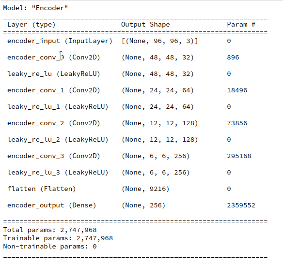
Structure of an AE for CelebA and its total loss after some epochs
Our test AE contains the same simple sequence of four Conv2D layers per Encoder and four 4 Conv2DTranspose layers as our VAE. See the AE’s Encoder layer structure below.
A difference, however, will be that I will not use any BatchNormalizer layers in the AE. But as a correctly implemented BatchNormalization should not affect the representational powers of a VAE network for very principle reasons this should not influence the comparison of the final z-point distribution in a significant way.
I performed an AE training run for 170,000 CelebA training images over 24 epochs. The latent space has a dimension if z_dim=256. (This relatively low number of dimensions will make it easier for a VAE to confine z_points around the origin; see the discussion in previous posts).
The resulting total loss of our AE became ca. 0.49 per pixel. This translates into a total value of
AE total loss on Celeb A after 24 epochs (for a step size of 0.0005): 4515
This value results from a summation over all geometric pixels of our CelebA images which were downsized to 96×96 px (see post IX). The given value can be compared to results measured by our GradientTape()-based VAE-model which delivers integrated values and not averages per pixel.
This value is significantly smaller than values we would get for the total loss of a VAE with a reasonably big KL-loss of contribution in the order of some percent of the reconstruction loss. A VAE produces values around 4800 up to 5000. Apparently, an AE’s Decoder reconstructs originals much better than a VAE with a significant KL-loss contribution to the total loss.
But what about a VAE with a very small KL-loss? You will get the answer in a minute.
Where does a standard Autoencoder [AE] place the z-points for CelebA data?
We can not directly plot a data point distribution in a 256-dimensional vector-space. But we can look at the data point density variation with a calculated distance from the origin of the latent space.
The distance R from the origin to the z-point for each image can be measured in terms of a L2 (= Euclidean) norm of the latent vector space. Afterward it is easy to determine the number of images within all radius intervals with e.g. a length of 0.5 e.g. between radii R
0 < R < 35 .
We perform the following steps to get respective numbers. We let the Encoder of our trained AE predict the z-points of all 170,000 training data
z_points = AE.encoder.predict(data_flow)
data_flow was created by a Keras DataImageGenerator to send batches of training data to the GPU (see the previous posts).
Radius values are then calculated as
print("NUM_Images_Train = ", NUM_IMAGES_TRAIN)
ay_rad_z = np.zeros((NUM_IMAGES_TRAIN,),  dtype='float32')
for i in range(0, NUM_IMAGES_TRAIN):
    sq = np.square(z_points[i])
    sqrt_sum_sq = math.sqrt(sq.sum())
    ay_rad_z[i] = sqrt_sum_sq
The numbers vs. radius relation then results from:
li_rad      = []
li_num_rad  = []
int_width = 0.5
for i in range(0,70):
    low   = int_width * i
    high  = int_width * (i+1)
    num   = np.count_nonzero( (ay_rad_z >= low) & (ay_rad_z < high ) )
    li_rad.append(0.5 * (low + high))
    li_num_rad.append(num)
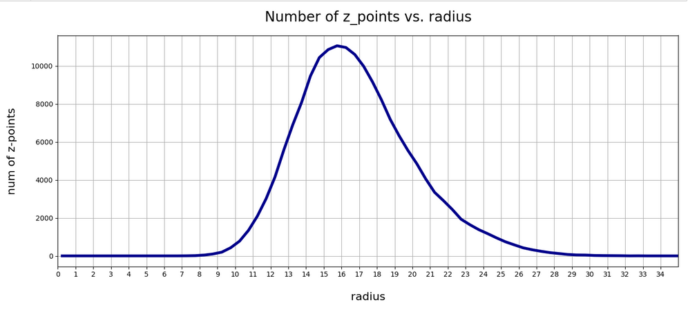
The resulting curve is shown below:
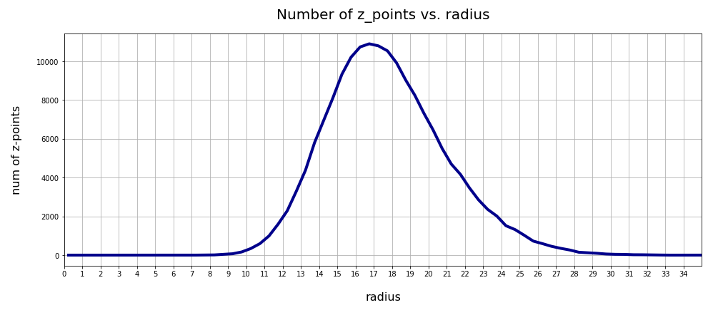
There seems to be a peak around R = 16.75. So, yet another question arises:
>What is so special about the radius values of 16 or 17 ?
We shall return to this point in the next post. For now we take this result as god-given.
Clustering of CelebA z-point data in the AE’s latent space?
Another interesting question is: Do we get some clustering in the latent space? Will there be a difference between an AE and a VAE?
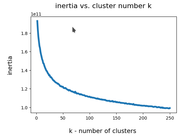
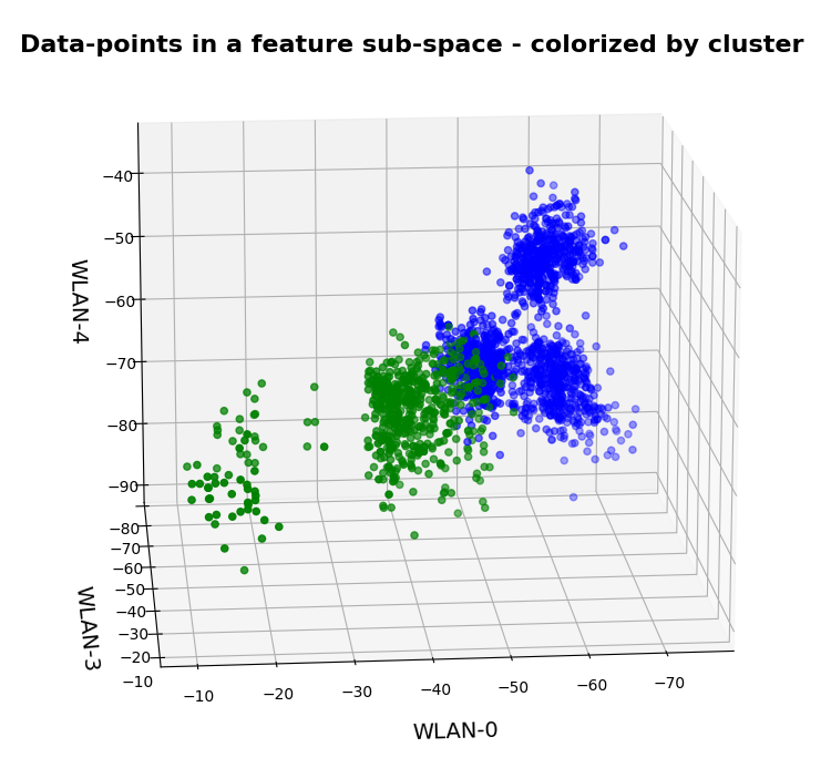
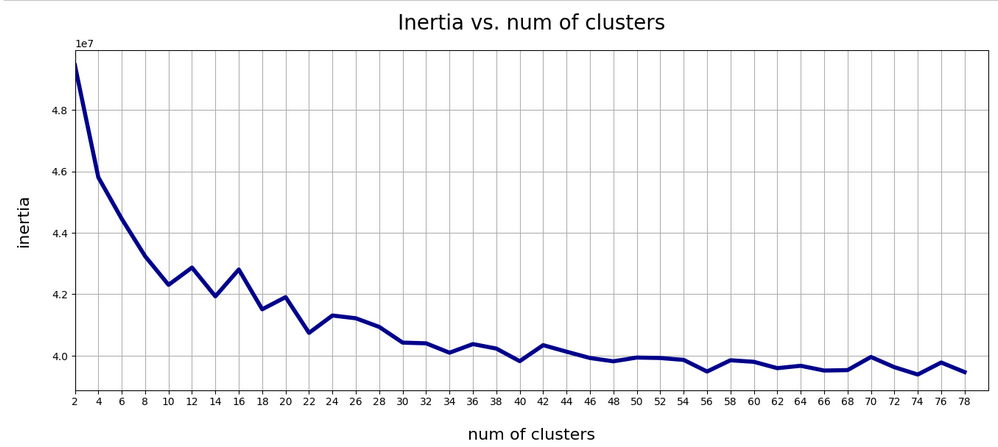
A standard method to find an indication of clustering is to look for an elbow in the so called “inertia” curve for different assumed numbers of clusters. Below you find an inertia plot retrieved from the z-point data with the help of MiniBatchKMeans.
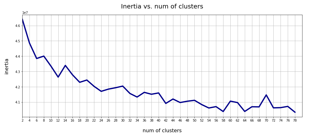
This result was achieved for data taken at every second value of the number of clusters “num_clus” between 2 ≤ num_clus ≤ 80. Unfortunately, the result does not show a pronounced elbow. Instead the variation at some special cluster numbers is relatively high. But, if we absolutely wanted to define a value then something between 38 and 42 appears to be reasonable. Up to that point the decline in inertia is relatively smooth. But do not let you get misguided – the data depend on statistics and initial cluster values. When you change to a different calculation you may get something like the following plot with more pronounced spikes:
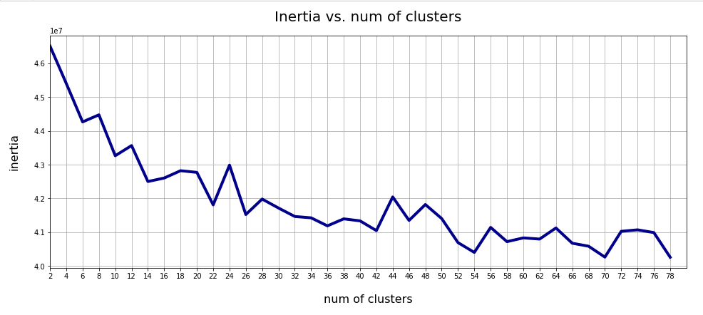
This is always as sign that the clustering is not very clear – and that the clusters do not have a significant distance, at least not in all coordinate directions. Filamental structures will not be honored well by KMeans.
Nevertheless: A value of 40 is reasonable as we have 40 labels coming with the CelebA data. I.e. 40 basic features in the face images are considered to be significant and were labeled by the creators of the dataset.
t-SNE projections
We can also have a look at a 2-dimensional t-SNE-projection of the z-point distribution. The plots below have been produced with different settings for early exaggeration and perplexity parameters. The first plot resulted from standard parameter values for sklearn’s t-SNE variant.
tsne = TSNE(n_components=2, early_exaggeration=12, perplexity=30, n_iter=1000)
Other plots were produced by the following setting:
tsne = TSNE(n_components=2, early_exaggeration=16, perplexity=10, n_iter=1000)
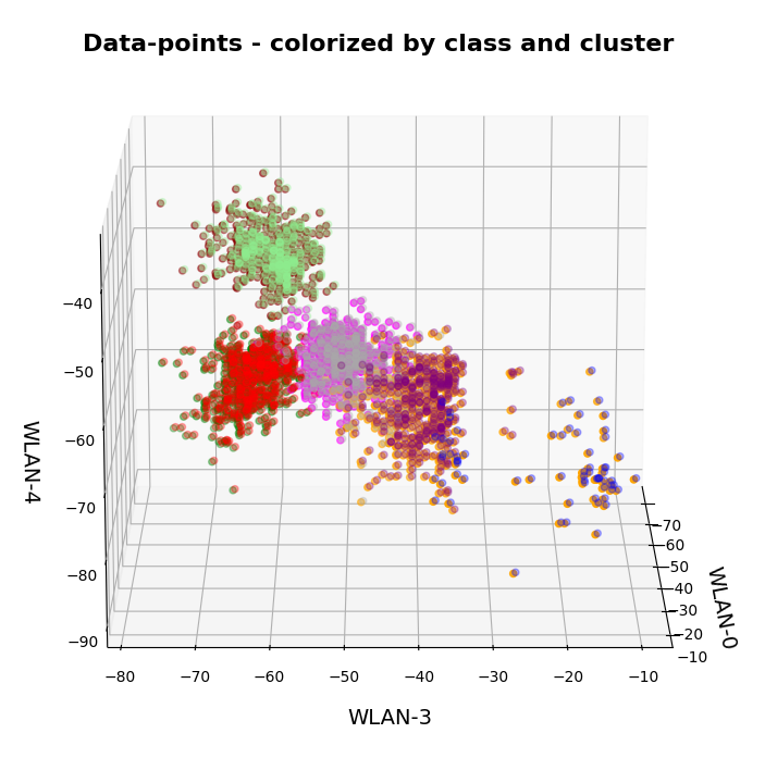
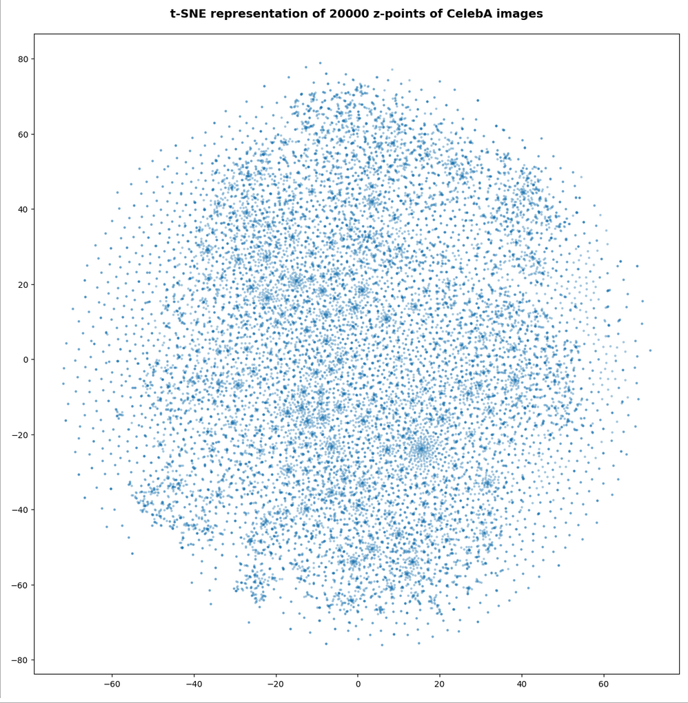
Below you find some plots of a t-SNE-analysis for different numbers and different adjusted parameters for the resulting scatter plot. The number of statistically chosen z-point varies between 20,000 and 140,000.
Number of statistical z-points: 20,000 (non-standard t-SNE-parameters)
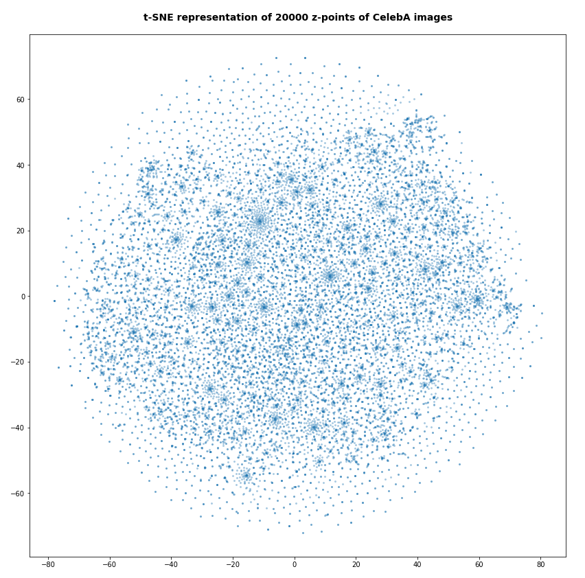
Actually we see some indication of clustering, though it is not very pronounced. The clusters in the projection are not separated by clear and broad gaps. Of course a 2-dimensional projection can not completely visualize the original separations in a 256-dim space. However, we get the impression that clusters are located rather close to each other. Remember: We already know that almost all points are locates in a multidimensional sphere shell between 12 < R < 24. And more than 50% between 14 ≤ R ≤ 19.
However, how the actual distribution of meaningful z-points (in the sense of a recognizable face reconstruction) really looks like cannot be deduced from the above t-SNE analysis. The concentration of the z-points may still be one which follows thin and maybe curved filaments in some directions of the multidimensional latent space on relatively small or various scales. We shall get a much clearer picture of the fragmentation of the z-point distribution in an AE’s latent space in the next post of this series.
Number of statistical z-points: 80,000
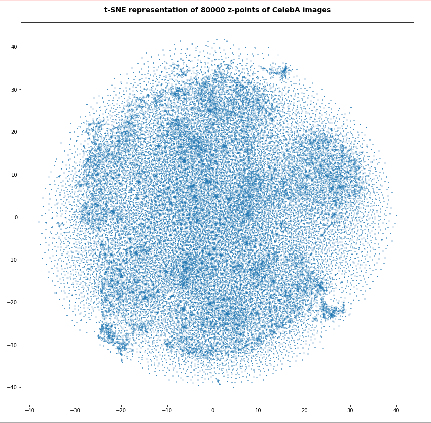
For the higher number of selected z-points the room between some concentration centers appears to be filled in the projection. But remember: This may only be due to projection effects in the presently chosen coordinate system. Another calculation with the above non-standard data for perplexity and early_exaggeration gives us:
Number of statistical z-points: 140,000
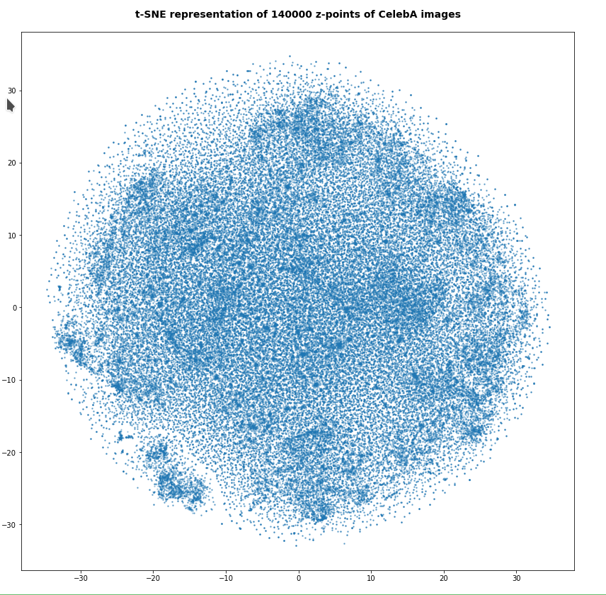
Note that some islands appear. Obviously, there is at least some clustering going on. However, due to projection effects we cannot deduce much for the real structure of the point distribution between possible clusters. Even the clustering itself could appear due to overlapping two or more broader filaments along a projection line.
Whether correlations would get more pronounced and therefore could also be better handled by t-SNE in a rotated coordinate system based on a PCA-analysis remains to be seen. The next post will give an answer.
At least we have got a clear impression about the radial distribution of the z-points. And thereby gathered some data which we can compare to corresponding results of a VAE.
Total loss of a VAE with a tiny KL-loss for CelebA data
Our test VAE is parameterized to create only a very small KL-loss contribution to the total loss. With the Python classes we have developed in the course of this post series we can control the ratio between the KL-loss and a standard reconstruction loss as e.g. BCE (binary-crossentropy) by a parameter “fact“.
For BCE
fact = 1.0e-5
is a very small value. For a working VAE we would normally choose something like fact=5 (see post XI).
A value like 1.0e-5 ensures a KL loss around 0.0178 compared to a reconstruction loss of 4550, which gives us a ratio below 4.e-6. Now, what is a VAE going to do, when the KL-loss is so small?
For the total loss the last epochs produced the following values:
AE total loss on Celeb A after 24 epochs for a step size of 0.0005: 4,553
Output of the last 6 of 24 epochs.
Epoch 1/6
1329/1329 [==============================] - 120s 90ms/step - total_loss: 4557.1694 - reco_loss: 4557.1523 - kl_loss: 0.0179
Epoch 2/6
1329/1329 [==============================] - 120s 90ms/step - total_loss: 4556.9111 - reco_loss: 4556.8940 - kl_loss: 0.0179
Epoch 3/6
1329/1329 [==============================] - 120s 90ms/step - total_loss: 4556.6626 - reco_loss: 4556.6450 - kl_loss: 0.0179
Epoch 4/6
1329/1329 [==============================] - 120s 90ms/step - total_loss: 4556.3862 - reco_loss: 4556.3682 - kl_loss: 0.0179
Epoch 5/6
1329/1329 [==============================] - 120s 90ms/step - total_loss: 4555.9595 - reco_loss: 4555.9395 - kl_loss: 0.0179
Epoch 6/6
1329/1329 [==============================] - 118s 89ms/step - total_loss: 4555.6641 - reco_loss: 4555.6426 - kl_loss: 0.0178
This is not too far away from the value of our AE. Other training runs confirmed this result. On four different runs the total loss value came to lie between
VAE total loss on Celeb A after 24 epochs: 4553 ≤ loss ≤ 4555 .
VAE with tiny KL-loss – z-point density distribution vs. radius
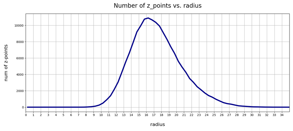
Below you find the plot for the variation of the number density of z-points vs. radius for our VAE:
Again, we get a maximum close to R = rad = 16. The maximum value lies a bit below the one found for a KL-loss-free AE. But all in all the form and width of the distribution of the VAE are very comparable to that of our test AE.
Can this result be reproduced?
Unfortunately not at a 100% of test runs performed. There are two main reasons:
- Firstly, we can not be sure that a second minimum does not exist for a distribution of points at bigger radii. This may be the case both for the AE and the VAE!
- Secondly, we have a major factor of statistical fluctuation in our game:
The epsilon value which scales the logvar-contribution to the loss in the sampling layer of the Encoder may in very seldom cases abruptly jump to an unreasonable high value. A Gaussian covers extreme values, although the chances to produce such a value are pretty small. and a Gaussian is invilved in the calculation of z-points by our VAE.
Remember that the z-point coordinates are calculated via the the mu and logvar tensors according to
z = mu + B.exp(log_var / 2.) * epsilon
See Variational Autoencoder with Tensorflow 2.8 – VIII – TF 2 GradientTape(), KL loss and metrics for respective code elements of the Encoder.
So, a lot depends on epsilon which is calculated as a statistically fluctuating quantity, namely as
epsilon = B.random_normal(shape=B.shape(mu), mean=0., stddev=1.)
Is there a chance that the training process may sometimes drive the system to another corner of the weight-loss configuration space due to abrupt fluctuations? With the result for the z-point distribution vs. radius that it may significantly deviate from a distribution around R = 16? I think: Yes, this is possible!
From some other training runs I actually have an indication that there is a second minimum of the cost hyperplane with similar properties for higher average radius-values, namely for a distribution with an average radius at R ≈ 19.75. I got there after changing the initialization of the weights a bit.
Another indication that the cost surface has a relative rough structure and that extreme fluctuations of epsilon and a resulting gradient-fluctuation can drive the position of the network in the weight configuration space to some strange corners. The weight values there can result in different z-point distributions at higher average radii. This actually happened during yet another training run: At epoch 22 the Adam optimizer suddenly directed the whole system to weight values resulting in a maximum of the density distribution at R = 66 ! This appeared as totally crazy. At the same time the KL-loss also jumped to a much higher value.
When I afterward repeated the run from epoch 18 this did not happen again. Therefore, a statistical fluctuation must have been the reason for the described event. Such an erratic behavior can only be explained by sudden and extreme changes of z-point data enforcing a substantial change in size and direction of the loss gradient. And epsilon is a plausible candidate for this!
So far I had nothing in our Python classes which would limit the statistical variation of epsilon. The effects seen spoke for a code change such that we do not allow for extreme epsilon-values. I set limits in the respective part of the code for the sampling layer and its lambda function
        # The following function will be used by an eventual Lambda layer of the Encoder
        def z_point_sampling(args):
            '''
            A point in the latent space is calculated statistically
            around an optimized mu for each sample
            '''
            mu, log_var = args # Note: These are 1D tensors !
            epsilon = B.random_normal(shape=B.shape(mu), mean=0., stddev=1.)
            if abs(epsilon) >= 5:
                epsilon *= 5. / abs(epsilon)
            return mu + B.exp(log_var / 2.) * epsilon * self.enc_v_eps_factor
This stabilized everything. But even without these limitations on average three out of 4 runs which I performed for the VAE ran into a cost minimum which was associated with a pronounced maximum of the z-point-distribution around R ≈ 16. Below you see the plot for the fourth run:
So, there is some chance that the degrees of freedom associated with the logvar-layer and the statistical variation for epsilon may drive a VAE into other local minima or weight parameter ranges which do not lead to a z-point distribution around R = 16. But after the limitation of epsilon fluctuations all training runs found a loss minimum similar to the one of our simple AE – in the sense that it creates a z-point density distribution around R ≈ 16.
VAE with tiny KL-loss: Inertia and clustering of the CelebA data?
Our VAE gives the following variation of the inertia vs. the number of assumed clusters:
This also looks pretty similar to one of the plots shown for our AE above.
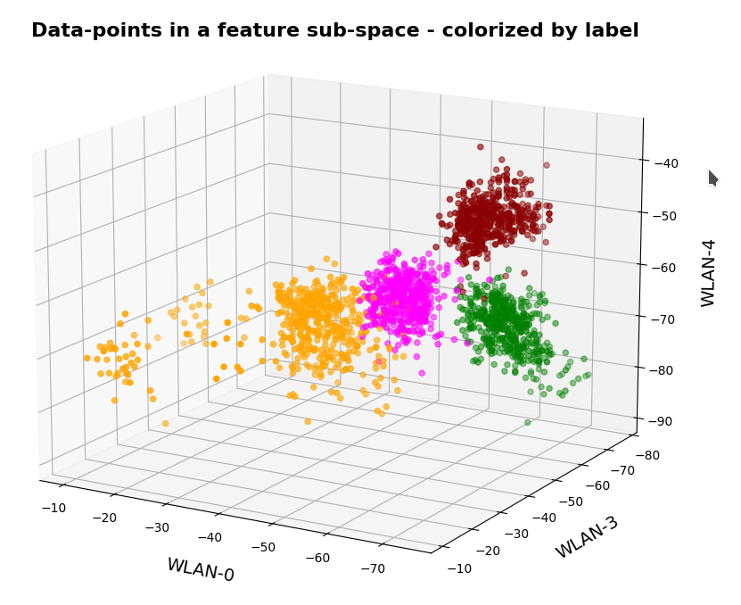
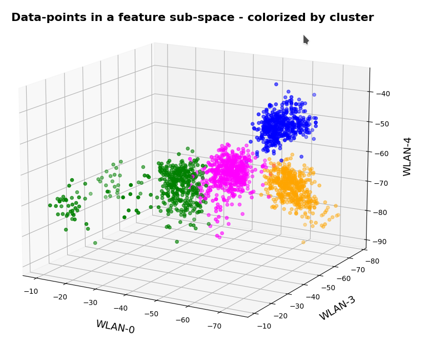
t-SNE for our VAE with a tiny KL loss
Below you find t-SNE plots for 20,000, 80,000 and 140,000 images:
Number of statistical z-points: 20,000 (non-standard t-SNE-parameters)
This is quite similar to the related image for the AE. You just have to rotate it.
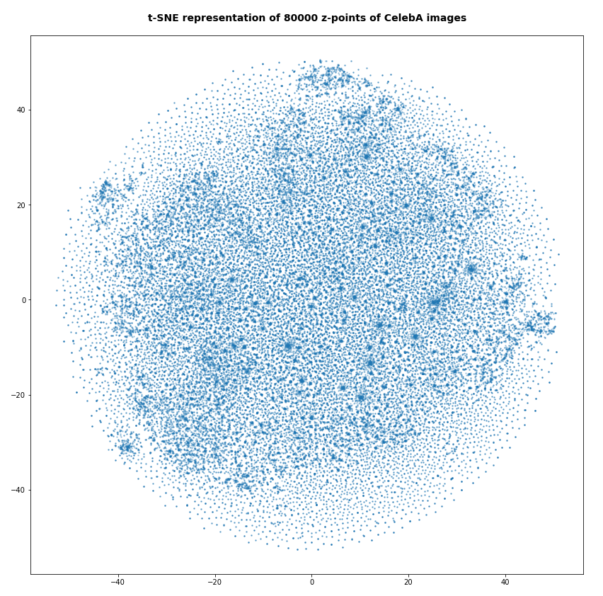
Number of statistical z-points: 80,000

Number of statistical z-points: 140,000
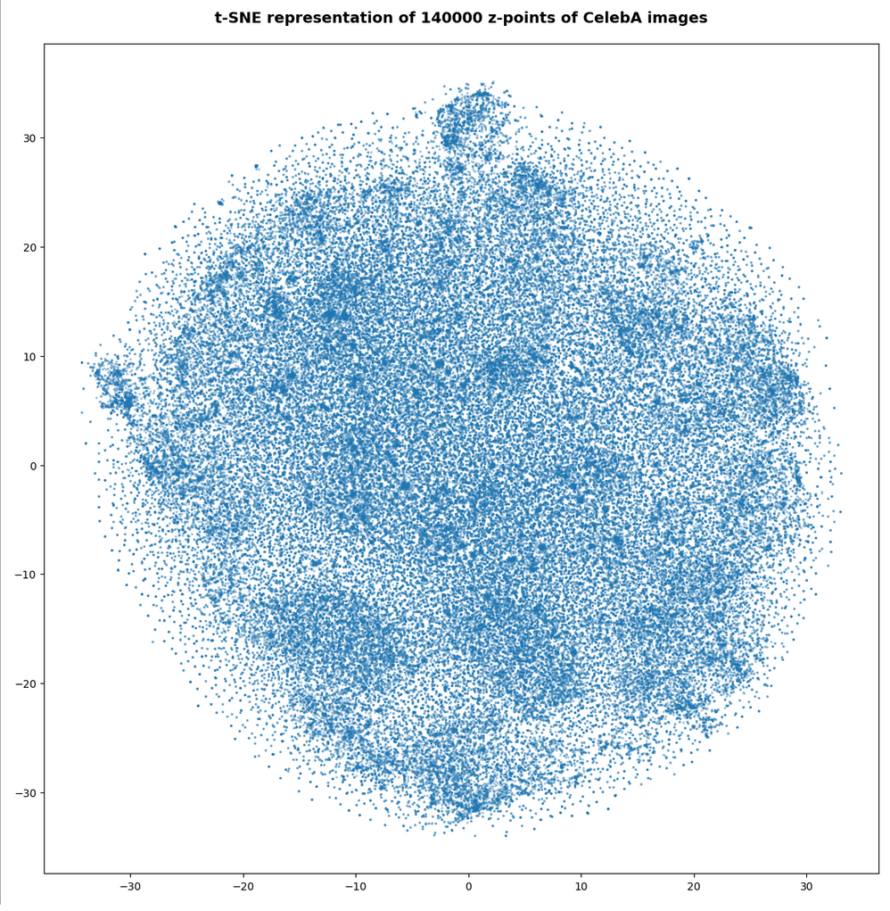
All in all we get very similar indications as from our AE that some clustering is going on.
VAE with tiny KL-loss: Should its logvar values become tiny, too?
Besides reproducing a similar z-point distribution with respect to radius values, is there another indication that a VAE behaves similar to an AE? What would be a clear sign that the similarity really exists on a deeper level of the layers and their weights?
The z-vector is calculated from the mu and logvar-vectors by:
z = mu + exp(logvar/2)*epsilon
with epsilon coming from a normal distribution. Please note that we are talking about vectors of size z_dim=256 per image.
If a VAE with a tiny KL-loss really becomes similar to an AE it should define and set its z-points basically by using mu-values, only, and not by logvar-values. I.e. the VAE should become intelligent enough to ignore the degrees of freedom associated with the logvar-layer. Meaning that the z-point coordinates of a VAE with a very small Kl-loss should in the end be almost identical to the mu-component-values.
Ok, but to me it was not self-evident that a VAE during its training would learn
- to produce significant mu-related weight-values, only,
- and to keep the weight values for the connections to the logvar-layer so small that the logvar-impact on the z-space position gets negligible.
Before we speculate about reasons: Is there any evidence for a negligible logvar-contribution to the z-point coordinates or, equivalently, to the respective vector components?
A VAE with tiny KL-loss produces tiny logvar values …
To get some quantitative data on the logvar impact the following steps are appropriate:
- Get the size and algebraic sign of the logvar-values. Negative values logvar < -3 would be optimal.
- Measure the deviation between the mu- and z_points vector components. There should only be a few components which show significant values &br; abs(mu – z) > 0.05
- Compare the the radius-value determined by z-components vs. the radius values derived from mu-components, only, and measure the absolute and relative deviations. The relative deviation should be very small on average.
Some values of logvar, (z – mu), z-radii and z-radius-deviations for a VAE with small KL-loss
Regarding the maximum value of the logvar’s vector-components I found
3.4 ≥ max(logvar) ≥ -3.2. # for 1 up to 3 components out of a total 45.52 million components
The first value may appear to be big for a component. But typically there are only 2 (!) out of 170,000 x 256 = 43.52 million vector components in an interval of [-3, 5]. On the component level I found the following minimum, maximum and average-values
Maximum value for logvar:  -2.0205276
Minimum value for logvar:  -24.660698
Average value for logvar:  -13.682616
The average value of logvar is pretty pleasing: Such big negative values indeed render the logvar-impact on the position of our z-points negligible. So we should only find very small deviations of the mu-components from the z-point components. And, actually, the maximum of the deviation between a z_point component and a mu component was delta_mu_z = 0.26:
Maximum (z_points - mu) = delta_mu_z = 0.26 # on the component level
There were only 5 out of the 45.52 million components which showed an absolute deviation in the interval
0.05 < abs(delta_mu_z) < 2.
The rest was much, much smaller!
What about radius values? Here the situation looks, of course, even better:
max radius defined by z  :  33.10274
min radius defined by z  :  6.4961233
max radius defined by mu :  33.0972
min radius defined by mu :  6.494558

avg_z:      16.283989
avg_mu:     16.283972

max absolute difference :  0.018045425
avg absolute difference :  0.00094899256

max relative difference  :   0.00072147313
avg relative difference  :   6.1240215e-05
As expected, the relative deviations between z- and mu-based radius values became very small.
In another run (the one corresponding to the second density distribution curve above) I got the following values:
Maximum value for logvar:  3.3761873
Minimum value for logvar:  -22.777826
Average value for logvar:  -13.4265175

max radius z :  35.51387
min radius z :  7.209168
max radius mu :  35.515926
min radius mu :  7.2086616

avg_z:  17.37412
avg_mu: 17.374104

max delta rad relative :   0.012512478
avg delta rad relative :   6.5660715e-05
This tells us that the z-point distributions may vary a bit in their width, their precise center and average values. But, overall they appear to be similar. Especially with respect to a relative negligible contribution of logvar-terms to the z-point position. The relative impact of logvar on the radius value of a z-point is of the order 6.e-5, only.
All the above data confirm that a trained VAE with a very small KL-loss primarily uses mu-values to set the position of its z-points. During training the VAE moves along a path to an overall minimum on the loss hyperplane which leads to an area with weights that produce negligible logvar values.
Explanation of the overall similarity of a VAE with tiny KL-loss to an AE
o far we can summarize: Under normal conditions the VAE’s behavior is pretty close to that of a similar AE. The VAE produces only small logvar values. z-point coordinates are extremely close to just the mu-coordinates.
Can we find a plausible reason for this result? Looking at the cost-hyperplane with respect to the Encoder weights helps:
The cost surface of a VAE spans across a space of many more weight parameters than a corresponding AE. The reason is that we have weights for the connection to the logvar-layer in addition to the weights for the mu-layer (or a single output layer as in a corresponding AE). But if we look at the corner of the weight-vector-space where the logvar-related values are pretty small, then we would at least find a local (if not global) loss minimum there for the same values of the mu-related weight parameters as in the corresponding AE (with mu replacing the z-output).
So our question reduces to the closely related question whether the old minimum of an AE remains at least a local one when we shift to a VAE – and this is indeed the case for the basic reason that the KL-contributions to the height of the cost-hyperplane are negligibly small everywhere (!) – even for higher logvar-related values.
This tells us that a gradient descent algorithm should indeed be able to find a cost minimum for very small values of logvar-related weights and for weight-values related to the mu-layer very close to the AE’s weight-values for direct connections to its output layer. And, of course, with all other weight parameter of the VAE-Decoder being close to the values of the weights of a corresponding AE. At least under the condition that all variable quantities really change smoothly during training.
Does a VAE with small KL-loss produce reasonable face images?
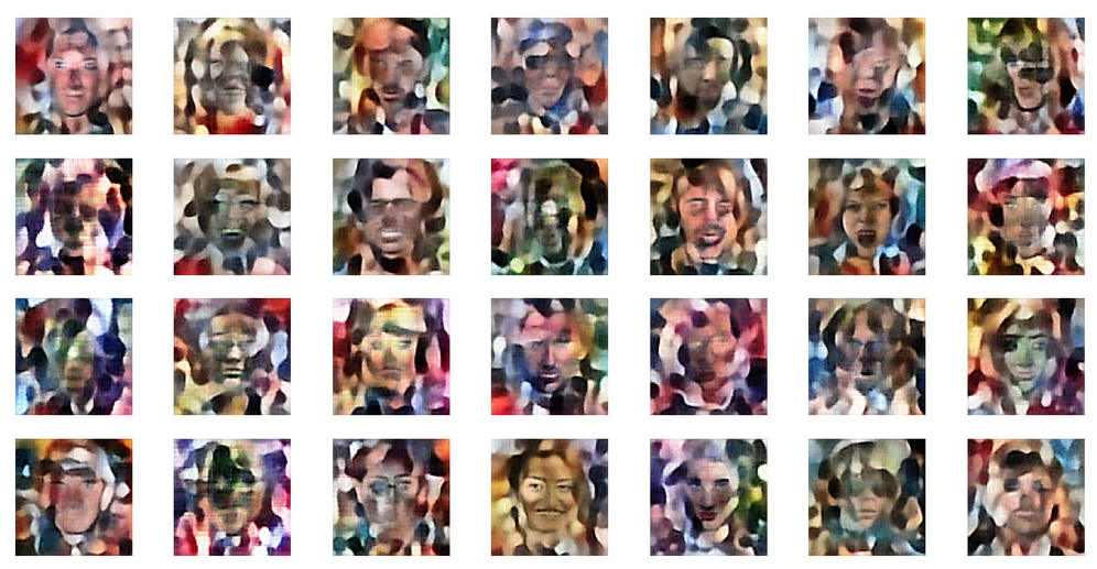
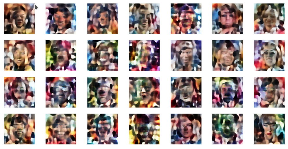
A last test to confirm that a VAE with a very small KL-loss operates as an comparable AE is a trial to create images with recognizable human faces from randomly chosen points in z-space. Such a trial should fail! I just show you three results – one for a normal distribution of the z-point components. And two for equidistant distribution of component values up to 3, 8 and 16:
z-point coordinates from normal distribution
z-point coordinates from equidistant distribution in [-2,2]
z-point coordinates from equidistant distribution in [-10,10]
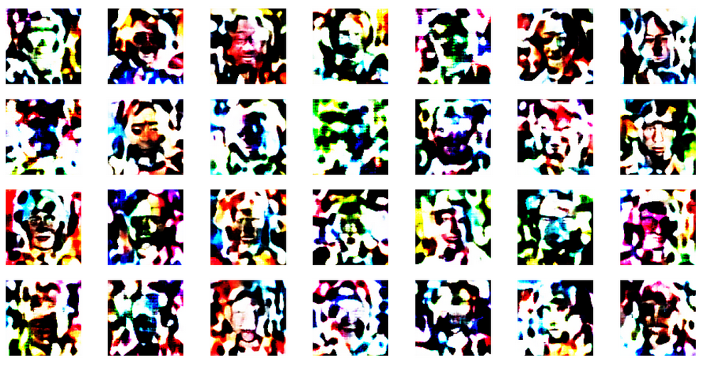
This reminds us very much about the behavior of an AE. See: Autoencoders, latent space and the curse of high dimensionality – I.
The z-point distribution in latent space of a VAE with a very small KL-loss obviously is as complicated as that of an AE. Neighboring points of a z-point which leads to a good image produce chaotic images. The transition path from good z-points to other meaningful z-points is confined to a very small filament-like volume.
Conclusion
A trained VAE with only a tiny KL-loss contribution will under normal circumstances behave similar to an AE with a the same hidden (convolutional) layers. It may, however, be necessary to limit the statistical variation of the epsilon factor in the z-point calculation based on mu– and logvar-values.
The similarity is based on very small logvar-values after training. The VAE creates a z-point distribution which shows the same dependency on the radius as an AE. We see similar indications and patterns of clustering. And the VAE fails to produce human faces from random z-points in the latent space – as a comparable AE.
We have found a plausible reason for this similarity by comparing the minimum of the loss hyperplane in the weight-loss parameter space with a corresponding minimum in the weight-loss space of the VAE – at a position with small weights for the connection to the logvar layers.
The z-point density distribution shows a maximum at a radius between 16 and 17. The z-point distribution basically has a Gaussian form. In the next post we shall look a bit closer at these findings – and their origin in Gaussian distributions along the coordinate axes of the latent space. After an application of a PCA analysis we shall furthermore see that the z-point distribution in an AE’s latent vector space is indeed fragmented and shows filaments on certain length scales. A VAE with a tiny KL-loss will show the same fragmentation.
In further forthcoming posts we shall afterward investigate the confining and at the same time blurring impact of the KL-loss on the latent space. Which will make it usable for creative purposes. But the next post
will first show you how to change model parameters at inference time.
And let us all who praise freedom not forget:
The worst fascist, war criminal and killer living today is the Putler. He must be isolated at all levels, be denazified and sooner than later be imprisoned. Long live a free and democratic Ukraine!