We proceed with our exercises on the moons dataset. This series of articles is intended for readers which – as me – are relatively new both to Python and Machine Learning. By working with examples we try to extend our knowledge about the tools “Juypter notebooks” and “Eclipse/PyDev” for setting up experiments which require plots for an interpretation.
We have so far used a Jupyter notebook to perform some initial experiments for creating and displaying a decision surface between the moons dataset clusters with an algorithm called “LinearSVC”. If you followed everything I described in the last articles
The moons dataset and decision surface graphics in a Jupyter environment – I
The moons dataset and decision surface graphics in a Jupyter environment – II – contourplots
The moons dataset and decision surface graphics in a Jupyter environment – III – Scatter-plots and LinearSVC
The moons dataset and decision surface graphics in a Jupyter environment – IV – plotting the decision surface
you may now have gathered around 20 different cells with code. Part of the cells’ code was used to learn some basics about contour and scatter plots. This code is now irrelevant for further experiments. Time to consolidate our plotting knowledge.
In the last article I promised to put plot-related code into a Python class. The class itself can become a part of a Python module – which we in turn can import into the code of Jupyter notebook. By doing this we can reduce the number of cells in a notebook drastically. The importing of external classes is thus helpful for concentrating on “real” data analysis experiments with different learning and predicting algorithms and/or a variation of their parameters.
I assume that you have some basic knowledge on how classes are build in Python. If not please see an introductory book on Python 3.
A class for plotting simple decision surfaces in a 2-dimensional space
In the articles
Eclipse, PyDev, virtualenv and graphical output of matplotlib on KDE – I
Eclipse, PyDev, virtualenv and graphical output of matplotlib on KDE – II
Eclipse, PyDev, virtualenv and graphical output of matplotlib on KDE – III
I had shown how to set up Eclipse PyDev to be used in the context of a Python virtual environment. In our special environment “ml1” used by our Jupyter notebook “moons1.ipynb” we have the following directory structure:
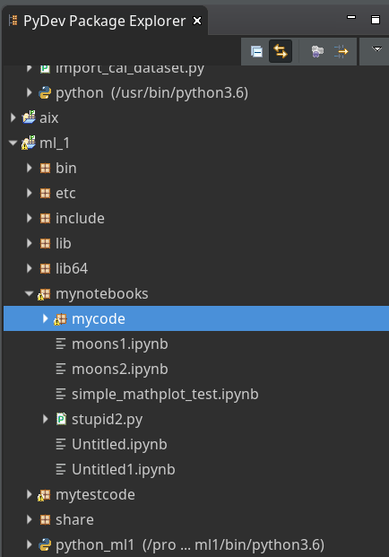
“ml1” has a sub-directory “mynotebooks” which contains notebook files as our “moons1.ipynb”. To provide a place for other general code there we open up a directory “mycode“. In it we create a file “myplots.py” for a module
“myplots“, which shall comprise our own Python classes for plotting.
We distribute the code discussed in the last 2 articles of this series into methods of a class “MyDecisionPlot“; we put the following code into our file “myplots.py” with the Pydev editor.
'''
Created on 15.07.2019
Module to gather classes for plotting
@author: rmo
'''
import numpy as np
import sys
from matplotlib import pyplot as plt
from matplotlib.colors import ListedColormap
import matplotlib.patches as mpat
#from matplotlib import ticker, cm
#from mpl_toolkits import mplot3d

class MyDecisionPlot():
    '''
    This class allows for
    1) decision surfaces in 2D (x1,x2) planes
    2) plotting scatter data of datapoints
    '''


    def __init__(self, X, y, predictor = None, ax_x_delta=1.0, ax_y_delta=1.0,
                 mesh_res=0.01, alpha=0.4, bcontour=1, bscatter=1,
                 figs_x1=12.0, figs_x2=8.0,
                 x1_lbl='x1', x2_lbl='x2',
                 legend_loc='upper right'
                 ):
        '''
        Constructor of MyDecisionPlot
        Input:
            X: Input array (2D) for learning- and predictor-algorithm as VSM
            y: result data for learning- and predictor-algorithm
            ax_x_delta, ax_y_delta : delta for extension of both axis beyond the given X, y-data
            mesh_res: resolution of the mesh spanned in the (x1,x2)-plane (x_max-x_min) * mesh_res
            alpha:  transparency  of contours
            bcontour: 0: Do not plot contour areas 1: plot contour areas
            bscatter: 0: Do not plot scatter points of the input data sample 1: Plot scatter plot of the input data sample
            figs_x1: plot size in x1 direction
            figs_x2: plot size in x2 direction
            x1_lbl, x2_lbl : axes lables
            legend_loc : position of a legend
        Ouptut:
            Internal: self._mesh_points (mesh points created)
            External: Plots - shoukd cone up automatically in Jupyter notebooks
        '''


        # initiate some internal variables
        self._x1_min = 0.0
        self._x1_max = 1.0
        self._x2_min = 0.0
        self._x2_max = 1.0

        # Alternatives to resize plots
        # 1: just resize figure  2: resize plus create subplots() [figure + axes]
        self._plot_resize_alternative = 2

        # X (x1,x2)-Input array
        self.__X = X
        self.__y = y
        self._Z  = None

        # predictor = algorithm to create y-values for new (x1,x2)-data points
        self._predictor = predictor

        # meshdata
        self._resolution = mesh_res   # resolution of the mesh
        self.__ax_x_delta = ax_x_delta
        self.__ax_y_delta = ax_y_delta
        self._alpha = alpha
        self._bscatter = bscatter
        self._bcontour = bcontour

        self._xm1 = None
        self._xm2 = None
        self._mesh_points = None

        # set marker array and define colormap
        self._markers = ('s', 'x', 'o', '^', 'v')
        self._colors = ('red', 'blue', 'lightgreen', 'gray', 'cyan')
        self._cmap = ListedColormap(self._colors[:len(np.unique(y))])

        self._x1_lbl = x1_lbl
        self._x2_lbl = x2_lbl
        self._legend_loc = legend_loc

        # Plot-sizing
        self._figs_x1 = figs_x1
        self._figs_x2 = figs_x2
        self._fig = None
        self._ax  = None
                # alternative 2 does resizing and (!) subplots()
        self.initiate_and_resize_plot(self._plot_resize_alternative)


r
        # create mesh in x1, x2 - direction with mesh_res resolution
        # meshpoint-array will be creted with right dimension for plotting data
        self.create_mesh()
        # Array meshpoints should exist now

        if(self._bcontour == 1):
            try:
                if self._predictor == None:
                    raise ValueError
            except ValueError:
                print ("You must provide an algorithm = 'predictor' as parameter")
                #sys.exit(0)
                sys.exit()

            self.make_contourplot()
        else:
            if (self._bscatter == 1):
                self.make_scatter_plot()


    # method to create a dense mesh in the (x1,x2)-plane
    def create_mesh(self):
        '''
        Method to create a dense mesh in an (x1,x2) plane
        Input: x1, x2-data are constructed from array self.__X
        Output: A suitable array of meshpoints is written to self._mesh_points()
        '''
        try:
            self._x1_min = self.__X[:, 0].min()
            self._x1_max = self.__X[:, 0].max()
        except ValueError: # as e:
            print ("cannot determine x1_min = X[:,0].min() or x1_max = X[:,0].max()")
        try:
            self._x2_min = self.__X[:, 1].min()
            self._x2_max = self.__X[:, 1].max()
        except ValueError: # as e:
            print ("cannot determine x2_min =X[:,1].min()) or x2_max = X[:,1].max()")

        self._x1_min, self._x1_max = self._x1_min - self.__ax_x_delta, self._x1_max + self.__ax_x_delta
        self._x2_min, self._x2_max = self._x2_min - self.__ax_x_delta, self._x2_max + self.__ax_x_delta

        #create mesh data (x1, x2)
        self._xm1, self._xm2 = np.meshgrid( np.arange(self._x1_min, self._x1_max, self._resolution),
                                            np.arange(self._x2_min, self._x2_max, self._resolution))

        #print (self._xm1)
        # for hasattr the variable cannot be provate !
        #print ("xm1 is there: ", hasattr(self,'_xm1' ) )

        # ordering and transposing of the mesh-matrix
        # for understanding the structure and transpose requirements see linux-blog.anracom.con
        self._mesh_points = np.array([self._xm1.ravel(), self._xm2.ravel()]).T

        try:
            if( hasattr(self, '_mesh_points') == False ):
                raise ValueError
        except ValueError:
            print("The required array mesh_points has not been created!")
            exit

    # -------------
    # Some helper functions to change valus on the fly if necessary

    def set_mesh_res(self, new_mesh_res):
        self._resolution = new_mesh_res

    def change_predictor(self, new_predictor):
        self._predictor = new_predictor

    def change_alpha(self, new_alpha):
        self._alpha = new_alpha

    def change_figs(self, new_figs_x1, new_figs_x2):
        self._figs_x1 = new_figs_x1
        self._figs_x2 = new_figs_x2


    # -------------
    # method to get subplots and resize the figure
    # -------------
    def initiate_and_resize_plot(self, alternative=2 ):

        # Alternative 1 to resize plots - works afte rimports to Jupyter notebooks, too
        if alternative == 1:
            self._fig_size = plt.rcParams["figure.figsize"]
            self._fig_size[0] = self._figs_x1
            self._fig_size[1] = self._figs_x2
            plt.rcParams["figure.figsize"] = self._fig_size

        # Not working for sizing if plain subplots() is used
        #plt.figure(figsize=(self._figs_x1 , self._figs_x2))
        #self._fig, self._ax = plt.subplots()
        # instead you have to
put the figsize-parameter into the subplots() function

        # Alternative 2 for resizing plots and using subplots()
        # we use this alternative as we may need the axes later for 3D plots
        if alternative == 2:
            self._fig, self._ax = plt.subplots(figsize=(self._figs_x1 , self._figs_x2))


    # ***********************************************

    # -------------
    # method to create contour plots
    # -------------
    def make_contourplot(self):
        '''
        Method to create a contourplot based on a dense mesh of points in an (x1,x2) plane
        and a predictor algorithm which allows for value calculations
        '''

        try:
            if( not hasattr(self, '_mesh_points') ):
                raise ValueError
        except ValueError:
            print("The required array mesh_points has not been created!")
            exit

        # Predict values for all meshpoints
        try:
            self._Z = self._predictor.predict(self._mesh_points)
        except AttributeError:
            print("method predictor.predict() does not exist")

        #reshape
        self._Z = self._Z.reshape(self._xm1.shape)
        #print (self._Z)

        # make the plot
        plt.contourf(self._xm1, self._xm2, self._Z, alpha=self._alpha, cmap=self._cmap)

        # create a scatter-plot of data sample as well
        if (self._bscatter == 1):
            self.make_scatter_plot()

        self.make_plot_legend()


    # -------------
    # method to create a scatter plot of the data sample
    # -------------
    def make_scatter_plot(self):
        alpha2 = self._alpha + 0.4
        if (alpha2 > 1.0 ):
            alpha2 = 1.0
        for idx, yv in enumerate(np.unique(self.__y)):
            plt.scatter(x=self.__X[self.__y==yv, 0], y=self.__X[self.__y==yv, 1],
                        alpha=alpha2, c=[self._cmap(idx)], marker=self._markers[idx], label=yv)

        if self._bscatter == 0:
            self._bscatter = 1

        self.make_plot_legend()


    # -------------
    # method to add a legend
    # -------------
    def make_plot_legend(self):
        plt.xlim(self._x1_min, self._x1_max)
        plt.ylim(self._x2_min, self._x2_max)
        plt.xlabel(self._x1_lbl)
        plt.ylabel(self._x2_lbl)

        # we have two cases
        #     a) for a scatter plot we have array values where the legend is taken from automatically
        #     b) For apure contourplot we need to prepare a legend with "patches" (kind og labels) used by pyplot.legend()
        if (self._bscatter == 1):
            plt.legend(loc=self._legend_loc)
        else:
            red_patch  = mpat.Patch(color='red',  label='0', alpha=0.4)
            blue_patch = mpat.Patch(color='blue', label='1', alpha=0.4)
            plt.legend(handles=[red_patch, blue_patch], loc=self._legend_loc)
This certainly is no masterpiece of superior code design; so you may change it. However, the code is good enough for our present purposes.
Note that we have to import basic Python modules into the namespace of this module. This is conventionally done at the top of the file.
Note also the 2 alternatives offered for resizing a plot! Both work also for “inline” plotting in a Jupyter environment; see the text below.
Using the module “myplots” in a Jupyter notebook
In a terminal we move to our example directory “/projekte/GIT/ai/ml1” and start our virtual Python environment:
myself@mytux: /projekte/GIT/ai/ml1> source bin/activate
(ml1) myself@mytux:/projekte/GIT/ai/ml1>
jupyter notebook
[I 11:46:14.687 NotebookApp] Writing notebook server cookie secret to /run/user/1999/jupyter/notebook_cookie_secret
[I 11:46:15.942 NotebookApp] Serving notebooks from local directory: /projekte/GIT/ai/ml1
[I 11:46:15.942 NotebookApp] The Jupyter Notebook is running at:
....
....
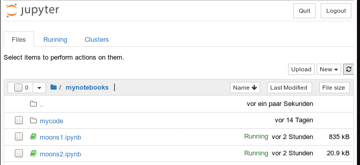
We then open our old notebook “moons1” and save it under the name “moons2”:
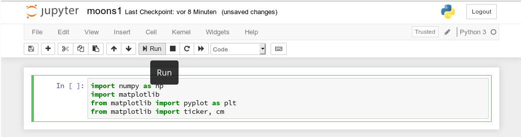
We delete all old cells. Then we change the first cell of our new notebook to the following contents:
import imp
%matplotlib inline
from mycode import myplots

from sklearn.datasets import make_moons
from sklearn.pipeline import Pipeline
from sklearn.preprocessing import StandardScaler
from sklearn.preprocessing import PolynomialFeatures
from sklearn.svm import LinearSVC
from sklearn.svm import SVC
You see that we imported the “myplots” module from the “package” directory “mycode”. The Jupyter notebook will find the path to “mycode” as long as we have opened the notebook on a higher directory level. Which we did … see above.
Note the statement with a so called “magic command” for our notebook:
%matplotlib inline
There are many other “magic commands” and parameters which you can study at
Ipython magic commands
The command “%matplotlib inline” informs the notebook to show plots created by any imported modules “inline”, i.e. in the visual context of the affected cell. This specific magic directive should be issued before matplotlib/pyplot is imported into any of the external python modules which we in turn import into the cell code.
A call of plt.show() in our class’s method “make_contourplot()” is no longer necessary afterwards.
If we, however, want to resize the plots in comparison to Jupyter standard values we have to control this by parameters of our plot class. Such parameters are offered already in the interface of the class; but they can be changed by a method “change_figs(new_figs_x1, new_figs_x2)), too.
In a second cell of our new notebook we now prepare the moon data set
X, y = make_moons(noise=0.1, random_state=5)
Further cells will be used for quick individual experiments with the moons dataset. E.g.:
imp.reload(myplots)
X, y = make_moons(noise=0.1, random_state=5)

# contour plot of the moons data - with scatter plot / training with LinearSVC
polynomial_degree = 3
max_iterations = 6000
polynomial_svm_clf = Pipeline([
  ("poly_features", PolynomialFeatures(degree=polynomial_degree)),
  ("scaler", StandardScaler()),
  ("svm_clf", LinearSVC(C=18, loss="hinge", max_iter=max_iterations))
])
#training
polynomial_svm_clf.fit(X, y)

#plotting
MyPlt = myplots.MyDecisionPlot(X, y, polynomial_svm_clf, bcontour = 1, bscatter=1 )
The last type of cell just handles the setup and training of our specific algorithm “LinearSVC” and delegates plotting to our class.
Testing the new notebook
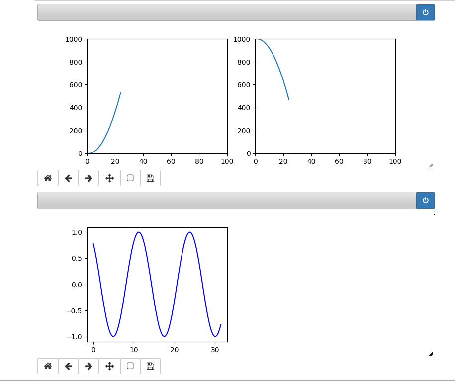
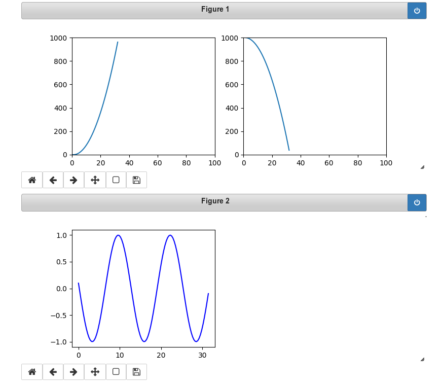
A test of the 3 cells in their order gives
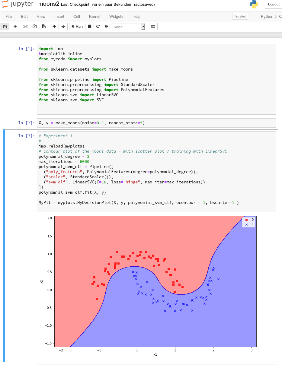
All well! This is exactly what we hoped to achieve.
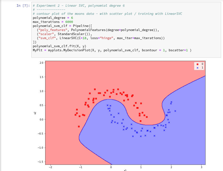
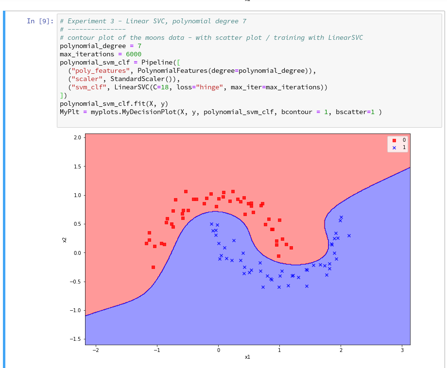
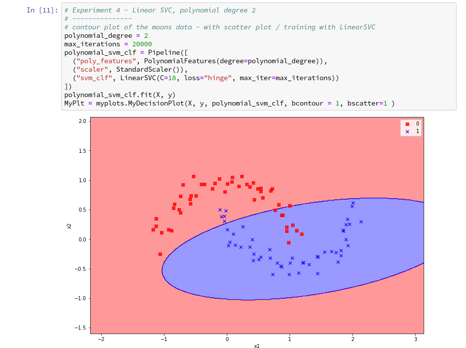
Three experiments with a varying polynomial degree
As we now have a simple and compact cell template for experiments we add three
further cells where we vary the degree of the polynomials for LinearSVC. Below we show the results for degree 6, 7 and for comparison also for a degree of 2.
On a modern computer it should take almost no time to produce the results. (We shall learn how to measure CPU-time in the next article).
We understand that we at least need a polynomial of degree 3 to separate the data reasonably. However, polynomials with an even degree (>= 4) separate the 2 data regions very differently compared to polynomials with an uneven degree (>=3) in outer areas of the (x1,x2)-plane (where no training data were placed):
Depending on the polynomial degree our Linear SVC algorithm obviously extrapolates in different ways to regions without such data. And we have no clue which of the polynomials is the better choice …
This poses a warning for the use of AI in general:
We should be extremely careful to trust predictions of any AI algorithm in parameter regions for which the algorithm must extrapolate – as long as we have no real data points available there to discriminate between multiple solutions that all work equally well in regions with given training data.
Would general modules be imported twice in a Jupyter cell – via the import of an external module, which itself includes import statements, and a direct import statement in a Jupyter cell?
The question posed in the headline is an interesting one for me as a Python beginner. Coming from other programming languages I get a bit nervous when I see the possibility for import statements referring to a specific module both in another already imported module and by a direct import statement afterwards in a Jupyter cell. E.g. we import numpy indirectly via our “myplots” module, but we could and sometimes must import it in addition directly in our Jupyter cell.
Note that we must make the general modules as numpy, matplotlib, etc. available in the namespace environment of our private module “myplots”. Otherwise the functions cannot be used there. The Jupyter cell, however, corresponds to an independent namespace environment. So, an import may indeed be required there, too, if we plan to handle numpy arrays via code in such a cell.
Reading a bit about the Python import logic on the Internet reveals that a double import or overwriting should not take place; instead an already imported piece of code only gets multiple references in the various specific namespaces of different code environments.
We can test this with the following code in a Jupyter cell:
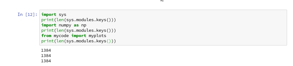
Note that numpy is also imported by our “myplots”. However, the length of the list produced by sys.modules.keys(), which enumerates all possible module reference points (including imports) does not change.
Reloading modules in Jupyter cells
What if we in the
course of or experiments need to change the code of our imported module? Then we need to reload the module in a Jupyter cell before we run it again. In our case (Python 3!) this can be done by the command
imp.reload(myplots)
As the code of our first cell reveals, the general package “imp” must have been imported before we can use its reload-function.
Conclusion
We saw that it is easy to use our own modules with Python class code, which we created in an Eclipse/PyDev environment, in a Jupyter notebook. We just use Python’s standard import mechanism in Jupyter cells to get access to our classes. We applied this to a module with a simple class for preparing decision surface plots based on contour and scatter plot routines of matplotlib. We imported the module in a new Jupyter notebook.
Plots created by our imported class-methods were displayed correctly within the cell environment as soon as we used the magic directive “%matplotlib inline” within our notebook.
In addition we used our new notebook with its compact cell structure for some quick experiments: We set different values for the polynomial degree parameter of our LinearSVC algorithm. We saw that the results of algorithms should be interpreted with caution if the predictions refer to data points in regions of the representation or feature space which were not at all covered by the data sets for training.
The prediction results (= extrapolations) of even one and the same algorithm with different parameters may deviate strongly in such regions – and we may not have any reliable indications to decide which of the predictions and their basic parameter setting are better.
In the next article of this series
The moons dataset and decision surface graphics in a Jupyter environment – VI – Kernel-based SVC algorithms
we shall have a look at what kind of decision surface some other SVM algorithms than LinearSVC create for the moons dataset. In addition shall briefly discuss kernel based algorithms.