Responsive fluid multi-column layouts – the DIV order problem – III

In the previous articles of this series

Responsive fluid multi-column layouts – the DIV order problem – I
Responsive fluid multi-column layouts – the DIV order problem – II

we discussed a problem that may arise when you want to make a fluid design responsive.

In order

  • to both use a fluid design with multiple content columns in horizontal direction and
  • and to control the vertical heights of optical background elements for the different columns

you need to encapsulate floated page elements in a container.

Such floated content elements could be a vertical navigation column, a main information block with text and a right column with teaser text elements. In your HTML code you would define and describe the tags of the floated container elements in just this natural sequence. The CSS properties of the containers require no special attention – everything is straightforward. However, the natural tag order may lead to conflicts when you want to reposition the column like page elements in a fluid and additionally responsive approach to our multi-column layout.

Typically, in a responsive approach you rearrange the content columns into a vertical order instead of the original horizontal sequence, because you want to make use of a maximum of the view port width for each of the information and navigation containers. For reasons of coding efficiency the vertical rearrangement of previously horizontally distributed containers should be achieved just by changing some CSS properties like “position”, “margin” or “float” when the view port gets smaller than some predefined values. Under normal circumstances you do NOT want to create major HTML block elements twice and switch them alternately on and off just to become responsive.

For getting the right vertical ordering effect you would e.g. make use of the automatic handling of floated elements by the browser for situations when the horizontal viewport space gets too small for displaying all floated elements in just one row. In such a situation, however, the last tag (of the sequence of floated elements) in the code represents the element which is moved downwards in the browser’s viewport first.

In the second article of this series we therefore discussed a special situation for which we required a specific vertical reordering of existing elements. We showed how we could re-nest and rearrange the DIV-container tags into the required code order – without changing the original optical and fluid layout. Of course we had to compensate by more complicated CSS definitions.

Among other things we used negative margin definitions to optically place floated elements where we needed them to be on the screen – despite an unusual tag position in the HTML code. With a bit of abstraction the discussed recipe will in general allow for any required tag order for the DIV-containers in the code. What we have achieved is that by using some compensating CSS tricks we can now choose a certain – unusual, but in a responsive context required – tag order in the HTML code without destroying the optical features and the fluidity of our multi-column page layout.

We have demonstrated how to handle a first responsive transition in viewport width by moving one of the columns downward and adapt our content areas in width – without loosing fluidity. In the last article we also discussed some additional, conventional measures to make the different content column blocks appear as separate optical elements floating above a common background (picture).

We have, however, not yet shown how to manage a second – and more
important – transition to a range of significant smaller view port widths. For small view port widths we would like to move our left sided vertical menu directly below the text area – an objective we had already defined in the first article and which will be met by the measures discussed in the present article.

We shall see in this article that our achievements now allow for almost trivial measures to gain the correct aspired responsiveness: You just need to change a few “float” and “margin” properties.

To make everything a bit more challenging we shall also show how one can add transparent background layers to each column of the original fluid layout and how we manage such transparency layers together with responsive width adaptions of the web page.

Extending the HTML code by tags for transparency layers

We firstly define DIV containers which serve us as transparent background stripes of all column elements of our fluid design. To be able to keep up the transparency during a later responsive element reordering we need to insert such background layer (DIV) elements

  • into the defined outmost container “div#outer_cont” and the additionally introduced internally nested container “div#main_cont”,
  • and as well as into each of the floated DIV-elements representing the text column blocks.

Due to some simple CSS rules already presented in the previous articles the absolutely positioned background layers will adapt automatically to the height of their encapsulating DIV containers (via “position: absolute; top:0; bottom:0;” settings).

The height of the encapsulating containers is in turn dynamically defined by the maximum height of their enclosed relatively positioned, but floated text containers – i.e. according to the available horizontal space, the text content length and the height of other enclosed inner elements.

The modified HTML code is here:

<!DOCTYPE html>
<html>
<head>
<meta charset="UTF-8">
<meta name="viewport" content="width=device-width, initial-scale=1">
<title>fluid standard 2</title>
<link href="css/fluid_standard2.css" rel="stylesheet">
</head>

<body>
<!-- 3 spalten layout -->
<div id="all">
	<div id="head">
		<div id="hmen_knapp_cont" class="hmen_knapp_cont">
			<a id="hmen_knapp"></a>
		</div>
		<div id="hmen_cont" class="hmen_cont">
			<ul>
				<li><div class="hmen_pkt">h-menu 1</div></li>
				<li><div class="hmen_pkt">h-menu 2</div></li>
				<li><div class="hmen_pkt">h-menu 3</div></li>
				<li><div class="hmen_pkt">h-menu 4</div></li>
				<li><div class="hmen_pkt">h-menu 5</div></li>
				<li><div class="hmen_pkt"><a id="but2" href="#"></a></div></li>
				<li class="floatstop"></li>
			</ul>
		</div>
	</div>
	
	<div id="outer_cont">
		<div id="bg_left0"></div>
		<div id="bg_right0">
			<!-- do not remove ! -->
			<div id="bg_right_inner0"></div>
		</div>
		<div id="bg_info0"></div>
		
		<div id="float_cont">
			<div id="main_cont">
				<div id="bg_left1"></div>
				<div id="bg_info1"></div>
				
				<div id="info_cont">
					<div id="float_info">
						<div id="bg_info2"></div>
						<div 
id="info"> 
							<p>Lorem ipsum .....</p>
							<p> </p>
							<p>Lorem ipsum ....</p>
							<p> </p>
							<p>This is the end, my friend<br> </p>
						</div>
					</div>
					<div id="left_nav">
						<div id="bg_left2"></div>
						<div id="left_inner">
							<ul>
								<li><p><a href="#">sub menu point 1</a></p></li>
								<li><p><a href="#">sub menu point 2</a></p></li>
								<li><p><a href="#">sub menu point 3</a></p></li>
							</ul>
						</div>
					</div>
					<p class="floatstop"> </p>
				</div>
			</div>
			
			<div id="right">
				<div id="bg_right2"></div>
				<div id="right_inner">
					<p>Some stupid text - just to show something</p>
					<p> </p>
					<p>Some stupid text - just to show something</p>
					<p>Some stupid text - just to show something</p>
				</div>
			</div> 
			
			<p class="floatstop"> </p>

		</div>
	</div>
</div>
</body>
</html>

 
Note: If you want to test our example in some smartphone do not forget a reasonable meta-tag like

<meta name=”viewport” content=”width=device-width, initial-scale=1″>

to the header of the HTML file. You may adapt the metatag given in the above code to your needs. For more information see e.g.:
https://css-tricks.com/snippets/html/responsive-meta-tag/

The reader may have noticed that we have changed some element names in comparison to the HTML code discussed in the last article – but this not be a big obstacle as we kept up the basic tag nesting structure.

The multiple defined internal background layers (bg_left0, bg_left1, bg_left2, bg_info0, bg_info1, bg_info2, bg_right0, bg_right2) MUST be switched/on off at certain width values for the viewport. See below.

Extending the CSS definitions to cover a second transition of the view port width – and transparency effects

We need to adapt the CSS definitions to handle the transparency layers properly – for all view port width transitions. In the 1st article we had defined 3 ranges of view port widths – therefore we have to cover 2 transitions. In the last article we have shown the definitions for the first transition from Range III to Range II.

In addition, we now need to take care of a second width transition from Range II to Range I. At this second transition we want to move the left sided menu area downwards – right below the main text area and on top of the originally right column area (see the 2nd article). All 3 text areas ( i.e. our original columns) shall use all the width of the view port – we only leave small border areas transparent.

You find the necessary, adapted CSS definitions here:

@CHARSET "UTF-8";

html {
	font-size:10px;
}

body {
	margin-left:0; 
	margin-right:0;
	margin-top: 0; 
	background-image: url(../image/hg_straa_mp.jpg);
	background-repeat:no-repeat; 
	background-position:top center;
}

p { 
	font-size: 1.6rem; 
	line-height: 1.4;
	margin: 0;
}
	

div#all { 
	position:relative; 
	width:100%; 
	padding-bottom: 1.0rem;
	padding-top: 1.0rem;

}

/* The header region */	

div#head { 
	position:relative; 
	width:100%; 
	min-
height: 3.0rem;
}

/* The main contents container */
/* *************************** */
	
div#outer_cont { 
	position:relative; 
	width:100%; 
	min-height: 10.0rem;
	margin-top:1.0rem;
}
	

/* some elementary width definitions */
/* --------------------------------  */
div#left_nav, 
div#bg_left0, 
div#bg_left1  {
	width: 14rem;
}

div#left_nav {
	margin-left: 1.0rem;
	
}

div#right,
div#bg_right0 {
	width: 27%;
}


/* background elements for all columns in range I */

div#bg_left0, 
div#bg_left1,
div#bg_left2,
div#bg_right0,
div#bg_right_inner0,
div#bg_right2,
div#bg_info0,
div#bg_info1,
div#bg_info2  {
	position: absolute;
	top:0;
	bottom:0;
	border-radius: 0.8rem;
}

div#bg_left0 {
	left:1.0rem;
	background-color: #FFF;
	opacity: 0.5;
	border: 0px solid #F00;
	z-index:1;
}

div#bg_info0 {
	position: absolute;
	left:16.0rem;
	right:27%; 
	background-color: #FFF;
	opacity: 0.85;
	border: 0px solid #00F;
	z-index:1;
}

div#bg_right0 {
	right: 0;
	border: 0px solid #F00;
	z-index:1;
}

div#bg_right_inner0 {
	left: 1.0rem;
	right: 1.0rem;
	background-color: #FEEEBB;
	opacity:0.80;
}


/* The float container and its basic elements */	
/* ****************************************** */

div#float_cont { 
	position:relative; 
	width: 100%; 
	border: 0px solid #FF0000;
	z-index:5;
}

/* floated left main container and 
 * its background elements for range II*/

div#main_cont { 
	position: relative;
	float: left; 
	width:100%;
	min-height: 2.0rem;
	border: 0px solid #009900;
	z-index:1;
}


div#bg_left1 {
	display: none;     
	left:1.0rem;
	background-color: #FFF;
	opacity: 0.75;
	border: 0px solid #F00;
	z-index:1;
}

div#bg_info1 {
	display: none; 
	left:16.0rem;
	right:1.0rem; 
	background-color: #FFF;
	opacity: 0.9;
	border: 0px solid #00F;
	z-index:1;
}


/* The main column */
/* --------------- */


div#info_cont {
	position: relative; 
	width:100%; 
	border:0px #F00 solid;
}

div#float_info { 
	position:relative; 
	float:left;
	width: 100%; 
	/*background-color: #99e;*/ 
	border: 0px solid #FF0000;
	z-index:2;
}


div#info { 
	position: relative; 
	margin: 0 27% 0 16rem;
	width:auto;
	/*background-color: #0f0;*/ 
	padding:0.8rem;
	/*height:200px;*/
	z-index: 1;
}

div#bg_info2 {
	display: none; 
	left:1.0rem;
	right:1.0rem; 
	background-color: #FFB;
	background-color: #FFF;
	opacity: 0.95;
	border: 0px solid #00F;
	z-index:1;
}


/* left column */
/* ----------- */

div#left_nav { 
	position:relative; 
	float:left;
	border: 0px solid #009900;
	margin-left: -100%;
	padding-left: 1.0rem;
	z-index:5;
}

div#left_inner {
	position: relative; 
	width:auto;
	padding: 0.8rem;
	z-index: 2; 
}

div#bg_left2 {
	display: none;     
	left:1.0rem;
	right:1.0rem; 
	border: 0px solid #F00;
	background-color: #FFF;
	opacity: 0.9;
	z-index:1; 
}


/* right column */
/* ------------ */

div#right { 
	float:left;
	position:relative; 
	margin-left: -27%;
	min-height: 2.0rem;
	/*min-width: 15.2rem;*/ 
	/*background-color: #eee;*/ 
	border: 0px solid #009900;
	z-index:2;
}

div#right_inner {
	position:relative;
	width:auto;
	margin-left: 1.0rem;
	margin-right: 1.0rem;
	padding: 0.8rem;
	z-index: 2;
}

div#bg_right2 {
	display: none;     
	left:1.0rem;
	right:1.0rem; 
	border: 0px solid #F00;
	background-color: #FEEEBB;
	opacity: 0.85;
	z-index:1; 
}


/* Support elements */ 	

p.floatstop {
	clear:both;
	height:0;
	margin:
0;
	line-height:0;
	padding: 0;
	font-size: 0;
}


/* contents of the upper horizontal menu */

div.hmen_cont {
	display: block; 
	position: relative;
	min-height: 3.0rem;
	width: auto;
	margin-right:0.8rem;
	margin-left:0.8rem;
	background-color: #EEE;
	border-radius: 1.0rem;
}

div.hmen_cont ul {
	position: relative;
	list-style-type: none;
	width: 100%;
	margin: 0;
	padding: 0;
}

div.hmen_cont ul li {
	float: left;
	padding: 0.2rem 4.0rem 0.2rem 4.0rem;
	/*border-left: #ffffff 1px solid;*/
	border-right: #a90000 0.2rem solid;
	min-height: 2.0rem;
	font-size: 1.6rem;
}
	
div.hmen_cont ul li.floatstop {
	float:none;
	clear:both;
	min-height: 0;
	margin:0;
	line-height:0;
	padding: 0;
	font-size: 0;
}

div#hmen_knapp_cont {
	display: none;
	position: absolute;
	right:0;
	top:10px;
	width: 50%;
	height: 2.4rem;
	border: 1px #A90000 solid;
}

a#hmen_knapp {
	display: block;
	width: 100%;
	height: 100%;
	background-color: #009999;		
}

a#but2 {
	display: block;
	width: 1.8rem;
	height: 1.8rem;
	background-color: #A90000;
	border-top: 0.2rem #CCC solid; 
	border-right: 0.2rem #CCC solid; 
	border-left: 0.2rem #AAA solid; 
	border-bottom: 0.2rem #AAA solid; 
}


/* contents of the left vertical menu */

#left_inner ul {
	width:100%;
	min-height: 2.2rem;
	list-style-type: none;
	padding: 0;
	margin: 0;
}

#left_inner ul li {
	width:100%; 
}

#left_inner ul li a, 
#left_inner ul li a:visited {
	color: #990000;
	
}
#left_inner ul li a:hover {
	color: #FFF;     
}
    
    
/* ---------------------------------------------- */    
    

/* @media screen decision and settings for range II */

@media screen and (min-width : 540px) and (max-width :828px) {
    
	div#info { 
		margin: 0 2.0rem 0 16rem;
		background-color:transparent;
	}
   
	div#right { 
		float:left;
		margin-top:1.0rem;
		margin-left: 0;
		margin-right: 0; 
		width:100%;
	 }
    
	div#right_inner {
		margin-left: 1.0rem; 
		margin-right: 1.0rem;
		width: auto; 
		/* background-color: #FEEEBB; */
		border-radius: 0.8rem;
	}
    
	/*
	 * Switch OFF backgrounds after 1st viewport width transition 
	 */
	div#bg_left0 {
		display: none;  
	}
	div#bg_info0 {
		display:none;  
	}
	div#bg_right0 {
		display: none; 
	}
    
    
	 /*
	  * Switch ON backgrounds after first viewport width transition 
	 */
	 
	 div#bg_left1 { 
		display: block; 
	 } 
	   
	 div#bg_info1 { 
		display: block; 
	 }
	 div#bg_right2 { 
		display: block; 
		opacity: 0.9;
	 }

}


/* ---------------------------------------------- */    
    

/* @media screen decision and settings for range I */


@media screen and (max-width : 539px)  {
    
	
	div#info { 
		margin: 0 1.0rem 0 1.0rem;
		/* background-color: #FFB; */
		border-radius: 0.8rem;
	}
	
	
	div#left_nav { 
		margin-top:1.0rem;
		margin-left: 0;
		width:100%;
		padding:0;
	}
	  
	div#left_inner {
		width:auto;
		padding: 0.8rem;
		margin: 0 1.0rem 0 1.0rem;
		/*  background-color: #DDDDDD; */
		border-radius: 0.8rem;
		z-index: 2; 
	}
	
	div#right { 
		float:left;
		margin-top:1.0rem;
		margin-left: 0;
		margin-right: 0; 
		width:100%;
	 }
	
	div#right_inner {
		margin-left: 1.0rem; 
		margin-right: 1.0rem;
		width: auto; 
		/* background-color: #FEEEBB;*/
		border-radius: 0.8rem;
	}


	/*
	 * Switch OFF backgrounds after 2nd viewport width transition 
	 */
	
	div#bg_info0 { 
		display: none; 
	 }
	div#bg_info1 { 
		display: none; 
	 }
	 
	div#bg_right0 {
		display: 
none;  
	}
	 
	div#bg_left0 {
		display: none; 
	}
	div#bg_left1 { 
		display: none; 
	}   
	
	/*
	 * Switch ON backgrounds after 2nd viewport width transition 
	*/
	div#bg_info2 { 
		display: block; 
		opacity: 0.95; 
	}
	div#bg_left2 { 
		display: block; 
		opacity: 0.95; 
	}   
	div#bg_right2 { 
		display: block; 
		opacity:0.9; 
	}

}    


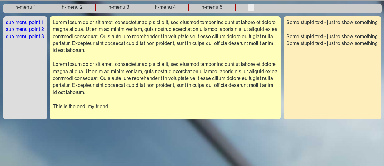
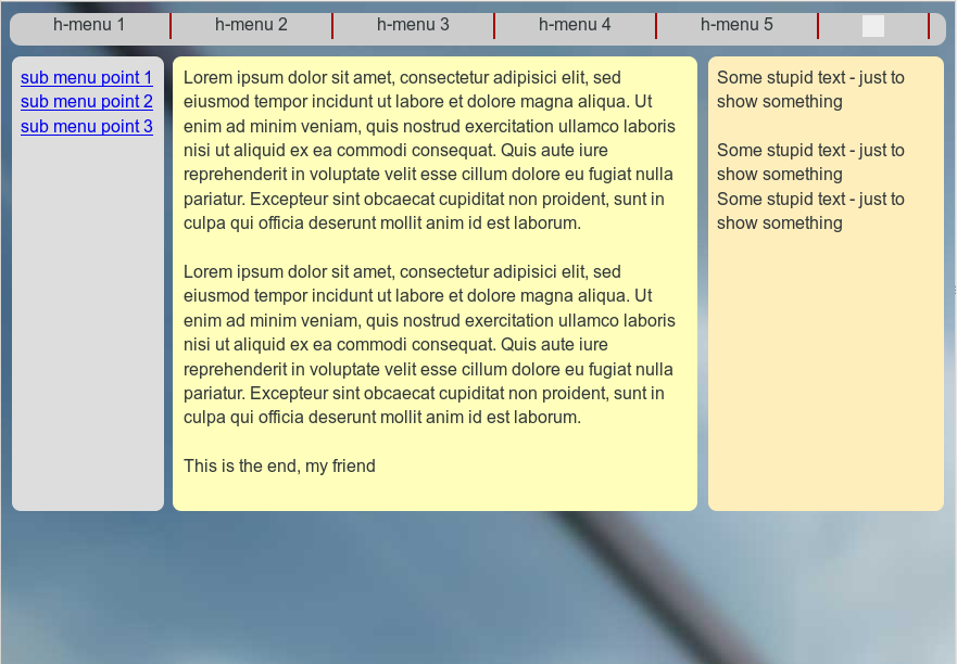
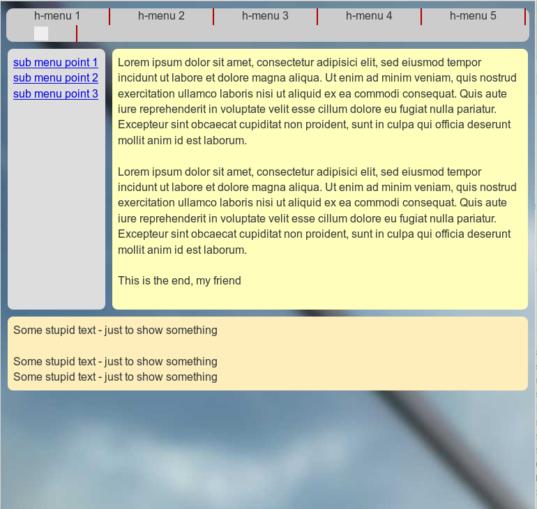
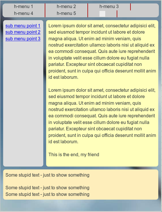
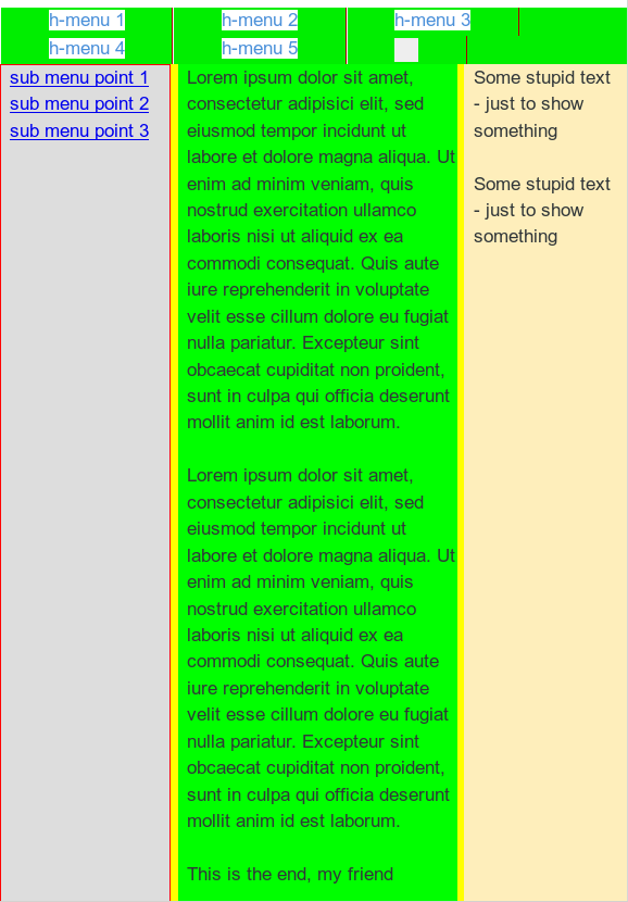
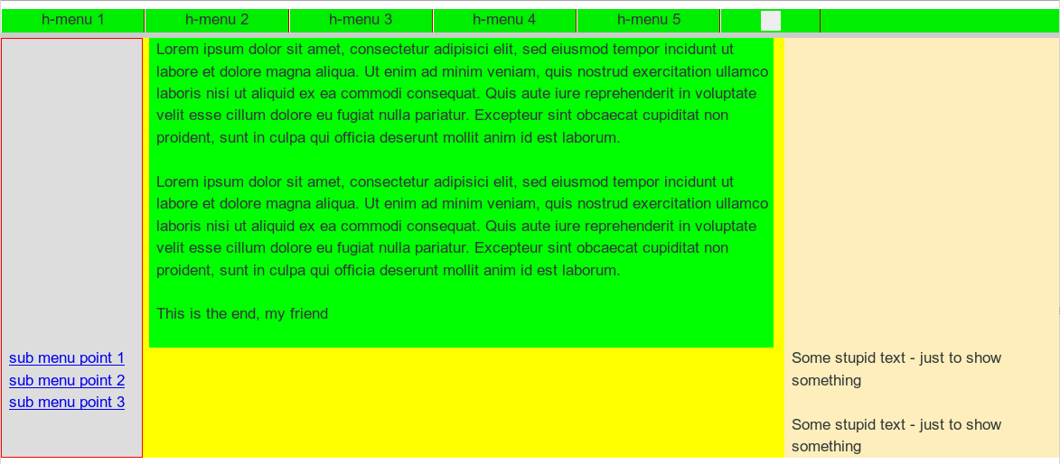
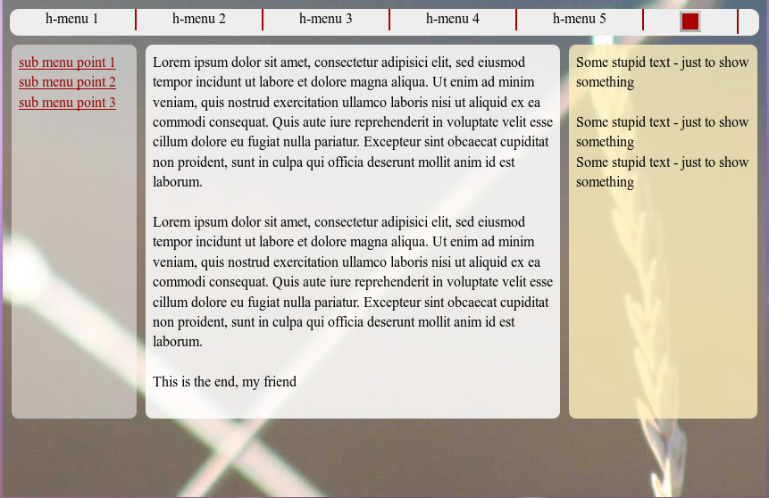
Before we discuss some details let us look at the visual results:

Range III: Starting point
responsive1

Range III: Fluidity when reducing viewport width
responsive3

Range II: Move the rightmost column to the bottom
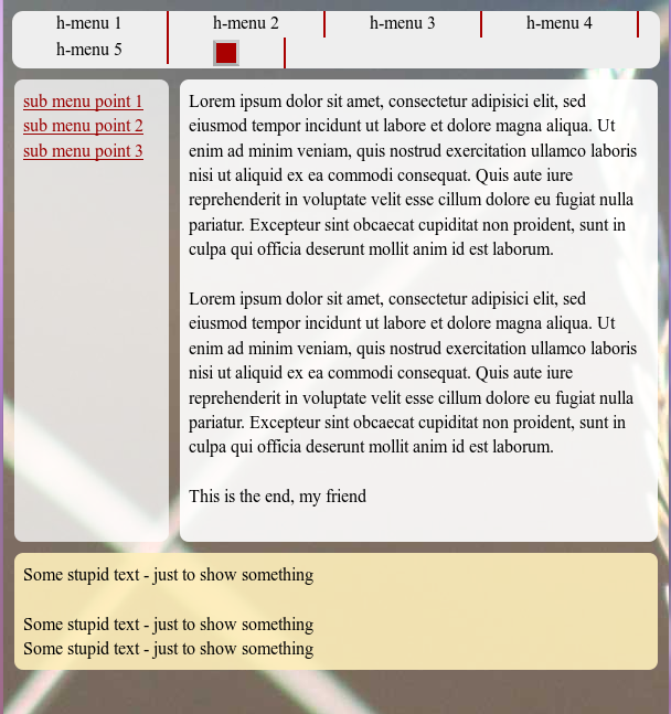
responsive4

Range I: Move the leftmost column right below the text box and over the initially right column
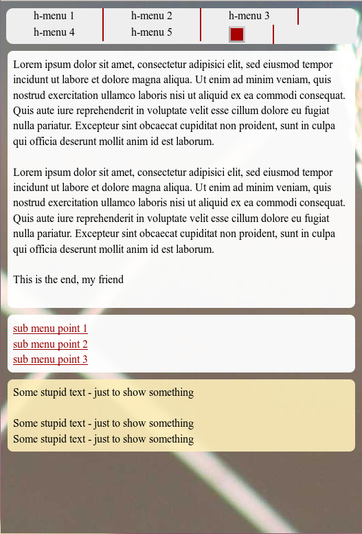
responsive5

A closer look may reveal that we changed the transparency a bit during the transitions between the viewport width ranges.

Some CSS hints

We switch some of the transparency layers off and on during the range transitions by using the “display” property. This is somewhat saver than just changing the visibility.

As soon as a major content element is moved downwards during a responsive action we switch off the corresponding background element in its encapsulating container. Instead, we switch on the respective background layer in that container which becomes relevant for the correct height of the background layer after the vertical repositioning.

Thus, in Range III bg_left0, bg_info0, bg_right0 are the active background layers. In Range II, however, we use
bg_left1, bg_info1 and bg_right2. In Range I we activate the innermost layers bg_left2, bg_info2, bg_right2.

The height of these absolutely positioned background containers layers is defined by the height of their outer encapsulating container. The height of the latter is defined by the highest of its inner relatively positioned content containers. This type of indirect height control of absolutely positioned layers via relatively positioned boxes on the same code level inside one and the same encapsulating container is basic CSS2.

The transition between Range II and Range I is done by mainly 2 adaptions in the section

@media screen and (max-width : 539px) {}

of the CSS code:

  • We adapt the margins of “div#info” to a full extension over the viewport width -i.e by setting both “margin-left” and “margin-right” to small values. ( Small values to keep some optical distance of the contents to the viewport edges …). This change of margins is already enough to vertically reposition “div#left_nav” if we at the same time change the property “left-margin” of “div#left_nav” (from -100%) to zero.
  • n

  • We set the width of “div#left_nav” to 100%.

Pretty simple, isn’t it?

All the rest is cosmetics. Note, that the opacity values are adapted during the transitions, too. Such an adaption may be helpful if elements of the background image started to disturb the readability of your text during the repositioning of the web page’s text containers.

What if we had wanted to move the left sided navigation column above the main text box in Range I?

This is a relevant question. But after what we have learned so far the answer is extremely trivial. So, I leave this up to the reader.

Addendum 25.08.2015:
As I got a question regarding this point I give a hint. The most simple solution builds on the following steps: Change the tag order of the floated “div#left_nav” and “div#float_info” in the HTML code. Adapt the margins of div#left_nav (no loner a negative margin-left, but a negative margin-right!). Change widths and margins – also margin-top – at the responsive transition as required.

Note that turning “div#float_info” a right floated div would not help much. The tag that is the last one in the code for floated elements of a container represents the first element which is moved downwards by the browser as soon as the widths of the floated elements collide. By performing such an experiment we would again see that the div-order in the code is of major importance. However, we are now able to adapt such an order quickly to our requirements regarding the final responsive outcome.

What about “inline-block” instead of floated elements?

Also a good point. With inline block elements [CSS property “display:inline-block;”] we can indeed replace floated elements in their containers. However, the tag order plays the same role for the behavior of inline-block elements as for floated elements when the space for a horizontal presentation becomes insufficient. The last tags are moved downwards. So we would have to work with the same type of tricks as discussed in this and the last article.

What is still missing?

Although we have harvested

  • control over the DIV order in the code required for an easily manageable responsiveness,
  • control over responsive adaptions of the position and width of content containers and their transparent background layers

there are of course still things to improve. E.g.:

  • The upper horizontal main menu could be collapsed to a button with a switch ON/OFF functionality on the upmost area of the web page.
  • The vertical navigation sub-menu could also be collapsed to a kind of button available on the left side of the viewport.

A full “Switch ON/OFF” functionality for such menu button requires Javascript. However, there is a well defined – though limited – solution also for users which have Javascript deactivated. These new objectives will be topics of forthcoming articles.

In the next article of this series

Responsive fluid multi-column layouts – with a responsive horizontal menu – IV

we shall describe a handling of the horizontal main menu line at small viewport widths – without involving Javascript.

Responsive fluid multi-column layouts – the DIV order problem – II

In the last article of this series

Responsive fluid multi-column layouts – the DIV order problem – I

I discussed a standard 3 column fluid design. HTML and CSS codes for a simple example were presented. Our solution depended on a certain order of DIV tags in the HTML code. The tag of the DIV container for the main content “div#main_content” got the last tag position and the CSS property “position:relative;” inside our outer container “div#float_cont”, where the container for 2 of the visible outer left and right “columns” were floated. By setting proper margins for the main content container we gained fluidity and at the same time automatic control over the apparent visual heights of all containers.

In this second article we make a first step towards a responsive design. We assume that the reader is already familiar with the definitions of the major DIV elements of our example page. As in the first article we shall identify the DIVs by their CSS ID representation.

We shall need to overcome some obstacles whilst getting responsive. Because this is a Linux blog we do not care if older and not W3C compliant MS IE browsers can reproduce our suggested CSS recipes for a solution. Code examples given below were tested with Firefox for Linux.

Responsiveness based on viewport width intervals

To start with responsiveness we first define some view port width intervals, for which we want to rearrange major (HTML) elements of our test page. We choose the width intervals a bit arbitrarily below. You may adapt them for your needs:

  • Range III: width range beyond 800px and larger
  • Range II: width range between 540px and 800px
  • Range I: width range below 540px

What are our objectives for the page layout in these ranges?

I shall set up some requirements and conditions for which the DIV order problem gets obvious. What I want to show is that when you deal with responsiveness you may have to align your initial standard HTML/CSS layout with what you want to achieve in view port ranges below certain width thresholds. Some people claim that one should always start designing for the narrow view port situation. My point of view is that with fluid layouts you need to consider both ends of your ranges right from the beginning.

Objectives for Range III:

In range III we just use our (or an improved) initial fluid design.

Objectives for Range II:

In range II the left column shall remain where it is. However, we remove the information in the right column to get more space for the main contents. Instead of omitting “div#right” completely we want to move it to the bottom of the page – and change its width at the same time to 100%. The optical and real height of “div#right” shall be determined by its contents. The “div#main_cont”, however, should keep its position, but use all the space being available at the right of the left column to the right edge of the view port. At the same time “div#main_cont” shall determine the optical (not necessarily the css) height of its own and the left column – if it is the longest. Otherwise the contents of the left column shall determine the height of the upper part on the page.

Objectives for Range I:

We set up an even more complicated scenario for range I:
The “div#main_cont” originally positioned in
the middle shall become dominant now and take the whole width offered. In addition we want to move the left side menu (div#left_nav”) from its original position. To make things tricky we want it to move to the bottom of the expanded DIV container “div#main_cont)” and give it a 100% width, too – so that if someone read and scrolled to the bottom of the “div#main_cont” he would see the available link options. The originally right column “div#right” shall move further down below the repositioned “div#left_nav”.

In addition we want to stop a further shrinking of the displayed main DIV container by a minimum width of 200px.

Later on

  • we shall in addition take care of a better treatment of the horizontal menu placed at the top of our test page in range I
  • and offer additional options to deal with the side menu originally placed left with vertical orientation.

Additional assumptions and requirements:

To make things really difficult, we want to achieve the transitions between Range III and Range II as well as between Range II and Range I without changing the HTML code defined for Range III. In addition we want to avoid Javascript/jQuery involvement to change the node order in the HTML tree during transitions. The reordering of the DIV containers defined above shall be achieved by CSS measures only.

Objective of this article – let us cover range II

We take these challenges step by step. For this article our goal is to cover Range II correctly – we do not care about Range I, yet. Already this limited objective will require some fundamental changes of our initial HTML code for Range III – and some interesting CSS tricks. But it will result in a solution which can also be used for Range I later on.

The order of the DIV tags prevents the repositioning of the DIV containers

We shall of course try to add some width dependent statements to our CSS file:

@media only screen and (min-width: 540px) and (max-width: 800px) { … }

But, what CSS directives could help us to move the container “div#right” to the bottom, i.e. below “div#main_cont” – without loosing our design achievements described in the last article? The frustrating result of many trials and errors was:

Given our assumptions above: none, actually. At least I was too stupid to find a reasonable solution.

You may play around a bit yourself. Even if you introduced some additional (floated) helper DIVs which would only be displayed in range II: Whatever you do to move the “div#right” – some of our requirements would be broken and/or the flow of the text in “div#main_cont” would be affected.

The first ugly thing is the following:
If we floated all major elements of the “div#float_cont” container “left” or “right” the final visible vertical order would not be correct. “div#main_cont” comes at the bottom of the original HTML code – so it moves to the bottom – whatever else happens. The same thing would happen if you turned off floating completely and used only relative positioning. You do not get the final order right.

So, what if we moved “div#main_cont” in our original HTML code and floated it instead of working with margins? Well, you cannot just float “div#main_cont” after (!) “div#left_nav” and keep up the adaptivity to any further width reduction of the viewport. This is mainly due to the fact that our left column container shall keep up a fixed width! You could solve
the adaptivity by changing “div#main_cont” to “position:absolute;” (and use “left:16rem; right:0;”) but then again you would loose any height control for “div#float_cont” and its external DIV containers. A loss of height control would also happen if you changed “div#info” to “position:absolute;” or if you floated it.

Now, you may think about additional floated helper DIVs which you switched on in the background of “div#main_cont” only after you passed a width threshold. But such a background floated DIV would have an impact onto any text written in “div#main_cont” ! Now, you could solve this by moving the text to an absolutely positioned inner container – and again loose height control. And so on, and so on …

What do we need?

From all my own experiments I could conclude 2 things which one needs to meet the adaptivity scenarios posed above:

  1. You need the HTML tag of “div#main_cont” as the first one inside the “div#float_cont” tag – more precise: before the other floated DIVs, which define the other columns.
  2. You sooner or later need “div#main_cont” to float itself.

However, as we have already seen at the end of our last article: Just moving the “div#main_cont” tag to the top and keeping up “position:relative;” will not work. However, if we floated it we would loose width adaptivity and/or would not get “div#left_cont” at the correct position with a fixed width. Is the last statement really true?

Negative margins to the rescue

We need to dig a bit deeper in our box of dirty CSS tricks. Let us assume that “div#main_cont” really were the first element of “div#float_cont”:

<div id="outer_cont">
	<div id="nav_left_bg"></div>
	<div id="right_bg"></div>
	<div id="info_bg"></div>
	<div id="float_cont">
		<div id="main_cont">
			<div id="info"> ... </div>
		</div>
		<div id="left_nav">
			<div id="left_inner"> ... </div>
		</div> 
		<div id="right">
			<div id="right_inner"> ... </div>
		</div> 
		<p class="floatstop"> </p>
	</div>
</div>

And let us further assume that we really floated “div#main_cont”. How could we regain width adaptivity and our text of “div#info” at the right position? Actually, this is pretty easy:

div#main_cont {
	position: relative; 	
	float: left;
	margin: 0; 
	width:100%;  /*adaptivity to the port view width!*/
}
div#info {
	/* height control: the contents defines the height of all parents */ 
	position: relative; 
	margin: 0 27% 0 16rem;
	padding: 0 0.8rem 0 0.8rem;
}

Note the “width:100%;” definition! It guarantees width adaptivity despite floating! To reserve enough pace at the left and right side of the main contents, we just use the same margin trick for “div#info” inside its container which we previously used for “div#main_cont” itself. Nice!

But, how do we get “div#left_nav” to its left position, now? We could use “position:absolute;” for this element. But, by doing this, we could no longer control container heights in case that the left column due to more contents ever became the longest of all columns. However, if we floated “div#left_nav”, it would move it downwards because “div#main_cont” already consumes all of the view port’s width.

Wait a second: What if we used negative margins? This could lead to a solution, because successive float elements can move across and over each other.
So, lets try it:

div#left_nav { 
	position:relative; 
	float:left;
	width: 14.2rem;
	margin-left: -100%;
}
div#right { 
	position:relative; 
	float:left;
	margin-left: -26%;
	width: 26%;
}

Some experiments with your browser would prove that this really works! After corresponding changes to the HTML and CSS codes we find that we more or less have come back to our original fluid scenario – but now the initial order of the HTML tags has changed fundamentally. Everything is floated – but by applying some tricky margins to our central containers we achieved the requested fluid layout again. How can we make use of the new tag order and the floating in range II ?

Elementary settings for range II

As soon as we reach the view port width threshold for range II, only some minor CSS changes are required for our new basic HTML/CSS layout:

@media only screen and (min-width: 540px) and (max-width: 800px) {
	div#right {
        	margin-left: 0;
		margin-top:1.0rem;
		width:100%;
		background-color: #FEEEBB;
	}
	div#info { 
		margin: 0 0 0 16rem;
	}
	div#right_bg {
		visibility: hidden; 
	}
	div#info_bg {
		right:0;
	}
}

This is pretty cool, isn’t it? We use our 100%-width of “div#main_cont”, change only one “left-margin” statement – and we have moved the “div#right” down. In addition we change the “right-margin” of “div#info” to use the total (adaptive!) width to the right for our main text information. The rest of the CSS changes just repairs some small gaps in the “optical appearance”:

fluid4

How to improve the optical appearance in Range III and Range II substantially?

As a developer, I thought I had achieved something and deserved a beer. However, I met strong criticism from my wife, who cares much more for optical design aspects than me. She pretty soon detected a major drawback of my HTML/CSS design:

The repositioned “div_right” still extends the height of the container “div#float_cont”. Thus, the heights of our colored background stripes “nav_left_bg”, “info_bg” and “right_bg” get bigger, too. The horizontally enlarged and moved “div_right” just overlaps and hides the background stripes.

Note, that we defined a “margin-top:10px;” for the repositioned “div#right;” in the CSS code above. Nevertheless, you see that our background stripes stretch down without any visible gap. As a result, I was confronted with a new requirement:

New additional requirement

What if you wanted to decouple the repositioned “div#right” from the 2 floated DIV containers above throughout Range II – in a clear optical way by a vertical gap – and also in the sense of HTML? And provide a region or stripe of transparency in between – i.e. in the gap opened by the margin-top definition)? Transparency, to allow the user e.g. to look at a background image of the whole page?

This requirement gave me some headache. But I understood the related objective very well. Web pages with seemingly floating areas (with rounded corners) above background images do look fancy, true enough. The eventual solution required additional changes to our initial HTML setup. I had to implement a kind of repetition of our new basic approach in a more convoluted way. Decoupling inevitably leads to more
containers …

Before looking at the code, let us first have a look at the result. As a starting point the new page appearance within Range III:

fluid5

A comparison with the next picture provides an impression of “width fluidity” in Range III:

fluid6

Now, let us have a look at the transition to Range II:

fluid7

And the width fluidity again:

fluid8

Even my wife accepted this – though, of course, she did not like the chosen background colors and the spacing of my test example. But related changes are within the reach of her work domain, now.

The new HTML code

Here are the resulting HTML and CSS codes for our test example. In comparison to our first article the statements may look a bit more complex. But, we only apply already discussed recipes at additional nested tag levels:

New HTML code:

<!DOCTYPE html>
<html>
<head>
<meta charset="UTF-8">
<title>fluid standard 2</title>
<link href="css/fluid_standard2.css" rel="stylesheet">
</head>

<body>
<!-- 3 spalten layout -->
<div id="all">
	<div id="head">
		<div id="hmen_knapp_cont" class="hmen_knapp_cont">
			<a id="hmen_knapp"></a>
		</div>
		<div id="hmen_cont" class="hmen_cont">
			<ul>
				<li><div class="hmen_pkt">h-menu 1</div></li>
				<li><div class="hmen_pkt">h-menu 2</div></li>
				<li><div class="hmen_pkt">h-menu 3</div></li>
				<li><div class="hmen_pkt">h-menu 4</div></li>
				<li><div class="hmen_pkt">h-menu 5</div></li>
				<li><div class="hmen_pkt"><a id="but2" href="#"></a></div></li>
				<li class="floatstop"></li>
			</ul>
		</div>
	</div>
	
	<div id="outer_cont">
		<div id="nav_left_bg"></div>
		<div id="right_bg">
			<!-- do not remove ! -->
			<div id="right_inner_bg"></div>
		</div>
		<div id="info_bg"></div>
		
		<div id="float_cont">
			<div id="main_cont">
				<div id="bg_left"></div>
				<div id="bg_info"></div>
				
				<div id="info_cont">
					<div id="float_info">
						<div id="info"> 
							<p>Lorem ipsum dolor .... </p>
							<p> </p>
							<p>Lorem ipsum dolor .... </p>
							<p> </p>
							<p>This is the end, my friend<br> </
p>
						</div>
					</div>
					<div id="left_nav">
						<div id="left_inner">
							<p><a href="#">sub menu point 1</a></p>
							<p><a href="#">sub menu point 2</a></p>
							<p><a href="#">sub menu point 3</a></p>
						</div>
					</div>
					<p class="floatstop"> </p>
				</div>
			</div>
			
			<div id="right">
				<div id="right_inner">
					<p>Some stupid text - just to show something</p>
					<p> </p>
					<p>Some stupid text - just to show something</p>
					<p>Some stupid text - just to show something</p>
				</div>
			</div> 
			
			<p class="floatstop"> </p>

		</div>
	</div>
</div>
</body>
</html>


You see that I took the decoupling of the left navigation area and the main contents container from the “div#right” container seriously. Actually, we reproduced the very same solution found above – but now inside an additional container “div#info_cont”, which itself resides inside the now floated container “div#main_cont”. Note, that by applying “position: relative;” for the container “div#info_cont” we can keep up full height control. Of course, in addition the floating inside the new additional float container “div#info_cont” has to be stopped to guarantee the dynamical propagation of height information to the outer enclosing DIVs.

As you can see, we placed some new and additional (colored) background DIVs inside the (now floated) “div#main_cont”. But throughout Range III we keep these elements hidden! However, in Range II we hide the original background stripes and activate the new ones instead.

The positioning of the container “div#right” works exactly as before – as log as we arrange for proper margins of “div#info”. To get a really nice padding of the background stripes in both ranges and to keep a constant distance of the contents of “div#right” to the contents of “div#info”, we need to include some more internal DIV containers – “div#right_inner_bg”, “div#left_inner”, “div#right_inner”. They provide some required “optical cosmetics”.

The new CSS code

The required new CSS statements for our example are the following:

   
@CHARSET "UTF-8";

html {
	font-size:10px;
}

body {
    margin-left:0; 
    margin-right:0;
    margin-top: 0; 
    background-image: url(../image/hg_drm_ap_7_1.jpg);
    background-repeat:no-repeat; 
    background-position:top center;
}

p { 
	font-size: 1.6rem; 
	line-height: 1.4;
	margin: 0;
}
	

div#all { 
	position:relative; 
	width:100%; 
	padding-bottom: 1.0rem;
	padding-top: 1.0rem;

}

/* The header region */	

div#head { 
	position:relative; 
	width:100%; 
	min-height: 3.0rem;
}

/* The main contents container */
	
div#outer_cont { 
	position:relative; 
	width:100%; 
	min-height: 10.0rem;
	margin-top:1.0rem;
}
	

/* some elementary width definitions */

div#left_nav,
div#nav_left_bg,
div#bg_left {
    width: 14rem;
    margin-left: 1.0rem;
}

div#right,
div#right_bg {
    width: 27%;
}


/* background elements for all columns in range I */

div#nav_left_bg, 
div#right_bg,
div#info_bg,
div#bg_left,
div#bg_info,
div#right_inner_bg {
    position: absolute;
    top:0;
    bottom:0;
    border-radius: 0.8rem;
}

div#nav_left_bg {
    position: absolute;
    left:0;
    
background-color: #DDD;
    border: 0px solid #F00;
    z-index:1;

}

div#info_bg {
    position: absolute;
    left:15.8rem;
    right:27%; 
    background-color: #FFB;
    border: 0px solid #00F;
    z-index:1;
}

div#right_bg {
    right: 0;
    border: 0px solid #F00;
    z-index:1;

}

div#right_inner_bg {
    left: 1.0rem;
    right: 1.0rem;
    background-color: #FEEEBB;
}


/* The float container and its basic elements */	

div#float_cont { 
    position:relative; 
    width: 100%; 
    border: 0px solid #FF0000;
    z-index:5;
}

/* floated left main container and 
 * its background elements for range II*/

div#main_cont { 
    position: relative;
    float: left; 
    width:100%;
    min-height: 2.0rem;
    border: 0px solid #009900;
    z-index:2;
}


div#bg_left {
    visibility: hidden; 
    position: absolute;
    left:0;
    background-color: #DDD;
    border: 0px solid #F00;
    z-index:1;

}

div#bg_info {
    visibility: hidden; 
    left:16.0rem;
    right:27%; 
    background-color: #FFB;
    border: 0px solid #00F;
    z-index:1;
}


/* The main column */

div#info_cont {
    position: relative; 
    width:100%; 
    border:0px #F00 solid;
}

div#float_info { 
    position:relative; 
    float:left;
    width: 100%; 
    border: 0px solid #FF0000;
    z-index:2;
}

div#info { 
    position: relative; 
    margin: 0 27% 0 16rem;
    width:auto;
    padding:0.8rem;
    min-height:2.0rem;
    z-index: 1;
}


/* right column */

div#right { 
    position:relative; 
    float:left;
    margin-left: -27%;
    min-height:2.0rem;
    border: 0px solid #009900;
    z-index:2;
}

div#right_inner {
    position:relative;
    width:auto;
    margin-left: 1.0rem;
    margin-right: 1.0rem;
    padding: 0.8rem;
}


/* left column */

div#left_nav { 
    position:relative; 
    float:left;
    border: 0px solid #009900;
    margin-left: -100%;
    padding-left: 1.0rem;
    z-index:5;
}

div#left_inner {
    width:auto;
    padding: 0.8rem;
}


/* Support elements */ 	

p.floatstop {
	clear:both;
	height:0;
	margin:0;
	line-height:0;
	padding: 0;
	font-size: 0;
}


/* contents of the upper horizontal menu */

div.hmen_cont {
	display: block; 
	position: relative;
	min-height: 3.0rem;
	width: auto;
	margin-right:0.8rem;
	margin-left:0.8rem;
	background-color: #ccc;
	border-radius: 1.0rem;
}

div.hmen_cont ul {
	position: relative;
	list-style-type: none;
	width: 100%;
	margin: 0;
	padding: 0;
}

div.hmen_cont ul li {
	float: left;
	padding: 0.2rem 4.0rem 0.2rem 4.0rem;
	border-right: #a90000 0.2rem solid;
	min-height: 2.0rem;
	font-size: 1.6rem;
}
	
div.hmen_cont ul li.floatstop {
	float:none;
	clear:both;
	min-height:0;
	margin:0;
	line-height:0;
	padding: 0;
	font-size: 0;
}

div#hmen_knapp_cont {
	display: none;
	position: absolute;
	right:0;
	top:10px;
	width: 50%;
	height: 2.4rem;
	border: 1px #A90000 solid;
}

a#hmen_knapp {
	display: block;
	width: 100%;
	height: 100%;
	background-color: #009999;		
}

a#but2 {
	display: block;
	width: 2.0rem;
	height: 2.0rem;
	background-color: #EEE;
}


/* @media screen decision and settings for range II */

@media screen and (min-width : 540px) and (max-width :800px) {
    
    div#info { 
        margin: 0 1.0rem 0 16rem;
        background-color:transparent;
    
    }
   
    div#right { 
        position:relative; 
        float:left;
        margin-top:1.0rem;
        margin-left: 0;
        margin-
right: 0; 
        width:100%;
     }
    
    div#right_inner {
        margin-left: 1.0rem; 
        margin-right: 1.0rem;
        width: auto; 
        background-color: #FEEEBB;
        border-radius: 0.8rem;
    }
    
    
    div#right_bg {
        visibility: hidden; 
    }

    div#info_bg {
        right:0;
    }

    div#nav_left_bg {
        visibility: hidden; 
    }

    div#info_bg {
        visibility: hidden; 
    }
    
    div#bg_left { 
        visibility: visible;
    } 
  
    div#bg_info { 
        visibility: visible;
        right: 1.0rem;
    }
}

 
Of course, you should replace the background image by your own.

Whilst studying the CSS statements, you may find that we extended the width of the right column to 27% of the view port width (instead of 26% before). Thus, physically “div#right” now connects directly to “div#info” at its left side. We did this to build up a seemingly constant (and not percentage dependent) visual distance between the middle and the right container contents. This may sound contradictory at first – but by using the additional inner DIV containers mentioned above and by applying proper margin/padding definitions we do achieve this objective.

At the bottom of the CSS file you find the necessary “@media screen” decisions and settings for range II. Because we set the negative left margin for “div#right” to zero this container moves down. The display of its contents requires some cosmetics; but the related CSS statements are very elementary.

One of the more interesting tricks is that we obviously hide the original (absolutely positioned and colored) background stripe containers and activate the new inner colored background stripe containers instead as soon as we perform the transition to Range II. This allows for a transparent gap between the visible upper part and the lower part of the web page in Range II – without loosing any height control for the visual columns in the upper part.

What have we achieved for our view port Ranges III and II?

Actually, all we wanted. We keep up optical height control where necessary in Range III and II. The CSS height of each of the container DIVs which represent the columns is completely determined by its contents (which we could change at any time, e.g. by a CMS). The longest of the three columns stirs the apparent visual height of all three columns in Range III.

In Range II we detach “div#right” and move it to the bottom of the page. Although we now create a gap between “div#right” and the upper part of the web page, full height control remains in place both for the floating 2 upper DIVs containers and their enclosing containers.

Fluidity is completely fulfilled in accordance with our objectives both for Range III and Range II.

The transition between Range III and Range II requires only some minor and obvious CSS changes. We did not have to change the HTML code at all during transition. We did not involve any Javascript so far.

Enough for today. We have not done anything, yet, to cover the objectives for Range I. I shall describe some appropriate measures in the next article:

Responsive fluid multi-column layouts – the DIV order problem – III

A good question the reader may consider in the meantime is:
What needs to be changed if we wanted to move the third column of Range III upwards instead of downwards during the transition to Range II?

Responsive fluid multi-column layouts – the DIV order problem – I

My wife works on a web project in Norway. As it is typical these days, functionality gets more weight than design when displaying web pages on mobile devices. Especially after Google’s decisions to explicitly require responsiveness. [Which was in my opinion mostly driven by their own interests to promote Android driven devices and their own development tools. And then maybe by general market and selling requirements. But this is a different story… ]

IT and communication in Norway is all about smart phones and tablets. So, of course, our Norwegian customer wanted to get some “responsive design”. OK … Although not really interested, I do take some challenges when my wife asks me for assistance …

As I am getting pretty IT-conservative with growing age my starting point with “responsiveness” was a fluid layout combined with “@media screen” CSS decisions – and a reluctance to use Javascript [JS] and jQuery. (This reluctance, of course, reflects the nagging question: What do we do when a customer has deactivated JS?)

My opinion was: In a certain range of browser window width – or more generally viewport width – the fluidity of the web design should predominantly govern the responsive reaction to a width change or a small target screen. I regard such a careful JS-free approach to responsive web design as reasonable – it helps already with different browser sizes on standard desktop screens – completely independent of mobile devices.

More extreme measures as removing visible parts of the layout or rearranging the positions, sizes and vertical order of whole HTML DIV container blocks would in this approach only be involved below certain viewport width thresholds via “@media” decisions. All in all, no big deal, I thought …. (In the first articles of this series we do not look at more detailed things as image resizing or font size adaptions).

What I underestimated is the fact that “old fashioned” fluid layouts may require a certain HTML tag order when we define its multiple columns”. However, in a responsive design approach you may eventually stumble across situations where the natural DIV element order you are used to is NOT suitable below some viewport width limits – i.e. when you want to rearrange the position and size of these DIV containers in a certain way. It took me some time to realize that there was a kind of contradiction between fluidity and responsiveness.

At this point I felt tempted again to use jQuery to freely rearrange the order of nodes of container DIVs in the HTML node tree or to use CSS flex boxes. However, flexboxes are not really standardized yet – and once you start with jQuery and responsiveness you must take care to align your Javascript conditions with the CSS @media decisions in a precise and non contradictory way. In addition I thought it better to understand JS free options and possibilities first before implementing some parametrizable JS machinery.

Whilst experimenting I all the time had the feeling that with some dirty CSS trick one should be able to gain control over the DIV element order – without destroying the optical appearance – and become able to adapt it to any predefined responsive reordering requirements for small viewport widths. I needed some hours to figure out how I could overcome at least some of the problems. I had some fun with this and maybe others find tweaking CSS interesting, too.

In this first article of a series I like to describe a standard flexible 3 column fluid layout and the CSS directives behind it. In a second article I shall add some elementary responsiveness and deduct the problem of the DIV order. Then I shall describe some CSS “trick” which will enable us to (manually) change or adapt the required DIV order in the HTML code without loosing fluidity and without loosing the optical appearance of the inital horizontal sequence of our columns. This will help us to achieve the pursued responsive and
vertical container rearrangement with a few very simple CSS changes below some width threshold of the viewport.

In other words: Our first objective is find CSS manipulations which enable us to code any required DIV order for the column grid in HTML such

  • that we optically do not change the column order or layout,
  • that we do not disturb the ability of our 3 column layout to adapt optically to the height of its largest (= highest) column,
  • that we can produce any predefined vertical content order of the column contents during a responsive reaction to view port width changes
  • and that we at the same time can realize responsiveness easily by basically changing some float or position statements in @media screen based decisions in our CSS file.

Note that the second point may impose additional difficulties!

Note further that even if we fulfilled our list of objectives we still would have to plan ahead our HTML code and its DIV order for the specific responsive layout we want to achieve. But being able to choose the required DIV order for our HTML code would already gives us the chance to create templates for different responsive reactions required by customers. In combination e.g. with PHP such templates would give us the freedom to switch any horizontal column order into any desired vertical order during responsive reactions – without involving JS.

Nevertheless, later in this series I want to show how we can use Javascript/jQuery to enforce a predefined responsive vertical order of the column contents from a basic 3-column layout we develop in the next two articles. But, at least I myself need some learning curve to get there.

We shall concentrate our efforts on a fluid 3-column layout.

Study example: A fluid/fixed layout with 3 columns

Below, we construct a simple example of a 3 column layout, where you arrange

  • a kind of navigation column on the left web page side,
  • a main contents area in the middle
  • and some column like area, e.g. for teaser elements, on the right page side.

Your fluidity objectives for a certain range of viewport widths would e.g. be

  • that the left column keeps up a fixed width,
  • whereas the middle main column changes its width adaptively with the viewport width
  • and that the right column adapts its width to a defined percentage of the viewport width.

Thus we have defined a combination of fixed/fluid elements which provides a good insight into the basic CSS techniques. Generalizations will be obvious. You require of course that the width adaption happens automatically whilst resizing the viewport width in the given range. All this should be governed by CSS statements, only. Imagine now, that you want to tweak things a bit further in the form that the longest of the three defined “columns” determines the height of the whole page and the apparent “visible” height of the other (not so high) columns, too. Above a responsiveness width threshold at least.

Typically, the main content column may become largest in size (height), whereas e.g. the left column may contain only some few menu points. Nevertheless, you want to create an appearance as if all 3 columns got the same height as the largest one with respect to height – and this should work automatically even if you changed the text and image contents of the content column significantly (e.g. via an CMS). This means that in case you add many lines of new text to the middle column the whole page and its right and left areas should somehow
optically adapt in height.
And: Everything should work analogously in case either the left or right column becomes the largest in height on some pages.

There is of course a simple, “conservative” CSS solution for this problem which I shall discuss a bit below. However, the requirement of fluidity in width in combination with the requirement of extending the web pages height automatically will unavoidably lead to a certain order of the HTML DIV containers.

Some details of our conventional fluid approach

The HTML file is pretty simple:

<!DOCTYPE html>
<html>
<head>
<meta charset="UTF-8">
<title>fluid standard</title>
<link href="css/fluid_standard.css" rel="stylesheet">
</head>

<body>
<!-- 3 spalten layout -->
<div id="all">
	<div id="head">
		<div id="hmen_knapp_cont" class="hmen_knapp_cont">
			<a id="hmen_knapp"></a>
		</div>
		<div id="hmen_cont" class="hmen_cont">
			<ul>
				<li><div class="hmen_pkt">h-menu 1</div></li>
				<li><div class="hmen_pkt">h-menu 2</div></li>
				<li><div class="hmen_pkt">h-menu 3</div></li>
				<li><div class="hmen_pkt">h-menu 4</div></li>
				<li><div class="hmen_pkt">h-menu 5</div></li>
				<li><div class="hmen_pkt"><a id="but2" href="#"></a></div></li>
				<li class="floatstop"></li>
			</ul>
		</div>
	</div>
	
	<div id="outer_cont">
		<div id="nav_left_bg"></div>
		<div id="right_bg"></div>
		<div id="info_bg"></div>
		
		<div id="float_cont">
			<div id="left_nav">
				<p><a href="#">sub menu point 1</a></p>
				<p><a href="#">sub menu point 2</a></p>
				<p><a href="#">sub menu point 3</a></p>
			</div> 
			<div id="right">
				<div id="right_inner">
					<p>Some stupid text - just to show something</p>
					<p> </p>
					<p>Some stupid text - just to show something</p>
				</div>
			</div> 
			<div id="main_cont">
				<div id="info"> 
					<p>Lorem ipsum .... </p>
					<p> </p>
					<p>Lorem ipsum ....</p>
					<p> </p>
					<p>This is the end, my friend<br> </p>
				</div>
			</div>
			<p class="floatstop"> </p>
		</div>
	</div>
</div>
</body>
</html>

The central DIV that shall contain most of the information of our web page is “div#info”. Why we have placed it inside an extra container “div#main_cont” may become clear in the next article. In the pure fluid approach it would not really have been necessary. You clearly detect the “left” sided DIV for e.g. a column with navigation points and the “right” sided DIV, which may contain something else. Note that there are “background” DIVs (with an ID like “…_bg”) that provide the impression of colored columns with exactly the length of the “outer_cont” DIV.

To understand the fluid behavior let us have a look at the CSS :

@CHARSET "UTF-8";

html {
	font-size:10px;
}

body {
    margin-left:0; 
    margin-right:0;
}

p { 
	font-size: 1.6rem; 
	line-height: 1.4;
	margin: 0;

}

div#all { 
	position:relative; 
	width:100%; 
	background-color: #000; 
}

/* The header region */	

div#head { 
	position:relative; 
	width:100%; 
	background-color: #FF0; 
	min-height: 3.0rem;
}

/* The main contents container */
	
div#outer_cont { 
	position:relative; 
	width:100%; 
	background-color: #FF0; 
	min-height: 10.0rem;
}
	
/* background elements for all columns */

div#left_nav,
div#nav_left_bg {
    width: 14.2rem;
}

div#right,
div#right_bg {
    width: 26%;
}

div#nav_left_bg, 
div#right_bg,
div#info_bg {
    top:0;
    bottom:0;
}

div#nav_left_bg {
    position: absolute;
    left:0;
    background-color: #DDD;
    z-index:1;
    border: 1px solid #F00;
}

div#right_bg {
    position: absolute;
    right: 0;
    background-color: #FEEEBB;
    z-index:1;
    border: 0px solid #F00;
}

	
/* The float container and its basic elements */	

div#float_cont { 
	position:relative; 
	width: 100%; 
	/*background-color: #99e;*/ 
	border: 0px solid #FF0000;
	z-index:5;
}


/* left column */

div#left_nav { 
    position:relative; 
    float:left;
    border: 0px solid #009900;
    padding-left:8px;
    /*margin-left: -320px;*/
    z-index:2;
}

/* middle column */

div#main_cont { 
	position: relative;
	margin: 0 27% 0 15rem;
	/*width:74%;*/
	/*min-width: 462px;*/
	/*background-color: #fff;*/ 
	border: 0px solid #009900;
	z-index:2;
}

div#info { 
	position: relative; 
	/*margin: 0 2px 0 160px;*/  
	width:auto;
	background-color: #0f0; 
	padding-left:8px;
	/*height:200px;*/
}

/* right column */

div#right { 
	position:relative; 
	float:right;
	/*min-width: 15.2rem;*/ 
	width: 26%;
	/*background-color: #00f;*/ 
	border: 0px solid #009900;
}

div#right_inner {
    width:auto;
    padding: 0 0.8rem 0 0.8rem;
}


/* Other elements */ 	

p.floatstop {
	clear:both;
	height:0;
	margin:0;
	line-height:0;
	padding: 0;
	font-size: 0;
}

/* contents of the upper horozontal menu */
div.hmen_cont {
	display: block; 
	position: relative;
	min-height: 3.0rem;
	width: 100%;
	background-color: #ccc;
}

div.hmen_cont ul {
	position: relative;
	list-style-type: none;
	width: 100%;
	margin: 0;
	padding: 0;
	background-color: #00EE00;
}

div.hmen_cont ul li {
	float: left;
	padding: 2px 40px 2px 40px;
	border-left: #ffffff 1px solid;
	border-right: #a90000 1px solid;
	min-height: 2.0rem;
	font-size: 1.6rem;
}
	
div.hmen_cont ul li.floatstop {
	float:none;
	clear:both;
	min-height:0;
	margin:0;
	line-height:0;
	padding: 0;
	font-size: 0;
}

div#hmen_knapp_cont {
	display: none;
	position: absolute;
	right:0;
	top:10px;
	width: 50%;
	height: 2.4rem;
	border: 1px #A90000 solid;
}

a#hmen_knapp {
	display: block;
	width: 100%;
	height: 100%;
	background-color: #009999;		
}

a#but2 {
	display: block;
	width:20px;
	height: 20px;
	background-color: #eee;
}

Note that all of the DIVs

  • div#all,
  • div#outer_cont,
  • div#float_cont,
  • div#main_cont,
  • div#info

got a “position: relative;”, but none got any defined height. Actually, as we stop the floating at the end of “div#float_cont” via an artificial p-element, the “div#float_cont” container responds dynamically to the maximum height of one of its inner floated elements or relatively positioned elements and imposes its own height on the surrounding DIV container “div#outer_cont”. The resulting height of this container can be used to indirectly define the height of absolutely positioned background
DIV elements which “simulate” a colored virtual height of all columns – at least as long as we do not rearrange DIV containers due to responsiveness.

Whereas the width adaptivity of the right column is understandable from its CSS width statement, the adaptivity of the “div#main_cont” results from its relative positioning with left and right margins on top of the vertical level which is automatically defined by the floated elements inside the “div#float_cont”. The margins guarantee that we leave enough space on the left and right side not to cover the floated columns contents there.

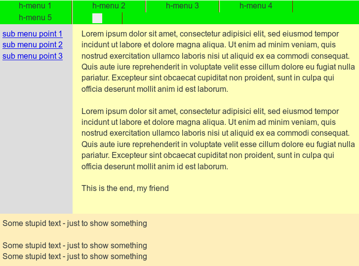
This fluid design is quite adaptive already – see the following images taken with Firefox.

fluid1

and

fluid2

But, of course, the column adaptivity will not be of much use on small smart phone displays: First there comes an end to shrinking as soon as some words get too large to fit into their column width. And on a smart phone we would appreciate very much to use all of the available width for the text in the main column. We shall look at related measures in the next article.

For now, I want you to realize that the above fluid design relies totally on the order of the DIVs inside the “div#float_cont”. See, what happens, if we changed the order of the DIVs to

<div id="float_cont">
	<div id="main_cont"> ... </div>
	<div id="left_nav">..</div>
	<div id="right"> ... </div>
	<p class="floatstop"> </p>
</div>

fluid3

Then the first DIV spans a region with height that defines the position of the layer for the floated elements – namely below the “div#main_cont”. So our nice fluid design would be doomed to fail in case we needed some other DIV order.

Outlook on forthcoming posts

In the next post

Responsive fluid multi-column layouts – the DIV order problem – II

we introduce some elementary responsiveness and discuss, why the defined DIV order in the HTML code may conflict with a responsive rearrangement. We shall present a responsive solution where some few CSS tricks allow us to (manually) change the DIV order in the HTML code in whatever required way to maintain an easy realization of responsiveness. See also

Responsive fluid multi-column layouts – the DIV order problem – III

for a full discussion.

In the articles
Responsive fluid multi-column layouts – with a responsive horizontal menu – IV
and
Responsive fluid multi-column layouts – with a responsive horizontal menu – V
we discuss menu adaptions without and with Javascript.

Our final objective is to use JS to switch the DIV tag order in the HTML node tree for
a basic 3 column layout in accordance with the required DIV order for a defined responsiveness – in a parametrized way.