In den Beiträgen “Opensuse 12 LDAP I” bis “LDAP III” hatte ich zwei Systeme mit Opensuse 12.1 als Betriebssystem betrachtet:
Ein System “vms2” wurde als LDAP-Server vorgesehen. Ein weiteres, unabhängiges System “vms1” im Netzwerk fungierte als typischer Arbeitsplatzrechner oder weiterer Server, auf dem unsere Opensuse-Endanwender sich einloggen und arbeiten sollen. Gewöhnliche unpriviligierte Useraccounts von “vms1” sollen nicht lokal hinterlegt, sondern auf dem LDAP-Server mit Hilfe von YaST2 verwaltet werden.
Anhand dieser zwei Beispielsysteme hatten wir bereits folgende Punkte diskutiert:
- Einrichtung eines LDAP-Servers auf einem Opensuse 12.1 System – hier auf “vms2”
- Vorbereitung des LDAP-Servers “vms2” auf TLS-gesicherte Verbindungen von externen ( – aber auch von internen) LDAP-Clients.
- Konfiguration wichtiger LDAP-Clients – nämlich PAM, NSSWITCH und LDAP-Kommandozeilen-Tools – auf dem Server (“vms2”) selbst und vor allem auch auf anderen Opensuse-Systemen (hier “vms1”) des Netzwerks.
- Konfiguration der LDAP-Clients (auf “vms1” und auch auf “vms2”) für TLS-Verbindungen zum zentralen LDAP-Server (“vms2”).
- Konfiguration der YaST2-Userverwaltung auf Opensuse-Systemen im Netzwerk (hier “vms1”), so dass die wichtigsten User-Account-Daten auf dem zentralen LDAP-Server hinterlegt werden können.
- Konfiguration von PAM und NSSWITCH, so dass ein Login-Vorgang auf einem Opensuse-System des Netzwerks (hier “vms1”) über den zentralen LDAP-Server (“vms2”) autorisiert wird.
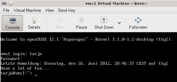
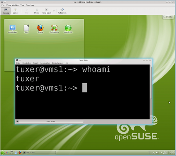
- Anlage eines LDAP-verwalteten Users auf einem Opensuse-System im Netz (hier “vms1”) mittels des dortigen YaST2 und Test des Logins eines solchen Users auf diesem System.
Zur Erledigung all dieser Aufgaben konnten wir auf dem LDAP-Server (“vms2”) und auch auf dem anderen Opensuse-System (hier “vms1”) bislang YaST2-Tools einsetzen.
Bevor wir uns nun weiter in die Möglichkeiten einer zentralen Userverwaltung von Opensuse-Systemen mittels LDAP einarbeiten, müssen wir noch einen Punkt nachtragen, den wir im Beitrag “Opensuse 12.1 – LDAP III” noch nicht genauer betrachtet hatten.
Zentrale User-Anlage auf “vms2” und erster Login auf einem anderen für LDAP konfigurierten Opensuse-System
Der oder die Testuser, die wir im Laufe des letzten Beitrag “LDAP III” auf dem System “vms1” angelegt hatten, wurden mit den YaST2-Modulen des Systems “vms1” (!) angelegt.
Bei der dortigen “LDAP Client”-Konfiguration hatten wir explizit vorgegeben, dass im Zuge der Account-Erstellung auch ein Homeverzeichnis auf dem lokalen System erstellt werden soll.
Ein Klick auf den Hilfebutton dieser Maske belehrt uns darüber, dass diese Vorgabe für die YaST2-Module des Systems (“vms1”) zur Useranlage von Bedeutung ist, da diese Module automatisch Homeverzeichnisse einrichten können. So geschah es denn auch, und das hat uns nicht weiter verwundert.
Das entspricht jedoch nicht der normalen Situation bei der Userverwaltung mit Hilfe eines LDAP-Servers.
Der Admin wird – wenn er denn überhaupt YaST2 verwendet – den User direkt auf dem LDAP-Server “vms2” mit dem dortigen YaST2 anlegen. Dann ergibt sich folgende Frage:
Was passiert eigentlich, wenn sich ein solcher User erstmalig an einem anderen System (wie “vms1”) anmeldet?
Dort existiert ja dann noch kein Home-Verzeichnis für
diesen User!
Der Reihe nach:
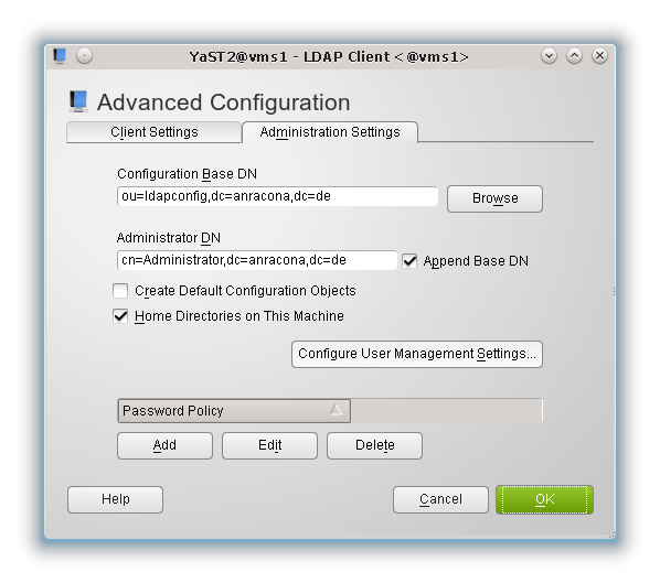
Schon aus Sicherheitsgründen wollen wir bei der künftigen Useranlage auf dem System “vms2” nicht, dass dort für einen neuen normalen User ein Homeverzeichnis erstellt wird.
Aus diesem Grunde wählen wir auf “vms2” die lokale Einrichtung eines Home-Verzeichnisses in der LDAP-Client-Konfiguration für die Zukunft ab:
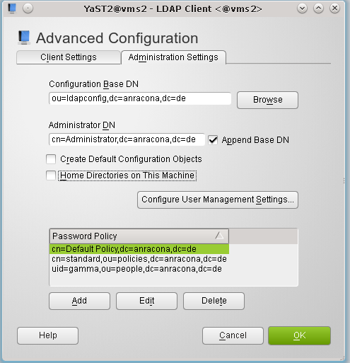
Hinweis: Die Einträge im unteren Feld zur Passwort-Politik werden wir am Ende dieses Artikels verstehen. Im Moment können wir sie ignorieren.
Zur Sicherheit stellen wir auch noch sicher, dass es auf “vms2” in der Datei “/etc/pam.d/common-session” keinen (!) Eintrag der Form
session optional pam_mkhomedir.so
gibt.
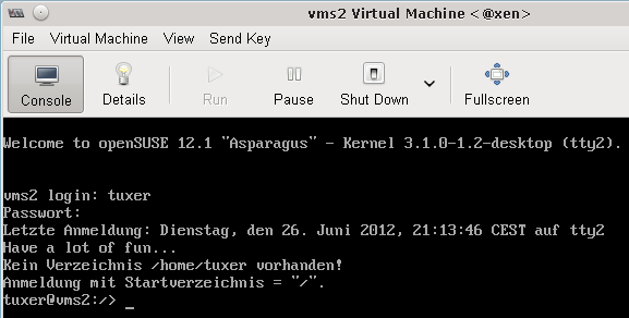
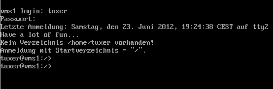
Nun legen wir auf “vms2” mittels des dortigen YaST2 einen neuen User – z.B. “tuxer” an. Ein anschließender Blick in das Verzeichnis “/home” auf “vms2” zeigt uns dann hoffentlich, dass für diesen neuen User tatsächlich kein Home-Verzeichnis angelegt wurde.
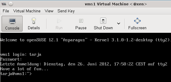
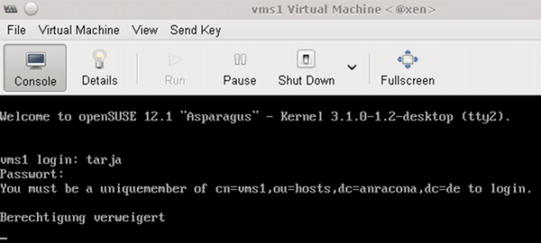
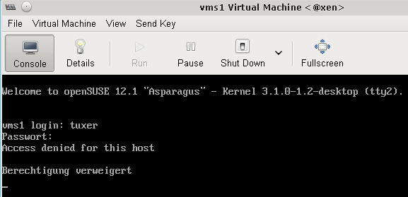
Nun probieren wir, uns mit diesem User auf dem System “vms1” einzuloggen. Grundsätzlich sollte das funktionieren, denn PAM hatten wir dort für die Nutzung des LDAP-Servers konfiguriert.
Aber was geschieht bzgl. des dort nicht vorhandenen Home-Verzeichnisses ?
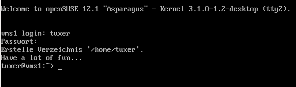
Offenbar wurde es auf meinem “vms1” generiert!
Was auf meinem System “vms1” ist dafür verantwortlich? Der Leser sehe einmal im Beitrag “LDAP III” nach. Meine PAM-Konfiguration auf “vms1” enthielt in der Datei “/etc/pam.d/common-session” einen Eintrag
session optional pam_mkhomedir.so
Dieses Modul erledigt das für uns. Informationen hierzu findet man z.B. unter folgenden Links:
http://manpages.ubuntu.com/manpages/maverick/man8/pam_mkhomedir.8.html
http://www.debian-administration.org/articles/403
Nebenbei: Lesenswert sind auch die Kommentare zum letzteren Artikel!
Den genannten Eintrag zu “pam_mkhomedir.so” kann man übrigens auf manchen Systemen auch in anderen PAM-Dateien und nicht nur in der Datei für “sessions” finden.
Hinweis zum graphischen Login: Unter Opensuse funktioniert nach der Generierung des Home-Verzeichnisses per PAM übrigens auch der graphische Login (z.B. für einen KDE-Desktop). Warum, mag der geneigte Leser selber erforschen.
Gegenprobe:
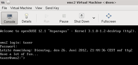
Wir machen nun mal die Gegenprobe, melden “tuxer” ab und löschen das Verzeichnis “/home/tuxer” auf “vms1”. Ferner kommentieren wir die oben dargestellte Zeile mit “pam_mkhomedir.so” in der Datei “/etc/pam.d/common-session” aus.
Versuchen wir danach, uns wieder als “tuxer” auf “vms1” einzuloggen, so geschieht Folgendes:
Ein graphischer Login geht allerdings nicht mehr. Der Leser möge das selbst probieren.
Wir lernen daraus zweierlei:
- Für die Anlage des Verzeichnisses ist auf unserem “vms1” tatsächlich der oben diskutierte “pam_mkhomedir.so”-Eintrag in der Datei “/etc/pam.d/common-session” verantwortlich.
- Der
jungfräuliche User “tuxer” kann sich auf “vms1” einloggen, obwohl er kein Homeverzeichnis besitzt !
Der letztere Punkt erschreckt uns dann doch ein wenig:
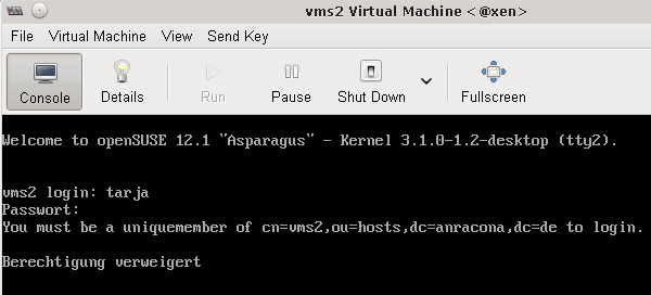
Denn das was für “vms1” gilt, gilt ja vermutlich auch für “vms2” ! Auch dort hatten wir ja früher mittels YaST2 die LDAP-Clients konfiguriert und Opensuse hatte damals auch eine brauchbare PAM-Konfiguration für uns vorgenommen.
Also selbst wenn wir auf “vms2” kein Modul “pam_mkhomedir.so” in der PAM-Konfiguration eingetragen haben und auch die Erzeugung eines Home-Verzeichnisses in der “YaST2-LDAP-Client”-Konfiguration von “vms2” unterbunden haben, so wird sich ein per LDAP verwalteter User “tuxer” auf dem “vms2” zwar nicht graphisch, aber doch über ein tty einloggen können:
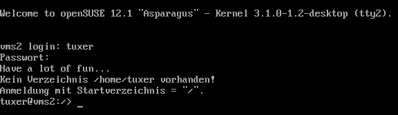
Ja, das ist also tatsächlich der Fall !
Nun könnte man spekulieren, was denn passiert, wenn man die Zeilen mit “pam_ldap.so” aus der PAM-Konfiguration des “vms2” wieder entfernt. Das ist interessant auszuprobieren. Ich überlasse das dem Leser, weise aber auf folgendes hin:
Es ist nicht unwahrscheinlich, dass es künftig ein paar User geben muss, die wir über LDAP verwalten wollen und die neben einem Zugang zu anderen Systemen auch einen direkten tty-Zugang zum “vms2” erhalten sollen. Dann brauchen wir auf “vms2” die LDAP-Client-Konfiguration!
Wir müssen also im Verlauf unserer LDAP-Experimente noch eine andere Lösung für die Zugangsbeschränkung zum LDAP-Server finden, als die PAM-LDAP-Funktionalität auf “vms2” abzuschalten.
Wir fassen das Ergebnis unserer bisherigen Tests zusammen:
- User, die direkt im LDAP-Verzeichnis eines LDAP-Servers (hier “vms2”) angelegt wurden, können sich auf anderen Opensuse-Systemen (hier “vms1”) einloggen, wenn die dortigen PAM-LDAP-Clients für den Zugriff auf den LDAP-Server konfiguriert wurden.
- Falls dort (auf “vms1” oder auf einem ähnlichen System) das Home-Verzeichnis des neuen Users noch nicht existieren sollte, wird es beim ersten Login automatisch angelegt ‐ wenn denn die PAM-Konfiguration geeignete “pam_mkhomedir.so” ‐ Einträge in der “common-session” ‐ Datei enthält.
- Auf Opensuse-12.1-Systemen klappt danach auch der graphische Login.
- User können sich auf dem LDAP-Server selbst aber auch einloggen, wenn der dortige LDAP-Client funktionstüchtig eingerichtet ist. Dies gilt auch dann, wenn auf dem LDAP-Server gar kein Homeverzeichnis für den User angelegt wurde und kein “pam_mkhomedir.so” ‐ Modul in PAM aktiv ist ! Dies stellt ein gewisses Sicherheitsrisiko dar !
Während die ersten drei Punkte unsere LDAP-User-Verrwaltung im Opensuse-Netzwerk erleichtern, müssen wir uns um den letzten Punkt wohl noch im Detail kümmern !
Immerhin ist jetzt trotz dieser Einschränkung relativ klar, wie man mit YaST2-Mitteln eine zentrale LDAP-basierte User-Verwaltung in einem kleinen Opensuse-Netzwerk aufziehen kann:
Der LDAP-Server muss mit YaST2 eingerichtet und auf TLS vorbereitet werden. Auf den übrigen Systemen sind die Konfigurationsdateien für die wichtigsten LDAP-Clients ‐ u.a. PAM und NSSWITCH ‐ für die LDAP‐Anbindung und deren TLS-Absicherung anzupassen. Das lokale YaST2 des jeweiligen Opensuse-Systems unterstützt auch dabei.
Das war es schon – beinahe zumindest ….
Weiterhin offene Fragen
Selbst für eine Userverwaltung in einem kleineren Netz wollen wir uns mit dem bisher Erreichten
nicht zufrieden geben. Uns fehlen noch Antworten auf folgende Fragen:
- Wie kann ich unter Opensuse auf dem LDAP-Server eine zentrale Passwort-Politik hinterlegen, die für alle LDAP-User gleichermaßen gelten soll?
- Wie schütze ich den zentralen Server oder auch andere Systeme im Netzwerk gegen den Zugriff von x-beliebigen Usern, die wir im LDAP-Verzeichnis per YaST2 von irgendeinem bestimmten Client-System aus angelegt haben ? Wie begrenze ich den Zugriff eines im LDAP erfassten Users oder einer Gruppe auf bestimmte Hosts ?
Beim Schreiben dieses Beitrags musste ich leider feststellen, dass beide Themen zuviel für einen Artikel sind. Ich muss die Leser bzgl. des zweiten Punktes also nochmals auf einen kommenden Beitrag “LDAP V” vertrösten. Sorry!
Wir machen in diesem Beitrag also “nur” einen Ausflug in die Untiefen einer zentralen “Password Policy” auf dem LDAP-Server. Dabei werden wir feststellen, dass das Konzept der sogenannten “Policy”-Objekte, das die Vorgabe zentraler “Password Constraints uf dem LDAP-Server ermöglicht, zwar grundsätzlich funktioniert.
Im heutigen OpenLDAP-Standard wird ein Passwort durch Policy-Objekte jedoch nicht im gleichen Umfang auf seine Stärke abgeprüft, wie dies mit dem PAM-Modul “pam_cracklib.so” möglich ist. Möglichkeiten jenseits des Standards verfolge ich in diesem Beitrag nicht, gebe aber weiter unten Links für Interessierte an.
Wer also meint, man könne nach der Lektüre dieses Beitrags die PAM-Konfiguration für Passwort-Änderungen auf den unterschiedlichen Systemen im Netz drastisch vereinfachen und auf die Prüffunktionen des LDAP-Systems beschränken, täuscht sich.
Vielmehr dient die zentrale LDAP-Politik im Moment mehr als eine Art letzter Hürde bei Passwortänderungen, die zusätzlich zu den PAM-Prüfungen aufgebaut werden kann. Eine Konsistenz zwischen den PAM-Prüfmodulen und der zentralen Politik muss im Interesse des Endanwenders allerdings hergestellt werden. Das Leben des Admins wird durch die Einführung einer zentralen LDAP Password Policy also nicht wirklich einfacher sondern eher noch ein wenig komplizierter.
Ich hoffe dennoch, dass der Blick auf OpenLDAPs Password Policy interessant ist – u.a. auch deshalb, weil wir dabei die Wechselwirkung der zentralen Regeln mit den lokalen PAM-Regeln zur Passwortänderung auf einem Opensuse-System studieren können.
Zentrale “Password Policy” mit OpenLDAP
Im Beitrag “Opensuse 12.1 – LDAP III” hatten wir beschrieben, wie wir von einem System “vms1” aus User-Account-Daten mittels YaST2 auf einem zentralen LDAP-Server hinterlegen können. Eine zentrale Passwortpolitik wurde dadurch aber nicht implementiert.
Die Betonung liegt hier wirklich auf “zentral”, denn lokal auf einem System (hier “vms1”) wird die Passwort-Politik ja durch diverse Parameter der (lokalen) PAM-Konfiguration gesteuert.
Ändert man etwa auf unserem Opensuse-System “vms1” im Yast2-Modul “Security Center and Hardening” über den Menüpunkt “Password Settings” die minimale Länge des Passwortes auf 8 Character ab, so führt dies zu folgender Einstellung in der ersten Zeile der Datei “/etc/pam.d/common-password-pc” bzw. der verlinkten Datei “/etc/pam.d/common-password” :
password requisite pam_cracklib.so minlen=8
password optional pam_gnome_keyring.so use_authtok
password sufficient pam_unix2.so use_authtok nullok
password required pam_ldap.so &
nbsp; try_first_pass use_authtok
Informationen zu den grundlegenden Fähigkeiten und Möglichkeiten des “pam_cracklib.so”-Moduls findet man z.B. hier:
http://www.deer-run.com/~hal/sysadmin/pam_cracklib.html
http://linux.die.net/man/8/pam_cracklib
Opensuse’s Default-Einstellungen für das Betriebssystem und auch YaST2 sorgen über die PAM-Konfiguration und den Einsatz der “cracklib” also auf jedem einzelnen System dafür, dass dort ein Minimum an lokalen (!) Regularien bzgl. der Passwortqualität eingehalten wird. Wir kommen weiter unten noch auf Details zurück.
Aber wir wollen in einem Rechnerverbund natürlich auch systemübergreifende Regeln implementieren – möglichst über das LDAP-System. Eine Modifikation der PAM-Regeln auf dem LDAP-Server (“vms2”) selbst nutzt in diesem Zusammenhang nichts, denn die beziehen sich ja nur auf Passwortvergaben, die dort lokal vorgenommen werden. Wir bzw. die späteren User wollen ja aber von jedem anderen Linux-System aus Passwort-Änderungen vornehmen können, die zentralen Kriterien genügen.
Bzgl. der minimalen Passwortlänge hatten wir im Beitrag LDAP III übrigens bereits einen Weg gesehen, wie man unter Opensuse eine erste zentrale Vorgabe auf dem LDAP-Server verankern kann. Dieser Weg führte über die Einrichtung des “yast”-LDAP-Schemas und die Einrichtung der Standardtemplates für die User-Anlage.
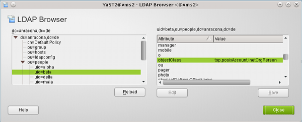
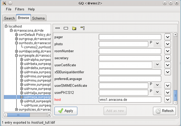
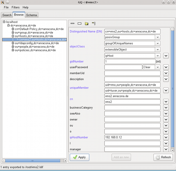
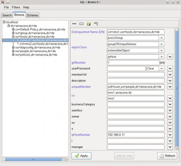
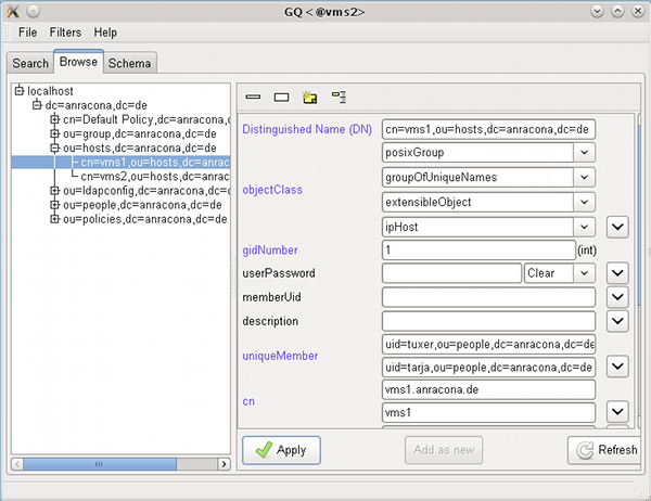
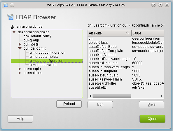
Man sehe sich auf dem LDAP-Server “vms2” im LDAP-Browser nochmals den Zweig “cn=userconfiguration,ou=ldapconfig,dc=anracona,dc=de” an:
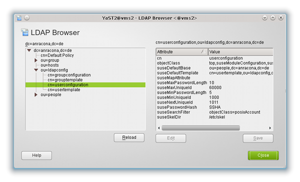
Hier ist zentral eine minimale Passwortlänge hinterlegt worden, die YaST2 bei der Useranlage per YaST2-Skripts auch kontrolliert. Diese Vorgabe ist aber eben SuSE- und leider auch nur tool-spezifisch:
Sie gilt nur für YaST2’s “User- und Gruppenverwaltung” – und auch dort führt das Vorgehen lediglich zu einer Warnung an den Administrator, die root natürlich auch ignorieren kann !
Zudem gilt :
- Es gibt eine Reihe weiterer Punkte einer Passwortpolitik, wie etwa der Gültigkeitszeitraum eines Passworts, die durch Suses “yast”-LDAP-Schema gar nicht erfasst werden.
- Neben lokalen Tools, die der PAM-Kontrolle unterliegen und die mit LDAP-Zusatz-Features ausgestattet werden, gibt es ggf. weitere Tools wie etwa “ldappasswd”, mit denen man die lokalen PAM-Einschränkungen an neue Passwörter umgehen kann.
- Zu den potentiellen Umgehern von PAM-Richtlinien sind auch Programme zu rechnen, die z.B. unter Java, PERL, Python oder PHP erstellt wurden und die mit dem LDAP-Server kommunizieren können. Wir wollen nicht, dass solche Werkzeuge eine gewünschte zentrale Passwort-Politik unterlaufen können.
Für das Thema zentrale Passwort-Politik im Zusammenhang mit LDAP wurde deshalb bereits im Jahr 2005 eine Lösung vorgeschlagen. Siehe hierzu folgendes, immer noch im Zustand eines Drafts befindliche Dokument:
RFC draft draft-behera-ldap-password-policy-09.txt.
Der Ansatz, Passwort-Einschränkungen zu erzwingen, bezog und bezieht sich dabei primär auf eine Absicherung des LDAP-Zugriffs selbst – also auf die Absicherung von LDAP-Binds.
Im Fokus der Absicherung stehen dabei Anforderungen an Passwörter der LDAP-Accounts für Benutzer sowie die Änderungs- und Verfallspolitik zu diesen Passwörtern. Passwort-Felder sind von den LDAP-Backends (LDAP-Datenbanken) über die Schema-Definitionen eindeutig identifizierbar.
Nun erfolgt aber auch eine PAM- und LDAP-basierte User-Authentifizierung und – Autorisierung von Anwendern, die sich auf einem Opensuse-
System wie “vms1” einloggen wollen, gerade über die erfolgreiche Durchführung von LDAP-Binds zum LDAP-Server, auf dem User-Passwörter verwaltet werden.
D.h., eine über das LDAP-Backend verankerte LDAP-Passwort-Politik wirkt sich natürlich direkt auf die Passwort-Qualität all jener Linux-User aus, die im Netz über das LDAP-System verwaltet werden. Damit kann – zumindest in der Theorie – eine zentral im LDAP-System definierte Passwort-Politik auch auf anderen Systemen im Netz zum Tragen kommen.
Ferner kann eine der Mindest-Qualitäten eines Passwortes – nämlich die Länge – auch unabhängig von den jeweils lokalen Prozessen, für die PAM Einschränkungen an die Passwortfestlegung oder -Änderung kontrolliert, erwirkt werden.
Password Policy am LDAP-Server per “Overlay”
Auf dem aktuellen Stand der Entwicklung implementiert man eine zentrale “LDAP Password Policy” über sogenannte “Extensions” oder “Overlays” des LDAP-Datenbank-Backends. Dadurch werden softwaretechnische “Hooks” definiert, die entsprechende LDAP-Erweiterungen bei der Manipulation der Dateneinträge nutzen können. Siehe hierzu etwa:
http://www.openldap.org/doc/admin24/overlays.html
http://www.highlandsun.com/hyc/ldapguide/overlays.html
http://onlamp.com/onlamp/2007/09/13/an-openldap-update.html
http://www.openldap.org/faq/data/cache/1169.html
Overlays erlauben es, Datenbankinhalte gemäß vorgegebener Regeln zu modifizieren oder zu prüfen, ohne die Datenbankstruktur des Backends selbst oder ein Schema ändern zu müssen. Ein spezielles Beispiel eines Overlays ist das “ppolicy”-Overlay. Schon der Name verrät, dass es sich um ein Overlay zur Kontrolle von Passwörtern handelt.
http://www.zytrax.com/books/ldap/ch6/#overlay
http://www.zytrax.com/books/ldap/ch6/ppolicy.html
www.dpunkt.de/leseproben/2104/Kapitel_17.pdf (siehe dort Kap. 17.3)
Aus den angegebenen Quellen erahnen wir, dass eine händische Einrichtung des Overlays “ppolicy” mehrere Schritte erfordern würde. Wir benutzen der Einfachheit halber deshalb die YaST2-eigenen Tools.
Dazu öffnen wir auf dem LDAP-Server “vms2” (!) das YaST2-Modul “LDAP-Server” und prüfen dort zunächst die installierten LDAP-Schemata:
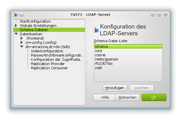
(Hinweis für die, die genauer hinsehen: Dieses Bild habe ich faktisch von einem etwas jungfräulicheren Server als unserem “vms2” entliehen. Daher die deutsche Beschriftung).
Neben-Hinweis:
Nebenbei merken wir uns für die spätere Administration des Servers, dass es auf dieser Maske zwei Buttons “Hinzufügen” oder “Add” sowie “Löschen” oder “Delete” gibt, die dazu dienen, die vom Server geladene Schema-Palette um weitere Schemata zu erweitern oder zu verkleinern. Aus meiner praktischen Erfahrung sind diese YaST2-Werkzeuge auf einem LDAP-Testsystem insbesondere dann nützlich, wenn man mal mit Inkompatibilitäten verschiedener LDAP-Schemata zu kämpfen hat und man diese schnell und systematisch durch das Laden und Entfernen ganz bestimmter Schemata untersuchen will.
Danach wechseln wir zum Punkt “Databases >> dc=anracona,dc=de >> Password Policy Configuration”:
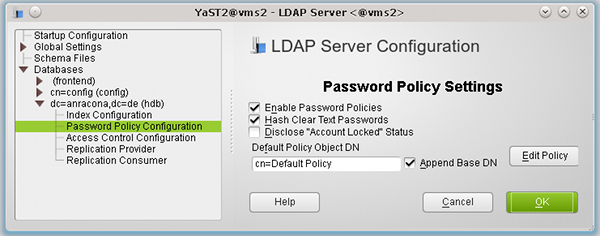
und aktivieren dort die Passwort-Richtlinien (Password Policy).
Die “Hash”-Vorgabe könnten wir eigentlich ignorieren, da wir über Opensuse’s “yast”-Schema und den Einsatz von YaST2-Tools bzw. über unsere Konfiguration von PAM (Option “pam_password exop”) sowieso alle Passwörter per SSHA-Hash verschlüsselt ablegen, wenn wir auf Systemen wie “vms1” Passwörter unter PAM-Kontrolle ändern.
Aber auch hier sollten wir uns daran erinnern, dass es andere Tools geben mag, die das anders handhaben.
Ein Abhaken der “ppolicy-Option” schadet zur Sicherheit also nichts.
Hinweis: SSHA ist der LDAP-Server-Default für exop-Clients: “exop” in der PAM-Konfiguration der LDAP-Clients sorgt dafür, dass die Hash-Verschlüsselung am Server mit dem dort festgelegten Hash-Verfahren erfolgt. Hat man bei der Serverkonfiguration nicht explizit etwas anderes angegeben, so ist der Default “SSHA”. Siehe hierzu auch den Beitrag “LDAP III”. Ich habe den Artikel nachträglich um diesbzgl. Anmerkungen ergänzt.
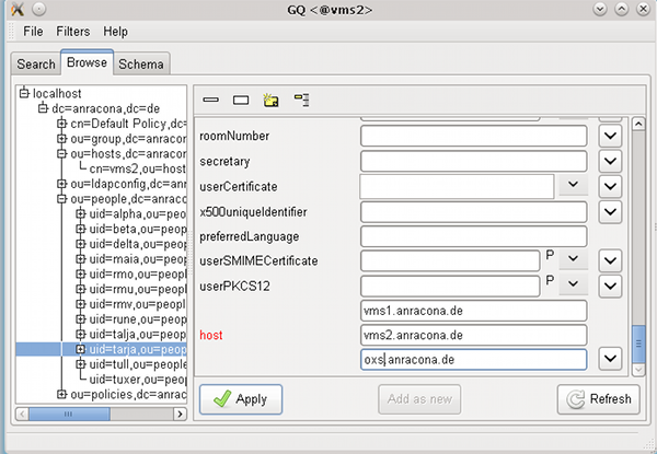
Man beachte auch, dass die Opensuse-spezifischen Festlegungen im LDAP-Zweig
“cn=userconfiguration,ou=ldapconfig,dc=anracona,dc=de”
für die YaST2-Userverwaltung ggf. andere und vom Server-Deafult abweichende Hash-Regeln festlegen. Spätestens jetzt wird es also Zeit, sich über die Konsistenz der verschiedenen Einstellungen Gedanken zu machen !
Die Einstellung zur “Default Policy DN” in der obigen Maske lassen wir unverändert :
Diese Einstellung führt zur Anlage eines zentralen “Policy-Objekts”, in dem wir Default-Passwort-Richtlinien hinterlegen und bei der Userpflege per YaST2 oder LDIF-Dateien neuen Usern zuordnen können. Wir werden weiter unten über das Default-Objekt hinaus noch zusätzliche, eigene “Password Policy-Objekte” in separaten Zweigen der LDAP-Datenstruktur anlegen.
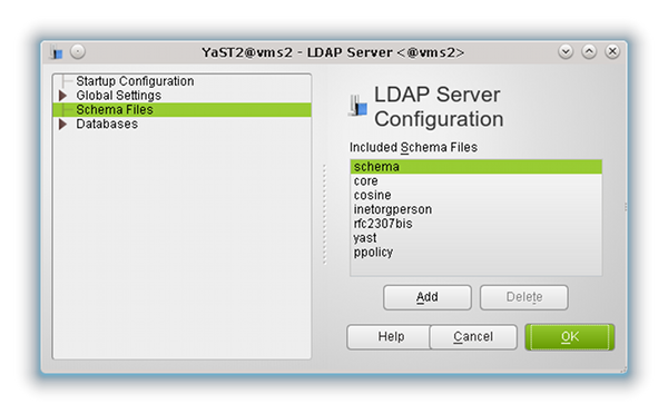
Abschließend lassen wir die gewünschten Änderungen an unserer LDAP-Server-Konfiguration durch Drücken der OK-Taste durchführen. Ein erneuter Blick auf die installierten Schemata zeigt, dass dabei ein neues Schema “ppolicy” integriert wurde.
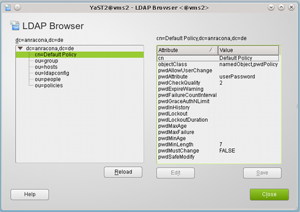
Ein weiterer Blick im LDAP-Browser auf die Verzeichnisstruktur zeigt die Anlage des “Objekts” zur Default Policy im LDAP-Baum:
An dieser Stelle ist es interessant, sich anzusehen, wie YaST2 das Overlay in den LDAP-Server-Konfigurationsdateien verankert hat. Also setzen wir mal folgendes Kommando ab:
vms2:/etc # grep -d recurse ppolicy ./openldap/
./openldap/slapd.d/cn=config/cn=schema/cn={5}ppolicy.ldif:dn: cn={5}ppolicy
./openldap/slapd.d/cn=config/cn=schema/cn={5}ppolicy.ldif:cn: {5}ppolicy
./openldap/slapd.d/cn=config/olcDatabase={1}hdb/olcOverlay={0}ppolicy.ldif:dn: olcOverlay={0}ppolicy
./openldap/slapd.d/cn=config/olcDatabase={1}hdb/olcOverlay={0}ppolicy.ldif:olcOverlay: {0}ppolicy
vms2:/etc #
Die ersten beiden Einträge entsprechen der Erweiterung der Liste der geladenen LDAP-Schemata. Die letzten beiden Einträge repräsentieren das Hinzufügen des Overlays “ppolicy” zur hier verwendeten hdb-Variante der BDB (s. zur “hdb” und zur “bdb” den Beitrag “Opensuse 12.1 – LDAP I“).
Wie man die letzten beiden Einträge händisch per LDIF-Datei hätte anlegen müssen, findet man hier
www.zytrax.com/books/ldap/ch6/slapd-config.html#use-overlays.
Einstellung der “Default Password Policy”
Natürlich ist es per Yast2 möglich, die Einstellungen der “Default Policy” zu ändern. Hierzu klickt man in der zuletzt geöffneten Maske von YaST2’s “LDAP-Server-Modul” (s. die vorletzte Abbildung) auf den Button “Edit Policy”.
Danach gelangt man zunächst zu folgender Maske für die “Password Change Policy”:
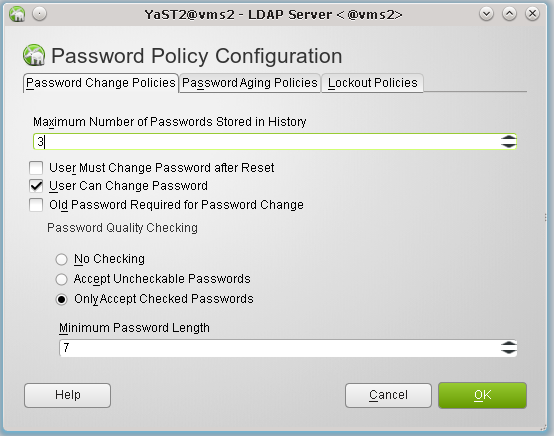
In ihr und in den Masken, die sich hinter den weiteren Reitern “Password Aging Policies” und “Lockout Policies” verbergen, kann man nun seine Einstellungen für die einzelnen Password Policies hinterlegen.
Kurzinformationen zur Bedeutung der Felder liefern der “Help”-Button der jeweiligen YaST2-Maske. Weiterführende Informationen erhält man aus den Internet-Artikeln zum “ppolicy”-Overlay, auf die wir oben verwiesen haben.
Nachfolgend wollen wir beispielhaft für andere Einstellungen eine zentrale Vorgabe für die Passwort-Länge testen. Die “Minimum Password Length” setzen wir hierfür in der oben abgebildeten Maske auf den Wert “7”.
Hinweis: Den Haken bei “Old Password Required for Password Change” lassen wir dagegen weg. Warum besprechen wir weiter unten.
Will man sich bei den nachfolgenden Tests nicht unnötig mit der “cracklib” und ihren Anforderungen an Passwort-Änderungen herumschlagen, setzt man besser auch die “Maximum Number of Passwords Stored in History” auf den Wert “0”.
Ein Test unseres “Constraints” bzgl. der Passwort-Länge ist u.a. deshalb interessant, weil wir uns dabei ansehen können, wie die zentrale Vorgabe auf “vms2” mit den lokalen Einstellungen für PAM auf dem System “vms1” interferiert. Tests anderer Einstellungen überlassen wir dem Leser.
(Kein) Test der LDAP-“ppolicy” – genauer der Default Policy – mit YaST2’s Userverwaltung
Als erstes wollen wir uns ansehen, ob die oben getroffene Längen-Einschränkung an ein Passwort überhaupt zieht, wenn man per YaST2 das Passwort eines Users (zurück-) setzt.
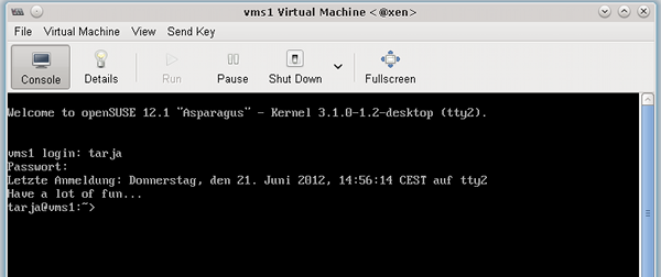
Hierzu öffnen wir auf “vms1” (!) mal das dortige YaST2-Modul zur “User- und Gruppen-Verwaltung”. Dort lassen wir uns per “Filter” die auf dem LDAP-Server “vms2” eingetragenen User anzeigen und ändern für einen unserer zwischenzeitlichen angelegten Testuser – hier “tarja” – das Passwort.
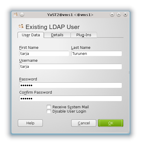
In unserem Beispiel nehme ich mit Absicht das Passwort “drei”. Dieses hat nur 4 Buchstaben und kollidiert daher mit einer ganzen Reihe von Festlegungen – u.a. auch mit der “Default Password Policy”, in der wir oben die “Minimum Password Length” auf den Wert 7 gesetzt hatten.
Es kollidiert aber auch mit den opensuse-spezifischen Festlegungen für die Anlage von Usern, die wir per YaST2 im LDAP-Zweig “cn=userconfiguration,ou=ldapconfig,dc=anracona,dc=de” des Servers hinterlegt hatten:
(Wer den entsprechenden Schritt inzwischen vergessen hat, möge mal im Beitrag “Opensuse 12.1 LDAP – III” nachsehen.) Dort hatten wir den Wert für die minimale Passwort-Länge auf “5” gesetzt (Parameter: suseMinPasswordLength). Natürlich fragt unser YaST2-Programm zur User-Modifikation diesen Wert ab.
Wir erhalten deshalb von YaST2 prompt eine Warnung:
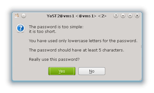
Im Warnungstext wird explizit auf die Festlegung “5” in den opensuse-spezifischen Festlegungen des LDAP Eintrags verwiesen. Wir setzen uns über die Warnung hinweg – wir sind root und dürfen das – und drücken auf “Yes”.
Jetzt erwarten wir eigentlich, dass die Festlegung in der “ppolicy” zieht und uns vom Speichern des Passwortes abhält.
Aber nein !! YaST2 schluckt unser kurzes Passwort ohne Probleme und speichert es tatsächlich im LDAP-Baum ab.
Dass das neue und zu kurze Passwort tatsächlich vom Testuser “tarja” verwendbar ist, zeigt ein Login-Versuch auf “vms1”, den ich in meiner virtualisierten KVM-Testumgebung auf einer KVM-VNC-Konsole durchgeführt habe:
Das ist doch irgendwie frustrierend! Was nützt uns unter diesen Umständen eigentlich die ganze hübsche zentrale “ppolicy”? Zumindest YaST2’s User-Modul ignoriert unsere “ppolicy”-Einträge offenbar!
Misstrauisch geworden sehen wir uns ein wenig um und editieren noch einmal den Testuser “tarja”. Dort gehen wir nun auf den bislang nicht beachteten Reiter “Plug-Ins”.
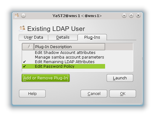
Hier klicken wir zunächst auf den Eintrag “Edit Password Policy” und dann auf den Button “Launch”.
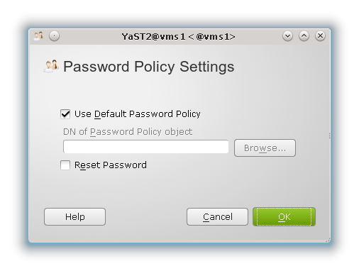
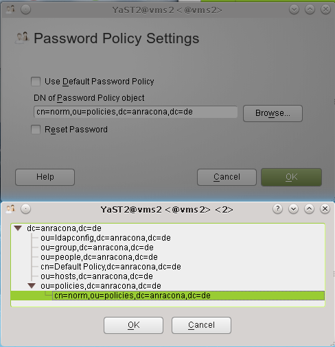
Dort setzen wir – falls nicht schon aktiviert – den Haken bei “Use Default Password Policy” und drücken solange auf “OK”-Buttons bis die Änderung gespeichert wird. Danach führen wir unseren Test erneut durch.
Es ergibt sich aber das gleiche Ergebnis wie zuvor :
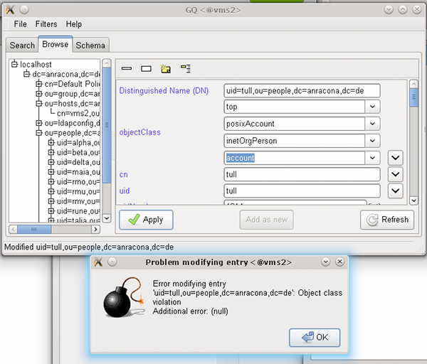
Root kann mit YaST2s Benutzerverwaltung ein viel zu kurzes Passwort in die LDAP-Datenbank schreiben!
Offenbar ist der Zweck der zuletzt benutzen interessanten Maske ein anderer als die Beachtung der “ppolicy”-Einstellungen zu erzwingen. Wir kommen hierauf weiter unten zurück.
Warum um alles in der Welt durften wir das im Vergleich zu den “ppolicy”-Festlegungen zu kurze Passwort in die LDAP-Bank schreiben? Der Grund ist relativ einfach:
LDAP-Aktionen, die mit einem “rootdn”-Bind auf dem LDAP-Server ausgeführt werden, können “ppolicy”-Einschränkungen umgehen !
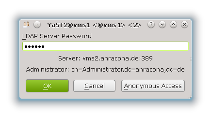
Der Grund für das Ignorieren der “ppolicy” liegt darin, dass bei der Benutzung der YaST2-Module die “rootdn” für einen LDAP-Bind benutzt wird. Bei der Anlage des LDAP-Servers hatten wir die “rootdn” auf
cn=Administrator,dc=anracona,dc=de
gesetzt. Wir erkennen den entsprechenden Bind-String im Text des PopUp-Dialogs wieder, in den wir das Passwort für die “rootdn” eingeben müssen, wenn wir im YaST-Tool die User bzgl. LDAP filtern :
Die YaST2-Benutzerverwaltung führt auch nachfolgend alle Operationen mit einem “rootdn”-Bind durch. Die “rootdn” hat auf dem LDAP-Server aber aus prinzipiellen Gründen sehr weitgehende Schreiberlaubnis und ist “ppolicy”-Einschränkungen nicht unterworfen. Siehe hierzu etwa den einleitenden Text von
https://linux.die.net/man/5/slapo-ppolicy
oder die Ausführungen in folgenden Forumsdiskussionen zu Fällen, in denen die LDAP-“ppolicy” auch “ignoriert” wurde:
http://www.openldap.org/lists/openldap-technical/201203/msg00375.html
http://www.openldap.org/lists/openldap-technical/201102/msg00261.html
Also:
Mit YaST2 können wir das Einhalten der zentralen “ppolicy” nicht testen! Auch
händische LDAP-Kommandos der folgenden Art, die ein gewiefter LDAP-Profi vielleicht am Prompt von “vms2” ausprobieren würde, würden nur ergeben, dass die “rootdn” Passwörter setzen darf, die die “ppolicy” verletzen :
vms2:/etc # ldappasswd -e ppolicy -W -x -D "cn=Administrator,dc=anracona,dc=de" \
>  -H ldap://127.0.0.1/ -A -S "uid=tarja,ou=people,dc=anracona,dc=de"
Wenden wir uns deshalb lieber unserem User “tarja” und seinen Möglichkeiten zu. Letztlich sollen ja nicht “root” und sein LDAP-Pendant “rootdn” sondern normale User daran gehindert werden, zentrale Constraints auf dem LDAP-Server zu umgehen.
Test der ppolicy – Default Policy – mit “/usr/bin/passwd” und PAM
Im Beitrag “LDAP III” hatten wir den Client “vms1” so konfiguriert, dass NSSWITCH und PAM den LDAP-Server nutzen. Ein Tool, das den PAM-Einschränkungen folgt, ist das Kommando “/usr/bin/passwd” , das ein User normalerweise zur Änderung seines Passwortes einsetzt.
Bevor wir dieses Kommando als User “tarja” auf dem “vms1” benutzen, werfen wir zur Sicherheit nochmal einen Blick auf folgende Einträge in der PAM-LDAP-Konfigurationsdatei “/etc/ldap.conf” auf “vms1”:
# Search the root DSE for the password policy (works
# with Netscape Directory Server). Make use of
# Password Policy LDAP Control (as in OpenLDAP)
pam_lookup_policy   yes

# Use the OpenLDAP password change
# extended operation to update the password.
pam_password   exop
Hinweis: Beide (!) Einträge sind notwendig, um die zentrale “ppolicy” in die Durchführung der von PAM kontrollierten Aktionen einzubinden (siehe den Beitrag LDAP III).
Welche Prüfungen von PAM bei einer Passwort-Änderung der Reihe nach auf “vms1” durchgeführt werden, offenbart die dortige Datei
/etc/pam.d/passwd
welche wiederum die Datei
/etc/pam.d/common-password
einbindet. Letztere ist übrigens ein Link auf die Datei “/etc/pam.d/common-password-pc”. Je nach Systemeinstellungen sieht die etwa so aus:
password requisite pam_cracklib.so minlen=8
password optional pam_gnome_keyring.so use_authtok
password sufficient pam_unix2.so use_authtok nullok
password required pam_ldap.so try_first_pass use_authtok
Man sieht hier erneut, dass auf meinem “vms1” ein neues Password zuerst vom PAM-Modul “pam_cracklib.so” geprüft wird. Ganz am Ende findet dann ein Einsatz des “pam_ldap”-Moduls statt, das nach unseren Anweisungen in der “/etc/ldap.conf” hoffentlich die “ppolicy” zum Zuge bringen wird.
Die Optionen “requisite” und “required” im obigen Beispiel sorgen dafür, dass in jedem Fall eine Fehlermeldung generiert wird, wenn die jeweilige Prüfung fehlschlägt. (Bei “requisite” wird die Kontrolle direkt ans aufrufende Programm – hier passwd – zurückgegeben.)
Der Parameter “minlen=8” führt – wie schon weiter oben diskutiert – zu einer Überprüfung einer “Mindestlänge” des Passwortes – hier 8 Zeichen.
Auf Opensuse-Systemen mit Standardeinstellungen findet man vor einer Manipulation durch YaST2-LDAP-Programme oft auch einen Eintrag der Form
password
requisite pam_pwcheck.so nullok cracklib
vor. Von dieser Standard-Einstellung kommt man zur oben dargestellten “vms1”-Konfiguration z.B. durch die Anwendung folgender Konfigurations-Kommandos als root:
# pam-config −d −−pwcheck
# pam-config −a −−cracklib −−cracklib-minlen=8
Auf die Syntax und die Optionen von /usr/sbin/pam-config” kann ich hier nicht genauer eingehen. Informationen zum Kommando “pam-config” findet man aber unter
http://www.linuxtopia.org/online_books/opensuse_guides/opensuse11.1_reference_guide/sec_pam_pam-config.html
Einfache Parameter wie “minlen” kann man auf einem Opensuse-System auch über die Änderung von Security-Einstellungen mittels des YaST2-Moduls “Security Center and Hardening” ändern:
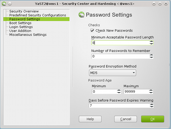
Ich ziehe für komplexere Konfigurationen aber das Kommando “/usr/sbin/pam-config” vor, weil man bei dessen Einsatz auch Rückmeldungen zu problematischen Modul- und Options-Kombinationen (wie z.B. zur Kombination von pam_pwcheck und pam_cracklib mit zusätzlichen Credit-Parametern) bekommt.
Jetzt mag sich der Leser fragen, was denn in diesem Zusammenhang ein Verweis auf “Credits” soll.
Leider müssen wir für eine Vergleichbarkeit der Passwort-Prüfungen, die in unserem Test auf “vms1”
- einerseits lokal von der “pam_cracklib.so” und
- andererseits von “pam_ldap.so” gegenüber der “ppolicy” auf dem LDAP-Server “vms2”
durchgeführt werden sollen, noch ein wenig ins Detail gehen. Die “minlen”-Einstellung ist nämlich mit Vorsicht zu genießen, und das offenbart die eben gezeigt einfache YaST2-Oberfläche leider nicht.
Das PAM-cracklib-Modul lässt sog. “Credits” in puncto Komplexität eines Passwortes zu. Ein “Credit” bezieht sich dabei auf die Passwortlänge und erlaubt Einsparungen an Zeichen. Das bedeutet in der Praxis, dass das Modul “pam_cracklib.so” trotz des “minlen” Parameters kürzere Passwörter zulässt, wenn diese neben Kleinbuchstaben auch Kombinationen von Sonderzeichen, Zahlen, Großbuchstaben enthalten.
Gesteuert werden “Credits” – mögliche Einsparungen von einem oder sogar mehreren Zeichen – durch vier weitere Parameter: “lcredit, ucredit, dcredit und ocredit”.
Ferner lässt die “cracklib” grundsätzlich keine Passwörter mit einer Länge unter 6 Zeichen zu. Siehe zu diesen Besonderheiten der “cracklib” auch:
http://www.deer-run.com/~hal/sysadmin/pam_cracklib.html
http://www.linux-faqs.info/security/force-strong-passwords
Nun weiß unsere zentrale LDAP-“ppolicy” aber leider gar nichts von solchen subtilen Feinheiten!
Dort – also auf dem LDAP-Server – bedeutet “Minimum Password Length” wirklich die Anzahl der Zeichen (zumindest solange Sie keine deutschen Umlaute verwenden). Damit wir eine konsistente Behandlung der Passwortlänge erhalten, modifizieren unsere erste PAM-cracklib-Prüfung daher wie folgt:
password required pam_cracklib.so minlen=6 lcredit=0 ucredit=0 dcredit=0 ocredit=0
Dies erreicht man entweder durch direktes Editieren der Datei “/etc/pam.d/common-
password-pc” (auf “vms1”) oder mittels “pam-config” :
vms1:~ # pam-config −a −−cracklib −−cracklib-minlen=6 −−cracklib-lcredit=0 −−cracklib-ucredit=0
−−cracklib-dcredit=0 −−cracklib-ocredit=0
Man beachte das geänderte “minlen=6” :
Cracklib soll für unseren nachfolgenden Test also Passwörter zulassen, die kleiner sind als die Länge “7”, die unsere “ppolicy” verlangt.
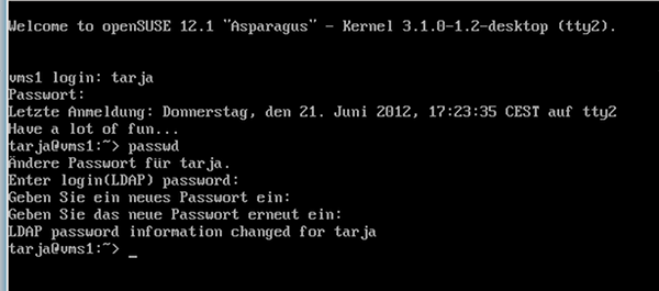
Nachdem wir das sichergestellt haben, loggen wir uns wieder mit dem zu kurzen Passwort “drei” als User “tarja” auf “vms1” ein und führen einen “passwd”-Dialog durch, bei dem wir ein Passwort mit genau 6 Zeichen eingeben.
Wir erwarten, dass cracklib das Passwort passieren lässt, wenn es nicht zu leicht zu “cracken” ist. Aber wir erwarten auch, dass wir anschließend an der LDAP-“ppolicy” scheitern:
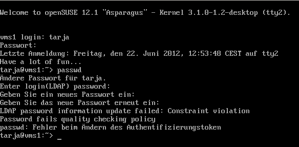
Erläuterung der Schritte:
- Auf die Frage nach dem alten LDAP-Passwort geben wir natürlich das alte Passwort “drei” an.
- Als neues Passwort verwenden wir testweise die 6 Zeichen lange ASCII-Kombination “%45zz6”, das cracklib auch anstandslos schluckt.
(Es ist heutzutage gar nicht mehr so leicht, eine passende Zeichenkombination zu finden, die cracklib
akzeptiert 🙂 ).
- Auf die obligatorische Rückfrage geben wir das neue Passwort erneut ein.
- Wir scheitern dann tatsächlich bei den Prüfungen gegen die LDAP-“ppolicy”, obwohl die Fehlermeldung zur “Constraint Violation” beim “LDAP Password Update” uns keine Auskunft über die genauere Art des Fehler gibt.
Das ist dennoch ein schöner Erfolg :
Wir haben erstmalig eine zentrale LDAP-“ppolicy” auf “vms2” beim Versuch, ein Passwort auf “vms1” zu ändern, zur Wirkung gebracht !
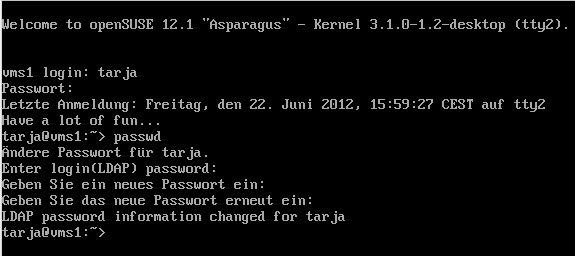
Nun machen wir noch den Positiv-Test:
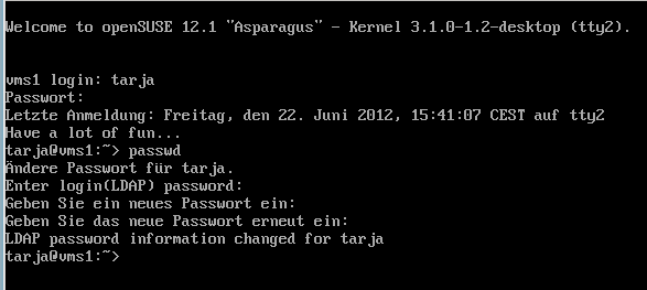
Erläuterung der Schritte:
- Auf die Frage nach dem alten LDAP-Passwort geben wir wieder das alte Passwort “drei” an. Es wurde ja beim vorhergehenden Versuch nicht geändert.
- Als neues Passwort verwenden wir nun die 7 Zeichen lange ASCII-Kombination “%45zz67”. Sie wird von cracklib akzeptiert.
- Auf die obligatorische Rückfrage geben wir das neue Passwort erneut ein.
- Nun akzeptiert auch das Modul “pam_ldap.so” unser Passwort! Es erfüllt ja das Längen-Kriterium unserer “ppolicy”.
In ähnlicher Weise kann man auch andere Constraints der “ppolicy” testen. Ggf. wird man dabei feststellen, dass die PAM-LDAP-Kombinatione nicht immer so informativ ist, wie man sich das wünschen würde. Zudem wird man wie ich über die eine oder andere kleinere Falle im Zusammenhang mit der Ablaufzeit von Passwörtern stolpern, für deren Aufklärung man das Internet zu Rate ziehen muss. Aber im Kern funktioniert die Sache.
Test der LDAP Default Password Policy – mit dem Tool “ldappasswd”
Wir haben ja auf unserem “vms1” neben “passwd” auch andere Tools – nämlich z.B. das LDAP-Kommandozeilentool “ldappasswd” – zur Verfügung, um ein Passwort zu ändern.
Wir vergegenwärtigen uns zudem, dass wir an der zugehörigen Konfigurationsdatei für LDAP-Clients auf
unserem “vms1” – nämlich in diesem Fall an der Datei “/etc/openldap/ldap.conf” – keine Änderungen vorgenommen haben, um eine “ppolicy” zu berücksichtigen. Diese Datei weist immer noch dieselben Inhalte auf, die wir bereits im Beitrag “LDAP III” gesehen hatten:
base dc=anracona,dc=de
uri ldap://vms2.anracona.de
ldap_version 3
ssl start_tls
TLS_CACERTDIR /etc/openldap
TLS_CACERT /etc/openldap/anracona_vms2.pem
TLS_REQCERT demand
Der Kommandozeilenbefehl “ldappasswd” kommt also theoretisch dafür in Frage, unsere zentrale “ppolicy” auszuhebeln. Zu den Optionen des Kommandos sehe man sich die Man-Seiten an.
Ein sinnvoller Befehl zur Änderung des Passwortes von “tarja” vom “vms1” aus ist dementsprechend:
ldappasswd −W −x −D “uid=tarja,ou=people,dc=anracona,dc=de” \
> −H ldap://vms2 −S “uid=tarja,ou=people,dc=anracona,dc=de”
Wir versuchen uns zunächst mit einem Positiv-Test und arbeiten uns durch folgenden Dialog auf unserem “vms1”:
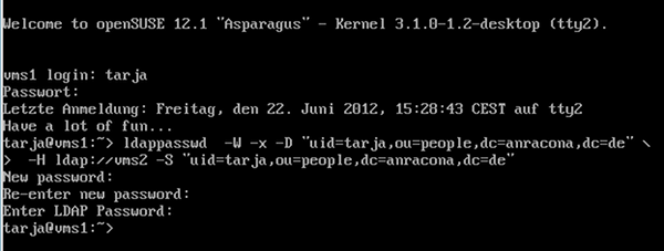
Erläuterung der Schritte:
- Auf die Frage nach dem alten LDAP-Passwort geben wir natürlich das alte Passwort “%45zz67” aus unserem letzten Test an.
- Als neues Passwort verwenden wir die 7 Zeichen lange ASCII-Kombination “%hjurtx”, die cracklib akzeptiert.
- Auf die obligatorische Rückfrage geben wir das neue Passwort erneut ein.
- Das läuft auch beim Modul “pam_ldap.so” durch wie geschmiert, denn unser Passwort erfüllt ja das Kriterium der “ppolicy”.
Nun der Negativ-Test:
Versucht man eine erneute Änderung des Passwortes mit der Zeichenkombination “%93gg6”, die zu kurz ist, erleben wir Folgendes:
Super ! Das freut uns, denn auch hier schlägt offenbar wieder der Constraint unserer LDAP-“ppolicy” zu.
Konsistenz der lokalen und der globalen Passwort-Politik?
Was haben wir erreicht?
- Wir können eine zentrale LDAP-Passwort-Politik unabhängig von einer lokalen PAM-Politik auf unseren SuSE-Systemen als letzten Rettungsanker benutzen, um eine definierte Qualität der Passwörter hinsichtlich ihrer Länge durchzusetzen.
- Durch die zentrale Politik werden auch Umgehungsversuche durch andere Tools (wie etwa LDAP-Tools für die Kommando-Zeile) abgefangen.
Was wir jedoch nicht können, sind Dinge wie die Passwortstärke jenseits der Länge an zentraler Stelle zu überprüfen. Dies gibt der aktuelle “ppolicy”-Mechanismus im Gegensatz zur “cracklib” unter PAM nicht her – zumindest nicht ohne weitere Hilfsmittel und einige Anstrengungen :
Um eine tiefergehende Passwort-Prüfung auf dem Server zu erreichen, müsste ein “cracklib”-Modul vom LDAP-Server in die von außen initiierte Passwort-Transaktionen eingebunden werden. Hier bewegen wir uns jenseits dessen, was heute zusammen mit OpenLDAP 2.4 als Standard ausgeliefert wird.
“PPolicy” ist aber grundsätzlich schon auf ein solches Verfahren ausgelegt. So ist eine entsprechende Schnittstelle zu Programmen auf dem LDAP-Server vorbereitet, die Passwörter checken können. Konfiguriert wird das auf
dem Server durch ein zusätzliches Attribut “pwdCheckModule”. Siehe hierzu die Dokumentation unter
https://linux.die.net/man/5/slapo-ppolicy.
Und tatsächlich gibt es Leute, die an dieser “non-standard extension to the LDAP password policy proposal ” basteln. Wer sich dafür interessiert, kann einen Blick in folgende Webseiten werfen:
http://www.calivia.com/blog/mike/openldap-check_password-password-policy-module
http://ltb-project.org/wiki/documentation/openldap-ppolicy-check-password
https://github.com/onyxpoint/ppolicy-check-password
Ich werde diese Wege hier aber nicht beschreiten. Ich warte lieber auf OpenLDAP 2.5. Vielleicht wird ein entsprechendes Feature zur Einbindung der “cracklib” dort schon mit ausgeliefert.
Fürs erste müssen wir uns deshalb hinsichtlich der Passwortstärke noch auf die lokalen cracklib-Module und eine vernünftige PAM-Konfiguration auf unseren Linux-Systemen verlassen. Das ist irgendwie ein großer Wehmutstropfen, den wir beim aktuellen Zustand von OpenLDAP hinnehmen müssen.
Durch die obigen Tests ist vermutlich auch klar geworden, dass eine Kombination der PAM-Module “pam_pwcheck.so” oder “pam_cracklib.so” mit einer nachfolgenden “ppolicy”-Prüfung durch “pam_ldap.so” &nsp; für den Anwender undurchsichtig werden kann !
So wurde die Eingabe zu kurzer Passwörter durch “cracklib” in unseren Testfällen aufgrund der lokalen Einstellungen ja zunächst akzeptiert. Erst danach kam die die Fehlermeldung vom LDAP-Server. Das kann irritierend wirken. Zudem sind die Fehlermeldungen der Cracklib auch bzgl. der Passwortlänge etwas aussagekräftiger als die LDAP-Rückmeldung.
Dies bedeutet aus meiner Sicht, dass der Administrator bis auf weiteres gut daran tut, die lokale PAM-Politik mit der LDAP-“ppolicy” auf konsistente Weise abzustimmen!
Dies betrifft einerseits die Beseitigung von Unterschieden, die es in der PAM-Konfiguration verschiedener Systeme im Netz geben mag.
Es betrifft – wie wir gesehen haben – aber auch Unterschiede im genauen Prüfungsverhalten der etablierten PAM-Routinen bzgl. der Passwort-Länge im Vergleich zum LDAP-System. Zur Etablierung gleicher Passwortkriterien, die zur zentralen “ppolicy” passen, muss man letztlich entsprechende “pam-config”-Kommandos auf allen Systemen, die sich des zentralen LDAP-Servers bedienen, absetzen. Dafür kann man z.B. Tools wie die “dsh” (distributed shell) nutzen.
“ppolicy mit pwdSafeModify” – Probleme und Fehler im LDAP-Client
Nun möchte ich noch auf zwei Fallen hinweisen, in die man im Zusammenhang mit “ppolicy” schnell und in bester Absicht stolpern kann. Bislang hatten wir nur eine einfache Art der Passwortänderung auf dem Server verlangt. Was aber, wenn der Server vor einer Änderung auch noch das alte Passwort prüfen soll?
Beim Einsatz von “passwd” nimmt uns das PAM ab. Aber bei anderen Tools und LDAP?
Der aufmerksame Leser erinnert sich jetzt an die YaST2-Maske “Password Policy Configuration” zur Einstellung der “Default Password Policy” auf dem LDAP-Server. Dort hatten wir vor unseren Tests keinen Haken bei “Old Password Required for Password Change” gesetzt!
Der Punkt hört sich aber doch sehr sinnvoll an, und deswegen probieren wir dies jetzt einmal aus:
Ein Blick in den LDAP-Browser auf “vms2”
zeigt hier übrigens, dass dies den Wert des Parameters “pwdSafeModify” unseres “ppolicy”-Objekts von FALSE auf TRUE setzt:
Nun machen wir wieder einen “passwd”-Test als User “tarja”. Dabei geben wir als neues Passwort zunächst eines mit passender Länge – nämlich mit 7 Buchstaben – und mit einer bunten Mischung aus Buchstaben und Zahlen an (z.B.”d4b3c9a”). Und laufen dann – obwohl “cracklib” nicht mosert – auf eine unerwartete Fehlermeldung vom LDAP-Server:
“Must supply old password to be changed as well as new one”.
Tja, hier haben wir es mit einer ersten Tücke zu tun, vor der uns YaST2 bei der “ppolicy”-Konfiguration leider nicht warnt.
Mit YaST2 setzt man auf dem Server schnell den Haken, aber man muss danach auch noch etwas auf den Clients ändern!
Irgendwie wird in unserem Test wohl das alte Passwort von der passwd/PAM-Kombination nicht an den LDAP-Server übermittelt. Um herauszufinden, an welcher Client-Einstellung das liegen mag , muss man ein wenig suchen. Den richtigen Hinweis findet man z.B. unter
https://linux.die.net/man/5/pam_ldap
bei der Beschreibung des Parameters “pam_password”:
pam_password
Specifies the password change protocol to use. The following protocols are supported:
exop
Change password using the RFC 3062 password modify extended operation (only the new password is sent).
exop_send_old
Change password using the RFC 3062 password modify extended operation (both the old and new passwords are sent).
Kurzanleitungen zur LDAP-Konfiguration von Clients wie etwa die unter
“http://karmak.org/archive/2003/02/ldap/ldap-linux.htm”
verschweigen meist, dass es zwei Varianten der “exop”-Einstellung gibt !
Mutig ändern wir nun auf “vms1” in der Datei “/etc/ldap.conf” den Eintrag zum Parameter “pam_password” wie folgt ab:
# Use the OpenLDAP password change
# extended operation to update the password.
pam_password exop_send_old
Danach führen wir unseren Test wieder durch – mit einem Passwort, das die Länge von 7 Buchstaben hat und auch die Anforderungen der “cracklib” erfüllt.
Erfolg! Das klappt nun schon mal.
Nun führen wir aber gegenüber der “ppolicy” erneut auch den Negativ-Test mit dem zu kurzen Passwort “%45zz6” (6 Zeichen) durch und erleben folgende Überraschung:
Nach dem hier dargestellten Ablauf zu urteilen, ist die Passwortänderung durchgeführt worden!
Ist das Passwort tatsächlich auf dem LDAP-Server abgelegt worden ? Haben wir den “Constraint” der LDAP-“ppolicy” bzgl. der Länge zuletzt doch noch umgehen können ?
Nein, dies ist entgegen den obigen Meldungen nicht der Fall ! Man logge sich aus und versuche, sich mit dem neuen Passwort “%45zz6” wieder einzuloggen. Dies schlägt fehl! Ein Login mit dem alten Passwort “%hjurtx” funktioniert dagegen.
Was lernen wir daraus? Die “ppolicy” hält auch in diesem Fall – aber das Zusammenspiel der PAM-LDAP-Clients mit dem LDAP-Server wird bei Einsatz der Konfigurationsoption
pam_password exop_send_old
in der Datei “/etc/ldap.conf” (hier auf “vms1”) buggy. Leider! Die Fehlermeldung vom LDAP-Server wird offenbar nicht mehr an den User auf “vms1” durchgereicht.
Tja, mich bringt diese ernüchternde Erfahrung völlig davon ab, die zusätzliche Prüfung des alten Passwortes auf dem Server zu verlangen. Ich mache deshalb diesen Punkt der Server-Konfiguration wieder rückgängig. Natürlich setze ich auf “vms1” auch die “pam_password”-Option wieder zurück auf “exop” !
Letzteres ist unbedingt notwendig, denn sonst bleibt das fehlerhafte Verhalten auf “vms1” nämlich unabhängig von der geänderten Servereinstellung bestehen.
So ist das halt – es ist nicht alles Gold, was auf den ersten Blick glänzt.
Zu Recht kann man an dieser Stelle die Frage stellen, ob eine Prüfung des alten Passwortes denn überhaupt und unbedingt notwendig ist. Ein erfolgreicher LDAP-Bind des Users ist für eine erfolgreiche Passwortänderung ja eine zwingende Voraussetzung. Und dabei wird ja gerade das alte Passwort geprüft.
Aber ich gebe gerne zu, dass ich nicht überblicke, ob es nicht doch Szenarien gibt, bei denen die zusätzliche Übermittlung des alten Psswortes nicht nur Beiwerk sondern ein echtes Sicherheitsfeature darstellen würde.
Anlegen weiterer spezieller “Password Policy”-Objekte und Zuweisung an einzelne User
Zum Schluss unseres Ausflugs in die “ppolicy”-Gefilde widmen wir uns der Frage, was man tun muss, wenn man für unterschiedliche Gruppen an Usern auch unterschiedliche “Passwort-Policies” hinterlegen will.
Dies kann z.B. deshalb erforderlich sein, weil man auf bestimmten Systemen/Servern des Netzes härtere Passwort-Bedingungen durchsetzen will. Dann muss man eigentlich schon bei der Useranlage eine Möglichkeit haben, dem User auf dem LDAP-Server eine andere “Password Policy” als die bislang benutzte “Default Policy” zuzuordnen.
Was man dafür zu tun hat, erschließt sich indirekt aus folgendem Text, den man
http://linux.die.net/man/5/slapo-ppolicy
entnehmen kann. Er betrifft einen Eintrag, den man pro User anlegen muss:
pwdPolicySubentry
This attribute refers directly to the pwdPolicy subentry that is to be used for this particular directory user. If pwdPolicySubentry exists, it must contain the DN of a valid pwdPolicy object. If it does not exist, the ppolicy module will enforce the default password policy rules on the user associated with this authenticating DN. If there is no default, or the referenced subentry does not exist, then no policy rules will be enforced.
Und in http://www.openldap.org/doc/admin24/overlays.html#Password%20Policies finden wir:
You can create additional policy objects as needed.
There are two ways password policy can be applied to individual objects:
1. The pwdPolicySubentry in a user’s object – If a user’s object has a pwdPolicySubEntry attribute specifying the DN of a policy object, then the policy defined by that object is applied.
2. Default password policy – If there is no specific pwdPolicySubentry set for an object, and the password policy module was configured with the DN of a default policy object and if that object exists, then the policy defined in that object is applied.
Unter OpenLDAP wird unser Problem also dadurch gelöst, dass man weitere spezifische “Password Policy Objekte” im LDAP-Baum anlegt und diese dann individuellen “User”-Einträgen über einen Eintrag “pwdPolicySubentry” zuordnet.
Hilft uns Yast2 auch hierbei? Ja, etwas, aber letztlich nicht so, wie ich mir das wünsche:
Man kann neue “Password Policy”-Objekte auf dem LDAP-Server “vms2” unter YaST2 zwar grundsätzlich über das “LDAP-Client”-Modul und dort über die Maske
“Advanced Configuration” >> “Administration Settings” > > Button “Add” (unter der Tabelle)
anlegen.
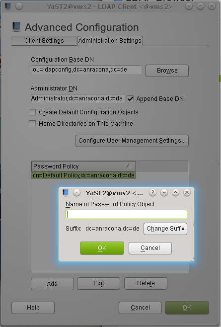
Das Problem ist aber, dass YaST2 dies direkt unter der LDAP-Wurzel tun will – also dort, wo auch schon das “Default Policy”-Objekt gemäß der Standardeinstellungen von YaST2 untergebracht wurde. Da hört bei mir jetzt ein wenig das Verständnis auf; ich finde es blöd, den Hauptast des LDAP-Baumes mit Einzelobjekten zuzupflastern.
Um das Ganze wenigstens etwas besser zu strukturieren, erzeugen wir uns mittels einer LDIF-Datei einen neuen Zweig
ou=policies,dc=anracona,dc=de
zur Unterbringung unserer Policy-Objekte im LDAP-Baum. Und bei der Gelegenheit legen wir uns gleich auch noch ein Policy-Objekt der Klasse “objectClass: pwdPolicy” an, das wir mit “norm” bezeichnen:
cn=standard,ou=policies,dc=anracona,dc=de
Eine entsprechende LDOF-Datei, die ich hier “ppolicy.ldif” nenne und in einem Verzeichnis “/root/ldapadmin/ldifs/” anlege, hat dann folgenden Inhalt:
dn: ou=policies,dc=anracona,dc=de
objectclass: organizationalUnit
ou:policies
dn: cn=norm,ou=policies,dc=anracona,dc=de
objectClass: namedObject
objectClass: pwdPolicy
pwdAttribute: userPassword
pwdCheckQuality: 2
pwdMinLength: 8
pwdMustChange: FALSE
Dann führen wir diese Datei mit folgendem Kommando auf dem LDAP-Server “vms2” aus:
vms2:~ # ldapadd -D “cn=Administrator,dc=anracona,dc=de” -W -x -a -f ./ldapadmin/ldifs/ppolicy.ldif
Mit YaST2’s LDAP-Browser überzeugen wir uns vom Ergebnis:
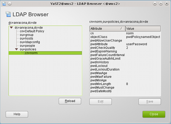
Wir haben ein neues spezielles “ppolicy”-Objekt angelegt, das sich von unserem “Default Policy”-Objekt im Moment nur dadurch unterscheidet, dass es eine Passwort-Länge von “8” Zeichen verlangt.
Dieses Policy-Objekt wollen wir nun einem unserer User zuordnen. Dies können wir unter YaST2 über die User- und Gruppenverwaltung tun:
Wir editieren zunächst unseren Testuser “tarja”
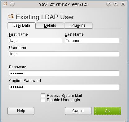
und klicken dort auf den Reiter “Plug-Ins”.
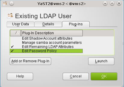
Dort launchen wir die “Passwor Policy Settings”, wählen auf der nächsten Maske die Standard Policy ab und klicken schließlich auf den “Browse”-Button.
Im sich öffnenden LDAP-Browser wählen wir unser neu angelegtes “norm”-“Policy Objekt” und weisen es dem User durch Klicken auf die übliche Kaskade von “OK”-Buttons zu.
Das Ganze funktioniert allerdings nur auf einer “pro User”-Basis. Diese Einschränkung liegt natürlich schon am “ldapmodify”.
Auf großen Systemen sollte man für Operationen, bei denen man viele User gleichzeitig modifizieren muss, mit einer Kombination aus Scripting und LDAP-Kommandozeilentools arbeiten. Typischerweise sucht man erst nach
LDAP-Einträgen, lädt das Ergebnis in ein File, welches man anschließend durch ein “sed”-Script manipuliert und schließlich als Eingabe für ldapmodify verwendet. Schade, dass Opensuse hier nichts passendes anbietet.
Leider wird man unter YaST2 nun auch vergeblich nach einer Maske suchen, über die man auf einfache Weise die Zuordnung von Policies zu Usereinträgen erkennen könnte.
Der Grund hierfür ist, dass es sich bei den “pwdSubEntry” – Einträgen um sogenannte “administrative” Einträge handelt, die auch “System-” oder “Directory”-Attribute genannt werden. Die allermeisten LDAP-Browser zeigen solche Einträge nicht an, da sie User-Manipulationen nicht zugänglich sein sollen. Hiervon macht auch der YaST2-LDAP-Browser keine Ausnahme. Mit “gq” kommt man auch nicht weiter.
Bleibt man bei YaST2, so muss man für den User, dessen Einstellungen einen interessieren, erneut die eben schon geöffnete YaST2-Maske in der User- und Gruppenverwaltung “launchen”, die der Verwaltung des “ppolicy”-Plug-Ins dient. Dort sieht man dann die aktuelle Zuordnung des gewählten Policy-Objekts zum User. Dieses Vorgehen führt aber pro User über mehrere Masken und ist deshalb unbequem.
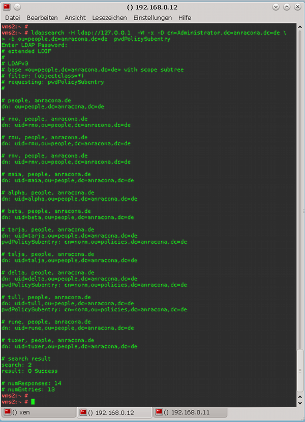
Tja, so verlassen wir nun langsam die Möglichkeiten von YaST2. Über das Kommandozeilen-Tool “ldapsearch” bekommen wir jedoch die Information, die wir haben wollen:
Das Testen, ob nun bei einem spezifischen User statt der “Default Policy” die Constraints des jeweiligen speziellen “Policy”-Objektes ziehen, überlassen wir dem Leser. Man geht dabei genauso vor, wie bereits oben beschrieben.
Nun bleibt dem Admin noch die mühsame Aufgabe, auf dem LDAP-Server weitere Policy-Objekte anzulegen und sie seinen Usern zuzuweisen. Dazu wird er die User typischerweise in Gruppen einteilen.
Zusammenfassung
In diesem Beitrag haben wir gesehen, wie man einem über LDAP verwalteten User-Account mit Hilfe der YaST2-Tools ein “Password-Policy”-Objekt des LDAP-Directories zuordnet. Wir hatten auch diskutiert, dass man die Einstellungen für die unter PAM aufgerufenen “cracklib”-Prüfungen auf den Systemen des Netzwerkes mit den zentralen Passworteinschränkungen in Einklang bringen sollte.
Der findige User wird aufgrund des oben Dargestellten nun sicher auch einen eigenen Weg finden, alle angelegten “Policy Objekte” – und auch das Default Policy”-Objekt – in einem dafür geeigneten Zweig des LDAP-Baums aufzuräumen.
Für Leute, die von dem Thema immer noch nicht genug haben, sei abschließend auf einen Artikel verwiesen, der zeigt, wie man die “ppolicy”-Technik von OpenLDAP mit SSH zusammenbringt:
http://directory.fedoraproject.org/wiki/Howto:PAM
Viel Spaß nun beim Anwenden zentraler LDAP Password Policies !