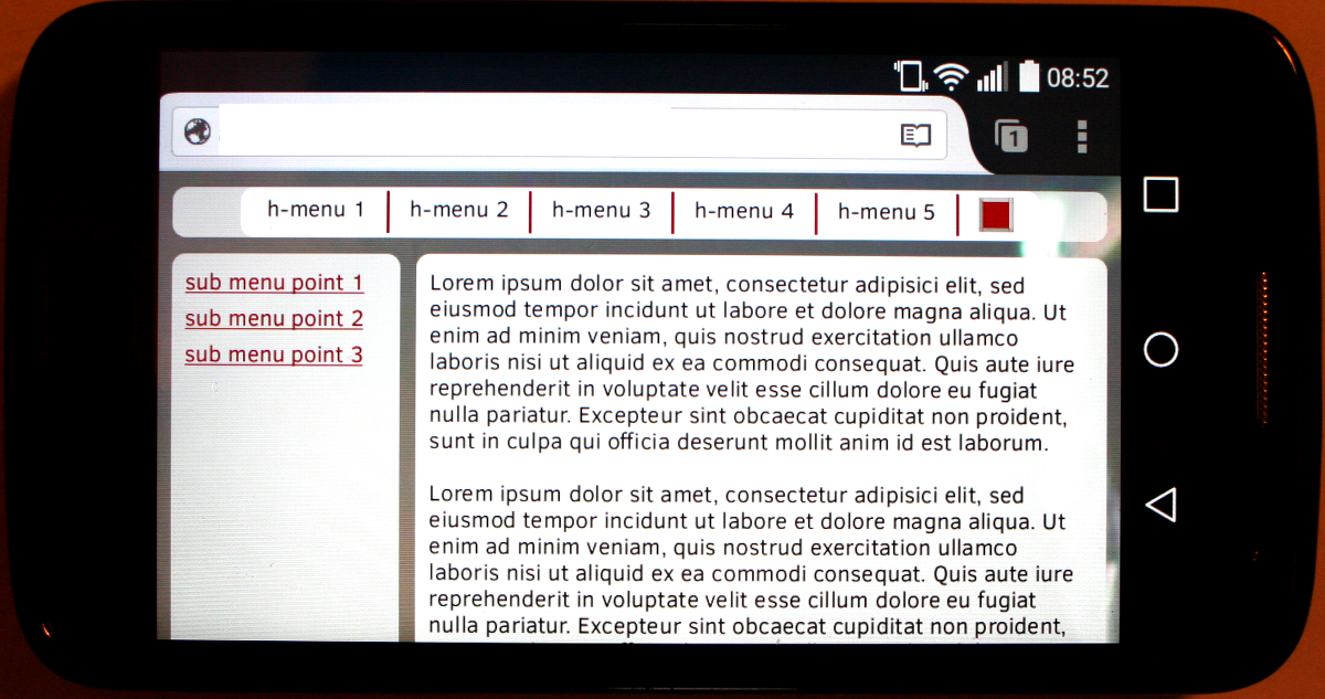
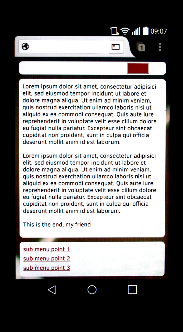
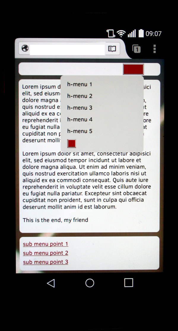
We continue with our series on responsive and at the same time fluid layouts with multiple columns :
Responsive fluid multi-column layouts – the DIV order problem – I
Responsive fluid multi-column layouts – the DIV order problem – II
Responsive fluid multi-column layouts – the DIV order problem – III
Responsive fluid multi-column layouts – with a responsive horizontal menu – IV
In the first article we had posed the problem of a required DIV order for an efficient realization of responsive fluid layouts. A complete overview over our responsive test scenario and over related HTML/CSS codes was given in articles II and III. In the fourth article of the series we looked at the responsive adaption of an originally horizontal menu to different viewport width ranges. So far all without Javascript [JS].
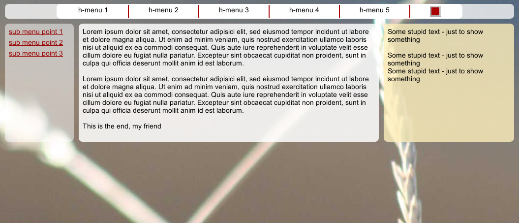
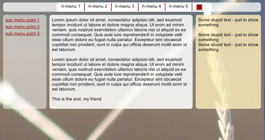
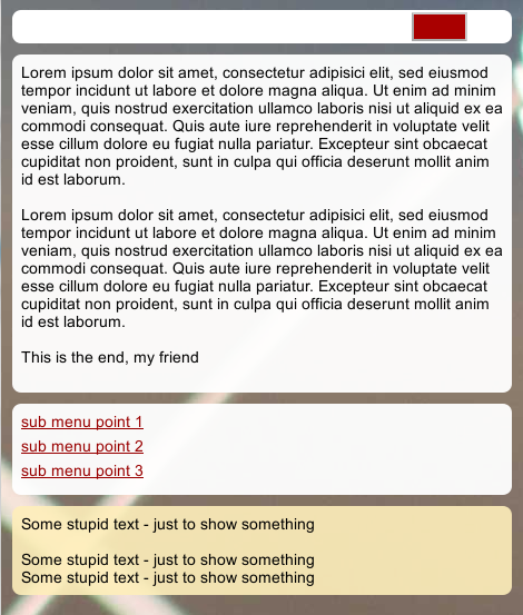
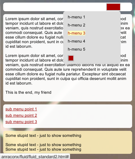
At small viewport widths (our so called viewport width Range I; see the second article of this series for a definition of viewport width ranges) we offered a “menu button” instead of a complete horizontal menu line. A mouseOver event over the button container (and in smartphones a tap on the menu button) opened the menu – but now in an adapted vertical form. See the pictures included in our last article.
Because no Javascript was used, the user had to move the mouse outside the visible button and menu areas to make the menu disappear. On a smartphone he/she would have to tap the finger to a point outside the visible menu area. Though functional (e.g. for users who deactivated JS) this kind of handling could be confusing. JS/jQuery gives us the chance to improve the situation by reacting to button clicks. We shall implement the required functionality in an object oriented way.
JS in addition gives us the opportunity to load or exchange CSS files. This may help us to react to the detection of mobile devices and e.g. adjust font-sizes by loading an adapted CSS file.
We shall discuss and apply both JS based techniques to our simple responsive test example. So, be prepared for a long code intensive article and switch the coffee machine on. Those who are impatient and rather would study code first may jump to this paragraph.
A more consistent handling of successive clicks on our “menu button” and of resize events after clicks would be:
- A first click on the menu button in Range I should make the menu visible (in vertical form and above all other page elements).
- A subsequent second click should hide the menu again.
- A “mouseover” event should become obsolete.
- When we resize the browser menu on a desktop by mouse dragging or on a smartphone by device rotation the menu should return to the original form and visibility defined by the CSS settings for the viewport width range reached.
In other words: The menu button in Range I should work like a toggle button for successive clicks and viewport resizing shall give the standard CSS settings priority again.
Before reading further about a series of details you may want to try our simple test example:
https://linux-blog.anracom.com/examples/fluid/fluid_standard2.html
We will use jQuery. Our JS strategy will be to create a “control object” [CtrlO] based on a constructor with prototype functions (“methods”) to manage the event handling. The approach of delegating event handling to object methods may appear unusual to JS beginners – but the initially required code overhead (in comparison to elementary “onClick”-handlers for the HTML elements) eventually leads in my opinion to a much better structured and manageable code for more complex pages – one CtrlO for each distinguished UI interaction area. This blows up the JS discussion a bit – but may be an interesting side aspect for some readers.
We assume that the reader is already familiar with the HTML code for the menu and the related CSS definitions presented in the last article. Before starting a in depth JS code discussion we first discuss some typical obstacles to overcome.
There are two major challenges that arise when you want to realize responsiveness mainly via Javascript and not only via CSS width conditions of the form
@media screen and (max-width : ….) { CSS statements for defined viewport width ranges }
To understand the type of problems that may occur imagine a user who continuously changes the viewport width up and down – e.g. by changing the browsers window size with the mouse on a desktop or indirectly by using the browsers scaling functionality. On a smartphone he/she could rotate the device from vertical to horizontal orientation and back again. Both actions trigger frequent or even permanent window “resize”-events to which the browser must react properly.
Problem 1: Priority of CSS property changes done by JS
One important thing is that CSS properties changed by Javascript – e.g. during the transition over viewport width threshold – automatically get a high priority:
Whatever CSS properties of HTML elements you set explicitly with JS: The change works as if a the property was changed inline for the affected DOM tree element (or as if a new line were added to the bottom of your CSS code). This in turn means: All previous settings – including the ones for the viewport width ranges – are overwritten! As a consequence your responsiveness may be hampered. E.g., if you at a viewport width threshold changed the position property of an HTML element to “absolute” via Javascript it would without any further measures stay so afterwards – even if your viewport width changes and your CSS rules for a certain viewport width range said “position:relative;”.
You could avoid this by using the CSS “!important” flag for the affected CSS properties in your CSS rules for certain viewport width ranges. But this “protection” of the property setting may in realistic scenarios conflict with other temporal and reasonable changes inflicted by other user UI interaction in a certain viewport range.
Alternatively you could check all the time by JS whether some new resize events are triggered in your browser and compare the present viewport size to threshold values and reset properties by Javascript again. This leads to problem 2. Actually, for most practical cases there is a more intelligent way to deal with this problem. See below.
Problem 2: Permanent tracking of resize events and aligning of CSS property settings between JS and our basic CSS definitions
If you need to make property changes via JS in certain viewport ranges, JS must get information about the present size of the viewport and must restore desired CSS property values. Your JS could react to the “window.onResize” event – which fires permanently as long as the browser window size changes. Ok, but if you have to
follow this event permanently and make all the same decisions all the time then JS will consume CPU time. And depending on the kind and depth of decisions this can have a significant effect on performance. On the other side you MUST align the decisions made on the Javascript side with your standard CSS settings for viewport width ranges defined in your CSS files, or inline CSS definitions for tags in the HTML code (i.e. in your CSS file). Together with problem 1 this may become a logical challenge.
How to circumvent the obstacles discussed above? In my opinion rule number 1 is:
You should always build your responsiveness mainly on pure CSS definitions for width ranges and involve JS only where and when absolutely necessary or helpful. The advantages in my opinion are: A CSS centered approach is more efficient, definitions for responsiveness are concentrated at one point and directly connected to other layout definitions, most of the maintenance does not require any programming knowledge and the performance of the browser gets much better.
In our specific test case: Involve JS only for the handling of the users interaction with the menu button in Range I and restrict the use of JS for this button – as it is only visible in viewport width Range I.
If you follow this main rule then the combination of two simple additional “tricks” can be helpful:
- Make your JS functionality intelligent enough to react to resize events only when necessary and restore the old conditions as soon as a resize happens. But do it only once (!) to avoid a permanent tracking of the resize event and a permanent repetition of decisions and reactions to it.
- Change CSS property values via loading an additional CSS class into a HTML object. Restoration of the original properties then becomes as simple as just removing the class again from the HTML object.
The first point means that we actually may sometimes track a resize event and react to it – but only under certain conditions. This is possible via dynamically switching the event handling On and Off again. More specifically: The very function that was triggered by an event handler for the resize event may turn off the same event handler!
We shall show below how to realize these rules for our test example. The basic principles can be transferred to more complex tasks.
There is another small obstacle which we need to overcome in our test example. For width Range I we had defined a rollover effect via a “:hover” definition for one of the inner menu containers “div#menu_cont”:
Excerpt of the HTML code for the horizontal main menu
<body onload="init_page();">
<div id="all">
	<div id="head">
		<div id="main_menu_cont">
			<div id="bg_hor_menu"></div>
			<div id="menu_cont" class="hover">
				<a id="hmen_but" title="main menu" href="#"></a>
				<div id="hmen_cont" class="hmen_cont">
					<div id="bg_ver_menu"></div>
					<ul id="menu_lst">
						<li><div class="hmen_pkt"><p><a href="#">h-menu 1</a></p></div></li>
						<li><div class="hmen_pkt"><p><a href="#">h-menu 2</a></p></div></li>
						<li><div class="hmen_pkt"><p><a href="#">h-menu 3</a></p></div></li>
						<li><div class="hmen_pkt"><p><a href="#">h-menu 4</a></p></div></li>
						<li>&
lt;div class="hmen_pkt"><p><a href="#">h-menu 5</a></p></div></li>
						<li class="hm_li_right"><div class="hmen_pkt"><a id="but2" href="#"></a></div></li>
						<li class="floatstop"></li>
					</ul>
				</div>
			</div>
			<p class="floatstop"> </p>
		</div>
	</div>
....
....
</div>
....
....
@media screen and (max-width : 539px)  {
....
	div#menu_cont:hover div.hmen_cont {
		visibility: visible;
	}
....
}
This provided us with a working solution for browsers with deactivated JS. However, when the target browser allows for JS we do not want this CSS pseudoclass definition to be active, because the “hover” effect shall be replaced by clicks on our menu button.
Unfortunately there is no way to change pseudo class definitions directly with JS or jQuery. Therefore, we move our “hover” settings into a class “hover” which we already smuggled into the HTML code of “div#menu_cont” above.
@media screen and (max-width : 539px)  {
....
	/*
	div#menu_cont:hover div.hmen_cont {
		visibility: visible;
	}
	*/

	div.hover:hover div.hmen_cont {
		visibility: visible;
	}

....
}
What is the advantage? With the help of JS and jQuery we can easily remove CSS classes from a tag. So, if JS is activated in the target browser one of our first actions would be to remove the class “hover” from the “div#menu_cont” element – and we would get rid of the hover effect completely. Thus, we do not need to remove our hover statement from the CSS code and remain prepared for non-JS situations.
Although it is convenient to use a responsive design as a first step to adapt web pages to smartphones and other mobile devices there is much truth in the statement that responsiveness is not equal to a dedicated mobile support.
First the general user interaction with an interface of limited physical dimensions is different from working on a desktop. Related aspects can be taken care of in responsive HTML/CSS/JS-definitions – but it includes logically more consideration than just planning reactions to small viewport widths in terms of pixels.
Another problem is the fact that due to the physical pixel density on mobiles a responsive layout without adjusting font-sizes may not be helpful. Especially for elderly people who have difficulties with reading small letters. Even if we do not want to investigate and distinguish pixel densities of different smartphones in detail, we would in general like to use bigger font-sizes on a smartphone than on a desktop browser:
Bigger font-sizes in certain viewport width ranges?
One first approach could be to enlarge font-sizes for small viewport width ranges. The disadvantage of this approach is that it also leads to enlarged fonts in desktop browsers, too, when the user shrinks the browser’s window width. But especially on a desktop we do not need to enlarge the normal font-size for narrow browser windows. There it is even counterproductive! So, if you follow a policy to raise font-size values for small viewport widths, do it moderately and without exaggeration.
Check for mobile browsers and load adapted CSS files with larger fonts!
With Javascript I personally would follow a different approach:
- Firstly, I would use JS to check for a mobile browser and
- secondly, I would enlarge text(!)-fonts if a mobile browser is detected –
without changing dimensions of other HTML objects.
We can achieve font-size changes simply by
- either appending an additional style sheet
- or replacing the existing style sheet with another style sheet
that contains new font-size definitions and another adjustments for mobiles for all width-ranges. Whether you replace or append might be a question of complexity. If you intend to change important viewport width thresholds I would choose a replacement strategy. When appending additional statements it may become very difficult to see and plan what has to be changed. For our simple test case will will append an additional file. (Its easier to see what we have changed, then.)
What do we need to take care of when changing font-sizes?
Personally, I scale almost all dimensions of my HTML objects by “em” or “rem”. In such a case we would NOT change the overall font-size definition in the <html>- or <body>-tag because this would rescale the whole page layout. We only change the font-settings and adjust other special size related properties for <p> and other tags in the additional CSS file! Note that changed font-sizes may in particular require an adjustment of (min-)heights, line-heights, margins and paddings, also of surrounding elements in our basic layout.
Another topic is the setting of width thresholds for menu adaptions: We saw in the last article that we set our width thresholds for changing padding/margin-values of menu elements such that we avoided wrapping into several menu lines. However, as we have explained, these threshold values depend on the font-size, too. Therefore, we need to adapt or introduce new viewport width thresholds for our menu behavior.
For reasons of completeness we list both the modified HTML and its CSS file below.
HTML file for our test case
<!DOCTYPE html>
<html>
<head>
<meta charset="UTF-8">
<meta name="viewport" content="width=device-width, initial-scale=1">
<title>fluid standard 2</title>
<link id="myMainCSS" href="css/fluid_standard2.css" rel="stylesheet">
<!-- The following CSS sheet will be loaded by JS  -->
<!--<link href="css/fluid_standard2_mobile.css" rel="stylesheet">-->

<script type="text/javascript" src="scripts/jquery-2.1.1.min.js"></script>
<script type="text/javascript" src="scripts/detectmobilebrowser_jQuery.js"></script>
<script type="text/javascript" src="scripts/response2.js"></script>
</head>

<body onload="page_init();">
<!-- 3 spalten layout -->
<div id="all">
	<div id="head">
		<div id="main_menu_cont">
			<div id="bg_hor_menu"></div>
			<div id="menu_cont" class="hover">
				<a id="hmen_but" title="main menu" href="#"></a>
				<div id="hmen_cont" class="hmen_cont">
					<div id="bg_menu"></div>
					<ul id="menu_lst">
						<li><div class="hmen_pkt"><p><a href="#">h-menu 1</a></p></div></li>
						<li><div class="hmen_pkt"><p><a href="#">h-menu 2</a></p></div></li>
						<li><div class="hmen_pkt"><p><a href="#">h-menu 3</a></p></div></li>
						<li><div class="hmen_pkt"><p><a href="#">h-menu 4</a></p></div></li>
						<li><div class="hmen_pkt"><p><a href="#">h-menu 5</a></p></div></li>
						<li class="hm_li_
right"><div class="hmen_pkt"><a id="but2" href="#"></a></div></li>
						<li class="floatstop"></li>
					</ul>
				</div>
			</div>
			<p class="floatstop"> </p>
		</div>
	</div>


	<div id="outer_cont">
		<div id="bg_left0"></div>
		<div id="bg_right0">
			<!-- do not remove ! -->
			<div id="bg_right_inner0"></div>
		</div>
		<div id="bg_info0"></div>

		<div id="float_cont">
			<div id="main_cont">
				<div id="bg_left1"></div>
				<div id="bg_info1"></div>

				<div id="info_cont">
					<div id="float_info">
						<div id="bg_info2"></div>
						<div id="info">
							<p>Lorem ipsum ... </p>
							<p> </p>
							<p>Lorem ipsum ...</p>
							<p> </p>
							<p>This is the end, my friend<br> </p>
						</div>
					</div>
					<div id="left_nav">
						<div id="bg_left2"></div>
						<div id="left_inner">
							<ul>
								<li><p><a href="#">sub menu point 1</a></p></li>
								<li><p><a href="#">sub menu point 2</a></p></li>
								<li><p><a href="#">sub menu point 3</a></p></li>
							</ul>
						</div>
					</div>
					<p class="floatstop"> </p>
				</div>
			</div>

			<div id="right">
				<div id="bg_right2"></div>
				<div id="right_inner">
					<p>Some stupid text - just to show something</p>telekom störung
					<p> </p>
					<p>Some stupid text - just to show something</p>
					<p>Some stupid text - just to show something</p>
				</div>
			</div>

			<p class="floatstop"> </p>

		</div>
	</div>
</div>
</body>
</html>
You see that we now load JS files – first the jQuery file of a present version, then a file suited for jQuery which helps to detect browsers. You can download the latter open source file, which contains a long regex test on browser information, from the following web page:
http://detectmobilebrowsers.com/
The last JS file is our own Javascript code (see below).
CSS file for our test case
@CHARSET "UTF-8";

html {
	font-size:10px;
}

body {
	margin-left:0;
	margin-right:0;
	margin-top: 0;
	background-image: url(../image/hg_straa_mp.jpg);
	background-repeat:no-repeat;
	background-position:top center;

	font-family: Arial;
}

p {
	font-size: 1.4rem;
	line-height: 1.6rem;
	margin: 0;
}


div#all {
	position:relative;
	width:100%;
	padding-bottom: 1.0rem;
	padding-top: 1.0rem;

}

/* The header region */
/* *******************/

div#head {
	position:relative;
	width:100%;
	min-height: 3.0rem;
	z-index: 6;
}

/* The main contents container */
/* *************************** */

div#outer_cont {
	position:relative;
	width:100%;
	min-height: 10.0rem;
	margin-top:1.0rem;
	z-index: 1;
}


/* some elementary width definitions */
/* --------------------------------  */
div#left_nav,
div#bg_left0,
div#bg_left1  {
	width: 14rem;
}

div#left_nav {
	margin-left: 1.0rem;

}

div#right,
div#bg_
right0 {
	width: 27%;
}


/* background elements for all columns in range I */

div#bg_left0,
div#bg_left1,
div#bg_left2,
div#bg_right0,
div#bg_right_inner0,
div#bg_right2,
div#bg_info0,
div#bg_info1,
div#bg_info2  {
	position: absolute;
	top:0;
	bottom:0;
	border-radius: 0.8rem;
}

div#bg_left0 {
	left:1.0rem;
	background-color: #FFF;
	opacity: 0.5;
	border: 0px solid #F00;
	z-index:1;
}

div#bg_info0 {
	position: absolute;
	left:16.0rem;
	right:27%;
	background-color: #FFF;
	opacity: 0.85;
	border: 0px solid #00F;
	z-index:1;
}

div#bg_right0 {
	right: 0;
	border: 0px solid #F00;
	z-index:1;
}

div#bg_right_inner0 {
	left: 1.0rem;
	right: 1.0rem;
	background-color: #FEEEBB;
	opacity:0.80;
}


/* The float container and its basic elements */
/* ****************************************** */

div#float_cont {
	position:relative;
	width: 100%;
	border: 0px solid #FF0000;
	z-index:5;
}

/* floated left main container and
 * its background elements for range II*/

div#main_cont {
	position: relative;
	float: left;
	width:100%;
	min-height: 2.0rem;
	border: 0px solid #009900;
	z-index:1;
}


div#bg_left1 {
	display: none;
	left:1.0rem;
	background-color: #FFF;
	opacity: 0.75;
	border: 0px solid #F00;
	z-index:1;
}

div#bg_info1 {
	display: none;
	left:16.0rem;
	right:1.0rem;
	background-color: #FFF;
	opacity: 0.9;
	border: 0px solid #00F;
	z-index:1;
}


/* The main column */
/* --------------- */


div#info_cont {
	position: relative;
	width:100%;
	border:0px #F00 solid;
}

div#float_info {
	position:relative;
	float:left;
	width: 100%;
	/*background-color: #99e;*/
	border: 0px solid #FF0000;
	z-index:2;
}


div#info {
	position: relative;
	margin: 0 27% 0 16rem;
	width:auto;
	/*background-color: #0f0;*/
	padding:0.8rem;
	/*height:200px;*/
	z-index: 1;
}

div#bg_info2 {
	display: none;
	left:1.0rem;
	right:1.0rem;
	background-color: #FFB;
	background-color: #FFF;
	opacity: 0.95;
	border: 0px solid #00F;
	z-index:1;
}


/* left column */
/* ----------- */

div#left_nav {
	position:relative;
	float:left;
	border: 0px solid #009900;
	margin-left: -100%;
	padding-left: 1.0rem;
	z-index:5;
}

div#left_inner {
	position: relative;
	width:auto;
	padding: 0.8rem;
	z-index: 2;
}

div#bg_left2 {
	display: none;
	left:1.0rem;
	right:1.0rem;
	border: 0px solid #F00;
	background-color: #FFF;
	opacity: 0.9;
	z-index:1;
}


/* right column */
/* ------------ */

div#right {
	float:left;
	position:relative;
	margin-left: -27%;
	min-height: 2.0rem;
	/*min-width: 15.2rem;*/
	/*background-color: #eee;*/
	border: 0px solid #009900;
	z-index:2;
}

div#right_inner {
	position:relative;
	width:auto;
	margin-left: 1.0em;
	margin-right: 1.0em;
	padding: 0.8rem;
	z-index: 2;
}

div#bg_right2 {
	display: none;
	left:1.0rem;
	right:1.0rem;
	border: 0px solid #F00;
	background-color: #FEEEBB;
	opacity: 0.85;
	z-index:1;
}


/* Support elements */

p.floatstop {
	clear:both;
	height:0;
	margin:0;
	line-height:0;
	padding: 0;
	font-size: 0;
}


/* contents of the upper horizontal menu */
/*-------------------------------------- */


div#main_menu_cont {
	display: block;
	position: relative;
	width: auto;
	margin-left: 1.0rem;
	margin-right: 1.0rem;
	min-height: 3.0rem;
}

div#bg_hor_menu {
	display:block;
	position: absolute;
	top: 0;
	bottom: 0;
	left: 0;
	right: 0;

border-radius: 0.8rem;
	background-color: #FFF;
	opacity: 0.75;
	z-index: 1;
}


div#menu_cont {
	display: block;
	position: relative;
	float:right;
	width: 100%;
	min-height: 3.0rem;
	z-index: 2;

	/* helps to center its enclosed container */
	text-align: center;
}


a#hmen_but {
	display: none;
	width: 4.6rem;
	height: 2.2rem;
	margin-top:0.2rem;
	background-color: #A90000;
	border-top: 0.2rem #CCC solid;
	border-right: 0.2rem #CCC solid;
	border-left: 0.2rem #AAA solid;
	border-bottom: 0.2rem #AAA solid;
}


div.hmen_cont {
	position: relative;

	/* display: block; */

	/* makes horizontal centering possible despite undefined width */
	display: inline-block;

	min-height: 3.0rem;

	/* A second method of centering - optically determined by the viewport width */
	/*
	width: auto;
	margin-right:0.8em;
	margin-left:0.8em;
	*/

	border-radius: 1.0rem;

	/* centers the enclosed list ! */
	text-align: center;
}

div#hmen_cont.vis {
	visibility:visible;
}


div#bg_menu {
	display:block;
	position: absolute;
	top: 0;
	bottom: 0;
	left: 0;
	right: 0;
	border-radius: 0.8rem;
	background-color: #FFF;
	opacity: 1.0;
	z-index: 1;
}


div.hmen_cont ul {
	position: relative;

	/* makes horizontal centering possible despite undefined width */
	display: inline-block;
	list-style-type: none;
	/*width: 100%;*/
	margin: 0;
	padding: 0;
	padding-left: 0.4rem;
	padding-right: 0.4rem;
	z-index:2;
}

div.hmen_cont ul li,
div.hmen_cont ul li.hm_li_left,
div.hmen_cont ul li.hm_li_right {
	float: left;
	padding: 0.2rem 4.0rem 0.2rem 4.0rem;
	margin:0;
	margin-top:0.2rem;
	height: 2.2rem;
	/*border-left: #ffffff 1px solid;*/
	border-right: #a90000 0.2rem solid;
	min-height: 2.0rem;
}

div.hmen_cont ul li.hm_li_left {
	border-left: #a90000 0.2rem solid;
}
div.hmen_cont ul li.hm_li_right {
	border-right: 0;
}


div.hmen_cont ul li.floatstop {
	float:none;
	clear:both;
	height:0;
	min-height: 0;
	margin:0;
	line-height:0;
	padding: 0;
	font-size: 0;
	border:0;
}

div.hmen_cont ul li a,
div.hmen_cont ul li a:visited  {
	text-decoration: none;
	color: #000;
}

div.hmen_cont ul li a:hover {
	color: #A90000;
	background-color: #FFFFBB;
}


a#but2 {
	display: block;
	width: 1.6rem;
	height: 1.6rem;
	background-color: #A90000;
	border-top: 0.2em #CCC solid;
	border-right: 0.2rem #CCC solid;
	border-left: 0.2rem #AAA solid;
	border-bottom: 0.2em #AAA solid;
}


/* contents of the left vertical menu */

#left_inner ul {
	width:100%;
	min-height: 2.2rem;
	list-style-type: none;
	padding: 0;
	margin: 0;
}

#left_inner ul li {
	width:100%;
	min-height: 2.2rem;
}


#left_inner ul li a,
#left_inner ul li a:visited {
	color: #990000;

}
#left_inner ul li a:hover {
	color: #000;
	background-color: #FFFFBB;
}


/* ---------------------------------------------- */

/* @media screen decision and settings for the horizontal menu */

@media screen and (max-width : 860px) {

	div.hmen_cont ul li,
	div.hmen_cont ul li.hm_li_left,
	div.hmen_cont ul li.hm_li_right
	 {
		padding: 0.2rem 1.2rem 0.2rem 1.2rem;
	}
}


/* @media screen decision and settings for range II */

@media screen and (min-width : 540px) and (max-width :828px) {

	div#info {
		margin: 0 2.0rem 0 16rem;
		background-color:transparent;
	}

	div#right {
		float:left;
		margin-top:1.0rem;
		margin-left: 0;
		margin-right: 0;
		width:100%;
	 }

	div#right_inner {
		margin-left: 1.0rem;

margin-right: 1.0rem;
		width: auto;
		/* background-color: #FEEEBB; */
		border-radius: 0.8rem;
	}

	/*
	 * Switch OFF backgrounds after 1st viewport width transition
	 */
	div#bg_left0 {
		display: none;
	}
	div#bg_info0 {
		display:none;
	}
	div#bg_right0 {
		display: none;
	}


	 /*
	  * Switch ON backgrounds after first viewport width transition
	 */

	 div#bg_left1 {
		display: block;
	 }

	 div#bg_info1 {
		display: block;
	 }
	 div#bg_right2 {
		display: block;
		opacity: 0.9;
	 }

}


/* ---------------------------------------------- */


/* @media screen decision and settings for range I */


@media screen and (max-width : 539px)  {


	div#info {
		margin: 0 1.0rem 0 1.0rem;
		/* background-color: #FFB; */
		border-radius: 0.8rem;
	}


	div#left_nav {
		margin-top:1.0rem;
		margin-left: 0;
		width:100%;
		padding:0;
	}

	div#left_inner {
		width:auto;
		padding: 0.8rem;
		margin: 0 1.0rem 0 1.0rem;
		/*  background-color: #DDDDDD; */
		border-radius: 0.8rem;
		z-index: 2;
	}

	div#right {
		float:left;
		margin-top:1.0rem;
		margin-left: 0;
		margin-right: 0;
		width:100%;
	 }

	div#right_inner {
		margin-left: 1.0rem;
		margin-right: 1.0rem;
		width: auto;
		/* background-color: #FEEEBB;*/
		border-radius: 0.8rem;
	}

	/*
	 * Switch OFF backgrounds after 2nd viewport width transition
	 */

	div#bg_info0 {
		display: none;
	 }
	div#bg_info1 {
		display: none;
	 }

	div#bg_right0 {
		display: none;
	}

	div#bg_left0 {
		display: none;
	}
	div#bg_left1 {
		display: none;
	}

	/*
	 * Switch ON backgrounds after 2nd viewport width transition
	*/
	div#bg_info2 {
		display: block;
		opacity: 0.95;
	}
	div#bg_left2 {
		display: block;
		opacity: 0.95;
	}
	div#bg_right2 {
		display: block;
		opacity:0.9;
	}


	/*
	* Treatment of the horizontal menu
	*/

	div#bg_hor_menu {
		opacity: 1.0;
	}


	div#menu_cont {
		margin-right: 4.0rem;
		width: 5.0rem;  /* button size ! */
		height: 3.0rem;
	}

	a#hmen_but {
		display: block;
	}


	/*
	div#menu_cont:hover div.hmen_cont {
		visibility: visible;
	}
	*/

	div.hover:hover div.hmen_cont {
		visibility: visible;
	}


	div.hmen_cont {
		position: absolute;
		visibility:hidden;
		top:3.0rem;
		right:0;
		min-height: 3.0rem;

		width: auto;
		min-width: 18.4rem;
		max-width: 25.0rem;

		margin-right:0rem;
		margin-left:auto;

		padding: 0.8rem;

		background-color: #DDD;
		border-radius: 1.0em;

		text-align: left;
	}

	div#bg_menu {
		background-color: #DDD;
		opacity: 1.0;
	}


	div.hmen_cont ul {
		position: relative;
		list-style-type: none;
		width: auto;
		margin: 0;
		padding: 0;
	}

	div.hmen_cont ul li,
	div.hmen_cont ul li.hm_li_left,
	div.hmen_cont ul li.hm_li_right {
		float: none;
		padding: 0.2rem 0.4rem 0.2rem 0.8rem;
		width:auto;
		/*border-left: #ffffff 1px solid;*/
		border-right: #a90000 0.0rem solid;
		min-height: 2.0rem;
	}

	div.hmen_cont ul li.floatstop {
		float:none;
	}

	div.hmen_cont ul li p {
		margin-top:0;
		line-height: 1.6rem;

	}

}

/* extreme case - reached e.g. by Ctrl + */
/* -------------------------------------- */
@media screen and (max-width : 260px)  {
	div#menu_cont {
		margin-right: 4.0rem;
	}

	div.hmen_cont {Additional CSS file to be loaded dynamically for mobiles
		right: -4.0rem;
		width: auto;
		min-width: 0;
	}


div#bg_menu {
		background-color: #DDD;
	}

}
More or less the same as presented in our last article. Note that we have introduced class “.vis” :
div#hmen_cont.vis {
visibility:visible;
}
We shall use use this class in our Javascript code.
Additional CSS file to be loaded dynamically for mobiles
@CHARSET "UTF-8";
p {
	font-size: 1.6rem;
	line-height: 2.0rem;
	margin: 0;
}


/* contents of the upper horizontal menu */
/*-------------------------------------- */

div.hmen_cont ul li,
div.hmen_cont ul li.hm_li_left,
div.hmen_cont ul li.hm_li_right {
	padding: 0.2rem 3.4rem 0.2rem 3.4rem;
	height: 2.4rem;
	min-height: 2.2rem;
	line-height: 2.0rem;
}

/*-------------------------------------- */

/* @media screen decision and settings for the horizontal menu */

@media screen and (max-width : 860px) {

	div.hmen_cont ul li,
	div.hmen_cont ul li.hm_li_left,
	div.hmen_cont ul li.hm_li_right {
		padding: 0.2rem 1.0rem 0.2rem 1.0rem;
	}
}

/* ---------------------------------------------- */

/* @media screen decision and settings for range I */

@media screen and (max-width : 539px)  {

	div.hmen_cont ul li,
	div.hmen_cont ul li.hm_li_left,
	div.hmen_cont ul li.hm_li_right {
		padding: 0.2rem 0.4rem 0.2rem 0.8rem;
	}

	div.hmen_cont ul li p {
		margin-top:0;
		line-height: 2.0rem;
	}
}
You see that we raised the <p>-font-size from 1.4rem to 1.6rem and adjusted other properties. This change is moderate – the reason being that I was too lazy to adapt the columns of the whole web structure. For larger font-sizes you had e.g. to enlarge the right menu block. But the font-size effect will be visible – and this is enough for demonstration purposes.
The JS code is propbably a bit more complicated than the reader expects – but we shall address interesting points in a minute. Still the code at some points is kept relatively simple and can/must of course be improved for real world cases.
JS code to load an additional style sheet for mobiles and to control the menu button actions at small viewport widths in our test example
* JS example to control the menu in a responsive layout
 */


// --------------------------------------------------------
// Constructor declarations
// --------------------------------------------------------

/**
 * Constructor of a global object controller object
 * - to prevent clattering of the global space
 * - to build all CtrlOs (each CtrlO is a singleton)
 */
function Anracon_GlobalObjectController(globalContext) {

	this.global = globalContext;

	// Prefixes for CtrlOs and their constructors
		this.ctrloPrefix  = "CtrlO_";
		this.constrPrefix = "Ctrl_";

	// CtrlO names - here we have only one CtrlO,
	// more CtrlOs would be handled on more complex pages
		this.ay_objNames 	 = new Array('Hmenu');
		this.len_ay_objNames = this.ay_objNames.length;


	// address of aditional mobile ccs file
		this.cssMobileFileUrl = "css/fluid_standard2_mobile.css";


    // Initial action to check for Mobile browser and to load additional CSS sheet
	// or to replace aaditional CSS sheet
	// check for mobile browser and react
	// --------------------------------

		// Shall the CSS file be replaced ?
		this.replaceCss = false; // false: CSS file will be appended, true: ex. css file will be replaced

		// Tag of
CSS file to be replaced
		this.cssLinkId = "#myMainCSS";

		this.mobile = false;
		if ($.browser != undefined ) {
			if ( $.browser.mobile != undefined ) {
				this.mobile = $.browser.mobile;
			}
		}

		// Load additional style sheet or replace existing style sheet to enlarge fonts
		// done already here to avoid unnecessary flickering
		this.mobile = true;
		if ( this.mobile ) {
			this.loadCssFile( this.cssMobileFileUrl, this.replaceCss, this.cssLinkId );
		}
}


/**
 * GOC method to create all CtrlOs after (!) web page creation
 * HTML object must exist before instanciating the CtrlOs
 */
Anracon_GlobalObjectController.prototype.populate = function() {

	var ctrloName;
	var constrName;

	// Loop over all defined CtrlO names
	// ----------------------------------
	for (i=0; i < this.len_ay_objNames; i++) {
		ctrloName  = this.ctrloPrefix  + this.ay_objNames[i];
		constrName = this.constrPrefix + this.ay_objNames[i];
		console.log("constructor_name = " + constrName);

		// Creation of all required CtrlOs
		// -------------------------------
		// via indirect addressing and indirect call of constructors
		this[ctrloName] = new this.global[constrName](ctrloName);
	}

	this.pushObjectReferences();
};


/**
 * GOC method to dispatch references to every CtrlO across all CtrlOs
 * each CtrlO should be able to address other CtrlOs
 *
 */
Anracon_GlobalObjectController.prototype.pushObjectReferences = function() {

	var i=0, j=0;
	var presentCtrloName = '';
	var globalCtrloName = '';
	var localCtrloName  = '';

	var localCtrloPrefix = this.ctrloPrefix;  // We use the same name as CtrlOs are singletons

	// Loop over all CtrlOs
	// --------------------
	for (i=0; i < this.len_ay_objNames; i++) {

		// "Present" CtrlO to which references of OTHER CtrlOs are dispatched
		presentCtrlOName = this.ctrloPrefix + this.ay_objNames[i];
		console.log("GOC push references into the following CtrlO :: i = " + i + " global CtrlO name = " + presentCtrlOName);

		// Dispatch all other CtrlO references to the present CtrlO
		// --------------------------------------------------------
		for (j=0; j < this.len_ay_objNames; j++) {
			if (j != i) {
				localCtrloName	= localCtrloPrefix + this.ay_objNames[j];
				globalCtrloName	= this.ctrloPrefix + this.ay_objNames[j];

				if ( this[presentCtrlOName][localCtrloName] == null || this[presentCtrlOName][localCtrloName] == 'undefined' ) {

					// assign the reference of the other CtrlO to a variable in the present CtrlO
					this[presentCtrlOName][localCtrloName] = this[globalCtrloName];
				}

				console.log(" reference to " + globalCtrloName + " assigned");
			}
		}
	}
};


/**
 * GOC method to load additional CSS sheets
 *
 * @param url  - address of CSS sheet relative ot the HTML file
 */
Anracon_GlobalObjectController.prototype.loadCssFile = function(url, replaceCss, cssLinkId) {

	var linkIdentifier = "<link rel=\"stylesheet\" type=\"text/css\" href=\"" + url + "\">";
	var cssLinkToFile = $(linkIdentifier);  // if already there it will not be cloned (see jQuery .append docu)

	var styleSheetSelector = '';

	if ( replaceCss == undefined ) {
		replaceCss = false;
	}

	if( cssLinkId != undefined ) {
		styleSheetSelector = cssLinkId + "[rel=stylesheet]";
	}

	// Non consistent parameters
	if ( replaceCss && styleSheetSelector == '') {
		// Include some error handling here .....
		// we just do nothing and thus fall back to the old CSS file
		return;
	}

	if ( replaceCss == true ) {
		$(styleSheetSelector).attr('href', url);
	}

	if ( !replaceCss ) {
		$("head").append(cssLinkToFile);
	}
};

r

/**
 * Constructor for the CtrlO which controls
 * the user interaction with the horizontal menu
 *
 *  @param obj_name  my own object name in the GOC
 */
function Ctrl_Hmenu(objName) {

	// Reference to our GOC
	// ----------------------
		this.GOC = Anracon_GOC;
		this.myName = this.GOC.ctrloPrefix + objName;
		// other CtrlOs references are received through a dispatching process

	// HTML IDs = identifiers for jQuery
	// -----------------------------------
		this.id_menuCont  = "#" + "menu_cont";
		this.id_hmenuBut  = "#" + "hmen_but";
		this.id_hmenuCont = "#" + "hmen_cont";

		this.id_rightInner = "#" + "right_inner";

	// variables
	// ----------
		// button clicked ?
		this.butMenuClicked = 0;
		// mobile browser ?
		this.mobile = false;


	// Some initial action
	/// ******************

	// switch off event handler for rollover set by CSS for non JS situations
	// ------------------------------------
		$(this.id_menuCont).removeClass("hover");

	// check for mobile browser and react
	// --------------------------------
		if ($.browser != undefined ) {
			if ( $.browser.mobile != undefined ) {
				this.mobile = $.browser.mobile;
			}
		}
		// Add message to the right column for test scenario
		this.rightTxt  = $(this.id_rightInner).html();
		this.mobileStr = '';
		if ( this.mobile ) {
			this.mobileStr = "<p style=\"color:red; font-weight:bold; margin-top:1.0rem;\">JS: Mobile browser detected!<br>Using bigger font-sizes!</p>"
		}
		else {
			this.mobileStr = "<p style=\"color:red; font-weight:bold; margin-top:1.0rem;\">JS: No mobile browser detected!</p>"
		}

		// Message
		this.rightTxt += this.mobileStr;
		$(this.id_rightInner).html(this.rightTxt);

		// Load additional CSS-sheet
		// --- Not done here, but initially - see GOC ----


	// register functionality for controlled HTML elements
	// -------------------------
		this.register_events();

	console.log("Constructor of Ctrl-Object " + this.myName);

}


/**
 * CtrlO method to register events for the active elements of the menu container
 */
Ctrl_Hmenu.prototype.register_events = function() {

	$(this.id_hmenuBut).click(
		$.proxy(this, 'displayHmenu')
	);

	console.log("From CtrlO Hmenu: Callback for click on menu button registered " );
};


/**
 * Ctrlo method to display the menu after a click on the menu button
 */
Ctrl_Hmenu.prototype.displayHmenu = function(e) {

	var method = 0;	// 0: load and unload additiinal css class
					// 1: directly change CSS property visibility

	e.preventDefault();

	if ( method == 0 ) {
		if ( this.butMenuClicked == 0 ) {
			$(this.id_hmenuCont).addClass("vis");

			// activate handler for window.resize event
			$(window).on("resize", $.proxy(this, 'removeClassVis') );

			this.butMenuClicked = 1;
			console.log("menu button clicked - menu activated" );
		}
		else {
			// $(this.id_hmenu_cont).css('display', 'none');
			$(this.id_hmenuCont).removeClass("vis");
			this.butMenuClicked = 0;
			console.log("menu button clicked - menu deactivated" );
		}
	}
	else {
		if ( this.butMenuClicked == 0 ) {
			$(this.id_hmenuCont).css('visibility', 'visible');
			this.butMenuClicked = 1;
			console.log("menu button clicked - menu activated" );
		}
		else {
			$(this.id_hmenuCont).css('visibility', 'hidden');
			this.butMenuClicked = 0;
			console.log("menu button clicked - menu deactivated" );
		}
	}
};


/**
 * Ctrlo method to remove the visibility class from the menu button
r
 *  - Note: this helps to avoid trouble with resizing
 */
Ctrl_Hmenu.prototype.removeClassVis = function(e) {
	console.log("resize event");
	$(this.id_hmenuCont).removeClass("vis");
	this.butMenuClicked = 0;

	// remove handler for window.resize event to avoid permanent event handling
	$(window).off("resize");

	console.log("class vis removed");

};


// --------------------------------------------------------------
// function declarations
// --------------------------------------------------------------

/**
 * Function to create all CtrlOs in the GOC
 * more is not required - the rest is done by methods of CtrlOs
 */
function page_init() {

	var GOC_name = "Anracon_GOC";
	// CtrlO creation
	this[GOC_name].populate();
}


//----------------------------------------------------------------------------
// Executable statements - after all declarations are known to the interpreter
// ----------------------------------------------------------------------------

// We now create our own container for all CtrlOs
// required to control the user interaction with elements of our web page
this.Anracon_GOC = new Anracon_GlobalObjectController(this);
The first thing we do is to create a global object “Anracon_GOC” – a Global Object Controller [GOC] – which shall control a variety of so called “Control Objects” (CtrlOs) for defined regions, i.e. containers, of a web page. A CtrlO contains all required functionality for all interactive GUI elements of the controlled container. Thus, we avoid clattering the global context with functions and variables.
Actually in our case we only need one CtrlO object for our menu container “div#main_menu_cont”. But I have left some parts of method code relevant for the treatment of multiple CtrlOs of more complex pages. The names of all CtrlOs which shall be created should be listed in the array “ay_objNames” of the constructor function “Anracon_GlobalObjectController()” for the GOC-object. Constructor functions of the form “Ctrl_NameoftheCtrlO” must be defined for all CtrlOs, which we want to handle. The name NameoftheCtrlO is the related name saved in the array “ay_objNames”. Prefixes are defined for both the constructor functions and the CtrlO objects.
The prototype “method” defined as “Anracon_GlobalObjectController.prototype.populate” creates all CtrlO objects defined. Do not get confused by the indirect addressing in the statement for object creation – this was done for convenience, i.e. for an automatic assignment of the right object names and the choice of the right constructors based on defined prefixes and the contents of our object name array. You may be astonished that the “new” operator is not followed by a literal. Actually the “new” operator in JS requires the address of a constructor function object – this is in our case provided as the relevant function reference in the global context (remember: a function in JS is itself an object!).
As the CtrlOs must in complex web pages be able to interact with each other, a further “method” defined in Anracon_GlobalObjectController.prototype.pushObjectReferences of the GOC dispatches references of all created CtrlOs to each of the CtrlOs. It is not necessary to discuss details here as we only have one CtrlO to care for.
The method defined as Anracon_GlobalObjectController.prototype.loadCssFile loads the mentioned additional CSS file for mobiles. This method is called in the GOCs constructor in case that the function defined in the file “detectmobilebrowser_jQuery.js” had set a variable of the jQuery object – namely jQuery.browser.mobile – to true. The url is the path or address of
the CSS file to load. The early loading of the additional CSS file helps to prevent page flickering flickering.
Addendum 09.09.2015: We have added some parameters and code to loadCssFile() to show what would have to be done, if we wanted to replace teh original CSS file instead of appending an additional one.
The object “CtrlO_Hmenu” is based on the constructor function “Ctrl_Hmenu(objName)”. It provides the desired functionality for our main menu container. In our test case the only interactive element is our menu button. The constructor first defines selectors for certain elements of the menu and also the text container in the right column of our layout (see the previous articles).
The first relevant action is to remove the “hover”-effect of our old JS-free solution by removing the defined CSS class “hover”, which we defined from the container “div#menu_cont”. This class triggered the “mouseOver” based remote rollover effect discussed in our last article. No such class – no “hover” and no possible negative impact on our aspired “click”-based control for the menu.
In the next step we display a message in case that we detected a mobile browser. We do this in the right column of our layout. The last step consist of a delegation of the functionality for handling a “click” on the menu-button to a method displayHmenu of the object CtrlO_Hmenu.
This is done by registering the method as a callback with the $.proxy() function of the jQuery object ($). This way we guarantee that the context of the this operator in the callback called during the click event is automatically switched from the event’s HTML object (our menu button “a#hmen_but”) to our pure JS object CtrlO_Hmenu.
If we had not used $.proxy() the context of “this” in displayHmenu() would have been the menu button. (A typical error ….) Read about the right context assignment in the documentation of $.proxy() and other articles on the Internet if you are in doubt.
The method displayHmenu() does some tricky things during the click event of “div#hmen_but”. This has to do with the priority of CSS properties set by JS. See the discussion above. The correct behavior is only achieved for “var method=0” – the alternative code is only for purposes of testing of a wrong solution.
To understand the problem of CSS priority let us do a thought experiment and assume that we directly changed the visibility property of “div#hmen_cont” by JS in course of a mouse click event:
First imagine that in the width Range I we just switched the visibility property of our menu after a click on the button to “visible”. No problem: The menu would appear as a vertical block – just as expected and due to our CSS rules for Range I. If we then resized the browser window again to bigger widths (viewport width Range II) the menu would stay visible a while as a vertical block – but at the threshold to Range II it would change its appearance from vertical appearance back to the regular a horizontal menu line. So far so good.
However, what happened if we in Range I clicked a second time on the button and this time used Javascript to change the visibility of the menu to “visibility:hidden”? This is exactly what a user expects as a standard interaction with a toggle button. Then during resizing of the browser window to a bigger width (on a desktop by dragging the window edge with the mouse or in a smartphone by rotating the device to a horizontal orientation) the menu would stay invisible forever and quite independent of the final
viewport width range. This is due to the priority of the CSS property change performed by JS! The same would by the way be true for other property changes directly set by JS. Such a behavior is, of course, not what we want!
We circumvent this problem by not setting properties directly but by loading and unloading an extra class “.vis”
div#hmenu_class.vis { visibility:visible;}
for “div#hmenu_cont” at the click-event of”div#hmen_but. See the code.
Now we stumble into the next problem: The unloading should also occur for a resize event of the window – even if we did not click a second time on the button. Otherwise the menu would remain visible to a transition to Range II and a successive transition back to Range I. No harm done – but it does not feel right: when we go to Range I the menu should always disappear and only be shown after a button click.
So, we have to react to the “window.resize” event and unload the class “vis” as soon as this event occurs. But for saving CPU power we want to unload only once and NOT to react all the time to the resize events which fire permanently during window size changes. To achieve this we use the following trick:
When clicking the first time on the menu button we load the class “vis” – and at the same time activate an event handler for the resize event by using jQuery’s $(window).on() function. At a subsequent click we unload the class “vis” and at the same time switch off the event handler by jQuery’s .off() function. We encapsulate the latter 2 steps in a method Ctrl_Hmenu.prototype.removeClassVis of our CtrlO.
This was really a long tour. But, actually, we have realized all our objectives. We have in addition seen that the efforts in our previous articles were not at all in vain. We integrated JS smoothly with the ability to automatically eliminate the few, possibly interfering CSS definitions for the Non-JS solution. Thanks to this approach, we now have a solution for browsers with and without activated Javascript. At least in principle we have also shown how we could react to mobile devices in a more specific way by loading appropriate CSS sheets to adjust font-sizes and other CSS properties.
As we did all JS in an object oriented way our JS code is now prepared to include further methods to control the user interaction in a structured form. We shall make use of this already in the next article. In the meantime you may want to play around with our present example with desktop and mobile browsers:
Address for our test example with Javascript:
https://linux-blog.anracom.com/examples/fluid/fluid_standard2.html
Address for the same example without JS:
https://linux-blog.anracom.com/examples/fluid/fluid_standardx.html
In the next forthcoming article of this series
Responsive fluid multi-column layouts – sub menu adaption with JS/jQuery – VI
we shall deal with the left sided sub menu in a more flexible and user friendly way.


