I continue with my series of posts about using KMeans as a classifier for some simple ML datasets. In the last post
KMeans as a classifier for the WIFI and MNIST datasets – I – Cluster analysis of the WIFI example
I applied KMeans to the “WIFI” dataset which was discussed in the German “Linux Magazin”; see the Nov and Dec editions of 2021. We found 4 to 5 well separated clusters in a projection of the data points onto a 2-dimensional space defined by just two out of seven features.

I briefly discuss how this result is related to a PCA analysis. In my opinion the discussion in the “Linux Magazin” was a bit misleading regarding this point.
PCA analysis
A PCA analysis helps to identify the main orthogonal axes of the distribution of the samples’ data-points in their multidimensional “feature space”. If the data points for the samples are distributed in all directions and over all regions of the feature space in a similar way we may indeed need all of the feature spaces’s dimensions to describe the data distribution. Still, we could find some complicated curved hyperplanes which separate groups of data points with identical label quite well.
But often the data points are positioned along certain preferred directions, i.e. the data points are located along specific lines or (multidimensional) flat planes in the feature space – not withstanding an additional clustering. In such cases the data distribution may exhibit some intrinsic major axes in the feature space AND/OR the distribution may be confined to a subspace of the original feature space. The sub-space is defined and spanned by fewer axes than the original space. We speak of the “primary components” of the data distribution when we refer to the (orthogonal) axes of such a sub-space.
Of course, we can span the full original feature space by the most important primary component axes plus some extra orthogonal axes. I.e., we just need the same number of main components as the dimension of the original feature space. Then we get a new coordinate system which describes the vector space of the original features in a different way: The differences are
- another orientation of the main component axes in comparison with the original axes,
- a difference in the position of the origins of the two coordinate systems.
Of course, there is a mathematically well defined transformation which maps coordinates of data points with respect to the original feature spaces axes to coordinates in a coordinate system defined by the main component axes.
Of course, we can project a vector describing a data point onto unit vectors along the axes of either coordinate system. By using these special components we can describe the data distribution in terms of a sub-space spanned by only the most important primary component axes. A projection of ML data points to primary component axes is equivalent to a reduction of the dimensionality of the ML problem. Whenever we find that we can use fewer main component axes than the feature space’s number of dimensions to describe the data distribution reasonably well we can reduce the dimensionality of the problem: We project the original data vectors in the feature space to the axes of the main components’ coordinate system with fewer dimensions than the feature space.
How do we measure the “importance” of a main or primary component?
A metric for the importance of a primary component axis is its contribution to the so called “explained variance”. This quantity measures correlations of data in the original feature space and thus also the amount of information residing in the data.
From a mathematical point of view determining the main component axes corresponds to the diagonalization of the so called covariance matrix and the identification of eigenvectors. (You can find a short explanation in the books of S. Rashka on “Python Machine Learning”, 2016, PACKT or the book of J. Frochte on “Maschinelles Lernen”, 2019, Carl Hanser.) The eigenvectors define the directions of the main components’ axes. The variation of the data along such a main component axis contributes to the total variance by its measure of specific correlations, i.d. weighted quadratic data point distances. We are interested in finding those main component axes for which the projected data distribution explains most of the data variation.
Note that the axes which a PCA-analysis determines are orthogonal axes. Thus PCA describes a transformation of vectors in the feature space from one coordinate system with orthogonal axes to another coordinate system with orthogonal axes. Geometrically, this can be described by a sequence of a translation, followed by a rotation – and in case of a dimensionality reduction in addition by a projection.
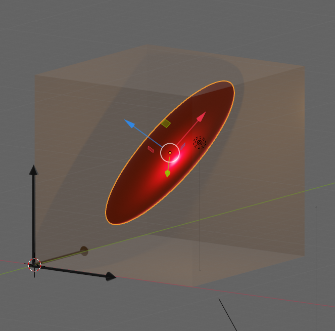
Let us visualize an example. The following picture shows the surface of an asymmetric “ellipsoidal” data distribution in a 3-dim feature space. (Actually, the image does not display a real ellipsoid – but we ignore the differences for reasons of simplicity.) The dark arrows in the picture indicate the orthogonal axes and unit-vectors per dimension of the 3-dim feature space. The colored arrows of the ellipsoid show the direction of the main component axes of the “ellipsoid”.
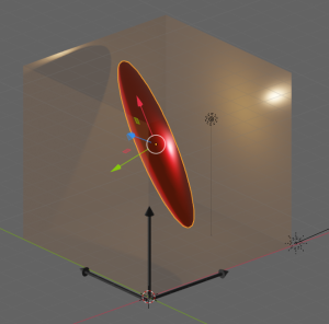


Regarding the dimensions of the ellipsoid the elongation along the red vector is biggest. The width of the data point distribution in the direction of the blue vector is significantly smaller, but still bigger than in the direction of the green vector. So, we would expect that the two main component axes in the directions of the red and the blue arrows explain most of the data variation in the feature space. The projections of the data point vectors in a coordinate system defined by the main component axes onto the “green” axis would only give us rather small values. Therefore, we can reduce the dimensionality of the problem by describing the data distribution in only two dimensions: We project the vectors of the original data points in the feature space onto the two most important main component axes – in the directions of the red and the blue unit vectors.
Note: The axis in the direction of the dominant elongation of the ellipsoid has a diagonal orientation in the feature space. This means that all of the three original features contribute to the data points’ distribution in this direction. Therefore, the following point must be underlined:
A PCA analysis is not a selection process with respect to the original features. A vector describing a main component axis of the data distribution is a
linear combination of all unit vectors along various original axes of the feature-space. Normally many – if not all – original features contribute to a main component axis.. Without a detailed analysis you can not assume that only one or two original features determine the primary component axis.
In particular: You cannot assume that only one special feature dominates a main component axis. Unfortunately, the text in the Linux Magazin on the WIFI example could be read and interpreted in this way. So, let us have a closer look at the reason, why the projections of the WIFI-data from the original 7-dimensional feature-space onto a reduced 2-dim space of the signal-combinations [WLAN-4, WLAN-0] or [WLAN-3, WLAN-0] worked so well.
How many main components dominate the variance of the WIFI data distribution?
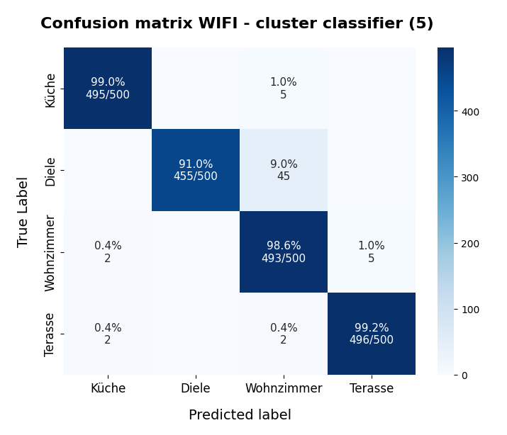
How many main components explain most of the variation of the samples’ data of the WIFI example? How do we get the required information about the contribution to the explained variance from PCA applications? Sklearn’s PCA implementation provides the usual “fit()”-function to perform the PCA calculation for a given data set. But it also provides an array named “explained_variance_” which contains the individual contributions of the main components to the “explained variance“.
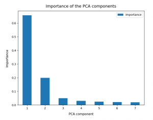
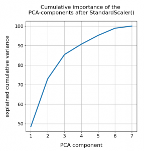
So, as a first step, we simply try and apply Sklearn’s PCA()-function directly to the original WIFI data given in their 7-dimensional feature space. I.e. without any scaling. Just as it was done in the Linux Magazin. The bar plot below displays the “importance” of a maximum of 7 main components. The importance of each component is measured by its normalized contribution to the “explained variance”:
An accumulation gives the following percentages:
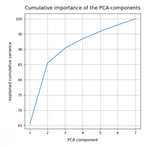
We see that only two of the main PCA components already explain 85% of the data variance in the feature space. We thus could choose these two main components as our “primary” components. But this does NOT automatically mean that only two features dominate the data distribution in the feature space.
Which features determine the primary components’ orientation?
As we have discussed above the projection of a unit vector along the main component axis onto the original axes of the feature-space may give similarly big values for each of the features. It is rather seldom that only a few features determine the direction of a main component’s axis.
But: The WIFI data are (on purpose?) indeed distributed in a very special way. Actually, only two original features determine the direction of the most important primary component’s axis already quite well. And just one feature dominates the second most important PCA component. So, in the WIFI example the first and the second main components are oriented more or less within a 2-dim feature plane and along a special feature axis, respectively. I.e. the data are more or less confined to a 3-dimensional sub-space of the feature space. How and where from did I get this information?
Sklearn’s function “PCA()” returns a reference to an object, which after a call to its method “fit()” has a filled property “components_“. This array gives us the 7 vector-components of each unit vector oriented along a PCA main component axis with respect to the various original axes of the feature space. I.e. we get the components of unit vectors along main component axes in terms of the original coordinate system spanning our feature space. The related coefficients of the vector tell us whether the main component axes are confined to a subspace spanned by just a few original features.
Below, the elements (rows) of the array were reversely sorted by the the contribution of the main component to the “explained variance”. So the first two rows correspond to the two most important PCA main components.
[6.22e-01 7.47e-04 1.03e-02 6.29e-01 2.02e-01 3.03e-01 2.91e-01]
 [1.71e-01 9.05e-02 4.31e-01 1.95e-01 8.50e-01 1.02e-01 7.62e-02]
 [2.41e-01 2.78e-01 2.18e-01 2.90e-01 9.80e-02 5.28e-01 6.67e-01]
 [1.67e-01 3.44e-01 7.05e-01 1.69e-01 4.22e-01 9.65e-02 3.75e-01]
 [1.13e-01 1.77e-01 3.15e-01 1.33e-01 1.82e-01 6.97e-01 5.66e-01]
 [6.37e-01 2.31e-01 3.28e-01 6.45e-01 1.26e-01 1.32e-02 3.22e-02]
 [2.80e-01 8.43e-01 2.50e-01 1.42e-01 2.43e-02 3.52e-01 5.12e-02]]
The first primary component has vector-components along the original axes of the feature space given by
6.22e-01, 7.47e-04, 1.03e-02, 6.29e-01, 2.02e-01, 3.03e-01, 2.91e-01
The features, i.e. the WLAN signals, are numbered in the given order from left to right. Obviously, the features “WLAN-0” and “WLAN-3” dominate the direction of the first primary component.
The second main component
1.71e-01, 9.05e-02, 4.31e-01, 1.95e-01, 8.50e-01, 1.02e-01, 7.62e-02
is instead dominated by he feature “WLAN-4”.
Actually, a closer look shows that the signal “WLAN-6” dominates the third main component by a relatively big value. This might be an indication that we had better used three primary components instead of two … I come back to this point below.
So, what do we learn from the results of the projections of the PCA unit vectors onto the axes of the feature space?
- In the very special case of the WIFI example around 3 original features dominate the overall data distribution.
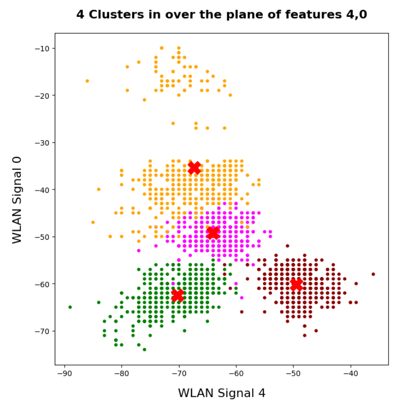
- In the WLAN-0/WLAN-3 plane we should see an approximate diagonal distribution of data. Reason: the vector components are of almost equal size.
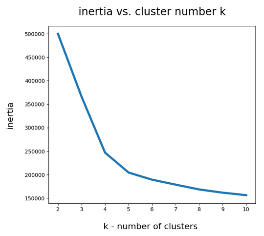
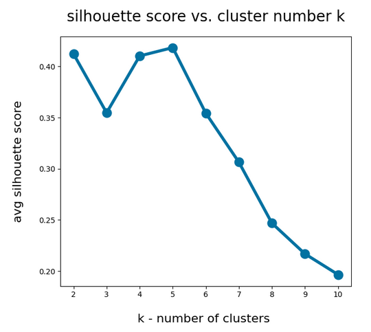
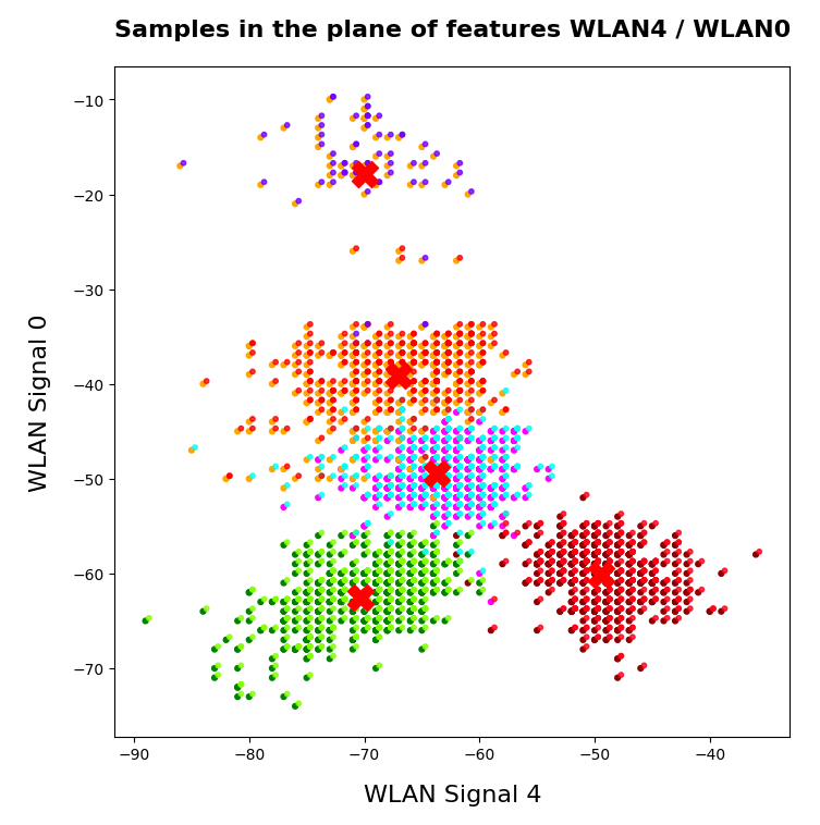
- As we already know from an elbow-analysis we have 4 to 5 clusters. So, we should see them clearly in a 3D-plot for the axes WLAN-0, WLAN-3 und WLAN-4.
- If the data are well separated into clusters along the diagonal in the WLAN-0/WLAN-3 plane AND the WLAN-4 direction then they will also be well separated in the 2-dim space of the 2 main PCA components.
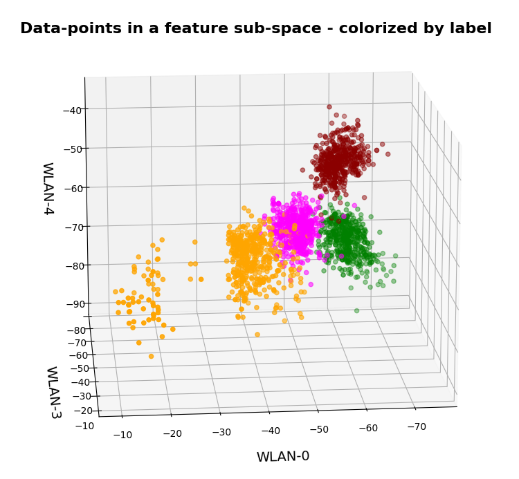
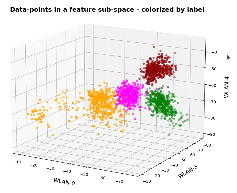
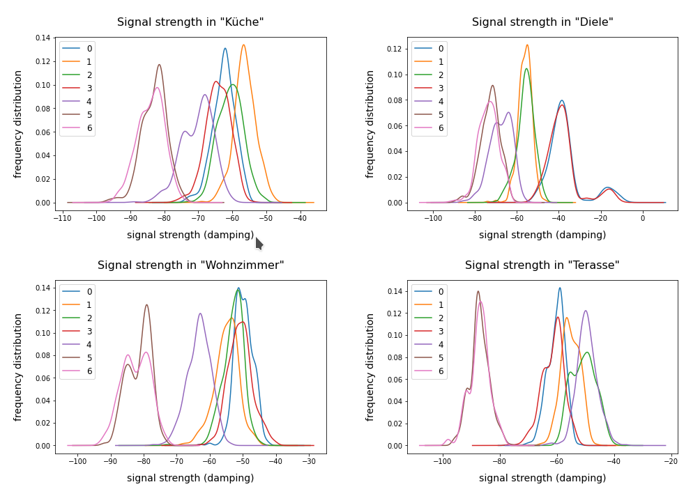
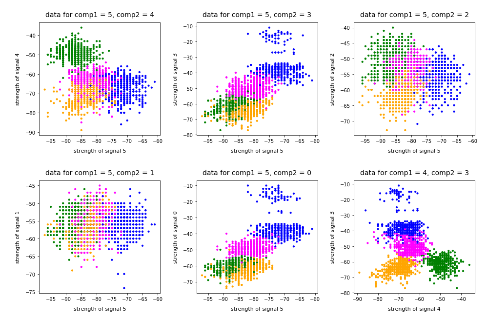
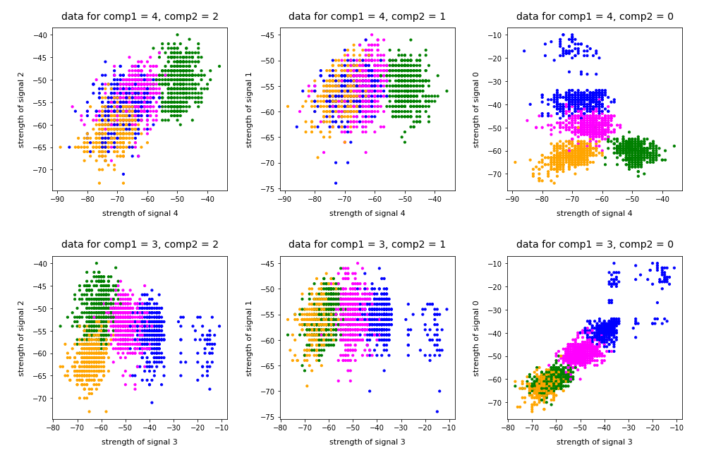
Ok, let us visualize it. The next plot shows the data distribution from a view almost perpendicular to the WLAN-3/WLAN-4 plane. The colors indicate the labels of the data (i.e. the rooms where the strength of each of the 7 WLAN signals has been measured).
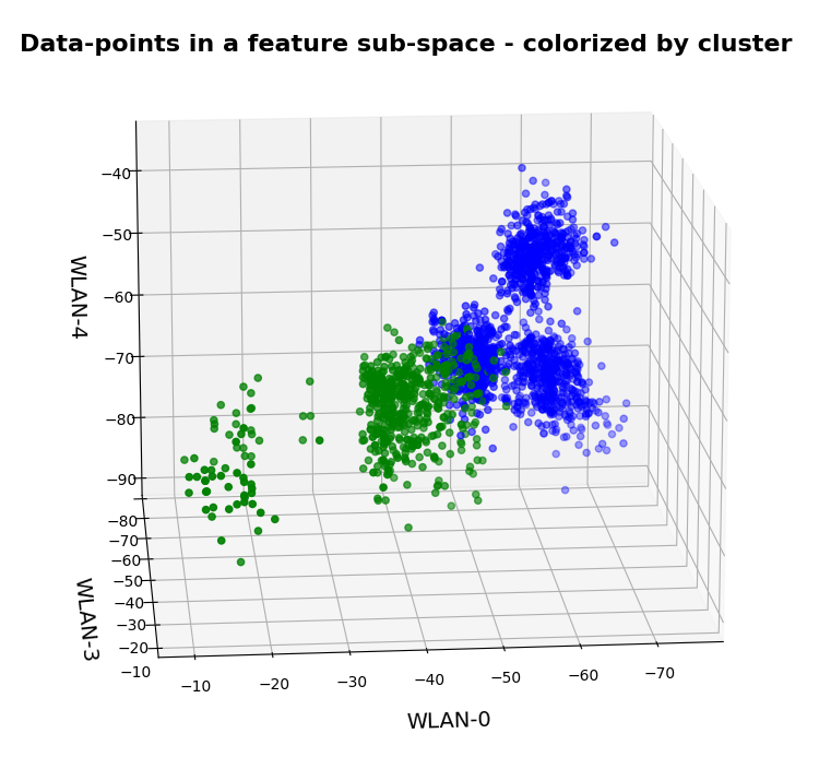
3D-plot of the WIFI data distribution in the space of the dominant 3 original features – the WLAN-3/WLAN-4 plane
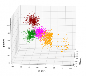
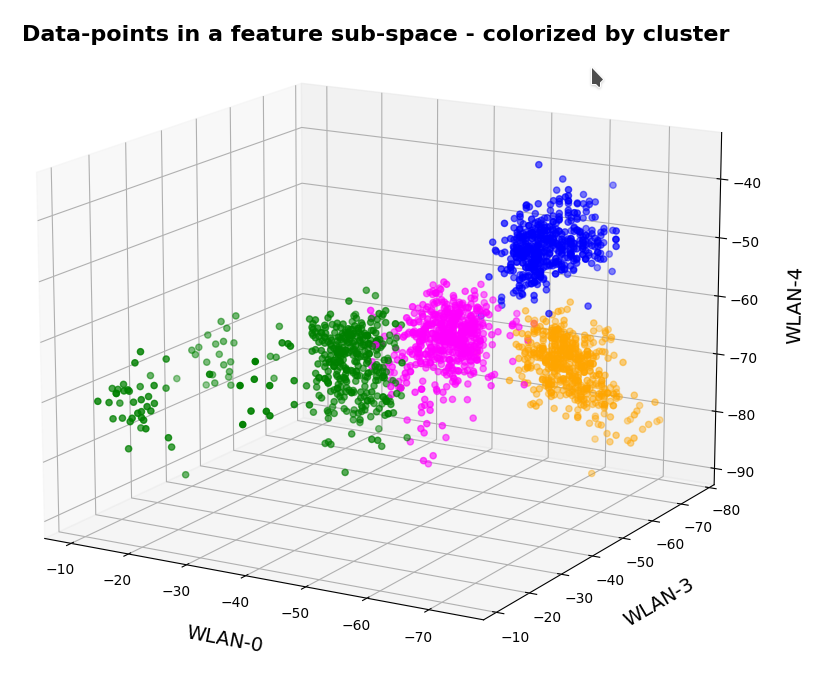
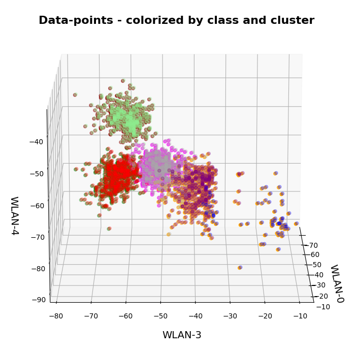
We already see the clustering. The next plot shows the data distribution from a direction almost perpendicular to the WLAN-0/WLAN-4 plane.
3D-plot of the WIFI data distribution in the space of the dominant 3 original features – the WLAN-0/WLAN-4 plane
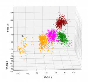
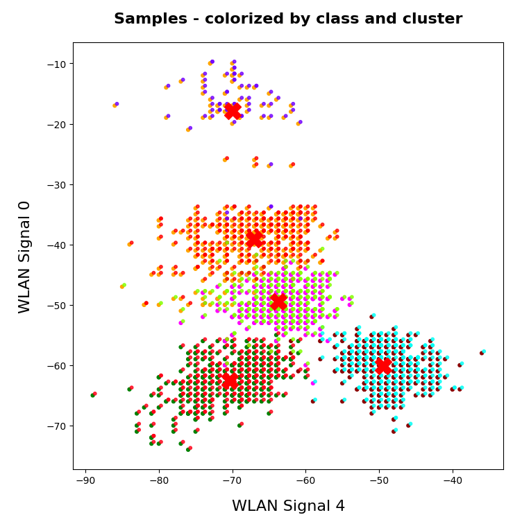
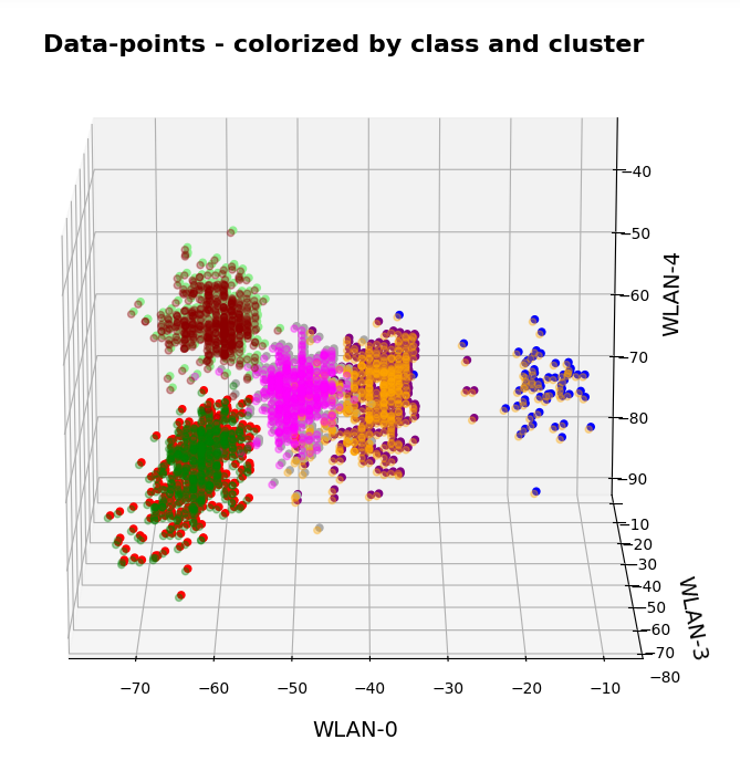
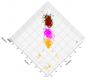
And now a view from above showing the diagonal distribution of very many data points. We clearly see that there is something strange going on in the “orange” room.
3D-plot of the WIFI data distribution in the space of the dominant 3 original features – the WLAN-3/WLAN-0 plane
So far, so good! We have again identified the clusters which we already got familiar with in my last post.
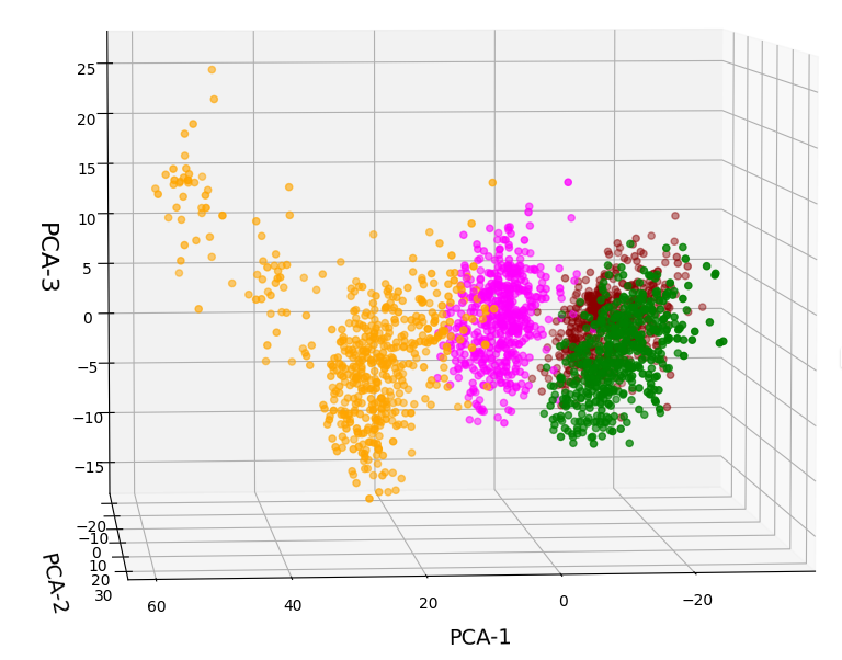
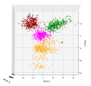
Data distribution in the vector space of the three most important PCA components
In full consistency with the results derived above we expect a good cluster separation in the plane of the first two main PCA components. These components are called “PCA-1” and “PCA-2” in the following plot:
3D-plot of the transformed WIFI data distribution in the space of the dominant 3 PCA components – the PCA-1/PCA-2 plane
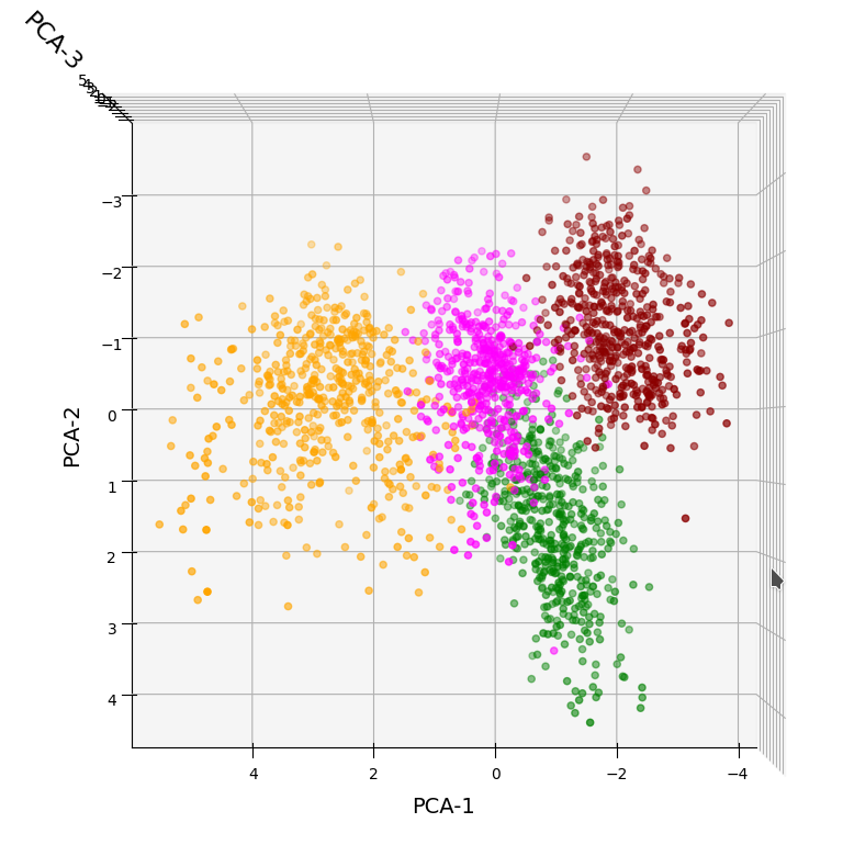
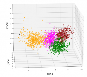
But looking from a different perspective, we see that there still is a significant distribution along the axis of the third main component – at least with the scaling used along the PCA-3 axis.
3D-plot of the transformed WIFI data distribution in the space of the dominant 3 PCA components – the PCA-1/PCA-3 plane

Even when we take into account the different scales of the axes: The spread in z-direction (PCA-3) is relatively big compared with the data spread in the PCA-2 direction. Again, we see that the data indicate three main components. Why did we not get this information already in our bar plot for the “explained variance”?
Working on scaled data
Well, part of the answer to the last question is that we did not really treat the various WLAN signals equally well. Actually, for very simple reasons, a PCA analysis of really independent features with different measurement units should be applied to scaled data. So, just for curiosity’s sake, let us apply Sklearn’s StandardScaler() to our WIFI data ahead of a PCA-analysis. Then, we indeed get a different bar plot:
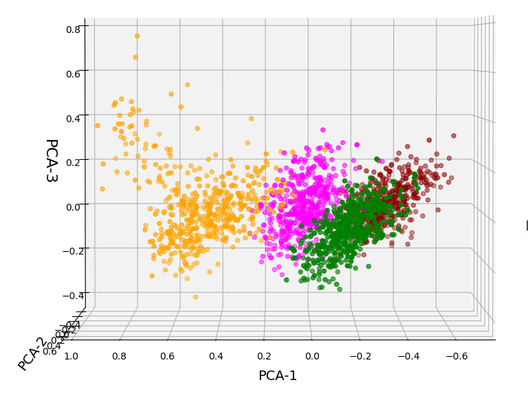
The elbow is now centered at a point corresponding to 3 main components! Below I show respective 3D-plots for the standardized and PCA-transformed data:
3D-plot of the scaled WIFI data distribution in the space of the dominant 3 PCA components – the PCA-1/PCA-3 plane
3D-plot of the scaled WIFI data distribution in the space of the dominant 3 PCA components – the PCA-1/PCA-2 plane

However, the 5th cluster – a subcluster of the orange one – is no longer so clearly visible as before. This is due to the fact that the standard deviation of the data around the mean value of each feature is adjusted to a value of 1.0 with StandardScaler(). A MinMaxScaler() does a better job:

In the case of the WIFI example there is also a strong counter-argument against scaling:
The individual features and their scales are NOT really independent of each other. A weaker signal or a specific spread around the mean value of a specific signal do actually mean something! When we have multiple maxima in a signal distribution (see the previous post) this carries some important information – and then the adjustment of the standard deviation to a standard value is not a really good idea. This means that it depends on the data and their meaning which kind of scaler one should use ahead of a PCA analysis.
Conclusions
The existence of a few primary components does not automatically mean that only a few features contribute to the data distribution’s variance in the features space. However, in the case of the WIFI data example we have a special situation for which only three out of seven features do determine the primary components and the direction of the respective preferred axes of the data distribution. We also saw that we may have to scale feature data properly before applying a PCA analysis.
In the next post of this series
KMeans as a classifier for the WIFI and MNIST datasets – III – KMeans as a classifier for the WIFI-example
we shall answer the question whether and how we can use the cluster algorithm KMeans also as a classifier for the WIFI data.
Ceterum censeo: The worst fascist today who really and urgently must be denazified is the Putler.