KMeans as a classifier for the WIFI and MNIST datasets – III – KMeans as a classifier for the WIFI-example

In the previous articles of this series

KMeans as a classifier for the WIFI and MNIST datasets – I – Cluster analysis of the WIFI example
KMeans as a classifier for the WIFI and MNIST datasets – II – PCA in combination with KMeans for the WIFI-example

I applied KMeans to the “WIFI” dataset – a small and rather simple training set of the UCI Irvine. The 7 dimensional feature space for this example is defined by the strength of seven different WLAN-signals. The data samples are labeled by numbers specifying four different rooms. We just have 2000 samples. But “simple” does not mean that one cannot learn something of it.

An elbow and a silhouette analysis indicated that the data can well be described by 4 to 5 clusters.
A detailed PCA analysis helped us to understand that the data could basically be described by two primary components whose axes were defined by a diagonal in a two-dimensional sub-space of the original feature space (defined by the features “WLAN-0” and “WLAN-3”) plus an orthogonal axis (defined by “WLAN-4”). As the data points segregated into well separated clusters in the coordinate system of the primary components we could expect that they also segregate well when projected onto two 2-dim sub-spaces of the feature space defined by the signal combinations {WLAN-0/WLAN-4} and {WLAN-3/WLAN-4}.

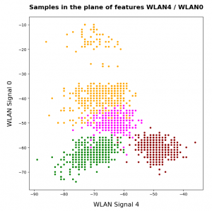
So we projected the results of a KMeans analysis into a 2-dim sub-space of the 7-dim feature space spanned by two selected “features” (WLAN signals WLAN-0 and WLAN-4). And indeed: For 2 special signal- or feature-combinations we saw a field with 4 to 5 well separated clusters.

As we have well separated clusters – either in sub-planes of the feature space or the space defined by the dominant two PCA components – a legitimate question is: Can we use the cluster information for classifying?

Clusters and classification

In the special example of the WIFI data the data points can obviously be divided into different “groups” filled by data points which belong to a certain “label” or class (in the WIFI case: a room):

In the plots above the colorization of the data points is given by their label in the plot above. However:
Does this mean that these spatially separated “groups” coincide with the clusters detected by KMeans?

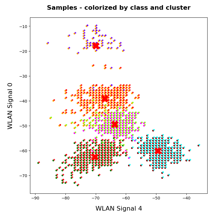
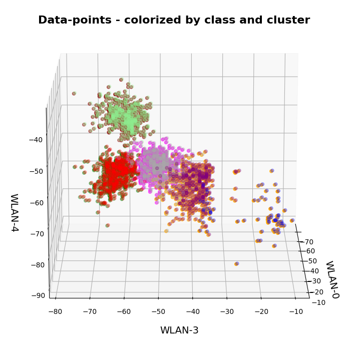
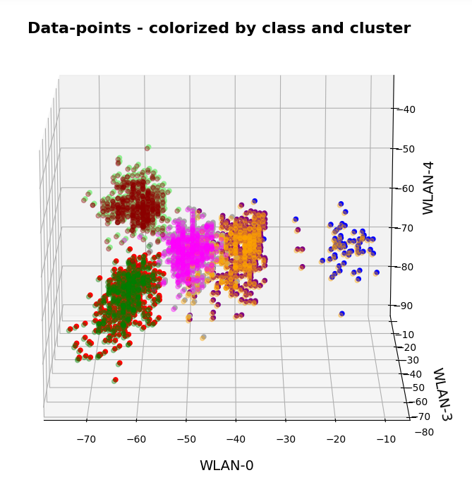
In the next plots I superimposed the data points – first colorized by class and then by cluster with different colors and a slight spatial deviation.

We see that the border of the class related points on average overlaps well with the border of the clusters. Only a few points show a major deviation.

Is this always the case? Of course not!

We see this already when we we just use 2 clusters and colorize the data points according to cluster membership in one of the two clusters:

Oops, all the beauty is gone! Members of the previously visual dark-red, green and pink “clusters” would now certainly be members of the first defined “green” cluster. And members of the visual pink and orange clusters would now be members of the “defined” blue cluster. So: Labels may but do strong>not always define clusters.

An important thing we learned by this consideration is that we should at least use a number of cluster greater or equal the number of labels.

But even then the separation may not work. Let us imagine three rooms: In room “A” we only have male persons, in room “B” only female persons and in the third room “C” female persons on one side of the room and male persons on the other – like in some old fashioned dancing courses. If we used the persons’ coordinates to define features and the “male”/”female” attributes as labels and tried a cluster analysis in the feature space we would clearly identify three clusters. However, in the cluster for room “C” we would find a mixture of samples with different labels. Spatial vicinity in the feature space does not mean class identity and a label does not necessarily mean a big distance in the feature space.

Hyperplanes and clusters

The only thing you can hope for with respect to a solvable ML problem is that the data points for different labels may be distributed such that a complicated and curved hyperplane can be found in the multidimensional feature space which separates groups of data points with the same label sufficiently well. But this hyperplane does not necessarily coincide with fictitious borders of some clusters identified by KMeans. We are lucky if the topologically closed surface of a cluster lies completely in a region of the hyperspace separated by complex and topologically open hyperplanes separating data points belonging to one class from other feature space regions which contain data points with different labels.

Not all data ensembles in ML will fall apart in extended clusters each of which dominated by some specific label. Ring like distributions of data samples with identical labels may pose a problem to cluster algorithms – mot only in 2 dimensions.

On the other side: If the labeled data – after some useful transformation – are not well separable in the feature space, then the posed ML task is problematic anyway and the chosen feature definitions may not be appropriate.

Granularity: Hope for label dominance in sufficiently fine grained clusters

What does a label-cluster correlation depend on? Well, if there is an important factor regarding the position of the centroids of KMeans then it is the number of clusters. In the extreme case of as many clusters as data points a super-well defined cluster/label-association exists – but it is not of much use for ML-task. It just represents the most extreme case of overfitting you can think of. It will be useless for new unknown samples.

But the example with the distribution of male/female samples gives you an indication of what we should try: With a growing number of cluster the chances for a fine grained separation into clusters residing on one side of a hyperplane separating samples of different labels rises and with it the chance for a clearer dominance of one label per cluster. This is even true for ring like data distributions: With more then 4 clusters we may even describe a ring like data distribution quite well.

Therefore: If the sample distribution has some reasonable separation hyperplane at all there is a chance that you may find a number of clusters for which each cluster is dominated by a specific label.

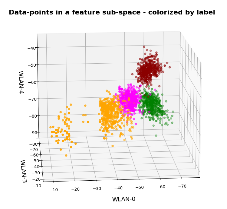
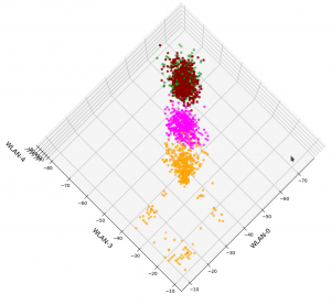
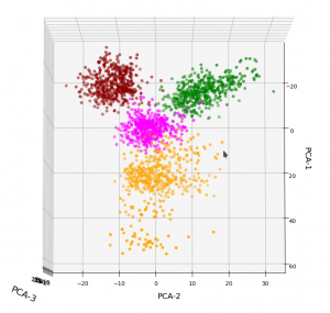
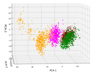
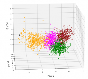
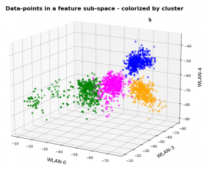
In the case of the WIFI example this is pretty obvious. The following first plot shows the data points colorized according to their labels:

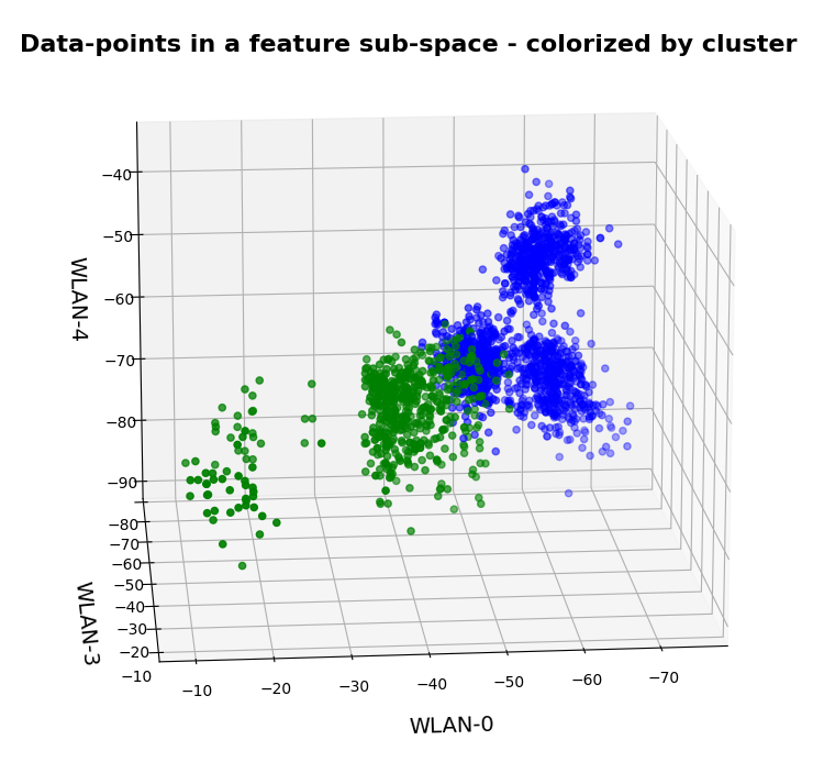
The next plot shows four cluster – with data points colorized according to their cluster membership:

The colors are different (we have no control of it) – but the different data point “clouds” in the pictures coincide rather well. Only some data points do not behave well. We can again use the trick we iused in 2 dimensions and superimpose data points with colorization according to cluster and class:

How do we define a classifier by the help of KMeans?

We need a predict()-function which predicts a label from a predicted cluster membership. The recipe is rather simple:

Define the number of cluster you want to use.

  • Use KMeans for a cluster analysis of a training set of samples.
  • Predict the cluster-membership of a sample with the help of the fitted kmeans-object and its predict()-function.
  • Get the labels of the samples belonging to a specific cluster.
  • Find out what the amount of samples with a certain label for a cluster is and compared the data.
  • Find the label which contributes most samples to a cluster. Check the relative amount of deviating data points with other labels. Should be sufficiently small…
  • Build a dictionary which associates the cluster number with its dominant label.
  • Build a prediction function for yet unknown data points. It first predicts the cluster and then the associated label.

You should then test the accuracy of your new cluster-based classifier model on test data.

More clusters than labels?

What will happen to such an algorithm if you use more clusters than labels? Short answer: Nothing – as long as each cluster is really dominated by a specific label. More precisely: A vast majority of your clusters should exhibit contributions from data points with one specific label to an amount significantly far beyond the statistical average. Having more clusters means that under reasonable conditions we just have more than one cluster predicting a certain label. For the case of the WIFI example this means that we can work with five clusters without getting nervous.

Application to the WIFI example

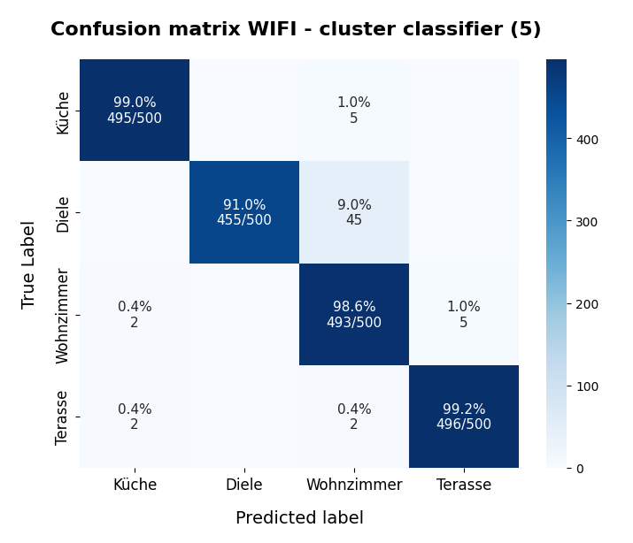
As the clusters represent the labels quite well we expect very good values for the recall values. The experiment is pretty simple. I just present the resulting confusion matrices for the four labels (identifying rooms) and different numbers of clusters “nclus”. I first show you a presentation with seaborn, which explains, how to interpret rows and columns:

nclus = 5

Here I used five (5) clusters and included all samples in the calculation. I.e. I did not separate a training set from a test set of data points.

Confusion matrices for different numbers of clusters

nclus = 4

[[496   0   4   0]
 [  0 425  75   0]
 [  2   0 492   6]
 [  2   0   2 496]]
num of wrongly predicted samples:  91  :: avg_err =  0.0455

The “avg_err” gives you the number of wrongly predicted samples divided by the total number of samples. We see that 4 clusters have a problem with the differentiation of the data points for the room “Diele”.

nclus = 5

[[495   0   5   0]
 [  0 455  45   0]
 [  2   0 493   5]
 [  2   0   2 496]]
num of wrongly predicted samples:  61  :: avg_err =  0.0305

nclus = 6

[[499   0   1   0]
 [  0 452  48   0]
 [  5   0 490   5]
 [  2   0   2 496]]
num of wrongly predicted samples:  63  :: avg_err =  0.0315

nclus = 7

[[499   0   1   0]
 [  0 492   8   0]
 [  4  38 455   3]
 [  2   0   3 495]]
 num of wrongly predicted samples:  59  :: avg_err =  0.0295

nclus =

num wrongly predicted samples:  58  :: avg_err =  0.029

nclus = 9

[[499   0   1   0]
 [  0 484  16   0]
 [  4  16 476   4]
 [  2   0   2 496]]
num of wrongly predicted samples:  45  :: avg_err =  0.0225

All data above were derived for the same random_state-variable to KMeans.

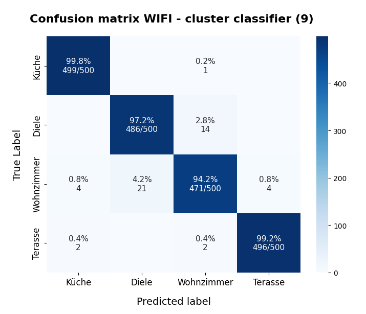
However, this result depends on the initial shuffling of the samples, the random_state parameter and the initial statistical distribution of the centroids by KMeans. And other hyperparameters … The next plot shows a slightly different result for nclus = 9:

nclus = 9

This means: Nine cluster give us a reasonably fine grained resolution in the case of the WIFI example.

But: Note that the problem areas in the confusion matrix have changed. “Diele” is handled a bit better, but “Wohnzimmer” is not so sharply separated as before. This is not astonishing as we saw a significant mix of data of different labels for different clusters above already:

After nclus = 9 we do not get much better – and dance around an average error of 0.025 => 2.5%:

nclus = 10

num of wrongly predicted samples:  55  :: avg_err =  0.0275

nclus = 11

num of wrongly predicted samples:  52  :: avg_err =  0.026

nclus = 25

num of wrongly predicted samples:  40  :: avg_err =  0.02

Being conservative we can say that our simple cluster based classifier approaches an accuracy around 97.4%. Not so bad regarding the crudeness of our approach! A random forest algorithm reaches something above 98.2%. This is not so much better.

Results after a separation of test data samples

I divided the data set than into 1500 train and 500 test samples.

For 9 clusters I got:

nclus = 9

[[374   0   1   0]
 [  0 362  13   0]
 [  3  17 352   3]
 [  2   0   2 371]]
num wrongly predicted train samples:  41  :: avg_err =  0.027333333333333334
num wrongly predicted train samples:  8  :: avg_err =  0.016

But these numbers depend strongly on the splitting – even if we split stratified. Another run gives:

nclus = 9

[[374   0   1   0]
 [  0 352  23   0]
 [  3   0 369   3]
 [  1   0   2 372]]
num wrongly predicted train samples:  33  :: avg_err =  0.022 
num wrongly predicted test samples:  11  :: avg_err =  0.022

Other runs may even give higher average error values. The variation depend upon of how many critical data points in the intermixing zone were omitted in the train samples. At least the results are not too different from the ones named above.

Conclusion

In this article I presented a very simple method by which a cluster algorithm can be used as a classifier. When we applied the approach to the rather simple WIFI example we saw that this worked pretty well.

What we in addition should try is to combine the classifier with a dimension reduction based on a PCA-analysis. From the results of a previous post we would expect that a cluster classifier should work well on the WIFI data after a transformation and projection of the samples’ data points into a 3-dimensional space spanned by the most important orthogonal main component axes. This is the topic of the next post in this series:

KMeans as a classifier for the WIFI and MNIST datasets – IV – KMeans on PCA transformed data

Ceterum censeo: The worst fascist today who must be denazified is the Putler.


KMeans as a classifier for the WIFI and MNIST datasets – II – PCA in combination with KMeans for the WIFI-example

I continue with my series of posts about using KMeans as a classifier for some simple ML datasets. In the last post

KMeans as a classifier for the WIFI and MNIST datasets – I – Cluster analysis of the WIFI example

I applied KMeans to the “WIFI” dataset which was discussed in the German “Linux Magazin”; see the Nov and Dec editions of 2021. We found 4 to 5 well separated clusters in a projection of the data points onto a 2-dimensional space defined by just two out of seven features.

I briefly discuss how this result is related to a PCA analysis. In my opinion the discussion in the “Linux Magazin” was a bit misleading regarding this point.

PCA analysis

A PCA analysis helps to identify the main orthogonal axes of the distribution of the samples’ data-points in their multidimensional “feature space”. If the data points for the samples are distributed in all directions and over all regions of the feature space in a similar way we may indeed need all of the feature spaces’s dimensions to describe the data distribution. Still, we could find some complicated curved hyperplanes which separate groups of data points with identical label quite well.

But often the data points are positioned along certain preferred directions, i.e. the data points are located along specific lines or (multidimensional) flat planes in the feature space – not withstanding an additional clustering. In such cases the data distribution may exhibit some intrinsic major axes in the feature space AND/OR the distribution may be confined to a subspace of the original feature space. The sub-space is defined and spanned by fewer axes than the original space. We speak of the “primary components” of the data distribution when we refer to the (orthogonal) axes of such a sub-space.

Of course, we can span the full original feature space by the most important primary component axes plus some extra orthogonal axes. I.e., we just need the same number of main components as the dimension of the original feature space. Then we get a new coordinate system which describes the vector space of the original features in a different way: The differences are

  • another orientation of the main component axes in comparison with the original axes,
  • a difference in the position of the origins of the two coordinate systems.

Of course, there is a mathematically well defined transformation which maps coordinates of data points with respect to the original feature spaces axes to coordinates in a coordinate system defined by the main component axes.

Of course, we can project a vector describing a data point onto unit vectors along the axes of either coordinate system. By using these special components we can describe the data distribution in terms of a sub-space spanned by only the most important primary component axes. A projection of ML data points to primary component axes is equivalent to a reduction of the dimensionality of the ML problem. Whenever we find that we can use fewer main component axes than the feature space’s number of dimensions to describe the data distribution reasonably well we can reduce the dimensionality of the problem: We project the original data vectors in the feature space to the axes of the main components’ coordinate system with fewer dimensions than the feature space.

How do we measure the “importance” of a main or primary component?

A metric for the importance of a primary component axis is its contribution to the so called “explained variance”. This quantity measures correlations of data in the original feature space and thus also the amount of information residing in the data.

From a mathematical point of view determining the main component axes corresponds to the diagonalization of the so called covariance matrix and the identification of eigenvectors. (You can find a short explanation in the books of S. Rashka on “Python Machine Learning”, 2016, PACKT or the book of J. Frochte on “Maschinelles Lernen”, 2019, Carl Hanser.) The eigenvectors define the directions of the main components’ axes. The variation of the data along such a main component axis contributes to the total variance by its measure of specific correlations, i.d. weighted quadratic data point distances. We are interested in finding those main component axes for which the projected data distribution explains most of the data variation.

Note that the axes which a PCA-analysis determines are orthogonal axes. Thus PCA describes a transformation of vectors in the feature space from one coordinate system with orthogonal axes to another coordinate system with orthogonal axes. Geometrically, this can be described by a sequence of a translation, followed by a rotation – and in case of a dimensionality reduction in addition by a projection.

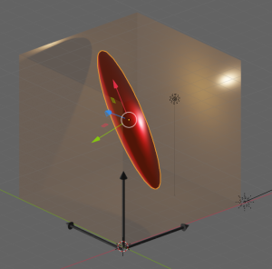
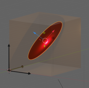
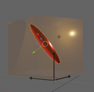
Let us visualize an example. The following picture shows the surface of an asymmetric “ellipsoidal” data distribution in a 3-dim feature space. (Actually, the image does not display a real ellipsoid – but we ignore the differences for reasons of simplicity.) The dark arrows in the picture indicate the orthogonal axes and unit-vectors per dimension of the 3-dim feature space. The colored arrows of the ellipsoid show the direction of the main component axes of the “ellipsoid”.

Regarding the dimensions of the ellipsoid the elongation along the red vector is biggest. The width of the data point distribution in the direction of the blue vector is significantly smaller, but still bigger than in the direction of the green vector. So, we would expect that the two main component axes in the directions of the red and the blue arrows explain most of the data variation in the feature space. The projections of the data point vectors in a coordinate system defined by the main component axes onto the “green” axis would only give us rather small values. Therefore, we can reduce the dimensionality of the problem by describing the data distribution in only two dimensions: We project the vectors of the original data points in the feature space onto the two most important main component axes – in the directions of the red and the blue unit vectors.

Note: The axis in the direction of the dominant elongation of the ellipsoid has a diagonal orientation in the feature space. This means that all of the three original features contribute to the data points’ distribution in this direction. Therefore, the following point must be underlined:

A PCA analysis is not a selection process with respect to the original features. A vector describing a main component axis of the data distribution is a
linear combination of all unit vectors along various original axes of the feature-space. Normally many – if not all – original features contribute to a main component axis.. Without a detailed analysis you can not assume that only one or two original features determine the primary component axis.

In particular: You cannot assume that only one special feature dominates a main component axis. Unfortunately, the text in the Linux Magazin on the WIFI example could be read and interpreted in this way. So, let us have a closer look at the reason, why the projections of the WIFI-data from the original 7-dimensional feature-space onto a reduced 2-dim space of the signal-combinations [WLAN-4, WLAN-0] or [WLAN-3, WLAN-0] worked so well.

How many main components dominate the variance of the WIFI data distribution?

How many main components explain most of the variation of the samples’ data of the WIFI example? How do we get the required information about the contribution to the explained variance from PCA applications? Sklearn’s PCA implementation provides the usual “fit()”-function to perform the PCA calculation for a given data set. But it also provides an array named “explained_variance_” which contains the individual contributions of the main components to the “explained variance“.

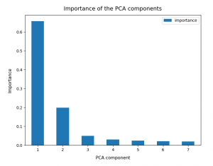
So, as a first step, we simply try and apply Sklearn’s PCA()-function directly to the original WIFI data given in their 7-dimensional feature space. I.e. without any scaling. Just as it was done in the Linux Magazin. The bar plot below displays the “importance” of a maximum of 7 main components. The importance of each component is measured by its normalized contribution to the “explained variance”:

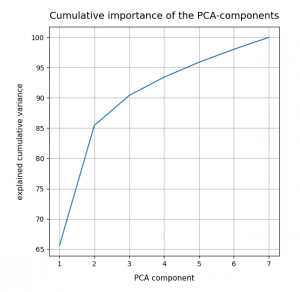
An accumulation gives the following percentages:

We see that only two of the main PCA components already explain 85% of the data variance in the feature space. We thus could choose these two main components as our “primary” components. But this does NOT automatically mean that only two features dominate the data distribution in the feature space.

Which features determine the primary components’ orientation?

As we have discussed above the projection of a unit vector along the main component axis onto the original axes of the feature-space may give similarly big values for each of the features. It is rather seldom that only a few features determine the direction of a main component’s axis.

But: The WIFI data are (on purpose?) indeed distributed in a very special way. Actually, only two original features determine the direction of the most important primary component’s axis already quite well. And just one feature dominates the second most important PCA component. So, in the WIFI example the first and the second main components are oriented more or less within a 2-dim feature plane and along a special feature axis, respectively. I.e. the data are more or less confined to a 3-dimensional sub-space of the feature space. How and where from did I get this information?

Sklearn’s function “PCA()” returns a reference to an object, which after a call to its method “fit()” has a filled property “components_“. This array gives us the 7 vector-components of each unit vector oriented along a PCA main component axis with respect to the various original axes of the feature space. I.e. we get the components of unit vectors along main component axes in terms of the original coordinate system spanning our feature space. The related coefficients of the vector tell us whether the main component axes are confined to a subspace spanned by just a few original features.

Below, the elements (rows) of the array were reversely sorted by the the contribution of the main component to the “explained variance”. So the first two rows correspond to the two most important PCA main components.

[6.22e-01 7.47e-04 1.03e-02 6.29e-01 2.02e-01 3.03e-01 2.91e-01]
 [1.71e-01 9.05e-02 4.31e-01 1.95e-01 8.50e-01 1.02e-01 7.62e-02]
 [2.41e-01 2.78e-01 2.18e-01 2.90e-01 9.80e-02 5.28e-01 6.67e-01]
 [1.67e-01 3.44e-01 7.05e-01 1.69e-01 4.22e-01 9.65e-02 3.75e-01]
 [1.13e-01 1.77e-01 3.15e-01 1.33e-01 1.82e-01 6.97e-01 5.66e-01]
 [6.37e-01 2.31e-01 3.28e-01 6.45e-01 1.26e-01 1.32e-02 3.22e-02]
 [2.80e-01 8.43e-01 2.50e-01 1.42e-01 2.43e-02 3.52e-01 5.12e-02]]

The first primary component has vector-components along the original axes of the feature space given by

6.22e-01, 7.47e-04, 1.03e-02, 6.29e-01, 2.02e-01, 3.03e-01, 2.91e-01

The features, i.e. the WLAN signals, are numbered in the given order from left to right. Obviously, the features “WLAN-0” and “WLAN-3” dominate the direction of the first primary component.

The second main component

1.71e-01, 9.05e-02, 4.31e-01, 1.95e-01, 8.50e-01, 1.02e-01, 7.62e-02

is instead dominated by he feature “WLAN-4”.

Actually, a closer look shows that the signal “WLAN-6” dominates the third main component by a relatively big value. This might be an indication that we had better used three primary components instead of two … I come back to this point below.

So, what do we learn from the results of the projections of the PCA unit vectors onto the axes of the feature space?

  1. In the very special case of the WIFI example around 3 original features dominate the overall data distribution.
  2. In the WLAN-0/WLAN-3 plane we should see an approximate diagonal distribution of data. Reason: the vector components are of almost equal size.
  3. As we already know from an elbow-analysis we have 4 to 5 clusters. So, we should see them clearly in a 3D-plot for the axes WLAN-0, WLAN-3 und WLAN-4.
  4. If the data are well separated into clusters along the diagonal in the WLAN-0/WLAN-3 plane AND the WLAN-4 direction then they will also be well separated in the 2-dim space of the 2 main PCA components.

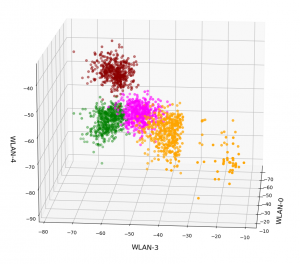
Ok, let us visualize it. The next plot shows the data distribution from a view almost perpendicular to the WLAN-3/WLAN-4 plane. The colors indicate the labels of the data (i.e. the rooms where the strength of each of the 7 WLAN signals has been measured).

3D-plot of the WIFI data distribution in the space of the dominant 3 original features – the WLAN-3/WLAN-4 plane

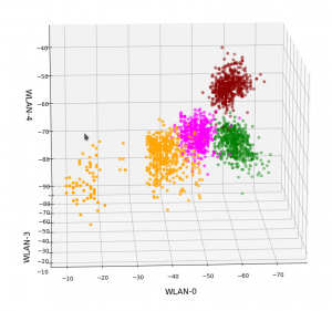
We already see the clustering. The next plot shows the data distribution from a direction almost perpendicular to the WLAN-0/WLAN-4 plane.

3D-plot of the WIFI data distribution in the space of the dominant 3 original features – the WLAN-0/WLAN-4 plane

And now a view from above showing the diagonal distribution of very many data points. We clearly see that there is something strange going on in the “orange” room.

3D-plot of the WIFI data distribution in the space of the dominant 3 original features – the WLAN-3/WLAN-0 plane

So far, so good! We have again identified the clusters which we already got familiar with in my last post.

Data distribution in the vector space of the three most important PCA components

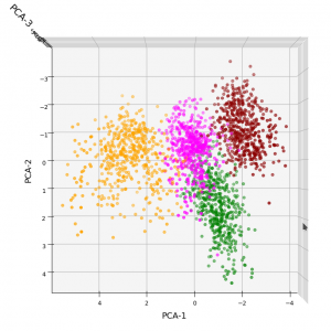
In full consistency with the results derived above we expect a good cluster separation in the plane of the first two main PCA components. These components are called “PCA-1” and “PCA-2” in the following plot:

3D-plot of the transformed WIFI data distribution in the space of the dominant 3 PCA components – the PCA-1/PCA-2 plane

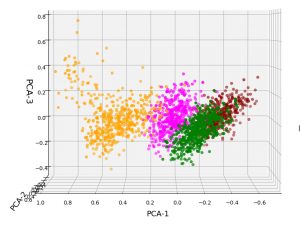
But looking from a different perspective, we see that there still is a significant distribution along the axis of the third main component – at least with the scaling used along the PCA-3 axis.

3D-plot of the transformed WIFI data distribution in the space of the dominant 3 PCA components – the PCA-1/PCA-3 plane

Even when we take into account the different scales of the axes: The spread in z-direction (PCA-3) is relatively big compared with the data spread in the PCA-2 direction. Again, we see that the data indicate three main components. Why did we not get this information already in our bar plot for the “explained variance”?

Working on scaled data

Well, part of the answer to the last question is that we did not really treat the various WLAN signals equally well. Actually, for very simple reasons, a PCA analysis of really independent features with different measurement units should be applied to scaled data. So, just for curiosity’s sake, let us apply Sklearn’s StandardScaler() to our WIFI data ahead of a PCA-analysis. Then, we indeed get a different bar plot:

The elbow is now centered at a point corresponding to 3 main components! Below I show respective 3D-plots for the standardized and PCA-transformed data:

3D-plot of the scaled WIFI data distribution in the space of the dominant 3 PCA components – the PCA-1/PCA-3 plane

3D-plot of the scaled WIFI data distribution in the space of the dominant 3 PCA components – the PCA-1/PCA-2 plane

However, the 5th cluster – a subcluster of the orange one – is no longer so clearly visible as before. This is due to the fact that the standard deviation of the data around the mean value of each feature is adjusted to a value of 1.0 with StandardScaler(). A MinMaxScaler() does a better job:

In the case of the WIFI example there is also a strong counter-argument against scaling:
The individual features and their scales are NOT really independent of each other. A weaker signal or a specific spread around the mean value of a specific signal do actually mean something! When we have multiple maxima in a signal distribution (see the previous post) this carries some important information – and then the adjustment of the standard deviation to a standard value is not a really good idea. This means that it depends on the data and their meaning which kind of scaler one should use ahead of a PCA analysis.

Conclusions

The existence of a few primary components does not automatically mean that only a few features contribute to the data distribution’s variance in the features space. However, in the case of the WIFI data example we have a special situation for which only three out of seven features do determine the primary components and the direction of the respective preferred axes of the data distribution. We also saw that we may have to scale feature data properly before applying a PCA analysis.

In the next post of this series

KMeans as a classifier for the WIFI and MNIST datasets – III – KMeans as a classifier for the WIFI-example

we shall answer the question whether and how we can use the cluster algorithm KMeans also as a classifier for the WIFI data.

Ceterum censeo: The worst fascist today who really and urgently must be denazified is the Putler.
KMeans as a classifier for the WIFI and MNIST datasets – I – Cluster analysis of the WIFI example

In the November and December 2021 editions of the German “Linux Magazin” R. Pleger discussed a simple but nevertheless interesting example for the application of a cluster algorithm. His test case was based on a dataset of the UCI Irvine. This dataset contains 2000 samples with (fictitious?) data describing WIFI signals which stemmed from seven WLAN spots around a building. The signal strength of each source was measured at varying positions in four different rooms. I call the whole setup the “WIFI example” below.

One objective of the articles in the Linux Magazin was to demonstrate how simple it is today to apply basic Machine Learning methods. In a first step the author used a ML classifier algorithm to determine the location (i.e. the room) of a measuring instrument just from the strengths of the different WIFI signals. This task can be solved by a variety of algorithms – e.g. by a Decision Tree, SVM/SVC or a simple Multilayer Perceptron. The author used Sklearn’s RandomForestTree. This method is a good example for the powerful “Ensemble Learning” technique. When applied to the simple and well structured WIFI example it predicts the rooms for test samples with an accuracy of more than 98%.

The author afterward performed a deeper analysis of the WIFI data via Kmeans, MiniBatchKMeans and PCA. His second article underlined a major question, which sometimes is not taken seriously enough:

Do the data, which we feed into ML algorithms, really cover all aspects of the problem? Is the set of target labels complete or sufficient in the sense that the separation of the samples into labeled groups really reflects the problem’s internal structure? Or do the data contain more information than the labels reveal?

Unfortunately, in my opinion, the Linux Magazine covered an important point, namely the relation of the results of a PCA analysis to a 2-dimensional cluster visualization, in an incomplete and also slightly misleading way. In addition another interesting question was not discussed at all:

Can we use KMeans also as a classifier? How would we do this?

In this series of posts I want to dig a bit deeper into these topics – both for the WIFI example and also for the MNIST dataset. For MNIST we will not be able to visualize clusters as easily as for the WIFI example. Therefore, we should have a clear idea about what we do when we use clusters for classifying.

In this first post I focus on the results of a cluster analysis for the WIFI example. In a second article I will discuss the relation of cluster results to a PCA analysis. A third post will then present a very simple method of how to turn a cluster algorithm into a classifier algorithm. In later articles we shall transfer our knowledge to the MNIST data. More precisely: We shall combine a PCA analysis with a cluster classifier to predict the labels of handwritten digit images. We will use the PCA technique to reduce the dimensions of the MNIST feature space from 784 down to below 80. It will be interesting to see what accuracy we can reach with a relatively crude clustering approach on only about 30 main PCA components. As a side aspect we shall also have a look at standardization and normalization of the MNIST data.

I do not present any code in the first three posts as the required Python programs can be build relatively straight-forward and most of the core statements were already given in the Linux Magazin. You unfortunately have to buy the articles of the magazine; but see https://www.linux-magazin.de/ausgaben/2021/11/maschinenlernen/. However, as soon as we turn to MNIST I shall provide a Jupyter notebook.

The WIFI example: Two thousand samples, each with data for the signal strength of seven WLAN sources measured in four rooms

You can download the data WIFI data set from the following address:
https://archive.ics.uci.edu/ml/machine-learning-databases/00422/wifi_localization.txt

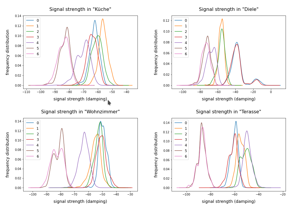
The feature space of this is example is 7-dimensional: 7 WLAN spots provide WIFI signals in the building. We have 2000 samples. Each sample provides the signal strength of each of the WLAN sources measured at different times and positions within a specific room. An integer number in [1,4] is provided as a label which identifies the room. The following plot shows the interpolated frequency distribution over the signal strength for each of the 7 signals in the four rooms:

Cluster analysis of the WIFI data – more than four rooms?

The original label-data of the WIFI example imply the existence of four rooms. But can we trust this information? The measurements in the room, which we called “Diele” in the plots above, indicate a consistent second peak for both the signals 0 and 3. Is this due to an opening into another room?

A simple method to analyze the inner structure of the distribution of data points in a configuration or feature space is a “cluster analysis”. The KMeans algorithm provides such an analysis for an assumed number of clusters.

KMeans is a basic but important ML method which reveals a lot about the data distribution in feature space and indirectly about the complexity of hyperplanes required to separate data according to their labels. Among other things KMeans determines the positions of cluster centers – the so called centroids – by measuring and systematically optimizing distances of samples to assumed centroids. Actually, the sum over all intra-cluster variances, i.e. the summed quadratic distances of the associated samples to their cluster’s centroid, is minimized. The respective quantity is called “inertia” of the cluster distribution. See e.g. the excellent book of P. Wilmott, Machine learning – an applied mathematics introduction” on this topic.

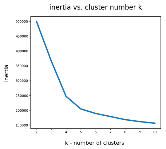
A simple method to find out into how many clusters a distribution probably segregates is to look for an elbow in the variation of the inertia with the number of clusters. When we look at the variation of inertia values with the number of potential clusters “k” for the WIFI example we get the following curve:

This indicates an elbow at k=4,5.

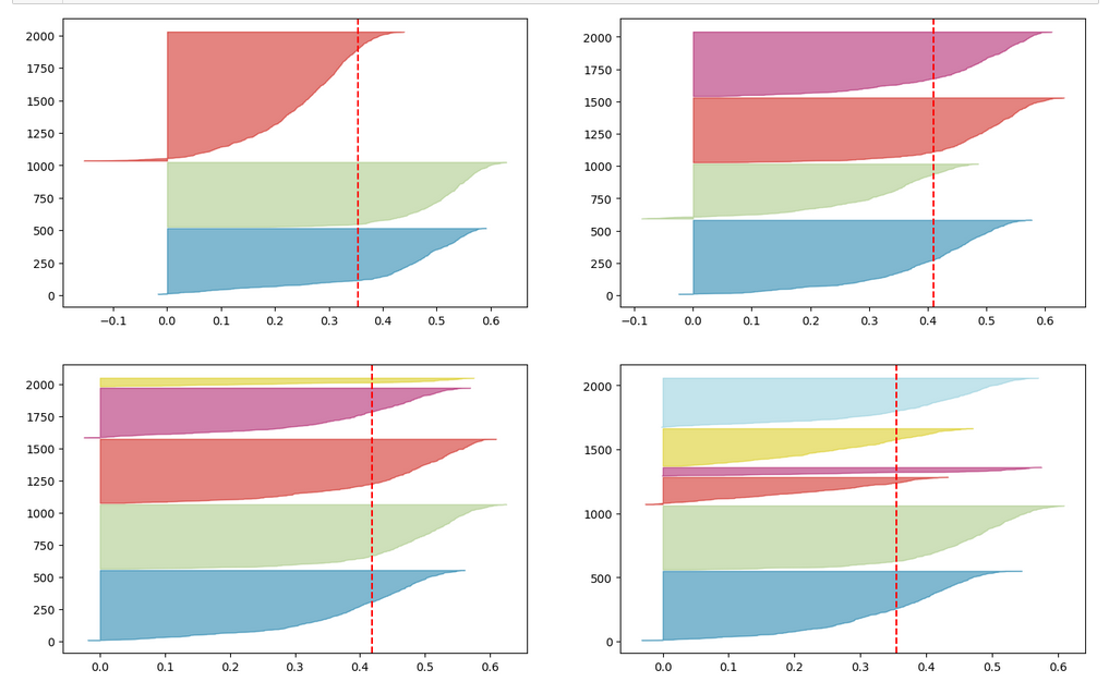
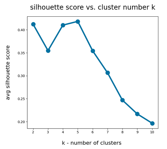
Another method to identify the most probable number of distinct clusters in a multi dimensional data point distribution is the so called “silhouette analysis”. See the book of A. Geron “Hands-On Machine Learning with Scikit-Learn, Keras and Tensorflow”, 2n edition, for a description. For the WIFI example the plots of the silhouette score data support the result of the elbow analysis:

The second plot shows ordered silhouette data for k = 3,4,5,6 clusters. Again, we get the most consistent pictures for k=4 and k=5.

So, the data indicate a fragmentation into 4 or 5 clusters. How can we visualize this with respect to the feature space?

Scatter plots for 2-dim sub-spaces of the feature space

A general problem with the visualization of cluster data for multidimensional data is that we are limited to 2, maximal 3 dimensions. And a projection down to two dimensions may not reflect the real cluster separation in the multidimensional feature space in a realistic way. But sometimes we are lucky.

We shall later see that there are two primary components which dominate the data and signal distributions in the WIFI example. A major question, however, is whether we will also find that only a few original features contribute dominantly to these major components. A PCA analysis does not mean that a “primary component” only depends on the same number of features!

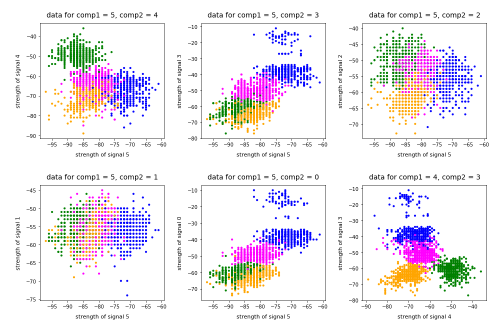
As I did not know the relation of “primary components” to features I just plotted the results of “KMeans” for a variety of 2-dim signal combinations. I used Sklearn’s version of KMeans; due to the very small data ensemble KMeans is applicable without consuming too much CPU time (this will change with MNIST; there we need to invoke MiniBatchKMeans):

Note that the colorization of the data points in all plots was done with respect to the cluster number predicted by KMeans for the samples – and not with respect to their labels.

It is interesting that the projections onto two special feature combinations – namely WLAN-4/WLAN 0 and WLAN-3/WLAN-0 signal – show a very distinct separation of the clusters.

Four or five clusters ?

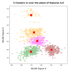
The data displayed above depend a bit on the initial distribution of cluster centers as an input into the KMeans algorithm. But for 4 and 5 clusters we get very consistent results. The next plots show the positions of the centroids:

This time the colorization was done with respect to the labels. What we see is: Five clusters represent the situation a bit better than only 4 clusters.

When we align this with the rooms: Five “rooms” may describe the signal variation better than only 4 rooms. The reason for this might be that one of the four rooms has a wall which partially separates different areas from another. We often find this in “entrances” [German: “Diele”] to houses. Sketches of the rooms in the Linux Magazin article actually show that this is the case. And, of course, such a wall or an opening into another room would have an impact on the damping of the WLAN signals.

Addendum 19.03.2022: Comparing clusters with groups of labeled data points

An important question which we have not answered yet by the images shown above is the following:

How well do clusters coincide with groups of data points having a specific label?

Note that in general you can not be sure that clusters reflect data points of the same label. Actually, a cluster is only a way to describe a close spatial vicinity of data points in some region of the multidimensional feature space. I.e. some kind of clumping of the data points around some centroids. But spatial vicinity does not necessarily reflect a label: A label border may often separate data points which are very close neighbors. And a cluster may contain a mixture of samples with different labels ….

Well, in the case of the WIFI example the identified 4 to 5 clusters match the groups of data points with different labels quite well. Below I superimposed the sample’s data points with different colors: First I colorized the data points according to their label. On top of the resulting scatter plot I placed the same data points again, but this time with a different and transparent colorization according to their cluster association. In addition I shifted the second data layer a bit to get a better contrast:

You see that the areas are not completely identical, but they overlap quite well. Obviously, I used 5 clusters. Also the fifth cluster fits well into a region characterized by just one label.

Conclusion

The simple WIFI example shows that a cluster analysis may give you new insights into the structure of ML data sets which a simple classifier algorithm can not provide. In the next article

KMeans as a classifier for the WIFI and MNIST datasets – II – PCA in combination with KMeans for the WIFI-example

we shall link the information contained in the “clusters” to the results of a PCA analysis of the WIFI example.

Stay tuned …

Ceterum censeo: The most important living fascist which must be denazified is the Putler.