Our series about a simple CNN trained on the MNIST data turns back to some coding.
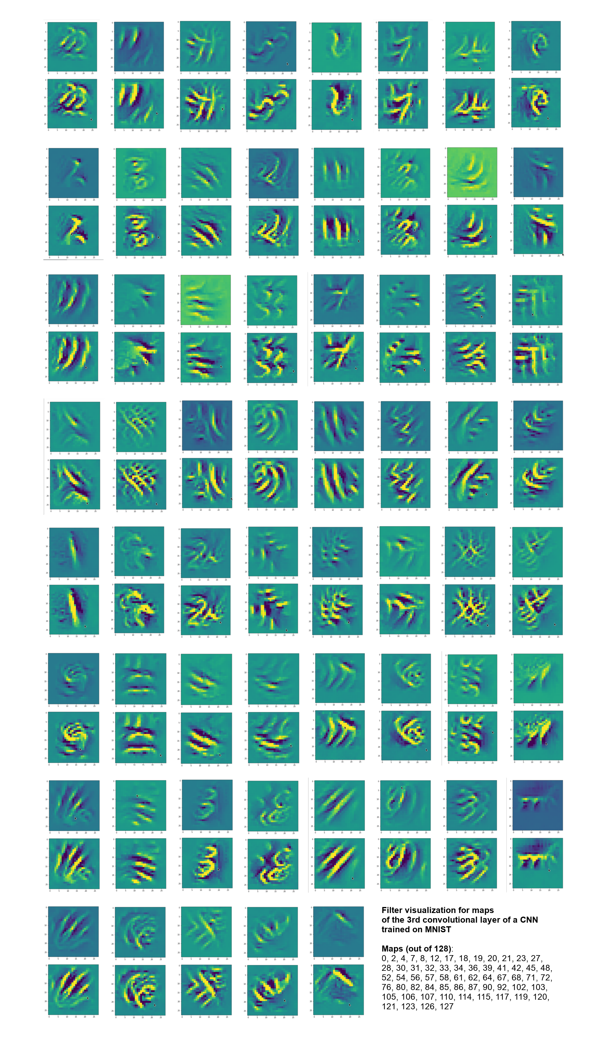
A simple CNN for the MNIST dataset – VII – outline of steps to visualize image patterns which trigger filter maps
A simple CNN for the MNIST dataset – VI – classification by activation patterns and the role of the CNN’s MLP part
A simple CNN for the MNIST dataset – V – about the difference of activation patterns and features
A simple CNN for the MNIST dataset – IV – Visualizing the activation output of convolutional layers and maps
A simple CNN for the MNIST dataset – III – inclusion of a learning-rate scheduler, momentum and a L2-regularizer
A simple CNN for the MNIST datasets – II – building the CNN with Keras and a first test
A simple CNN for the MNIST datasets – I – CNN basics
In the last article I discussed an optimization algorithm which should be able to create images of pixel patterns which trigger selected feature maps of a CNN strongly. In this article we shall focus on the required code elements. I again want to emphasize that I apply and modify some basic ideas which I read in a book of F. Chollet and in a contribution of a guy called Mohamed to a discussion at kaggle.com (see my last article for references). A careful reader will notice differences not only with respect to coding; there are major differences regarding the normalization of intermediate data and the construction of input images. To motivate the latter point I first want to point out that OIPs are idealized technical abstractions and that not all maps may react to purely statistical data on short length scales.
Images of OIPs which trigger feature maps are artificial technical abstractions!
In the last articles I made an explicit distinction between two types of patterns which we can analyze in the context of CNNs:
- FCP: A pattern which emerges within and across activation maps of a chosen (deep) convolutional layer due to filter operations which the CNN applied to a specific input image.
- OIP: A pattern which is present within the pixel value distribution of an input image and to which a CNN map reacts strongly.
Regarding OIPs there are some points which we should keep in mind:
- We do something artificial when we create an image of an elementary OIP pattern to which a chosen feature map reacts. Such an OIP is already an abstraction in the sense that it reflects an idealized pattern – i.e. a specific geometrical correlation between pixel values of an input image which passes a very specific filter combinations. We forget about all other figurative elements of the input image which may trigger other maps.
- There is an additional subtle point regarding our present approach to OIP-visualization:
Our algorithm – if it works – will lead to OIP images which trigger a
map’s neurons maximally on average. What does “average” mean with respect to the image area? A map always covers the whole input image area. Now let us assume that a filter combination of lower layers reacts to an elementary pattern limited in size and located somewhere on the input image. But some filters or filter combinations may be capable of detecting such a pattern at multiple locations of an input image.
One example would be a crossing of two relatively thin lines. Such a crossing could appear at many places in an input image. In fact, a trained CNN has seen several thousand images of handwritten “4”s where the crossing of the horizontal and the vertical line actually appeared at many different locations and may have learned about this when establishing filters. Under such conditions it is obvious that a map gets optimally activated if a relatively small elementary pattern appears multiple times within the image which our algorithm artificially constructs out of initial random data.
So our algorithm will with a high probability lead to OIP images which consist of a combination or a superposition of elementary patterns at multiple locations. In this sense an OIP image constructed due to the rule of a maximum average activation is another type of idealization. In a real MNIST image the re-occurrence of elementary patterns may not be present at all. Therefore, we should be careful and not directly associate the visualization of a pattern created by our algorithm with an elementary OIP or “feature”.
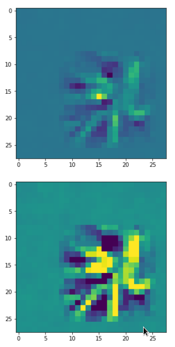
- The last argument can in some cases also be reverted: There may be unique large scale patterns which can only be detected by filters of higher (i.e. deeper) convolutional levels which filter coarsely and with respect to relatively large areas of the image. In our approach such unique patterns may only appear in OIP images constructed for maps of the deepest convolutional layer.
Independence of the statistical data of the input image?
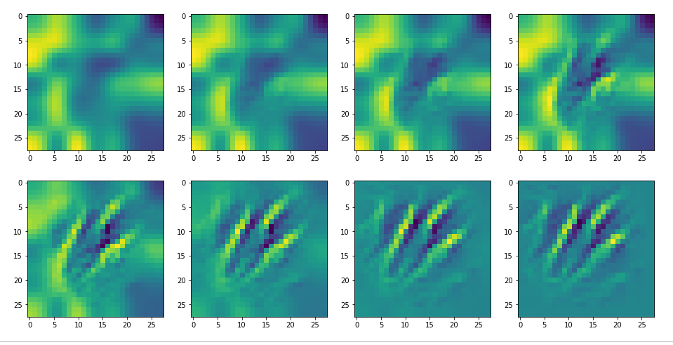
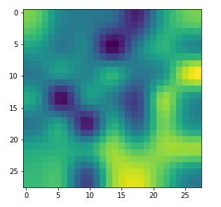
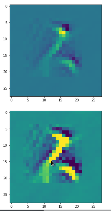
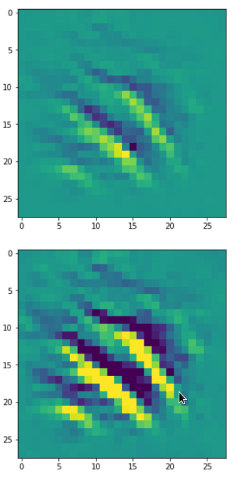
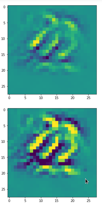
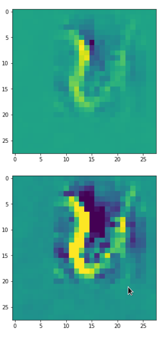
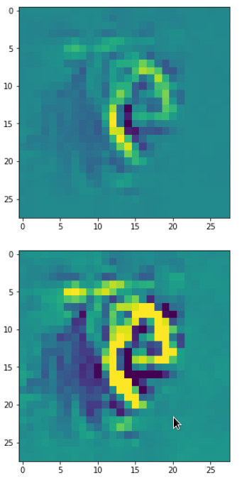
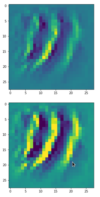
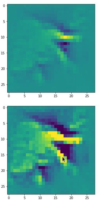
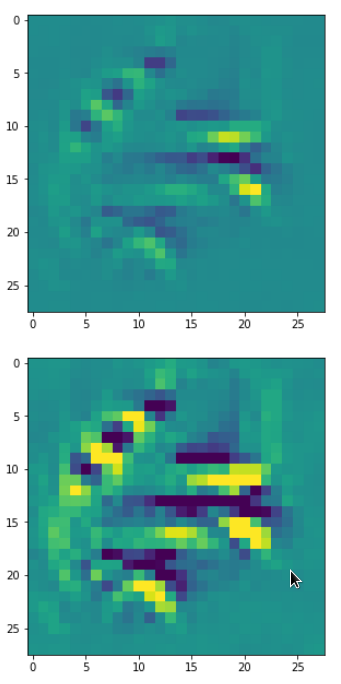
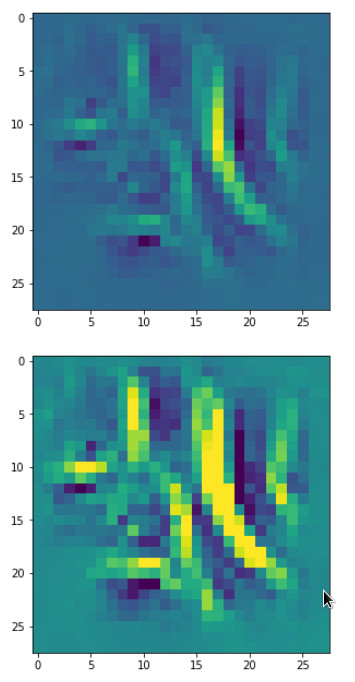
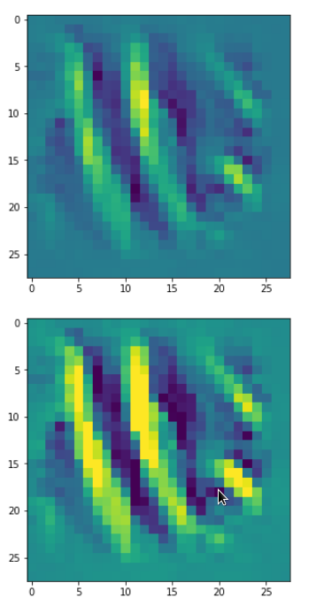
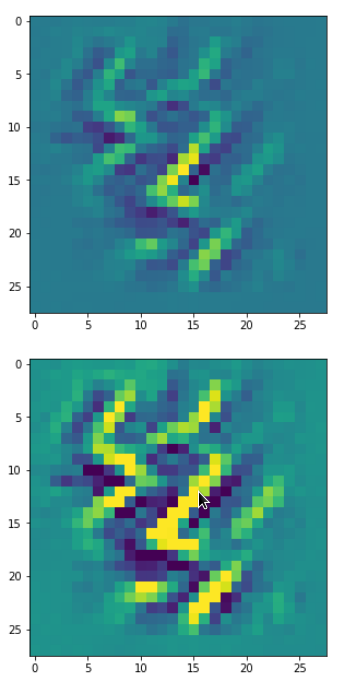
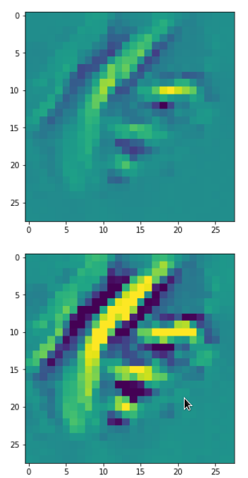
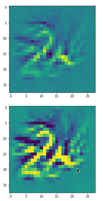
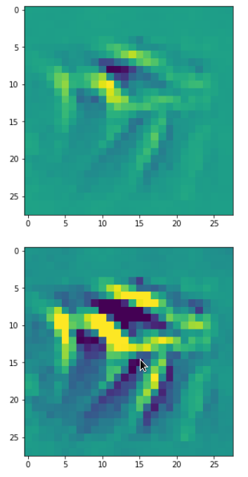
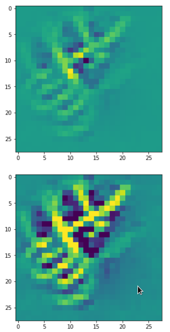
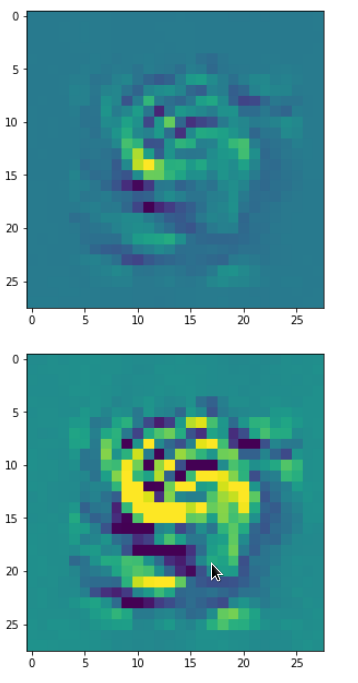
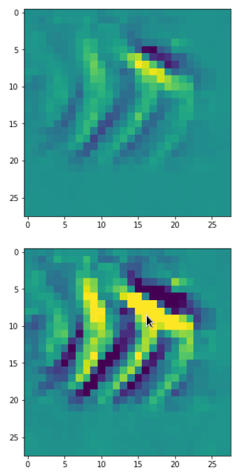
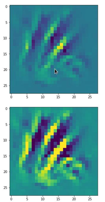
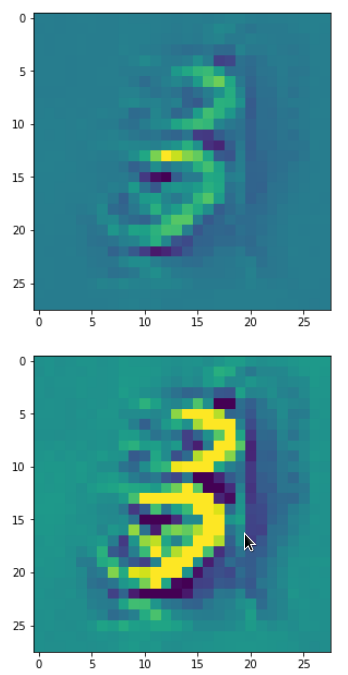
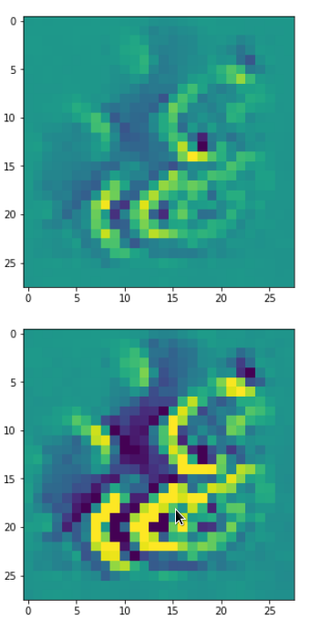
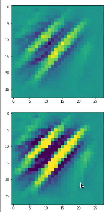
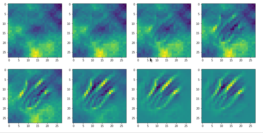
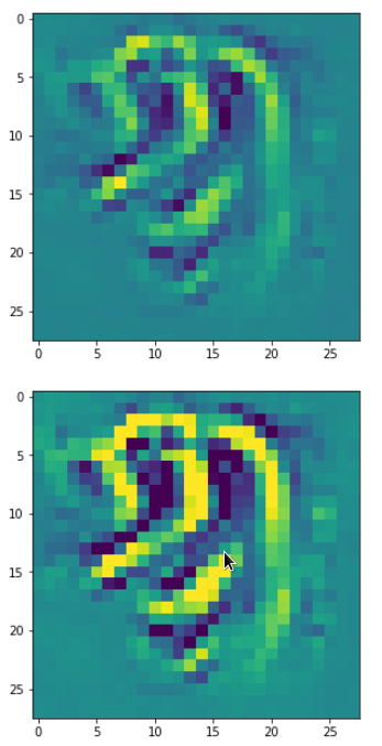
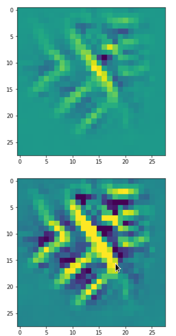
In the last article I showed you already some interesting patterns for certain maps which emerged from randomly varying pixel values in an input image. The fluctuations were forced into patterns by the discussed optimization loop. An example of the resulting evolution of the pixel values is shown below: With more and more steps of the optimization loop an OIP-pattern emerges out of the initial “chaos”.
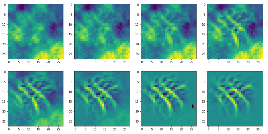
Images were taken at optimization steps 0, 9, 18, 36, 72, 144, 288, 599 of a loop. Convergence is given by a change of the loss values between two different steps divided by the present loss value :
3.6/41 => 3.9/76 => 3.3/143 => 2.3/240 => 0.8/346 => 0.15/398 => 0.03/418
As we work with gradient ascent in OIP detection a lower loss means a lower activation of the map.
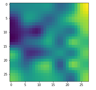
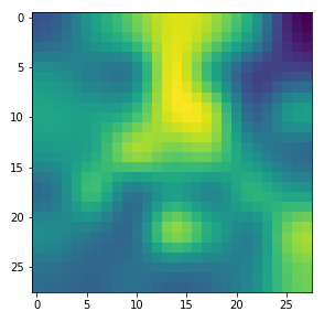
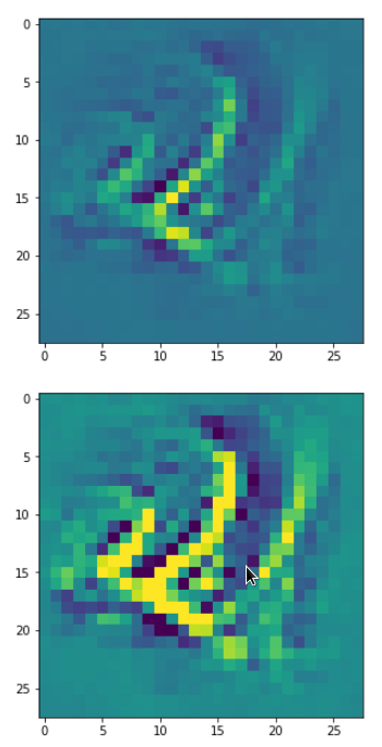
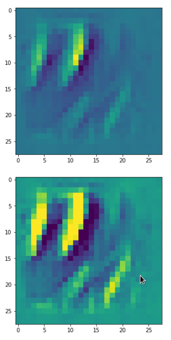
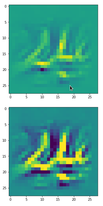
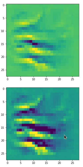
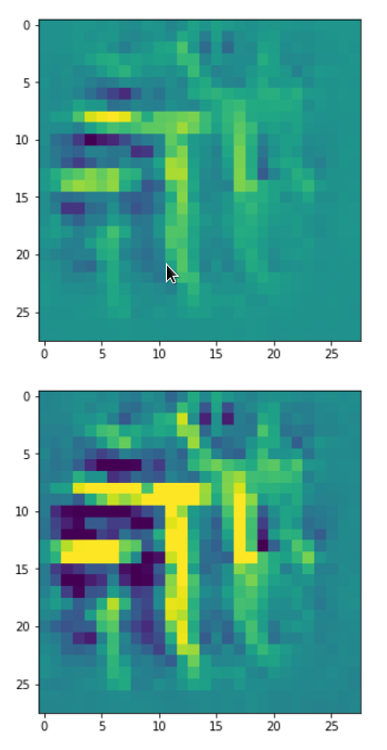
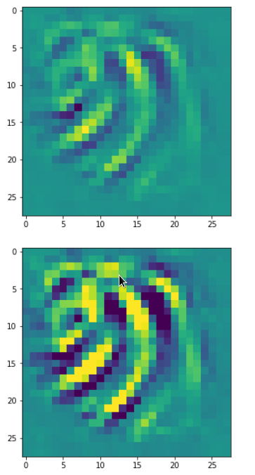
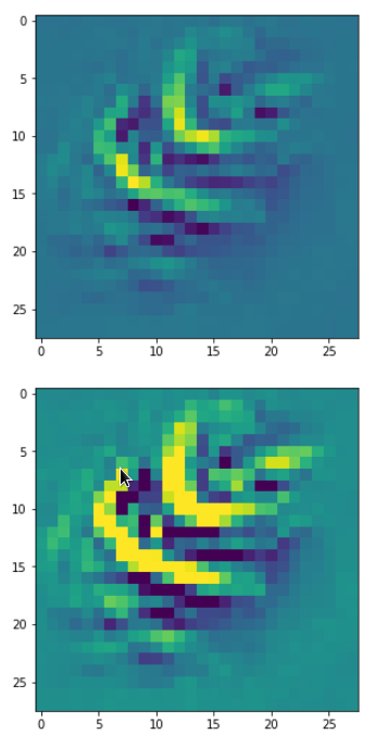
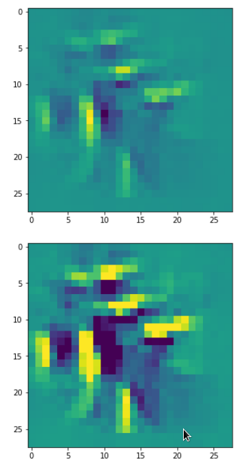
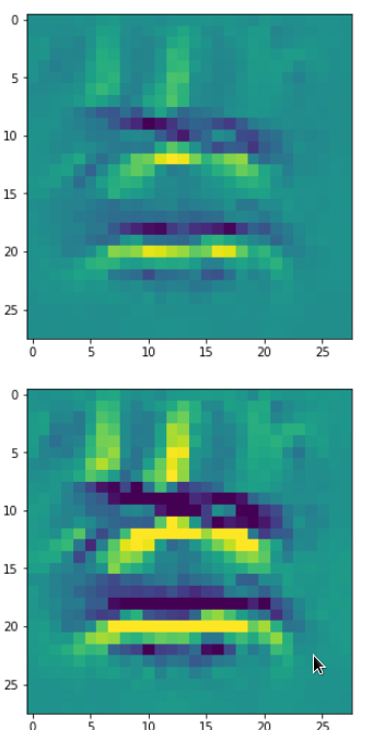
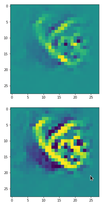
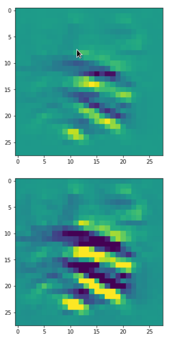
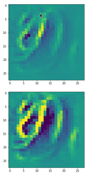
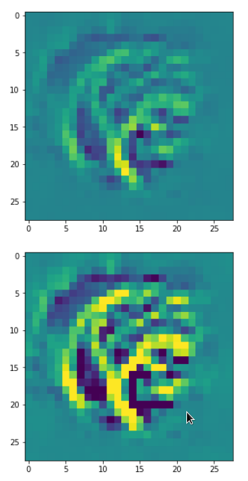
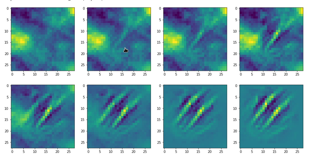
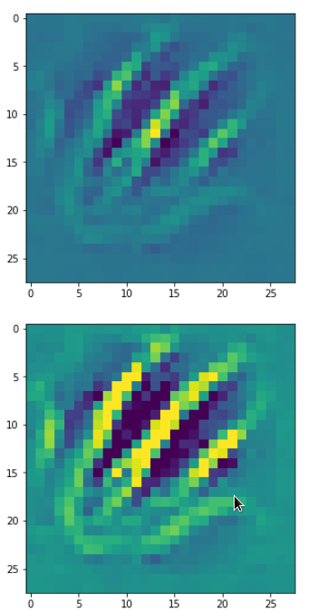
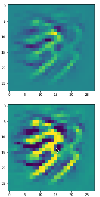
If we change the wavelength of the initial input fluctuations we get a somewhat, though not fundamentally different result (actually with a lower loss value of 381):
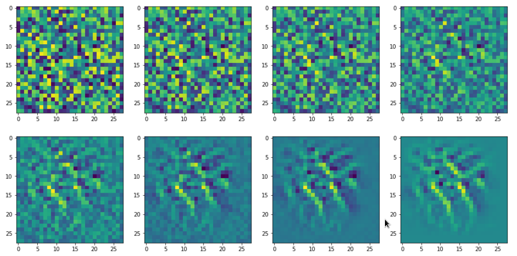
This gives us confidence in the general usability of the method. However, I would like to point out that during your own experiments you may also experience the contrary:
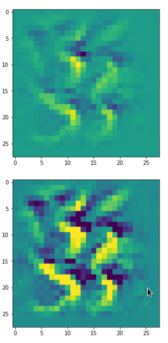
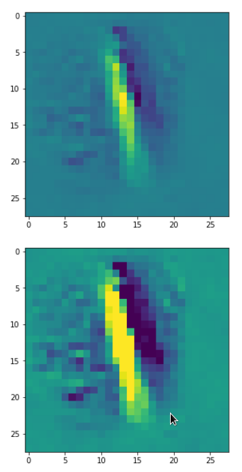
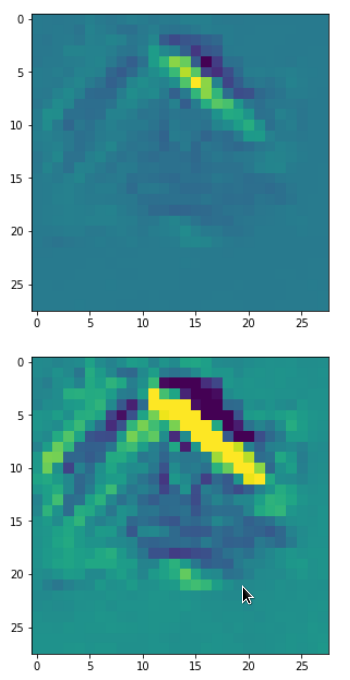
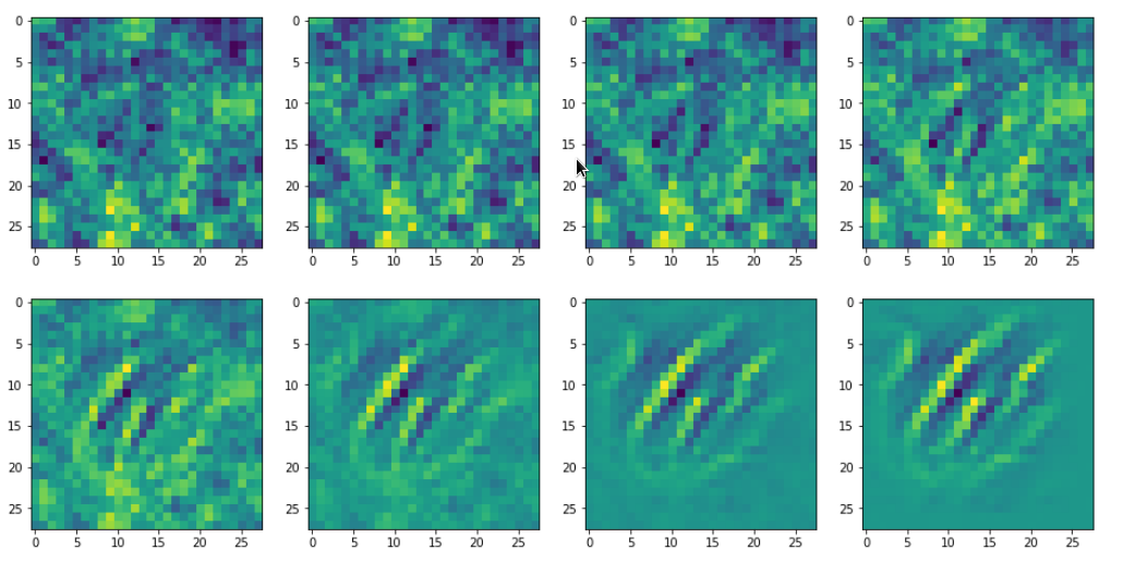
For some maps and for some initial statistical input data varying at short length scales, only, the optimization process will not converge. It will not even start to do so. Instead you may experience a zero activation of the selected map during all steps of the optimization for a given random input.
You should not be too surprised by this fact. Our CNN was optimized to react to patterns present in written digits. As digits have specific elements (features?) as straight lines, bows, circles, line-crossings, etc., we should expect that not all input will trigger the activation of a selected map which reacts on pixel value variations at relatively large length scales. Therefore, it is helpful to be able to vary the statistical input pattern at different length scales when you start your hunt for a nice visualization of an OIP and/or elementary feature.
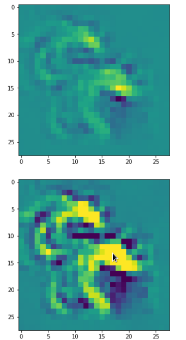
All in all we cannot exclude a dependency on the statistical initial input image fluctuations. Our algorithm will find a maximum with respect to the specific input data fluctuations presented to him. Due to this point we should always be aware of the fact that the visualizations produced by our algorithm will probably mark a local maximum in the multidimensional parameter or representation space – not a global one. But also a local maximum may reveal significant sub-structures a specific filter combination is sensitive to.
Libraries
To build a suitable code we need to import some libraries, which you first must install into your virtual Python environment:
import numpy as np
import scipy
import time
import sys
import math

from sklearn.preprocessing import StandardScaler
import tensorflow as tf
from tensorflow import keras as K
from tensorflow.python.keras import backend as B
from tensorflow.keras import models
from tensorflow.keras import layers
from tensorflow.keras import regularizers
from tensorflow.keras import optimizers
from tensorflow.keras.optimizers import schedules
from tensorflow.keras.utils import to_categorical
from tensorflow.keras.datasets import mnist

from tensorflow.python.client import device_lib

import matplotlib as mpl
from matplotlib import pyplot as plt
from matplotlib.colors import ListedColormap
import matplotlib.patches as mpat

import os
from os import path as path
Basic code elements to construct OIP patterns from statistical input image data
To develop some code for OIP visualizations we follow the outline of steps discussed in the last article. To encapsulate the required functionality we set up a Python class. The following code fragment gives an overview about some variables which we are going to use. In the comments and explanations I sometimes used the word “reference” to mark a difference between
- addresses to some intermediate Tensorflow 2 [TF2] objects handled by a “watch()“-method of TF2’s GradientTape-object for eager calculation of gradients
- and eventual return objects (of a function based on keras’ backend) filled with values which we can directly use during the optimization iterations for corrections.
This is only a reminder of complex internal TF2 background operations based on complex layer models; I do not want to stress any difference in the sense of pointers and objects. Actually, I do not even know the precise programming patterns used behind TF2’s watch()-mechanism; but according to the documentation it basically records all operations involving the “watched” objects. The objective is the ability to produce gradient values of defined functions with respect to any variable changes instantaneously in eager execution later on.
# class to produce images of OIPs for a chosen CNN-map
# ****************************
***************************
class My_OIP:
    '''
    Version 0.2, 01.09.2020
    ~~~~~~~~~~~~~~~~~~~~~~~~~
    This class allows for the creation and the display of OIP-patterns
    to which a selected map of a CNN-model reacts

    Functions:
    ~~~~~~~~~~
    1) _load_cnn_model()             => load cnn-model
    2) _build_oip_model()            => build an oip-model to create OIP-images
    3) _setup_gradient_tape()        => Implements TF2 GradientTape to watch input data
                                        for eager gradient calculation
    4) _oip_strat_0_optimization_loop():
                                     => Method implementing a simple strategy to create OIP-images
                                        based on superposition of random data on large distance scales
    5) _oip_strat_1_optimization_loop():
       (NOT YET DEVELOPED)           => Method implementing a complex strategy to create OIP-images
                                        based on partially evolved intermediate image
                                        getting enriched by small scale fluctuations
    6) _derive_OIP():                => Method used externally to start the creation of
                                        an OIP for a chosen map
    7) _build_initial_img_data()     => Method to construct an initial image based on
                                        a superposition by random date on 4 different length scales


    Requirements / Preconditions:
    ~~~~~~~~~~~~~~~~~~~~~~~~~~~~~
    In the present version
    * a CNN-model is assumed which works with standardized (!) input images,
    * a CNN-Modell trained on MNIST data is assumed ,
    * exactly 4 length scales for random data fluctations are used
      to compose initial statistical image data
      (roughly with a factor of 2 between them)


    '''
    def __init__(self, cnn_model_file = 'cnn_best.h5',
                 layer_name = 'Conv2D_3', map_index = 0,
                 img_dim = 28,
                 b_build_oip_model = True
                ):
        '''
        Input:
        ~~~~~~
            cnn_model_file:     Name of a file containing  a full CNN-model
                                can later be overwritten by _load_cnn_model()
            layer_name:         We can define a layer name we are interested in already when starting; s. below
            map_index:          We may define a map we are interested in already when starting; s. below
            img_dim:            The dimension of the assumed quadratic images

        Major internal variables:
        **************************
            _cnn_model:             A reference to the CNN model object
            _layer_name:            The name of convolutional layer
                                    (can be overwritten by method _build_oip_model() )
            _map_index:             index of the map in the layer's output array
                                    (can later be overwritten by other methods)
            _r_cnn_inputs:          A reference to the input tensor of the CNN model (here: 1 image - NOT a batch of images)
            _layer_output:          Tensor with all maps of a certain layer

            _oip_submodel:          A new model connecting the input of the cnn-model with a certain map

            _tape:                  An instance of TF2's GradientTape-object
                                    Watches input, output, loss of a model
                                    and calculates gradients in TF2 eager mode
            _r_oip_outputs:         A reference to the output of the new OIP-model
            _r_oip_grads:           Reference to gradient tensors for the new OIP-model
            _r_oip_loss:            Reference to a loss
defined by operations on the OIP-output
            _val_oip_loss:          Reference to a loss defined by operations on the OIP-output

            _iterate:               Keras backend function to invoke the new OIP-model
                                    and calculate both loss and gradient values (in TF2 eager mode)
                                    This is the function to be used in the optimization loop for OIPs

            Parameters controlling the optimization loop:
            ~~~~~~~~~~~~~~~~~~~~~~~~~~~~~~~~~~~~~~~~~~~
            _oip_strategy:          0, 1 - There are two strategies to evolve OIP patterns out of statistical data - only the first strategy is supported in this version
                                    0: Simple superposition of fluctuations at different length scales
                                    1: Evolution over partially evolved images based on longer scale variations
                                       enriched with fluctuations on shorter length scales
                                    Both strategies can be combined with a precursor calculation


            _b_oip_precursor:       True/False - Use a precursor analysis of long range variations
                                    regarding loss => search for optimum variations for a given map
                                    (Some initial input images do not trigger a map at all or
                                    sub-optimally => We test out multiple initial fluctuation patterns).

            _ay_epochs:             A list of 4 optimization epochs to be used whilst
                                    evolving the img data via strategy 1 and intermediate images
            _n_epochs:              Number of optimization epochs to be used with strategy 0

            _n_steps:               Defines at how many intermediate points we show images and report
                                    on the optimization process

            _epsilon:               Factor to control the amount of correction imposed by
                                    the gradient values of the OIP-model

            Input image data of the OIP-model and references to it
            ~~~~~~~~~~~~~~~~~~~~~~~~~~~~~~~~~~
            _initial_precursor_img  The initial image to start a precursor optimization with.
                                    Would normally be an image of only long range fluctuations.
            _precursor_image:       The evolved image updated during the precursor loop

            _initial_inp_img_data:  A tensor representing the data of the input image
            _inp_img_data:          A tensor representing the data of the input img during optimization
            _img_dim:               We assume quadratic images to work with
                                    with dimension _img_dim along each axis
                                    For the time being we only support MNIST images

            Parameters controlling the composition of random initial image data
            ~~~~~~~~~~~~~~~~~~~~~~~~~~~~~~~~~~~~~~~~~~~
            _li_dim_steps:          A list of the intermediate dimensions for random data;
                                    these data are smoothly scaled to the image dimensions
            _ay_facts:              A Numpy array of 4 factors to control the amount of
                                    contribution of the statistical variations
                                    on the 4 length scales to the initial image

        '''

        # Input data and variable initializations
        # ****************************************

        # the model
        self._cnn_model_file = cnn_model_file
        self._
cnn_model      = None

        # the layer
        self._layer_name = layer_name
        # the map
        self._map_index  = map_index

        # References to objects and the OIP sub-model
        # ~~~~~~~~~~~~~~~~~~~~~~~~~~~~~~
        self._r_cnn_inputs  = None # reference to input of the CNN_model
                                   # also used in the OIP-model

        self._layer_output  = None
        self._oip_submodel  = None

        self._tape          = None # TF2 GradientTape variable
        # some "references"
        self._r_oip_outputs = None # output of the OIP-submodel to be watched
        self._r_oip_grads   = None # gradients determined by GradientTape
        self._r_oip_loss    = None
        # respective values
        self._val_oip_grads = None
        self._val_oip_loss  = None

        # The Keras function to produce concrete outputs of the new OIP-model
        self._iterate       = None

        # The strategy to produce an OIP pattern out of statistical input images
        # ~~~~~~~~~~~~~~~~~~~~~~~~~--------~~~~~~
        # 0: Simple superposition of fluctuations at different length scales
        # 1: Move over 4 interediate images - partially optimized
        self._oip_strategy = 0

        # Parameters controlling the OIP-optimization process
        # ~~~~~~~~~~~~~~~~~~~~~~~~~--------~~~~~~
        # Use a precursor analysis ?
        self._b_oip_precursor = False

        # number of epochs for optimization strategy 1
        self._ay_epochs    = np.array((20, 40, 80, 400))
        len_epochs         = len(self._ay_epochs)

        # number of epochs for optimization strategy 0
        self._n_epochs     = self._ay_epochs[len_epochs-1]
        self._n_steps      = 7   # divides the number of n_epochs into n_steps
                                 # to produce intermediate outputs

        # size of corrections by gradients
        self._epsilon       = 0.01 # step-size for gradient correction


        # Input images and references to it
        # ~~~~~~~~
        # precursor image
        self._initial_precursor_img = None
        self._precursor_img         = None
        # The evetually used input image - a superposition of initial random fluctuations
        self._initial_inp_img_data  = None  # The initial data constructed
        self._inp_img_data          = None  # The data used and varied for optimization
        # image dimension
        self._img_dim               = img_dim   # = 28 => MNIST images for the time being


        # Parameters controlling the setup of an initial image
        # ~~~~~~~~~~~~~~~~~~~~~~~~~--------~~~~~~~~~~~~~~~~~~~
        # The length scales for initial input fluctuations
        self._li_dim_steps = ( (3, 3), (7,7), (14,14), (28,28) )
        # Parameters for fluctuations  - used both in strategy 0 and strategy 1
        self._ay_facts     = np.array( (0.5, 0.5, 0.5, 0.5) )


        # ********************************************************
        # Model setup - load the cnn-model and build the oip-model
        # ************

        if path.isfile(self._cnn_model_file):
            # We trigger the initial load of a model
            self._load_cnn_model(file_of_cnn_model = self._cnn_model_file, b_print_cnn_model = True)
            # We trigger the build of a new sub-model based on the CNN model used for OIP search
            self._build_oip_model(layer_name = self._layer_name, b_print_oip_model = True )
        else:
            print("<\nWarning: The standard file " + self._cnn_model_file +
                  " for the cnn-model could not be found!\n " +
                  " Please use method _load_cnn_model() to load
a valid model")

        return
The purpose of most of the variables will become clearer as we walk though the class’s methods below.
Loading the original trained CNN model
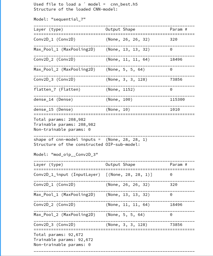
Let us say we have a trained CNN-model with all final weight parameters for node-connections saved in some h5-file (see the 4th article of this series for more info). We then can load the CNN-model and derive sub-models from its layer elements. The following method performs the loading task for us:
    #
    # Method to load a specific CNN model
    # **********************************
    def _load_cnn_model(self, file_of_cnn_model='cnn_best.h5', b_print_cnn_model=True ):

        # Check existence of the file
        if not path.isfile(self._cnn_model_file):
            print("<\nWarning: The file " + file_of_cnn_model +
                  " for the cnn-model could not be found!\n" +
                  "Please change the parameter \"file_of_cnn_model\"" +
                  " to load a valid model")

        # load the CNN model
        self._cnn_model_file = file_of_cnn_model
        self._cnn_model = models.load_model(self._cnn_model_file)

        # Inform about the model and its file file 7
        # ~~~~~~~~~~~~~~~~~~~~~~~~~~~
        print("Used file to load a ´ model = ", self._cnn_model_file)
        # we print out the models structure
        if b_print_cnn_model:
            print("Structure of the loaded CNN-model:\n")
            self._cnn_model.summary()

        # handle/references to the models input => more precise the input image
        # ~~~~~~~~~~~~~~~~~~~~~~~~~~~~~~~~~~~~
        #    Note: As we only have one image instead of a batch
        #    we pick only the first tensor element!
        #    The inputs will be needed for buildng the oip-model
        self._r_cnn_inputs = self._cnn_model.inputs[0]  # !!! We have a btach with just ONE image

        # print out the shape - it should be known fro the original cnn-model
        print("shape of cnn-model inputs = ", self._r_cnn_inputs.shape)

        return
Actually, I used this function already in the class’ “__init__()”-method – provided the standard file for the last CNN exists. (In a more advanced version you would in addition check that the name of the standard CNN-model meets your expectations.)
The code is straightforward. You see that the structure of the original CNN-model is printed out if requested by the user.
Note also that we assigned the first element of the input tensor of the CNN-model, i.e. a single image tensor, to the variable “self._r_cnn_inputs”. This tensor will become a major ingredient in a new Keras model which we are going to build in a minute and which we shall use to calculate gradient components of a loss function with respect to all pixel values of the input image. The gradient’s component values will in turn be used during gradient ascent to correct the pixel values. Repeated corrections should lead to a systematic approach of a maximum of our loss function, which describes the map’s activation. (Remember: Such a maximum may depend on the input image fluctuations).
Build a new Keras model based on the input tensor and a chosen layer
The next method is more interesting. We need to build a new Keras layer “model” based on the input layer and a deeper layer of the original CNN-model. (We already used the same kind of “trick” when we tried to visualize the activation output of a convolutional layer of the CNN.)
    #
    # Method to construct a model to optimize input for OIP-detection
    #
***************************************
    def _build_oip_model(self, layer_name = 'Conv2D_3', b_print_oip_model=True ):
        '''
        We need a Conv layer to build a working model for input image optimization.
        We get the Conv layer by the layer's name.
        The new model connects the first input element of the CNN to
        the output maps of the named Conv layer CNN
        '''
        # free some RAM - hopefully
        del self._oip_submodel

        self._layer_name = layer_name
        if self._cnn_model == None:
            print("Error: cnn_model not yet defined.")
            sys.exit()
        # We build a new model based ion the model inputs and the output
        self._layer_output = self._cnn_model.get_layer(self._layer_name).output

        # We do not acre at the moment about the composition of the input
        # We trust in that we handle only one image - and not a batch
        model_name = "mod_oip__" + layer_name
        self._oip_submodel = models.Model( [self._r_cnn_inputs], [self._layer_output], name = model_name)

        # We print out the oip model structure
        if b_print_oip_model:
            print("Structure of the constructed OIP-sub-model:\n")
            self._oip_submodel.summary()
        return
We use the tensor for a single input image and the output of layer (= a collection of maps) of the original CNN-model as the definition elements of the new Keras model.
TF2’s GradientTape() – watch the change of variables which have an impact on model gradients and the loss function
What do we have so far? We have defined a new Keras model connecting input and output data of a layer of the original model. TF2 can determine related gradients by the node connections defined in the original model. However, we cannot rely on a graph analysis by Tensorflow as we were used to with TF1. TF2 uses eager mode – i.e. it calculates gradients directly. What does “directly” mean? Well – as soon as changes to variables occur which have an impact on the gradient values. This in turn means that “something” has to watch out for such changes. TF2 offers a special object for this purpose: tf.GradientTape. See:
https://www.tensorflow.org/guide/eager
https://www.tensorflow.org / api_docs/python/tf/GradientTape
So, as a next step, we set up a method to take care of “GradientTape()”.
    #
    # Method to watch gradients
    # *************************
    def _setup_gradient_tape(self):
        '''
        For TF2 eager execution we need to watch input changes and trigger gradient evaluation
        '''
        # Working with TF2 GradientTape
        self._tape = None

        # Watch out for input, output variables with respect to gradient chnages
        with tf.GradientTape() as self._tape:
            # Input
            # ~~~~~~~
            self._tape.watch(self._r_cnn_inputs)
            # Output
            # ~~~~~~~
            self._r_oip_outputs = self._oip_submodel(self._r_cnn_inputs)

            # Loss
            # ~~~~~~~
            self._r_oip_loss = tf.reduce_mean(self._r_oip_outputs[0, :, :, self._map_index])
            print(self._r_oip_loss)
            print("shape of oip_loss = ", self._r_oip_loss.shape)
Note that the loss definition included in the code fragment is specific for a chosen map. This implies that we have to call this method every time we chose a different map for which we want to create OIP visualizations.
The advantage of the above code element is that “_tape()” can produce gradient values for the relation of the input data and loss data of a model automatically whenever we change the input image data. Gradient values can be called by
self._r_oip_grads = self._tape.gradient(self._r_oip_loss, self._r_cnn_inputs)
Gradient ascent
As already discussed in my last article we apply a gradient ascent method to our “loss” function whose outcome rises with the activation of the neurons of a map. The following code sets up a method which first calls “_setup_gradient_tape()” and afterwards applies a normalization to the gradient values which “_tape()” produces. It then defines a convenience function and eventually calls a method which runs the optimization loop.
    #
    # Method to derive OIP from a given initial input image
    # ********************
    def _derive_OIP(self, map_index = 1, n_epochs = None, n_steps = 4,
                          epsilon = 0.01,
                          conv_criterion = 5.e-4,
                          b_stop_with_convergence = False ):
        '''
        V0.3, 31.08.2020
        This method starts the process of producing an OIP of statistical input image data

        Requirements:    An initial input image with statistical fluctuations of pixel values
        -------------    must have been created.

        Restrictions:    This version only supports the most simple strategy - "strategy 0":
        -------------    Optimize in one loop - starting from a superposition of fluctuations
                         No precursor, no intermediate evolution of input image data

        Input:
        ------
        map_index:       We can chose a map here       (overwrites previous settings)
        n_epochs:        Number of optimization steps  (overwrites previous settings)
        n_steps:         Defines number of intervals (with length n_epochs/ n_steps) for reporting
                         This number also sets a requirement for providing n_step external axis-frames
                         to display intermediate images of the emerging OIP
                         => see _oip_strat_0_optimization_loop()
        epsilon:         Size for corrections by gradient values
        conv_criterion:  A small threshold number for (difference of loss-values / present loss value )
        b_stop_with_convergence:
                         Boolean which decides whether we stop a loop if the conv-criterion is fulfilled

        '''
        self._map_index = map_index
        self._n_epochs  = n_epochs
        self._n_steps   = n_steps
        self._epsilon   = epsilon

        # number of epochs for optimization strategy 0
        # ~~~~~~~~~~~~~~~~~~~~~~~~~~~~~~~~~~~~~~~~~~~~~~
        if n_epochs == None:
            len_epochs = len(self._ay_epochs)
            self._n_epochs   = self._ay_epochs[len_epochs-1]
        else:
            self._n_epochs = n_epochs

        # Rest some variables
        self._val_oip_grads = None
        self._val_oip_loss  = None
        self._iterate       = None

        # Setup the TF2 GradientTape watch
        # ~~~~~~~~~~~~~~~~~~~~~~~~~~~~~~~~~~~~~~~~~~~~~~~~~~~
        self._setup_gradient_tape()
        print("GradientTape watch activated ")

        # Gradient handling - so far we only deal with addresses
        # ~~~~~~~~~~~~~~~~~~
        self._r_oip_grads  = self._tape.gradient(self._r_oip_loss, self._r_cnn_inputs)
        #print("shape of grads = ", self._r_oip_grads.shape)

        # normalization of the gradient
        self._r_oip_grads /= (B.sqrt(B.mean(B.
square(self._r_oip_grads))) + 1.e-7)
        #grads = tf.image.per_image_standardization(grads)

        # define an abstract recallable Keras function
        # producing loss and gradients for corrected img data
        # the first list of addresses points to the input data, the last to the output data
        self._iterate = B.function( [self._r_cnn_inputs], [self._r_oip_loss, self._r_oip_grads] )

        # get the initial image into a variable for optimization
        self._inp_img_data = None
        self._inp_img_data = self._initial_inp_img_data

        # Optimization loop for strategy 0
        # ~~~~~~~~~~~~~~~~~~~~~~~~~~~~~~~~
        if self._oip_strategy == 0:
            self._oip_strat_0_optimization_loop( conv_criterion = conv_criterion,
                                                b_stop_with_convergence = b_stop_with_convergence )
Gradient value normalization is done here with respect to the L2-norm of the gradient. I.e., we adjust the length of the gradient to a unit length. Why does such a normalization help us with respect to convergence? You remember from a previous article series about MLPs that we had to care about a reasonable balance of an adaptive application of gradient values and a systematic reduction of the learning rate when approaching the global minimum of a cost function. The various available adaptive gradient methods care about speed and a proper deceleration of the steps by which we move across the cost hyperplane. When we approached a minimum we needed to care about overshooting. In our present gradient ascent case we have no such adaptive fine-tuning available. What we can do, however, is to control the length of the gradient vector such that changes remain of the same order as long as we do not change the step-size factor (epsilon). I.e.:
- We do not wildly accelerate our path on the loss hyperplane when some local pixel areas want to drive us into a certain direction.
- We reduce the chance of creating pixel values out of normal boundaries.
The last point fits well with a situation where the CNN has been trained on normalized or standardizes input images. Due to the normalization the size of pixel value corrections now depends significantly on the factor “epsilon”. We should choose it small enough with respect to the pixel values.
Another interesting statement in the above code fragment is
self._iterate = B.function( [self._r_cnn_inputs], [self._r_oip_loss, self._r_oip_grads] )
Here we use the Keras Backend to define a convenience function which relates input data with dependent outputs, whose calculations we previously defined by suitable statements. The list which is used as the first parameter of this function “_iterate()” defines the input variables, the list used as a second parameter defines the output variables which will internally be calculated via the GradientTape-functionality defined before. The “_iterate()”-function makes it much easier for us to build the optimization loop.
The optimization loop for the construction of images that visualize OIPs and features
The optimization loop must systematically correct the pixel values to approach a maximum of the loss function. The following method “_oip_strat_0_optimization_loop()” does this job for us. (The “0” in the method’s name refers to a first simple approach.)
    #
    # Method to optimize an emerging OIP out of statistical input image data
    # (simple strategy - just optimize, no precursor, no intermediate pattern evolution
    # ********************************
    def _oip_strat_0_optimization_loop(self, conv_criterion = 5.e-4,
                                            b_stop_with_
convergence = False ):

        '''
        V 0.2, 28.08.2020

        Purpose:
        This method controls the optimization loop for OIP reconstruction of an initial
        input image with a statistical distribution of pixel values.
        It also provides intermediate output in the form of printed data and images.

        Parameter:
        conv_criterion:  A small threshold number for (difference of loss-values / present loss value )
        b_stop_with_convergence:
                         Booelan which decides whether we stop a loop if the conv-criterion is fulfilled


        This method produces some intermediate output during the optimization loop in form of images.
        It uses an external grid of plot frames and their axes-objects. The addresses of the
        axis-objects must provided by an external list "li_axa[]".
        We need a seqence of >= n_steps axis-frames length(li_axa) >= n_steps).
        With Jupyter the grid for plots can externally be provided by statements like

        # figure
        # -----------
        #sizing
        fig_size = plt.rcParams["figure.figsize"]
        fig_size[0] = 16
        fig_size[1] = 8
        fig_a = plt.figure()
        axa_1 = fig_a.add_subplot(241)
        axa_2 = fig_a.add_subplot(242)
        axa_3 = fig_a.add_subplot(243)
        axa_4 = fig_a.add_subplot(244)
        axa_5 = fig_a.add_subplot(245)
        axa_6 = fig_a.add_subplot(246)
        axa_7 = fig_a.add_subplot(247)
        axa_8 = fig_a.add_subplot(248)
        li_axa = [axa_1, axa_2, axa_3, axa_4, axa_5, axa_6, axa_7, axa_8]

        '''

        # Check that we really have an input image tensor
        if ( (self._inp_img_data == None) or
             (self._inp_img_data.shape[1] != self._img_dim) or
             (self._inp_img_data.shape[2] != self._img_dim) ) :
            print("There is no initial input image or it does not fit dimension requirements (28,28)")
            sys.exit()

        # Print some information
        print("*************\nStart of optimization loop\n*************")
        print("Strategy: Simple initial mixture of long and short range variations")
        print("Number of epochs = ", self._n_epochs)
        print("Epsilon =  ", self._epsilon)
        print("*************")

        # some initial value
        loss_old = 0.0

        # Preparation of intermediate reporting / img printing
        # --------------------------------------
        # Number of intermediate reporting points during the loop
        steps = math.ceil(self._n_epochs / self._n_steps )
        # Logarithmic spacing of steps (most things happen initially)
        n_el = math.floor(self._n_epochs / 2**(self._n_steps) )
        li_int = []
        for j in range(self._n_steps):
            li_int.append(n_el*2**j)
        print("li_int = ", li_int)
        # A counter for intermediate reporting
        n_rep = 0
        # Array for intermediate image data
        li_imgs = np.zeros((self._img_dim, self._img_dim, 1), dtype=np.float32)

        # Convergence? - A list for steps meeting the convergence criterion
        # ~~~~~~~~~~~~
        li_conv = []


        # optimization loop
        # *******************
        # A counter for steps with zero loss and gradient values
        n_zeros = 0

        for j in range(self._n_epochs):

            # Get output values of our Keras iteration function
            # ~~~~~~~~~~~~~~~~~~~
            self._val_oip_loss, self._val_oip_grads = self._iterate([self._inp_img_data])

            # loss difference to last step - shuold steadily become smaller
            loss_diff = self._
val_oip_loss - loss_old
            #print("loss_val = ", loss_val)
            #print("loss_diff = ", loss_diff)
            loss_old = self._val_oip_loss

            if j > 10 and (loss_diff/(self._val_oip_loss + 1.-7)) < conv_criterion:
                li_conv.append(j)
                lenc = len(li_conv)
                # print("conv - step = ", j)
                # stop only after the criterion has been met in 4 successive steps
                if b_stop_with_convergence and lenc > 5 and li_conv[-4] == j-4:
                    return

            grads_val     = self._val_oip_grads
            # the gradients average value
            avg_grads_val = (tf.reduce_mean(grads_val)).numpy()

            # Check if our map reacts at all
            # ~~~~~~~~~~~~~~~~~~~~~~~~~~~~~~~~
            if self._val_oip_loss == 0.0 and avg_grads_val == 0.0:
                print( "0-values, j= ", j,
                       " loss = ", self._val_oip_loss, " avg_loss = ", avg_grads_val )
                n_zeros += 1

            if n_zeros > 10:
                print("More than 10 times zero values - Try a different initial random distribution of pixel values")
                return

            # gradient ascent => Correction of the input image data
            # ~~~~~~~~~~~~~~~
            self._inp_img_data += grads_val * self._epsilon

            # Standardize the corrected image - we won't get a convergence otherwise
            # ~~~~~~~~~~~~~~~~~~~~~~~~~~~~~~~
            self._inp_img_data = tf.image.per_image_standardization(self._inp_img_data)

            # Some output at intermediate points
            #     Note: We us logarithmic intervals because most changes
            #           appear in the intial third of the loop's range
            if (j == 0) or (j in li_int) or (j == self._n_epochs-1) :
                # print some info
                print("\nstep " + str(j) + " finalized")
                #print("Shape of grads = ", grads_val.shape)
                print("present loss_val = ", self._val_oip_loss)
                print("loss_diff = ", loss_diff)
                # display the intermediate image data in an external grid
                imgn = self._inp_img_data[0,:,:,0].numpy()
                #print("Shape of intermediate img = ", imgn.shape)
                li_axa[n_rep].imshow(imgn, cmap=plt.cm.viridis)
                # counter
                n_rep += 1

        return
The code is easy to understand: We use our convenience function “self._iterate()” to produce actual loss and gradient values within the loop. Then we change the pixel values of our input image and feed the changed image back into the loop. Note the positive sign of the correction! All complicated gradient calculations are automatically and “eagerly” done internally thanks to “GradientTape”.
We said above that we limited the gradient values. How big is the size of the resulting corrections compared to the image data? If and when we use standardized image data and scale our gradient to unit length size then the relative size of the changes are of the order of the step size “epsilon” for the correction. In our case we set epsilon to 5.e-4.
The careful reader has noticed that I standardized the image data after the correction with the (normalized) gradient. Well, this step proved to be absolutely necessary to get convergence in the sense that we really approach an extremum of the cost function. Reasons are:
- My CNN was trained on standardized MNIST input images.
- We did not include any normalization layers into our CNN.
- Without counter-measures our normalized gradient values would eventually drive unlimited activation
values.
The last point deserves some explanation:
We used the ReLU-function as the activation function of nodes in the inner layers of our CNN. For positive input values ReLU actually is a linear function. Now let us assume that we have found a rather optimal input pattern which via a succession of basically linear operations drives an activation pattern of a map’s neurons. What happens if we just add constant small values to each pixel per iteration step? The output values after the sequence of linear transformations will just grow! With our method and the ReLU activation function we walk around a surface until we reach a linear ramp and climb it up. Without compensatory steps we will not find a real maximum because there is none. The situation is very different at the convolutional layers than at the eventual output layer of the CNN’s MLP-part.
You may ask yourself why we experienced nothing of this during the classification training? First answer: We did not optimize input data but weights during the training. Second answer: During training we did NOT maximize potentially unbound activation values but minimized a cost function based on output values of the last a MLP-layer. And these values were produced by a sigmoid function! The sigmoid function limits any input to the range ]0, +1[. In addition, the cost function (categorial_crossentropy) is designed to be convex for deviations of limited calculated values from a limited target vector.
The consequence is that we have to limit the values of the (corrected) input data and the related gradients in our present optimization procedure at the same time! This is done by the standardization of the image data. Remember that the correction values are around of the relative order of 5.e-4. In the end this is the order of the fluctuations which are unavoidable in the final OIP image; but now we have a chance to converge to a related small region around a real maximum.
The last block in the code deals with intermediate output – not only printed data on the loss function but also in form of intermediate images of the hopefully emerging pattern. These images can be provided in an external grid of figures in e.g. a Jupyter environment. The important point is that we define a suitable number of Matplotlib’s axis-objects and deliver their addresses via an external array “li_axa[]”. I am well aware of that the plotting solution coded here is a very basic one and it requires some ahead planning of the user – feel free to program it in a better way.
Initial input image data – with variations on different length scales
We lack just one further ingredient: We need a method to construct an input image with statistical data. I have discussed already that it may be helpful to vary data on different length scales. A very simple approach to tackle this problem manually is the following one:
We use squares – each with a different small and limited number of cells; e.g. a (4×4)-, a (7×7)-, a (14×14)- and (28×28)-square. Note that (28×28) is the original size of the MNIST images. For other samples we may need different sizes of such squares and more of them. We then fill the cells with random numbers between [-1, 1]. We smoothly scale the variations of the smaller squares up to the real input image size; here: (28×28). We can do this by applying a bicubic interpolation to the data. In the end we add up all random data and normalize or standardize the resulting distribution of pixel values. See the code below for details:
#
# Method to build an initial image from a superposition of random data on different length scales
# ***********************************
def _build_initial_img_data( self,
strategy = 0,
li_epochs = (20, 50, 100, 400),
li_
facts = (0.5, 0.5, 0.5, 0.5),
li_dim_steps = ( (3,3), (7,7), (14,14), (28,28) ),
b_smoothing = False):
'''
V0.2, 31.08.2020
Purpose:
~~~~~~~~
This method constructs an initial input image with a statistical distribution of pixel-values.
We use 4 length scales to mix fluctuations with different "wave-length" by a simple
approach:
We fill four squares with a different number of cells below the number of pixels
in each dimension of the real input image; e.g. (4x4), (7x7, (14x14), (28,28) <= (28,28).
We fill the cells with random numbers in [-1.0, 1.]. We smootly scale the resulting pattern
up to (28,28) (or what ever the input image dimensions are) by bicubic interpolations
and eventually add up all values. As a final step we standardize the pixel value distribution.
Limitations
~~~~~~~~~~~
This version works with 4 length scales. it only supports a simple strategy for
evolving OIP patterns.
'''
self._oip_strategy = strategy
self._ay_facts = np.array(li_facts)
self._ay_epochs = np.array(li_epochs)
self._li_dim_steps = li_dim_steps
fluct_data = None
# Strategy 0: Simple superposition of random patterns at 4 different wave-length
# ~~~~~~~~~~
if self._oip_strategy == 0:
dim_1_1 = self._li_dim_steps[0][0]
dim_1_2 = self._li_dim_steps[0][1]
dim_2_1 = self._li_dim_steps[1][0]
dim_2_2 = self._li_dim_steps[1][1]
dim_3_1 = self._li_dim_steps[2][0]
dim_3_2 = self._li_dim_steps[2][1]
dim_4_1 = self._li_dim_steps[3][0]
dim_4_2 = self._li_dim_steps[3][1]
fact1 = self._ay_facts[0]
fact2 = self._ay_facts[1]
fact3 = self._ay_facts[2]
fact4 = self._ay_facts[3]
# print some parameter information
# ~~~~~~~~~~~~~~~~~~~~~~~~~~~~~~~~
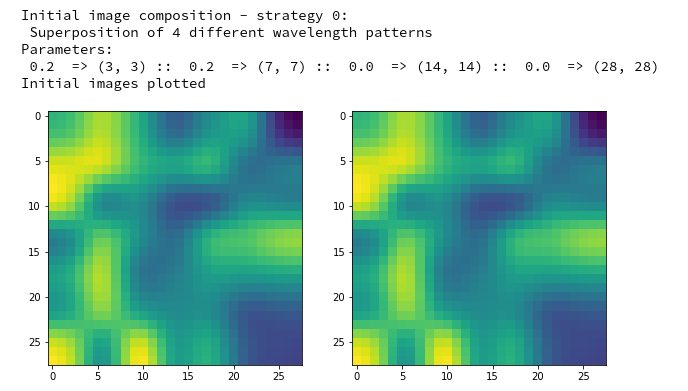
print("\nInitial image composition - strategy 0:\n Superposition of 4 different wavelength patterns")
print("Parameters:\n",
fact1, " => (" + str(dim_1_1) +", " + str(dim_1_2) + ") :: ",
fact2, " => (" + str(dim_2_1) +", " + str(dim_2_2) + ") :: ",
fact3, " => (" + str(dim_3_1) +", " + str(dim_3_2) + ") :: ",
fact4, " => (" + str(dim_4_1) +", " + str(dim_4_2) + ")"
)
# fluctuations
fluct1 = 2.0 * ( np.random.random((1, dim_1_1, dim_1_2, 1)) - 0.5 )
fluct2 = 2.0 * ( np.random.random((1, dim_2_1, dim_2_2, 1)) - 0.5 )
fluct3 = 2.0 * ( np.random.random((1, dim_3_1, dim_3_2, 1)) - 0.5 )
fluct4 = 2.0 * ( np.random.random((1, dim_4_1, dim_4_2, 1)) - 0.5 )
# Scaling with bicubic interpolation to the required image size
fluct1_scale = tf.image.resize(fluct1, [28,28], method="bicubic", antialias=True)
fluct2_scale = tf.image.resize(fluct2, [28,28], method="bicubic", antialias=True)
fluct3_scale = tf.image.resize(fluct3, [28,28], method="bicubic", antialias=True)
fluct4_scale = fluct4
# superposition
fluct_data = fact1*fluct1_scale + fact2*fluct2_scale + fact3*fluct3_scale + fact4*fluct4_scale
# get the standardized plus smoothed and unsmoothed image
# ~~~~~~~~~~~~~~~~~~~~~~~~~~~~~~~~~~~~~~~~
# TF2 provides a function performing standardization of image data function
r
fluct_data_unsmoothed = tf.image.per_image_standardization(fluct_data)
fluct_data_smoothed = tf.image.per_image_standardization(
tf.image.resize( fluct_data, [28,28],
method="bicubic", antialias=True) )
if b_smoothing:
self._initial_inp_img_data = fluct_data_smoothed
else:
self._initial_inp_img_data = fluct_data_unsmoothed
# There should be no difference
img_init_unsmoothed = fluct_data_unsmoothed[0,:,:,0].numpy()
img_init_smoothed = fluct_data_smoothed[0,:,:,0].numpy()
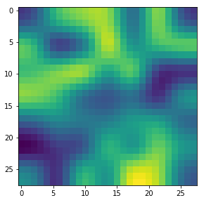
ax1_1.imshow(img_init_unsmoothed, cmap=plt.cm.viridis)
ax1_2.imshow(img_init_smoothed, cmap=plt.cm.viridis)
print("Initial images plotted")
return self._initial_inp_img_data
The factors fact1, fact2 and fact3 determine the relative amplitudes of the fluctuations at the different length scales. Thus the user is e.g. able to suppress short-scale fluctuations completely.
I only took exactly four squares to simulate fluctuation on different length scales. A better code would make the number of squares and length scales parameterizable. Or it would work with a Fourier series right from the start. I was too lazy for such elaborated things. The plots again require the definition of some external Matplotlib figures with axis-objects. You can provide a suitable figure in a Jupyter cell.
Conclusion
In this article we have build a simple class to create OIPs for a specific CNN map out of an input image with a random distribution of pixel values. The algorithm should have made it clear that this a constructive work performed during iteration:
- We start from the “detection” of slight traces of a pattern in the initial statistical pixel value distribution; the
pattern actually is a statistical pixel correlation which triggers the chosen map,
- then we amplify the recognized pattern elements
- and suppress pixel values which are not relevant into a homogeneous background.
So the headline of this article is a bit misleading: We do not only “detect” a map related OIP; we also “create” it.
Our new Python class makes use of a given trained CNN-model and follows the outline of steps discussed in a previous article. The class has many limitations – in its present version it is only usable for MNIST images and the user has to know a lot about internals. However, I hope that my readers nevertheless have understood the basic ingredients. From there it is only a small step towards are more general and more capable version.
I have also underlined in this article that the images produced by the coded methods may only represent local maxima of the loss function for average map activation and idealized patterns composed of re-occuring elementary sub-structures. In the next article
A simple CNN for the MNIST dataset – IX – filter visualization at a convolutional layer
I am going to apply the code to most of the maps of the highest, i.e. inner-most convolutional layer of my trained CNN. We shall discover a whole zoo of simple and complex input image patterns. But we shall also confirm the suspicion that our optimization algorithm for finding an OIP for a specific map does not react to each and every kind of initial statistical pixel value fluctuation presented to the CNN.