In the first article of this mini series
Vertical gaps resulting from nested inline block elements inside DIV containers – I
we have seen that under certain circumstances (nested) inline-blocks may lead to vertical gaps between themselves and/or between their lower border and the lower bottom of surrounding DIV containers. (Others may describe it as an unexected spacing or margin). We tried to explain this behavior:
If no other precisely defined height scale is given the (min-) height of the innermost inline element – in our case an inline block – will be interpreted as if a letter of a corresponding font-size were present. We have shown that the baseline for letters indeed is set to the bottom of the innermost inline block if no (relatively positioned) contents of the innermost inline block is given.
In this article we want to play around with our example to get an improved understanding and to find options to control and eliminate the vertical gaps. Our example code is:
<!DOCTYPE HTML>
<html>
<head>
<meta http-equiv="Content-Type" content="text/html; charset=iso-8859-1">
<title>Test</title>
<style type="text/css">

	html {
		font-family: Verdana, Geneva, Arial, Helvetica, sans-serif;
		font-size: 10px;
	}

	div {
		position:relative;
		margin:0;
		padding:0;
	}

	div.header {
		float:left;
		min-width: 30.0rem;
		min-height: 3.2rem;
		background-color: #DDDDDD;
	}

	div.hornav {
		width: auto;
		min-height: 3.0rem;
		line-height: 3.0rem;
		border: #F00 0.1rem solid;
		background-color: black;
		text-align: center;

	}

	div.hornav_txt {
		display:inline-block;
		min-width: 20.0rem;
		min-height:2.8rem;
		line-height: 2.8rem;
		border: solid 0.1rem #FF0;
		background-color: #FFF;
		text-align:center;

	}

	div.mp_cont {
		display:inline-block;
		min-width:10.0rem;
		min-height:2.6rem;
		line-height:2.6rem;
		border:solid 0.1rem #090;
		background-color:#F00;

	}

	div.bg{
		position: absolute;
		min-width:10.0rem;
		min-height:2.6rem;
		top:0;
		bottom:0;
		left:0;
		right:0;
		border:0;
		background-color:#FF0;
		opacity: 0.5;
		z-index:1;
	}

	div.fg {
		position: absolute;
		min-width:10.0rem;
		min-height:2.6rem;
		line-height:2.6rem;
		border:0;
		z-index:2;
	}

</style>
</head>

<body>
        <div class="header">
            <div class="hornav">
                <div class="hornav_txt">
                	<div class="mp_cont">
                		<div class="bg"></div>
                		<div class="fg"></div>
                	</div>
             	</div>
            </div>
        </div>
        <div class="header" style="margin-left:50px;">
            <div class="hornav">
                <div class="hornav_txt">
                	<div class="mp_cont">
                		<div class="bg"></div>
                		<div class="fg"></div>
                	</div><span style="font-size:2.8rem; ">XÜj</span>jjgg
             	</div><span style="color:yellow;">jg</span>
            </div>
        </div>
        <p style="clear:left;" ></p>
</body>
</html>
Test 1 – line-height reduction for the inline-blocks
r
If our explanation of the gap occurrence has some truth in it we should see an effect when we reduce the line-height for the inline-blocks in their containers.
So, let us first try the following:
        <div class="header">
            <div class="hornav">
                <div class="hornav_txt" style="line-height:0;">
                	<div class="mp_cont">
                		<div class="bg"></div>
                		<div class="fg"></div>
                	</div>
             	</div>
           </div>
        </div>
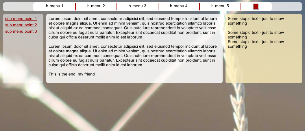
Now, our innermost inline-block element div.mp_cont gets no line-height in its container, but it still has a min-height. The result is:
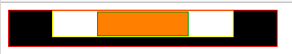
Not quite, what we wanted. At least div.mp_cont shrank to the expected height. But, still, there is no defined inline-block height available and the browser still does not know what to do about the inline element div.hornav. Hence the vertical gap between div.hornav_txt and div.hornav.
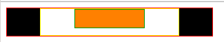
Now, we go a step further and repeat our approach one tag-level higher:
        <div class="header">
            <div class="hornav" style="line-height:0;>
                <div class="hornav_txt" style="line-height:0;">
                	<div class="mp_cont">
                		<div class="bg"></div>
                		<div class="fg"></div>
                	</div>
             	</div>
            </div>
        </div>
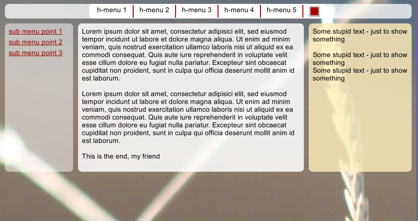
We get:
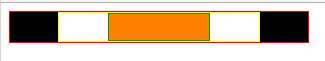
Yes! Now, we have at least found a remedy in case that we need to control the height for inline boxes with empty or absolutely positioned contents. Let us keep this option of line-height reduction in mind!
Test 2 – provide some relatively positioned contents in the innermost inline block
If our gap theory is valid we should provide an innermost inline content with a defined height to get a reasonable vertical adjustment in the end. To achieve this for our example we have to perform 2 steps:
- Set the CSS value of “position” for the innermost block element div.fg to “relative” instead of “absolute”.
- Put some inline text into div.fg
With the first step we fulfill an objective that we already discussed in our first article:
The innermost contents shall control the height expansion of all containers in a dynamical, flexible way. This is especially important for responsive layouts and CMS systems.
So, lets do the following:
        <div class="header">
            <div class="hornav">
                <div class="hornav_txt">
                	<div class="mp_cont">
                		<div class="bg"></div>
                		<div class="fg" style="position:relative;"></div>
                	</div>
             	</div>
            </div>
        </div>
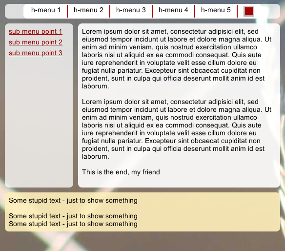
Note that we eliminated the setting “line-heigt:0;” again. We get:
A bit frustrating, isn’t it? We gained nothing compared with our original example. But our finding is still consistent with our theory – we still have no defined height of an innermost inline element.
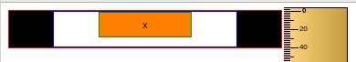
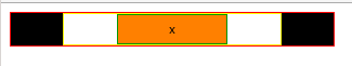
So, now let us look at a small wonder of CSS: We just add a text element – a tiny harmless letter
“x” –
        <div class="header">
            <div class="hornav">
                <div class="hornav_txt">
                	<div class="mp_cont">
                		<div class="bg"></div>
                		<div class="fg" style="position:relative;">x</div>
                	</div>
             	</div>
            </div>
        </div>
and, hey, everything gets fixed in the sense of our original expectations.
Intermediate Summary
If we had started with the very reasonable setting of our last test we would never have noted any problem in our example. So, why all the fuss?
One reason is that there are a lot of articles on the Internet about uncontrollable vertical gaps related to inline block elements. Actually these gaps are understandable and controllable.
The other reason is that in templates (e.g. for CMS systems) the (future) contents of inline-blocks may not be known – and the inline block elements may intentionally be left empty. Then we would run into the described situation of our example. The use of nested inline blocks on the other side makes horizontal centering easy if the width of the innermost contents is not really known.
Two options to get control over the gaps
Now, we have seen 2 remedies that can be applied to avoid gaps between (nested) inline blocks and their containers:
- Set the line-height in each of the container of an inline-block to zero or a sufficiently small value. (But be careful – this may have an impact on other elements on the same HTML/DOM hierarchy level.)
- Provide an innermost inline (text) element with a defined height (e.g. given by a font-size). This innermost element may be a “ ”. Ensure that the innermost inline element can have an impact on outer containers via relative (!) positioning.
Of course, you may/must in some situations also combine these options.
Note: The use of a “ ” may be helpful for (PHP) templates as a dummy contents. Just replace this dummy text during the creation of the real page by real contents – eg. the text of a real menu point.
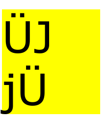
What about <P>-tags with different font-sizes as the innermost tags?
Ok, up to now we used plain text inside the div.fg-container. What happens when we use
-tags and change the font sizes for these tags? Well, then it may get pretty weird:
A <p> may actually create vertical gaps again – despite the fact there is enough space for it inside its block container div.fg. One of the reasons is that browsers add their own bit of white space to a <p>. This can be controlled by margin- and padding-settings. However, in our case of a a <p> inside inline-blocks even a “margin-top:0; margin-bottom:0;” does not help.
See the following example:
	<div class="header" style="margin-left:50px;">
            <div class="hornav">
                <div class="hornav_txt" >
                    <div class="mp_cont" >
                        <div class="bg"></div>
                        <div class="fg">
                            <p style="font-size:1.4rem; margin-top:0rem; margin-bottom:0rem;">Ügj</p>
                        </div>
                    </div>
             	</div>
            </div>
        </div>
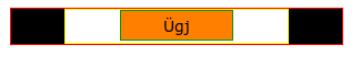
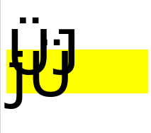
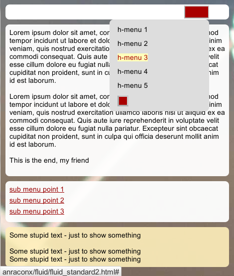
There is again (!) a small but clearly visible gap at the lower bottom. The inline text-element inside the <p>-tag affects the next inline-block element despite the fact that we have defined normal block element with sufficient vertical space in between. The gap gets bigger with the font-size. See the same example for “font-size:1.6rem;”:
For real CSS2/3 experts this may not be too surprising; for me it was.
So, how can we correct this effect? And what do we have to do, when the font-size of the encapsulated
-tag really exceeds the height and line-height of the surrounding container?
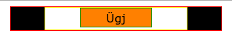
The answers are given in the following final code for our example:
<!DOCTYPE HTML>
<html>
<head>
<meta http-equiv="Content-Type" content="text/html; charset=iso-8859-1">
<title>Test</title>
<style type="text/css">

	html {
		font-family: Verdana, Geneva, Arial, Helvetica, sans-serif;
		font-size: 10px;
	}

	div {
		position:relative;
		margin:0;
		padding:0;
	}

	div.header {
		float:left;
		min-width: 30.0rem;
		min-height: 3.2rem;
		background-color: #DDDDDD;
	}

	div.hornav {
		width: auto;
		min-height: 3.0rem;
		line-height: 0rem;
		border: #F00 0.1rem solid;
		background-color: black;
		text-align: center;
		margin:0;
		padding:0;
	}

	div.hornav_txt {
		display:inline-block;
		position:relative;
		min-width: 20.0rem;
		min-height:2.8rem;
		line-height: 0rem;
		border: solid 0.1rem #FF0;
		background-color: #FFF;
		text-align:center;
		margin:0;
		padding:0;
	}

	div.mp_cont {
		display:inline-block;
		position: relative;
		min-width:10.0rem;
		min-height:2.6rem;
		line-height: 2.6rem;
		border:solid 0.1rem #090;
		background-color:#F00;
		margin:0;
		padding:0;
	}

	div.bg{
		position: absolute;
		min-width:10.0rem;
		/* line below not required */
		/*min-height:2.6rem;*/
		top:0;
		bottom:0;
		left:0;
		right:0;
		border:0;
		background-color:#FF0;
		opacity: 0.5;
		z-index:1;
	}

	div.fg {
		position:relative;
		min-width:10.0rem;
		min-height:2.6rem;
		line-height:2.6rem;
		border:transparent 0.0rem solid;
		padding:0;
		margin:0;
		z-index:2;
	}

</style>
</head>

<body>
        <div class="header">
            <div class="hornav">
                <div class="hornav_txt">
                	<div class="mp_cont">
                		<div class="bg"></div>
                		<div
class="fg"> </div>
                	</div>
             	</div>
	    </div>
        </div>
       <div class="header" style="margin-left:50px;">
            <div class="hornav">
                <div class="hornav_txt" >
                	<div class="mp_cont" >
                		<div class="bg"></div>
                		<div class="fg"><p style="font-size:1.8rem; margin-top:0rem; margin-bottom:0rem;">Ügj</p></div>
		  	</div>
                </div>
	    </div>
        </div>
        <p style="clear:left;"></p>
        <div class="header" style="margin-left:0px; margin-top:50px;">
            <div class="hornav">
                <div class="hornav_txt" >
                	<div class="mp_cont" >
                		<div class="bg"></div>
                		<div class="fg" style="line-height: normal;"><p style="font-size:5.0rem; margin-top:0.6rem; margin-bottom:0.6rem;">Ügj</p></div>
                	</div>
             	</div>
            </div>
        </div>
        <div class="header" style="margin-left:50px; margin-top:50px;">
            <div class="hornav">
                <div class="hornav_txt" >
                	<div class="mp_cont" >
                		<div class="bg"></div>
                		<div class="fg" style="line-height:normal;"><p style="font-size:5.0rem; margin-top:0.6rem; margin-bottom:0.6rem;">Ügj<br>Ügj</p></div>
                	</div>
             	</div>
            </div>
        </div>
        <p style="clear:left;"></p>
        <div class="header" style="margin-left:50px; margin-top:50px; min-width: 50.0rem; ">
            <div class="hornav">
                <div class="hornav_txt" >
                	<div class="mp_cont" >
                		<div class="bg"></div>
                		<div class="fg" style="line-height:normal; padding-left:1.0rem; padding-right:1.0rem;"><p style="font-size:5.0rem; margin-top:0.6rem; margin-bottom:0.6rem;">Hallo Hallo<br>Hallo Hallo Ügj</p></div>
                	</div>
             	</div>
            </div>
        </div>
</body>
</html>
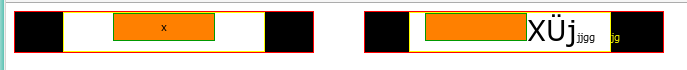
What did we change ?
The first thing you may note is that in the CSS definitions we used our first trick:
We explicitly set the line-heights for div.hornav and div.hornav_txt to zero.
The second important point is that when the font gets too large we must adjust the line-height for the container div.fg. We use “line-height:normal;” to adjust the line-height to the height of the included contents.
So, in case you should build a CMS in which the user can choose font-sizes by himself this is something you have to take care about. You may provide a standard setting; but if in situations like in our example case the font size of a <P>-tag exceeds defined limits our page creation program has to modify style settings explicitly to guarantee a flexible height adjustment.
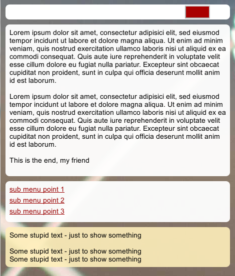
The result is shown in following picture:
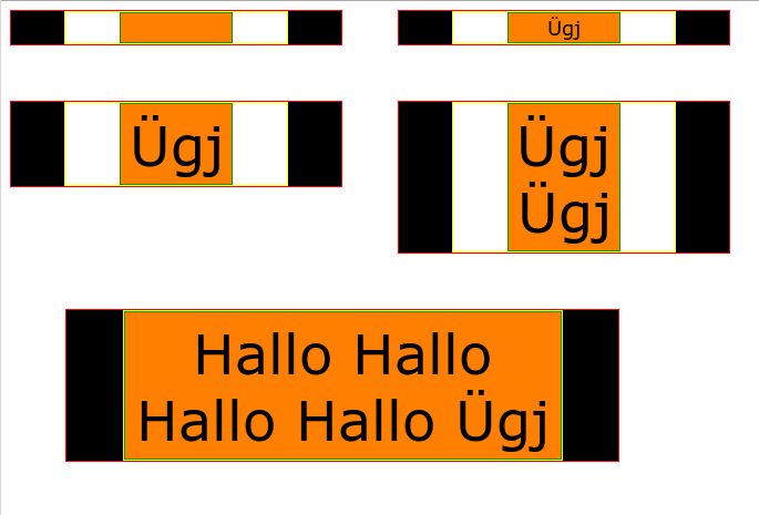
This gives us exactly what we wanted:
- Easy horizontal centering via the use of (nested) inline block elements (even if the content length gets
bigger than some threshold). - Vertical flexibility – even if we work with font-sizes bigger than a threshold.
- NO VERTICAL GAPS between (nested) containers of inline-block elements.
It is easy to see how we can use the discussed elements in templates to create horizontally centered menus with menu points for which the horizontal and vertical size is not known.
CSS is a bit weird sometimes – but fun, too!