Responsive fluid multi-column layouts – the DIV order problem – II

In the last article of this series

Responsive fluid multi-column layouts – the DIV order problem – I

I discussed a standard 3 column fluid design. HTML and CSS codes for a simple example were presented. Our solution depended on a certain order of DIV tags in the HTML code. The tag of the DIV container for the main content “div#main_content” got the last tag position and the CSS property “position:relative;” inside our outer container “div#float_cont”, where the container for 2 of the visible outer left and right “columns” were floated. By setting proper margins for the main content container we gained fluidity and at the same time automatic control over the apparent visual heights of all containers.

In this second article we make a first step towards a responsive design. We assume that the reader is already familiar with the definitions of the major DIV elements of our example page. As in the first article we shall identify the DIVs by their CSS ID representation.

We shall need to overcome some obstacles whilst getting responsive. Because this is a Linux blog we do not care if older and not W3C compliant MS IE browsers can reproduce our suggested CSS recipes for a solution. Code examples given below were tested with Firefox for Linux.

Responsiveness based on viewport width intervals

To start with responsiveness we first define some view port width intervals, for which we want to rearrange major (HTML) elements of our test page. We choose the width intervals a bit arbitrarily below. You may adapt them for your needs:

  • Range III: width range beyond 800px and larger
  • Range II: width range between 540px and 800px
  • Range I: width range below 540px

What are our objectives for the page layout in these ranges?

I shall set up some requirements and conditions for which the DIV order problem gets obvious. What I want to show is that when you deal with responsiveness you may have to align your initial standard HTML/CSS layout with what you want to achieve in view port ranges below certain width thresholds. Some people claim that one should always start designing for the narrow view port situation. My point of view is that with fluid layouts you need to consider both ends of your ranges right from the beginning.

Objectives for Range III:

In range III we just use our (or an improved) initial fluid design.

Objectives for Range II:

In range II the left column shall remain where it is. However, we remove the information in the right column to get more space for the main contents. Instead of omitting “div#right” completely we want to move it to the bottom of the page – and change its width at the same time to 100%. The optical and real height of “div#right” shall be determined by its contents. The “div#main_cont”, however, should keep its position, but use all the space being available at the right of the left column to the right edge of the view port. At the same time “div#main_cont” shall determine the optical (not necessarily the css) height of its own and the left column – if it is the longest. Otherwise the contents of the left column shall determine the height of the upper part on the page.

Objectives for Range I:

We set up an even more complicated scenario for range I:
The “div#main_cont” originally positioned in
the middle shall become dominant now and take the whole width offered. In addition we want to move the left side menu (div#left_nav”) from its original position. To make things tricky we want it to move to the bottom of the expanded DIV container “div#main_cont)” and give it a 100% width, too – so that if someone read and scrolled to the bottom of the “div#main_cont” he would see the available link options. The originally right column “div#right” shall move further down below the repositioned “div#left_nav”.

In addition we want to stop a further shrinking of the displayed main DIV container by a minimum width of 200px.

Later on

  • we shall in addition take care of a better treatment of the horizontal menu placed at the top of our test page in range I
  • and offer additional options to deal with the side menu originally placed left with vertical orientation.

Additional assumptions and requirements:

To make things really difficult, we want to achieve the transitions between Range III and Range II as well as between Range II and Range I without changing the HTML code defined for Range III. In addition we want to avoid Javascript/jQuery involvement to change the node order in the HTML tree during transitions. The reordering of the DIV containers defined above shall be achieved by CSS measures only.

Objective of this article – let us cover range II

We take these challenges step by step. For this article our goal is to cover Range II correctly – we do not care about Range I, yet. Already this limited objective will require some fundamental changes of our initial HTML code for Range III – and some interesting CSS tricks. But it will result in a solution which can also be used for Range I later on.

The order of the DIV tags prevents the repositioning of the DIV containers

We shall of course try to add some width dependent statements to our CSS file:

@media only screen and (min-width: 540px) and (max-width: 800px) { … }

But, what CSS directives could help us to move the container “div#right” to the bottom, i.e. below “div#main_cont” – without loosing our design achievements described in the last article? The frustrating result of many trials and errors was:

Given our assumptions above: none, actually. At least I was too stupid to find a reasonable solution.

You may play around a bit yourself. Even if you introduced some additional (floated) helper DIVs which would only be displayed in range II: Whatever you do to move the “div#right” – some of our requirements would be broken and/or the flow of the text in “div#main_cont” would be affected.

The first ugly thing is the following:
If we floated all major elements of the “div#float_cont” container “left” or “right” the final visible vertical order would not be correct. “div#main_cont” comes at the bottom of the original HTML code – so it moves to the bottom – whatever else happens. The same thing would happen if you turned off floating completely and used only relative positioning. You do not get the final order right.

So, what if we moved “div#main_cont” in our original HTML code and floated it instead of working with margins? Well, you cannot just float “div#main_cont” after (!) “div#left_nav” and keep up the adaptivity to any further width reduction of the viewport. This is mainly due to the fact that our left column container shall keep up a fixed width! You could solve
the adaptivity by changing “div#main_cont” to “position:absolute;” (and use “left:16rem; right:0;”) but then again you would loose any height control for “div#float_cont” and its external DIV containers. A loss of height control would also happen if you changed “div#info” to “position:absolute;” or if you floated it.

Now, you may think about additional floated helper DIVs which you switched on in the background of “div#main_cont” only after you passed a width threshold. But such a background floated DIV would have an impact onto any text written in “div#main_cont” ! Now, you could solve this by moving the text to an absolutely positioned inner container – and again loose height control. And so on, and so on …

What do we need?

From all my own experiments I could conclude 2 things which one needs to meet the adaptivity scenarios posed above:

  1. You need the HTML tag of “div#main_cont” as the first one inside the “div#float_cont” tag – more precise: before the other floated DIVs, which define the other columns.
  2. You sooner or later need “div#main_cont” to float itself.

However, as we have already seen at the end of our last article: Just moving the “div#main_cont” tag to the top and keeping up “position:relative;” will not work. However, if we floated it we would loose width adaptivity and/or would not get “div#left_cont” at the correct position with a fixed width. Is the last statement really true?

Negative margins to the rescue

We need to dig a bit deeper in our box of dirty CSS tricks. Let us assume that “div#main_cont” really were the first element of “div#float_cont”:

<div id="outer_cont">
	<div id="nav_left_bg"></div>
	<div id="right_bg"></div>
	<div id="info_bg"></div>
	<div id="float_cont">
		<div id="main_cont">
			<div id="info"> ... </div>
		</div>
		<div id="left_nav">
			<div id="left_inner"> ... </div>
		</div> 
		<div id="right">
			<div id="right_inner"> ... </div>
		</div> 
		<p class="floatstop"> </p>
	</div>
</div>

And let us further assume that we really floated “div#main_cont”. How could we regain width adaptivity and our text of “div#info” at the right position? Actually, this is pretty easy:

div#main_cont {
	position: relative; 	
	float: left;
	margin: 0; 
	width:100%;  /*adaptivity to the port view width!*/
}
div#info {
	/* height control: the contents defines the height of all parents */ 
	position: relative; 
	margin: 0 27% 0 16rem;
	padding: 0 0.8rem 0 0.8rem;
}

Note the “width:100%;” definition! It guarantees width adaptivity despite floating! To reserve enough pace at the left and right side of the main contents, we just use the same margin trick for “div#info” inside its container which we previously used for “div#main_cont” itself. Nice!

But, how do we get “div#left_nav” to its left position, now? We could use “position:absolute;” for this element. But, by doing this, we could no longer control container heights in case that the left column due to more contents ever became the longest of all columns. However, if we floated “div#left_nav”, it would move it downwards because “div#main_cont” already consumes all of the view port’s width.

Wait a second: What if we used negative margins? This could lead to a solution, because successive float elements can move across and over each other.
So, lets try it:

div#left_nav { 
	position:relative; 
	float:left;
	width: 14.2rem;
	margin-left: -100%;
}
div#right { 
	position:relative; 
	float:left;
	margin-left: -26%;
	width: 26%;
}

Some experiments with your browser would prove that this really works! After corresponding changes to the HTML and CSS codes we find that we more or less have come back to our original fluid scenario – but now the initial order of the HTML tags has changed fundamentally. Everything is floated – but by applying some tricky margins to our central containers we achieved the requested fluid layout again. How can we make use of the new tag order and the floating in range II ?

Elementary settings for range II

As soon as we reach the view port width threshold for range II, only some minor CSS changes are required for our new basic HTML/CSS layout:

@media only screen and (min-width: 540px) and (max-width: 800px) {
	div#right {
        	margin-left: 0;
		margin-top:1.0rem;
		width:100%;
		background-color: #FEEEBB;
	}
	div#info { 
		margin: 0 0 0 16rem;
	}
	div#right_bg {
		visibility: hidden; 
	}
	div#info_bg {
		right:0;
	}
}

This is pretty cool, isn’t it? We use our 100%-width of “div#main_cont”, change only one “left-margin” statement – and we have moved the “div#right” down. In addition we change the “right-margin” of “div#info” to use the total (adaptive!) width to the right for our main text information. The rest of the CSS changes just repairs some small gaps in the “optical appearance”:

fluid4

How to improve the optical appearance in Range III and Range II substantially?

As a developer, I thought I had achieved something and deserved a beer. However, I met strong criticism from my wife, who cares much more for optical design aspects than me. She pretty soon detected a major drawback of my HTML/CSS design:

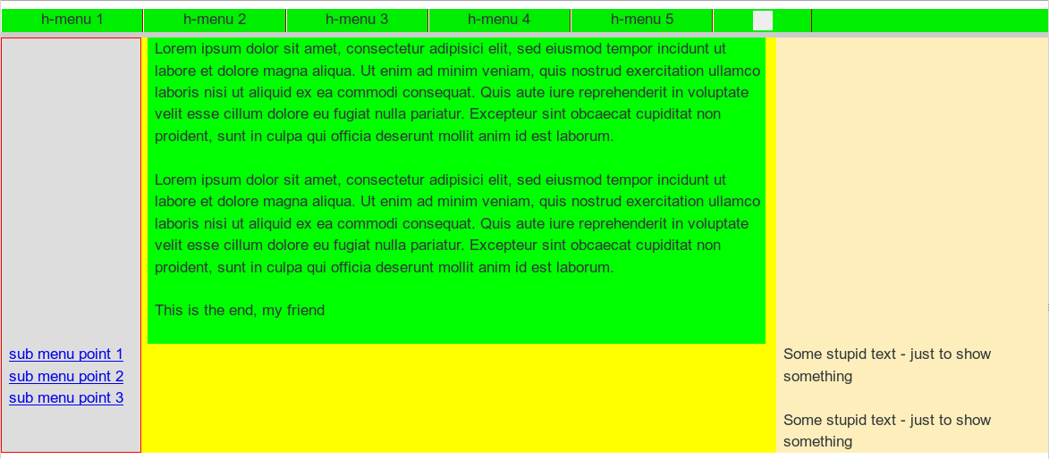
The repositioned “div_right” still extends the height of the container “div#float_cont”. Thus, the heights of our colored background stripes “nav_left_bg”, “info_bg” and “right_bg” get bigger, too. The horizontally enlarged and moved “div_right” just overlaps and hides the background stripes.

Note, that we defined a “margin-top:10px;” for the repositioned “div#right;” in the CSS code above. Nevertheless, you see that our background stripes stretch down without any visible gap. As a result, I was confronted with a new requirement:

New additional requirement

What if you wanted to decouple the repositioned “div#right” from the 2 floated DIV containers above throughout Range II – in a clear optical way by a vertical gap – and also in the sense of HTML? And provide a region or stripe of transparency in between – i.e. in the gap opened by the margin-top definition)? Transparency, to allow the user e.g. to look at a background image of the whole page?

This requirement gave me some headache. But I understood the related objective very well. Web pages with seemingly floating areas (with rounded corners) above background images do look fancy, true enough. The eventual solution required additional changes to our initial HTML setup. I had to implement a kind of repetition of our new basic approach in a more convoluted way. Decoupling inevitably leads to more
containers …

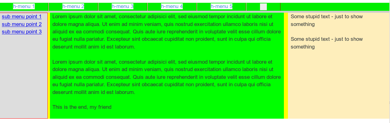
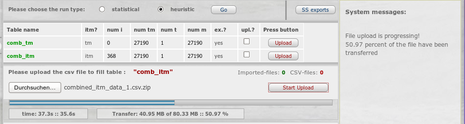
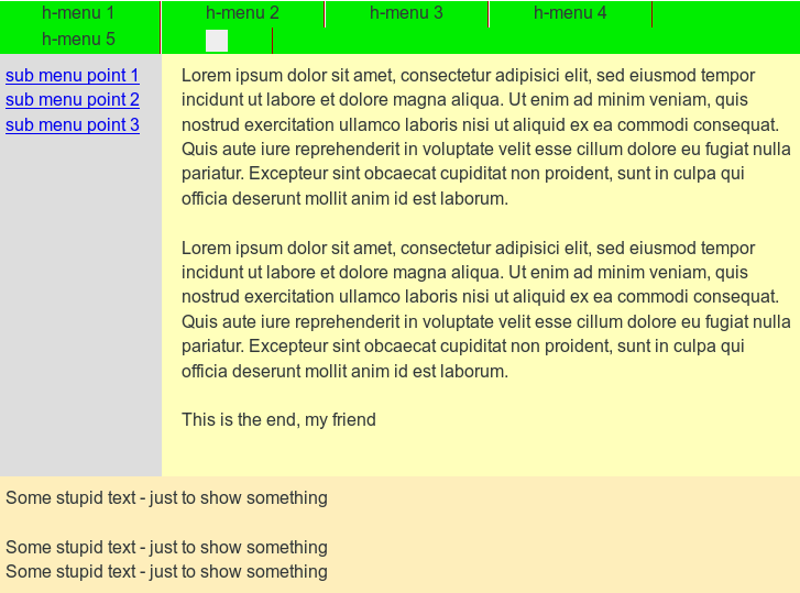
Before looking at the code, let us first have a look at the result. As a starting point the new page appearance within Range III:

fluid5

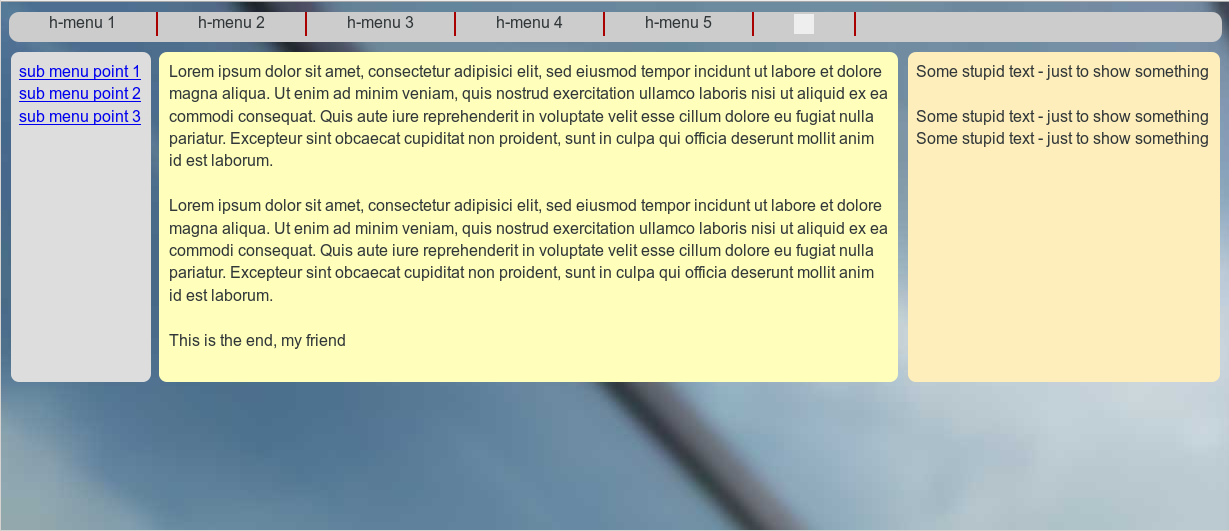
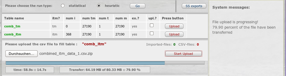
A comparison with the next picture provides an impression of “width fluidity” in Range III:

fluid6

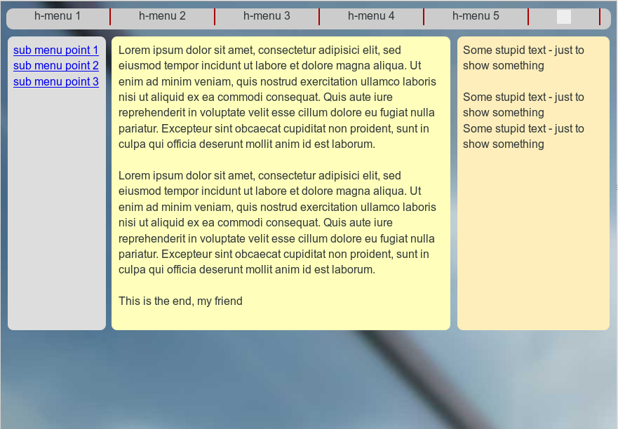
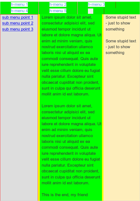
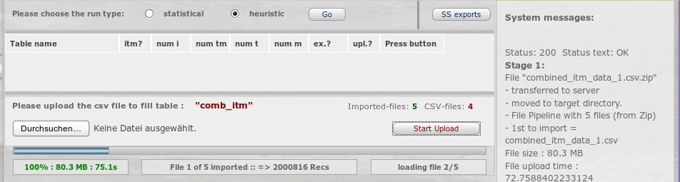
Now, let us have a look at the transition to Range II:

fluid7

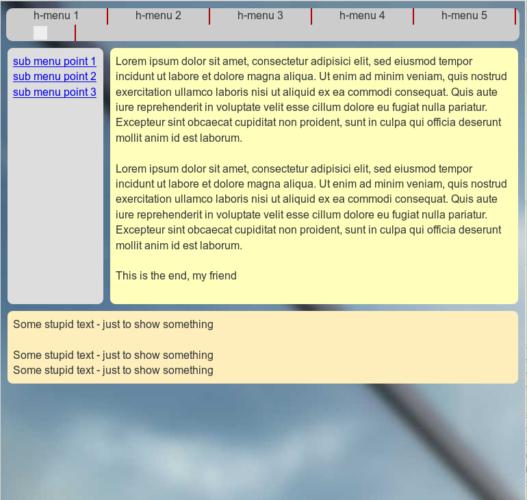
And the width fluidity again:

fluid8

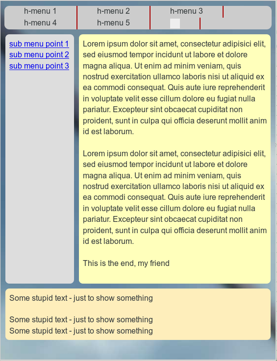
Even my wife accepted this – though, of course, she did not like the chosen background colors and the spacing of my test example. But related changes are within the reach of her work domain, now.

The new HTML code

Here are the resulting HTML and CSS codes for our test example. In comparison to our first article the statements may look a bit more complex. But, we only apply already discussed recipes at additional nested tag levels:

New HTML code:

<!DOCTYPE html>
<html>
<head>
<meta charset="UTF-8">
<title>fluid standard 2</title>
<link href="css/fluid_standard2.css" rel="stylesheet">
</head>

<body>
<!-- 3 spalten layout -->
<div id="all">
	<div id="head">
		<div id="hmen_knapp_cont" class="hmen_knapp_cont">
			<a id="hmen_knapp"></a>
		</div>
		<div id="hmen_cont" class="hmen_cont">
			<ul>
				<li><div class="hmen_pkt">h-menu 1</div></li>
				<li><div class="hmen_pkt">h-menu 2</div></li>
				<li><div class="hmen_pkt">h-menu 3</div></li>
				<li><div class="hmen_pkt">h-menu 4</div></li>
				<li><div class="hmen_pkt">h-menu 5</div></li>
				<li><div class="hmen_pkt"><a id="but2" href="#"></a></div></li>
				<li class="floatstop"></li>
			</ul>
		</div>
	</div>
	
	<div id="outer_cont">
		<div id="nav_left_bg"></div>
		<div id="right_bg">
			<!-- do not remove ! -->
			<div id="right_inner_bg"></div>
		</div>
		<div id="info_bg"></div>
		
		<div id="float_cont">
			<div id="main_cont">
				<div id="bg_left"></div>
				<div id="bg_info"></div>
				
				<div id="info_cont">
					<div id="float_info">
						<div id="info"> 
							<p>Lorem ipsum dolor .... </p>
							<p> </p>
							<p>Lorem ipsum dolor .... </p>
							<p> </p>
							<p>This is the end, my friend<br> </
p>
						</div>
					</div>
					<div id="left_nav">
						<div id="left_inner">
							<p><a href="#">sub menu point 1</a></p>
							<p><a href="#">sub menu point 2</a></p>
							<p><a href="#">sub menu point 3</a></p>
						</div>
					</div>
					<p class="floatstop"> </p>
				</div>
			</div>
			
			<div id="right">
				<div id="right_inner">
					<p>Some stupid text - just to show something</p>
					<p> </p>
					<p>Some stupid text - just to show something</p>
					<p>Some stupid text - just to show something</p>
				</div>
			</div> 
			
			<p class="floatstop"> </p>

		</div>
	</div>
</div>
</body>
</html>


You see that I took the decoupling of the left navigation area and the main contents container from the “div#right” container seriously. Actually, we reproduced the very same solution found above – but now inside an additional container “div#info_cont”, which itself resides inside the now floated container “div#main_cont”. Note, that by applying “position: relative;” for the container “div#info_cont” we can keep up full height control. Of course, in addition the floating inside the new additional float container “div#info_cont” has to be stopped to guarantee the dynamical propagation of height information to the outer enclosing DIVs.

As you can see, we placed some new and additional (colored) background DIVs inside the (now floated) “div#main_cont”. But throughout Range III we keep these elements hidden! However, in Range II we hide the original background stripes and activate the new ones instead.

The positioning of the container “div#right” works exactly as before – as log as we arrange for proper margins of “div#info”. To get a really nice padding of the background stripes in both ranges and to keep a constant distance of the contents of “div#right” to the contents of “div#info”, we need to include some more internal DIV containers – “div#right_inner_bg”, “div#left_inner”, “div#right_inner”. They provide some required “optical cosmetics”.

The new CSS code

The required new CSS statements for our example are the following:

   
@CHARSET "UTF-8";

html {
	font-size:10px;
}

body {
    margin-left:0; 
    margin-right:0;
    margin-top: 0; 
    background-image: url(../image/hg_drm_ap_7_1.jpg);
    background-repeat:no-repeat; 
    background-position:top center;
}

p { 
	font-size: 1.6rem; 
	line-height: 1.4;
	margin: 0;
}
	

div#all { 
	position:relative; 
	width:100%; 
	padding-bottom: 1.0rem;
	padding-top: 1.0rem;

}

/* The header region */	

div#head { 
	position:relative; 
	width:100%; 
	min-height: 3.0rem;
}

/* The main contents container */
	
div#outer_cont { 
	position:relative; 
	width:100%; 
	min-height: 10.0rem;
	margin-top:1.0rem;
}
	

/* some elementary width definitions */

div#left_nav,
div#nav_left_bg,
div#bg_left {
    width: 14rem;
    margin-left: 1.0rem;
}

div#right,
div#right_bg {
    width: 27%;
}


/* background elements for all columns in range I */

div#nav_left_bg, 
div#right_bg,
div#info_bg,
div#bg_left,
div#bg_info,
div#right_inner_bg {
    position: absolute;
    top:0;
    bottom:0;
    border-radius: 0.8rem;
}

div#nav_left_bg {
    position: absolute;
    left:0;
    
background-color: #DDD;
    border: 0px solid #F00;
    z-index:1;

}

div#info_bg {
    position: absolute;
    left:15.8rem;
    right:27%; 
    background-color: #FFB;
    border: 0px solid #00F;
    z-index:1;
}

div#right_bg {
    right: 0;
    border: 0px solid #F00;
    z-index:1;

}

div#right_inner_bg {
    left: 1.0rem;
    right: 1.0rem;
    background-color: #FEEEBB;
}


/* The float container and its basic elements */	

div#float_cont { 
    position:relative; 
    width: 100%; 
    border: 0px solid #FF0000;
    z-index:5;
}

/* floated left main container and 
 * its background elements for range II*/

div#main_cont { 
    position: relative;
    float: left; 
    width:100%;
    min-height: 2.0rem;
    border: 0px solid #009900;
    z-index:2;
}


div#bg_left {
    visibility: hidden; 
    position: absolute;
    left:0;
    background-color: #DDD;
    border: 0px solid #F00;
    z-index:1;

}

div#bg_info {
    visibility: hidden; 
    left:16.0rem;
    right:27%; 
    background-color: #FFB;
    border: 0px solid #00F;
    z-index:1;
}


/* The main column */

div#info_cont {
    position: relative; 
    width:100%; 
    border:0px #F00 solid;
}

div#float_info { 
    position:relative; 
    float:left;
    width: 100%; 
    border: 0px solid #FF0000;
    z-index:2;
}

div#info { 
    position: relative; 
    margin: 0 27% 0 16rem;
    width:auto;
    padding:0.8rem;
    min-height:2.0rem;
    z-index: 1;
}


/* right column */

div#right { 
    position:relative; 
    float:left;
    margin-left: -27%;
    min-height:2.0rem;
    border: 0px solid #009900;
    z-index:2;
}

div#right_inner {
    position:relative;
    width:auto;
    margin-left: 1.0rem;
    margin-right: 1.0rem;
    padding: 0.8rem;
}


/* left column */

div#left_nav { 
    position:relative; 
    float:left;
    border: 0px solid #009900;
    margin-left: -100%;
    padding-left: 1.0rem;
    z-index:5;
}

div#left_inner {
    width:auto;
    padding: 0.8rem;
}


/* Support elements */ 	

p.floatstop {
	clear:both;
	height:0;
	margin:0;
	line-height:0;
	padding: 0;
	font-size: 0;
}


/* contents of the upper horizontal menu */

div.hmen_cont {
	display: block; 
	position: relative;
	min-height: 3.0rem;
	width: auto;
	margin-right:0.8rem;
	margin-left:0.8rem;
	background-color: #ccc;
	border-radius: 1.0rem;
}

div.hmen_cont ul {
	position: relative;
	list-style-type: none;
	width: 100%;
	margin: 0;
	padding: 0;
}

div.hmen_cont ul li {
	float: left;
	padding: 0.2rem 4.0rem 0.2rem 4.0rem;
	border-right: #a90000 0.2rem solid;
	min-height: 2.0rem;
	font-size: 1.6rem;
}
	
div.hmen_cont ul li.floatstop {
	float:none;
	clear:both;
	min-height:0;
	margin:0;
	line-height:0;
	padding: 0;
	font-size: 0;
}

div#hmen_knapp_cont {
	display: none;
	position: absolute;
	right:0;
	top:10px;
	width: 50%;
	height: 2.4rem;
	border: 1px #A90000 solid;
}

a#hmen_knapp {
	display: block;
	width: 100%;
	height: 100%;
	background-color: #009999;		
}

a#but2 {
	display: block;
	width: 2.0rem;
	height: 2.0rem;
	background-color: #EEE;
}


/* @media screen decision and settings for range II */

@media screen and (min-width : 540px) and (max-width :800px) {
    
    div#info { 
        margin: 0 1.0rem 0 16rem;
        background-color:transparent;
    
    }
   
    div#right { 
        position:relative; 
        float:left;
        margin-top:1.0rem;
        margin-left: 0;
        margin-
right: 0; 
        width:100%;
     }
    
    div#right_inner {
        margin-left: 1.0rem; 
        margin-right: 1.0rem;
        width: auto; 
        background-color: #FEEEBB;
        border-radius: 0.8rem;
    }
    
    
    div#right_bg {
        visibility: hidden; 
    }

    div#info_bg {
        right:0;
    }

    div#nav_left_bg {
        visibility: hidden; 
    }

    div#info_bg {
        visibility: hidden; 
    }
    
    div#bg_left { 
        visibility: visible;
    } 
  
    div#bg_info { 
        visibility: visible;
        right: 1.0rem;
    }
}

 
Of course, you should replace the background image by your own.

Whilst studying the CSS statements, you may find that we extended the width of the right column to 27% of the view port width (instead of 26% before). Thus, physically “div#right” now connects directly to “div#info” at its left side. We did this to build up a seemingly constant (and not percentage dependent) visual distance between the middle and the right container contents. This may sound contradictory at first – but by using the additional inner DIV containers mentioned above and by applying proper margin/padding definitions we do achieve this objective.

At the bottom of the CSS file you find the necessary “@media screen” decisions and settings for range II. Because we set the negative left margin for “div#right” to zero this container moves down. The display of its contents requires some cosmetics; but the related CSS statements are very elementary.

One of the more interesting tricks is that we obviously hide the original (absolutely positioned and colored) background stripe containers and activate the new inner colored background stripe containers instead as soon as we perform the transition to Range II. This allows for a transparent gap between the visible upper part and the lower part of the web page in Range II – without loosing any height control for the visual columns in the upper part.

What have we achieved for our view port Ranges III and II?

Actually, all we wanted. We keep up optical height control where necessary in Range III and II. The CSS height of each of the container DIVs which represent the columns is completely determined by its contents (which we could change at any time, e.g. by a CMS). The longest of the three columns stirs the apparent visual height of all three columns in Range III.

In Range II we detach “div#right” and move it to the bottom of the page. Although we now create a gap between “div#right” and the upper part of the web page, full height control remains in place both for the floating 2 upper DIVs containers and their enclosing containers.

Fluidity is completely fulfilled in accordance with our objectives both for Range III and Range II.

The transition between Range III and Range II requires only some minor and obvious CSS changes. We did not have to change the HTML code at all during transition. We did not involve any Javascript so far.

Enough for today. We have not done anything, yet, to cover the objectives for Range I. I shall describe some appropriate measures in the next article:

Responsive fluid multi-column layouts – the DIV order problem – III

A good question the reader may consider in the meantime is:
What needs to be changed if we wanted to move the third column of Range III upwards instead of downwards during the transition to Range II?

Responsive fluid multi-column layouts – the DIV order problem – I

My wife works on a web project in Norway. As it is typical these days, functionality gets more weight than design when displaying web pages on mobile devices. Especially after Google’s decisions to explicitly require responsiveness. [Which was in my opinion mostly driven by their own interests to promote Android driven devices and their own development tools. And then maybe by general market and selling requirements. But this is a different story… ]

IT and communication in Norway is all about smart phones and tablets. So, of course, our Norwegian customer wanted to get some “responsive design”. OK … Although not really interested, I do take some challenges when my wife asks me for assistance …

As I am getting pretty IT-conservative with growing age my starting point with “responsiveness” was a fluid layout combined with “@media screen” CSS decisions – and a reluctance to use Javascript [JS] and jQuery. (This reluctance, of course, reflects the nagging question: What do we do when a customer has deactivated JS?)

My opinion was: In a certain range of browser window width – or more generally viewport width – the fluidity of the web design should predominantly govern the responsive reaction to a width change or a small target screen. I regard such a careful JS-free approach to responsive web design as reasonable – it helps already with different browser sizes on standard desktop screens – completely independent of mobile devices.

More extreme measures as removing visible parts of the layout or rearranging the positions, sizes and vertical order of whole HTML DIV container blocks would in this approach only be involved below certain viewport width thresholds via “@media” decisions. All in all, no big deal, I thought …. (In the first articles of this series we do not look at more detailed things as image resizing or font size adaptions).

What I underestimated is the fact that “old fashioned” fluid layouts may require a certain HTML tag order when we define its multiple columns”. However, in a responsive design approach you may eventually stumble across situations where the natural DIV element order you are used to is NOT suitable below some viewport width limits – i.e. when you want to rearrange the position and size of these DIV containers in a certain way. It took me some time to realize that there was a kind of contradiction between fluidity and responsiveness.

At this point I felt tempted again to use jQuery to freely rearrange the order of nodes of container DIVs in the HTML node tree or to use CSS flex boxes. However, flexboxes are not really standardized yet – and once you start with jQuery and responsiveness you must take care to align your Javascript conditions with the CSS @media decisions in a precise and non contradictory way. In addition I thought it better to understand JS free options and possibilities first before implementing some parametrizable JS machinery.

Whilst experimenting I all the time had the feeling that with some dirty CSS trick one should be able to gain control over the DIV element order – without destroying the optical appearance – and become able to adapt it to any predefined responsive reordering requirements for small viewport widths. I needed some hours to figure out how I could overcome at least some of the problems. I had some fun with this and maybe others find tweaking CSS interesting, too.

In this first article of a series I like to describe a standard flexible 3 column fluid layout and the CSS directives behind it. In a second article I shall add some elementary responsiveness and deduct the problem of the DIV order. Then I shall describe some CSS “trick” which will enable us to (manually) change or adapt the required DIV order in the HTML code without loosing fluidity and without loosing the optical appearance of the inital horizontal sequence of our columns. This will help us to achieve the pursued responsive and
vertical container rearrangement with a few very simple CSS changes below some width threshold of the viewport.

In other words: Our first objective is find CSS manipulations which enable us to code any required DIV order for the column grid in HTML such

  • that we optically do not change the column order or layout,
  • that we do not disturb the ability of our 3 column layout to adapt optically to the height of its largest (= highest) column,
  • that we can produce any predefined vertical content order of the column contents during a responsive reaction to view port width changes
  • and that we at the same time can realize responsiveness easily by basically changing some float or position statements in @media screen based decisions in our CSS file.

Note that the second point may impose additional difficulties!

Note further that even if we fulfilled our list of objectives we still would have to plan ahead our HTML code and its DIV order for the specific responsive layout we want to achieve. But being able to choose the required DIV order for our HTML code would already gives us the chance to create templates for different responsive reactions required by customers. In combination e.g. with PHP such templates would give us the freedom to switch any horizontal column order into any desired vertical order during responsive reactions – without involving JS.

Nevertheless, later in this series I want to show how we can use Javascript/jQuery to enforce a predefined responsive vertical order of the column contents from a basic 3-column layout we develop in the next two articles. But, at least I myself need some learning curve to get there.

We shall concentrate our efforts on a fluid 3-column layout.

Study example: A fluid/fixed layout with 3 columns

Below, we construct a simple example of a 3 column layout, where you arrange

  • a kind of navigation column on the left web page side,
  • a main contents area in the middle
  • and some column like area, e.g. for teaser elements, on the right page side.

Your fluidity objectives for a certain range of viewport widths would e.g. be

  • that the left column keeps up a fixed width,
  • whereas the middle main column changes its width adaptively with the viewport width
  • and that the right column adapts its width to a defined percentage of the viewport width.

Thus we have defined a combination of fixed/fluid elements which provides a good insight into the basic CSS techniques. Generalizations will be obvious. You require of course that the width adaption happens automatically whilst resizing the viewport width in the given range. All this should be governed by CSS statements, only. Imagine now, that you want to tweak things a bit further in the form that the longest of the three defined “columns” determines the height of the whole page and the apparent “visible” height of the other (not so high) columns, too. Above a responsiveness width threshold at least.

Typically, the main content column may become largest in size (height), whereas e.g. the left column may contain only some few menu points. Nevertheless, you want to create an appearance as if all 3 columns got the same height as the largest one with respect to height – and this should work automatically even if you changed the text and image contents of the content column significantly (e.g. via an CMS). This means that in case you add many lines of new text to the middle column the whole page and its right and left areas should somehow
optically adapt in height.
And: Everything should work analogously in case either the left or right column becomes the largest in height on some pages.

There is of course a simple, “conservative” CSS solution for this problem which I shall discuss a bit below. However, the requirement of fluidity in width in combination with the requirement of extending the web pages height automatically will unavoidably lead to a certain order of the HTML DIV containers.

Some details of our conventional fluid approach

The HTML file is pretty simple:

<!DOCTYPE html>
<html>
<head>
<meta charset="UTF-8">
<title>fluid standard</title>
<link href="css/fluid_standard.css" rel="stylesheet">
</head>

<body>
<!-- 3 spalten layout -->
<div id="all">
	<div id="head">
		<div id="hmen_knapp_cont" class="hmen_knapp_cont">
			<a id="hmen_knapp"></a>
		</div>
		<div id="hmen_cont" class="hmen_cont">
			<ul>
				<li><div class="hmen_pkt">h-menu 1</div></li>
				<li><div class="hmen_pkt">h-menu 2</div></li>
				<li><div class="hmen_pkt">h-menu 3</div></li>
				<li><div class="hmen_pkt">h-menu 4</div></li>
				<li><div class="hmen_pkt">h-menu 5</div></li>
				<li><div class="hmen_pkt"><a id="but2" href="#"></a></div></li>
				<li class="floatstop"></li>
			</ul>
		</div>
	</div>
	
	<div id="outer_cont">
		<div id="nav_left_bg"></div>
		<div id="right_bg"></div>
		<div id="info_bg"></div>
		
		<div id="float_cont">
			<div id="left_nav">
				<p><a href="#">sub menu point 1</a></p>
				<p><a href="#">sub menu point 2</a></p>
				<p><a href="#">sub menu point 3</a></p>
			</div> 
			<div id="right">
				<div id="right_inner">
					<p>Some stupid text - just to show something</p>
					<p> </p>
					<p>Some stupid text - just to show something</p>
				</div>
			</div> 
			<div id="main_cont">
				<div id="info"> 
					<p>Lorem ipsum .... </p>
					<p> </p>
					<p>Lorem ipsum ....</p>
					<p> </p>
					<p>This is the end, my friend<br> </p>
				</div>
			</div>
			<p class="floatstop"> </p>
		</div>
	</div>
</div>
</body>
</html>

The central DIV that shall contain most of the information of our web page is “div#info”. Why we have placed it inside an extra container “div#main_cont” may become clear in the next article. In the pure fluid approach it would not really have been necessary. You clearly detect the “left” sided DIV for e.g. a column with navigation points and the “right” sided DIV, which may contain something else. Note that there are “background” DIVs (with an ID like “…_bg”) that provide the impression of colored columns with exactly the length of the “outer_cont” DIV.

To understand the fluid behavior let us have a look at the CSS :

@CHARSET "UTF-8";

html {
	font-size:10px;
}

body {
    margin-left:0; 
    margin-right:0;
}

p { 
	font-size: 1.6rem; 
	line-height: 1.4;
	margin: 0;

}

div#all { 
	position:relative; 
	width:100%; 
	background-color: #000; 
}

/* The header region */	

div#head { 
	position:relative; 
	width:100%; 
	background-color: #FF0; 
	min-height: 3.0rem;
}

/* The main contents container */
	
div#outer_cont { 
	position:relative; 
	width:100%; 
	background-color: #FF0; 
	min-height: 10.0rem;
}
	
/* background elements for all columns */

div#left_nav,
div#nav_left_bg {
    width: 14.2rem;
}

div#right,
div#right_bg {
    width: 26%;
}

div#nav_left_bg, 
div#right_bg,
div#info_bg {
    top:0;
    bottom:0;
}

div#nav_left_bg {
    position: absolute;
    left:0;
    background-color: #DDD;
    z-index:1;
    border: 1px solid #F00;
}

div#right_bg {
    position: absolute;
    right: 0;
    background-color: #FEEEBB;
    z-index:1;
    border: 0px solid #F00;
}

	
/* The float container and its basic elements */	

div#float_cont { 
	position:relative; 
	width: 100%; 
	/*background-color: #99e;*/ 
	border: 0px solid #FF0000;
	z-index:5;
}


/* left column */

div#left_nav { 
    position:relative; 
    float:left;
    border: 0px solid #009900;
    padding-left:8px;
    /*margin-left: -320px;*/
    z-index:2;
}

/* middle column */

div#main_cont { 
	position: relative;
	margin: 0 27% 0 15rem;
	/*width:74%;*/
	/*min-width: 462px;*/
	/*background-color: #fff;*/ 
	border: 0px solid #009900;
	z-index:2;
}

div#info { 
	position: relative; 
	/*margin: 0 2px 0 160px;*/  
	width:auto;
	background-color: #0f0; 
	padding-left:8px;
	/*height:200px;*/
}

/* right column */

div#right { 
	position:relative; 
	float:right;
	/*min-width: 15.2rem;*/ 
	width: 26%;
	/*background-color: #00f;*/ 
	border: 0px solid #009900;
}

div#right_inner {
    width:auto;
    padding: 0 0.8rem 0 0.8rem;
}


/* Other elements */ 	

p.floatstop {
	clear:both;
	height:0;
	margin:0;
	line-height:0;
	padding: 0;
	font-size: 0;
}

/* contents of the upper horozontal menu */
div.hmen_cont {
	display: block; 
	position: relative;
	min-height: 3.0rem;
	width: 100%;
	background-color: #ccc;
}

div.hmen_cont ul {
	position: relative;
	list-style-type: none;
	width: 100%;
	margin: 0;
	padding: 0;
	background-color: #00EE00;
}

div.hmen_cont ul li {
	float: left;
	padding: 2px 40px 2px 40px;
	border-left: #ffffff 1px solid;
	border-right: #a90000 1px solid;
	min-height: 2.0rem;
	font-size: 1.6rem;
}
	
div.hmen_cont ul li.floatstop {
	float:none;
	clear:both;
	min-height:0;
	margin:0;
	line-height:0;
	padding: 0;
	font-size: 0;
}

div#hmen_knapp_cont {
	display: none;
	position: absolute;
	right:0;
	top:10px;
	width: 50%;
	height: 2.4rem;
	border: 1px #A90000 solid;
}

a#hmen_knapp {
	display: block;
	width: 100%;
	height: 100%;
	background-color: #009999;		
}

a#but2 {
	display: block;
	width:20px;
	height: 20px;
	background-color: #eee;
}

Note that all of the DIVs

  • div#all,
  • div#outer_cont,
  • div#float_cont,
  • div#main_cont,
  • div#info

got a “position: relative;”, but none got any defined height. Actually, as we stop the floating at the end of “div#float_cont” via an artificial p-element, the “div#float_cont” container responds dynamically to the maximum height of one of its inner floated elements or relatively positioned elements and imposes its own height on the surrounding DIV container “div#outer_cont”. The resulting height of this container can be used to indirectly define the height of absolutely positioned background
DIV elements which “simulate” a colored virtual height of all columns – at least as long as we do not rearrange DIV containers due to responsiveness.

Whereas the width adaptivity of the right column is understandable from its CSS width statement, the adaptivity of the “div#main_cont” results from its relative positioning with left and right margins on top of the vertical level which is automatically defined by the floated elements inside the “div#float_cont”. The margins guarantee that we leave enough space on the left and right side not to cover the floated columns contents there.

This fluid design is quite adaptive already – see the following images taken with Firefox.

fluid1

and

fluid2

But, of course, the column adaptivity will not be of much use on small smart phone displays: First there comes an end to shrinking as soon as some words get too large to fit into their column width. And on a smart phone we would appreciate very much to use all of the available width for the text in the main column. We shall look at related measures in the next article.

For now, I want you to realize that the above fluid design relies totally on the order of the DIVs inside the “div#float_cont”. See, what happens, if we changed the order of the DIVs to

<div id="float_cont">
	<div id="main_cont"> ... </div>
	<div id="left_nav">..</div>
	<div id="right"> ... </div>
	<p class="floatstop"> </p>
</div>

fluid3

Then the first DIV spans a region with height that defines the position of the layer for the floated elements – namely below the “div#main_cont”. So our nice fluid design would be doomed to fail in case we needed some other DIV order.

Outlook on forthcoming posts

In the next post

Responsive fluid multi-column layouts – the DIV order problem – II

we introduce some elementary responsiveness and discuss, why the defined DIV order in the HTML code may conflict with a responsive rearrangement. We shall present a responsive solution where some few CSS tricks allow us to (manually) change the DIV order in the HTML code in whatever required way to maintain an easy realization of responsiveness. See also

Responsive fluid multi-column layouts – the DIV order problem – III

for a full discussion.

In the articles
Responsive fluid multi-column layouts – with a responsive horizontal menu – IV
and
Responsive fluid multi-column layouts – with a responsive horizontal menu – V
we discuss menu adaptions without and with Javascript.

Our final objective is to use JS to switch the DIV tag order in the HTML node tree for
a basic 3 column layout in accordance with the required DIV order for a defined responsiveness – in a parametrized way.


Bumblebee auf Laptops mit Opensuse 13.1 / 13.2

Ich nutze ja auch einige Laptops unter Linux. U.a. einen nun schon etwas älteren “Terra 17 Zoll Laptop”, bei dem netterweise fast die gesamte Hardware unter Linux unterstützt wird. Dieser Laptop hat einen “i7-3632QM” Prozessor mit integrierter Intel HD 4000 Grafikkarte; ferner existiert eine zusätzliche Nvidia GT 645M.

Diese “Nvidia Optimus” Ausstattung erfordert unter Linux Bumblebee.

Bumblebee erlaubt das gezielte Aufrufen des Nvidia-Treibers für 3D-Grafik-Applikationen, die dann durch die dedizierte Nvidia-Karte beschleunigt in ein Fenster des von der Intel-Grafikkarte gesteuerten Desktops eingeblendet werden. Aus meiner Sicht ist das eine fast optimale Methode, die leistungsstarke, aber auch energiehungrige Nvidia-Grafikkarte nur dann zu zuzuschalten, wenn sie wirklich benötigt wird.

Eigentlich ist die Installation von Bumblebee aus den entsprechenden Opensuse Repositories inzwischen ein Leichtes. Dennoch erhalte ich immer mal wieder ein Problem, wenn ich Updates des Systems vornehme – u.a. der Kernelversion. Danach laufen die Kommandos “bbswitch” bzw. “optirun” und “primusrun” zum An- und Ab-Schalten der Nvidia-Karte bzw. zum Starten von 3D-Applikationen meist nicht mehr wie erwartet. In der Regel erinnere ich mich dann auch nicht mehr an alle Voraussetzungen, die gegeben sein müssen, damit Bumblebee ordentlich funktioniert. Für alle, denen es ähnlich geht, stelle ich nachfolgend ein paar Schritte und Voraussetzungen zur Nutzung von Bumblebee zusammen.

Wichtige Ergänzung 08.08.2016:
Dieser Artikel ist nicht mehr ganz gültig, was die für neuere Kernelversionen notwendigen Repositories anbelangt. Im Besonderen funktioniert bbswitch zum An- und Abschalten der Nvidia-Karte u.U. nicht mehr. So sollte man statt der nachfolgenden Bumblebee-Repositories das Repository für das Bumblebee3-Projekt heranziehen; es steht für verschiedene Opensuse-Versionen zur Verfügung (s. http://download.opensuse.org/repositories/home:/Bumblebee-Project:/Bumblebee3/). Das dortige Paket “dkms-bbswitch” ist dasjenige, was mit neueren Kernelversionen und Nvidia-Treibern funktioniert. Ferner sollte man ein Repository für einen neueren Nvidia-Treiber wählen, etwa Treiberversion 361.42. Einen upgedateten Artikel finden Sie unter
https://linux-blog.anracom.com/2016/08/08/bumblebee-auf-optimus-notebooks-und-laptops-mit-opensuse-13-1-13-2-leap-42-1/

Installation und Einrichtung von Bumblebee

Folgende RPM-Repositories sollte man der SW-Verwaltung unter YaST für Opensuse 13.1 Installationen verfügbar machen:
http://download.opensuse.org/repositories/X11:/Bumblebee/openSUSE_13.1/
http://download.opensuse.org/repositories/home:/Bumblebee-Project:/Bumblebee/openSUSE_13.1/
http://download.opensuse.org/repositories/home:/Bumblebee-Project:/nVidia:/346.35/openSUSE_13.1/

Unter Opensuse 13.2 ist “13.1” in den Adressen natürlich jeweils durch “13.2” zu ersetzen.

Will man den neuesten Treiber nutzen, so sollte man sich statt des dritten genannten Repositories für
http://download.opensuse.org/repositories/home:/Bumblebee-Project:/nVidia:/latest/openSUSE_13.1/
bzw.
http://download.opensuse.org/repositories/home:/Bumblebee-Project:/nVidia:/latest/openSUSE_13.2/
r
entscheiden

Das erste der oben genannten Repositories umfasst z.Z. den Umfang des zweiten fast vollständig. Der Unterschied besteht in der Bereitstellung eines zusätzlichen Pakets für acpi Calls im zweiten Repository. Ganz entscheidend ist jedoch das dritte Nvidia-bezogene Repository; dieses bietet die Installation des proprietären Nvidia-Treibers in einer für Bumblebee geeigneten Form an.

Folgende Pakete habe ich bei mir unter Opensuse 13.1 konkret installiert:
bumblebee1

bumblebee2

Entscheidend ist die Installation des Nvidia-Kernel-Modules “nvidia” über das Paket “X11-video-nvidia” aus dem 3-ten Repository. Während der Installation wird die erforderliche Kompilation für den aktuellen Kernel vorgenommen.

Blacklisten des nouveau-Treibers

Nach einer Neuinstallation von Opensuse auf einem Laptop mag es sein, dass der Nouveau-Treiber installiert ist. Ich habe Bumblebee bislang nicht mit dem Nouveau-Treiber ausprobiert, sondern aus verschiedenen Gründen immer den proprietären Nvidia-Treiber (erfolgreich) genutzt. Damit dies möglich wird, muss der Nouveau-Treiber, soweit auf dem Laptop-System vorhanden, deaktiviert werden. Ich habe ihn deshalb zur Sicherheit in eine Blacklist für Kernelmodule aufgenommen. Die Dateien “/etc/modprobe.d/50-blacklist-nouveau.conf” und auch “/etc/modprobe.d/50-blacklist.conf” enthalten somit folgende Statements:

blacklist nouveau
options nouveau modeset=0

Keine Installation des proprietären Nvidia-Treibers über das Linux-Installationsprogramm von der Nvidia-Web-Seite!

Versuchen Sie bitte weder während der Opensuse-Erstinstallation noch später den proprietären Treiber von Nvidia mit den Installationsroutinen von der Nvidia Webseite zu installieren! Das wird in einer Optimus-Konfiguration zu keinem Erfolg führen! Der proprietäre Nvidia-Treiber sollte auf Optimus Laptops statt dessen immer aus dem oben genannten “Bumblebee-Project:/nVidia”-Repository geladen werden.

KMS nicht abschalten!

KMS (Kernel mode setting; s. http://de.wikipedia.org/wiki/Mode-Setting) wird für das “i915”-Modul (also den treiber für die Intel Graka) zwingend benötigt – DKMS sollte man also (im Gegensatz zu früheren Desktop-Installationen mit Nvidia-Karten) nicht über Kernelparameter wie “nomodeset” beim Starten des Systems deaktivieren.

Ferner gilt: Das Opensuse Community Repository für Nvidia Treiber sollte deaktiviert sein; keines der Nvidia RPMs – sprich kein Nvidia-Treiber-Paket – aus diesem Community Repository sollte installiert sein.

Welche Services sind zu aktivieren?

Folgende Services müssen für den Systemstart unter systemd ggf. noch explizit aktiviert werden:

systemctl enable bumblebeed.service
systemctl enable dkms.service

Desktop-User als Mitglied der Gruppe “bumblebee” einrichten

Zudem muss der User, unter dem man den Desktop nutzt, Mitglied der ggf. neu anzulegenden Gruppe “bumblebee” werden.

xorg.conf-Datei

Es lohnt sich ein Blick in das Verzeichnis /etc/bumblebee”: Dort befindet sich eine spezielle Datei “xorg.conf.nvidia”, die von Bumblebee genutzt wird. Eine evtl.
vorhandene “/etc/X11/xorg.conf” im Verzeichnis “/etc/X11” sollte man entfernen !

Sind alle Voraussetzungen geschaffen, startet man das System am besten neu. Man sollte dann auf der gewohnten Desktop-Oberfläche landen. Diese wird vom Intel Treiber – in meinem Fall vom kernel-Modul “i915” – gesteuert. KDE-3D-Effekte lassen sich auch über die Intel-Grafikkarte nutzen; dafür reicht deren Performance allemal.

lsmod” sollte folgende Module anzeigen, die im Zusammenhang mit Grafik von Bedeutung sind:

i915 710403 8
bbswitch 13943 0
drm 313440 11 i915,drm_kms_helper
drm_kms_helper 56806 1 i915
video 19507 1 i915
button 13952 1 i915
thermal_sys 36646 5 x86_pkg_temp_thermal,intel_powerclamp,thermal,video,processor
 
videobuf2_core 44595 1 uvcvideo
videodev 141701 2 uvcvideo,videobuf2_core
videobuf2_vmalloc 13216 1 uvcvideo
videobuf2_memops 13362 1 videobuf2_vmalloc

Start von 3D-Anwendungen

Spezielle 3d-Applikationen, wie etwa Spiele (z.B. “alienarena”)oder OpenGL-Anwendungsprogramme, die mehr Rechenpower erfordern, kann man dann als Desktop-User über

optirun alienarena

oder

primusrun alienarena

starten.

bumblebee4

“primusrun” reduziert die Framerate der Graka auf die Schirmrate, wenn keine weiteren Parameter angegeben werden. Frame- und vertikale Bildschirmfrequenz werden also synchronisiert. Für volle Performance muss man

vblank_mode=0 primusrun alienarena

benutzen.

Folgender Artikel liefert ein paar Hinweise zum ursprünglichen Unterschied zwischen “primusrun” und “optirun”: http://www.webupd8.org/2012/11/primus-better-performance-and-less.html
Faktisch sind die aktuellen Performance-Unterschiede zwischen “primusrun” und “optirun” auf meinem System jedoch minimal.

“lsmod” zeigt nach dem Starten einer 3d-Applikation dann folgende zusätzlichen Module an:

nvidia 8370147 37
drm 313440 11 nvidia,i915,drm_kms_helper

Aufruf des Tools nvidia-settings

Übrigens: Das Tool “nvidia-settings” ruft man wie folgt auf:

optirun -b none nvidia-settings -c :8

Ab- und An-Schalten der Nvidia-Karte im normalen Desktop-Betrieb

“optirun” und “primusrun” aktivieren die Nividia-Karte bei Bedarf selbständig und deaktivieren sie auch wieder. Zum gezielten Abschalten der Nvidia-Karte im normalen Desktop-Betrieb benutzt man als root-User dagegen folgendes Kommando:

tee /proc/acpi/bbswitch <<< OFF

Anschalten geht über

tee /proc/acpi/bbswitch <<< ON

Der Laptop zeigt die Aktivität der Nvidia-Graka i.d.R. über eine LED an. Ein gezieltes Anschalten im normalen Desktop-Betrieb kann dann nützlich sein, wenn man – wie in meinem Fall – durch ein erratisches Anspringen des Laptop-Lüfters gerade bei zu kühlem Zustand des Laptops genervt wird. Manchmal hilft die zusätzliche Abwärme der Nvidia-Graka im Leerlauf, einen kontinuierlichen Lüfterbetrieb zu erzwingen.

nStartbedingungen zum An- und Abschalten der Nvidia Graka legt man über entsprechende Parameter in der Datei “/etc/modprobe.de/50-bbswitch.conf” fest:

options bbswitch load_state=0 unload_state=1

Was ist nach einem Kernelupdate und Neustart des Systems zu tun ?

Nach einem Kernelupdate läuft der “intel915” Treiber ja typischerweise noch. Man gelangt dadurch auf die grafische Oberfläche. Am einfachsten ist dann eine Deinstallation und anschließende Neuinstallation der oben dargestellten Pakete aus den Bumblebee Repositories – u.a. dkms, dkms-nvidia, bbswitch, vor allem aber “X11-video-nvidia”. Der Nvidia-Treiber wird dabei neu kompliert.

Und was ist mit Opensuse 13.2?

Ich gehe davon aus, dass die Voraussetzungen für eine reibungslosen Bumblebee-betrieb unter Opensuse 13.2 mehr oder weniger analog zu dem oben Beschriebenen für Opensuse 13.1. sind. Siehe auch die entsprechenden nachfolgenden Links.

Links

http://linuxandblues.com/linux/opensuse-13-2-easy-nvidia-bumblebee-guide-update-23-december-14/
http://www.opensuse-forum.de/allgemeines/system-einrichten-und-verwalten/10600-erledigt-nvidia-bumblebee-optirun-probleme/
https://github.com/Bumblebee-Project/Bumblebee/wiki/Install-and-usage
https://wiki.archlinux.org/index.php/Bumblebee

Nun bleibt nur noch, viel Spaß mit Nvidia 3D Beschleunigung auf Optimus Laptops unter Linux zu wünschen.

CSV file upload with ZIP containers, jQuery, Ajax and PHP 5.4 progress tracking – V

In the previous articles of this series about an Ajax controlled file upload with PHP progress tracking

CSV file upload with ZIP containers, jQuery, Ajax and PHP 5.4 progress tracking – IV
CSV file upload with ZIP containers, jQuery, Ajax and PHP 5.4 progress tracking – III
CSV file upload with ZIP containers, jQuery, Ajax and PHP 5.4 progress tracking – II
CSV file upload with ZIP containers, jQuery, Ajax and PHP 5.4 progress tracking – I

we have studied elements of an Ajax controlled setup to trigger the upload itself and additional independent jobs for progress tracking.

On the Javascript side we first became acquainted with Control objects [CtrlOs] to fully control HTML elements and the Ajax communication of different forms and objects with the PHP server. We then learned that our main PHP job [handle_uploaded_init_files.php5] triggered from the file upload form is of no use for progress tracking.

In the last article we therefore discussed some Javascript methods to start a sequence of independent Ajax controlled polling jobs. Such jobs can retrieve information about the progress of the file upload from the server periodically and in the background. We learned in addition that we may need some adaption of our polling time interval to the measured data transfer rate. We expect to get the rate information from the server together with some standard progress information as e.g. the sum of bytes uploaded at the moment of polling.

The progress information for the file transfer is continuously updated in the $_SESSION array on the LAMP server according to settings in the php.ini configuration file. In this article we now discuss the rather simple PHP job for fetching the information and sending it back to the client (browser).

The PHP polling job to read progress information and send it to the client

The periodically called PHP job, which we named “check_progress.php5”, basically contains four steps:

  • Access the session and start output buffering,
  • instantiate an object which controls information gathering,
  • fetch information from the $_SESSION array,
  • encode and send the JSON object to the Ajax client

PHP program “check_progress.php5”

// start session and output buffer
session_start();
ob_start(); 

// Instantiate progress checker object 
$PC = new ProgressChecker();  

// retrieve and send information 
$PC->check_progr(); 
$PC->encodeAndSendJson(); 
exit; 

// ------------------------------
class ProgressChecker  
{
	//Some variables 
	...
	function __construct() {
		....
	}
	function check_progr() {
		....
	}
	function encodeAndSendJson() {
		....
	}
}

Why did we need the output buffering ob_start()? By using the buffer we control unwanted output produced e.g. by warnings of the PHP interpreter! We want to guarantee that our Ajax client really receives a JSON object (which it expects!) and nothing else. See the third article of this series for more remarks on this
point.

Remark, 05.07.2015: We have corrected a mistake in the originally published code. “ob_end_clean()” was removed from the main program code. Note that “ob_end_clean()” must be performed just before the Ajax response is sent. This happens in the method encodeAndSendJson(); see below.

Although not required we put all functionality into a class. This will give us more flexibility in case we need to extend the functionality of the object for progress tracking later on.

Some variables of the class “ProgressChecker”

In our class we first set some initial values of elements of an array “$ajax_response[]“. This array will later on be encoded as the JSON response object of our Ajax transaction.

	// The array to build the JSON object from 
	var $ajax_response = array();
	// Some useful variables 
	var $percentage = -1;
	// Error handling 
	var $err = 0;
	// variables to compose the key of progress information in $_SESSION
	var $sess_key_progress 	= '';
	var $key_POST = "progress_key";
	
	function __construct() {
		
		$this->ajax_response['sess_key_progress'] = '';
		
		$this->ajax_response['msg'] = '';
		$this->ajax_response['err'] = 0;
		$this->ajax_response['err_msg'] = '';
		$this->ajax_response['sys_msg'] = '';
		
		$this->ajax_response['finalized'] = 0;
		$this->ajax_response['time'] = '';
		$this->ajax_response['secs'] = 0.0;
		$this->ajax_response['diff_secs'] = 0.0;
		$this->ajax_response['end_time'] = '';
		$this->ajax_response['end_secs'] = 0.0;
	
		$this->ajax_response['bytes'] = -1;
		$this->ajax_response['diff_bytes'] = -1;
		$this->ajax_response['total'] = -1;
		$this->ajax_response['percentage'] = -1;
		$this->ajax_response['rate'] = -1.0;
	
		$this->ajax_response['fs_limit'] = -1;
		$this->ajax_response['max_inp_time'] = -1;
	}

 
We organize the information that may be required by the client: the composed key to access progress information in $_SESSION, some time information and real progress information.

“bytes” represents the number of Bytes received so far on the server, “total” is the total number of bytes of the transferred file (i.e. its size), “percentage” is calculated from “bytes” and “total”. In addition we deliver a measured data transfer “rate” in [Bytes/msec]. The reader may compare this with the result handling on the Javascript client side described in the last article of this series.

Last but not least we initialize some variables which shall deliver useful information about parameters set in the “php.ini” file on the server.

You see that we intentionally set some variables to negative values. Such an initialization can help to analyze potential errors on the server and especially after some response has been returned on the client.

Reading progress information from the $_SESSION array

The core of our class is the method check_progress():

function check_progr() {
	
	// Compose the key for the information in the $_SESSION array  
	if (!isset( $_POST[$this->key_POST] ) ) {
		$this->err++;
		$this->ajax_response['err'] = 1;
		$this->ajax_response['err_msg'] .= '<br>The required key was not delivered in $_POST';
	}
		
	if ( $this->err == 0 ) {
		$this->sess_key_progress .= ini_get("session.upload_progress.prefix"). $_POST[$this->key_POST];
		$this->ajax_
response['sess_key_progress'] = $this->sess_key_progress;
	}
		
	// Check for progr. information 
		// We have set session.upload_progress.cleanup = Off
		// So we do have some information here
			
	if (!isset($_SESSION[$this->sess_key_progress]) || empty($_SESSION[$this->sess_key_progress])) {
		$this->err++;
		$this->ajax_response['err'] = 2;
		$this->ajax_response['err_msg'] .= '<br>Error: The progress information could not be read from $_SESSION';
		return; 
	}
			
	// Save some information at the first poll for later rate calculations 	
	if (!isset($_SESSION['first_secs'])) {
		$_SESSION['first_secs'] = microtime(true);
	}
	if (!isset($_SESSION['first_bytes'])) {
		$_SESSION['first_bytes'] = $_SESSION[$this->sess_key_progress]["bytes_processed"];
	}
		
	// Get some php.ini parameters
	$file_size_limit = ini_get("upload_max_filesize");
	$this->ajax_response['fs_limit'] = $file_size_limit; 
	$this->ajax_response['max_inp_time'] = ini_get("max_input_time"); 

	// investigate whether file size is too big and return error 
	$file_size = $total / 1024 / 1024; 
	if ( $file_size > $file_size_limit ) {
		$this->err++; 
		$this->ajax_response['err'] = 3;
		$this->ajax_response['err_msg'] .= "<br>Error: The file has a size of " . number_format($file_size, 2, '.', '') . " MByte and is bigger than the allowed limit on the server (" . $file_size_limit . " MByte)"; 
		return; 	
	}
	
	// Retrieve progress information 
			
	// Bytes
	$current = $_SESSION[$this->sess_key_progress]["bytes_processed"];
	$total 	 = $_SESSION[$this->sess_key_progress]["content_length"];
	
	$this->ajax_response['percentage'] = ($current < $total) ? ($current / $total * 100) : 100;
	$this->ajax_response['bytes'] = $current;
	$this->ajax_response['total'] = $total;
		
	$this->ajax_response['time'] = date('%d.%m.%Y-%H:%M:%S');
	$this->ajax_response['secs'] = microtime(true);
	$this->ajax_response['first_bytes'] = $_SESSION['first_bytes'];
	$this->ajax_response['first_secs'] = $_SESSION['first_secs'];
	$this->ajax_response['diff_secs'] = $this->ajax_response['secs']  - $_SESSION['first_secs'];
	$this->ajax_response['diff_bytes'] = $this->ajax_response['bytes'] - $_SESSION['first_bytes'];
	
	// Rate in bytes / msec
	if ($this->ajax_response['diff_secs'] > 1.0 ) {
		$this->ajax_response['rate'] = floor($this->ajax_response['diff_bytes'] / ( $this->ajax_response['diff_secs'] * 1000.0));
	}
		
	// upload finalized ? if yes => cleanup of $_SESSION 
	$done_upl 	= $_SESSION[$this->sess_key_progress]["done"];
	$done_file 	= $_SESSION[$this->sess_key_progress]["files"][0]["done"];
		
	if ($done_upl && $done_file) {
		$this->ajax_response['end_time'] = $this->ajax_response['time'];
		$this->ajax_response['end_secs'] = $this->ajax_response['secs'];
	
		// cleanup of progress variables
		// the real session will be closed by the upload job
		unset($_SESSION[$this->sess_key_progress]);
		unset($_SESSION['first_secs']);
		unset($_SESSION['first_bytes']);
	}
		
}

 
As we already know, we first have to compose the key to access progress information in the $_SESSION array. We must use

  • both information provided by the client to uniquely identify the file transfer process to which our polling job refers
  • and some specific information of the “php.ini” file.

See the third article of this series for more information about this point. Remember that we explicitly took care about the fact that key relevant information reaches the server first – i.e. before the file data.

In the block of program statements we obviously test
the existence of progress data – and stop our activities with setting an error flag and an error message in our response array. Such an error situation must be recognized and handled on the client side; see the last article of this series.

Then we add some initial time information and byte information to new elements of the $_SESSION array. Obviously, this happens only at the first polling job. This stored information will later on be used for rate estimations.

Important note:

Our simplified approach to rate estimation via additional $_SESSION variables will only work if you trigger exactly one upload process at a time. If you triggered several upload jobs in parallel (i.e. before previously started jobs have finalized and within one and the same session) you would need to make all progress information which you add to $_SESSION dependent on the identifier of the transfer process.

We leave this extension to the reader and assume that different upload jobs are started from the client only sequentially.

We now fetch 2 parameter values from the “php.ini” file: for the maximum allowed size of upload files and the maximum allowed input parsing time. The latter value determines how much time can be used on the server to deal with the transferred (POST) data. This is a critical limit about which the client should be informed.

In addition: If we find that the size of the transferred file is too big, we return an error to the client.

Next, we retrieve progress information, calculate the reached percentage of transferred bytes and estimate a transfer rate. To avoid any problems with divisions by zero we deliver a rate value only after at least a second (i.e. the default the update time interval on the server for progress information) has passed. Remember that these rate values are used on the client side to adapt the polling period to reasonable values.

Finally, we check by some criteria whether the transfer job has already finished and all file data are received. If this is the case, we erase progress related information from the $_SESSION array. This is absolutely necessary if you want to start further upload jobs during the same PHP session.

Important note:

We are only able to retrieve the information about the end of the file transfer if the progress information is not automatically erased from the $_SESSION array by the tracking engine of the server itself. Otherwise our last polling job would almost always run into problems. So, for our Ajax controlled polling to work flawlessly, we must set:
session.upload_progress.cleanup = Off
in our “php.ini”-file – and do some cleanup ourselves.

At this point I also want to remind the reader that our main job for dealing with the uploaded file data may already have started before the last polling job is triggered. Due to the length of polling time interval such a situation is very probable. We had to take care of this situation on the Javascript client side to avoid a confusing mixture or overwriting of returning messages from both PHP jobs; see the last article of this series for more remarks on this point.

Encoding the JSON object

The final step is trivial:

function encodeAndSendJson() {
	$this->ajax_response['sys_msg'] .= ob_get_contents(); 
	ob_end_clean();
	$response = json_encode($this->ajax_response);
	echo $response; 
}

Some example output of the Ajax controlled client/server interaction for the file upload

After all this theory let us now have a brief look of output of the
Ajax interaction between the client and the server. Initially we give the user a chance to select a file

upl_form_1
 
The PHP job that created the web page which contains our upload form also started the required PHP session. You may ignore the upper parts of the displayed excerpt of our web page. The interesting things happen in the lower form which allows for file selection.

The attached information elements (progress bar, small text areas) below actually belong to a separate and different web page area (DIV container) which contains an invisible form for the control of the progress polling jobs.

Note that in the displayed test case we have chosen a ZIP file container (which actually contains 5 files with 5 million records each). Then we start the Ajax controlled transfer with a click on the button “Start Upload”. This job starts the file transfer and the first Ajax transaction. This will trigger the main PHP job “handle_uploaded_init_files.php5” for file processing when the data transfer has finalized.

upl_form_2

In parallel the sequence of polling jobs is automatically started in the background. Each Ajax transaction in the time loop triggers a job “check_progress.php5” on the server, which retrieves progress information from $_SESSION as discussed above. The information of each PHP polling job returned to the client via a JSON object is used to enlarge the progress bar and to display additional information text about the progress.

upl_form_3
upl_form_4

Note the display of the bytes transferred, the time elapsed and the remaining time estimated from the measured rate.

After all file data have been received at the server we display some final information in green on the left side. After that the main PHP job (triggered by our original form submit) takes over and the status bar runs again – this time indicating the processing of the individual files we moved to the server in our Zip file container.

upl_form_6

We turn to the handling of the ZIP container and its contents in one of the next articles of this series.

Adaption of the polling interval

In our previous example the polling period stayed at the lowest boundary of 1200 msec. The file (around 80 MByte) was not big enough for an adjustment at the given rate. However, a different example with a bigger file around 150 MByte shows the adaption of the polling period quite clearly. Excerpts from respective messages in the console.log:

time = 1433754422037, 
polling_
period = 1200

Present upload percentage = 3.0057897183539
rate is 1485, poll_soll = 1501,
polling_period = 1440

Present upload percentage = 5.0072492005327
rate is 1341, poll_soll = 1652  
polling_period = 1652

Present upload percentage = 7.0087017625639
rate is 1235, poll_soll = 1785
polling_period = 1652

Present upload percentage = 8.0094300619559
rate is 1209, poll_soll = 1821
polling_period = 1821

Present upload percentage = 11.011615536811
rate is 1250, poll_soll = 1765
polling_period = 1821


Present upload percentage = 12.012343836203
rate is 1219, poll_soll = 1807
polling_period = 1821

Present upload percentage = 13.013072712274
rate is 1193, poll_soll = 1844
polling_period = 1821

Present upload percentage = 14.013802741702
rate is 1172, poll_soll = 1875
polling_period = 1821

Present upload percentage = 16.015263377239
rate is 1231, poll_soll = 1790 
polling_period = 1821

Present upload percentage = 17.01599225331
rate is 1211, poll_soll = 1818
polling_period = 1821

Present upload percentage = 18.016722859418
rate is 1193, poll_soll = 1844
polling_period = 1821

Present upload percentage = 19.017454042205
rate is 1177, poll_soll = 1868
polling_period = 1821

Present upload percentage = 21.018911217668
rate is 1206, poll_soll = 1825
polling_period = 1821

 
The rate changes from 1200 msec to 1821 msec in 4 steps. That is exactly what we wanted to achieve.

However, there is a glitch of one additional percent every 4th step. This can be explained by the fact that our polling interval allows for around 1.2 % effective change but that we pick up only a 1% change due to the servers settings between 2 polling events. As the update period on the server is a bit smaller and thus a bit asynchronous to our polling events a glitch is bound to happen around every 4th event on the server. The reader may sketch the polling events and boundaries of the update period on the server in a drawing to get a clear understanding. We can ignore the glitch for all practical purposes.

Note that for larger files at the same rate the adaption would take more steps – but the behavior would more or less be the same.

A first conclusion

So far, so good. Obviously, it is possible to use the progress tracking of PHP versions ≥ 5.4 in combination with a series of Ajax controlled polling jobs. The Javascript side was a bit tricky – but we got it working – and we now have full control about the upload process and its messages. At least in principle …

However, there are still some severe issues. Especially, if the upload file is big and the rate is small. Then our mechanism may run into trouble due to parameter settings of the PHP engine. In the next article of this series

CSV file upload with ZIP containers, jQuery, Ajax and PHP 5.4 progress tracking – VI

we will therefore discuss how we can get some control over situations in which violations of server limits become probable.