
In the course of a series of articles about Responsive Web Design I made use of some elements in a horizontal menu line in the form of “inline block elements”. See:
Responsive fluid multi-column layouts – main menu control with JS/jQuery and font-size adaption – V
and other articles quoted there.
One reason for using inline elements was/is that the centering of inline blocks without a defined width inside a DIV block container is easy. One may need this e.g. in templates for a CMS where you do not know the number and the text of menu points in advance.
When my wife recently started building a new website for a customer she used part of my prescriptions and came back with an annoying finding:
If you embed and nest inline block elements inside standard block DIV containers and define
- both the container and its inline block elements to have some (min-) heights
- and define in addition for each of the (nested) inline elements a line-height
then FF (better the Gecko engine) will create some vertical pixels distance – a gap – between the bottom of the DIV-container and its enclosed inline block element(s) and/or between the lower borders of nested inline block elements. This happens when
- the heights of all nested elements (blocks, inline blocks) are not defined exactly
- AND no innermost real inline element (as a text) with a precisely defined height can be found.
The vertical gaps are an interesting though counter-intuitive consequence of the application of CSS2/3 rules. You may by accident stumble across similar effects when working with nested inline blocks. So, I thought it may be interesting to write a bit about it – and discuss some precautions and remedies in case you need to deal with unexpected vertical element gaps.
Why use undefined DIV container and undefined (inline) block heights?
Why would we use nested block or inline-block elements without a precise height definitions? Well, in some contexts and especially when we design responsive layouts for mobiles we may need vertical flexibility. One example is the creation of flexible menus in templates for CM-systems: To make them generally applicable one cannot make assumptions on the specific size/length of the menu point texts. We do not know whether line wrapping will occur and how much the container of a menu element will have to extend its vertical height.
In such a case min-height style definitions are required instead of precise “height”-definitions. Additional “line-height” definitions may be required
- to vertically center text in standard cases with the text fitting into a one line geometry
- and/or to control the vertical space requirement when line wrapping occurs.
Vertical height control is simple when you work with standard block elements – it is the standard box model that defines everything. However, some surprising things may occur when we deal with (nested) inline blocks with defined line-heights.
A simple example for nested inline blocks with unexpected vertical gaps
Just to get an example for the occurence of vertical gaps associated with inline block elements let us have a look at the following simple HTML code:
<!DOCTYPE HTML>
<html>
<head>
<meta http-equiv="Content-Type" content="text/html; charset=iso-8859-1">
<title>Test</title>
<style type="text/css">


	html {
		font-family: Verdana, Geneva, Arial, Helvetica, sans-serif;
		font-size: 10px;
	}

	div {
		position:relative;
		margin:0;
		padding:0;
	}

	div.header {
		float:left;
		width: 30.0rem;
		min-height: 3.2rem;
		background-color: #DDDDDD;
	}

	div.hornav {
		width: auto;
		min-height: 3.0rem;
		line-height:0;
		line-height: 3.0rem;
		border: #F00 0.1rem solid;
		background-color: black;
		text-align: center;

	}

	div.hornav_txt {
		display:inline-block;
		width: 20.0rem;
		min-height:2.8rem;
		line-height:0;
		line-height: 2.8rem;
		border: solid 0.1rem #FF0;
		background-color: #FFF;
		text-align:center;

	}

	div.mp_cont {
		display:inline-block;
		width:10.0rem;
		min-height:2.6rem;
		line-height:0;
		line-height:2.6rem;
		border:solid 0.1rem #090;
		background-color:#F00;

	}

	div.bg{
		position: absolute;
		width:10.0rem;
		min-height:2.6rem;
		line-height:0;
		line-height:2.6rem;
		top:0;
		bottom:0;
		left:0;
		right:0;
		border:0;
		background-color:#FF0;
		opacity: 0.5;
		z-index:1;
	}

	div.fg {
		position: relative;
		width:10.0rem;
		min-height:2.6rem;
		line-height:0;
		line-height:2.6rem;
		border:0;
		z-index:2;
	}

</style>
</head>

<body>
   <div class="header">
       <div class="hornav">
           <div class="hornav_txt">
               <div class="mp_cont">
                   <div class="bg"></div>
                   <div class="fg"></div>
                </div>
           </div>
       </div>
    </div>
</body>
</html>
When we open a HTML file with the above contents in a present Firefox version (41.x) for Linux or e.g. the browser built into Eclipse we get the following picture (the KDE lineal on the right side was added for pixel measurement).
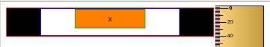
We see that our horizontal centering works perfectly – however, regarding the heights we get a weird vertical gap of a size around 8 to 10 pixels. This seems to be wrong – at least compared with (naive) expectations based on the CSS definitions given above: all min-heights plus border dimensions were chosen with values such that all nested elements should vertically fit into each other seamlessly.
What exactly did we do in our example?
We defined an outer container DIV “div.header” which works like a kind of header section. Inside we placed a new standard block container “div.hornav”. Let us look at it as a frame for an expandable menu. Then we placed and horizontally centered an inline block element “div.hornav_txt” inside our “div.hornav”. This inline block element shall work as the container of a menu point. A menu point itself “div.mp_cont” then contains 2 absolutely positioned layers over each other. This allows for the opacity control of the background-color and a menu text with no opacity (opacity:1.0). All containers have only defined min-heights – but as long as the menu text uses only one line all elements should fit perfectly into each other (including borders).
So why does the obvious visible vertical distance occur at all?
A plausible reason for the vertical gaps
Our intuition for a seamless vertical fitting is based on 2 assumptions, namely
- that an inline-block would behave more or less like a standard block element,
- and that a surrounding block would adjust to an encapsulated inline block as if the latter were a block element.
Both assumptions are wrong. To understand a bit better what happens let us first look at how the height of a block DIV container responds to its contents if no precise height value is defined:
The browser will analyze the required height of the block contents and adjust the block height according to the box model with paddings and margins (if defined). In case the encapsulated contents is an inline element – as e.g. a text – then its space requirements is analyzed – e.g. the font-size plus required space above and below to account for all types of letters of this font – e.g. “Ü”; or “j”. If you artificially reduce the line-height of the contents and the encapsulating box vertical below the height required for a full display of the font letters vertical overlaps of the several text lines may occur and the box size will shrink to defined limits related to the font size according to CSS rules.
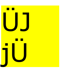
E.g.:
	<div style="clear:left; width: 20.0rem; margin-top:150px; line-height:0.0rem; background-color: yellow;">
		<span style="font-size:8.8rem; line-height:0.0rem; ">ÜJ<br>jÜ</span>
	</div>
leads to:
In contrast
	<div style="clear:left; width: 20.0rem; margin-top:150px; line-height:0.0rem; background-color: yellow;">
		<span style="font-size:8.8rem; line-height:0.0rem; ">ÜJ<br>jÜ</span>
	</div>
leads to:
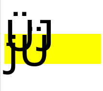
So far, so good. In any case: What happens exactly depends on the (inline) contents, its height and the line-height calculated or defined for the display of the contents.
Now back to our example:
As there is no container element with a defined height the browser engine has to analyze successively nested inner elements to determine defined or calculable height scales. But in our case we never get to such a finite height scale for the relatively positioned elements inside the innermost inline block container.
The only precisely defined height scale in our example is eventually given by a letter “x” – however, the height of this letter only affects layers absolutely positioned at z-indices above their containers. It has no impact on the sizing of the container “div.mp_cont”.
So what can the browser engine actually cling to and rely on when following the successively embedded and relatively positioned elements? The last height scales given is the min-height and the line-height of the innermost inline (!) block element div#mp_cont. But from the perspective of the surrounding encapsulating containers “div.hornav_txt” and “div.hornav” this actually has the same effect as if a big letter had been placed inside them.
By using a small trick we can actually see that our FF browser engine (Gecko; but KHTML/Webkit does it as well) adjusts the baseline for letters according to this pseudo-“letter”-dimension (i.e. according to the height of the inline box “div.mp_cont”)
and reserves vertical space in between the two successive inline-block elements.
<body>
        <div class="header">
            <div class="hornav">
                <div class="hornav_txt" style="line-height:0;">
                	<div class="mp_cont">
                		<div class="bg"></div>
                		<div class="fg">x</div>
                	</div>
             	</div>
			</div>
        </div>
        <div class="header" style="margin-left:50px;">
            <div class="hornav">
                <div class="hornav_txt">
                	<div class="mp_cont">
                		<div class="bg"></div>
                		<div class="fg"></div>
                	</div><span style="font-size:2.8rem; ">XÜj</span>jjgg
             	</div><span style="color:yellow;">jg</span>
			</div>
        </div>
</body>
results in :
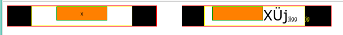
So, indeed: If we add some normal letters we see that the baseline for letters inside “div.hornav_txt” is the bottom of the included “div.mp_cont”. But letters require additional vertical space below their baseline!
So, the browser recognizes the existence of some inline (!) contents with a defined (min-) height inside the first inline-block “div.hornav_txt” and adjusts everything else according to some complicated height calculations. See http://www.w3.org/TR/CSS21/visudet.html#propdef-line-height.
I have to admit that I do not really understand all details and their consequences of the W3C height calculation rules. But the overall effect of nesting an inline block with a min-height inside another inline block without any further defined (inner) height scale resembles pretty much a situation in which a letter with the same font-height value were placed inside the enclosing outer inline block (here inside “div.hornav_txt”).
Conclusion: In the absence of any further inline element with precisely defined height the min-height of the innermost identifiable inline element determines the full layout and the resulting height calculations
- for any surrounding (inline) block elements with flexible height
- and then the innermost relatively positioned standard block container enclosing the nested inline blocks
just as a letter with the same font-size would do. And a letter needs more vertical space then its font-size! The nested inline blocks transfer the resulting excess height requirement to the enclosing standard block element and therefore automatically lead to a vertical gap! (I suspect that the size of the gap depends on the rendering engine of the browser, but it did not investigate this point, yet).
Note: This may also happen inside horizontal lists where inline blocks are used instead of floated elements.
Vertical gaps resulting from nested inline block elements inside DIV containers – II – getting control
we shall play around with our example and show what happens if
we change the innermost contents and/or some CSS settings. Our objective then is to get control over the vertical gaps introduced by the rendering engine.