In the previous articles of this series
Responsive fluid multi-column layouts – the DIV order problem – I
Responsive fluid multi-column layouts – the DIV order problem – II
Responsive fluid multi-column layouts – the DIV order problem – III
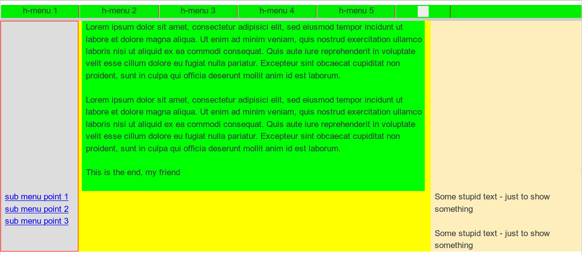
I described how we can control HTML div order problems which may interfere with a simple, efficient approach to make a 3 column fluid layout responsive to the viewport width. I regard this topic as sufficiently covered: By planning the HTML code and its DIV order properly we can make responsiveness a matter of changing just a few CSS properties (like float) for defined viewport width ranges in our CSS code. Small CSS tricks restore the optical layout if we have to choose a special and unusual DIV order of (horizontally) floated or relatively positioned DIV containers in the HTML code for achieving a specific vertical element order after a responsive transformation.
Nevertheless, I do not want to close this article series about responsive layouts without looking into methods for a more suitable handling of the horizontal main menu. Actually, up to now we did not care about the main menu at all. The floated menu points just move downwards over several rows if the viewport width gets to small to display the menu in just one line.
Some people may find such an approach uneconomical, looking weird and not at all a professional solution for small viewport widths, e.g. on a smartphone. For a real responsive (horizontal) menu the wide spread expectation is that the whole menu collapses at small viewport widths – in parallel to the vertical reordering of major page areas.
In this and the next article we shall have a look at some options how to achieve a better responsive menu control – without and with Javascript.
Objectives for an originally horizontal main menu at small viewport widths
In the second article of this series we defined 3 viewport width ranges. “Range I” stands for small viewport widths which may be typical for smartphones. In this range the main menu would only be interesting if the user really needs it – otherwise it consumes too much of the limited screen area and may enforce unnecessary scrolling.
Therefore, it is reasonable to collapse the horizontal menu to a button (with a reasonable menu symbol) within Range I. This is exactly what e.g. many wordpress designs and other web tools do: Below a certain width threshold menus are reduced to symbols with button functionality. A click on such a button would open the main menu – now with vertically listed menu points as we do not have much width available. A second click on the button – and/or other actions which we need to discuss – would close the menu again.
This description seems to imply that Javascript [JS] is required for a convenient handling of a collapsed menu. More precisely: for a convenient dealing with user induced GUI-events for some specific elements of our web page. Therefore the following question is of major interest: What alternatives do exist for users who have deactivated Javascript?
In this article we concentrate one a JS-free approach. Some readers may not find the suggested solution convenient enough; but the efforts in this article to build a flexible horizontal menu which gets collapsed are not at all in vain – all HTML and CSS code can and will be used almost unchanged in a JS-based solution. See a forthcoming article for this.
Restructuring the horizontal menu on the HTML level
The
horizontal menu as we described it in the previous articles was set up in a most simply way: It was just a list with floated elements – positioned on the left side in its container “div#head” due to defaults. The CSS statements offered no options to center the menu or put it on the left or right side of the page. However, such options – in the form of easily changeable CSS properties – may be important in certain web layouts. In addition we need a “menu button” which shall be displayed for small viewport width. Two good reasons for restructuring the main menu a bit …
The new HTML code for the container “div#head” appears much more complex than in the previous articles – but you will understand the advantages of the DIV nesting in a minute.
HTML code for the horizontal main menu
<body onload="init_page();">
<div id="all">
	<div id="head">
		<div id="main_menu_cont">
			<div id="bg_hor_menu"></div>
			<div id="menu_cont">
				<a id="hmen_but" title="main menu" href="#"></a>
				<div id="hmen_cont" class="hmen_cont">
					<div id="bg_ver_menu"></div>
					<ul id="menu_lst">
						<li><div class="hmen_pkt"><p><a href="#">h-menu 1</a></p></div></li>
						<li><div class="hmen_pkt"><p><a href="#">h-menu 2</a></p></div></li>
						<li><div class="hmen_pkt"><p><a href="#">h-menu 3</a></p></div></li>
						<li><div class="hmen_pkt"><p><a href="#">h-menu 4</a></p></div></li>
						<li><div class="hmen_pkt"><p><a href="#">h-menu 5</a></p></div></li>
						<li class="hm_li_right"><div class="hmen_pkt"><a id="but2" href="#"></a></div></li>
						<li class="floatstop"></li>
					</ul>
				</div>
			</div>
			<p class="floatstop"> </p>
		</div>
	</div>
....
....
</div>
....
....
We encapsulate our menu now inside the main container “div#main_menu_cont” and supply a background element “div#bg_hor_menu” which allows for a full control of background and opacity effects in a “horizontal header line”.
Note: In the following CSS strategy this horizontal header line which comprises the menu outside width range I will still be shown when we collapse the menu contents.
To decouple the menu itself from the “header line” we introduce a second inner container “div#menu_cont”. It shall server 2 purposes:
- It will help us to gain control about centering the menu – a list of points – inside the horizontal menu line despite a missing explicit definition of the menu width.
- It is also required to control the interaction of the user with the menu for small viewport widths when Javascript is not available. This will become clear in some minutes.
“div#menu_cont” encloses the real content stuff of the menu for all width ranges. Among its new elements is a “menu button” – more precisely: a block A-tag “a#hmen_but” – which up to now has no functionality – and shall only be visible in viewport width Range I. As a matter of fact, in the JS-free solution we do NOT assign any functionality to this button – but instead to its container “div#menu_cont”! See below.
The container “div#hmen_cont” encloses in addition
- a relatively positioned list “ul#menu_list”, which contains the floated menu points (LI-tags)
- and an absolutely positioned “div#bg_menu” for controlling background effects (color, opacity) for the possibly horizontally centered and later on vertically displayed menu.
Note that in our test example the width of the menu list and also of “div#hmen_cont” will not be defined explicitly for viewport widths outside of Range I: The browser has to evaluate the menu width from the widths of its listed elements.
Centering the menu in the header line
The following CSS excerpt makes clear how we achieve a centering of the menu list in the header line.
....
....
/* The header region */
/* *******************/

div#head {
	position:relative;
	width:100%;
	min-height: 3.0rem;
	z-index: 6;
}

/* The main contents container */
/* *************************** */

div#outer_cont {
	position:relative;
	width:100%;
	min-height: 10.0rem;
	margin-top:1.0rem;
	z-index: 1;
}
....
....
/* Support elements */

p.floatstop {
	clear:both;
	height:0;
	margin:0;
	line-height:0;
	padding: 0;
	font-size: 0;
}


/* contents of the upper horizontal menu */
/*-------------------------------------- */

div#main_menu_cont {
	display: block;
	position: relative;
	width: auto;
	margin-left: 1.0rem;
	margin-right: 1.0rem;
	min-height: 3.0rem;
}

div#bg_hor_menu {
	display:block;
	position: absolute;
	top: 0;
	bottom: 0;
	left: 0;
	right: 0;
	border-radius: 0.8rem;
	background-color: #FFF;
	opacity: 0.75;
	z-index: 1;
}

div#menu_cont {
	display: block;
	position: relative;
	float:right;
	width: 100%;
	min-height: 3.0rem;
	z-index: 2;

	/* helps to center its enclosed container */
	text-align: center;
}

a#hmen_but {
	display: none;
	width: 4.6rem;
	height: 2.2rem;
	margin-top:0.2rem;
	background-color: #A90000;
	border-top: 0.2rem #CCC solid;
	border-right: 0.2rem #CCC solid;
	border-left: 0.2rem #AAA solid;
	border-bottom: 0.2rem #AAA solid;
}

div.hmen_cont {
	position: relative;

	/* display: block; */

	/* makes horizontal centering possible despite undefined width */
	display: inline-block;

	min-height: 3.0rem;

	/* A second method of centering - optically determined by the viewport width */
	/*
	width: auto;
	margin-right:0.8rem;
	margin-left:0.8rem;
	*/

	border-radius: 1.0rem;

	/* centers the enclosed list ! */
	text-align: center;
}

div#bg_menu {
	display:block;
	position: absolute;
	top: 0;
	bottom: 0;
	left: 0;
	right: 0;
	border-radius: 0.8rem;
	background-color: #FFF;
	opacity: 1.0;
	z-index: 1;
}

div.hmen_cont ul {
	position: relative;

	/* makes horizontal centering possible despite undefined width */
	display: inline-block;
	list-style-type: none;
	/*width: 100%;*/
	margin: 0;
	padding: 0;
	padding-left: 0.4rem;
	padding-right: 0.4rem;
	z-index:2;
}

div.hmen_cont ul li,
div.hmen_cont ul li.hm_li_left,
div.hmen_cont ul li.hm_li_right {
	float: left;
	padding: 0.2rem 4.0rem 0.2rem 4.0rem;
	margin:0;
	margin-top:0.2rem;
	height: 2.2rem;
	/*border-left: #ffffff 1px solid;*/
	border-right: #a90000 0.2rem solid;
	min-height: 2.0rem;
	font-size: 1.6rem;
}

div.hmen_cont ul li.hm_li_left {
	border-left: #a90000 0.2rem solid;
}
div.hmen_cont ul li.hm_li_right {
	border-right: 0;
}

div.hmen_cont ul li.floatstop {
	float:none;
	clear:both;
	height:0;
	min-height: 0;
	margin:0;
	line-height:0;
	padding: 0;
	font-size: 0;
	border:0;
}

div.hmen_cont ul li a,
div.hmen_cont ul li a:visited  {
	text-decoration: none;

	color: #000;
}

div.hmen_cont ul li a:hover {
	color: #A90000;
	background-color: #FFFFBB;
}

a#but2 {
	display: block;
	width: 1.6rem;
	height: 1.6rem;
	background-color: #A90000;
	border-top: 0.2rem #CCC solid;
	border-right: 0.2rem #CCC solid;
	border-left: 0.2rem #AAA solid;
	border-bottom: 0.2rem #AAA solid;
}
Note that the new layer “div#menu_cont” is floated in its enclosing container “div#main_menu_cont”. This was done due to convenience reasons. In course of the transition to Range I we shall reduce the width of “div#menu_cont” and position it on the right side of the horizontal menu line. This is easily achieved by floating. If we wanted it to collapse to the left side in Range I we would just change the float direction. Thus floating “div#menu_cont” gives us a bit of positioning freedom whenever we should need it. As long as we set the width to “100%” outside Range I we do not need to take care of any centering of “div#menu_cont” there.
Note that we blend out the menu button (via “display:none;”) – as long as we are not in Range I (see below). The dimensions of the block A-tag will become important in Range I.
How exactly do we do the centering for the menu contents?
As the width of “ul#menu_lst” is undefined, we cannot use the usual trick with “margin-left:auto; margin-right:auto;”. Instead we need declare the block-element “ul#menu_lst” as an inline element via “display: inline-block;”. After this the CSS property “text-align:center;” of the enclosing container “div#hmen_cont” does its job.
Now the UL-tag is centered in its container. But “div#hmen_cont” has no defined width either. We therefore extend and cascade this type of centering one level higher – and declare also “div#hmen_cont” itself to be an “inline-block” element in its container “div#menu_cont”.
However, there are other possibilities to center dynamically on this outer tag-level:
One possibility could be to declare “div#hmen_cont” as a normal block element, but to set both its “margin-left” and its “margin-right” property to one and the same value. Then the visible width of “div#hmen_cont” and its background element “div#bg_menu” would become independent of the width of “ul#menu_lst”. Instead, the viewport width would determine the visible menu width. Such a centering would, however, not obstruct a further inner centering of the UL-tag within a wider “div#hmen_cont”! Try it out!
Note that instead of centering we could also move the menu containers to the right or left in their enclosing containers by using the property “text-align”. A bit of abstraction and combining different options on the 2 container levels will give us even more options to adapt to different optical layouts requested by our customers. The introduced intermediate containers open up for variety of centered and non-centered layouts of the horizontal menu.
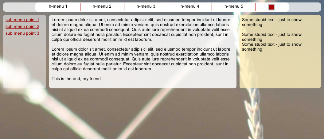
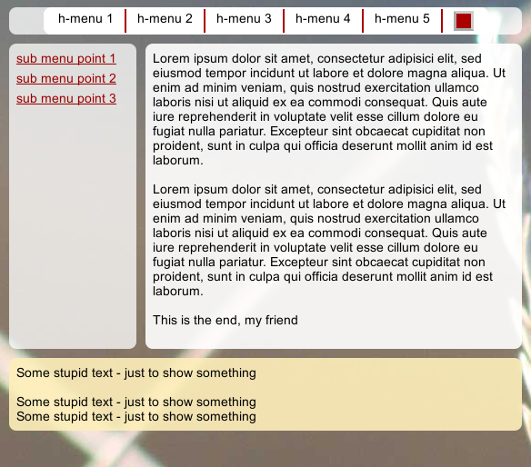
For our next discussion points we shall only follow the line of a full centering. An impression of the resulting menu in Range III can be seen on the following picture.
A transitional option to handle the horizontal menu
What about viewport widths between a typical desktop width of more than 1000 pixels and small viewport width around 400 to 500? In such an intermediate width range it is reasonable to first use the available space a bit better than just collapsing the menu directly. How you would adjust the width of each menu point depends of course on the way how you distributed them:
In our test example the original width of the horizontal menu was defined
by some “padding“-definitions for each the floated “LI”-tags in the horizontal menu (see the CSS above or in the last article). Therefore, an intermediate step could be to reduce the values for horizontal padding substantially when the viewport width shrinks below a threshold:
/* @media screen decision and settings for the horizontal menu */
@media screen and (max-width : 860px) {
	div.hmen_cont ul li {
		padding: 0.2rem 1.2rem 0.2rem 1.2rem;
	}
}
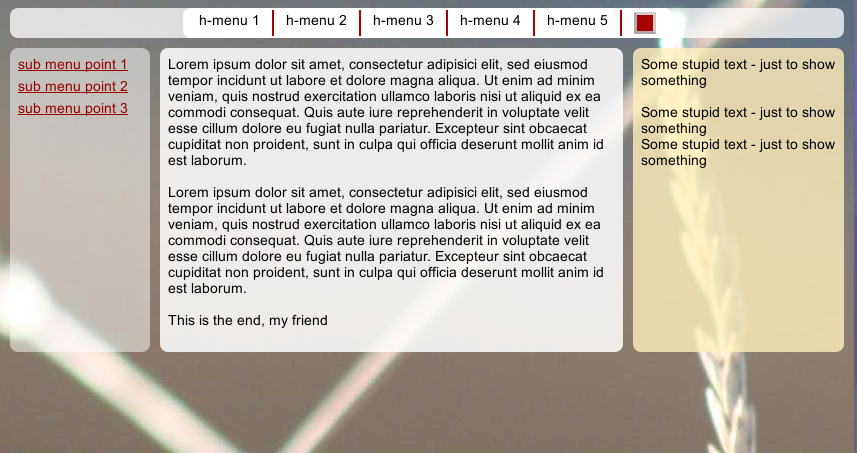
In our test case this actually helps until the final transition to smallest viewport widths of Range I occurs:
and
Some warnings:
What looks nice in the pictures actually depends in real web layouts on a proper choice of the width threshold for the transition to smaller padding-values – we want to shrink the padding-values only when the menu width gets too big for the available viewport width. But the menu width in our example depends in turn mainly on the font settings for the page, e.g.:
@CHARSET "UTF-8";

html {
	font-size:10px;
}

body {
	margin-left:0;
	margin-right:0;
	margin-top: 0;
	background-image: url(../image/hg_straa_mp.jpg);
	background-repeat:no-repeat;
	background-position:top center;

	font-family: Arial;
}

p {
	font-size: 1.4rem;
	line-height: 1.6rem;
	margin: 0;
}
Therefore, setting a proper width threshold for which the responsive transition to smaller padding-values shall occur also depends on the chosen font – and under worst circumstances also on font settings for the user’s browser. You see: some effort and testing for different fonts (especially for Google fonts if Android devices are the target client) is waiting for you. (At least if you do not want to depend on Javascript. JS would give you many more possibilities to analyze the situation dynamically.)
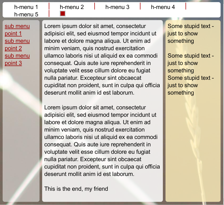
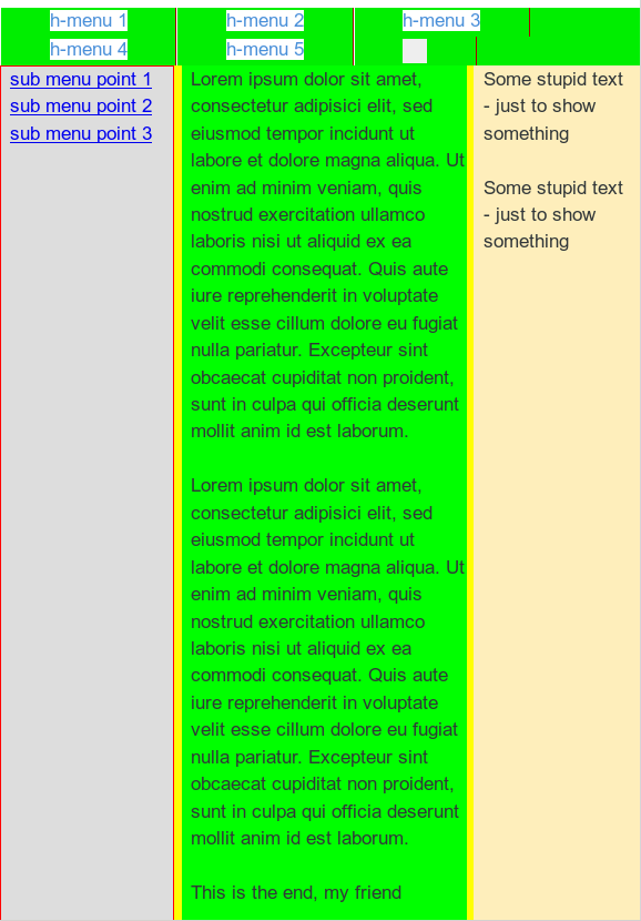
As a side effect we again see that a container policy with expandable containers in height is extremely important in responsive designs …. (we followed such a policy so far): If a browser replaced our carefully chosen fonts by some strange font and the available horizontal space got too small then we still had a fallback: We would display the menu with several rows without disturbing the rest of our page. The next pic shows a provoked situation of this type:
You should at least follow the rule: Always set the threshold width for shrinking the distance between menu elements with some safety margins in mind! Already some slight differences in the display of fonts may lead to different behaviors of different browsers! Always test your responsiveness for a font which is set with relatively wide letters (like Verdana) first to be on the safe side.
Furthermore: In more realistic cases than our test example you may need additional thresholds and related successive padding- and/or margin-adjustments. Note that due to automatic margin-/padding-settings for list elements
in some browsers you may have to set margin-values explicitly in addition to controlling the menu width.
How to make a horizontal menu responsive ? Some general alternatives …
The general choices for dealing with a horizontal menu in responsive layouts are in my opinion:
- Solution 1:Allow for horizontal menus with two or more lines in a certain viewport width range.
- Solution 2:Adjust the width of the menu elements of a horizontal main menu – by reducing padding/margin-definitions or by introducing percentage widths of the menu elements – below certain viewport width thresholds.
- Solution 3:Collapse the horizontal menu to a button below a defined viewport width threshold (without or with Javascript support for mouse interactions with the button).
- Solution 4:Change from a horizontal to a vertical menu and position it properly.
The first solution was shown in the last articles. The second solution was briefly presented above.
At some point of the viewport width, however, you probably want and need to collapse the whole menu. The resulting menu button would then be attached to a vertical menu area whose visibility is controlled by mouse interactions with the button. This means that solution 3 is directly connected with solution 4. However, option 4 could in some cases (i.e. for Javascript free solutions) also be used as a totally independent solution.
After this overview we now concentrate on a collapse solution with a button in our defined viewport width “Range I” – without making use of Javascript [JS].
Collapsing the main menu to a button without Javascript support
A JS free solution may be useful for people who have JS deactivated. Although, without click-events on a button-like element it may be a bit more difficult to control the touch screen interaction with smartphones and tablet-PCs.
Fortunately, the browser developers for smartphones have understood this. E.g. both Firefox and Chrome for Android translate “rollover” events into something very similar to pure “click”-events. Therefore, the following solution should work even in browsers for (Android) smartphones:
CSS statements for a collapsing menu with remote rollover
/* @media screen decision and settings for the horizontal menu */

@media screen and (max-width : 860px) {

	div.hmen_cont ul li,
	div.hmen_cont ul li.hm_li_left,
	div.hmen_cont ul li.hm_li_right
	 {
		padding: 0.2rem 1.2rem 0.2rem 1.2rem;
	}
}
.....
.....

/* @media screen decision and settings for range I */
/* ----------------------------------------------- */

@media screen and (max-width : 539px)  {
....
.....
	/*
	* Treatment of the horizontal menu
	*/

	div#bg_hor_menu {
		opacity: 1.0;
	}


	div#menu_cont {
		margin-right: 4.0rem;
		width: 5.0rem;  /* button size ! */
		height: 3.0rem;
	}

	a#hmen_but {
		display: block;
	}


	div#menu_cont:hover div.hmen_cont {
		visibility: visible;
	}


	div.hmen_cont {
		position: absolute;
		visibility:hidden;
		top:3.0rem;
		right:0;
		min-height: 3.0rem;

		width: auto;
		min-width: 18.4rem;
		max-width: 25.0rem;

		margin-right:0rem;
		margin-left:auto;

		padding: 0.8rem;

		background-color: #DDD;
		border-radius: 1.0rem;

		text-align: left;
	}

	div#bg_menu {
		background-color: #DDD;
		opacity: 1.0;
	}


	div.hmen_cont ul {
		position: relative;
		list-style-type: none;
		width:
auto;
		margin: 0;
		padding: 0;
	}

	div.hmen_cont ul li,
	div.hmen_cont ul li.hm_li_left,
	div.hmen_cont ul li.hm_li_right {
		float: none;
		padding: 0.2rem 0.4rem 0.2rem 0.8rem;
		width:auto;
		/*border-left: #ffffff 1px solid;*/
		border-right: #a90000 0.0rem solid;
		min-height: 2.0rem;
		font-size: 1.6rem;
	}

	div.hmen_cont ul li.floatstop {
		float:none;
	}

	div.hmen_cont ul li p {
		margin-top:0;
		line-height: 1.6rem;

	}

}

/* extreme case - reached e.g. by Ctrl + */
@media screen and (max-width : 260px)  {
	div#menu_cont {
		margin-right: 4.0rem;
	}

	div.hmen_cont {
		right: -4.0rem;
		width: auto;
		min-width: 0;
	}

	div#bg_menu {
		background-color: #DDD;
	}

}
The horizontal menu line “div#main_menu_cont” and the enclosed background DIV “div#bg_hor_menu” remain visible in all viewport width ranges. But with the transition to Range I we give up the centering and collapse the menu instead. This is done by a sequence of measures:
- In Range I we make the menu button “a#hmen_but” visible. (In our example just a simple red button).
- The dimensions of “div#menu_cont” are collapsed down to the size of the menu button. The (floated) container is moved a defined distance away from the right border of its container by setting a right-margin.
- The menu container “div#hmen_cont” is optically hidden (via: “visibilty:hidden;”)
- The menu container “div#hmen_cont” gets an absolute position, a minimum and a maximum width. The maximum width is required to enforce line wrapping for long menu points and is adjusted to a further viewport shrinking via an additional width threshold condition.
- Color and opacity of the menus background layer are adjusted such that the menu region will clearly be visible above other layers. In z-direction the visibility on top of other layers is already guaranteed by the high z-index value assigned to div#head (see above).
- Floating of the list elements is stopped. This gives us a vertical list of menu points.
- We define a further width threshold and adjust properties of “div#hmen_cont” for extremely small viewport widths.
Note: The situation of an extreme small viewport width can be provoked in 2 ways in a browser:
- Firstly by reducing the physical width of the browser window.
- Secondly via a relative rescaling of the basic font size and adjusting all elements. This happens “Ctrl +” is used in a browser – i.e. by the zooming functionality of the browser in connection with our “rem” CSS-scaling of all dimensions. Everything is recalculated then with relative factors. And relative to the increased font-size the viewport width goes down. So the browser initiates the defined transitions.
The second possibility is the reason why we have to guarantee a reasonable behavior of our web page for even extreme small viewport widths. This explains our final safety transition: @media screen and (max-width : 260px) {}.
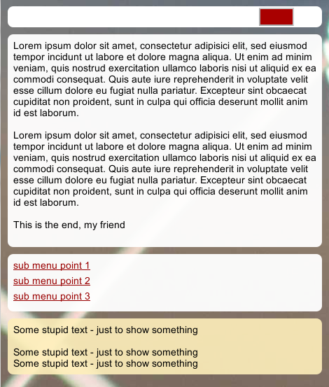
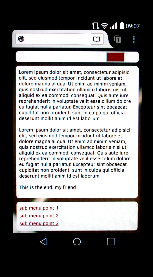
The next picture shows our “collapsed” menu in form of a pure button in viewport width Range I:
Triggering the visibility of the menu after the collapse to a button – without JS
The reader may have asked already: How shall a user get access to the new vertical menu which is set to “visibility:hidden;
” in Range I? To achieve this we use a simple “trick” called “remote rollover”:
We move the mouse over an element and another element at a very different position reacts to this rollover. Our “div#menu_cont” and its logically enclosed “div#hmen_cont” provide a typical example:
div#menu_cont:hover div.hmen_cont {
		visibility: visible;
	}
The pseudo class “:hover” of an container element may trigger CSS properties of an enclosed (absolutely positioned) element at an optical different position. In our case the hover triggers the visibility of its enclosed and now absolutely positioned container div.hmen_cont. The hover actually occurs on all visible elements of the container – independent of where they are located. So, if we could move the mouse from the area of “div#menu_cont” directly into the visible area of “div#hmen_cont” without moving outside one of these containers the triggered visibility of “div#hmen_cont” will sustain. Firefox and Chrome realize this CSS feature properly – so we can use it here.
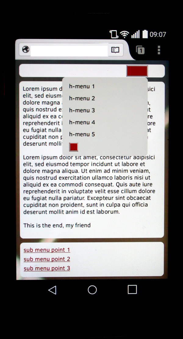
The next picture gives you an impression of the “rollover” effect:
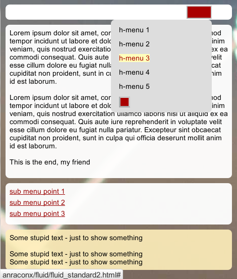
Exactly what we wanted to achieve. You may also test in Firefox or Chrome that the button and the vertical menu really are vertically “connected” despite the little optical vertical gap between them:
You can move the mouse from the button vertically down into the menu below without loosing contact and visibility. Once visible the lower area remains so if we move the mouse vertically downward in a channel of the button width. This is due to the fact that the upper edge of “div#hmen_cont” seamlessly touches the lower edge of “div#menu_cont”. [If you really wanted or needed a major and visible vertical distance between the two Divs: This can be achieved by introducing a transparent, properly dimensioned and absolutely positioned bridge element, i.e. an additional more or less transparent and absolutely positioned DIV inside “div#menu_cont”.]
However, as soon as the mouse in our example leaves either the area of the button or the area of the still visible menu then the visibility of the menu is lost. So, to make the menu disappear again the user just has to move the mouse outside the connected visible areas of the “menu button” and the menu itself.
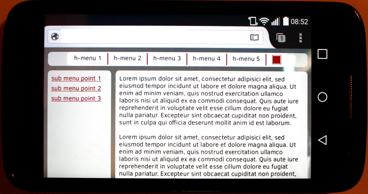
What happens in a smartphone browser? See the picture for an Android 5 smartphone in horizontal orientation with relatively low resolution.
OK – range II is chosen. Now what about the button behavior? We rotate the smartphone:
At least in FF or Chrome you can just press your finger (similar to a “click”) on our menu button – and our vertical menu region will appear.
Then you can “click” on any menu point – the menu remains visible. To make the menu disappear the user just
has to “click” – i.e. press the finger – on some page area outside the button or the displayed menu. Nice, isn’t it?
Again a warning:
Although this is a fully functional solution a normal user will find it unusual or even frustrating that a second click on the red button does not hide the menu again. Without JS we unfortunately have no remedy for this. And the page gets not unusable.
Still: We have reached our main objectives. So far, we have only used CSS – no Javascript at all. Nevertheless we have realized a menu collapse with a rollover functionality throughout our responsive viewport width transition.
Of course you can use all the little tricks discussed above also for (left sided) submenus. We come back to this point in a later article of this series.
Alternatives?
There is always the trivial alternative for users who have deactivated JS to transform the menu into a permanently visible vertical menu – but with a “position:relative;” inside the then expanding header line. Such a solution would be very similar to what we did with the left sided menu in the last article. We do not need to show code examples. Such a solution would, however, consume even the same or more space at the top of the web page than a simple floating solution with several menu lines. Its only advantage over a floating solution is that it may look a bit more organized.
A supplemental hint regarding scrollbars
All our main relatively positioned containers scale with the viewport width due to a setting of “position:relative; width: 100%;”.
This may not be the case in realistic layouts. If you have a layout where the main page elements do not expand with the viewport above a certain width threshold, but have a maximum width instead, you should always use the following CSS setting
width: 100%;
max-width: your_max_width_value;
and not just
width: your_max_width_value; /* above the threshold */
for all outmost containers inside the body and where necessary also for enclosed elements. Do not forget to do this also for images which shall be scaled below a width threshold set for the named max-width of the elements.)
This type of setting is required to give the browser a chance to deal in a reasonable way with vertical scrollbars and a restructuring of the page elements when the scrollbar is displayed. Note that the viewport width includes the width scrollbar to be displayed. I.e. the scrollbar is part of the viewport. So changes of page elements during responsive transitions may only occur when the distance between the left browser edge and the right outer (!) edge of the scrollbar fits to the viewport width threshold value. So some elements may be covered and hidden by the scrollbar before the CSS statements below the width threshold get operative.
Therefore, if you just switch the CSS properties for containers to “width: 100%;” below the width threshold a vertical and an additional (superfluous) horizontal scrollbar may appear. If you instead use the given definition above only the vertical scrollbar will appear because the browser then can rearrange the displayed contents as soon as the vertical scrollbar appears and even when it moves inside the width threshold.
Conclusion
Even without JS a solution is achievable with a collapsed menu at small viewport widths. It is fully functional though maybe not exactly how the user may expect it.
In the forthcoming article
Responsive fluid multi-column layouts – main menu control with JS/jQuery and font-size adaption –
V
we shall discuss how we introduce some simple Javascript functionality into the menu handling.

