
For experiments in Machine Learning [ML] it is quite useful to see the development of some characteristic quantities during optimization processes for algorithms – e.g. the behaviour of the cost function during the training of Artificial Neural Networks. Beginners in Python the look for an option to continuously update plots by interactively changing or extending data from a running Python code.
Does Matplotlib offer an option for interactively updating plots? In a Jupyter notebook? Yes, it does. It is even possible to update multiple plot areas simultanously. The magic (meta) commands are “%matplotlib notebook” and “matplotlib.pyplot.ion()”.
The following code for a Jupyter cell demonstrates the basic principles. I hope it is useful for other ML- and Python beginners as me.
# Tests for dynamic plot updates
#-------------------------------
%matplotlib notebook
import numpy as np
import matplotlib.pyplot as plt
import time

x = np.linspace(0, 10*np.pi, 100)
y = np.sin(x)

# The really important command for interactive plot updating
plt.ion()

# sizing of the plots figure sizes
fig_size = plt.rcParams["figure.figsize"]
fig_size[0] = 8
fig_size[1] = 3

# Two figures
# -----------
fig1 = plt.figure(1)
fig2 = plt.figure(2)

# first figure with two plot-areas with axes
# --------------------------------------------
ax1_1 = fig1.add_subplot(121)
ax1_2 = fig1.add_subplot(122)

fig1.canvas.draw()

# second figure with just one plot area with axes
# -------------------------------------------------
ax2 = fig2.add_subplot(121)
line1, = ax2.plot(x, y, 'b-')
fig2.canvas.draw()

z= 32
b = np.zeros([1])
c = np.zeros([1])
c[0] = 1000

for i in range(z):
    # update data
    phase = np.pi / z * i
    line1.set_ydata(np.sin(0.5 * x + phase))
    b = np.append(b, [i**2])
    c = np.append(c, [1000.0 - i**2])

    # re-plot area 1 of fig1
    ax1_1.clear()
    ax1_1.set_xlim (0, 100)
    ax1_1.set_ylim (0, 1000)
    ax1_1.plot(b)

    # re-plot area 2 of fig1
    ax1_2.clear()
    ax1_2.set_xlim (0, 100)
    ax1_2.set_ylim (0, 1000)
    ax1_2.plot(c)

    # redraw fig 1
    fig1.canvas.draw()

    # redraw fig 2 with updated data
    fig2.canvas.draw()

    time.sleep(0.1)
As you see clearly we defined two different “figures” to be plotted – fig1 and fig2. The first figure ist horizontally splitted into two plotting areas with axes “ax1_1” and “ax1_2”. Such a plotting area is created via the “fig1.add_subplot()” function and suitable parameters. The second figure contains only one plotting area “ax2”.
Then we update data for the plots within a loop witrh a timer of 0.1 secs. We clear the respective areas, redefine the axes and perform the plot for the updated data via the function “plt.figure.canvas.draw()”.
In our case we see two parabolas develop in the upper figure; the lower figure shows a sinus-wave moving slowly from the right to the left.
The following plots show screenshots of the output in a Jupyter notebook in th emiddle of the loop and at its end:
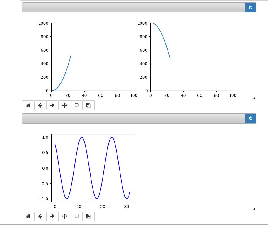
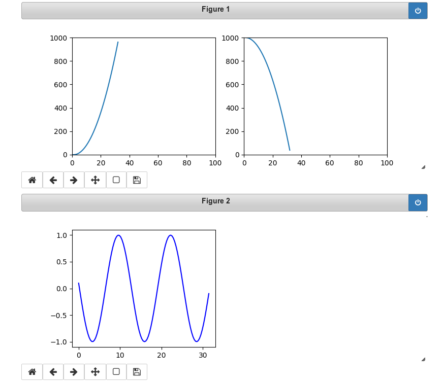
You see that we can deal with 3 plots at the same time. Try it yourself!
Hint:
There is small problem with the plot sizing when you have used the zoom-functionality of Chrome, Chromium or Firefox. You should work with interactive plots with the browser-zoom set to 100%.