In the November and December 2021 editions of the German “Linux Magazin” R. Pleger discussed a simple but nevertheless interesting example for the application of a cluster algorithm. His test case was based on a dataset of the UCI Irvine. This dataset contains 2000 samples with (fictitious?) data describing WIFI signals which stemmed from seven WLAN spots around a building. The signal strength of each source was measured at varying positions in four different rooms. I call the whole setup the “WIFI example” below.
One objective of the articles in the Linux Magazin was to demonstrate how simple it is today to apply basic Machine Learning methods. In a first step the author used a ML classifier algorithm to determine the location (i.e. the room) of a measuring instrument just from the strengths of the different WIFI signals. This task can be solved by a variety of algorithms – e.g. by a Decision Tree, SVM/SVC or a simple Multilayer Perceptron. The author used Sklearn’s RandomForestTree. This method is a good example for the powerful “Ensemble Learning” technique. When applied to the simple and well structured WIFI example it predicts the rooms for test samples with an accuracy of more than 98%.
The author afterward performed a deeper analysis of the WIFI data via Kmeans, MiniBatchKMeans and PCA. His second article underlined a major question, which sometimes is not taken seriously enough:
Do the data, which we feed into ML algorithms, really cover all aspects of the problem? Is the set of target labels complete or sufficient in the sense that the separation of the samples into labeled groups really reflects the problem’s internal structure? Or do the data contain more information than the labels reveal?
Unfortunately, in my opinion, the Linux Magazine covered an important point, namely the relation of the results of a PCA analysis to a 2-dimensional cluster visualization, in an incomplete and also slightly misleading way. In addition another interesting question was not discussed at all:
Can we use KMeans also as a classifier? How would we do this?
In this series of posts I want to dig a bit deeper into these topics – both for the WIFI example and also for the MNIST dataset. For MNIST we will not be able to visualize clusters as easily as for the WIFI example. Therefore, we should have a clear idea about what we do when we use clusters for classifying.
In this first post I focus on the results of a cluster analysis for the WIFI example. In a second article I will discuss the relation of cluster results to a PCA analysis. A third post will then present a very simple method of how to turn a cluster algorithm into a classifier algorithm. In later articles we shall transfer our knowledge to the MNIST data. More precisely: We shall combine a PCA analysis with a cluster classifier to predict the labels of handwritten digit images. We will use the PCA technique to reduce the dimensions of the MNIST feature space from 784 down to below 80. It will be interesting to see what accuracy we can reach with a relatively crude clustering approach on only about 30 main PCA components. As a side aspect we shall also have a look at standardization and normalization of the MNIST data.
I do not present any code in the first three posts as the required Python programs can be build relatively straight-forward and most of the core statements were already given in the Linux Magazin. You unfortunately have to buy the articles of the magazine; but see https://www.linux-magazin.de/ausgaben/2021/11/maschinenlernen/. However, as soon as we turn to MNIST I shall provide a Jupyter notebook.
The WIFI example: Two thousand samples, each with data for the signal strength of seven WLAN sources measured in four rooms
You can download the data WIFI data set from the following address:
https://archive.ics.uci.edu/ml/machine-learning-databases/00422/wifi_localization.txt
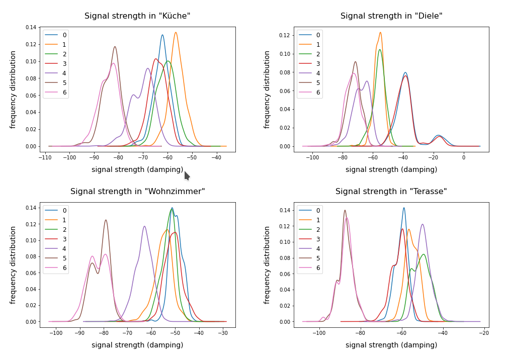
The feature space of this is example is 7-dimensional: 7 WLAN spots provide WIFI signals in the building. We have 2000 samples. Each sample provides the signal strength of each of the WLAN sources measured at different times and positions within a specific room. An integer number in [1,4] is provided as a label which identifies the room. The following plot shows the interpolated frequency distribution over the signal strength for each of the 7 signals in the four rooms:
Cluster analysis of the WIFI data – more than four rooms?
The original label-data of the WIFI example imply the existence of four rooms. But can we trust this information? The measurements in the room, which we called “Diele” in the plots above, indicate a consistent second peak for both the signals 0 and 3. Is this due to an opening into another room?
A simple method to analyze the inner structure of the distribution of data points in a configuration or feature space is a “cluster analysis”. The KMeans algorithm provides such an analysis for an assumed number of clusters.
KMeans is a basic but important ML method which reveals a lot about the data distribution in feature space and indirectly about the complexity of hyperplanes required to separate data according to their labels. Among other things KMeans determines the positions of cluster centers – the so called centroids – by measuring and systematically optimizing distances of samples to assumed centroids. Actually, the sum over all intra-cluster variances, i.e. the summed quadratic distances of the associated samples to their cluster’s centroid, is minimized. The respective quantity is called “inertia” of the cluster distribution. See e.g. the excellent book of P. Wilmott, Machine learning – an applied mathematics introduction” on this topic.
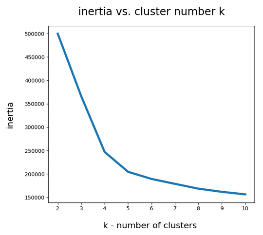
A simple method to find out into how many clusters a distribution probably segregates is to look for an elbow in the variation of the inertia with the number of clusters. When we look at the variation of inertia values with the number of potential clusters “k” for the WIFI example we get the following curve:
This indicates an elbow at k=4,5.
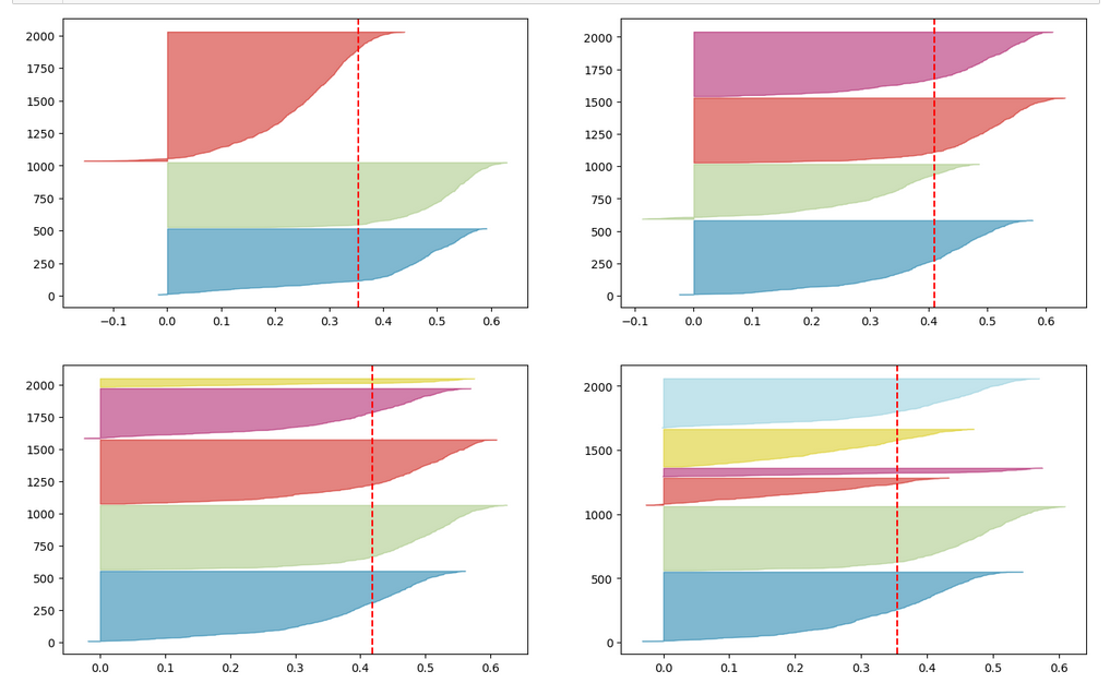
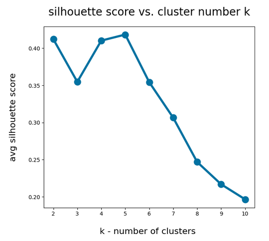
Another method to identify the most probable number of distinct clusters in a multi dimensional data point distribution is the so called “silhouette analysis”. See the book of A. Geron “Hands-On Machine Learning with Scikit-Learn, Keras and Tensorflow”, 2n edition, for a description. For the WIFI example the plots of the silhouette score data support the result of the elbow analysis:
The second plot shows ordered silhouette data for k = 3,4,5,6 clusters. Again, we get the most consistent pictures for k=4 and k=5.
So, the data indicate a fragmentation into 4 or 5 clusters. How can we visualize this with respect to the feature space?
Scatter plots for 2-dim sub-spaces of the feature space
A general problem with the visualization of cluster data for multidimensional data is that we are limited to 2, maximal 3 dimensions. And a projection down to two dimensions may not reflect the real cluster separation in the multidimensional feature space in a realistic way. But sometimes we are lucky.
We shall later see that there are two primary components which dominate the data and signal distributions in the WIFI example. A major question, however, is whether we will also find that only a few original features contribute dominantly to these major components. A PCA analysis does not mean that a “primary component” only depends on the same number of features!
As I did not know the relation of “primary components” to features I just plotted the results of “KMeans” for a variety of 2-dim signal combinations. I used Sklearn’s version of KMeans; due to the very small data ensemble KMeans is applicable without consuming too much CPU time (this will change with MNIST; there we need to invoke MiniBatchKMeans):
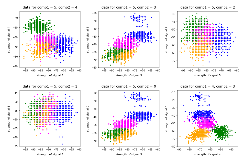
Note that the colorization of the data points in all plots was done with respect to the cluster number predicted by KMeans for the samples – and not with respect to their labels.
It is interesting that the projections onto two special feature combinations – namely WLAN-4/WLAN 0 and WLAN-3/WLAN-0 signal – show a very distinct separation of the clusters.
Four or five clusters ?
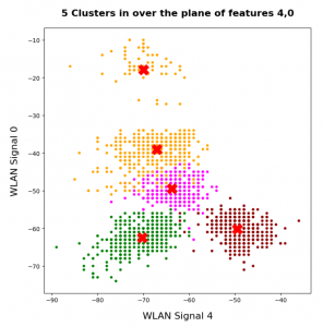
The data displayed above depend a bit on the initial distribution of cluster centers as an input into the KMeans algorithm. But for 4 and 5 clusters we get very consistent results. The next plots show the positions of the centroids:
This time the colorization was done with respect to the labels. What we see is: Five clusters represent the situation a bit better than only 4 clusters.
When we align this with the rooms: Five “rooms” may describe the signal variation better than only 4 rooms. The reason for this might be that one of the four rooms has a wall which partially separates different areas from another. We often find this in “entrances” [German: “Diele”] to houses. Sketches of the rooms in the Linux Magazin article actually show that this is the case. And, of course, such a wall or an opening into another room would have an impact on the damping of the WLAN signals.
Addendum 19.03.2022: Comparing clusters with groups of labeled data points
An important question which we have not answered yet by the images shown above is the following:
How well do clusters coincide with groups of data points having a specific label?
Note that in general you can not be sure that clusters reflect data points of the same label. Actually, a cluster is only a way to describe a close spatial vicinity of data points in some region of the multidimensional feature space. I.e. some kind of clumping of the data points around some centroids. But spatial vicinity does not necessarily reflect a label: A label border may often separate data points which are very close neighbors. And a cluster may contain a mixture of samples with different labels ….
Well, in the case of the WIFI example the identified 4 to 5 clusters match the groups of data points with different labels quite well. Below I superimposed the sample’s data points with different colors: First I colorized the data points according to their label. On top of the resulting scatter plot I placed the same data points again, but this time with a different and transparent colorization according to their cluster association. In addition I shifted the second data layer a bit to get a better contrast:
You see that the areas are not completely identical, but they overlap quite well. Obviously, I used 5 clusters. Also the fifth cluster fits well into a region characterized by just one label.
Conclusion
The simple WIFI example shows that a cluster analysis may give you new insights into the structure of ML data sets which a simple classifier algorithm can not provide. In the next article
we shall link the information contained in the “clusters” to the results of a PCA analysis of the WIFI example.
Stay tuned …
Ceterum censeo: The most important living fascist which must be denazified is the Putler.

