During this article series we use the moons dataset to acquire basic knowledge on Python based tools for machine learning [ML] – in this case for a classification task. The first article
The moons dataset and decision surface graphics in a Jupyter environment – I
provided us with some general information about the moons dataset. The second article
The moons dataset and decision surface graphics in a Jupyter environment – II – contourplots
explained how to use a Jupyter notebook for performing ML-experiments. We also had a look at some functions of “matplotlib” which enabled us to create contour plots. We will need the latter to eventually visualize a decision surface between the two moon-like shaped clusters in the 2-dimensional representation space of the moons data points.
In this article we extend our plotting knowledge to the creation of a scatter-plot for visualizing data points of the moons data set. Then we will have a look at the “pipeline” feature of SciKit for a sequence of tasks, namely
- to prepare the moons data set,
- to analyze it
- and to train a selected SVM-algorithm.
In this article we shall use a specific algorithm – namely LinearSVC – to predict the cluster association for some new data points.
Starting our Jupyter notebook, extending imports and loading the moons data set
At the end of the last session you certainly have found out, how to close the Jupyter notebook on a Linux system. Three steps were involved:
- Logout via the button at the top-right corner of the web-page
- Ctrl-C in your terminal window
- Closing the tags in the browser.
For today’s session we start the notebook again from our dedicated Python “virtualenv” by
myself@mytux:/projekte/GIT/ai/ml1> source bin/activate
(ml1) myself@mytux:/projekte/GIT/ai/ml1> cd mynotebooks/
(ml1) myself@mytux:/projekte/GIT/ai/ml1/mynotebooks> jupyter notebook
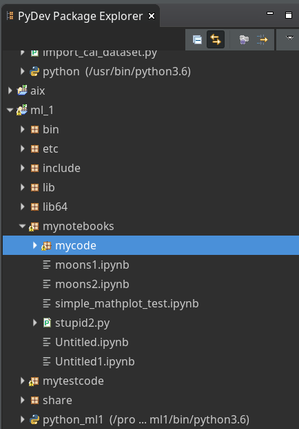
We open “moons1.ipynb” from the list of available notebooks. (Note the move to the directory mynotebooks above; the Jupyter start page lists the notebooks in its present directory, which is used as a kind of “/”-directory for navigation. If you want the whole directory structure of the virtualenv accessible, you should choose a directory level higher as a starting point.)
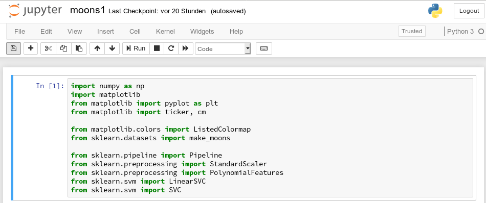
For the work of today’s session we need some more modules/classes from “sklearn” and “matplotlib”. If you have not yet imported some of the most important ML-packages you should do so now. Probably, you need a second terminal – as the prompt of the first one is blocked by Jupyter:
myself@mytux:/projekte/GIT/ai/ml1> source bin/activate
(ml1) myself@mytux:/projekte/GIT/ai/ml1> pip3 install --upgrade matplotlib numpy pandas scipy scikit-learn
Collecting matplotlib
  Downloading https://files.pythonhosted.org/packages/57/4f/dd381ecf6c6ab9bcdaa8ea912e866dedc6e696756156d8ecc087e20817e2/matplotlib-3.1.1-cp36-cp36m-manylinux1_x86_64.whl (13.1MB)
.....
The nice people from SciKit/SkLearn have already prepared data and functionality for the setup of the moons data set; we find the relevant function in sklearn.datasets. Later on we will also need some colormap functionality for scatter-plotting. And for doing the real work (training, SVM-analysis, …) we need some special classes of sklearn.
So, as a first step, we extend the import statements
inside the first cell of our Jupyter notebook and run it:
Then we move to the end of our notebook to prepare new cells. (We can rerun already defined cell code at any time.)
We enter the following code that creates the moons data-points with some “noise”, i.e. with a spread in the coordinates around a perfect moon-like line. You see the relevant function below; for a beginning it is wise to keep the spread limited – to avoid to many overlap points of the data clusters. I added some print-statements to get an impression of the data structure.
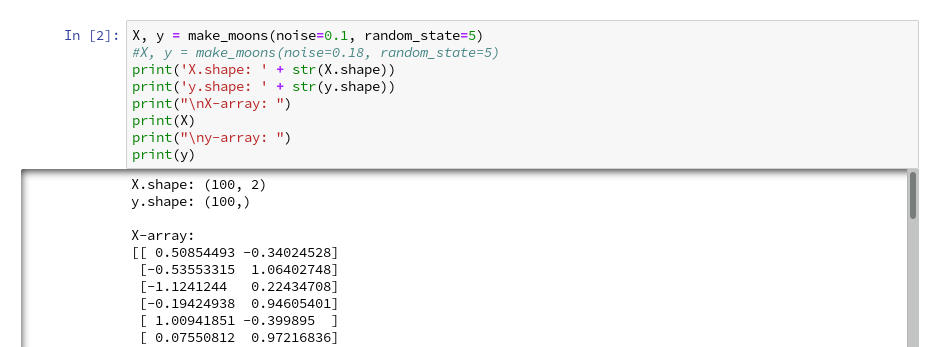
It is common use to assign an uppercase letter “X” to the input data points and a lowercase letter to the array with the classification information (per data point) – i.e. the target vector “y“.
The function “make_moons()” creates such an input array “X” of 2-dim data points and an associated target array “y” with classification information for the data points. In our case the classification is binary, only; so we get an array with “0”s or “1”s for each point.
This basic (X,y)-structure of data is very common in classification tasks of ML – at its core it represents the information reduction: “multiple features” => “member of a class”.
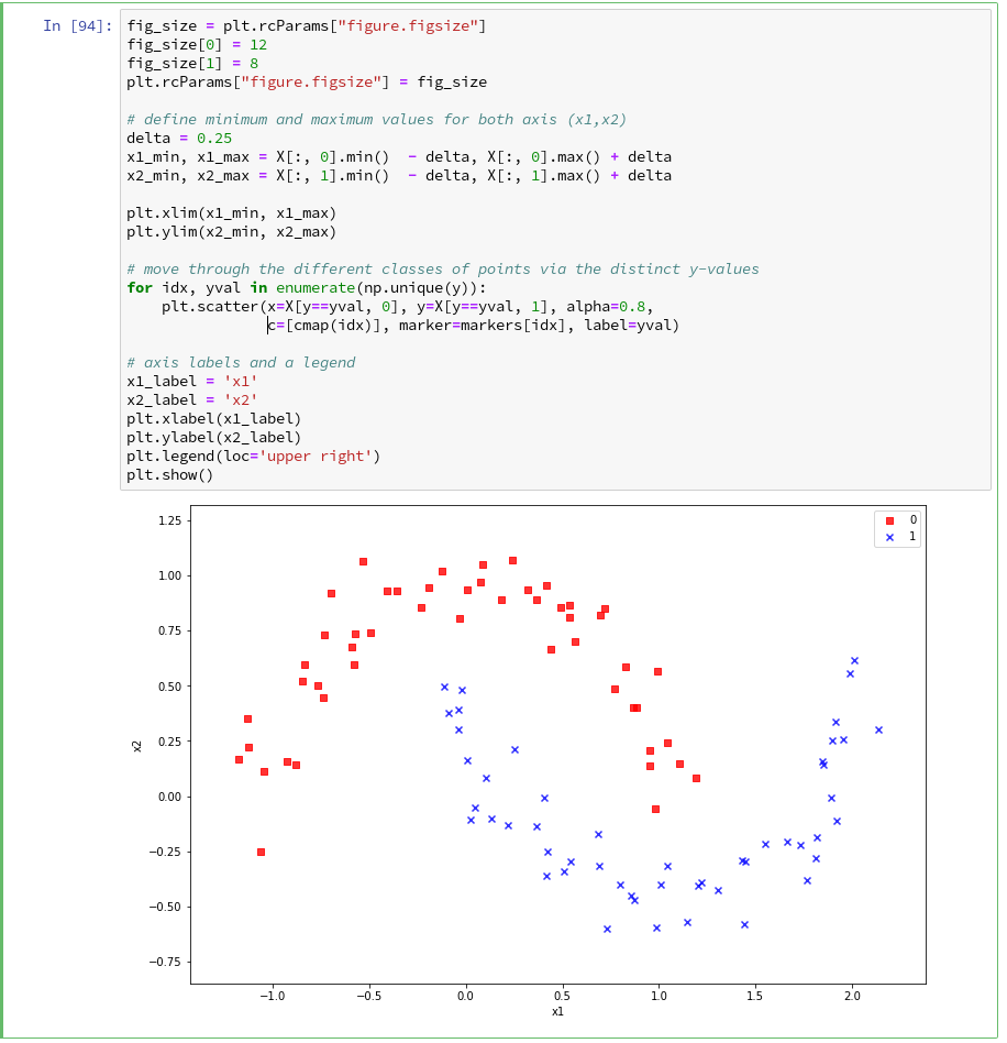
Scatter-plots: Plotting the raw data in 2D and 3D
We want to create a visual representation of the data points in their 2-dim feature space. We name the two elements of a data point array “x1” and “x2”.
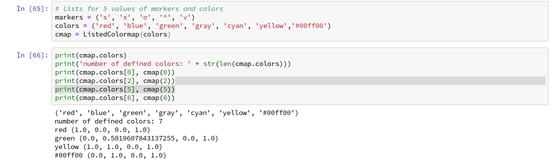
For a 2D-plot we need some symbols or “markers” to distinguish the different data points of our 2 classes. And we need at least 2 related colors to assign to the data points.
To work efficiently with colors, we create a list-like ColorMap-object from given color names (or RGB-values); see ListedColormap. We can access the RGBA-values from a ListedColormap by just creating it as a “list” with an integer index, i.e.:
colors= ('red', 'green', 'yellow')
cmap=ListedColormap(colors)
print(cmap(1)) // gives: (0.0, 0.5019607843137255, 0.0, 1.0)
print(cmap(1)) // gives: (0.0, 0.5019607843137255, 0.0, 1.0)
All RGBA-values are normalized between 0.0 and 1.0. The last value defines an alpha-opacity. Note that “green” in matplotlib is defined a bit strange in comparison to HTML.
Let us try it for a list (‘red’, ‘blue’, ‘green’, gray’, ‘yellow’, ‘#00ff00’):
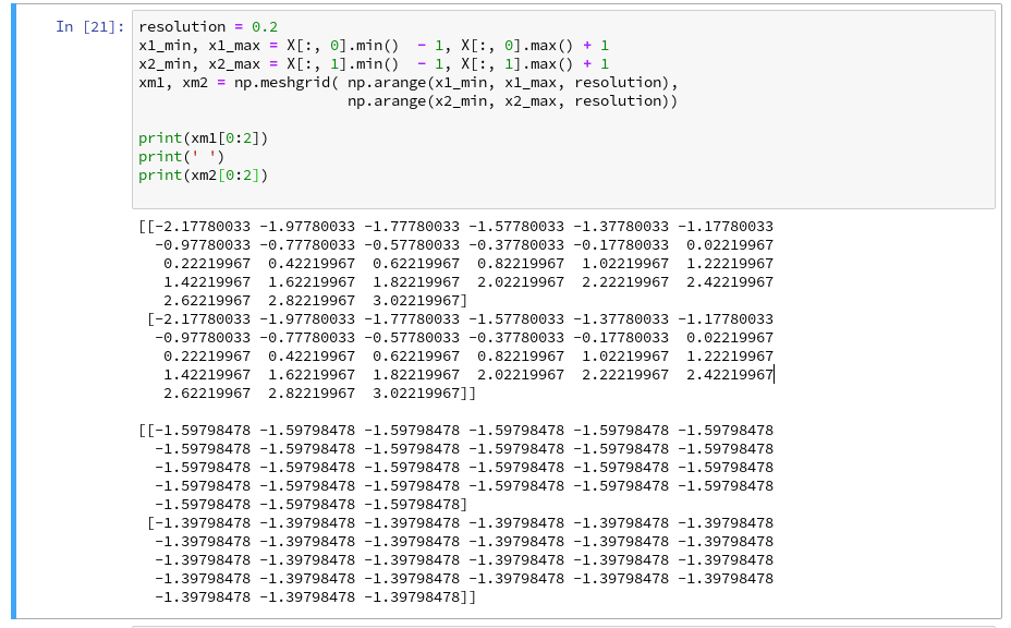
The lower and upper limits of the the two axes must be given. Note that this sets the size of the region in our representation space which we want to analyze or get predictions for later on. We shall make the region big enough to willingly cover points outside the defined clusters. It will be interesting to see how an algorithm extrapolates its knowledge learned by training on the input data to regions beyond the
training area.
For the purpose of defining the length of the axes we can use the plot functions pyplot.xlim() and pyplot.ylim().
The central function, which we shall use for plotting data points in the defined area of the (x1,x2)-plane, is “matplotlib.pyplot.scatter()“; see the documentation scatter() for parameters.
Regarding the following code, please note that we plot all points of each of the two moon like cluster in one step. Therefore, we call scatter() exactly two times with the for-loop defined below:
In the code you may stumble across the defined lists there with expressions included in the brackets. These are examples of so called Python “list comprehensions”. You find an elementary introduction here.
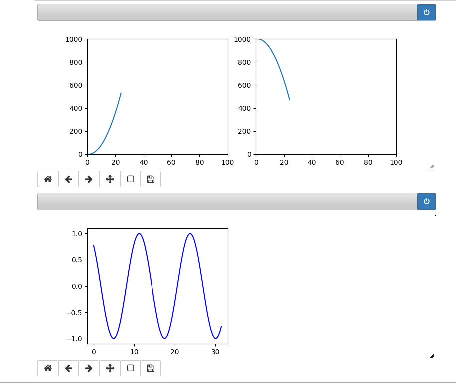
As we are have come so far, lets try a 3D-scatter-plot, too. This is not required to achieve our objectives, but it is fun and it extends our knowledge base:
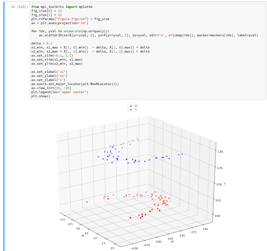
Of course all points of a class are placed on the same level (0 or 1) in z-direction. When we change the last statement to “ax.view_init(90, 0)”. We get
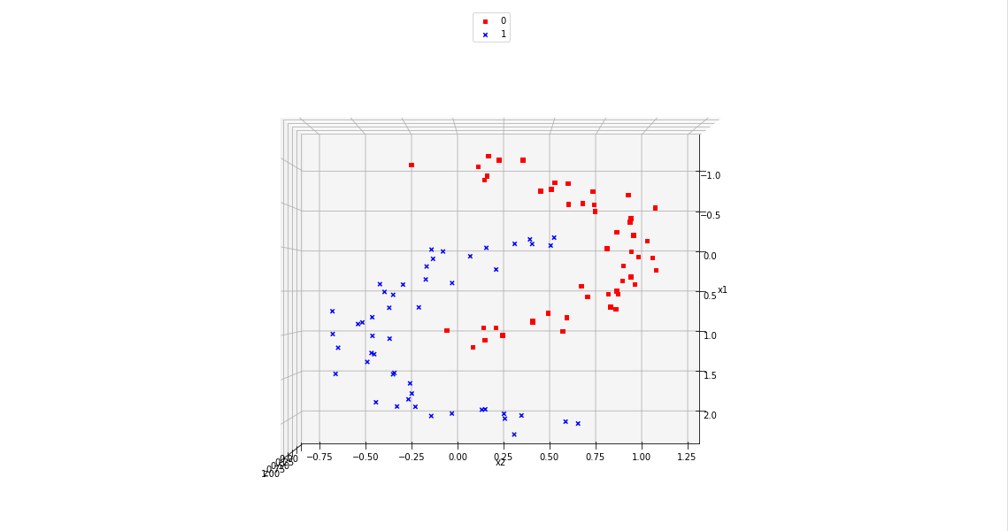
As expected 🙂 .
Analyzing the data with the help of a “pipeline” and “LinearSVC” as an SVM classificator
Sklearn provides us with a very nice tool (actually a class) named “Pipeline“:
Pipeline([]) allows us
- to define a series of transformation operations which are successively applied to a data set
- and to define exactly one predictor algorithm (e.g. a regression or classifier algorithm), which creates a model of the data and which is optimized later on.
Transformers and predictors are also called “estimators“.
“Transformers” and “predictors” are defined by Python classes in Sklearn. All transformer classes must provide a method ” fit_transform()” which operates on the (X,y)-data; the predictor class of a class provides a method “fit()“.
The “Pipeline([])” is defined via rows of an array, each comprising a tuple with a chosen name for each step and the real class-names of the transformers/predictor. A pipeline of transformers and a predictor creates an object with a name, which also offers the method “fit()” (related to the predictor algorithm).
Thus a pipeline prepares a data set(X,y) via a chain of operational steps for training.
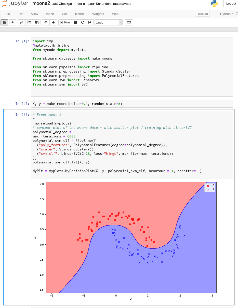
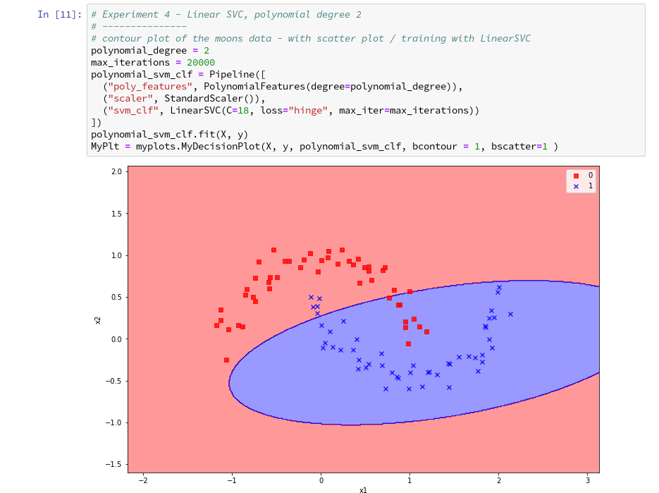
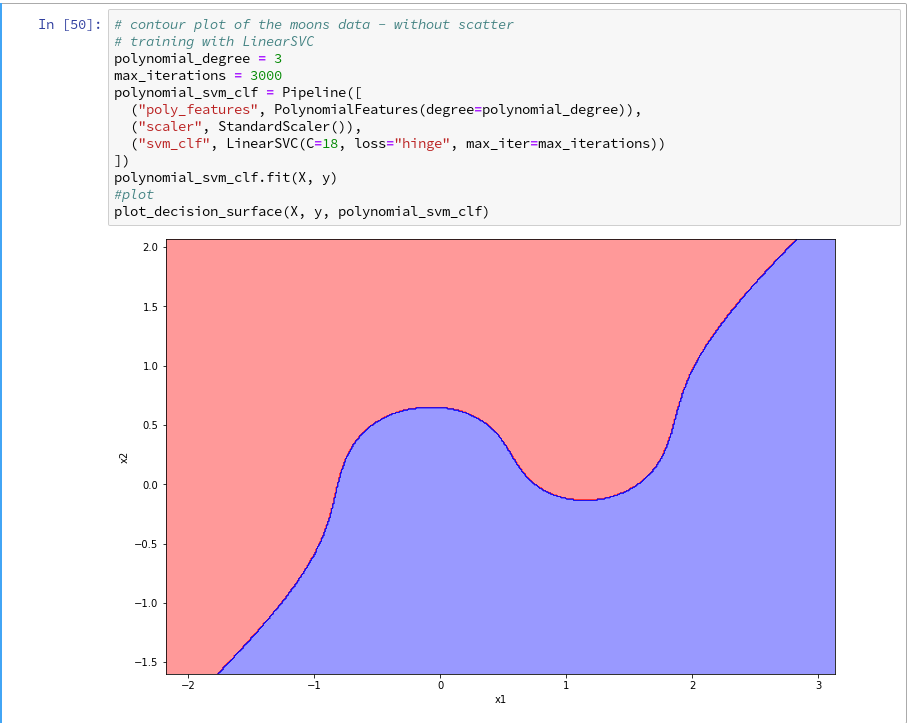
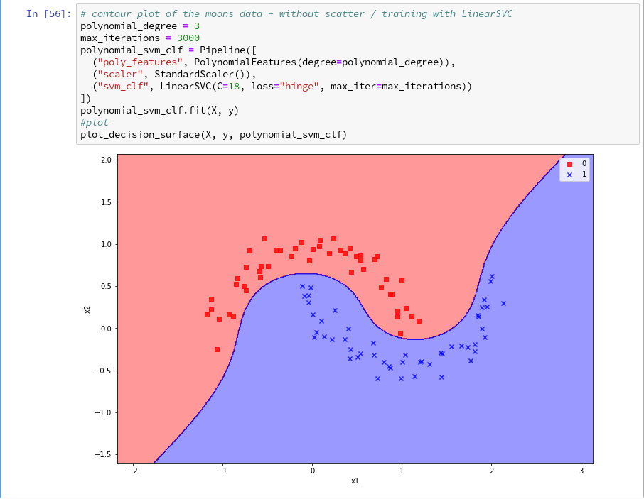
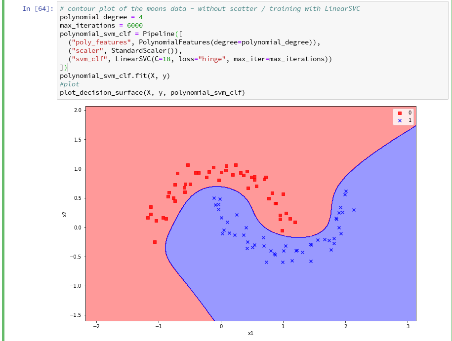
This sounds complicated, but is actually pretty easy to use. How does such a pipeline look like for our moons dataset? One possible answer is:
polynomial_svm_clf = Pipeline([
  ("poly_features", PolynomialFeatures(degree=3)),
  ("scaler", StandardScaler()),
  ("svm_clf", LinearSVC(C=18, loss="hinge", max_iter=3000))
])
polynomial_svm_clf.fit(X, y)
The transformers obviously are “PolynomialFeatures” and ”
StandardScaler“, the predictor is “LinearSVC” which is a special linear SVM method, trying to find a linear separation channel between the data in their representation space.
The last statement
polynomial_svm_clf.fit(X, y)
starts the training based on our pipeline – with its algorithm.
PolynomialFatures
What is “PolynomialFeatures” in the first step of our Pipeline good for? Well, looking at the moons data plotted above, it becomes quite clear that in the conventional 2-dim space for the data points in the (x1, x2)-plane there is no linear decision surface. Still, we obviously want to use a linear classification algorithm …. Isn’t this a contradiction? What can be done about the problem of non-linearity?
In the first article of this series I briefly discussed an approach where data, which are apparently not linearly separable in their original representation space, can be placed into an extended feature space. For each data point we add new “features” by defining additional variables consisting of polynomial combinations of the points basic X-coordinates. We do this up to a maximum degree, namely the order of a polynomial function – e.g. T(x1,x2) = x1**3 + a* x1**2*x2 + b*x1*x2**2 + c*x1*x2 + x2**3.
Thereby, the dimensionality of the original X(x1,x2) set is extended by multiple further dimensions. Each data point is positioned in the extended feature space by a defined transformation T.
Our hope is that we can find a linear separation (“decision”) surface in the new extended multi-dimensional feature space.
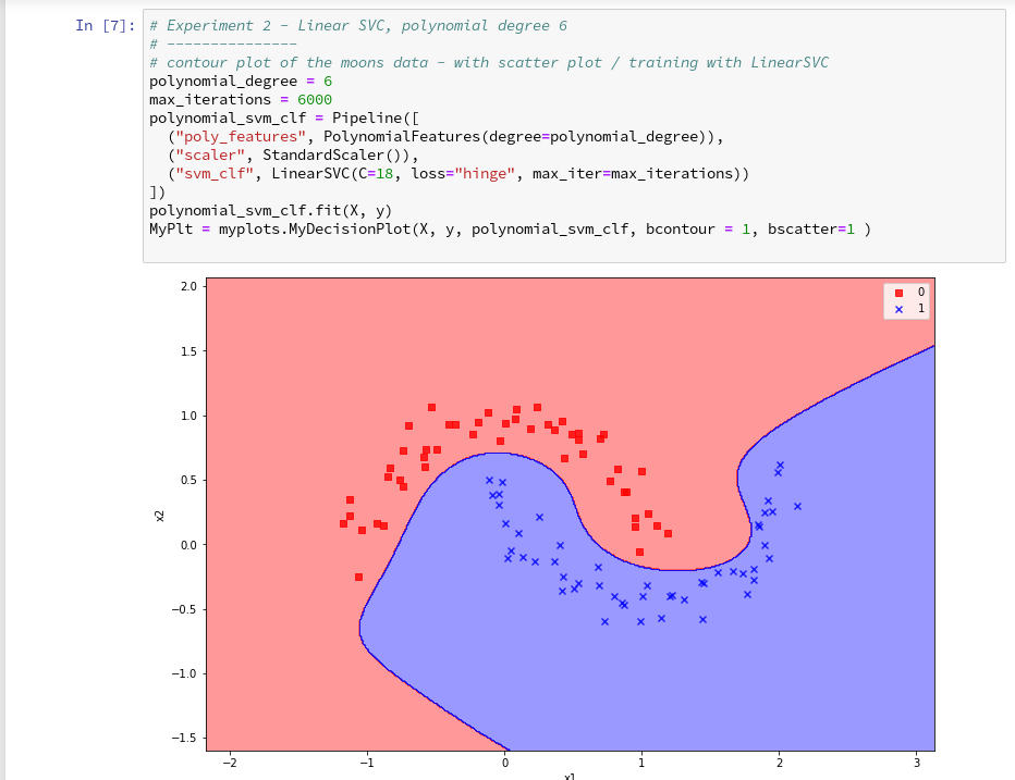
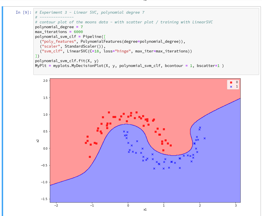
The first step of our Pipeline enhances our X by additional and artificial polynomial “features” (up to a degree of 3 in our example). We do not need to care for details – they are handled by the class “PolynomialFeatures”. The choice of a polynomial of order 3 is a bit arbitrary at the moment; we shall play around with the polynomial degree in a future article.
StandardScaler
The second step in the Pipeline is a simple one: StandardScaler.fit_transform() scales all data such that they fit into standard ranges. This helps both for e.g. linear regression- and SVM-analysis.
The predictor LinearSVC
The third step assigns a predictor – in our example a simple linear SVM-like algorithm. It is provided by the class LinearSVC (a linear soft margin classificator). See e.g
support-vector-machine-algorithm/,
LinearSVC vs SVC,
www.quora.com : What-is-the-difference-between-Linear-SVMs-and-Logistic-Regression.
The basic parameters of LinearSVC, as the number of iterations (3000) to find an optimal solution and the width “C” for the separation channel, will also be a subject of further experiments.
Analyzing the moons data and fitting the LinearSVC algorithm
Let us apply our pipeline and predict for some data points outside the X-region whether they belong to the “red” or the “blue” cluster. But, how do we predict?
We are not surprised that we find a method predict() in the documentation for our classifier algorithm; see LinearSVC.
So:
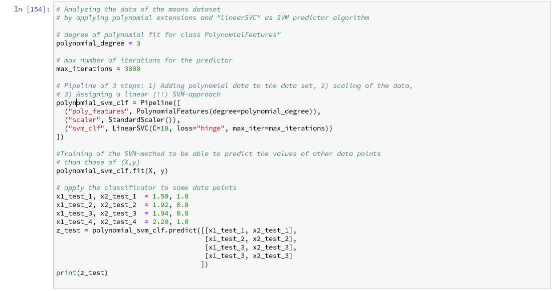
We get for the different test points
[x1=1.50, x2=1.0] => 0
[x1=1.92, x2=0.8]
=> 0
[x1=1.94, x2=0.8] => 1
[x1=2.20, x2=1.0] => 1
Looking at our scatter plot above we can assume that the decision line predicted by LinearSVC moves through the right upper corner of the (x1,x2)-space.
However and of course, looking at some test data points is not enough to check the quality of our approach to find a decision surface. We absolutely need to plot the decision surface throughout the selected region of our (x1,x2)-plane.
Conclusion
But enough for today’s session. We have seen, how we can produce a scatter plot for our moons data. We have also learned a bit about Sklearn’s “pipelines”. And we have used the classes “PolynomialFeatures” and “LinearSVC” to try to separate our two data clusters.
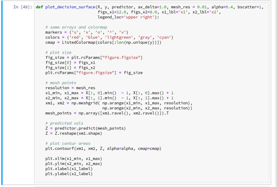
By now, we have gathered so much knowledge that we should be able to use our predictor to create a contour plot – with just 2 contour areas in our representation space. We just have to apply the function contourf() discussed in the second article of this series to our data:
If we cover the (x1,x2)-plane densely and associate the predicted values of 0 or 1 with colors we should clearly see the contour line, i.e. the decision surface, separating the two areas in our contour plot. And hopefully all data points of our original (X,y) set fall into the right region. This is the topic of the next article
The moons dataset and decision surface graphics in a Jupyter environment – IV – plotting the decision surface
Stay tuned.
Links
Understanding Support Vector Machine algorithm from examples (along with code) by Sunil Ray
Stackoverflow – What is exactly sklearn-pipeline?
LinearSVC