During the last articles of this mini-series
Eclipse, PyDev, virtualenv and graphical output of matplotlib on KDE – I
Eclipse, PyDev, virtualenv and graphical output of matplotlib on KDE – II
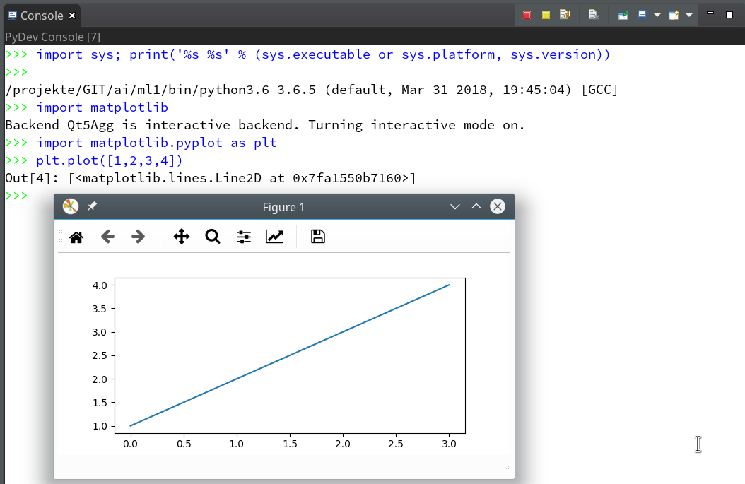
we saw how to set up a basic PyDev project in Eclipse which we coupled to a virtual Python environment. We modified the PYTHONPATH and added Python packages to our project with the help of “pip”. In addition we have prepared the PyDev console for interactive Python experiments such that we can use matplotlib in a Qt5 environment. Thus we got a reasonably equipped development environment to start with Python based experiments in “Machine-Learning” [ML] – and build up code much more systematically than just with Jupyter notebooks.
One thing that we expect from an IDE (besides editors and code organization) is a possibility of debugging complicated Python modules and classes. So, in the final article of this series we shall have a brief look at (local) debugging of Python code within PyDEV. To set up a remote debugging server for any clients of our Linux machine is no major problem – but it is beyond the scope of this article.
As with the previous articles experienced Python and PyDev developers won’t learn anything new. My target group is students of ML and people intrested in Python who have some experience with other programming languages.
A “stupid” test example
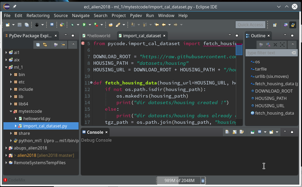
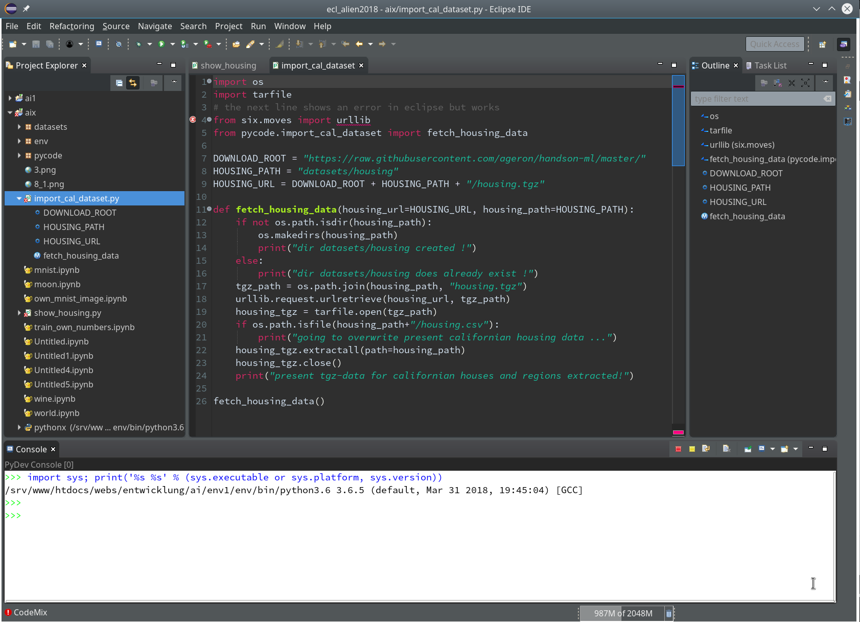
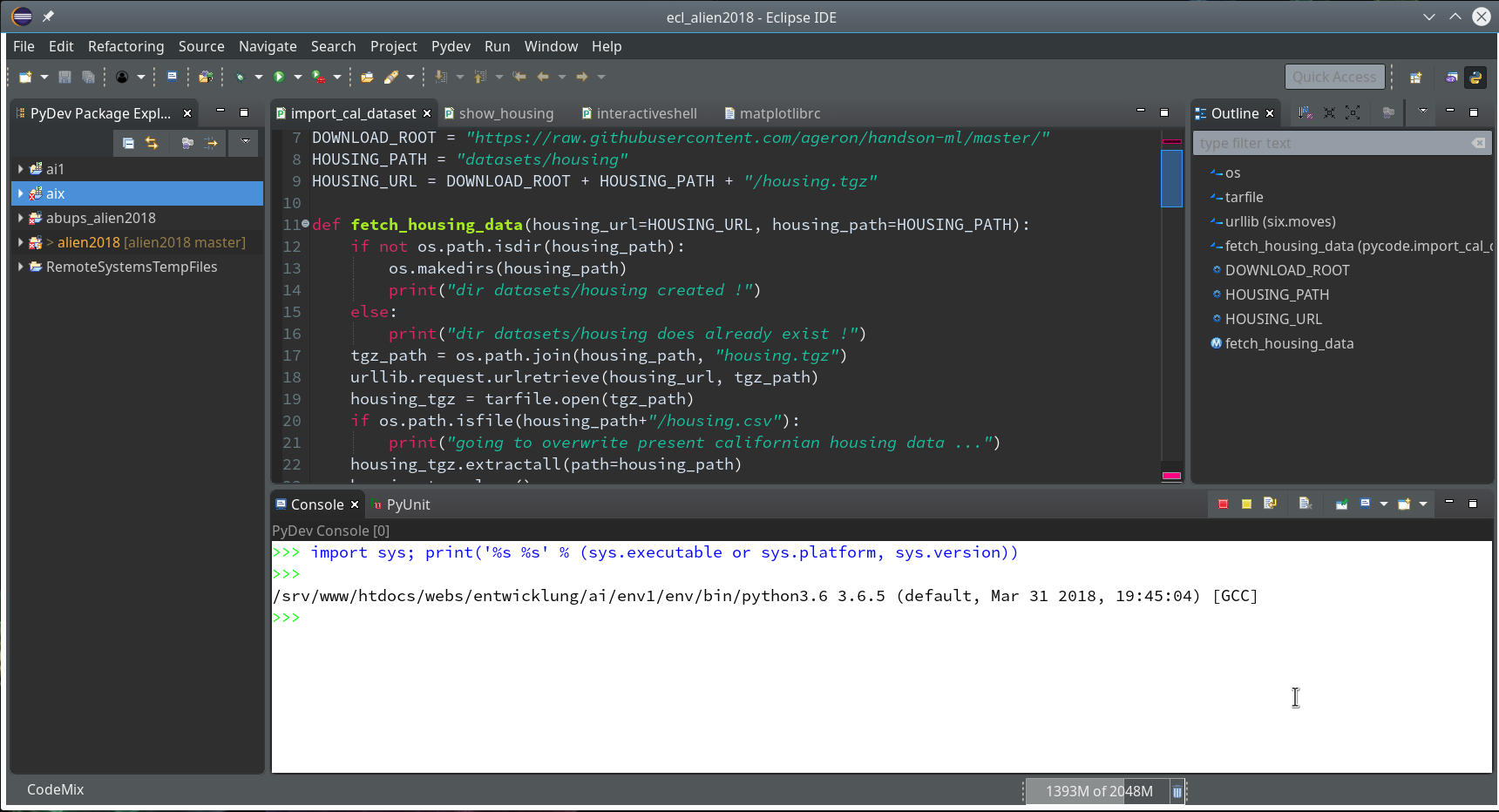
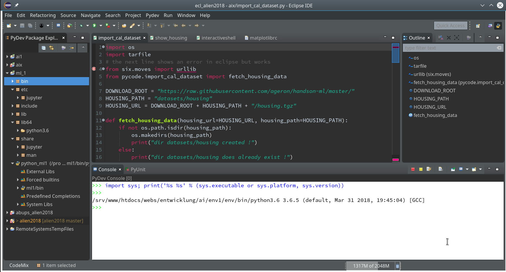
We need a simple test code example to learn working with the debugging features of PyDev. We open our Eclipse installation and change to the PyDev perspective.
Watch out for the activated symbol at the right upper corner – here a list of different perspectives (which you have used recently) are displayed.
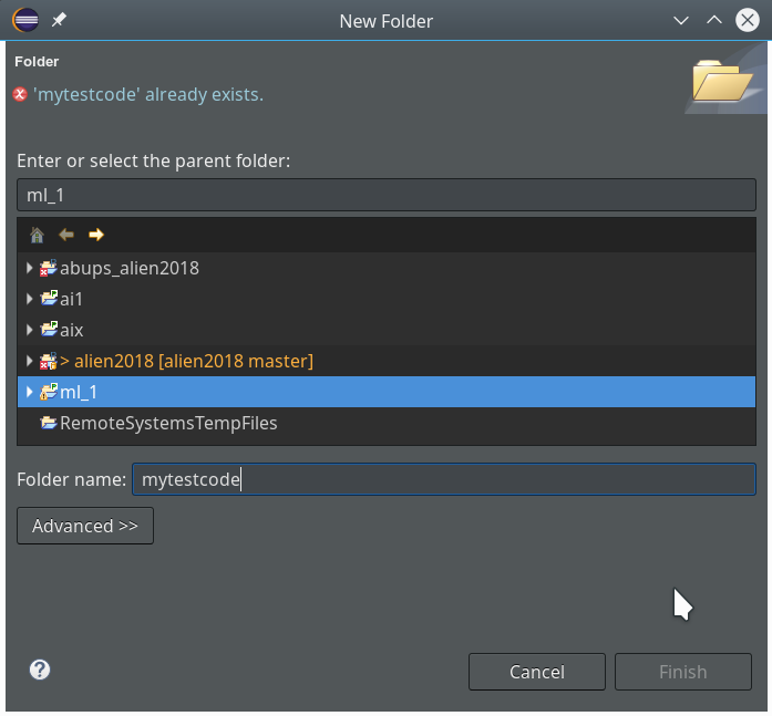
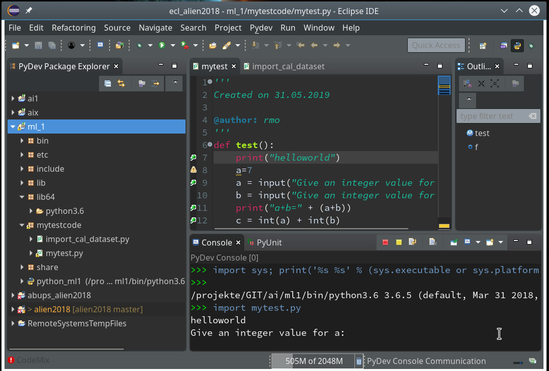
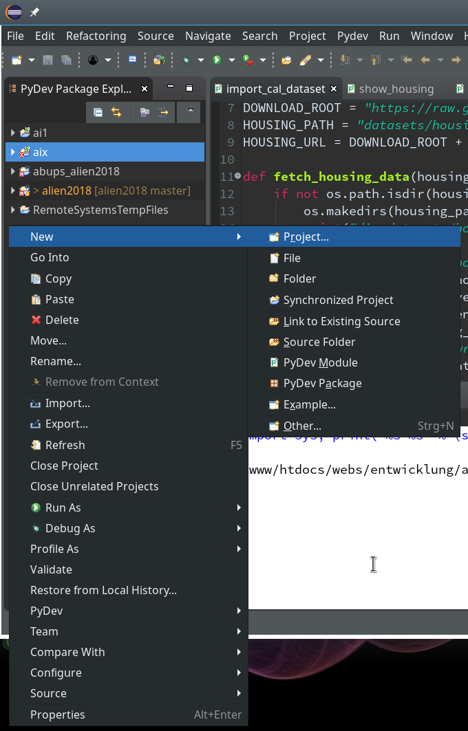
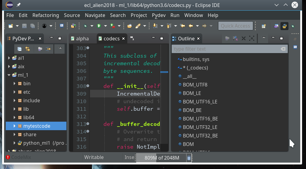
During the last article we had (within the PyDev-Explorer) already created a directory “mytestcode” below our basic project “ml_1”. By default settings of the PyDev environment, actually, we have created not only a directory but a so called Python “package” – which is a collection of modules that have a common context and should be delivered together. (You find more about “modules” and “packages” in any reasonable book on Python).
Now we add a (test) module – i.e. a file with some Python code – to our “package”.
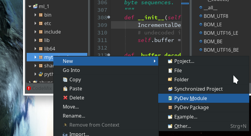
In the next window (not shown we provide a name (without a “.py”-ending), e.g. “stupid” and in the subsequent window we choose a Template of type “<Empty>”. All these actions lead to the creation of a Python file “stupid.py” for which the Python editor of PyDev is opened:
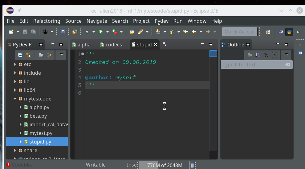
Here we enter some “stupid” code:
def
test(x=-1, y=-1):

    print("\nhelloworld: let us multiply and divide two POSITIVE INTEGERS < 10")
    if (x < 0):
        a = input("Give an integer value for a: ")
    else:
        a = x
    if (y < 0):
        b = input("Give an integer value for b: ")
    else:
        b = y
    print("a =" + a + ", b = " + b)

    if (a > 10):
        a=0
    if (b > 10):
        b=0

    c = int(a) * int(b)
    print("c=" + str(c))

    d = int(a) / int(b)
    print("d = " + str(d))
    return [c, d]
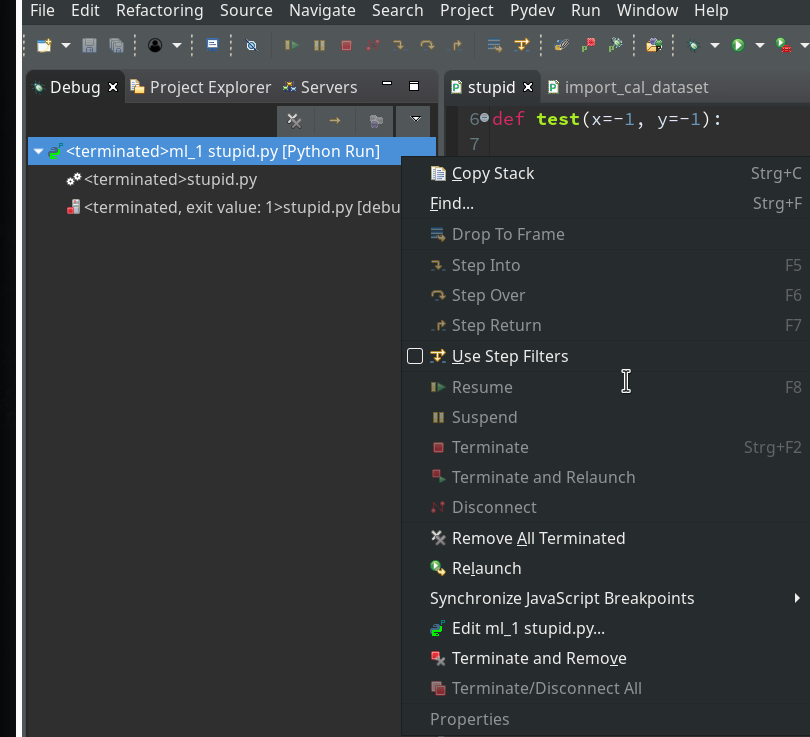
Of course, you see already traps and lines doomed for failure; some of these traps we want to explore below by debugging :-). Debug As >> Other >> Python Run
By the way, we see a major disadvantage of the Eclipse environment (which does not only affect PyDEV): With “Oxygen” the outline view missed its capability to analyze beyond the first level of the code’s node hierarchy.
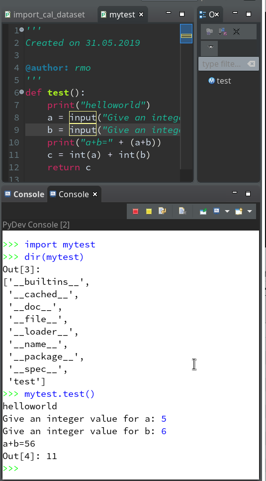
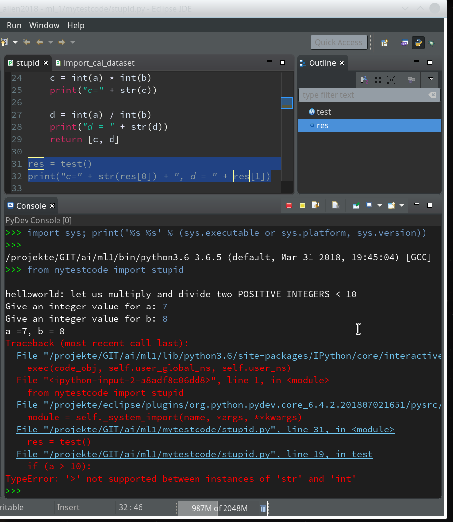
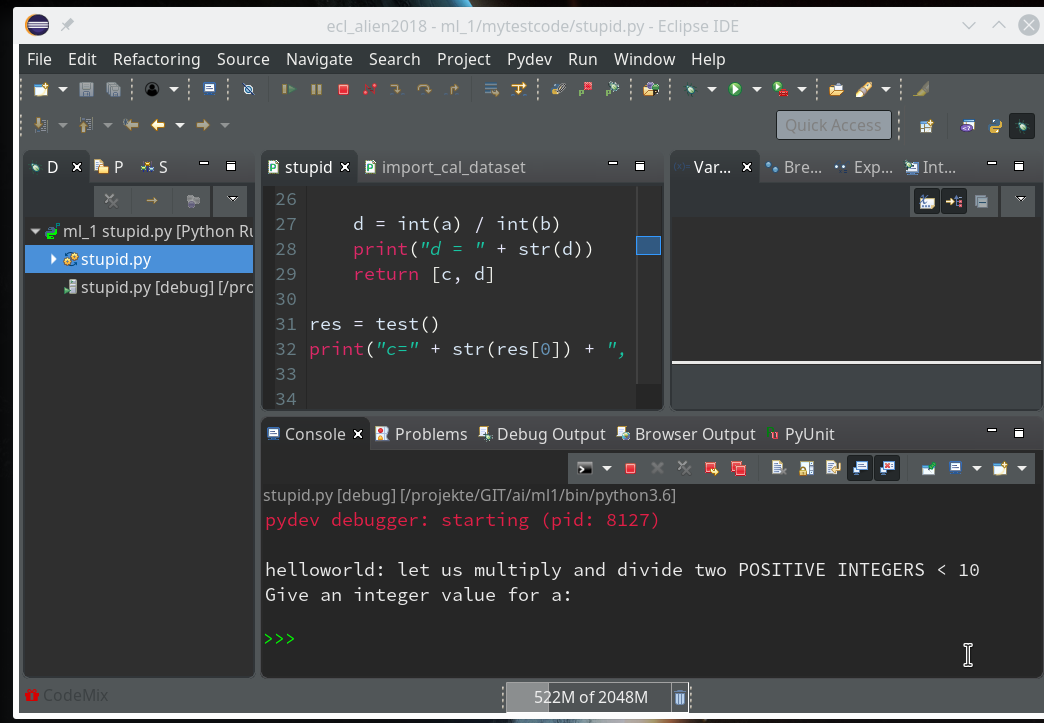
Our code does not contain any direct executable commands. We add 2 lines to be able to run it as a “Python Run” at the Python prompt of a console.
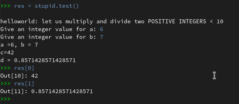
res = test()
print("c=" + str(res[0]) + ", d = " + res[1])
After this you may notice that the variable re is now displayed in the “outline view”.
Preparing debugging
Lets try to run our code:
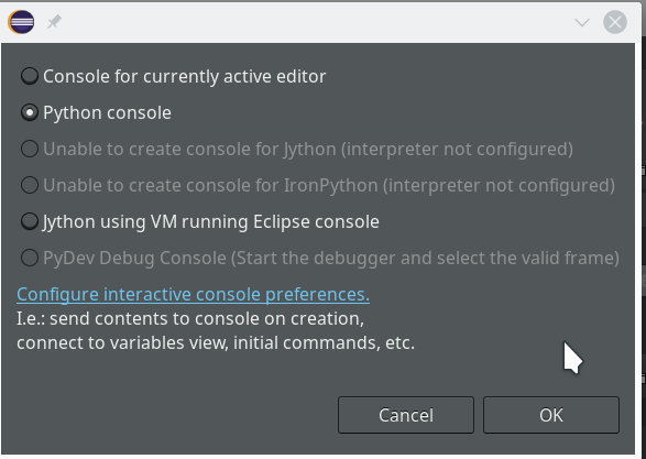
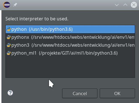
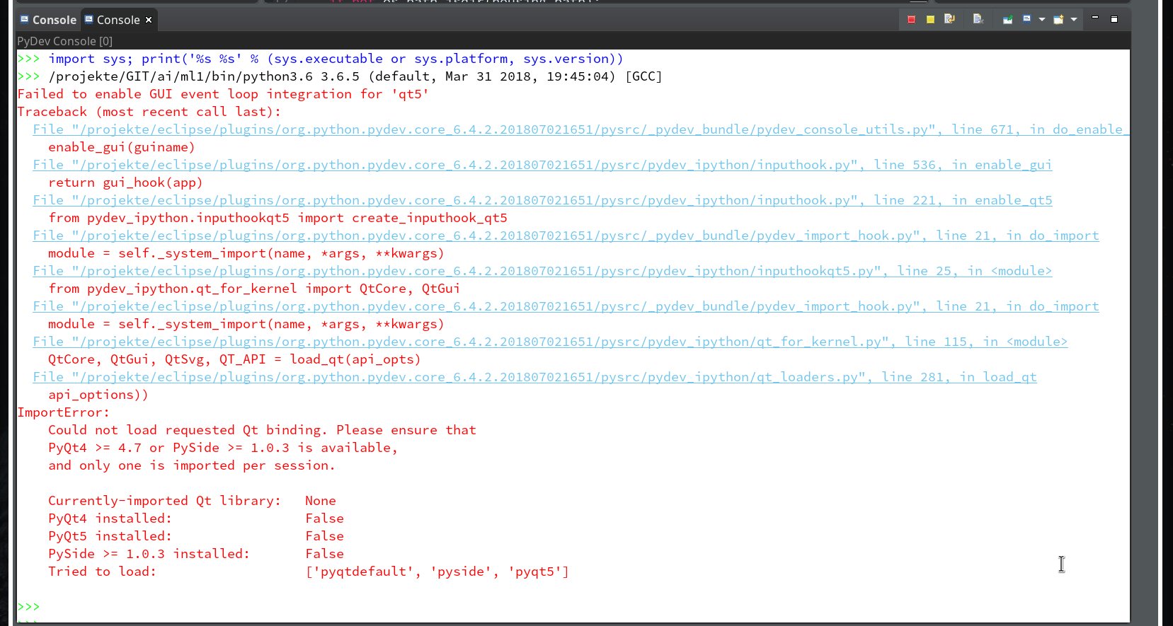
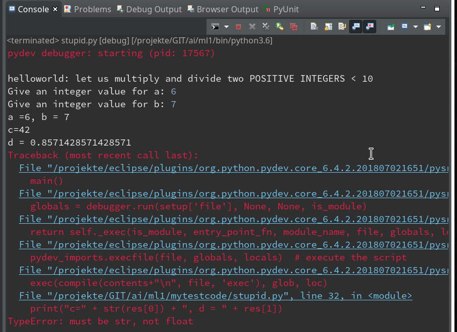
Within the PyDev perspective we open a PyDev console for the interpreter of our virtualenv “ml1” (see the last article about how to do this). There we “import” our “stupid” code and answer the questions by typing in values for the variables a, b and pressing “Enter” each time. We end up with a first error message:
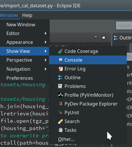
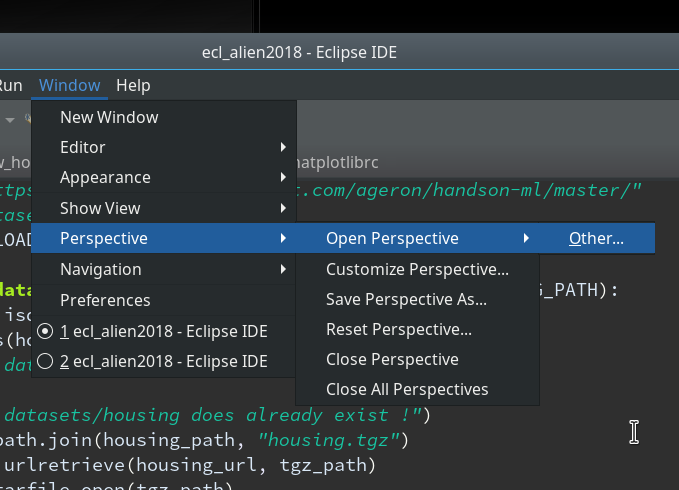
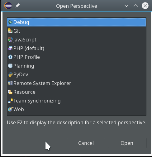
Not unexpected. Ok, lets turn to debugging. Eclipse offers us a special “perspective” which supports debugging. We open it by using the menu “Window >> Perspective >> Open perspective >> Other…“.
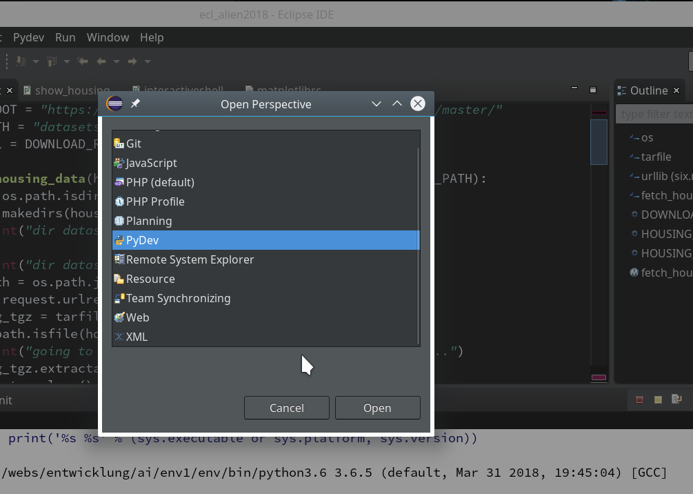
In the next window we choose “Debug”:
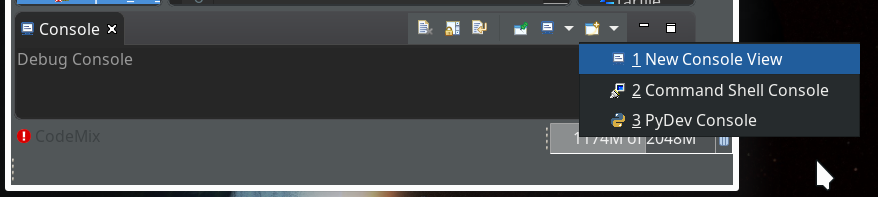
This leads to a change of the screen layout. The console view shows in the lower part of the screen that we have opened a “Debug console”. (You will see this in some of the following pictures).
There are a lot of new buttons available in the icon bar at the top. One in the middle shows a picture of a “bug” with an arrow besides it: obviously, there are options in what way to debug.
We now first click into our editor window for the “stupid” code and then on the arrow besides the “bug” button; you get something like this:
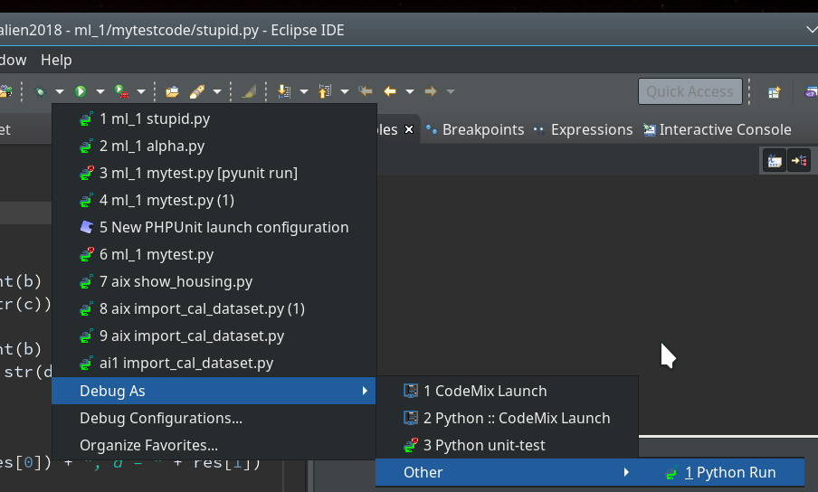
In my case there is a long list of previous debug runs.
However, in your case the list may be empty as you may never have launched any debug runs before.
As indicated in the screenshot you choose “Debug As >> Other >> Python Run” and click.
Unfortunately, the console view will now display an error message regarding “cython speedups”; this may look similar to the following:
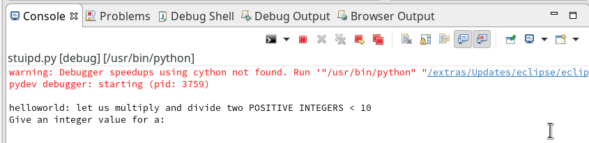
I took the screen shot from another fresh installation – without a virtual Python environment… So the details of the message (especially the path to the interpreter) may look differently.
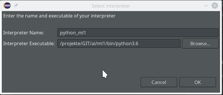
When I set up my PyDev environment with my virtualenv “ml1” the actual recommendation was to run the command
"/projekte/GIT/ai/ml1/bin/python3.6" "/projekte/eclipse/plugins/org.python.pydev.core_6.4.2.201807021651/pysrc/setup_cython.py" build_ext --inplace
The double quotes around the first 2 parts of the command are important in some command environments! On a Linux command console they do not do any harm.
The reason for this command is that we need to compile and install some additional cython related c-programs to get the “speedups” mentioned in the error message. It is not necessary to understand the details of this in our context.
What you have to do now is to start a Linux terminal window. There you move to the directory of your virtual Python environment – in my case to “/projekte/GIT/ai/ml1”. There you launch the command “source bin/activate” to activate the “virtualenv” with its interpreter.
Then you enter the following commands – Do NOT forget to activate the virtualenv “ml1” with the second command !
myself@mytux:~> cd /projekte/GIT/ai/ml1/
myself@mytux:/projekte/GIT/ai/ml1> source bin/activate
(ml1) myself@mytux:/projekte/GIT/ai/ml1> "/projekte/GIT/ai/ml1/bin/python3.6" "/projekte/eclipse/plugins/org.python.pydev.core_6.4.2.201807021651/pysrc/setup_cython.py" build_ext --inplace
running build_ext
building '_pydevd_bundle.pydevd_cython' extension
creating build
creating build/temp.linux-x86_64-3.6
creating build/temp.linux-x86_64-3.6/_pydevd_bundle
gcc -pthread -Wno-unused-result -Wsign-compare -DNDEBUG -fmessage-length=0 -grecord-gcc-switches -O2 -Wall -D_FORTIFY_SOURCE=2 -fstack-protector-strong -funwind-tables -fasynchronous-unwind-tables -fstack-clash-protection -g -DOPENSSL_LOAD_CONF -fwrapv -fmessage-length=0 -grecord-gcc-switches -O2 -Wall -D_FORTIFY_SOURCE=2 -fstack-protector-strong -funwind-tables -fasynchronous-unwind-tables -fstack-clash-protection -g -fmessage-length=0 -grecord-gcc-switches -O2 -Wall -D_FORTIFY_SOURCE=2 -fstack-protector-strong -funwind-tables -fasynchronous-unwind-tables -fstack-clash-protection -g -fPIC -I/usr/include/python3.6m -c _pydevd_bundle/pydevd_cython.c -o build/temp.linux-x86_64-3.6/_pydevd_bundle/pydevd_cython.o
creating build/lib.linux-x86_64-3.6
creating build/lib.linux-x86_64-3.6/_pydevd_bundle
gcc -pthread -shared -flto -fuse-linker-plugin -ffat-lto-objects -flto-partition=none build/temp.linux-x86_64-3.6/_pydevd_bundle/pydevd_cython.o -L/usr/lib64 -lpython3.6m -o build/lib.linux-x86_64-3.6/_pydevd_bundle/pydevd_cython.cpython-36m-x86_64-linux-gnu.so
copying build/lib.linux-x86_64-3.6/_pydevd_bundle/pydevd_cython.cpython-36m-x86_64-linux-gnu.so -> _pydevd_bundle
running build_ext
building '_pydevd_frame_eval.pydevd_frame_evaluator' extension
creating build/temp.linux-x86_64-3.6/_pydevd_frame_eval
gcc -pthread -Wno-unused-result -Wsign-compare -DNDEBUG -fmessage-length=0 -grecord-gcc-switches -O2 -Wall -D_FORTIFY_SOURCE=2 -fstack-protector-strong -funwind-tables -fasynchronous-unwind-tables -fstack-clash-protection -g -DOPENSSL_LOAD_CONF -fwrapv -fmessage-length=0 -grecord-gcc-switches -O2 -Wall -D_FORTIFY_SOURCE=2 -fstack-protector-strong -funwind-tables -fasynchronous-unwind-tables -fstack-clash-protection -g -fmessage-length=0 -grecord-gcc-switches -O2 -Wall -D_FORTIFY_SOURCE=2 -fstack-protector-strong -funwind-tables -fasynchronous-unwind-tables -fstack-clash-protection -g -fPIC -I/usr/include/python3.6m -c _pydevd_frame_eval/pydevd_frame_evaluator.c -o build/temp.linux-x86_64-3.6/_pydevd_frame_eval/pydevd_frame_evaluator.o
creating build/lib.linux-x86_64-
3.6/_pydevd_frame_eval
gcc -pthread -shared -flto -fuse-linker-plugin -ffat-lto-objects -flto-partition=none build/temp.linux-x86_64-3.6/_pydevd_frame_eval/pydevd_frame_evaluator.o -L/usr/lib64 -lpython3.6m -o build/lib.linux-x86_64-3.6/_pydevd_frame_eval/pydevd_frame_evaluator.cpython-36m-x86_64-linux-gnu.so
copying build/lib.linux-x86_64-3.6/_pydevd_frame_eval/pydevd_frame_evaluator.cpython-36m-x86_64-linux-gnu.so -> _pydevd_frame_eval
(ml1) myself@mytux:/projekte/GIT/ai/ml1>
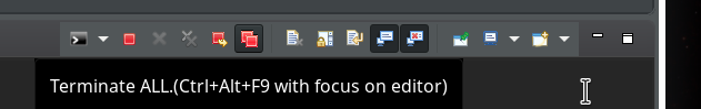
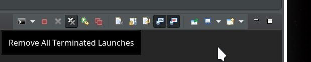
After this it is reasonable to restart Eclipse via the menu point “File >> Restart“. if you first want to clean up the started Debug runs you could first click on the double red square icon in the console view’s icon bar:
and afterward on the double “x”-icon:
If you looked a bit to the leftmost window “Debug” of the debug perspective during these actions, you would have seen some changes there :-). What you did was to forcefully terminate and remove all launched debug runs from the debug environment!
Then restart by “File >> Restart”. Your Eclipse application should automatically start again – with the perspective and files open that you last worked with.
Breakpoints
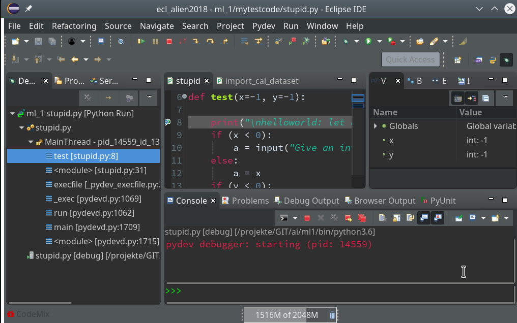
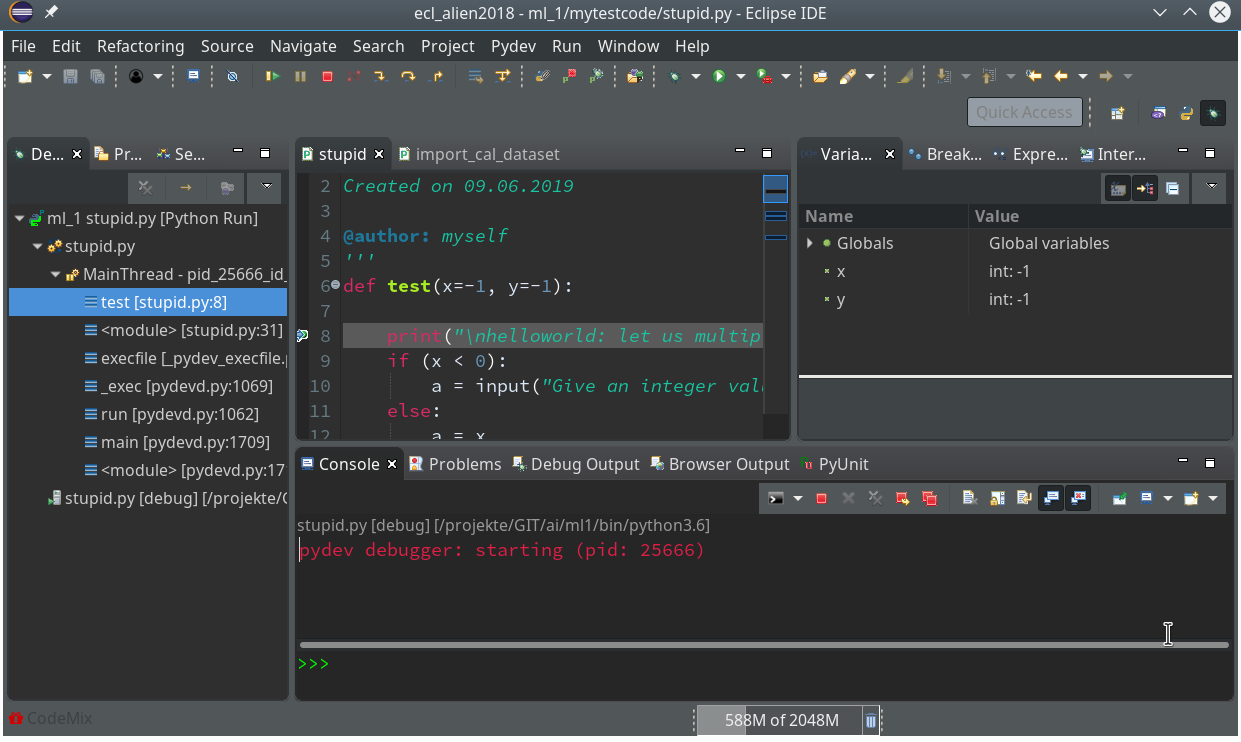
Now we again click into the editor window for “stupid.py” and move the mouse over the bug-like icon in the top icon bar
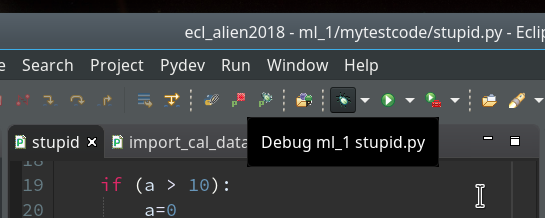
and click. Now you should get something like the following – without errors for the debugger:
Our program code has started automatically due to the first of our final two commands (“res=test()”).
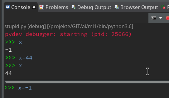
Note that the console has two parts – an upper one, where output from the code is shown and a lower part with a Python prompt.
The lower part is for interactive command execution during debugging. We ignore for the time being and only work in the upper part. This is, by the way, the area where the “input” command of Python prompts us to enter values.
There we enter 2 values for our variables a and b and … Of course, we run again into our first error. I have not displayed this as we would learn nothing new from it.
The reason, of course, is: We debugged without having set breakpoints before.
Setting breakpoints is fortunately easy: We move to our PyDev editor view. On the left side we see line numbers (if not: right click on the outer left border stripe of the editor view to get related options!). We right-click on the left side stripe of the line where we want to set a breakpoint to force a stop of the code execution there (i.e. before execution the line’s command).
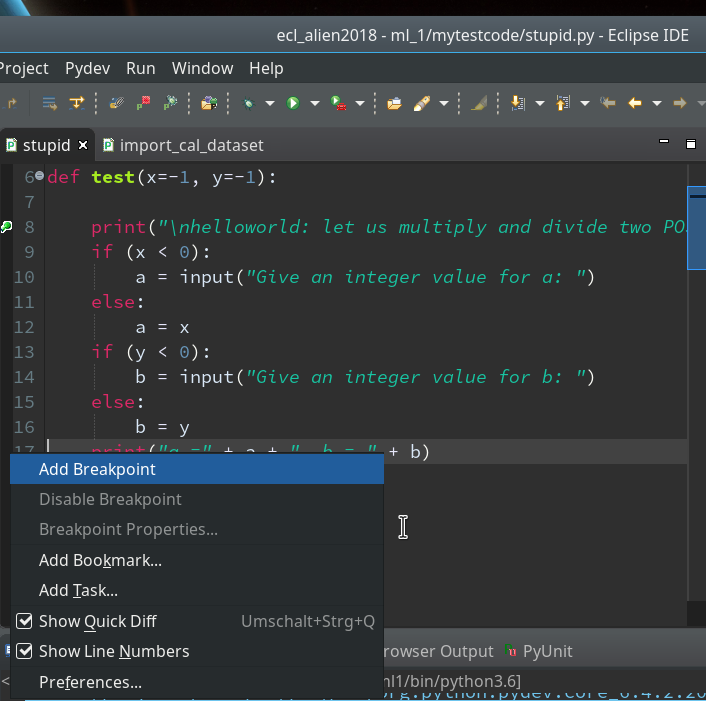
Hint: Setting and removing breakpoints can also be done by left double-clicking on the leftmost black stripe of the editor.
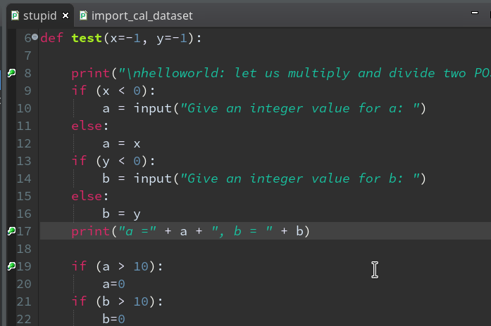
We add 3 breakpoints for a start – at line 8, 17 and 19 :
Debugging
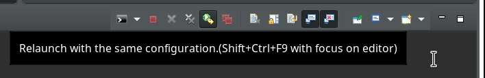
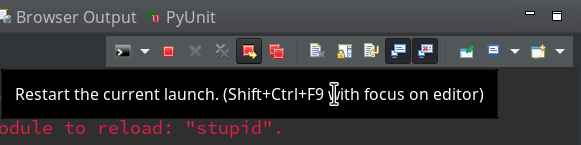
Our debugger should be in a state where we can just re-debug the present code. There are 2 possibilities for doing so: In the icon bar of the debug console view we can click on the green “Relaunch”-button:
Or you right-click on the relevant entry on the leftmost view on the last debug runs (which is only one right now) and choose the “Relaunch” option in the context menu:
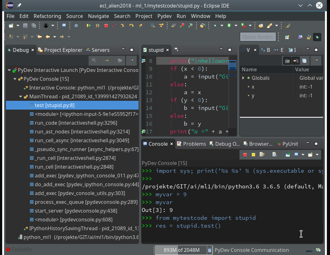
Code execution stops at our first breakpoint – the correspondent line gets marked in the editor; in the “Variables View” on the upper right we see the values of the variables (x, y) set so far:
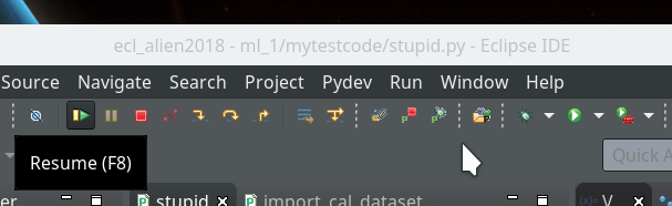
How to resume code execution?
This is where the different “player” icons in the top icon menu bar enter the game. You should explore these buttons in detail; for our introduction we just need the green “Resume“-button (and maybe also the red “Terminate“-button):
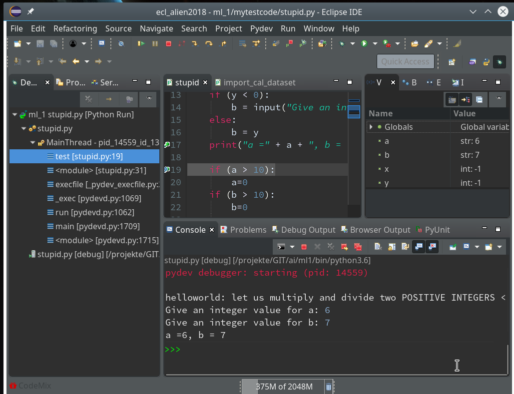
By clicking on the “Resume”-button code-execution is performed until the next break-point; we enter two integers for a and b again, and the code stops at line 17:
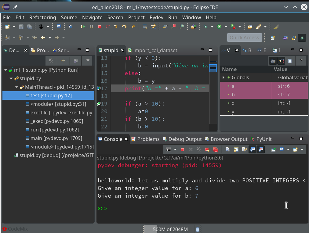
In the variables view we see now that a and b are strings! It is therefore that line 19 will produce an error – as we have learned before. We resume and end at line 19:
Resuming code execution now would again lead to an error. Let us, therefore, change the code, cast a, b to integers and save the modified file. However, this leads to an error message:
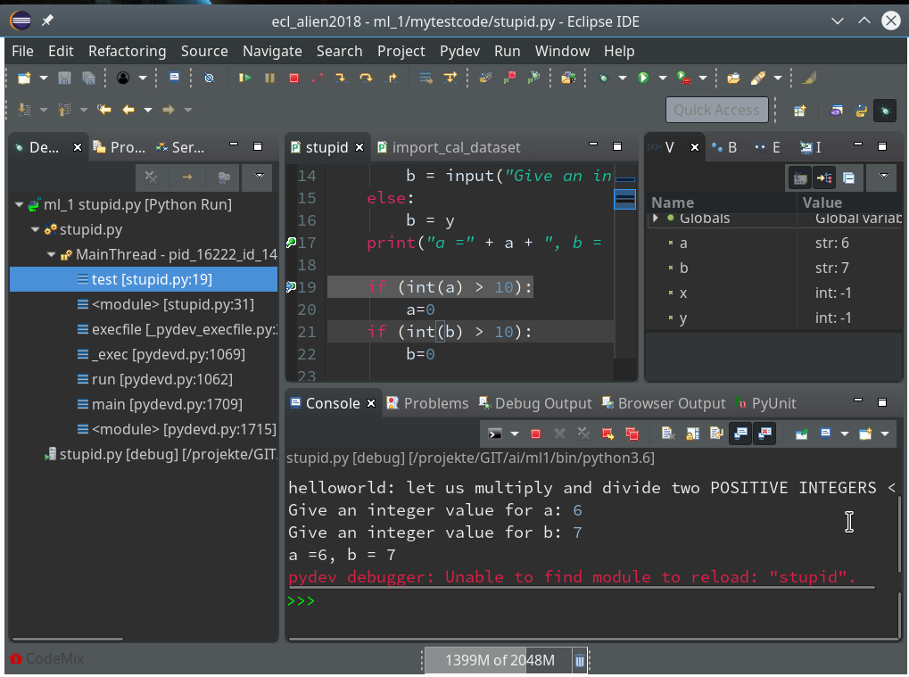
The debug environment lost track of our python code file.
Unfortunately, resuming now leads to our old error – despite the file changes:
Hint:
Whilst debugging as a Python run even reloading the “stupid”-module would not help.
Actually, what we do have to is to relaunch the whole debug process.
Whilst in an un-terminated debug session we can do this by simply pressing the red button with the yellow resume arrow:
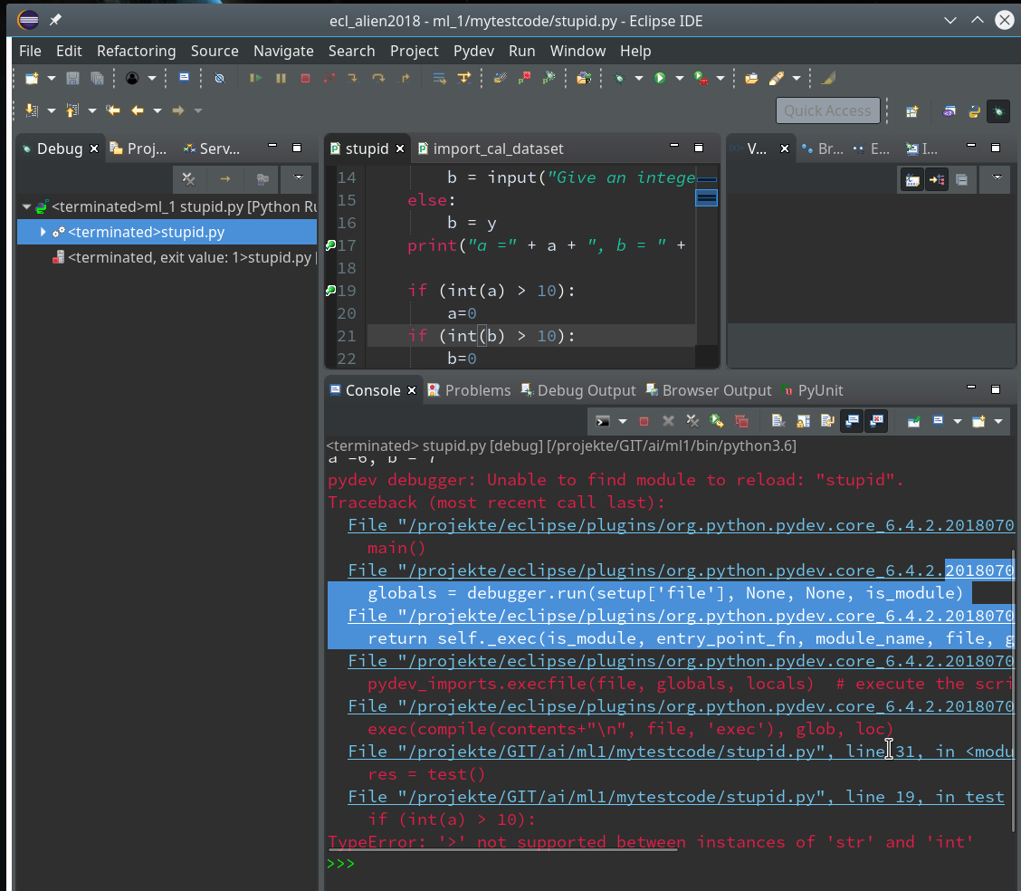
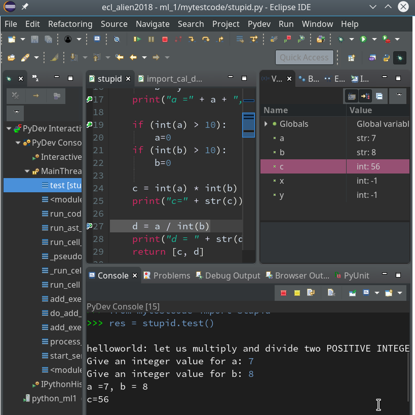
Doing so and moving from breakpoint to breakpoint leads again into trouble – however now at a different code line, namely the final one (line 32):
You know,of course, why. But the code of our function test() in between has worked flawlessly now.
Instead of adding another breakpoint or performing the necessary code change for the last line, we try a different way of debugging – namely by linking a standard PyDev console to the debugger.
To clean up our workspace we terminate and remove all running debug runs first. We could use the buttons of the debug console for it as we have learned it above. But this time you could also try and use the leftmost “Debug View” and right-click on the relevant run there to get an option “terminate and Remove”.
Connect a PyDev command console to Debug sessions
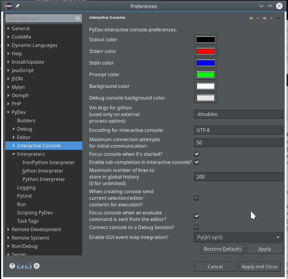
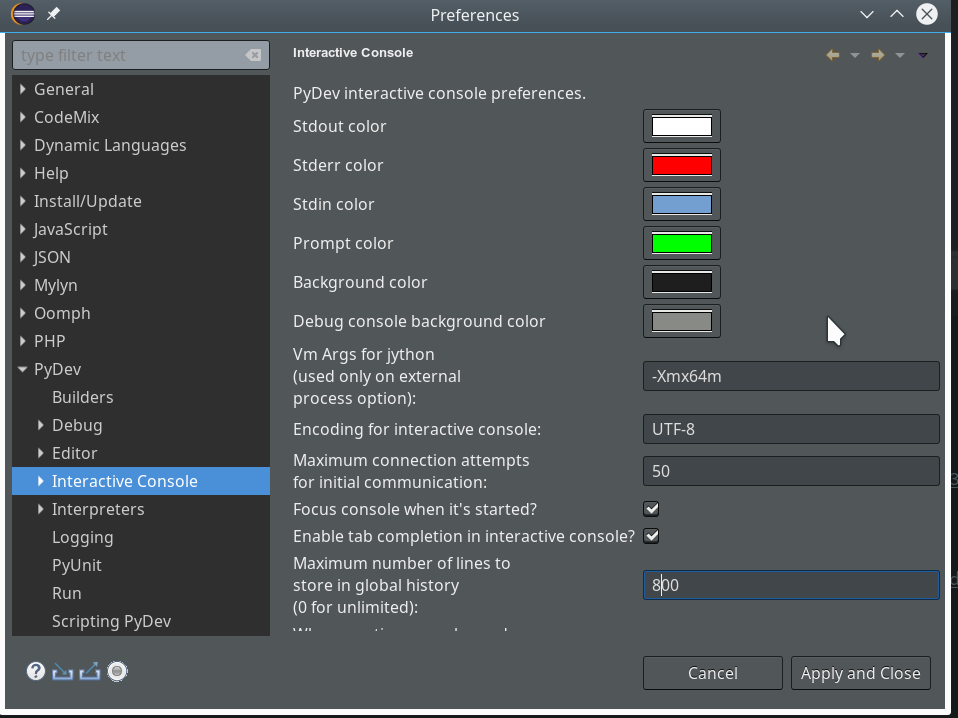
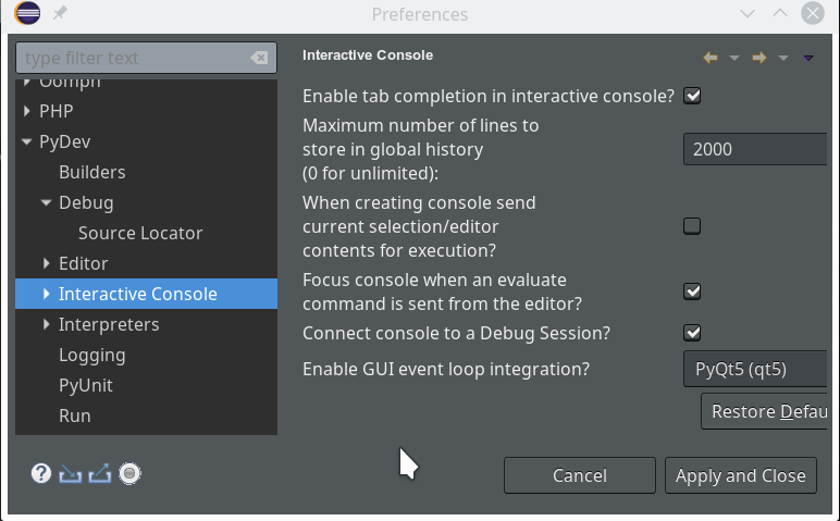
We open “Window >> Preferences >> PyDev >> Interactive Console” and activate the checkbox for the point “Connect Console to a debug session?”
Then we provoke a new error in our code at line 27 by changing it to:
d = a / int(b)
In addition we remove our last 2 lines
res = test()
print("c=" + str(res[0]) + ", d = " + res[1])
Thereby, importing module “stupid” in a console will NOT cause direct code execution 🙂 .
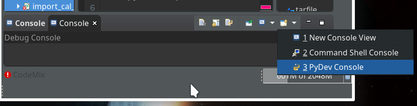
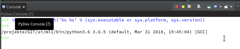
Let us start a PyDev console for the interpreter of our virtualenv (see the last article if you have forgotten how to do it). This gives us:
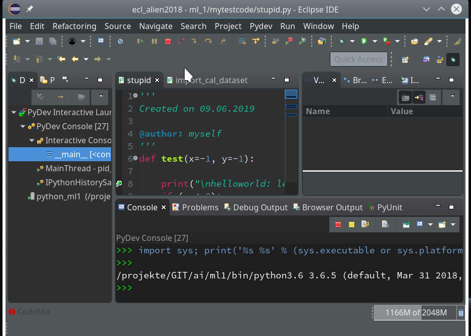
As expected we get a PyDev-console with a Python prompt.
The interesting thing, however, is indicated on the left screen side:
The entries in the “Debug View” show that we obviously started some debug run! Actually, our console is now part of a debugging session.
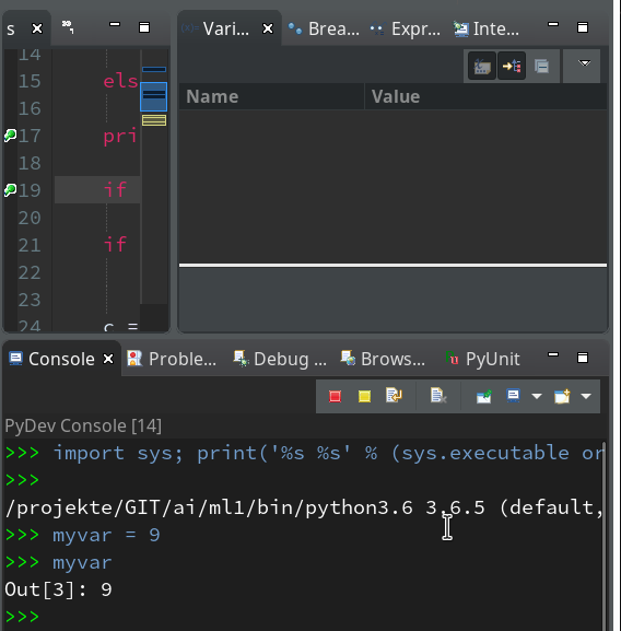
We can type anything at the prompt; we may e.g. define a variable “myvar”. Unfortnately it is not shown in the variables view, but we can get its value at any time when (and if) we have the prompt available :
As we are in an interactive environment we must import our module and do something with the test-function (as no code is executed automatically):
from
mytestcode import stupid
res = stupid.test()
This brings us to our first break point:
We add a breakpoint to line 27, which will lead to an error – and march from breakpoint to breakpoint until we reach line 27:
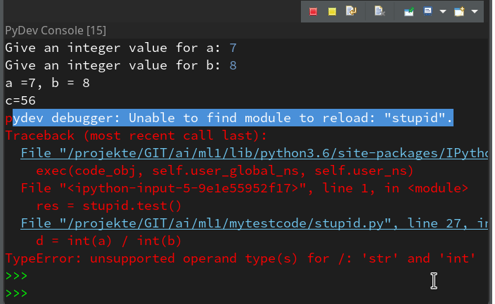
Variable “a” is a string and would cause trouble. Let us change the code to “d = int(a) / int(b)” and save the modified file. We again get an error :
pydev debugger: Unable to find module to reload: "stupid".
If we now resume code execution we will run into the foreseen trouble:
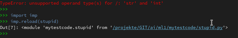
But afterwards we still have an active Python prompt of our Pydev-console for our session. We should be able to reload the code.
For Python 3.6 the following is required to do so:
By using the up-arrow then we move backward through the command history, start “res=stupid.test()” again and move via the break-points to the end – no errors any more (at least for the chosen a- and b-values):
Of course our file “stupid.py” contains a lot more sources for errors. E.g. there is no check or exception handling for a division by zero. And we have not used the function’s parameters, yet. I leave it to the reader to experiment with respective debugging.
How to use the prompt in the normal Debug console?
Now that you know the basics of how to debug, there is one more thing worth mentioning:
When you debug something as a Python Run in the standard “Debug Console”, you may have noticed the (green) Python prompt in the lower part of the console view:
What is it good for?
Well, with it you can interactively change variables and do other things interactively within the context of the debugged object (here of function test()).
Important note:
To avoid inconsistent states you should use the interactive prompt only, when the debugger stopped at a breakpoint. In addition you should enter values for variables requested by “input”-statements only in the upper part of the debug console!
But as soon as the debugger stops you can interactively ask e.g. for values of variables:
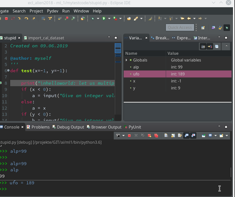
As soon as you press Enter in the lower part the
command is reflect in the upper part of the Debug console and results are shown there, too. So, while the debugger stops at a break point, you can do a lot of interactive things; you may set some new variables and use them later on – this is very useful when you want to keep some intermediate results for later purposes during a debug session.
Such new, interactively set variables will, by the way, even be shown in the Variables View (watch out for variables “alp” and “ufo”):
Customization of the debug environment
Eventually, a hint regarding customization of the environment discussed so far.
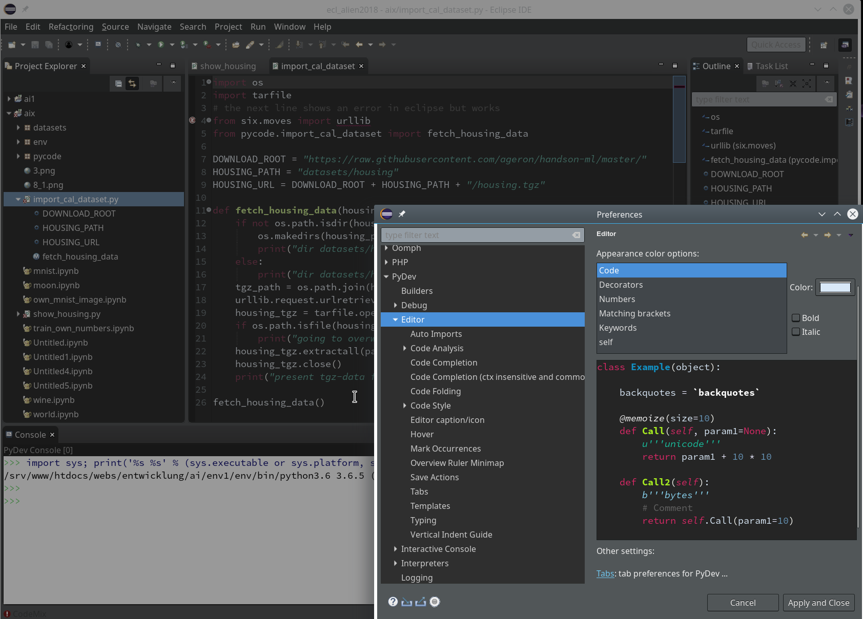
You should now have a look at all sub-points of the the two following menu points under “Window >> Preferences“:
Of course, there are the sub-points of “PyDev”:
There you can detect a lot more properties of e.g. the “Interpreters” (e.g. of your virtualenv environments) and e.g. the “Interactive Console“.
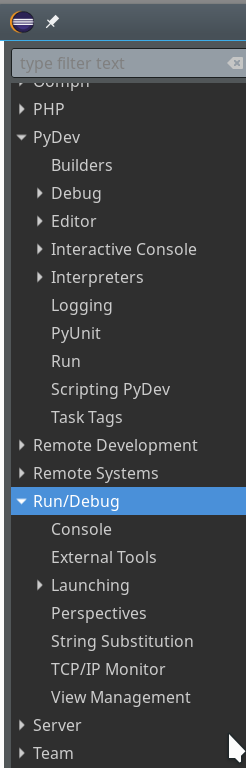
But Another interesting point is “Run/Debug“:
After a while you may want to use some of the properties there to make life easier during debug sessions. See e.g. for the length of the list of the last debug runs menu point “Run/Debug >> Launching >> Size of recently launched application list”.
Although I cannot discuss it in this article:
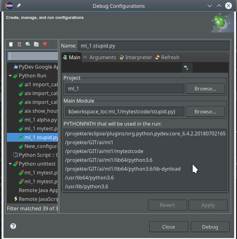
Another thing you should become familiar with is the configuration of Debug (and unittest) Runs.
You find a screen for it when you open the combobox of the main debug icon in the top icon bar of Eclipse and click on the point “Debug configurations …” there.
Unit tests
Interactively debugging is nice and useful. Something that is equally important in the long run is, however, “unit testing”. There are two interesting mechanisms that Python provides for doing this: The “doctest”-module and “unittest”. Both are beyond the scope of our introduction to PyDev. You find more about these things on the Internet or in reasonable books on Python.
Note, however, that Python’s “unittest” is especially interesting as the Debug environment of Eclipse/PyDev provides some nice views and tools for it. The following links may give you a first introduction:
https://www.youtube.com/watch?v=1Lfv5tUGsn8
https://www.youtube.com/watch?v=fU7RHewj6dg
https://www.blog.pythonlibrary.org/2016/07/07/python-3-testing-an-intro-to-unittest/
Conclusion
In this mini series of articles I have tried to show that setting up Eclipse with PyDev is relatively easy. This gives anybody interested in doing Machine-Learning-experiments with Python, Tensorflow and Keras a reasonable and cost free environment where you can build up and test solid code. A starting point could be module code which you export from a Jupyter notebook after some first trial experiments.
I will provide some examples for a two folded approach with Jupyter notebooks and code refinement via PyDev later on in this
blog.
One may ask now, why do we need Jupyter notebooks at all for machine learning experiments. Well, one big advantage of a Jupyter environment is the fact that we can arrange blocks of Python commands in a cell and re-execute the code-blocks in a self-chosen order again. So, it is possible to redo experiments quickly in a modified way; Jupyter gives you – in my opinion – a bit more flexibility in executing preliminary code fragments in a quick and (admittedly) dirty way. In PyDev you would have to work with editors and maybe multiple files to something similar.