The moons dataset and decision surface graphics in a Jupyter environment – III – Scatter-plots and LinearSVC

During this article series we use the moons dataset to acquire basic knowledge on Python based tools for machine learning [ML] – in this case for a classification task. The first article

The moons dataset and decision surface graphics in a Jupyter environment – I

provided us with some general information about the moons dataset. The second article

The moons dataset and decision surface graphics in a Jupyter environment – II – contourplots

explained how to use a Jupyter notebook for performing ML-experiments. We also had a look at some functions of “matplotlib” which enabled us to create contour plots. We will need the latter to eventually visualize a decision surface between the two moon-like shaped clusters in the 2-dimensional representation space of the moons data points.

In this article we extend our plotting knowledge to the creation of a scatter-plot for visualizing data points of the moons data set. Then we will have a look at the “pipeline” feature of SciKit for a sequence of tasks, namely

  • to prepare the moons data set,
  • to analyze it
  • and to train a selected SVM-algorithm.

In this article we shall use a specific algorithm – namely LinearSVC – to predict the cluster association for some new data points.

Starting our Jupyter notebook, extending imports and loading the moons data set

At the end of the last session you certainly have found out, how to close the Jupyter notebook on a Linux system. Three steps were involved:

  1. Logout via the button at the top-right corner of the web-page
  2. Ctrl-C in your terminal window
  3. Closing the tags in the browser.

For today’s session we start the notebook again from our dedicated Python “virtualenv” by

myself@mytux:/projekte/GIT/ai/ml1> source bin/activate
(ml1) myself@mytux:/projekte/GIT/ai/ml1> cd mynotebooks/
(ml1) myself@mytux:/projekte/GIT/ai/ml1/mynotebooks> jupyter notebook

We open “moons1.ipynb” from the list of available notebooks. (Note the move to the directory mynotebooks above; the Jupyter start page lists the notebooks in its present directory, which is used as a kind of “/”-directory for navigation. If you want the whole directory structure of the virtualenv accessible, you should choose a directory level higher as a starting point.)

For the work of today’s session we need some more modules/classes from “sklearn” and “matplotlib”. If you have not yet imported some of the most important ML-packages you should do so now. Probably, you need a second terminal – as the prompt of the first one is blocked by Jupyter:

myself@mytux:/projekte/GIT/ai/ml1> source bin/activate 
(ml1) myself@mytux:/projekte/GIT/ai/ml1> pip3 install --upgrade matplotlib numpy pandas scipy scikit-learn
Collecting matplotlib
  Downloading https://files.pythonhosted.org/packages/57/4f/dd381ecf6c6ab9bcdaa8ea912e866dedc6e696756156d8ecc087e20817e2/matplotlib-3.1.1-cp36-cp36m-manylinux1_x86_64.whl (13.1MB)
.....

The nice people from SciKit/SkLearn have already prepared data and functionality for the setup of the moons data set; we find the relevant function in sklearn.datasets. Later on we will also need some colormap functionality for scatter-plotting. And for doing the real work (training, SVM-analysis, …) we need some special classes of sklearn.

So, as a first step, we extend the import statements
inside the first cell of our Jupyter notebook and run it:

Then we move to the end of our notebook to prepare new cells. (We can rerun already defined cell code at any time.)

We enter the following code that creates the moons data-points with some “noise”, i.e. with a spread in the coordinates around a perfect moon-like line. You see the relevant function below; for a beginning it is wise to keep the spread limited – to avoid to many overlap points of the data clusters. I added some print-statements to get an impression of the data structure.

It is common use to assign an uppercase letter “X” to the input data points and a lowercase letter to the array with the classification information (per data point) – i.e. the target vector “y“.

The function “make_moons()” creates such an input array “X” of 2-dim data points and an associated target array “y” with classification information for the data points. In our case the classification is binary, only; so we get an array with “0”s or “1”s for each point.

This basic (X,y)-structure of data is very common in classification tasks of ML – at its core it represents the information reduction: “multiple features” => “member of a class”.

Scatter-plots: Plotting the raw data in 2D and 3D

We want to create a visual representation of the data points in their 2-dim feature space. We name the two elements of a data point array “x1” and “x2”.

For a 2D-plot we need some symbols or “markers” to distinguish the different data points of our 2 classes. And we need at least 2 related colors to assign to the data points.

To work efficiently with colors, we create a list-like ColorMap-object from given color names (or RGB-values); see ListedColormap. We can access the RGBA-values from a ListedColormap by just creating it as a “list” with an integer index, i.e.:

colors= ('red', 'green', 'yellow')
cmap=ListedColormap(colors)
print(cmap(1)) // gives: (0.0, 0.5019607843137255, 0.0, 1.0)  

All RGBA-values are normalized between 0.0 and 1.0. The last value defines an alpha-opacity. Note that “green” in matplotlib is defined a bit strange in comparison to HTML.

Let us try it for a list (‘red’, ‘blue’, ‘green’, gray’, ‘yellow’, ‘#00ff00’):

The lower and upper limits of the the two axes must be given. Note that this sets the size of the region in our representation space which we want to analyze or get predictions for later on. We shall make the region big enough to willingly cover points outside the defined clusters. It will be interesting to see how an algorithm extrapolates its knowledge learned by training on the input data to regions beyond the
training area.

For the purpose of defining the length of the axes we can use the plot functions pyplot.xlim() and pyplot.ylim().

The central function, which we shall use for plotting data points in the defined area of the (x1,x2)-plane, is “matplotlib.pyplot.scatter()“; see the documentation scatter() for parameters.

Regarding the following code, please note that we plot all points of each of the two moon like cluster in one step. Therefore, we call scatter() exactly two times with the for-loop defined below:

In the code you may stumble across the defined lists there with expressions included in the brackets. These are examples of so called Python “list comprehensions”. You find an elementary introduction here.

As we are have come so far, lets try a 3D-scatter-plot, too. This is not required to achieve our objectives, but it is fun and it extends our knowledge base:

Of course all points of a class are placed on the same level (0 or 1) in z-direction. When we change the last statement to “ax.view_init(90, 0)”. We get

As expected 🙂 .

Analyzing the data with the help of a “pipeline” and “LinearSVC” as an SVM classificator

Sklearn provides us with a very nice tool (actually a class) named “Pipeline“:

Pipeline([]) allows us

  • to define a series of transformation operations which are successively applied to a data set
  • and to define exactly one predictor algorithm (e.g. a regression or classifier algorithm), which creates a model of the data and which is optimized later on.

Transformers and predictors are also called “estimators“.

Transformers” and “predictors” are defined by Python classes in Sklearn. All transformer classes must provide a method ” fit_transform()” which operates on the (X,y)-data; the predictor class of a class provides a method “fit()“.

The “Pipeline([])” is defined via rows of an array, each comprising a tuple with a chosen name for each step and the real class-names of the transformers/predictor. A pipeline of transformers and a predictor creates an object with a name, which also offers the method “fit()” (related to the predictor algorithm).

Thus a pipeline prepares a data set(X,y) via a chain of operational steps for training.

This sounds complicated, but is actually pretty easy to use. How does such a pipeline look like for our moons dataset? One possible answer is:

polynomial_svm_clf = Pipeline([
  ("poly_features", PolynomialFeatures(degree=3)),
  ("scaler", StandardScaler()),
  ("svm_clf", LinearSVC(C=18, loss="hinge", max_iter=3000))
])
polynomial_svm_clf.fit(X, y)

The transformers obviously are “PolynomialFeatures” and ”
StandardScaler“, the predictor is “LinearSVC” which is a special linear SVM method, trying to find a linear separation channel between the data in their representation space.

The last statement

polynomial_svm_clf.fit(X, y)

starts the training based on our pipeline – with its algorithm.

PolynomialFatures

What is “PolynomialFeatures” in the first step of our Pipeline good for? Well, looking at the moons data plotted above, it becomes quite clear that in the conventional 2-dim space for the data points in the (x1, x2)-plane there is no linear decision surface. Still, we obviously want to use a linear classification algorithm …. Isn’t this a contradiction? What can be done about the problem of non-linearity?

In the first article of this series I briefly discussed an approach where data, which are apparently not linearly separable in their original representation space, can be placed into an extended feature space. For each data point we add new “features” by defining additional variables consisting of polynomial combinations of the points basic X-coordinates. We do this up to a maximum degree, namely the order of a polynomial function – e.g. T(x1,x2) = x1**3 + a* x1**2*x2 + b*x1*x2**2 + c*x1*x2 + x2**3.

Thereby, the dimensionality of the original X(x1,x2) set is extended by multiple further dimensions. Each data point is positioned in the extended feature space by a defined transformation T.

Our hope is that we can find a linear separation (“decision”) surface in the new extended multi-dimensional feature space.

The first step of our Pipeline enhances our X by additional and artificial polynomial “features” (up to a degree of 3 in our example). We do not need to care for details – they are handled by the class “PolynomialFeatures”. The choice of a polynomial of order 3 is a bit arbitrary at the moment; we shall play around with the polynomial degree in a future article.

StandardScaler

The second step in the Pipeline is a simple one: StandardScaler.fit_transform() scales all data such that they fit into standard ranges. This helps both for e.g. linear regression- and SVM-analysis.

The predictor LinearSVC

The third step assigns a predictor – in our example a simple linear SVM-like algorithm. It is provided by the class LinearSVC (a linear soft margin classificator). See e.g
support-vector-machine-algorithm/,
LinearSVC vs SVC,
www.quora.com : What-is-the-difference-between-Linear-SVMs-and-Logistic-Regression.

The basic parameters of LinearSVC, as the number of iterations (3000) to find an optimal solution and the width “C” for the separation channel, will also be a subject of further experiments.

Analyzing the moons data and fitting the LinearSVC algorithm

Let us apply our pipeline and predict for some data points outside the X-region whether they belong to the “red” or the “blue” cluster. But, how do we predict?

We are not surprised that we find a method predict() in the documentation for our classifier algorithm; see LinearSVC.

So:

We get for the different test points

[x1=1.50, x2=1.0] => 0  
[x1=1.92, x2=0.8] 
=> 0
[x1=1.94, x2=0.8] => 1
[x1=2.20, x2=1.0] => 1               

Looking at our scatter plot above we can assume that the decision line predicted by LinearSVC moves through the right upper corner of the (x1,x2)-space.

However and of course, looking at some test data points is not enough to check the quality of our approach to find a decision surface. We absolutely need to plot the decision surface throughout the selected region of our (x1,x2)-plane.

Conclusion

But enough for today’s session. We have seen, how we can produce a scatter plot for our moons data. We have also learned a bit about Sklearn’s “pipelines”. And we have used the classes “PolynomialFeatures” and “LinearSVC” to try to separate our two data clusters.

By now, we have gathered so much knowledge that we should be able to use our predictor to create a contour plot – with just 2 contour areas in our representation space. We just have to apply the function contourf() discussed in the second article of this series to our data:

If we cover the (x1,x2)-plane densely and associate the predicted values of 0 or 1 with colors we should clearly see the contour line, i.e. the decision surface, separating the two areas in our contour plot. And hopefully all data points of our original (X,y) set fall into the right region. This is the topic of the next article

The moons dataset and decision surface graphics in a Jupyter environment – IV – plotting the decision surface

Stay tuned.

Links

Understanding Support Vector Machine algorithm from examples (along with code) by Sunil Ray
Stackoverflow – What is exactly sklearn-pipeline?
LinearSVC

The moons dataset and decision surface graphics in a Jupyter environment – II – contourplots

I proceed with my present article series on the “moons dataset” as an example for classification tasks in the field of “machine learning” [ML]. My objective is to gather basic knowledge on Python related tools for performing related experiments. In my last blog article

The moons dataset and decision surface graphics in an Jupyter environment – I

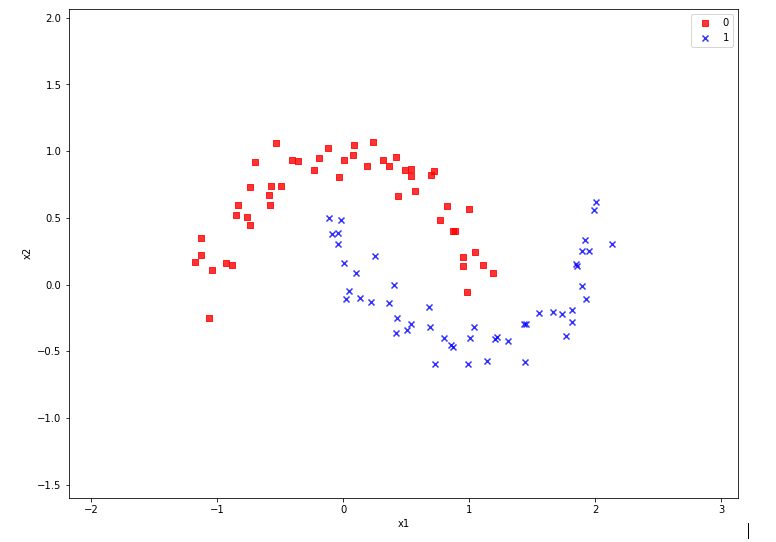
In the case of the “moons dataset” we can apply and train support vector machines [SVM] algorithms for solving the classification task: The trained algorithm will predict to which of the 2 clusters a new data point probably belongs. The basic task for this kind of information reduction is to find a (curved) decision surface between the data clusters in the n-dimensional representation space of the data points during the training of the algorithm.

As the moons feature space is only 2-dimensional the decision surface would be a curved line. Of course, we would like to add this line to the 2D-plot of the moons clusters shown in the last article.

The challenge of plotting data points and decision surfaces for our moon clusters

  1. is sufficiently simple for a Python- and AI/ML-beginner as me,
  2. is a good opportunity to learn how to work with a Jupyter notebook,
  3. gives us a reason to become acquainted with some basic plotting functions of matplotlib,
  4. an access to some general functions of SciKit – and some specific ones for SVM-problems.

Much to learn from one little example. Points 2 and 3 are the objectives of this article.

Contour plots !

But what kind of plots should we be interested in? We need to separate areas of a 2-dimensional parameter space (x1,x2) for which we get different (integer) target or y-values, i.e. to distinguish between a set of distinct classes to which data points may belong – in our case either to a class “0” of the first moon like cluster and a class “1” for data points around the second cluster.

In applied mathematics there is a very similar problem: For a given function z(x1,x2) we want to visualize regions in the (x1,x2)-plane for which the z-values cover a range between 2 selected distinct z-values, so called contour areas. Such contour areas are separated by contour lines. Think of height lines in a map of a mountain region. So, there is an close relation between a contour line and a decision surface – at least in a two dimensional setup. We need contour plots!

Let us see how we start a Jupyter environment and how we produce nice 2D- and even 3D-contour-plots.

Starting a Jupyter notebook from a virtual Python environment on our Linux machine

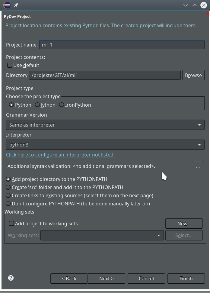
I discussed the setup of a virtual Python environment (“virtualenv”) already in the article Eclipse, PyDev, virtualenv and graphical output of matplotlib on KDE – I of this blog. I refer to the example and the related paths there. The “virtualenv” has a name of “ml1” and is located at “/projekte/GIT/ai/ml1”.

In the named article I had also shown how to install the Jupyter package with the help of “pip3” within this environment. You can verify the Jupyter installation by having a look into the directory “/projekte/GIT/ai/ml1/bin” – you should see some files “ipython3” and “jupyter” there. I had also prepared a directory
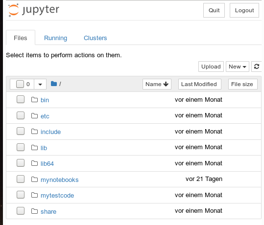
“/projekte/GIT/ai/ml1/mynotebooks”
to save some experimental notebooks there.

How do we start a Jupyter notebook? This is simple – we just use a
terminal window and enter:

myself@mytux:/projekte/GIT/ai/ml1> source bin/activate 
(ml1) myself@mytux:/projekte/GIT/ai/ml1> jupyter notebook 
[I 16:16:27.734 NotebookApp] Writing notebook server cookie secret to /run/user/1004/jupyter/notebook_cookie_secret
[I 16:16:29.040 NotebookApp] Serving notebooks from local directory: /projekte/GIT/ai/ml1
[I 16:16:29.040 NotebookApp] The Jupyter Notebook is running at:
[I 16:16:29.040 NotebookApp] http://localhost:8888/?token=942e6f5e75b0d014659aea047b1811d1992ca77e4d8cc714
[I 16:16:29.040 NotebookApp] Use Control-C to stop this server and shut down all kernels (twice to skip confirmation).
[C 16:16:29.054 NotebookApp] 
    
    To access the notebook, open this file in a browser:
        file:///run/user/1004/jupyter/nbserver-19809-open.html
    Or copy and paste one of these URLs:
        http://localhost:8888/?token=942e6f5e75b0d014659aea047b1811d1992ca77e4d8cc714

We see that a local http-server is started and that a http-request is issued. In the background on my KDE desktop a new tag in my standard browser “Firefox” is opened for this request:

Note that a standard port 8888 is used; this port should not be used by other services on your machine.

On the displayed web page we can move to the “mynotebooks” directory. We open a new notebook there by clicking on the “New”-button on the right side of the browser window:

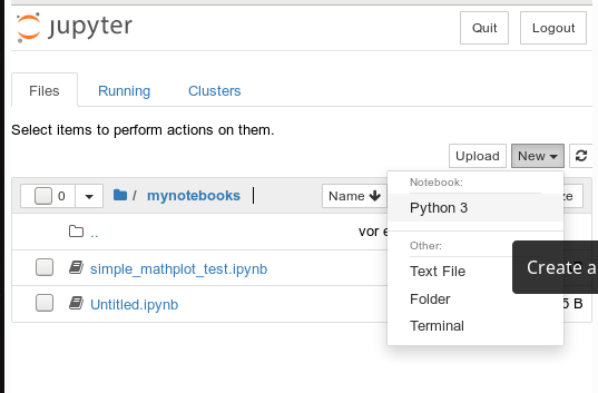
We choose Python3 as the relevant interpreter and get a new browser window:

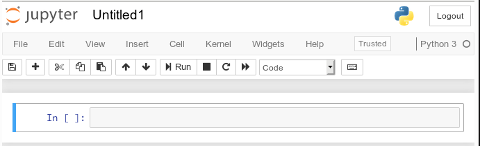
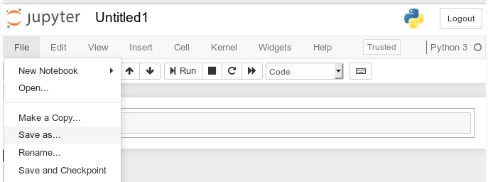
We give the notebook a title by clicking on “File >> Save as …” before start using the provided input “cell” for coding

I name it “moons1” in the next input form and check afterward in a terminal that the file “/projekte/GIT/ai/ml1mynotebooks/moons1.ipynb” really has been created; you see this also in the address bar of the browser – see below.

Lets do some plotting within a notebook

Most of the icons regarding the notebook screen are self explanatory. The interesting and pretty nice thing about a Jupyter notebook is that the multiple lines of Python code can be filled into cells. All lines can be executed in a row by first choosing a cell via clicking on a it and then clicking on the “Run” button.

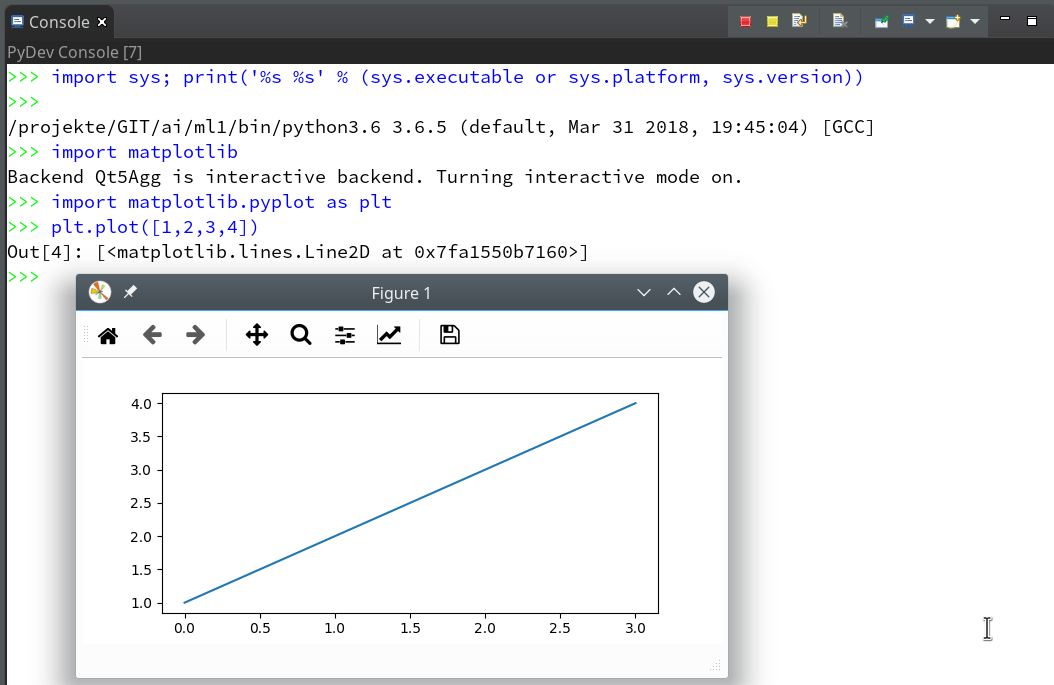
As a first exercise I want to do some plotting with “matplotlib” (which I also installed together with the numpy package in a previous article). We start by importing the required modules:

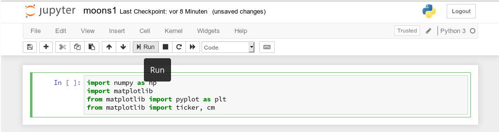
A new cell for input opens automatically (it is clever to separate cells for imports and for real code). Let us produce a most simple plot there:

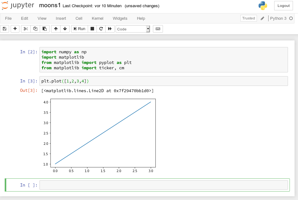
No effort in comparison to what we had to do to prepare an Eclipse environment for plotting (see Eclipse, PyDev, virtualenv and graphical output of matplotlib on KDE – II). Calling plot routines simply works – no special configuration is required. Jupyter and the browser do all the work for us. We save our present 2 cells by clicking on the “Save“-icon.

How do we plot contour lines or contour areas?

Later on we need to plot a separation line in a 2-dimensional parameter space between 2 clustered sets of data. This task is very similar to plotting a contour line. As this is a common task in math we expect matplotlib to provide some functionality for us. Our ultimate goal is to wrap this plotting functionality into a function or class which also accepts an SVM based ML-method of SciKit to prepare and evaluate the basic data first. But let us proceed step by step.

Some research on the Internet shows: The keys to contour plotting with matplotlib are the functions “contour()” and “contourf()” (matplotlib.pyplot.contourf):

contour(f)([X, Y,] Z, [levels], **kwargs)

“contour()” plots lines, only, whilst “contourf()” fills the area between the lines with some color.

Both functions accept data sets in the form of X,Y-coordinates and Z-values (e.g. defined by some function Z=f(X,Y)) at the respective points.

X and Y can be provided as 1-dim arrays; Z-values, however, must be given by a 2-dim array, such that len(X) == M is the number of columns in Z and len(Y) == N is the number of rows in Z. We cover the X,Y-plane with Z-values from bottom to top (Y, lines) and from the left to the right (X, columns).

Somewhat counter-intuitively, X and Y can also be provided as 2-dim arrays – with the same dimensionality as Z.
There is a nice function “meshgrid” (of packet numpy) which allows for the creation of e.g. a mesh of two 2-dimensional X- and separately Y-matrices. See for further information (numpy.meshgrid). Both arrays then have a (N,M)-layout (shape); as the degree of information of one coordinate is basically 1-dimensional, we do expect repeated values of either coordinate in the X-/Y-meshgrid-matrices.

The function “shape” gives us an output in the form of (N lines, M columns) for a 2-dim array. Lets apply all this and create a rectangle shaped (X,Y)-plane:

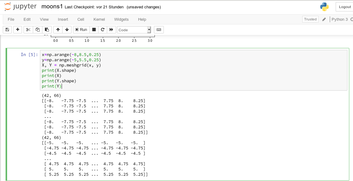
The basic numpy-function “arange()” turns a range between two limiting values into an array of equally spaced values. We see that meshgrid() actually produces two 2-dim arrays of the same “shape”.

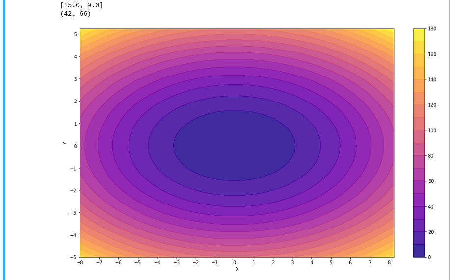
For test purposes let us use a function

Z1=-0.5* (X)**2 + 4*(Y)**2.

For this function we expect elliptical contours with the longer axis in X-direction. The “contourf()”-documentation shows that we can use the parameters “levels“, “cmap” and “alpha” to set the number of contour levels (= number of contour lines -1), a so called colormap, and the opacity of the area
coloring, respectively.

You find predefined colormaps and their names at this address: matplotlib colormaps. If you add an “_r” to the colormap-name you just reverse the color sequence.

We combine all ingredients now to create a 2D-plot (with the “plasma” colormap):

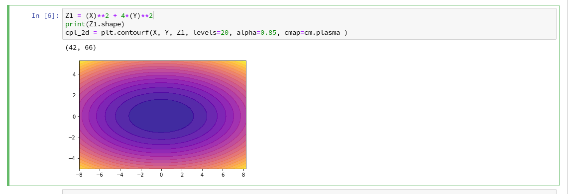
Our first reasonable contour-plot within a Jupyter notebook! We got the expected elliptic curves! Time for a coffee ….

Changing the plot size

A question that may come to your mind at this stage is: How can we change the size of the plot?

Well, this can be achieved by defining some basic parameters for plotting. You need to do this in advance of any of your specific plots. One also wants to add some labels for all axis. We, therefore, extend the code in our cell a bit by the following statements and click again on “Run”:

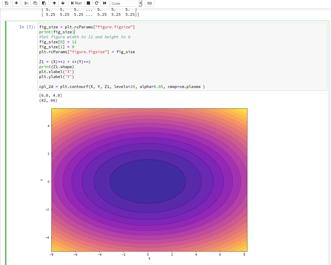
You see that “fig_size = plt.rcParams[“figure.figsize”]” provides you with some kind of array- or object like information on the size of plots. You can change this by assigning new values to this object. “figure” is an instance of a container class for all plot elements. “plt.xlabel” and “plt.ylabel” offer a simple option to add some text to an axis of the plot.

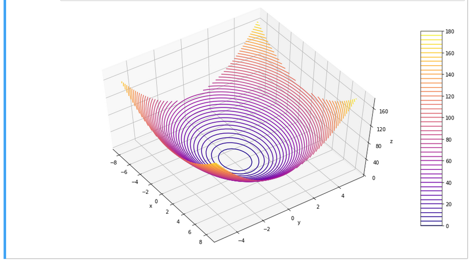
What about a 3D-representation …

As we are here – isn’t our function for Z1 not a good example to get a 3D-representation of our data? As 3D-plots are helpful in other contexts of ML, lets have a quick side look at this. You find some useful information at the following addresses:
PythonDataScienceHandbook and mplot3d-tutorial

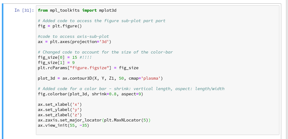
I used the given information in form of the following code:

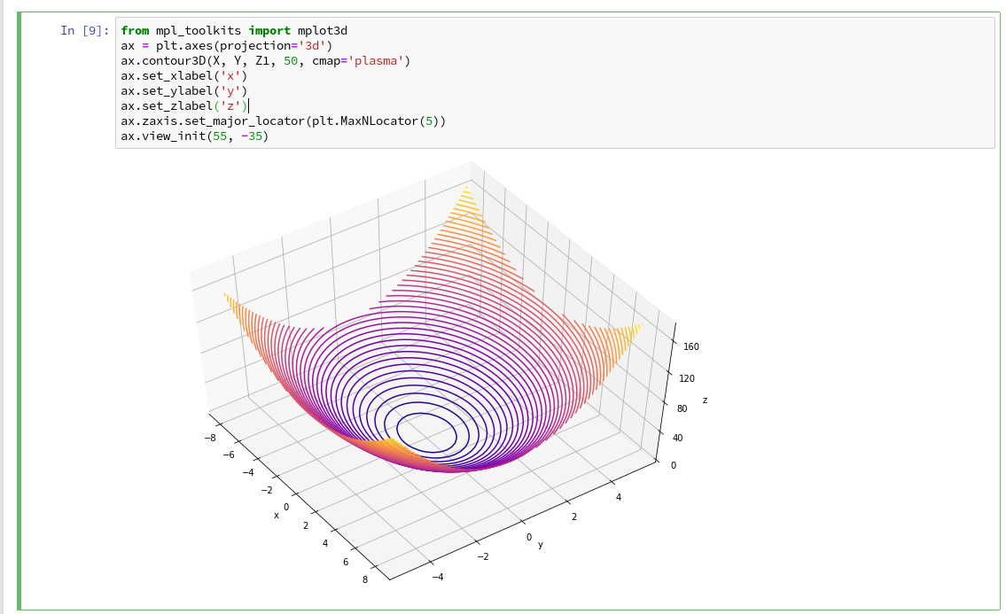
You see that we can refer to a special 3D-plot-object as the output of plt.axes(projection=’3d’). The properties of such an object can be manipulated by a variety of methods. You also see that I manipulated the number of ticks on the z-axis to 5 by using a function “set_major_locator(plt.MaxNLocator(5)“. I leave it to the reader to dive deeper into manipulation options for a plot axis.

Addendum – 07.07.2019: Adding a colorbar

A reader asked me to show how one can set ticks and add a color-bar to the plots. I give an example code below:
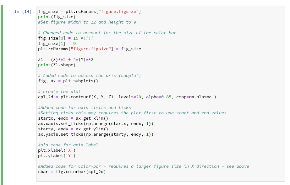
The result is:

For the 3D-plots we get:

Conclusion

Enough for today. We have seen that it is relatively simple to create nice contour and even 3D-plots in a Jupyter notebook environment. This new knowledge provides us with a good basis for a further approach to our objective of plotting a decision surface for the moons dataset. In the next article

The moons dataset and decision surface graphics in a Jupyter environment – III – scatter-plots and LinearSVC

we first import the moons data set into our Jupyter notebook. Then we shall create a so called “scatter plot” for all data points. Furthermore we shall train a specific SVM algorithm (LinearSVC) on the dataset.

Links

https://codeyarns.com/2014/10/27/how-to-change-size-of-matplotlib-plot/
matplotlib.pyplot.contourf
https://stackoverflow.com/questions/12608788/changing-the-tick-frequency-on-x-or-y-axis-in-matplotlib


The moons dataset and decision surface graphics in a Jupyter environment – I

For me as a beginner in Machine Learning [ML] and Python the first interesting lesson was that artificial neural networks are NOT needed to solve various types of problems. A second lesson was that I needed a lightweight tool for quick experiments in addition to Eclipse PyDev – which lead me to Jupyter notebooks. A third lessons was that some fundamental knowledge about plotting functionalities provided by Sklearn is mandatory – especially in the field of classification tasks, where you need to visualize decision or separation surfaces. For a newbie both in ML, Python and SciKit/Sklearn the initial hurdles are many and time consuming. Not all text books were really helpful – as the authors often avoid a discussion of basic code elements on a beginner level.

Playing around with a special test and training example for beginners – namely the moons data set – helped me to overcome initial obstacles and to close some knowledge gaps. With this article series I want to share some of my insights with other people starting to dive into the field of ML. ML-professionals will not learn anything new.

Classification, SVM and the moons dataset

An interesting class of ML-problems is the reduction of information in the following sense:

A set of data vectors describes data points in a n-dimensional representation space. Each individual data point in the set belongs to a specific cluster of multiple existing disjunctive clusters of data points in the representation space. After a training an algorithm shall predict for any new given data point vector to which cluster the data point belongs.

This poses a typical classification task in ML. I talk of a representation space as it represents the “n” different features of our data points. The representation space is sometimes also called “feature space”.

“Disjunctive” is to be understood in a geometrical sense: The regions the clusters occupy in the representation space should be clearly separable. A “separation surface” – mathematically a hyperplane – should exist which separates two clusters from each other.

Each cluster may exhibit special properties of its members. Think e.g. of diseases; a certain combination of measured parameter or “feature” values describing the status of a patient’s body (temperature, blood properties, head ache, reduced lung capacity, ..) may in a complicated way decide between different kinds of virus infections.

In such a case an ML-algorithm – after a training – has to separate the multidimensional representation space into disjunctive regions and afterward determine (by some exact criteria) into which region the “feature” values in some given new data vector place the related data point. To achieve this kind of prediction capability may in real world problems be quite challenging:

The data points of each known cluster may occupy a region with a complex curved or even wiggled surface in the representation space. Therefore, most often the separation surface of data point clusters can NOT be described in a simple linear way; the separation hyperplane between clusters in a multidimensional representation space is typically given by a non-linear function; it describes a complex surface with a dimensionality of n-1 inside the original n-dim vector space for data representation.

One approach to find such hyperplanes was/is e.g. the use of so called “Support Vector Machines” (as described e.g. in chapter 5 of the brilliant book of “Machine Learning with SciKit-Learn & TensorFlow” by A. Geron; published by O’Reilly, 2018).

An interesting simple example for using the SVM approach is the “moon” dataset. It displays 2 disjunctive clusters of data in a 2-dimensional
representation space ( with coordinates x1 and x2 for two features). The areas are formed like 2 moon crescents.

The 2-dim vectors describing the data points are associated with target values of “0” and “1” – with “0” describing the membership in the upper cluster and “1” the membership in the lower cluster of points. We see at once that any hyperplane – in this case a one dimensional, but curved line – separating the data clusters requires some non-linear description with respect to x1 and x2.

We also understand that we need some special plotting technique to visualize the separation. Within the named book of Geron we do not find a recipe for such a plot; however you do find example programs on the author’s website for the exercises in the book. Actually, I found some additional hints in a different book “Python Machine Learning” of Sebastian Raschka, pubished by PACKT Publishing, 2016. When I came to Geron’s discussion of the moon dataset I tried to combine it with the plotting approach of Raschka. For me – as a beginner – the whole thing was a very welcome opportunity to do some exercises with a Jupyter notebook and write some small functions for plotting decision regions.

I describe my way of dealing with the moon dataset below – and hope it may help others. However, before we move to Jupyter based experiments I want to give some hints on the SVM approach and Python libraries required.

SVM, “Polynomial Features” and the SVC Kernel

The algorithm behind a SVM performs an analysis of data point vectors in a multidimensional vector space and the distances of the points of different clusters. The strategy to find a separating hyperplane between data point clusters should follow 3 principles:

  • We want to guarantee a large separation in terms of metrical distances of outer cluster points to the separation plane.
  • We want to minimize the number of of points violating the separation.
  • The number of mathematical operations shall be reduced.

If we had some vector analysis a part of our education we may be able to figure out how to determine a hyperplane in cases where a linear separation is sufficient. We adjust the parameters of the linear hyperplane such that for some defined average the distance of carefully chosen cluster points to the plane is maximized. We could also say that we try to “maximize” the margins of the data clusters to the hyperplane (see the book of Raschka, cahpter 3, around page 70). We can moderate the “maximize” strategy by some parameters allowing for a narrower margin not to get too many wrongly placed data points. Thus we would avoid overfitting. But what to do about a non-linear separation surface?

Non-linearity can be included by a trick: Polynomial variations of the data variables – i.e. powers of the data variables – are added as new so called slack variables to the original data sets – thereby extending the dimensionality of the sets. In the extended new vector space data which previously were not separable can appear in clearly separated regions.

A SciKit-Learn Python class “PolynomialFeatures” supports variations in the combination of powers of the original data up to a limiting total power (e.g. 3). If the 2 dim data variables are x1 and x2, we may e.g. include x1**3, x2**3, x2*x1**2, x1*x2**2 and x1*x2 as new variables. On the extended vector space we could then apply a conventional linear analysis again.

Such a linear analysis is provided by a Python module called LinearSVC which is part of “sklearn.svm”, which provides SVM
related classes and methods. PolynomialFeatures is a class and part of “sklearn.preprocessing”.

Note that higher polynomials obviously will lead to a steep rise in the number of data operations as the dimensionality of the data sets grows significantly due to combinatorics. For many cases it can, however, be shown that it is sufficient to operate with the original data points in the lower dimensional representation space in a special way to cover polynomial extensions or distance calculations for the hyperplane determination in the higher dimensional and extended representation space. A so called “Polynomial Kernel” function takes care of this without really extending the dimensionality of the original datasets.

Note that there are other kernel functions for other types of calculation approaches to determine the separation surface: One approach uses an exponentially weighted distance (Gaussian kernel or RBF-kernel) between points in the sense of a similarity function to add new features (= dimensions) to the representation space. In this case we have to perform mathematical operations on pairs of data points in the original space with lower dimensionality, only.

Thus, different kinds of kernel functions are included in a SciKit-Learn class named “SVC“. All methods work sufficiently well at least for small and medium data sets. For large datasets the polynomial Kernel may scale badly regarding CPU time.

There is another kind of scaling – namely of the data to reasonable value regions. It is well known that data scaling is important when using SVM for the determination of decision surfaces. So, we need another Python class to scale our “moon” data reasonably – “StandardScaler” which is part of sklearn.preprocessing.

Required Python libraries

We assume that we have installed the Python packets sklearn, mathlotlib and numpy in the virtual Python environment for our ML experiments, already. (See previous articles in this blog for the establishment of such an environment on a Linux machine.)

We shall use the option of SciKit-Learn to build pipelines of operations on datasets. So, we need to import the class “Pipeline” from sklearn.pipeline. The “moons dataset” itself is part of the datasets library of “sklearn”.

All in all we will use the following libraries in the forthcoming experiments:

import numpy as np
import matplotlib.pyplot as plt
from matplotlib.colors import ListedColormap

from sklearn.datasets import make_moons

from sklearn.pipeline import Pipeline
from sklearn.preprocessing import StandardScaler
from sklearn.preprocessing import PolynomialFeatures

from sklearn.svm import LinearSVC
from sklearn.svm import SVC

Enough for today.In the next article

The moons dataset and decision surface graphics in a Jupyter environment – II – contourplots

we will acquire some basic tool skills in ML: I shall show how to start a Jupyter notebook and how to create contour-plots. We will need this knowledge later on for doing experiments with our moons data set and to visualize the results of SVM algorithms for classification.