In this article series
The moons dataset and decision surface graphics in a Jupyter environment – I
The moons dataset and decision surface graphics in a Jupyter environment – II – contourplots
The moons dataset and decision surface graphics in a Jupyter environment – III – Scatter-plots and LinearSVC
we used the moons data set to build up some basic knowledge about using a Jupyter notebook for experiments, Pipelines and SVM-algorithms of SciKit-Sklearn and plotting functionality of matplotlib.
Our ultimate goal is to write some code for plotting a decision surface between the moon shaped data clusters. The ability to visualize data sets and related decision surfaces is a key to quickly testing the quality of different SVM-approaches. Otherwise, you would have to run some kind of analysis code to get an impression of what is going on and possible deficits of the determined separation surface.
In most cases, a visual impression of the separation surface for complexly shaped data sets will give you much clearer information. With just one look you get answers to the following questions:
- How well does the decision surface really separate the data points of the clusters? Are there data points which are placed on the wrong side of the decision surface?
- How reasonable does the decision surface look like? How does it extend into regions of the representation space not covered by the data points of the training set?
- Which parameters of our SVM-approach influences what regarding the shape of the surface?
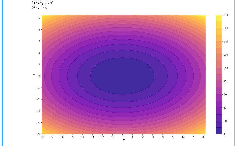
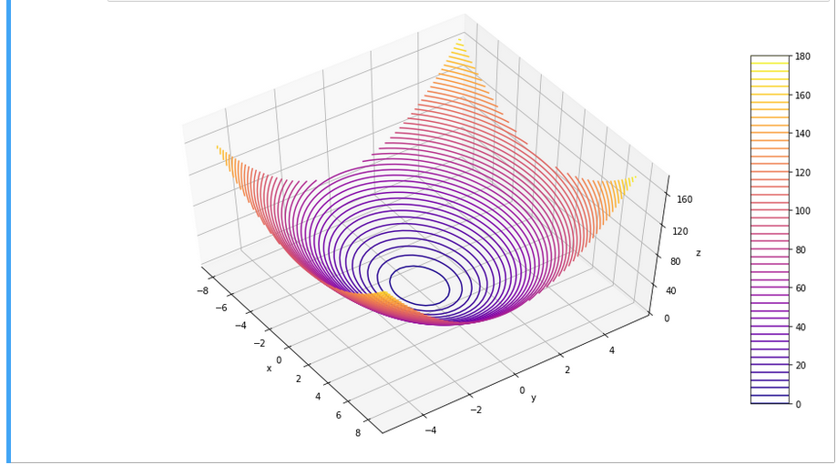
In the second article of this series we saw how we would create contour-plots. The motivation behind this was that a decision surface is something as the border between different areas of data points in an (x1,x2)-plane for which we get different distinct Z(x1,x2)-values. I.e., a contour line separating contour areas is an example of a decision surface in a 2-dimensional plane.
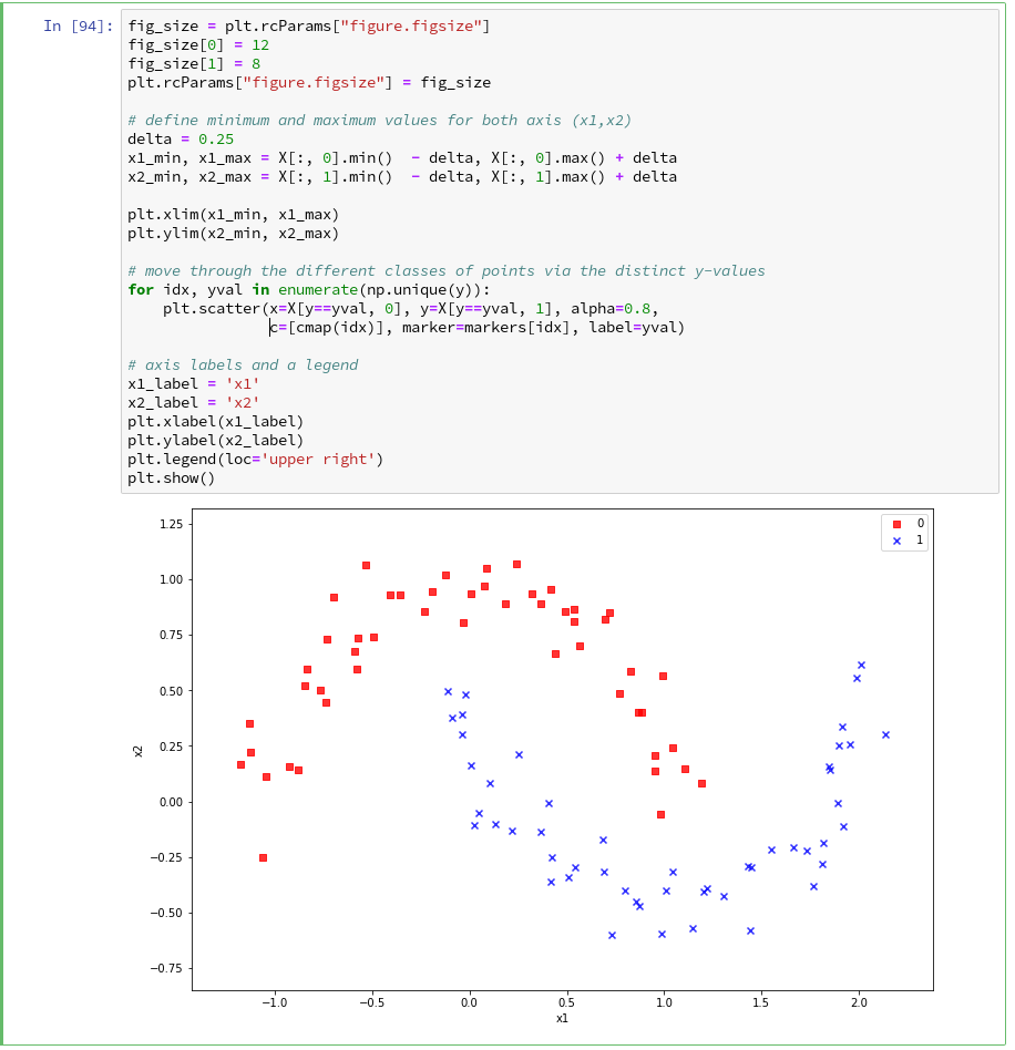
During the third article we learned in addition how we could visualize the various distinct data points of a training set via a scatter-plot.
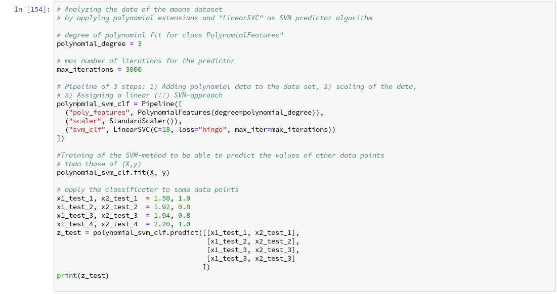
We then applied some analysis tools to analyze the moons data – namely the “LinearSVC” algorithm together with “PolynomialFeatures” to cover non-linearity by polynomial extensions of the input data.
We did this in form of a Sklearn Pipeline for a step-wise transformation of our data set plus the definition of a predictor algorithm. Our LinearSVC-algorithm was trained with 3000 iterations (for a polynomial degree of 3) – and we could predict values for new data points.
In this article we shall combine all previous insights to produce a visual impression of the decision interface determined by LinearSVC. We shall put part of our code into a wrapper function. This will help us to efficiently visualize the results of further classification experiments.
Predicting Z-values for a contour plot in the (x1,x2) representation space of the moons dataset
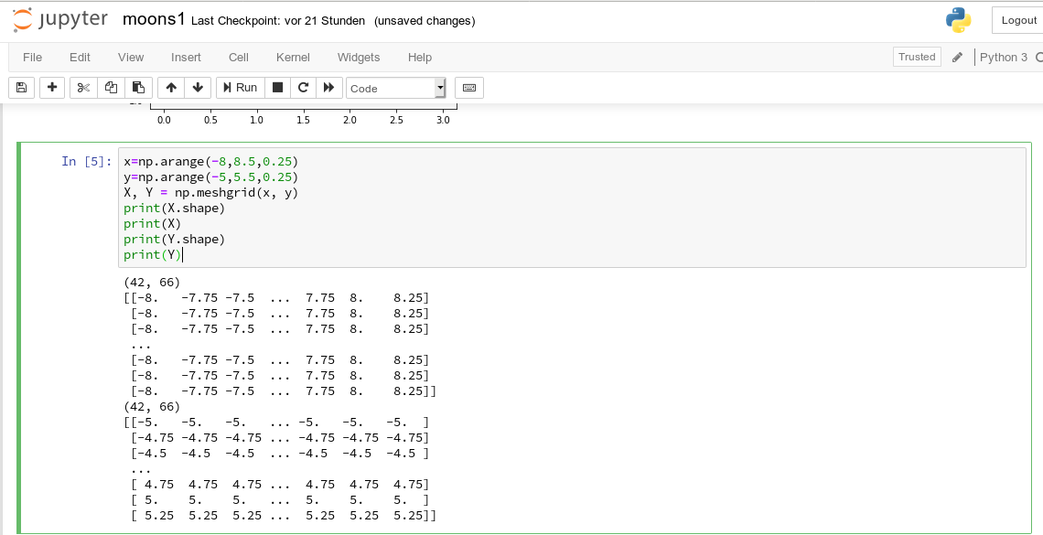
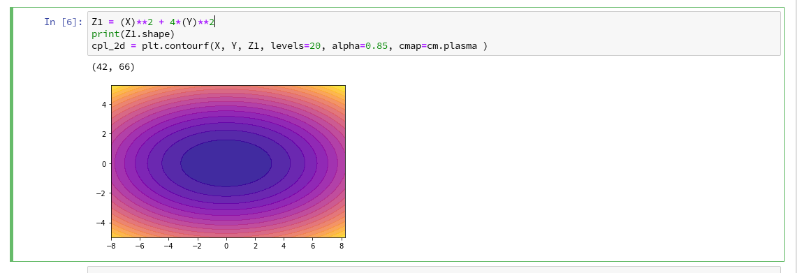
To allow for the necessary interpolations done during contour plotting we need to cover the visible (x1,x2)-area relatively densely and systematically by data points. We then evaluate Z-values for all these points – in our case distinct values, namely 0 and 1. To achieve this we build a mesh of data points both in x1-
and x2-direction. We saw already in the second article how numpy’s meshgrid() function can help us with this objective:
resolution = 0.02
x1_min, x1_max = X[:, 0].min()  - 1, X[:, 0].max() + 1
x2_min, x2_max = X[:, 1].min()  - 1, X[:, 1].max() + 1
xm1, xm2 = np.meshgrid( np.arange(x1_min, x1_max, resolution),
                        np.arange(x2_min, x2_max, resolution))
We extend our area quite a bit beyond the defined limits of (x1,x2) coordinates in our data set. Note that xm1 and xm2 are 2-dim arrays (!) of the same shape covering the surface with repeated values in either coordinate! We shall need this shape later on in our predicted Z-array.
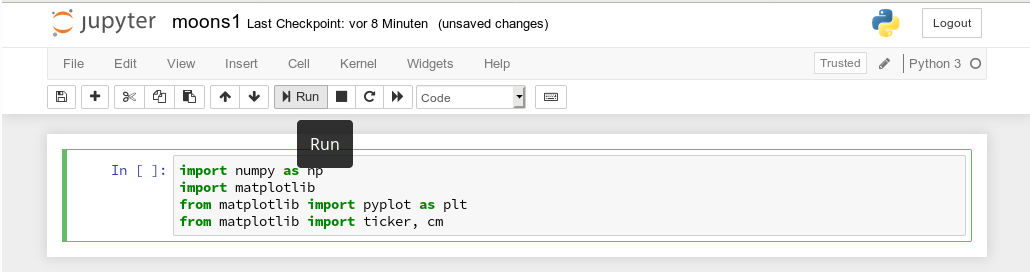
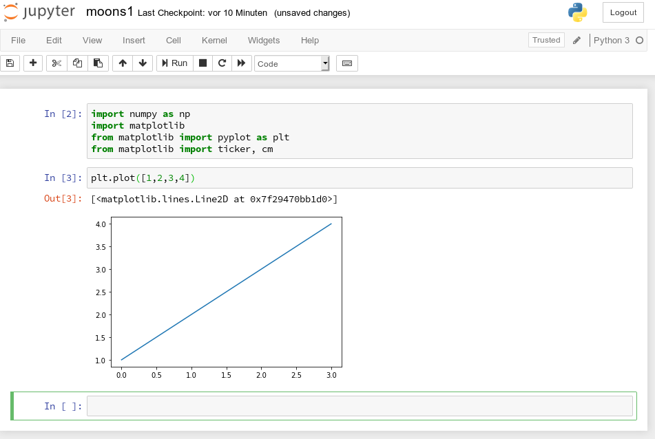
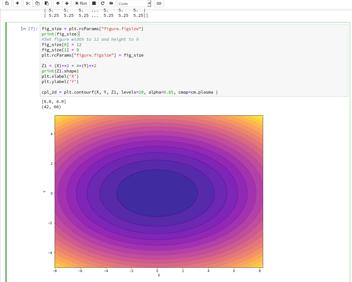
To get a better understanding of the structure of the meshgrid data we start our Jupyter notebook (see the last article), and, of course, first run the cell with the import statements
import numpy as np
import matplotlib
from matplotlib import pyplot as plt
from matplotlib import ticker, cm
from mpl_toolkits import mplot3d

from matplotlib.colors import ListedColormap
from sklearn.datasets import make_moons

from sklearn.pipeline import Pipeline
from sklearn.preprocessing import StandardScaler
from sklearn.preprocessing import PolynomialFeatures
from sklearn.svm import LinearSVC
from sklearn.svm import SVC
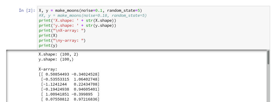
Then we run the cell that creates the moons data set to get the X-array of [x1,x2] coordinates plus the target values y:
X, y = make_moons(noise=0.1, random_state=5)
#X, y = make_moons(noise=0.18, random_state=5)
print('X.shape: ' + str(X.shape))
print('y.shape: ' + str(y.shape))
print("\nX-array: ")
print(X)
print("\ny-array: ")
print(y)
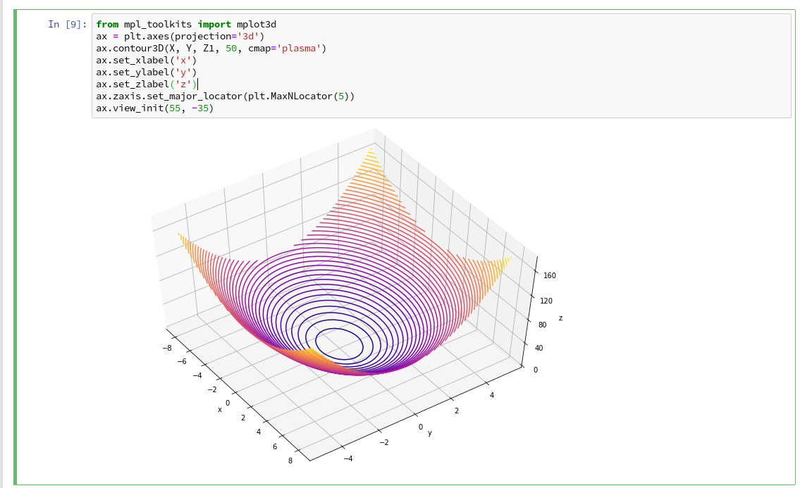
Now we can apply the “meshgrid()”-function in a new cell:
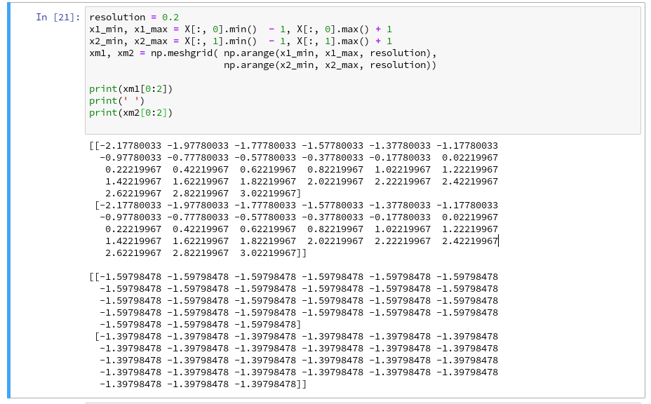
You see the 2-dim structure of the xm1- and xm2-arrays.
Rearranging the mesh data for predictions
How do we predict data values? In the last article we did this in the following form
z_test = polynomial_svm_clf.predict([[x1_test_1, x2_test_1],
                                     [x1_test_2, x2_test_2],
                                     [x1_test_3, x2_test_3],
                                     [x1_test_3, x2_test_3]
                                    ])
“polynomial_svm_clf” was the trained predictor we got by our pipeline with the LinearSVC algorithm and a subsequent training.
The “predict()”-function requires its input values as a 1-dim array, where each element provides a (x1, x2)-pair of coordinate values. But how do we get such pairs from our strange 2-dimensional xm1- and xm2-arrays?
We need a bit of array- or matrix-wizardry here:
Numpy gives us the function “ravel()” which transforms a 2d-array into a 1-d array AND numpy also gives us the possibility to transpose a matrix (invert the axes) via “array().T“. (Have a look at the numpy-documentation e.g. at https://docs.scipy.org/doc/).
We can use these options in the following way – see the test example:
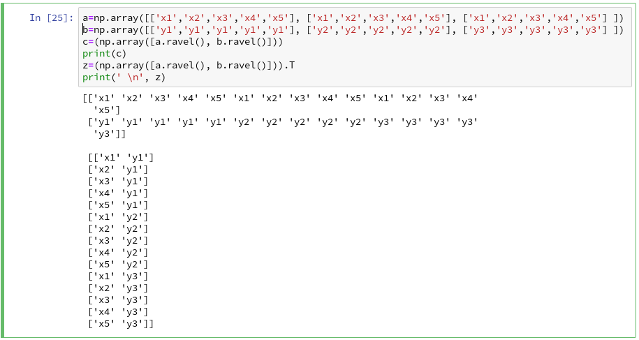
The involved logic should be clear by now. So, the next step should be something like
Z = polynomial_svm_clf.predict( np.array([xm1.ravel(), xm2.ravel()] ).T)
However, in the second article we already learned that we need Z in the same
shape as the 2-dim mesh coordinate-arrays to create a contour-plot with contourf(). We, therefore, need to reshape the Z-array; this is easy – numpy contains a method reshape() for numpy-array-objects : Z = Z.reshape(xm1.shape). It is sufficient to use xm1 – it has the same shape as xm2.
Applying contourf()
To distinguish contour areas we need a color map for our y-target-values. Later on we will also need different optical markers for the data points. So, for the contour-plot we add some statements like
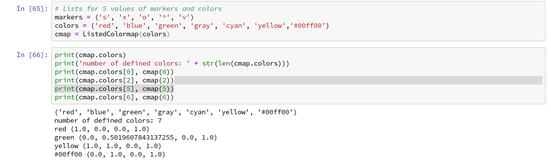
markers = ('s', 'x', 'o', '^', 'v')
colors = ('red', 'blue', 'lightgreen', 'gray', 'cyan')
# fetch unique values of y into array and associate with colors
cmap = ListedColormap(colors[:len(np.unique(y))])

Z = Z.reshape(xm1.shape)

# see article 2 for the use of contourf()
plt.contourf(xm1, xm2, Z, alpha=0.4, cmap=cmap)
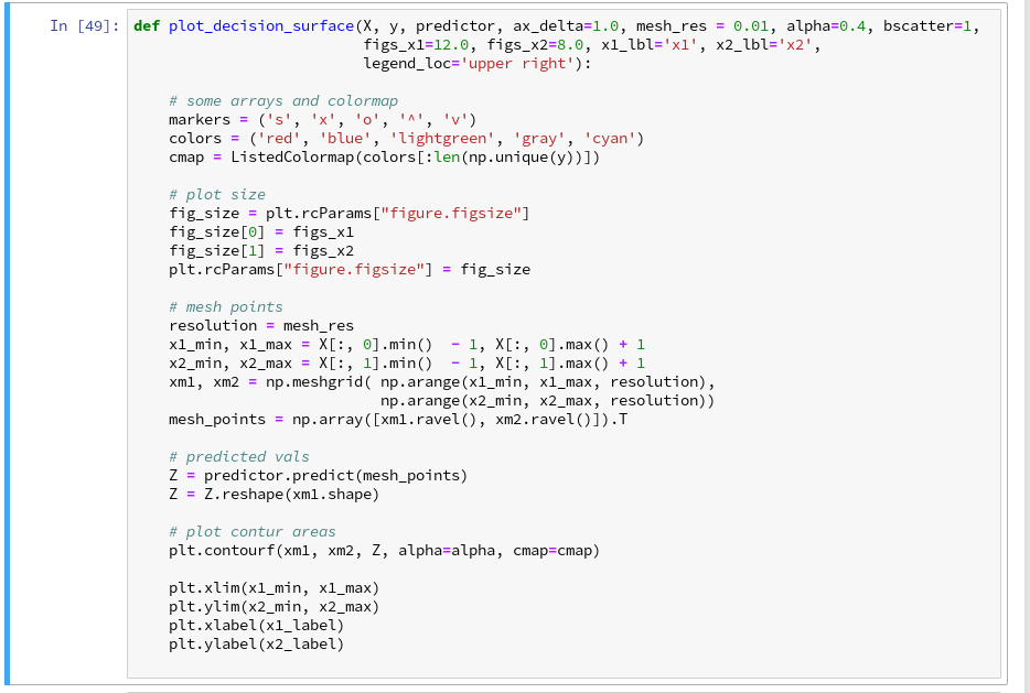
Let us put all this together; as the statements to create a plot obviously are many, we first define a function “plot_decision_surface()” in a notebook cell and run the cell contents:
Now, let us test – with a new cell that repeats some of our code of the last article for training:
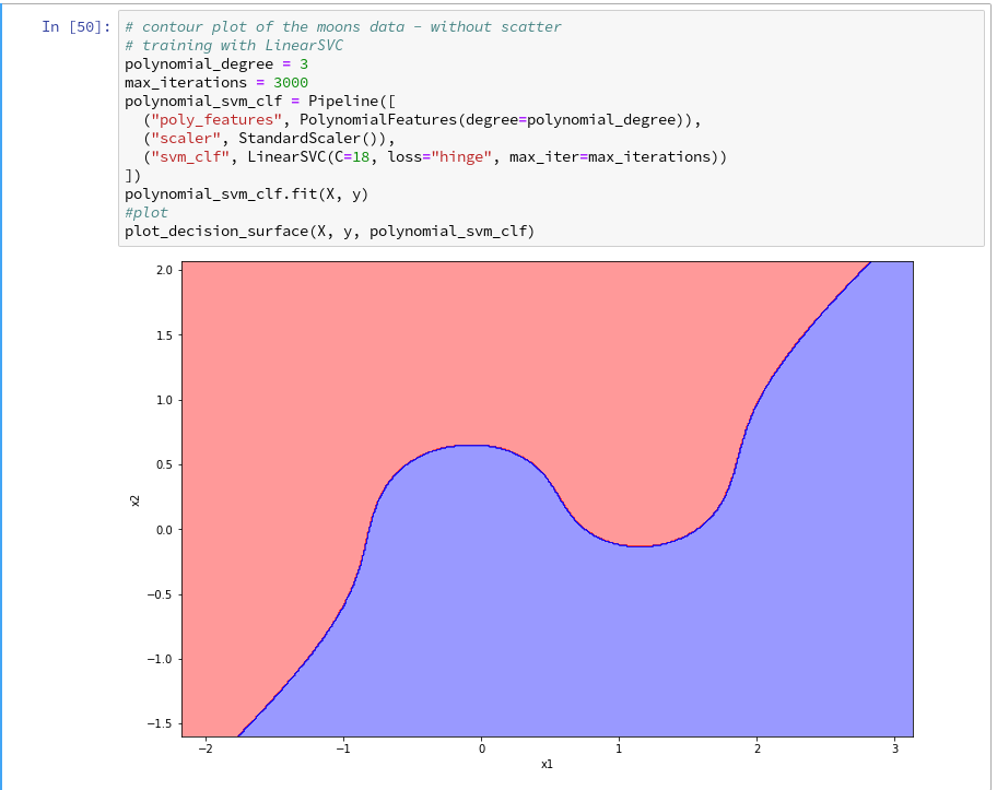
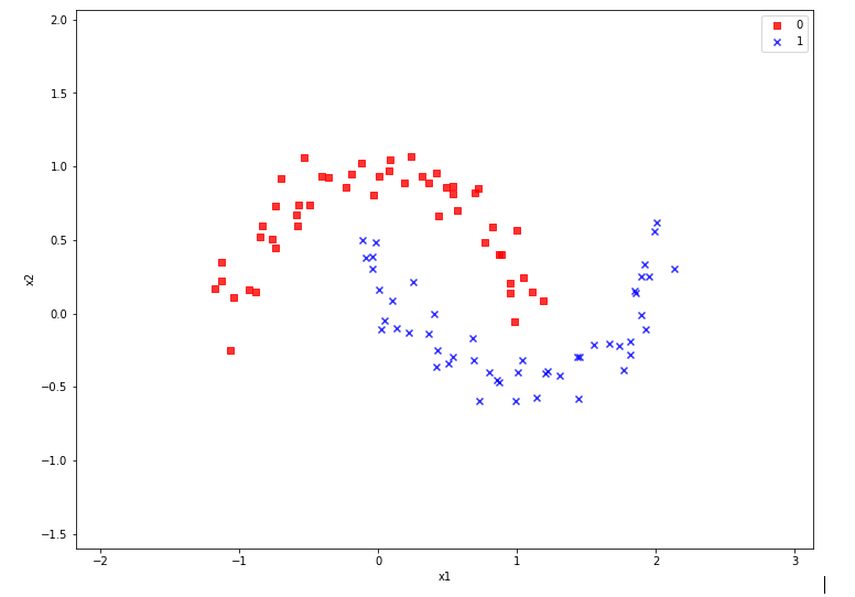
Yeah – we eventually got our decision surface!
But this result still is not really satisfactory – we need the data set points in addition to see how good the 2 clusters are separated. But with the insights of the last article this is now a piece of cake; we extend our function and run the definition cell
def plot_decision_surface(X, y, predictor, ax_delta=1.0, mesh_res = 0.01, alpha=0.4, bscatter=1,
                          figs_x1=12.0, figs_x2=8.0, x1_lbl='x1', x2_lbl='x2',
                          legend_loc='upper right'):

    # some arrays and colormap
    markers = ('s', 'x', 'o', '^', 'v')
    colors = ('red', 'blue', 'lightgreen', 'gray', 'cyan')
    cmap = ListedColormap(colors[:len(np.unique(y))])

    # plot size
    fig_size = plt.rcParams["figure.figsize"]
    fig_size[0] = figs_x1
    fig_size[1] = figs_x2
    plt.rcParams["figure.figsize"] = fig_size

    # mesh points
    resolution = mesh_res
    x1_min, x1_max = X[:, 0].min()  - 1, X[:, 0].max() + 1
    x2_min, x2_max = X[:, 1].min()  - 1, X[:, 1].max() + 1
    xm1, xm2 = np.meshgrid( np.arange(x1_min, x1_max, resolution),
                            np.arange(x2_min, x2_max, resolution))
    mesh_points = np.array([xm1.ravel(), xm2.ravel()]).T

    # predicted vals
    Z = predictor.predict(mesh_points)
    Z = Z.reshape(xm1.shape)

    # plot contur areas
    plt.contourf(xm1, xm2, Z, alpha=alpha, cmap=cmap)

    # add a scatter plot of the data points
    if (bscatter == 1):
        alpha2 = alpha + 0.4
        if (alpha2 > 1.0 ):
            alpha2 = 1.0
        for idx, yv in enumerate(np.unique(y)):
            plt.scatter(x=X[y==yv, 0], y=X[y==yv, 1],
                        alpha=alpha2, c=[cmap(idx)], marker=markers[idx], label=yv)

    plt.xlim(x1_min, x1_max)
    plt.ylim(x2_min, x2_max)
    plt.xlabel(x1_label)
    plt.ylabel(x2_label)
    if (bscatter == 1):
        plt.legend(loc=legend_loc)
Now we get:
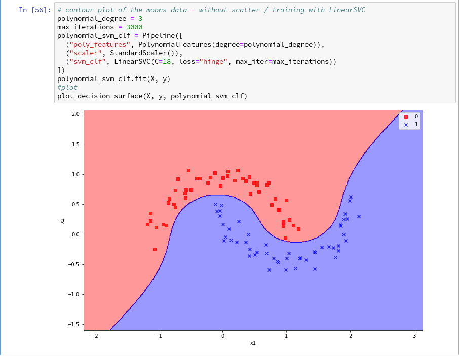
So far, so good ! We see that our specific model of the moons data separates the (x1,x2)-plane into two areas – which has two wiggles near our data points, but otherwise asymptotically approaches almost a diagonal.
Hmmm, one could bet that this is model specific. Therefore, let us do a quick test for a polynomial_degree=4 and max_iterations=6000. We get
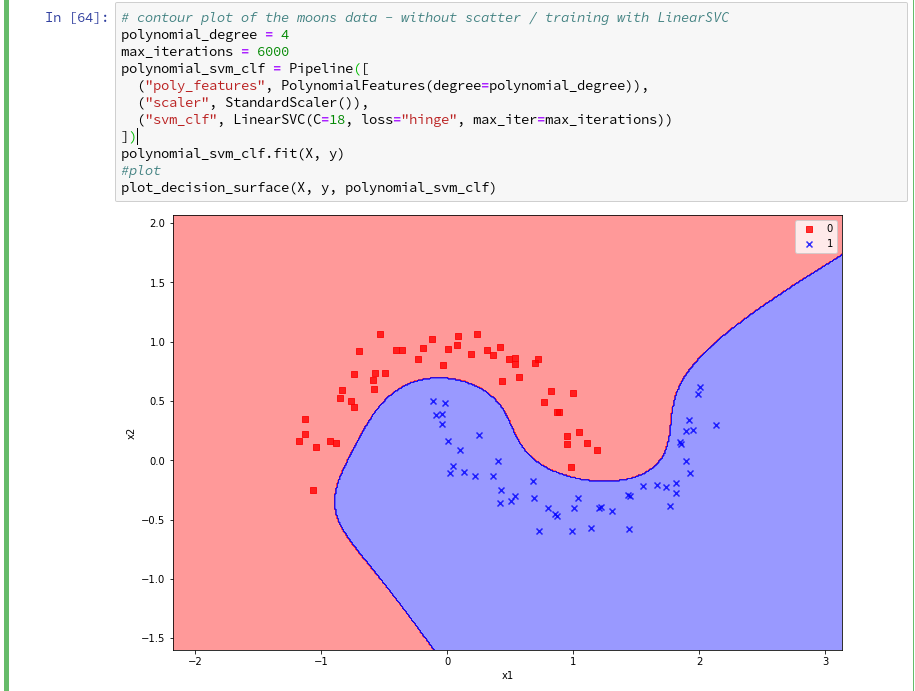
Surprise, surprise … We have already 2 different models fitting our data.
Which one do you believe to be “better” for extrapolations into the big (x1,x2)-plane? Even in the vicinity of the leftmost and rightmost points in x1-direction we would get different predictions of our models for some points. We see that our knowledge is insufficient – i.e. the test data do not provide enough information to really distinguish between different models.
Conclusion
After some organization of our data we had success with our approach of using a contour plot to visualize a decision surface in the 2-dimensional space (x1,x2) of input data X for our moon clusters. A simple wrapper function for surface plotting equips us now for further fast experiments with other algorithms.
To become better organized, we should save this plot-function for decision surfaces as well as a simpler function for pure scatter plots in a Python class and import the functionality later on.
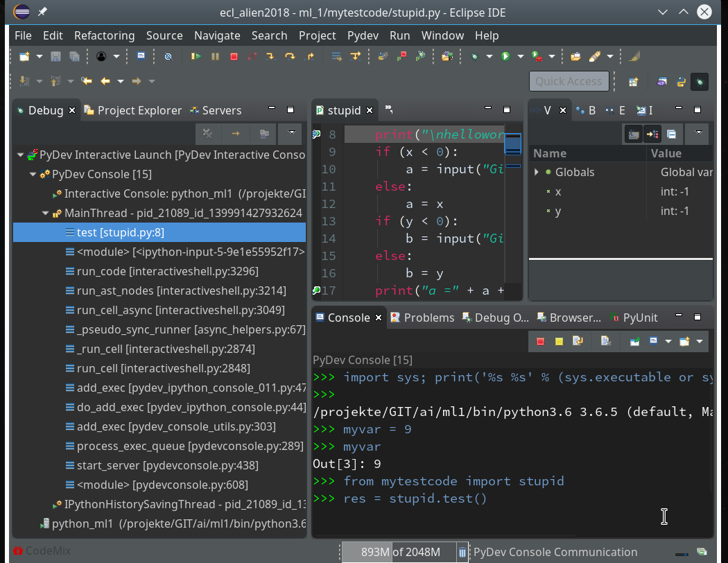
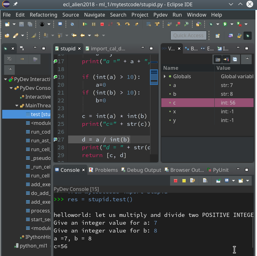
We shall create such a class within Eclipse PyDev as a first step in the next article:
Afterward we shall look at other SVM algorithms – as the “polynomial kernel” and the “Gaussian kernel”. We shall also have a look at the impact of some of the parameters of the algorithms. Stay tuned …