In my last article in this blog I wrote a bit about some steps to get Keras running with Tensorflow 2 [TF2] and Cuda 10.2 on Opensuse Leap 15.1. One objective of these efforts was a performance comparison between two similar Multilayer Perceptrons [MLP] :
- my own MLP programmed with Python and Numpy; I have discuss this program in another article series;
- an MLP with a similar setup based on Keras and TF2
Not for reasons of a competition, but to learn a bit about differences. When and for what parameters do Keras/TF2 offer a better performance?
Another objective is to test TF-alternatives to Numpy functions and possible performance gains.
For the Python code of my own MLP see the article series starting with the following post:
A simple Python program for an ANN to cover the MNIST dataset – I – a starting point
But I will discuss relevant code fragments also here when needed.
I think, performance is always an interesting topic – especially for dummies as me regarding Python. After some trials and errors I decided to discuss some of my experiences with MLP performance and optimization options in a separate series of the section “Machine learning” in this blog. This articles starts with two simple measures.
A factor of 6 turns turns into a factor below 2
Well, what did a first comparison give me? Regarding CPU time I got a factor of 6 on the MNIST dataset for a batch-size of 500. Of course, Keras with TF2 was faster 🙂 . Devastating? Not at all … After years of dealing with databases and factors of up to 100 by changes of SQL-statements and indexing a factor of 6 cannot shock or surprise me.
The Python code was the product of an unpaid hobby activity in my scarce free time. And I am still a beginner in Python. The code was also totally unoptimized, yet – both regarding technical aspects and the general handling of forward and backward propagation. It also contained and still contains a lot of superfluous statements for testing. Actually, I had expected an even bigger factor.
In addition, some things between Keras and my Python programs are not directly comparable as I only use 4 CPU cores for Openblas – this gave me an optimum for Python/Numpy programs in a Jupyter environment. Keras and TF2 instead seem to use all available CPU threads (successfully) despite limiting threading with TF-statements. (By the way: This is an interesting point in itself. If OpenBlas cannot give them advantages what else do they do?)
A very surprising point was, however, that using a GPU did not make the factor much bigger – despite the fact that TF2 should be able to accelerate certain operations on a GPU by at least by a factor of 2 up to 5 as independent tests on matrix operations showed me. And a factor of > 2 between my GPU and the CPU is what I remember from TF1-times last year. So, either the CPU is better supported now or the GPU-support of TF2 has become worse compared to TF1. An interesting point, too, for further investigations …
An even bigger surprise was that I could reduce the factor for the given batch-size down to 2 by just two major, butsimple code changes! However, further testing also showed a huge dependency on the batch sizechosen for training – which is another interesting point. Simple tests show that we may even be able to reduce the performance factor further by
- by using directly coupled matrix operations – if logically possible
- by using the basic low-level Python API for some operations
Hope, this sounds interesting for you.
The reference model based on Keras
I used the following model as a reference
in a Jupyter environment executed on Firefox:
Jupyter Cell 1
# compact version
# ****************
import time
import tensorflow as tf
#from tensorflow import keras as K
import keras as K
from keras.datasets import mnist
from keras import models
from keras import layers
from keras.utils import to_categorical
from keras import regularizers
from tensorflow.python.client import device_lib
import os

# use to work with CPU (CPU XLA ) only
os.environ["CUDA_VISIBLE_DEVICES"] = "-1"
# The following can only be done once - all CPU cores are used otherwise
tf.config.threading.set_intra_op_parallelism_threads(4)
tf.config.threading.set_inter_op_parallelism_threads(4)

gpus = tf.config.experimental.list_physical_devices('GPU')
if gpus:
  try:
    tf.config.experimental.set_virtual_device_configuration(gpus[0],
          [tf.config.experimental.VirtualDeviceConfiguration(memory_limit=1024)])
  except RuntimeError as e:
    print(e)

# if not yet done elsewhere
#tf.compat.v1.disable_eager_execution()
#tf.config.optimizer.set_jit(True)
tf.debugging.set_log_device_placement(True)

use_cpu_or_gpu = 0 # 0: cpu, 1: gpu

# function for training
def train(train_images, train_labels, epochs, batch_size, shuffle):
    network.fit(train_images, train_labels, epochs=epochs, batch_size=batch_size, shuffle=shuffle)

# setup of the MLP
network = models.Sequential()
network.add(layers.Dense(70, activation='sigmoid', input_shape=(28*28,), kernel_regularizer=regularizers.l2(0.01)))
#network.add(layers.Dense(80, activation='sigmoid'))
#network.add(layers.Dense(50, activation='sigmoid'))
network.add(layers.Dense(30, activation='sigmoid', kernel_regularizer=regularizers.l2(0.01)))
network.add(layers.Dense(10, activation='sigmoid'))
network.compile(optimizer='rmsprop', loss='categorical_crossentropy', metrics=['accuracy'])

# load MNIST
mnist = K.datasets.mnist
(X_train, y_train), (X_test, y_test) = mnist.load_data()
# simple normalization
train_images = X_train.reshape((60000, 28*28))
train_images = train_images.astype('float32') / 255
test_images = X_test.reshape((10000, 28*28))
test_images = test_images.astype('float32') / 255
train_labels = to_categorical(y_train)
test_labels = to_categorical(y_test)
Jupyter Cell 2
# run it
if use_cpu_or_gpu == 1:
    start_g = time.perf_counter()
    train(train_images, train_labels, epochs=35, batch_size=500, shuffle=True)
    end_g = time.perf_counter()
    test_loss, test_acc= network.evaluate(test_images, test_labels)
    print('Time_GPU: ', end_g - start_g)
else:
    start_c = time.perf_counter()
    with tf.device("/CPU:0"):
        train(train_images, train_labels, epochs=35, batch_size=500, shuffle=True)
    end_c = time.perf_counter()
    test_loss, test_acc= network.evaluate(test_images, test_labels)
    print('Time_CPU: ', end_c - start_c)

# test accuracy
print('Acc:: ', test_acc)
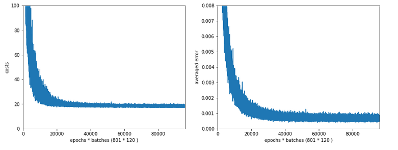
Typical output – first run:
Epoch 1/35
60000/60000 [==============================] - 1s 16us/step - loss: 2.6700 - accuracy: 0.1939
Epoch 2/35
60000/60000 [==============================] - 0s 5us/step - loss: 2.2814 - accuracy: 0.3489
Epoch 3/35
60000/60000 [==============================] - 0s 5us/step - loss: 2.1386 - accuracy: 0.3848
Epoch 4/35
60000/60000 [==============================] - 0s 5us/step - loss: 1.9996 - accuracy: 0.3957
Epoch 5/35
60000/60000 [==============================] - 0s 5us/step - loss: 1.8941 - accuracy: 0.4115
Epoch 6/35
60000/60000 [==============================] -
0s 5us/step - loss: 1.8143 - accuracy: 0.4257
Epoch 7/35
60000/60000 [==============================] - 0s 5us/step - loss: 1.7556 - accuracy: 0.4392
Epoch 8/35
60000/60000 [==============================] - 0s 5us/step - loss: 1.7086 - accuracy: 0.4542
Epoch 9/35
60000/60000 [==============================] - 0s 5us/step - loss: 1.6726 - accuracy: 0.4664
Epoch 10/35
60000/60000 [==============================] - 0s 5us/step - loss: 1.6412 - accuracy: 0.4767
Epoch 11/35
60000/60000 [==============================] - 0s 5us/step - loss: 1.6156 - accuracy: 0.4869
Epoch 12/35
60000/60000 [==============================] - 0s 5us/step - loss: 1.5933 - accuracy: 0.4968
Epoch 13/35
60000/60000 [==============================] - 0s 5us/step - loss: 1.5732 - accuracy: 0.5078
Epoch 14/35
60000/60000 [==============================] - 0s 5us/step - loss: 1.5556 - accuracy: 0.5180
Epoch 15/35
60000/60000 [==============================] - 0s 5us/step - loss: 1.5400 - accuracy: 0.5269
Epoch 16/35
60000/60000 [==============================] - 0s 5us/step - loss: 1.5244 - accuracy: 0.5373
Epoch 17/35
60000/60000 [==============================] - 0s 5us/step - loss: 1.5106 - accuracy: 0.5494
Epoch 18/35
60000/60000 [==============================] - 0s 5us/step - loss: 1.4969 - accuracy: 0.5613
Epoch 19/35
60000/60000 [==============================] - 0s 5us/step - loss: 1.4834 - accuracy: 0.5809
Epoch 20/35
60000/60000 [==============================] - 0s 5us/step - loss: 1.4648 - accuracy: 0.6112
Epoch 21/35
60000/60000 [==============================] - 0s 5us/step - loss: 1.4369 - accuracy: 0.6520
Epoch 22/35
60000/60000 [==============================] - 0s 5us/step - loss: 1.3976 - accuracy: 0.6821
Epoch 23/35
60000/60000 [==============================] - 0s 5us/step - loss: 1.3602 - accuracy: 0.6984
Epoch 24/35
60000/60000 [==============================] - 0s 5us/step - loss: 1.3275 - accuracy: 0.7084
Epoch 25/35
60000/60000 [==============================] - 0s 5us/step - loss: 1.3011 - accuracy: 0.7147
Epoch 26/35
60000/60000 [==============================] - 0s 5us/step - loss: 1.2777 - accuracy: 0.7199
Epoch 27/35
60000/60000 [==============================] - 0s 5us/step - loss: 1.2581 - accuracy: 0.7261
Epoch 28/35
60000/60000 [==============================] - 0s 5us/step - loss: 1.2411 - accuracy: 0.7265
Epoch 29/35
60000/60000 [==============================] - 0s 5us/step - loss: 1.2259 - accuracy: 0.7306
Epoch 30/35
60000/60000 [==============================] - 0s 5us/step - loss: 1.2140 - accuracy: 0.7329
Epoch 31/35
60000/60000 [==============================] - 0s 5us/step - loss: 1.2003 - accuracy: 0.7355
Epoch 32/35
60000/60000 [==============================] - 0s 5us/step - loss: 1.1890 - accuracy: 0.7378
Epoch 33/35
60000/60000 [==============================] - 0s 5us/step - loss: 1.1783 - accuracy: 0.7410
Epoch 34/35
60000/60000 [==============================] - 0s 5us/step - loss: 1.1700 - accuracy: 0.7425
Epoch 35/35
60000/60000 [==============================] - 0s 5us/step - loss: 1.1605 - accuracy: 0.7449
10000/10000 [==============================] - 0s 37us/step
Time_CPU:  11.055424336002034
Acc::  0.7436000108718872
A second run was a bit faster: 10.8 secs. Accuracy around: 0.7449.
The relatively low accuracy is mainly due to the regularization (and reasonable to avoid overfitting). Without regularization we would already have passed the 0.9 border.
My own unoptimized MLP-program was executed with the following parameter setting:
             my_data_set="mnist_keras",
             n_hidden_layers = 2,
             ay_nodes_layers = [0, 70, 30, 0],
             n_nodes_layer_out = 10,
             num_test_records = 10000, #
number of test data

             # Normalizing - you should play with scaler1 only for the time being
             scaler1 = 1,   # 1: StandardScaler (full set), 1: Normalizer (per sample)
             scaler2 = 0,   # 0: StandardScaler (full set), 1: MinMaxScaler (full set)
             b_normalize_X_before_preproc = False,
             b_normalize_X_after_preproc  = True,

             my_loss_function = "LogLoss",

             n_size_mini_batch = 500,
             n_epochs = 35,
             lambda2_reg = 0.01,

             learn_rate = 0.001,
             decrease_const = 0.000001,

             init_weight_meth_L0 = "sqrt_nodes",  # method to init weights in an interval defined by  =>"sqrt_nodes" or a constant interval  "const"
             init_weight_meth_Ln = "sqrt_nodes",  # sqrt_nodes", "const"
             init_weight_intervals = [(-0.5, 0.5), (-0.5, 0.5), (-0.5, 0.5)],   # in case of a constant interval
             init_weight_fact = 2.0,              # extends the interval
             mom_rate   = 0.00005,

             b_shuffle_batches = True,    # shuffling the batches at the start of each epoch
             b_predictions_train = True,  # test accuracy by  predictions for ALL samples of the training set (MNIST: 60000) at the start of each epoch
             b_predictions_test  = False,
             prediction_train_period = 1, # 1: each and every epoch is used for accuracy tests on the full training set
             prediction_test_period = 1,  # 1: each and every epoch is used for accuracy tests on the full test dataset
People familiar with my other article series on the MLP program know the parameters. But I think their names and comments are clear enough.
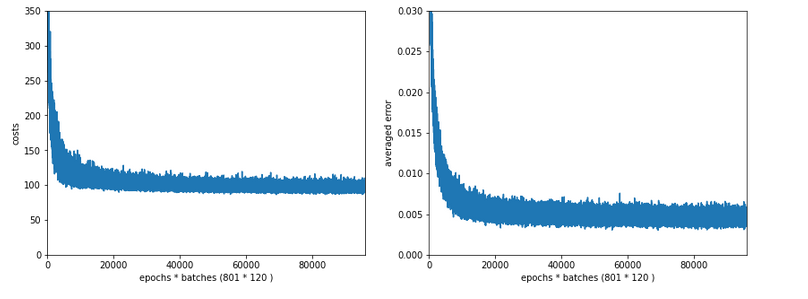
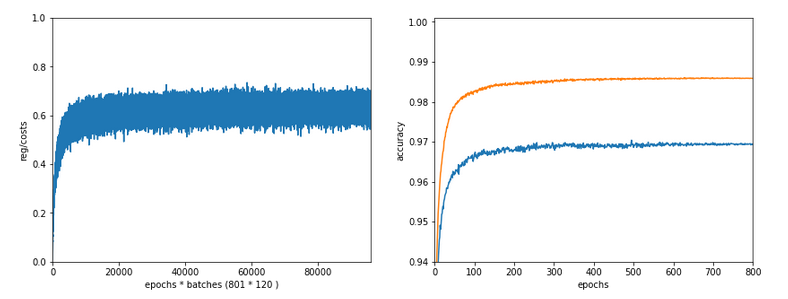
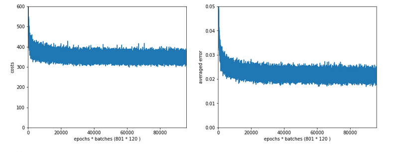
With a measurement of accuracy based on a forward propagation of the complete training set after each and every epoch (with the adjusted weights) I got a run time of 60 secs.
With accuracy measurements based on error tracking for batches and averaging over all batches, I get 49.5 secs (on 4 CPU threads). So, this is the mentioned factor between 5 and 6.
(By the way: The test indicates some space for improvement on the “Forward Propagation” 🙂 We shall take care of this in the next article of this series – promised).
So, these were the references or baselines for improvements.
Two measures – and a significant acceleration
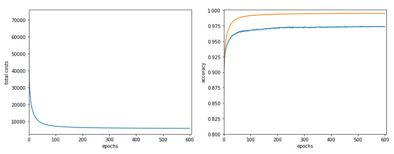
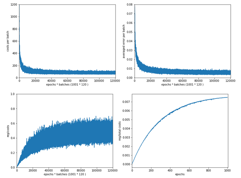
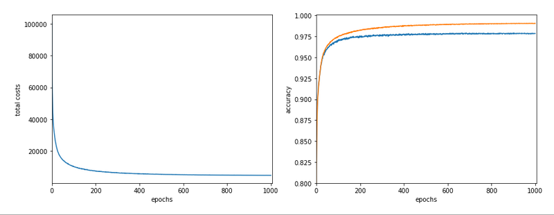
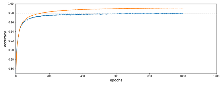
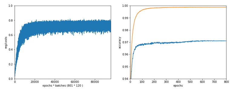
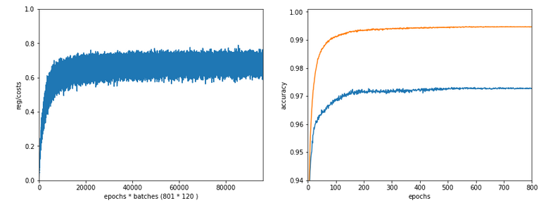
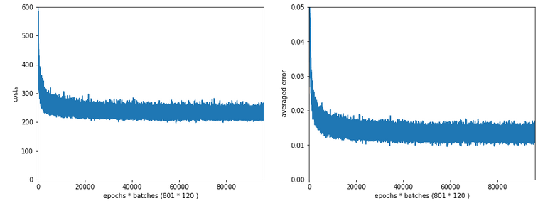
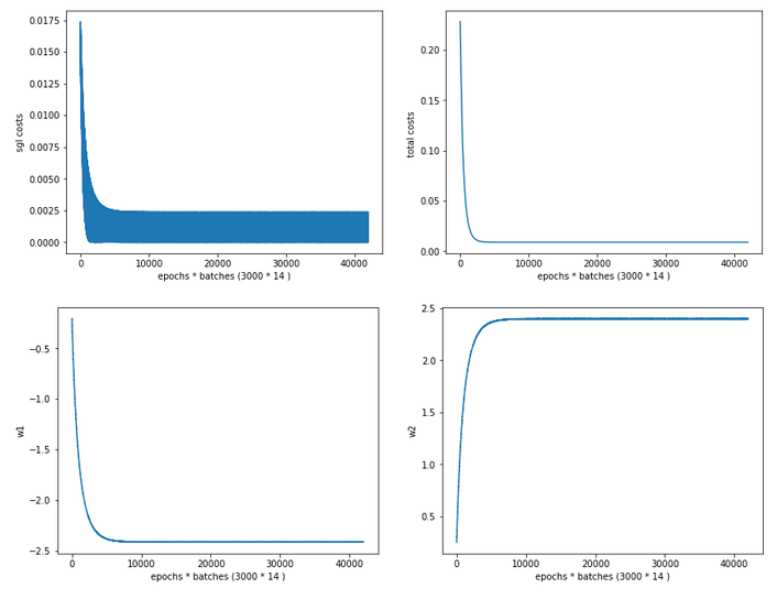
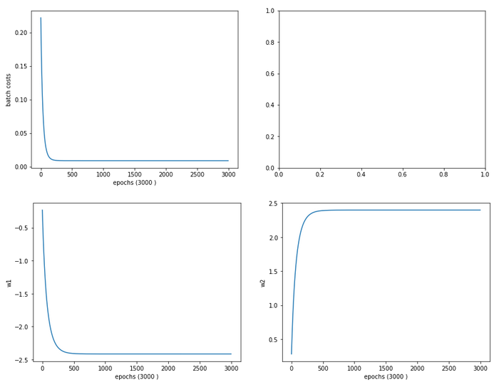
Well, let us look at the results after two major code changes. With a test of accuracy performed on the full training set of 60000 samples at the start of each epoch I get the following result :
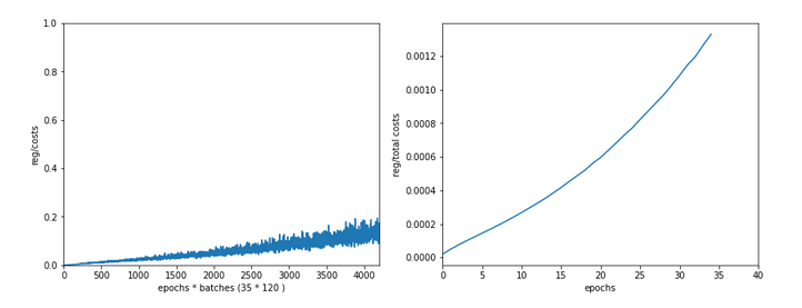
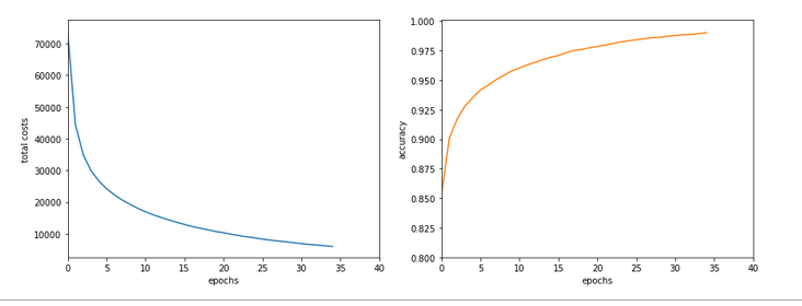
------------------
Starting epoch 35

Time_CPU for epoch 35 0.5518779030026053
relative CPU time portions: shuffle: 0.05  batch loop: 0.58  prediction:  0.37
Total CPU-time:  19.065050211000198

learning rate =  0.0009994051838157095

total costs of training set   =  5843.522
rel. reg. contrib. to total costs =  0.0013737131

total costs of last mini_batch   =  56.300297
rel. reg. contrib. to batch costs =  0.14256112

mean abs weight at L0 :  0.06393985
mean abs weight at L1 :  0.37341583
mean abs weight at L2 :  1.302389

avg total error of last mini_batch =  0.00709
presently reached train accuracy   =  0.99072

-------------------
Total training Time_CPU:  19.04528829299714
With accuracy taken only from the error of a batch:
avg total error of last mini_batch =  0.00806
presently reached train accuracy   =  0.99194
-------------------
Total training Time_CPU:  11.331006342999899
Isn’t this good news? A time of 11.3 secs is pretty close to what Keras provides us with! (Well, at least for a batch size of 500). And with a better result regarding accuracy on my side – but this has to do with a probably different
handling of learning rates and the precise translation of the L2-regularization parameter for batches.
Plots:

How did I get to this point? As said: Two measures were sufficient.
A big leap in performance by turning to float32 precision
So far I have never cared too much for defining the level of precision by which Numpy handles arrays with floating point numbers. In the context of Machine Learning this is a profound mistake. on a 64bit CPU many time consuming operations can gain almost a factor of 2 in performance when using float 32 precision – if the programmers tweaked everything. And I assume the Numpy guys did it.
So: Just use “dtype=np.float32” (np means “numpy” which I always import as “np”) whenever you initialize numpy arrays!
For the readers following my other series: You should look at multiple methods performing some kind of initialization of my “MyANN”-class. Here is a list:
    def _handle_input_data(self):
        .....
            self._y = np.array([int(i) for i in self._y], dtype=np.float32)
        .....
        self._X = self._X.astype(np.float32)
        self._y = self._y.astype(np.int32)
        .....
    def _encode_all_y_labels(self, b_print=True):
        .....
        self._ay_onehot = np.zeros((self._n_labels, self._y_train.shape[0]), dtype=np.float32)
        self._ay_oneval = np.zeros((self._n_labels, self._y_train.shape[0], 2), dtype=np.float32)

        .....
    def _create_WM_Input(self):
        .....
        w0 = w0.astype(dtype=np.float32)
        .....
    def _create_WM_Hidden(self):
        .....
            w_i_next = w_i_next.astype(dtype=np.float32)
        .....
    def _create_momentum_matrices(self):
        .....
            self._li_mom[i] = np.zeros(self._li_w[i].shape, dtype=np.float32)
        .....
    def _prepare_epochs_and_batches(self, b_print = True):
        .....
        self._ay_theta = -1 * np.ones(self._shape_epochs_batches, dtype=np.float32)
        self._ay_costs = -1 * np.ones(self._shape_epochs_batches, dtype=np.float32)
        self._ay_reg_cost_contrib = -1 * np.ones(self._shape_epochs_batches, dtype=np.float32)
        .....
        self._ay_period_test_epoch     = -1 * np.ones(shape_test_epochs, dtype=np.float32)
        self._ay_acc_test_epoch        = -1 * np.ones(shape_test_epochs, dtype=np.float32)
        self._ay_err_test_epoch        = -1 * np.ones(shape_test_epochs, dtype=np.float32)
        self._ay_period_train_epoch    = -1 * np.ones(shape_train_epochs, dtype=np.float32)
        self._ay_acc_train_epoch       = -1 * np.ones(shape_train_epochs, dtype=np.float32)
        self._ay_err_train_epoch       = -1 * np.ones(shape_train_epochs, dtype=np.float32)
        self._ay_tot_costs_train_epoch = -1 * np.ones(shape_train_epochs, dtype=np.float32)
        self._ay_rel_reg_train_epoch   = -1 * np.ones(shape_train_epochs, dtype=np.float32)
        .....
        self._ay_mean_abs_weight = -10 * np.ones(shape_weights, dtype=np.float32)
        .....

   def _add_bias_neuron_to_layer(self, A, how='column'):
        .....
            A_new = np.ones((A.shape[0], A.shape[1]+1), dtype=np.float32)
        .....
            A_new = np.ones((A.shape[0]+1, A.shape[1]), dtype=np.float32)
    .....
After I applied these changes the factor in comparison to Keras went down to 3.1 – for a batch size of 500. Good news after a first simple step!
Reducing the CPU time once more
The next step required a bit more thinking. When I went through further more detailed tests of CPU consumption for various steps during training I found that the error back propagation through the network required significantly more time than the forward propagation.
At first sight this seems to be logical. There are more operations to be done between layers – real matrix multiplications with np.dot() (or np.matmul()) and element-wise multiplications with the “*”-operation. See also my PDF on the basic math:
Back_Propagation_1.0_200216.
But this is wrong assumption: When I measured CPU times in detail I saw that such operations took most time when network layer L0 – i.e. the input layer of the MLP – got involved. This also seemed to be reasonable: the weight matrix is biggest there; the input layer of all layers has most neuron nodes.
But when I went through the code I saw that I just had been too lazy whilst coding back propagation:
    ''' -- Method to handle error BW propagation for a mini-batch --'''
    def _bw_propagation(self,
                        ay_y_enc, li_Z_in, li_A_out,
                        li_delta_out, li_delta, li_D, li_grad,
                        b_print = True, b_internal_timing = False):

        # Note: the lists li_Z_in, li_A_out were already filled by _fw_propagation() for the present batch

        # Initiate BW propagation - provide delta-matrices for outermost layer
        # ***********************
        # Input Z at outermost layer E  (4 layers -> layer 3)
        ay_Z_E = li_Z_in[self._n_total_layers-1]
        # Output A at outermost layer E (was calculated by output function)
        ay_A_E = li_A_out[self._n_total_layers-1]

        # Calculate D-matrix (derivative of output function) at outmost the layer - presently only D_sigmoid
        ay_D_E = self._calculate_D_E(ay_Z_E=ay_Z_E, b_print=b_print )

        # Get the 2 delta matrices for the outermost layer (only layer E has 2 delta-matrices)
        ay_delta_E, ay_delta_out_E = self._calculate_delta_E(ay_y_enc=ay_y_enc, ay_A_E=ay_A_E, ay_D_E=ay_D_E, b_print=b_print)

        # add the matrices at the outermost layer to their lists ; li_delta_out gets only one element
        idxE = self._n_total_layers - 1
        li_delta_out[idxE] = ay_delta_out_E # this happens only once
        li_delta[idxE]     = ay_delta_E
        li_D[idxE]         = ay_D_E
        li_grad[idxE]      = None    # On the outermost layer there is no gradient !

        # Loop over all layers in reverse direction
        # ******************************************
        # index range of target layers N in BW direction (starting with E-1 => 4 layers -> layer 2))
        range_N_bw_layer = reversed(range(0, self._n_total_layers-1))   # must be -1 as the last element is not taken

        # loop over layers
        for N in range_N_bw_layer:

            # Back Propagation operations between layers N+1 and N
            # *******************************************************
            # this method handles the special treatment of bias nodes in Z_in, too
            ay_delta_N, ay_D_N, ay_grad_
N = self._bw_prop_Np1_to_N( N=N, li_Z_in=li_Z_in, li_A_out=li_A_out, li_delta=li_delta, b_print=False )

            # add matrices to their lists
            li_delta[N] = ay_delta_N
            li_D[N]     = ay_D_N
            li_grad[N]= ay_grad_N

        return
with the following key function:
    ''' -- Method to calculate the BW-propagated delta-matrix and the gradient matrix to/for layer N '''
    def _bw_prop_Np1_to_N(self, N, li_Z_in, li_A_out, li_delta):
        '''
        BW-error-propagation between layer N+1 and N
        Inputs:
            li_Z_in:  List of input Z-matrices on all layers - values were calculated during FW-propagation
            li_A_out: List of output A-matrices - values were calculated during FW-propagation
            li_delta: List of delta-matrices - values for outermost ölayer E to layer N+1 should exist

        Returns:
            ay_delta_N - delta-matrix of layer N (required in subsequent steps)
            ay_D_N     - derivative matrix for the activation function on layer N
            ay_grad_N  - matrix with gradient elements of the cost fnction with respect to the weights on layer N
        '''

        # Prepare required quantities - and add bias neuron to ay_Z_in
        # ****************************

        # Weight matrix meddling between layers N and N+1
        ay_W_N = self._li_w[N]
        # delta-matrix of layer N+1
        ay_delta_Np1 = li_delta[N+1]

        # !!! Add row (for bias) to Z_N intermediately !!!
        ay_Z_N = li_Z_in[N]
        ay_Z_N = self._add_bias_neuron_to_layer(ay_Z_N, 'row')

        # Derivative matrix for the activation function (with extra bias node row)
        ay_D_N = self._calculate_D_N(ay_Z_N)

        # fetch output value saved during FW propagation
        ay_A_N = li_A_out[N]

        # Propagate delta
        # **************
        # intermediate delta
        ay_delta_w_N = ay_W_N.T.dot(ay_delta_Np1)
        # final delta
        ay_delta_N = ay_delta_w_N * ay_D_N
        # reduce dimension again (bias row)
        ay_delta_N = ay_delta_N[1:, :]

        # Calculate gradient
        # ********************
        #     required for all layers down to 0
        ay_grad_N = np.dot(ay_delta_Np1, ay_A_N.T)

        # regularize gradient (!!!! without adding bias nodes in the L1, L2 sums)
        ay_grad_N[:, 1:] += (self._li_w[N][:, 1:] * self._lambda2_reg + np.sign(self._li_w[N][:, 1:]) * self._lambda1_reg)

        return ay_delta_N, ay_D_N, ay_grad_N
Now, look at the eventual code:
    ''' -- Method to calculate the BW-propagated delta-matrix and the gradient matrix to/for layer N '''
    def _bw_prop_Np1_to_N(self, N, li_Z_in, li_A_out, li_delta, b_print=False):
        '''
        BW-error-propagation between layer N+1 and N
        ....
        '''
        # Prepare required quantities - and add bias neuron to ay_Z_in
        # ****************************

        # Weight matrix meddling between layers N and N+1
        ay_W_N = self._li_w[N]
        ay_delta_Np1 = li_delta[N+1]

        # fetch output value saved during FW propagation
        ay_A_N = li_A_out[N]

        # Optimization !
        if N > 0:
            ay_Z_N = li_Z_in[N]
            # !!! Add intermediate row (for bias) to Z_N !!!
            ay_Z_N = self._add_bias_neuron_to_layer(ay_Z_N, 'row')

            # Derivative matrix for the activation function (with extra bias node
row)
            ay_D_N = self._calculate_D_N(ay_Z_N)

            # Propagate delta
            # **************
            # intermediate delta
            ay_delta_w_N = ay_W_N.T.dot(ay_delta_Np1)
            # final delta
            ay_delta_N = ay_delta_w_N * ay_D_N
            # reduce dimension again
            ay_delta_N = ay_delta_N[1:, :]

        else:
            ay_delta_N = None
            ay_D_N = None

        # Calculate gradient
        # ********************
        #     required for all layers down to 0
        ay_grad_N = np.dot(ay_delta_Np1, ay_A_N.T)

        # regularize gradient (!!!! without adding bias nodes in the L1, L2 sums)
        if self._lambda2_reg > 0.0:
            ay_grad_N[:, 1:] += self._li_w[N][:, 1:] * self._lambda2_reg
        if self._lambda1_reg > 0.0:
            ay_grad_N[:, 1:] += np.sign(self._li_w[N][:, 1:]) * self._lambda1_reg

        return ay_delta_N, ay_D_N, ay_grad_N
You have, of course, detected the most important change:
We do not need to propagate any delta-matrices (originally coming from the error deviation at the output layer) down to layer 1!
This is due to the somewhat staggered nature of error back propagation – see the PDF on the math again. Between the first hidden layer L1 and the input layer L0 we only need to fetch the output matrix A at L0 to be able to calculate the gradient components for the weights in the weight matrix connecting L0 and L1. This saves us from the biggest matrix multiplication – and thus reduces computational time significantly.
Another bit of CPU time can be saved by calculating only the regularization terms really asked for; for my simple densely populated network I almost never use Lasso regularization; so L1 = 0.
These changes got me down to the values mentioned above. And, note: The CPU time for backward propagation then drops to the level of forward propagation. So: Be somewhat skeptical about your coding if backward propagation takes much more CPU time than forward propagation!
Dependency on the batch size
I should remark that TF2 still brings some major and remarkable advantages with it. Its strength becomes clear when we go to much bigger batch sizes than 500:
When we e.g. take a size of 10000 samples in a batch, the required time of Keras and TF2 goes down to 6.4 secs. This is again a factor of roughly 1.75 faster.
I do not see any such acceleration with batch size in case of my own program!
More detailed tests showed that I do not gain speed with a batch size over 1000; the CPU time increases linearly from that point on. This actually seems to be a limitation of Numpy and OpenBlas on my system.
Because , I have some reasons to believe that TF2 also uses some basic OpenBlas routines, this is an indication that we need to put more brain into further optimization.
Conclusion
We saw in this article that ML programs based on Python and Numpy may gain a boost by using only dtype=float32 and the related accuracy for Numpy arrays. In addition we saw that avoiding unnecessary propagation steps between the first hidden and at the input layer helps a lot.
In the next article of this series we shall look a bit at the performance of forward propagation – especially during accuracy tests on the training and test data set.
Further articles in this series
MLP, Numpy, TF2 – performance issues – Step II – bias neurons,
F- or C- contiguous arrays and performance
MLP, Numpy, TF2 – performance issues – Step III – a correction to BW propagation