Autoencoders and latent space fragmentation – VIII – approximation of the latent vector distribution by a multivariate normal distribution and ellipses

This post series is about creative abilities of convolutional Autoencoders [AE] which have been trained on a set of human face images. The objectives of this series and its numerical experiments are:

  • We want to create images with human faces from statistical z-vectors and related z-points in the AE’s latent space [z-space or LS]. Image creation will be done with the help of the AE’s Decoder after a training on the CelebA dataset.
  • We work with a standard Autoencoder, only. I.e., we do NOT add any artificial layers and cost terms to the Autoencoder’s layer structure (as it is done e.g. in Variational Autoencoders).
  • We analyze the position, shape and internal structure of the multidimensional z-vector distribution created by the AE’s Encoder after training. We assume that generated statistical z-vectors must point to respective regions of the latent space to guarantee images with reasonable content.
  • We raise the question whether simple statistical generator algorithms are sufficient to cover these regions with statistical z-vectors.

Our numerical experiments gave us some indications that such an endeavor is indeed feasible. In addition the third objective may give us some insight into the rules a trained AE follows when it encodes information about human faces into vectors of its latent space.

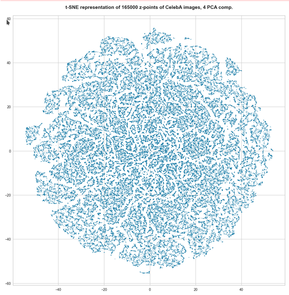
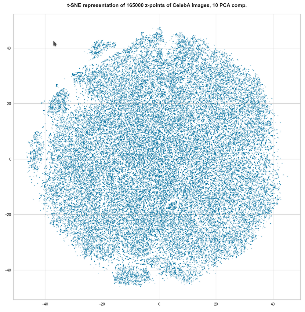
We have already studied the “natural” z-vector distribution created by a convolutional Autoencoder for CelebA images after a thorough training. The related z-point distribution fortunately filled just one confined and coherent off-center region of the AE’s latent space. Our experiments have furthermore shown that we must indeed restrict the statistical z-vector creation such that the vectors point to this particular region. Otherwise we will not get reasonable images. For details see the previous posts.

Autoencoders and latent space fragmentation – VII – face images from statistical z-points within the latent space region of CelebA
Autoencoders and latent space fragmentation – VI – image creation from z-points along paths in selected coordinate planes of the latent space
Autoencoders and latent space fragmentation – V – reconstruction of human face images from simple statistical z-point-distributions?
Autoencoders and latent space fragmentation – IV – CelebA and statistical vector distributions in the surroundings of the latent space origin
Autoencoders and latent space fragmentation – III – correlations of latent vector components
Autoencoders and latent space fragmentation – II – number distributions of latent vector components
Autoencoders and latent space fragmentation – I – Encoder, Decoder, latent space

The frustrating point so far was that simple methods for creating statistical vectors fail to put the end-points of the z-vectors into the relevant latent space region. In particular methods based on constant probability distributions within a common value interval for all z-vector components are doomed to miss the interesting region due to intricate mathematical reasons.

Afterward we tried to restrict the component values of test vectors to intervals defined by the shape of the number distribution for the values of each component of the CelebA related z-vectors. Such a distribution is nothing else than a one-dimensional probability density function for our special set of encoded CelebA samples: The function describes the probability that a component of a z-vector for human face images gets a value within a certain small value range. The probability distributions for all z-vector components were bell shaped and showed clear transitions to flat wings with very low values. See the plots below. This allowed us to define a value range

d_j_l   <   x_j   <   d_j_h

for each vector component x_j.

But keeping statistical values per component within the identified respective interval was not a sufficient restriction. We saw this clearly in the last post from significant irregular fluctuations in the reconstructed images. Obviously the components of statistically generated z-vectors must in addition fulfill correlation conditions.

The questions which I want to answer in this post are:

  • Can we approximate the 1-dimensional probability density functions for the z-vector components by some simple and common mathematical function?
  • What kind of correlations do we find between the components of the z-vectors encoding the information of human face images?
  • Can we derive some mathematical description of the multivariate z-vector distribution created by convolutional AEs for human face images in the AE’s multidimensional latent space?

Correlations are to be expected …

Please note: We deal with a multidimensional problem. A single latent vector encodes information about a human face image via all of its component values and by relations between these values. Regarding the purpose and the task an AE has to fulfill, it would be naive to assume that the components of our multi-dimensional z-vectors were independently organized. A z-vector encodes information for a convolutional Decoder to combine patterns detected by the Encoder and represented in neural (feature) maps of the networks to create an image. This is a subtle business. Just think about what you do when you draw a sketch of a human face. There are a lot of rules you follow.

When you think about the properties of basic feature patterns in a human face you would certainly assume that the pixel data of a corresponding image show strong correlations. This is among other things due to obvious symmetries – not excluding fluctuations of basic parameters describing human face features. But a nose tends to be at a position below the eyes and at a mid-distance of the eyes. In additions fluctuations of face features would on average respect certain limits given by natural proportions of a face. It would therefore be unreasonable to assume that the input for a Decoder to create a superposition of elementary patterns consists of un-correlated data. Instead the patterns in the original data should not only lead to well adjusted weights in the convolutional networks’ feature maps, but also to well regulated structural elements in the data distribution in the target space of the information encoding, namely in the latent space.

If the relations of the vector components were of a complex, highly non-linear kind and involved many dimensions at the same time we might be lost. But the results we have gained so far indicate a proper common structure of at least the density function for the individual components. This gives us some hope that the multidimensional problem somehow involves well defined 1-dimensional constituents. Whether this a sign that the multidimensional structure of the z-vector distribution can be decomposed into low-dimensional relations remains to be seen.

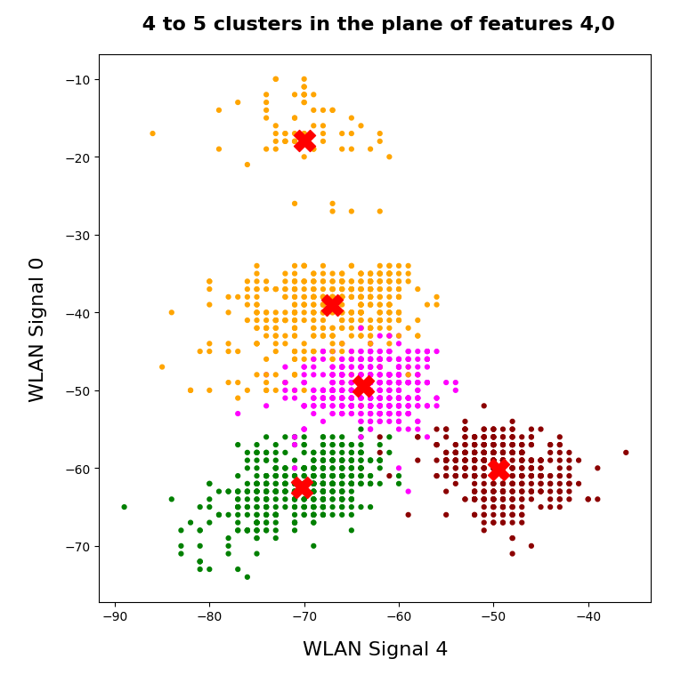
Observations regarding the z-vector distribution created by convolutional Autoencoders for human face images

Coordinate values of the z-points are identical to z-vector component values when we fix the end of each vector to the origin of the latent space coordinate system. The z-vector distribution thus directly corresponds to a z-point density distribution in the orthogonal coordinate system of the AE’s multi-dimensional LS. We have already made three interesting observations regarding these distributions:

  • The individual probability density function for a selected component of the latent vectors has a bell-shaped form. One , therefore, is tempted to think of a Gaussian function. This would indicate a possible normal distribution for the coordinate values of the z-points along each of the selected coordinate axes.
    Note: This does not exclude that the probability distributions for the components are correlated in some complex way.
  • When we plotted the projection of the z-point distribution onto 2-dimensional coordinate planes (for selected pairs of coordinate axes) then almost all of the resulting 2-dimensional density distributions seemed to have a defined core with an ellipsoidal form of its boundary.
  • For certain component- or axis-pairs the main axes of the apparent ellipses for pair-wise density function appeared rotated against the coordinate axes. The elongated regular and more or less symmetric forms showed a diagonal orientation (with different angles). This alone signals a strong correlation between related two vector components. Indeed we found high values for certain elements of the matrix of normalized Pearson correlation coefficients for the multi-dimensional distribution of z-vector component values.

These observations are not unrelated; they indicate a clear pattern of dependencies and correlations of the distributions for the variables in place. Regarding the data basis we have to keep five things in mind:

  • We treat the z-point distribution for CelebA images as a multi-dimensional probability density distribution. During the analysis we look in particular at 2-dimensional projections of this distribution onto planes spanned by a selected pair of orthogonal axes of the LS coordinate system. We also consider the one-dimensional value distributions for z-vector components. In this sense we regard the z-vector components as logically separate variables.
  • The data used are numbers of z-points counted in finite 1d-intervals, 2d-rectangles or multidimensional cuboids. We fit idealized functions to the respective discrete bar plots. Even if there is a good 1d-fit fluctuations may especially get visible in multidimensional plots for correlated data. A related probability density requires a normalization. We drop the resulting constant factors in the qualitative discussions below.
  • Statistical (un-)correlation of statistical variable distributions must NOT to be confused with underlying variable (in-) dependency. Linear correlations can be reduced to zero by coordinate transformations without eliminating the original variable dependencies.
  • Pearson correlation coefficients are sensitive to linear elements in the relations of logically separate variable distributions. They can not fully cover non-linear distribution relations or covered variable dependencies.
  • A transformation to a local coordinate system whose axes are aligned to the so called main axes of the multidimensional distributions does not remove the original data relations – but there may exist a coordinate system in which the distribution data can be described in a simple, factorized form corresponding to a composition of seemingly un-correlated data distributions.

Anyway – by discussing density distributions we work on overall and large scale average relations between statistical value distributions for our variables, namely the z-vector components. We do not cover local micro-relations that may be in place in addition.

The relation of ellipses with Gaussian probability densities

Probability density functions for two logically separate, but maybe not un-correlated variables have to be multiplied. In our case this reflects the following point: First we determine the probability that the value of component x_i lies in a certain (infinitesimal) interval and then we determine the probability that (for the given value of x_i) the component x_j falls into another value range. The distributions for a specific variable can include variable relations and thus the probability density g(x_j) can include a dependency g(x_j(x_i)).

In the case of uncorrelated normal distributions per coordinate we can just multiply the individual Gaussians g(x_i) * g(x_j). Due to the quadratic terms in the exponent of the Gaussians we then get a sum of quadratic expressions in the common exponent, having the form fac1 * (x_i-mu_i)**2 + fac2 * (x_j-mu_j)**2.

By setting this expression to a constant value we get contour lines of the probability density distribution for the (x_i, x_j)-distribution. Quadratic sums correspond to the definition of an ellipse having main axes which are aligned with the x_i- and x_j-axes of the coordinate system. Thus the contour lines of a 2-dimensional distribution composed of un-correlated Gaussians are ellipses having an orientation aligned with the coordinate axes.

This was for un-correlated density-distributions of two vector components. Mathematically a linear correlation between a pair of Gaussians-distributions corresponds to an affine transformation of the contour-ellipses. The transformation can be expressed by a defined sequence of matrix operations describing a translation, rotations (in a defined order) and a dilation.

This means: The contour lines for a 2-dimensional probability density composed of linearly correlated Gaussians are still ellipses. But these ellipses will appear to be shifted, rotated and stretched along the main axes in comparison with their originally un-correlated Gaussian counterparts. The angle of rotation depends on details of the correlation function and the original standard deviations. The Pearson correlation matrix for linearly correlated distributions is a positive-definite one and, of course, shows off-diagonal elements different from zero. This result can be extended to multivariate normal distributions in spaces with many dimensions and related affine transformations of the coordinate system.

A multivariate normal distribution with linear correlations between the Gaussians results in elliptic contour lines for pair-wise density distributions in the respective 2D-coordinate planes of an orthogonal coordinate system. When we define the contours via multiples of the standard deviations of the underlying Gaussian functions we arrive at so called confidence ellipses.

A really nice mathematical aspect is that the basic parameters of the confidence ellipses can be derived from the normalized correlation coefficients of the Pearson matrix of the multivariate probability distribution. I will come back to this point in forthcoming posts in more detail. For now we just need to know that a multidimensional probability density comes along with confidence ellipses which can be calculated with the help of Pearson correlation coefficients.

Before we go on a word of caution: For a general multi-variate distribution it is not at all clear that it should decompose into a factorized form. However, for a multivariate normal distribution with un-correlated or only linearly correlated components this is by definition different. In this case a transformation to a coordinate system can be found which leads to a complete decomposition into a product of (seemingly) un-correlated Gaussians per component. The latter point lies at the center of PCA and SVD algorithms, which diagonalize the Pearson correlation matrix.

Do we really have Gaussian probability distributions for the individual z-vector-components?

After this short tour into the world of (multi-variate) normal distributions, Gaussian functions and related ellipses we are a bit better equipped to understand the density distributions in the latent space of our Autoencoders for human face images.

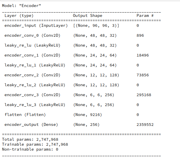
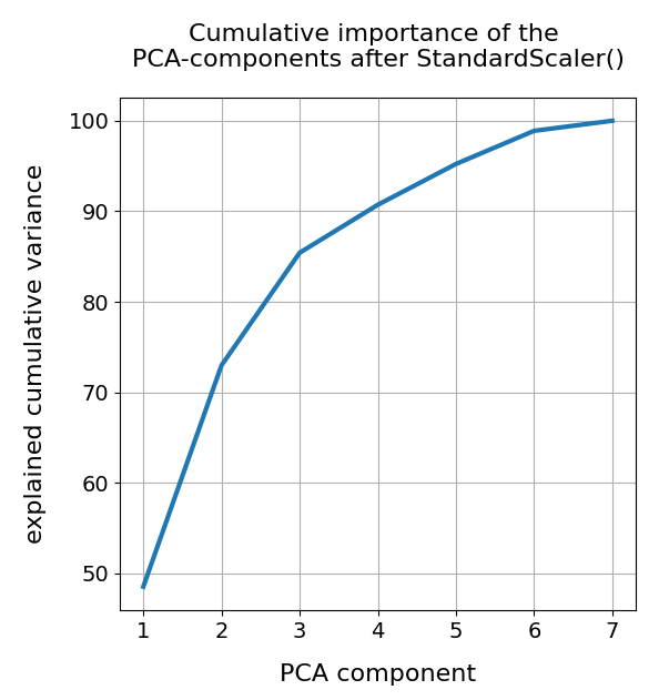
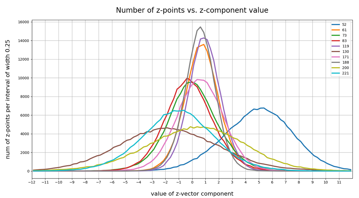
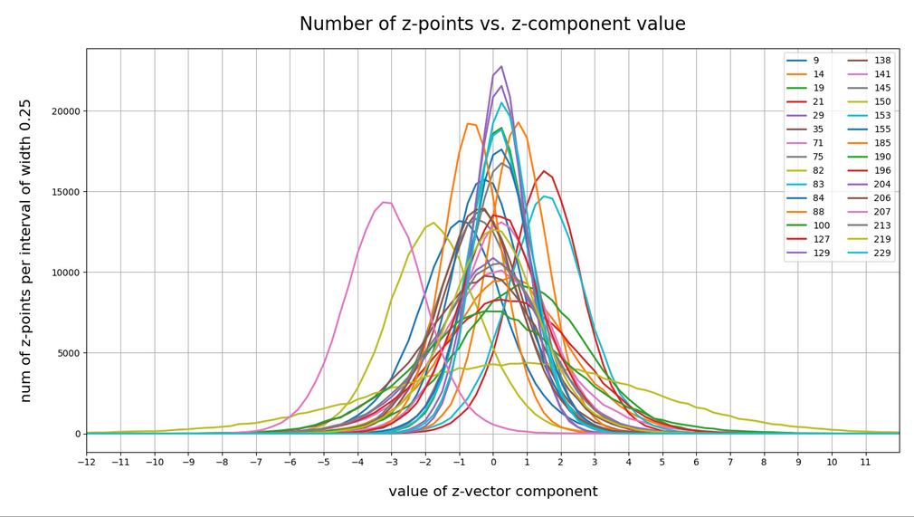
Let me remind you about the shapes of the number distribution for our concrete z-vector components resulting for for CelebA face images. The first plot shows the number densities on sampling intervals of width 0.25 for selected vector components resulting for case I of our experiments. The second plot shows the number densities for the values of selected components of case II.

Ok, these curves do resemble Gaussians and some fluctuations are normal. But can we prove the Gaussian properties of the curves a bit better?

Well, for case II I have drawn the best fits by Gaussian functions with the help of SciPy’s optimize.curve_fit() for 3 and yet another 4 selected components of the latent vectors and the respective number distribution curves. The dashed lines show the approximations by Gaussian functions:

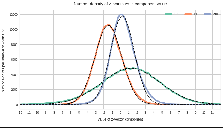
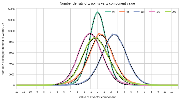
The selected components are part of the list of around 20 dominant component distributions – due to their relatively large standard deviations. But the Gaussian form is consistently found for all components (with some small deviations regarding the symmetry of the curves).

So all in all it looks like as if our convolutional AE has indeed created a multivariate normal z-point distribution in the latent space. As said: This does not exclude correlations …

Pairwise linear correlations of the (normal) probability distributions for the latent vector components?

Now we are a bit bold – and assume the best case for us: Could the approxiate Gaussians distributions for the component values be pair-wise and linearly correlated? What would be a clear indication of a pair-wise linear correlation of our component distributions?

Well, we should find an elliptic form of contour lines in the 2-dimensional distribution for the component pair in the respective coordinate plane of the basic orthogonal LS coordinate system. This imposes quite strong symmetry conditions on the contour lines. The ellipses can be shifted and rotated – but they should remain being ellipses. If non-linear contributions to the correlation had a significant impact this would not be the case.

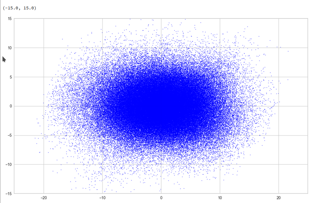
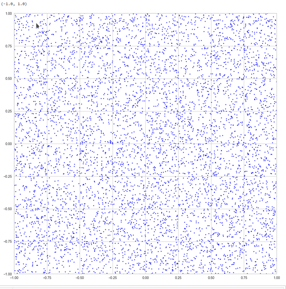
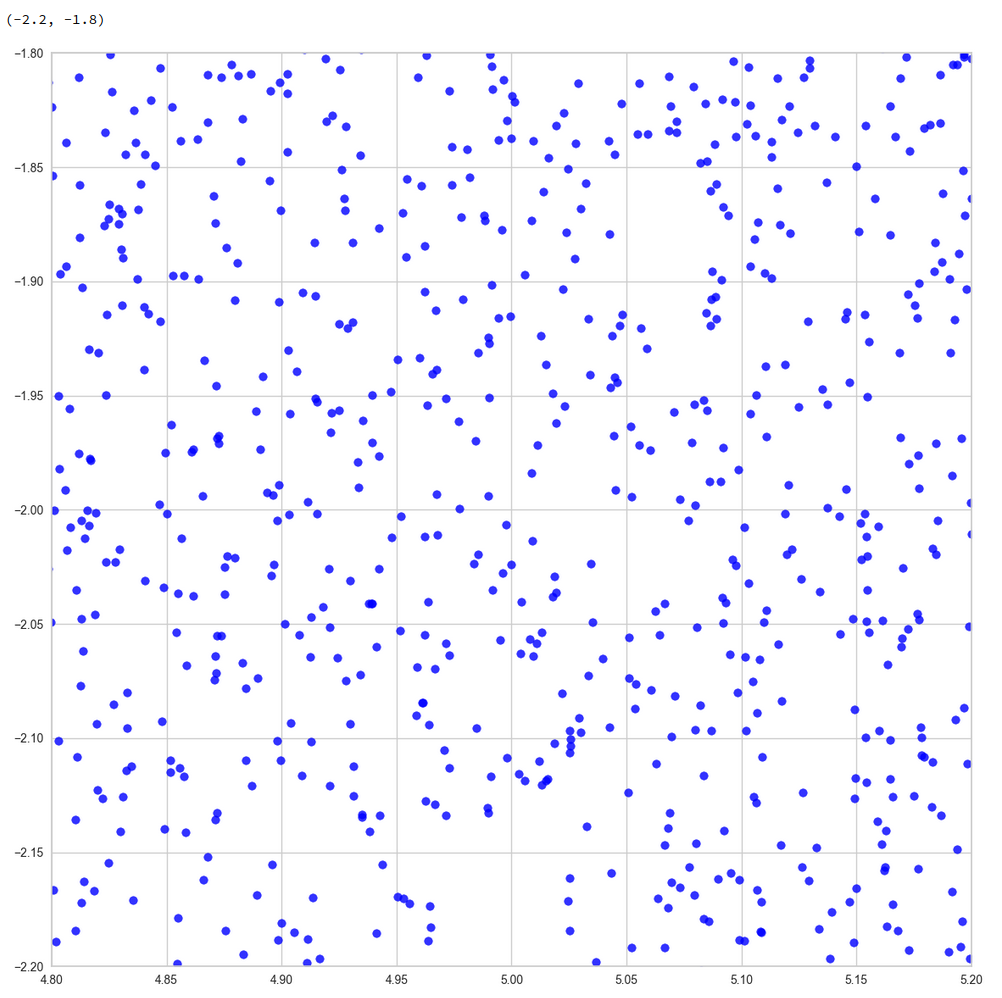
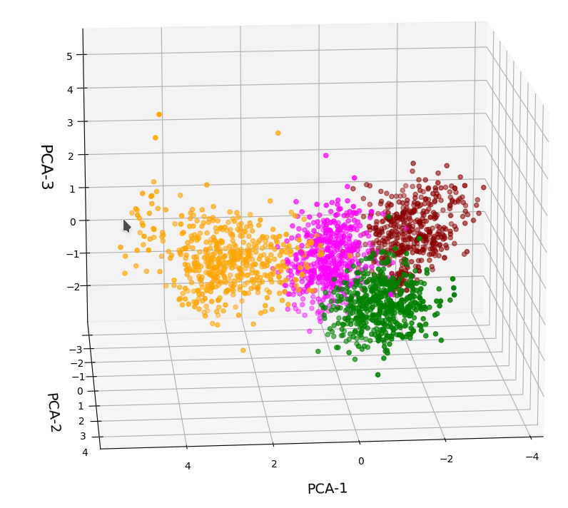
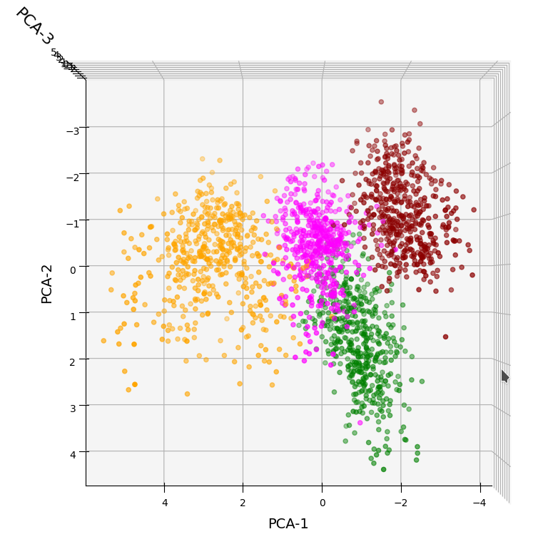
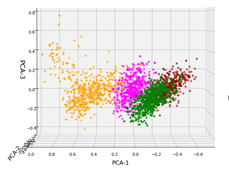
Practically it is not trivial to prove that we have approximately rotated ellipses in 2 dimensions. Satter plos alone do not help: Ellipses fit a lot of plotted distributions of discrete data points quite well. We really need to count number densities to get reliable contour lines. The following plots show such contour lines based on number sampling in rectangles and local smoothing operations with the help of scipy.stats.gaussian_kde().

The fat red and dark orange lines show corresponding confidence ellipses derived from the original CelebA distribution. See below for some remarks on confidence ellipses.

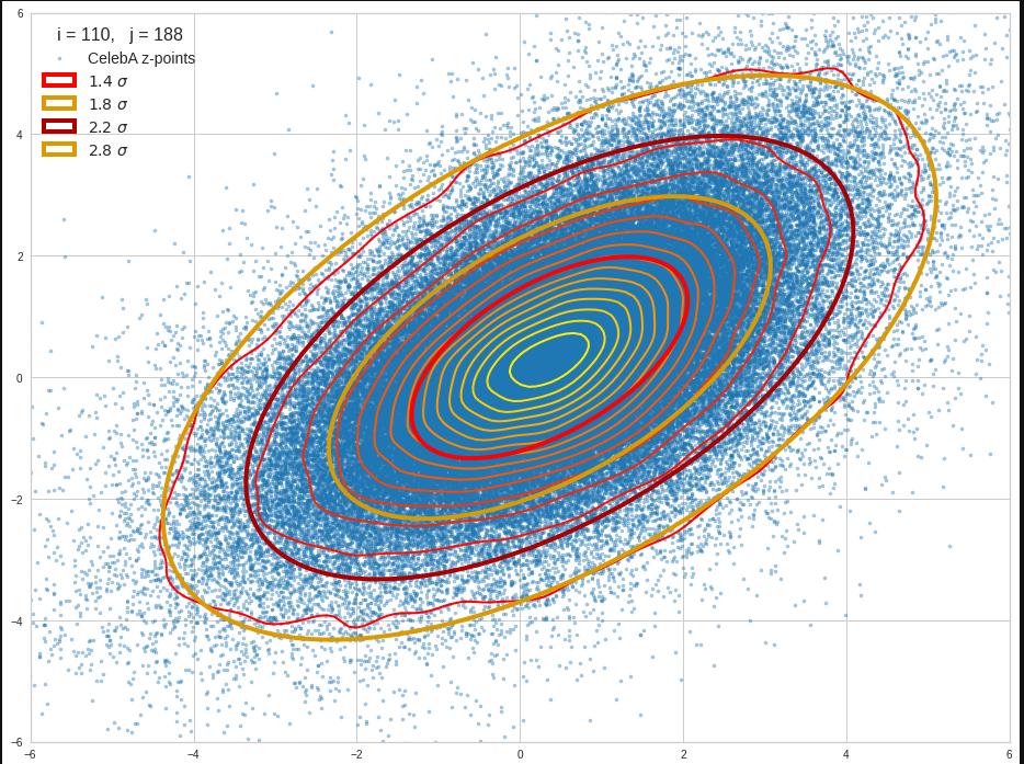
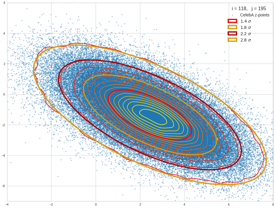
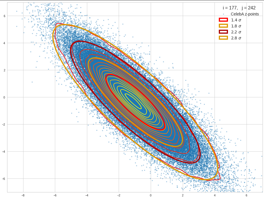
The contours are basically of elliptic shape although they do not show the complete symmetry expected for pure and linearly dependent Gaussian distributions. But overall the confidence ellipses fit quite well into the general form and orientation of the distributions. We also see that for higher σ-levels the coincidence with nearby contours is quite good. The wiggles in the contour change with the z-vector selection a bit.

We conclude that our basic impression regarding an elliptic shape of the z-point distributions is basically consistent with only linearly correlated Gaussian probability density distributions for the component values of the latent vectors.

Approximation of the core of the multivariate z-point distribution by confidence ellipses for component pairs

Above I referred to the boundary of a core of the probability density for two selected vector components. But how would we define the “boundary” of a continuous distribution in the coordinate planes? Answer: As we like – but based on the decline of the approximate Gaussian curves.

We can e.g. pick two times the half-width in each direction or we can use contours defined by confidence levels.
For 2 ≤ fact * σ ≤ 3 we saw already that the contour lines could well be fitted by confidence ellipses. A 3-sigma level covers around 97% of all data points or more. A 2 sigma-level ellipse encircles between 70% and 90% of all data points, depending on the eccentricity of the ellipse. Note that the numbers are smaller for ellipses than for rectangles. I.e. the standard 68-95-99.7 rule does not apply.

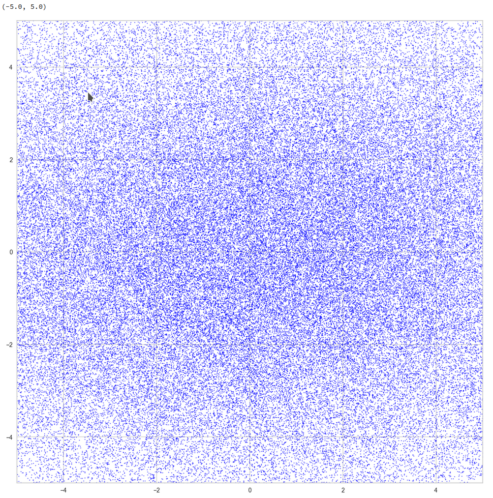
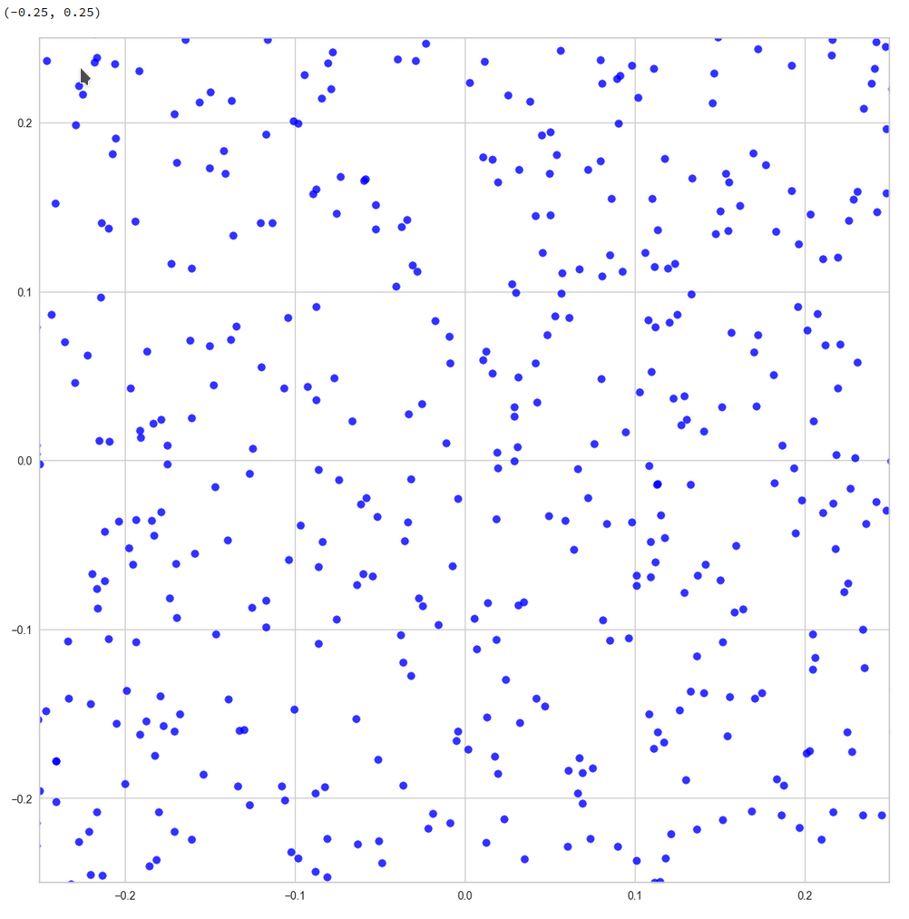
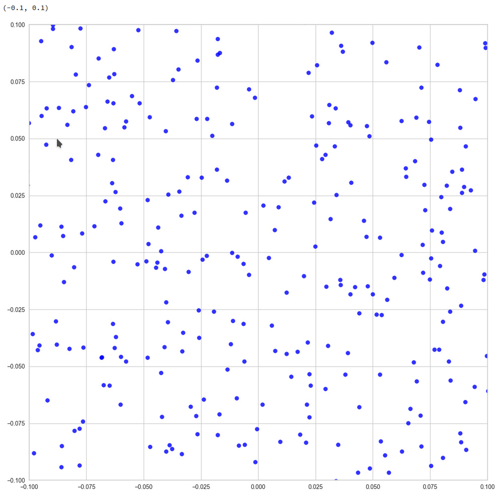
The plots below give you an impression of how well ellipses for a -confidence level approximate the core of the CelebA distribution in selected 2D coordinate planes of the latent space:

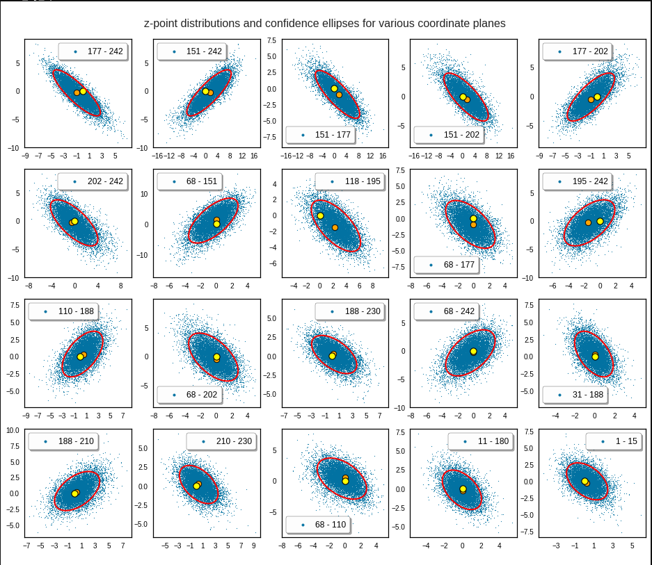
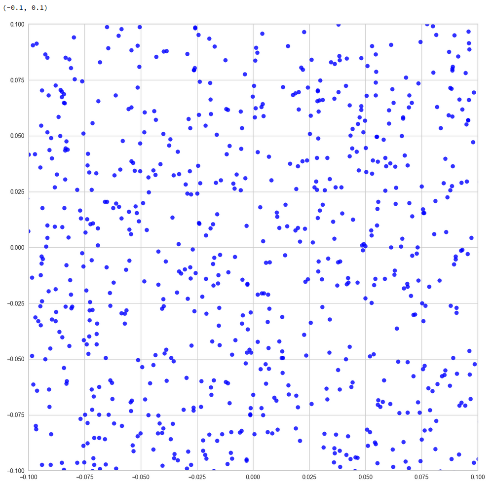
Each of the sub-plots was based on 10,000 statistically selected vectors of the 170,000 available in my test runs. This is a relative low number. Therefore, for a certain diameter of the points in the scatter plot only the inner core appears to be densely populated. The next plots shows the results for a 3 σ-level of the ellipse – but this time for 50,000 vectors. With more vectors we could visually fill the outer regions of the core.

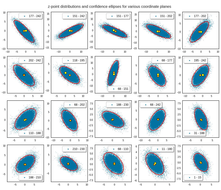
The orange points mark the center of the multidimensional distributions derived from the one-dimensional distribution curves for the components. We see that it does not always appear to be optimally centered. There are multiple reasons: Our functions are not fully symmetric as ideal Gaussians. And equally important: The accuracy of the position depends on the sampling resolution which was coarse. Outliers of the distribution do have an impact.

And how would we explain the appearance of Gaussians and ellipses?

This all looks quite good, despite some notable deviations regarding symmetry and maxima. Gaussians fit at least most of the important probability density curves very well, though not by a 100%. The appearance of an elliptic shape of the inner core of the distribution and the appearance of overall elliptic contour curves can be explained by linear correlations of the Gaussian distributions for the components.

The appearance of normal distributions per component and basically linear correlations is something that really should be explained. I mean, dwell a bit on what we have found:

A convolutional Autoencoder network with more than 10 million adjustable parameters encoded information about human face images in the form of a roughly multivariate normal distribution of z-points in its latent space – with basically linear correlations between the Gaussian curves describing the probability densities functions for the component values of the z-vectors.

I find this astonishing and not at all self-evident. It is one of the most simple solutions for a multidimensional situation one can imagine. The following questions automatically came to my mind:

Does such a result only appear for training images of defined objects with some Gaussian variation in their features? Are the normal distributions a reflection of variations of relevant features in the original data?
Is this a typical result for (convolutional) AEs? How does it depend on the dimensionality of the latent space? Does it automatically come with a large number of z-space dimensions? Is it an efficient way to encode feature differences in the latent space, which (convolutional) AEs in general tend to use due to their structure?

Do I personally have a convincing explanation? No. Especially not, as the data shown above stem from convolutional neural networks [CNNs] without any batch-normalization layers.

A first idea would be that the dominant features of a human face themselves show variations described by Gaussian normal distributions already in the original data and that convolutional filtering does not destroy such distributions during optimization. A problem of this idea lies in the (non-) linear activation functions used at the nodes of the neural maps. Though ReLU, Leaky ReLU and SeLU contain linear parts.

The other problem is the linear form of the correlations. This is a rather simple kind of correlations. But why should an AE choose this simple form into its mapping of image information to latent space vectors after training?

How to generate statistical vectors for the creation of human face images?

The positive message which comes with the above results is that our problem of how to create proper statistical z-vectors decomposes into a sequence of two-dimensional problems. We can use the data of the ellipses appearing in the density-distributions for pairs of vector components to confine the components of statistically generated z-vectors to the relevant region in the latent space. All ellipses together restrict the component values in a well defined form. In the next post I will shortly outline some methods of how we can use the information contained in the ellipses with available algorithms.

Conclusion

In this post we have seen that for the case of a convolutional Autoencoder trained on CelebA human face images the latent vector distributions showed some remarkable properties:

The probability density functions for all component values can roughly be approximated by Gaussian functions. The components appear to be pairwise linearly correlated – at least to first order analysis. This automatically implies elliptic contour curves for the pairwise number density functions of coordinate values. Such contour curves were indeed found with first order accuracy. The core of the probability density for the z-points in the latent space could therefore be approximated by confidence ellipses for a σ-level above σ = 2.5.
The elliptic conditions correspond to a multivariate normal distribution with linear correlations of the variables.

Before we get to enthusiastic about these findings we should be careful and await a further test. All statements refer to a first order approximations. A real multivariate normal distribution would decompose into un-correlated Gaussians and 2D-ellipses of probability densities of component pairs after a PCA transformation.
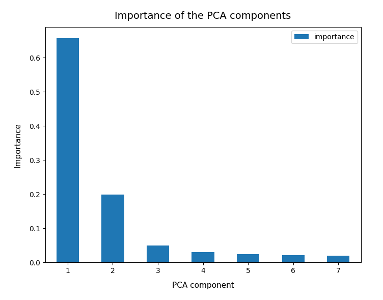
In the next post

Autoencoders and latent space fragmentation – IX – PCA transformation of the z-point distribution for CelebA

I shall present the results of a PCA analysis. In later posts I will introduce a related method to restrict the components of statistical vectors to the relevant region in the latent space of our Autoencoder.

Links and literature

On first sight my short description of the relation between multivariate Gaussian normal distributions and ellipses as the contour lines for the projected density distributions on coordinate planes may appear plausible. But in the general multi-dimensional case the question of linear correlations requires some more math than indicated. For details I just refer to some articles on the Internet – but any good book on multivariate analysis will give you the relevant information
https://de.wikipedia.org/ wiki/ Multivariate_ Normalverteilung
https://de.wikipedia.org/ wiki/ Mehrdimensionale_ Normalverteilung
http:// www.mi.uni-koeln.de/ ~jeisenbe/ Vortrag2.pdf
https://methodenlehre.uni-mainz.de/ files/ 2019/06/ Multivariate-Distanz-Normalverteilung-MDC-Bayes.pdf
https://en.wikipedia.org/ wiki/ Multivariate_ normal_ distribution
https://en.wikipedia.org/ wiki/ Confidence_region
https://users.cs.utah.edu/ ~tch/ CS6640F2020/ resources/ How to draw a covariance error ellipse.pdf
https://biotoolbox.binghamton.edu/ Multivariate Methods/ Multivariate Tools and Background/ pdf files/ MTB%20070.pdf

Regarding the intimate relation between the ellipses’ main axes to normalized Pearson correlation coefficients I also refer to
https://carstenschelp.github.io/ 2018/09/14/ Plot_ Confidence_ Ellipse_ 001.html
I am very grateful that the author Carsten Schelp saved me a lot of time when trying to find a way to program a solution for confidence ellipses. Thank you, Mr. Schelp for the great work.


Autoencoders, latent space and the curse of high dimensionality – II – a view on fragments and filaments of the latent space for CelebA images

I continue with experiments regarding the structure which an Autoencoder [AE] builds in its latent space. In the last post of this series

Autoencoders, latent space and the curse of high dimensionality – I

we have trained an AE with images of the CelebA dataset. The Encoder and the Decoder of the AE consist of a series of convolutional layers. Such layers have the ability to extract characteristic patterns out of input (image) data and save related information in their so called feature maps. CelebA images show human heads against varying backgrounds. The AE was obviously able to learn the typical features of human faces, hair-styling, background etc. After a sufficient number of training epochs the AE’s Encoder produces “z-points” (vectors) in the latent space. The latent space is a vector space which has a relatively low number of dimension compared with the number of image pixels. The Decoder of the AE was able to reconstruct images from such z-points which resembled the original closely and with good quality.

We saw, however, that the latent space (or “z-space”) lacks an important property:

The latent space of an Autoencoder does not appear to be densely and uniformly populated by the z-points of the training data.

We saw that his makes the latent space of an Autoencoder almost unusable for creative and generative purposes. The z-points which gave us good reconstructions in the sense of recognizable human faces appeared to be arranged and positioned in a very special way within the latent space. Below I call a CelebA related z-point for which the Decoder produces a reconstruction image with a clearly visible face a “meaningful z-point“.

We could not reconstruct “meaningful” images from randomly chosen z-points in the latent space of an Autoencoder trained on CelebA data. Randomly in the sense of random positions. The Decoder could not re-construct images with recognizable human heads and faces from almost any randomly positioned z-point. We got the impression that many more non-meaningful z-points exist in latent space than meaningful z-points.

We would expect such a behavior if the z-points for our CelebA training samples were arranged in tiny fragments or thin (and curved) filaments inside the multidimensional latent space. Filaments could have the structure of

  • multi-dimensional manifolds with almost no extensions in some dimensions
  • or almost one-dimensional string-like manifolds.

The latter would basically be described by a (wiggled) thin curve in the latent space. Its extensions in other dimensions would be small.

It was therefore reasonable to assume that meaningful z-points are surrounded by areas from which no reasonable interpretable image with a clear human face can be (re-) constructed. Paths from a “meaningful” z-point would only in a very few distinct directions lead to another meaningful point. As it would be the case if you had to follow a path on a thin curved manifold in a multidimensional vector space.

So, we had some good reasons to speculate that meaningful data points in the latent space may be organized in a fragmented way or that they lie within thin and curved filaments. I gave my readers a link to a scientific study which supported this view. But without detailed data or some visual representations the experiments in my last post only provided indirect indications of such a complex z-point distribution. And if there were filaments we got no clue whether these were one- or multidimensional.

Important Addendum, 03/18/2023:

I have to correct this post regarding the basic line of thought: Even if we find that the z-points for CelebA images are arranged in filaments the failure we saw in the first post of this series may not have its direct cause in missing these filaments in latent space by randomly chosen z-points. It could also be that we miss a much larger, coherent region where meaningful points are located. The filaments then would correspond to a correlation of certain features, only, which may not be decisive for the reconstruction of a face. So, the investigation of the existence of filaments is interesting – but the explanation of the AE’s reconstruction failure may require a more thorough analysis. I have done the calculations already, but have not yet found the time to write about them. As soon as the posts are ready I am going to provide a link. See also an added comment at the end of this post.

Do we have a chance to get a more direct evidence about a fragmented or filamental population of the latent space? Yes, I think so. And this is the topic of this post.

However, the analysis is a bit complicated as we have to deal with a multidimensional space. In our case the number of dimensions of the latent space is z_dim = 256. No chance to plot any clusters or filaments directly! However, some other methods will help to reduce the dimensionality of the problem and still get some valid representations of the data point correlations. In the end we will have a very strong evidence for the existence of filaments in the AE’s z-space.

Methods to work with data distributions in many dimensions

Below I will use several methods to investigate the z-point distribution in the multidimensional latent space:

  • An analysis of the variation of the z-point number-density along coordinate axes and vs. radius values.
  • An application of t-SNE projections from the standard multidimensional coordinate system onto a 2-dimensional plane.
  • PCA analysis and subsequent t-SNE projections of the PCA-transformed z-point distribution and its most important PCA components down to a 2-dim plane. Note that such an approach corresponds to a sequence of projections:
    1) Linear projections onto PCA rotated coordinates.
    2) A non-linear SNE-projection which scales and represents data point correlations on different scales on a 2-dim plane.
  • A direct view on the data distribution projected onto flat planes formed by two selected coordinate axes in the PCA-coordinate system. This will directly reveal whether the data (despite projection effects exhibit filaments and voids on some (small ?) scales.
  • A direct view on the data distribution projected onto a flat plane formed by two coordinate axes of the original latent space.

The results of all methods combined strongly support the claim that the latent space is neither populated densely nor uniformly on (small) scales. Instead data points are distributed along certain filamental structures around voids.

Layer structure of the Autoencoder

Below you find the layer structure of the AE’s Encoder. It got four Conv2D layers. The Decoder has a corresponding reverse structure consisting of Conv2DTranspose layers. The full AE model was constructed with Keras. It was trained on CelebA for 24 epochs with a small step size. The original CelebA images were reduced to a size of 96×96 pixels.

Encoder

Decoder

Number density of z-points vs. coordinate values

Each z-point can be described by a vector, whose components are given by projections onto the 256 coordinate axes. We assume orthogonal axes. Let us first look at the variation of the z-point number density vs. reasonable values for each of the 256 vector-components.

Below I have plotted the number density of z-points vs. coordinate values along all 256 coordinate axes. Each curve shows the variation along one of the 256 axes. The data sampling was done on intervals with a width of 0.25:

Most curves look like typical Gaussians with a peak at the coordinate value 0.0 with a half-width of around 2.

You see, however, that there are some coordinates which dominate the spatial distribution in the latent vector-space. For the following components the number density distribution is relatively broad and peaks at a center different from the origin of the z-space. To pick a few of these coordinate axes:

 52, center:  5.0,  width: 8
 61; center;  1.0,  width: 3 
 73; center:  0.0,  width: 5.5  
 83; center: -0.5,  width: 5
 94; center:  0.0,  width: 4
116; center:  0.0,  width: 4
119; center:  1.0,  width: 3
130; center: -2.0,  width: 9
171; center:  0.7,  width: 5
188; center:  0.75, width: 2.75
200; center:  0.5,  width: 11
221; center: -1.0,  width: 8

The first number is just an index of the vector component and the related coordinate axis. The next plot shows the number density along some these specific coordinate axes:

What have we learned?
For most coordinate axes of the latent space the number density of the z-points peaks at 0.0. We see an approximate Gaussian form of the number density distribution. There are around 5 coordinate directions where the distribution has a peak significantly off the origin (52, 130, 171, 200, 221). Along the corresponding axes the distribution of z-points obviously has an elongated form.

If there were only one such special vector component then we would speak of an elongated, ellipsoidal and almost cigar like distribution with the thickest area at some position along the specific coordinate axis. For a combination of more axes with elongated distributions, each with with a center off the origin, we get instead diagonally oriented multidimensional and elongated shapes.

These findings show again that large regions of the latent space of an AE remain empty. To get an idea just imagine a three dimensional space with all data in x-direction culminating at a coordinate value of 5 with a half-width of lets say 8. In the other directions y and z we have our Gaussian distributions with a total half-width of 1 around the mean value 0. What do we get? A cigar like shape confined around the x-axis and stretching from -3 < x < 13. And the rest of the space: More or less empty. We have obviously found something similar at different angular directions of our multidimensional latent space. As the number of special coordinate directions is limited these findings tell us that a PCA analysis could be helpful. But let us first have a look at the variation of number density with the radius value of the z-points.

Number density of z-points vs. radius

We define a radius via an Euclidean L2 norm for our 256-dimensional latent space. Afterward we can reduce the visualization of the z-point distribution to a one dimensional problem. We can just plot the variation of the number density of z-points vs. the radius of the z-points.

In the first plot below the sampling of data was done on intervals of 0.5 .

The curve does not remain that smooth on smaller sampling intervals. See e.g. for intervals of width 0.05

Still, we find a pronounced peak at a radius of R=16.5. But do not get misguided: 16 appears to be a big value. But this is mainly due to the high number of dimensions!

How does the peak in the close vicinity of R=16 fit to the above number density data along the coordinate axes? Answer: Very well. If you assume a z-point vector with an average value of 1 per coordinate direction we actually get a radius of exactly R=16!

But what about Gaussian distributions along the coordinate axes? Then we have to look at resulting expectation values. Let us assume that we fill a vector of dimension 256 with numbers for each component picked statistically from a normal distribution with a width of 1. And let us repeat this process many times. Then what will the expectation value for each component be?

A coordinate value contributes with its square to the radius. The math, therefore, requires an evaluation of the integral integral[(x**2)*gaussian(x)] per coordinate. This integral gives us an expectation value for the contribution of each coordinate to the total vector length (on average). The integral indeed has a resulting value of 1.0. From this it follows that the expectation value for the distance according to an Euclidean L2-metric would be avg_radius = sqrt(256) = 16. Nice, isn’t it?

However, due to the fact that not all Gaussians along the coordinate axes peak at zero, we get, of course, some deviations and the flank of the number distribution on the side of larger radius values becomes relatively broad.

What do we learn from this? Regions very close to the origin of the z-space are not densely populated. And above a radius value of 32, we do not find z-points either.

t-SNE correlation analysis and projections onto a 2-dimensional plane

To get an impression of possible clustering effects in the latent space let us apply a t-SNE analysis. A non-standard parameter set for the sklearn-variant of t-SNE was chosen for the first analysis

tsne2 = TSNE(n_components, early_exaggeration=16, perplexity=10, n_iter=1000) 

The first plot shows the result for 20,000 randomly selected z-points corresponding to CelebA images

Also this plot indicates that the latent space is not populated with uniform density in all regions. Instead we see some fragmentation and clustering. But note that this might happened on different length scales. t-SNE arranges its projections such that correlations on different scales get clearly indicated. So the distances in this plot must not be confused with the real spatial distances in the original latent space. The axes of the t-SNE plot do not reflect any axes of the latent space and the plotted distribution is not the real data point distribution after a linear and orthogonal projection onto a plane. t-SNE works non-linearly.

However, the impression of clustering remains for a growing numbers of z-points. In contrast to the first plot the next plots for 80,000 and 165,000 z-points were calculated with standard t-SNE parameters.

We still see gaps everywhere between locally dense centers. At the center the size of the plotted points leads to overlapping. If one could zoom into some of the centers then gaps would again appear on smaller scales (see more plots below).

PCA analysis and t-SNE-plots of the z-point distribution in the (rotated) PCA coordinate system

The z-point distribution can be analyzed by a PCA algorithm. There is one dominant component and the importance smooths out to an almost constant value after the first 10 components.

This is consistent with the above findings. Most of the coordinates show rather similar Gaussian distributions and thus contribute in almost the same manner.

The PCA-analysis transforms our data to a rotated coordinate system with a its origin at a position such that the transformed z-point distribution gets centered around this new origin. The orthogonal axes of the new PCA-coordinates system show into the direction of the main components.

When the projection of all points onto planes formed by two selected PCA axes do not show a uniform distribution but a fragmented one, then we can safely assume that there really is some fragmentation going on.

t-SNE after PCA

Below you see t-SNE-plots for a growing number of leading PCA components up to 4. The filamental structure gets a bit smeared out, but it does not really disappear. Especially the elongated empty regions (voids) remain clearly visible.

t-SNE after PCA for the first 2 main components – 80,000 randomly selected z-points

t-SNE after PCA for the first 2 main components – 165,000 randomly selected z-points

t-SNE after PCA for the first 4 main PCA components – 165,000 randomly selected z-points

For 10 components t-SNE gets a presentation problem and the plots get closer to what we saw when we directly operated on the latent space.

But still the 10-dim space does not appear to be uniformly populated. Despite an expected smear out effect due to the non-linear projection the empty ares seem to be at least as many and as extended as the populated areas.

Direct view on the z-point distribution after PCA in the rotated and centered PCA coordinate system

t-SNE blows correlations up to make them clearly visible. Therefore, we should also answer the following question:

On what scales does the fragmentation really happen ?

For this purpose we can make a scatter plot of the projection of the z-points onto a plane formed by the leading two primary component axes. Let us start with an overview and relatively large limiting values along the two (PCA) axes:

Yeah, a PCA transformation obviously has centered the distribution. But now the latent space appears to be filled densely and uniformly around the new origin. Why?

Well, this is only a matter of the visualized length scales. Let us zoom in to a square of side-length 5 at the center:

Well, not so densely populated as we thought.

And yet a further zoom to smaller length scales:

And eventually a really small square around the origin of the PCA coordinate system:

z-point distribution at the center of a two-dim plane formed by the coordinate axes of the first 2 primary components
The chosen qsquare has its corners at (-0.25, -0.25), (-0.25, 0.25), (0.25, -0.25), (0.25, 0.25).

Obviously, not a dense and neither a uniform distribution! After a PCA transformation we see the still see how thinly the latent space is populated and that the “meaningful” z-points from the CelebA data lie along curved and narrow lines or curves with some point-like intersections. Between such lines we see extended voids.

Let us see what happens when we look at the 2-dim pane defined by the first and the 18th axes of the PCA coordinate system:

Or the distribution resulting for the plane formed by the 8th and the 35th PCA axis:

We could look at other flat planes, but we do not get rid of he line like structures around void like areas. This is really a strong indication of filamental structures.

Interpretation of the line patterns:
The interesting thing is that we get lines for z-point projections onto multiple planes. What does this tell us about the structure of the filaments? In principle we have the two possibilities already named above: 1) Thin multidimensional manifolds or 2) thin and basically one-dimensional manifolds. If you think a bit about it, you will see that projections of multidimensional manifolds would not give us lines or curves on all projection planes. However curved string- or tube-like manifolds do appear as lines or line segments after a projection onto almost all flat planes. The prerequisite is that the extension of the string in other directions than its main one must really be small. The filament has to have a small diameter in all but one directions.

So, if the filaments really are one-dimensional string-like objects: Should we not see something similar in the original z-space? Let us for example look at the plane formed by axis 52 and axis 221 in the original z-space (without PCA transformation). You remember that these were axes where the distribution got elongated and had centers at -2 and 5, respectively. And indeed:

Again we see lines and voids. And this strengthens our idea about filaments as more or less one-dimensional manifolds.

The “meaningful” z-points for our CelebA data obviously get positioned on long, very thin and basically one-dimensional filaments which surround voids. And the voids are relatively large regarding their area/volume. (Reminds me of the galaxy distribution in simulations of the development of the early universe, by the way.)

Therefore: Whenever you chose a randomly positioned z-point the chance that you end up in an unpopulated region of the z-space or in a void and not on a filament is extremely big.

Conclusion

We have used a whole set of methods to analyze the z-point distribution of an AE trained on CelebA images. We found the the z-point distribution is dominated by the number density variation along a few coordinate axes. Elongated shapes in certain directions of the latent space are very plausible on larger scales.

We found that the number density distributions along most of the coordinate axes have a thin Gaussian form with a peak at the origin and a half-with of 1. We have no real explanation for this finding. But it may be related to the fact the some dominant features of human faces show Gaussian distributions around a mean value. With Gaussians given we could however explain why the number density vs. radius showed a peak close to R=16.

A PCA analysis finds primary directions in the multidimensional space and transforms the z-point distribution into a corresponding one for orthogonal primary components axes. For logical reason we can safely assume that the corresponding projections of the z-point distribution on the new axes would still reveal existing thin filamental structures. Actually, we found lines surrounding voids independently onto which flat plane we projected the data. This finding indicates thin, elongated and curved but basically one-dimensional filaments (like curved strings or tubes). We could see the same pattern of line-like structure in projections onto flat coordinate planes in the original latent space. The volume of the void areas is obviously much bigger than the volume occupied by the filaments.

Non-linear t-SNE projections onto a 2-dim flat hyperplanes which in addition reproduce and normalize correlations on multiple scales should make things a bit fuzzier, but still show empty regions between denser areas. Our t-SNE projections all showed signs of complex correlation patterns of the z-points with a lot of empty space between curved structures.

Important Addendum, 03/18/2023:
The following original conclusion is misleading and by parts wrong:

The experiments all in all indicate that z-points of the training data, for which we get good reconstructions, lie within thin filaments on characteristic small length scales. The areas/volumes of the voids between the filaments instead are relatively big. This explains why chances that randomly chosen points in the z-space falls into a void are very high.
The results of the last post are consistent with the interpretation that z-points in the voids do not lead to reconstructions by the Decoder which exhibit standard objects of the training images. in the case of CelebA such z-points do not produce images with clear face or head like patterns. Face like features obviously correspond to very special correlations of z-point coordinates in the latent space. These correlations correspond to thin manifolds consuming only a tiny fraction of the z-space with a volume close zero.

Due to a new analysis I would like to replace my original statemets with a question:

Do our findings of the existence of filaments and large surrounding voids really explain the results of the first post that randomly chosen z-points miss areas in the latent space which allow for a reconstruction of “faces”?

I am going to answer this question in another better prepared post series, soon. To make you a bit curious I leave you with the fact that the following picture shows a face reconstructed by an AE from a randomly selected point in the latent space – with some simple conditions applied:


KMeans as a classifier for the WIFI and MNIST datasets – IV – KMeans on PCA transformed data

In the last posts of this series

KMeans as a classifier for the WIFI and MNIST datasets – I – Cluster analysis of the WIFI example
KMeans as a classifier for the WIFI and MNIST datasets – II – PCA in combination with KMeans for the WIFI-example
KMeans as a classifier for the WIFI and MNIST datasets – III – KMeans as a classifier for the WIFI-example

we applied the KMeans algorithm to perform a cluster analysis of the WIFI dataset of the UCI Irvine. The results gave us insights into the spatial grouping and the separability of the data samples in their 7-dimensional feature space. An additional PCA analysis helped to understand why projections of the data into some selected 2-dimensional sub-spaces of the feature space revealed the four or five dominant clusters very well. In the third post I discussed a simple method to transform KMeans into a classifier. In the WIFI case a set of 9 to 11 clusters provided a good resolution of the data distribution and we reached a convincing classifier accuracy.

What we have not done, yet, is to transform and project the WIFI data into the coordinate system of the most important main components and afterward apply clustering by the help of KMeans. We know already that three primary components fit the data very well and give us around 90% of the “explained variance“. See the second post for these basic PCA results. We, therefore, expect comparably accurate prediction results of a cluster classifier for the PCA transformed data as the accuracy values given in the last post. For 500 test samples after a KMeans fit of 1500 training samples in the original feature space we found a prediction accuracy of around 98%.

In this post we first perform a PCA analysis for three primary components of the WIFI data distribution and then transform the vectors of 1500 randomly selected training samples to the 3-dimensional main component space. Then we apply KMeans onto the data in the reduced vector space and establish a classifier predictor based on the methods described in the last article. Eventually, we check the accuracy and display the resulting confusion matrix for the 500 test samples.

As a side-step for readers who look for real world use cases regarding signals I want to mention an article in “Nature”, which I found today via a newspaper podcast. There neural firing rates of a brain region, i.e. some very special signals, were used to enable an ALS patient to select letters from presented sequences and form statements – by his “thoughts”. This looks like an environment where Machine Learning really could contribute more in the future.

KMeans as a classifier on the PCA transformed WIFI data

Below I give you the results for the WIFI data transformed and projected to the most important three primary components and 11 clusters:

Results for 1500 training samples

  
Confusion matrix for training data - 11 clusters, 3 PCA components 
A confusion matrix for the classes according to the clustering
[[374   0   1   0]
 [  0 362  13   0]
 [  4   7 359   5]
 [  1   0   0 374]]

Number of wrongly predicted train samples:  31  :: avg_err =  0.020

So, just from counting wrongly classified examples the average error is measured to be around 2% and the relative accuracy is something like 98%.

And for the test data I got:

Number of wrongly predicted test samples:  6  :: avg_err =  0.012

This gives us the following confusion matrix:

This actually proves that our assumption about combining a PCA transformation with a KMeans classifier was correct. The reduction of the dimensionality of the problem did not affect the prediction accuracy very much.

Just for completeness the data for only 2 primary components:

The accuracy of around 97% is still convincing. The reason is that the two most important primary components already deliver around 85% of the “explained variance”.

Why is the Wifi-example not so boring as one may think?

A reader wrote me that he finds the WIFI example too simple and boring. OK, but … The principles and methods remain the same when more complex data are analyzed for clusters. Especially in the case of binary classification. But are there interesting real world use cases for other types of signals? Oh, yes. I just want to refer to an interesting example which I read about this morning.

The WIFI example works with samples which describe 7 signals. Now, imagine that such signals come from a sensor implant measuring electric potentials of a human brain and that we do not analyze for the location of rooms but for the selection of letters by “Yes/No” decision-“imaginations” – made by a human who was trained via frequency based audio-feedback for the brain regions covered by the implants. Science fiction? No, reality. And of huge help for ALS patients. See

Chaudhary, U., Vlachos, I., Zimmermann, J.B. et al. Spelling interface using intracortical signals in a completely locked-in patient enabled via auditory neurofeedback training. Nat Commun 13, 1236 (2022). https://doi.org/10.1038/s41467-022-28859-8

and
https://www.nature.com/articles/s41467-022-28859-8

There, signals were measured from two implant arrays with 64 electrodes. OK, these are somewhat more signals than just 7. But if I understood the text correctly not all channels were used or useful. Just a few. Reminds us of PCA? In addition the time structure of the signal (firing rates) are important – but these are just different signal characteristics. And we have different labels. But, at least in principle, we speak of nothing else than pattern detection based on signal values.

I only had a brief look into the supplementary data of the experiment (an Excel file) and I am not at all familiar with the the experimental setup – but from reading my impression was that just threshold values for the firing rate of some channels were used to distinguish “Yes” from “No”. Maybe we could do a bit better with AI (PCA and classifying according to multidimensional pattern analysis)? Does this look like an interesting use case?

Conclusion

In the case of the WIFI example KMeans can be used as an efficient classifier for samples in a feature space which describes characteristics of multiple signal sources. We have seen that the basic concept also works when we apply KMeans after a PCA based transformation to the most important primary components.

The question is: Does this work equally well for other data sets? The answer depends upon the accuracy by which clusters reside completely within regions of the feature space filled by samples of a specific label.
A data set whose samples show grouping in a multidimensional feature space and appear relatively well separable by their labels is the MNIST data set. In the next post of this series we shall therefore try and apply a clustering algorithm to the MNIST data ensemble.

Stay tuned …

Ceterum censeo: The worst fascist today who must be isolated and denazified is the Putler.

KMeans as a classifier for the WIFI and MNIST datasets – II – PCA in combination with KMeans for the WIFI-example

I continue with my series of posts about using KMeans as a classifier for some simple ML datasets. In the last post

KMeans as a classifier for the WIFI and MNIST datasets – I – Cluster analysis of the WIFI example

I applied KMeans to the “WIFI” dataset which was discussed in the German “Linux Magazin”; see the Nov and Dec editions of 2021. We found 4 to 5 well separated clusters in a projection of the data points onto a 2-dimensional space defined by just two out of seven features.

I briefly discuss how this result is related to a PCA analysis. In my opinion the discussion in the “Linux Magazin” was a bit misleading regarding this point.

PCA analysis

A PCA analysis helps to identify the main orthogonal axes of the distribution of the samples’ data-points in their multidimensional “feature space”. If the data points for the samples are distributed in all directions and over all regions of the feature space in a similar way we may indeed need all of the feature spaces’s dimensions to describe the data distribution. Still, we could find some complicated curved hyperplanes which separate groups of data points with identical label quite well.

But often the data points are positioned along certain preferred directions, i.e. the data points are located along specific lines or (multidimensional) flat planes in the feature space – not withstanding an additional clustering. In such cases the data distribution may exhibit some intrinsic major axes in the feature space AND/OR the distribution may be confined to a subspace of the original feature space. The sub-space is defined and spanned by fewer axes than the original space. We speak of the “primary components” of the data distribution when we refer to the (orthogonal) axes of such a sub-space.

Of course, we can span the full original feature space by the most important primary component axes plus some extra orthogonal axes. I.e., we just need the same number of main components as the dimension of the original feature space. Then we get a new coordinate system which describes the vector space of the original features in a different way: The differences are

  • another orientation of the main component axes in comparison with the original axes,
  • a difference in the position of the origins of the two coordinate systems.

Of course, there is a mathematically well defined transformation which maps coordinates of data points with respect to the original feature spaces axes to coordinates in a coordinate system defined by the main component axes.

Of course, we can project a vector describing a data point onto unit vectors along the axes of either coordinate system. By using these special components we can describe the data distribution in terms of a sub-space spanned by only the most important primary component axes. A projection of ML data points to primary component axes is equivalent to a reduction of the dimensionality of the ML problem. Whenever we find that we can use fewer main component axes than the feature space’s number of dimensions to describe the data distribution reasonably well we can reduce the dimensionality of the problem: We project the original data vectors in the feature space to the axes of the main components’ coordinate system with fewer dimensions than the feature space.

How do we measure the “importance” of a main or primary component?

A metric for the importance of a primary component axis is its contribution to the so called “explained variance”. This quantity measures correlations of data in the original feature space and thus also the amount of information residing in the data.

From a mathematical point of view determining the main component axes corresponds to the diagonalization of the so called covariance matrix and the identification of eigenvectors. (You can find a short explanation in the books of S. Rashka on “Python Machine Learning”, 2016, PACKT or the book of J. Frochte on “Maschinelles Lernen”, 2019, Carl Hanser.) The eigenvectors define the directions of the main components’ axes. The variation of the data along such a main component axis contributes to the total variance by its measure of specific correlations, i.d. weighted quadratic data point distances. We are interested in finding those main component axes for which the projected data distribution explains most of the data variation.

Note that the axes which a PCA-analysis determines are orthogonal axes. Thus PCA describes a transformation of vectors in the feature space from one coordinate system with orthogonal axes to another coordinate system with orthogonal axes. Geometrically, this can be described by a sequence of a translation, followed by a rotation – and in case of a dimensionality reduction in addition by a projection.

Let us visualize an example. The following picture shows the surface of an asymmetric “ellipsoidal” data distribution in a 3-dim feature space. (Actually, the image does not display a real ellipsoid – but we ignore the differences for reasons of simplicity.) The dark arrows in the picture indicate the orthogonal axes and unit-vectors per dimension of the 3-dim feature space. The colored arrows of the ellipsoid show the direction of the main component axes of the “ellipsoid”.

Regarding the dimensions of the ellipsoid the elongation along the red vector is biggest. The width of the data point distribution in the direction of the blue vector is significantly smaller, but still bigger than in the direction of the green vector. So, we would expect that the two main component axes in the directions of the red and the blue arrows explain most of the data variation in the feature space. The projections of the data point vectors in a coordinate system defined by the main component axes onto the “green” axis would only give us rather small values. Therefore, we can reduce the dimensionality of the problem by describing the data distribution in only two dimensions: We project the vectors of the original data points in the feature space onto the two most important main component axes – in the directions of the red and the blue unit vectors.

Note: The axis in the direction of the dominant elongation of the ellipsoid has a diagonal orientation in the feature space. This means that all of the three original features contribute to the data points’ distribution in this direction. Therefore, the following point must be underlined:

A PCA analysis is not a selection process with respect to the original features. A vector describing a main component axis of the data distribution is a
linear combination of all unit vectors along various original axes of the feature-space. Normally many – if not all – original features contribute to a main component axis.. Without a detailed analysis you can not assume that only one or two original features determine the primary component axis.

In particular: You cannot assume that only one special feature dominates a main component axis. Unfortunately, the text in the Linux Magazin on the WIFI example could be read and interpreted in this way. So, let us have a closer look at the reason, why the projections of the WIFI-data from the original 7-dimensional feature-space onto a reduced 2-dim space of the signal-combinations [WLAN-4, WLAN-0] or [WLAN-3, WLAN-0] worked so well.

How many main components dominate the variance of the WIFI data distribution?

How many main components explain most of the variation of the samples’ data of the WIFI example? How do we get the required information about the contribution to the explained variance from PCA applications? Sklearn’s PCA implementation provides the usual “fit()”-function to perform the PCA calculation for a given data set. But it also provides an array named “explained_variance_” which contains the individual contributions of the main components to the “explained variance“.

So, as a first step, we simply try and apply Sklearn’s PCA()-function directly to the original WIFI data given in their 7-dimensional feature space. I.e. without any scaling. Just as it was done in the Linux Magazin. The bar plot below displays the “importance” of a maximum of 7 main components. The importance of each component is measured by its normalized contribution to the “explained variance”:

An accumulation gives the following percentages:

We see that only two of the main PCA components already explain 85% of the data variance in the feature space. We thus could choose these two main components as our “primary” components. But this does NOT automatically mean that only two features dominate the data distribution in the feature space.

Which features determine the primary components’ orientation?

As we have discussed above the projection of a unit vector along the main component axis onto the original axes of the feature-space may give similarly big values for each of the features. It is rather seldom that only a few features determine the direction of a main component’s axis.

But: The WIFI data are (on purpose?) indeed distributed in a very special way. Actually, only two original features determine the direction of the most important primary component’s axis already quite well. And just one feature dominates the second most important PCA component. So, in the WIFI example the first and the second main components are oriented more or less within a 2-dim feature plane and along a special feature axis, respectively. I.e. the data are more or less confined to a 3-dimensional sub-space of the feature space. How and where from did I get this information?

Sklearn’s function “PCA()” returns a reference to an object, which after a call to its method “fit()” has a filled property “components_“. This array gives us the 7 vector-components of each unit vector oriented along a PCA main component axis with respect to the various original axes of the feature space. I.e. we get the components of unit vectors along main component axes in terms of the original coordinate system spanning our feature space. The related coefficients of the vector tell us whether the main component axes are confined to a subspace spanned by just a few original features.

Below, the elements (rows) of the array were reversely sorted by the the contribution of the main component to the “explained variance”. So the first two rows correspond to the two most important PCA main components.

[6.22e-01 7.47e-04 1.03e-02 6.29e-01 2.02e-01 3.03e-01 2.91e-01]
 [1.71e-01 9.05e-02 4.31e-01 1.95e-01 8.50e-01 1.02e-01 7.62e-02]
 [2.41e-01 2.78e-01 2.18e-01 2.90e-01 9.80e-02 5.28e-01 6.67e-01]
 [1.67e-01 3.44e-01 7.05e-01 1.69e-01 4.22e-01 9.65e-02 3.75e-01]
 [1.13e-01 1.77e-01 3.15e-01 1.33e-01 1.82e-01 6.97e-01 5.66e-01]
 [6.37e-01 2.31e-01 3.28e-01 6.45e-01 1.26e-01 1.32e-02 3.22e-02]
 [2.80e-01 8.43e-01 2.50e-01 1.42e-01 2.43e-02 3.52e-01 5.12e-02]]

The first primary component has vector-components along the original axes of the feature space given by

6.22e-01, 7.47e-04, 1.03e-02, 6.29e-01, 2.02e-01, 3.03e-01, 2.91e-01

The features, i.e. the WLAN signals, are numbered in the given order from left to right. Obviously, the features “WLAN-0” and “WLAN-3” dominate the direction of the first primary component.

The second main component

1.71e-01, 9.05e-02, 4.31e-01, 1.95e-01, 8.50e-01, 1.02e-01, 7.62e-02

is instead dominated by he feature “WLAN-4”.

Actually, a closer look shows that the signal “WLAN-6” dominates the third main component by a relatively big value. This might be an indication that we had better used three primary components instead of two … I come back to this point below.

So, what do we learn from the results of the projections of the PCA unit vectors onto the axes of the feature space?

  1. In the very special case of the WIFI example around 3 original features dominate the overall data distribution.
  2. In the WLAN-0/WLAN-3 plane we should see an approximate diagonal distribution of data. Reason: the vector components are of almost equal size.
  3. As we already know from an elbow-analysis we have 4 to 5 clusters. So, we should see them clearly in a 3D-plot for the axes WLAN-0, WLAN-3 und WLAN-4.
  4. If the data are well separated into clusters along the diagonal in the WLAN-0/WLAN-3 plane AND the WLAN-4 direction then they will also be well separated in the 2-dim space of the 2 main PCA components.

Ok, let us visualize it. The next plot shows the data distribution from a view almost perpendicular to the WLAN-3/WLAN-4 plane. The colors indicate the labels of the data (i.e. the rooms where the strength of each of the 7 WLAN signals has been measured).

3D-plot of the WIFI data distribution in the space of the dominant 3 original features – the WLAN-3/WLAN-4 plane

We already see the clustering. The next plot shows the data distribution from a direction almost perpendicular to the WLAN-0/WLAN-4 plane.

3D-plot of the WIFI data distribution in the space of the dominant 3 original features – the WLAN-0/WLAN-4 plane

And now a view from above showing the diagonal distribution of very many data points. We clearly see that there is something strange going on in the “orange” room.

3D-plot of the WIFI data distribution in the space of the dominant 3 original features – the WLAN-3/WLAN-0 plane

So far, so good! We have again identified the clusters which we already got familiar with in my last post.

Data distribution in the vector space of the three most important PCA components

In full consistency with the results derived above we expect a good cluster separation in the plane of the first two main PCA components. These components are called “PCA-1” and “PCA-2” in the following plot:

3D-plot of the transformed WIFI data distribution in the space of the dominant 3 PCA components – the PCA-1/PCA-2 plane

But looking from a different perspective, we see that there still is a significant distribution along the axis of the third main component – at least with the scaling used along the PCA-3 axis.

3D-plot of the transformed WIFI data distribution in the space of the dominant 3 PCA components – the PCA-1/PCA-3 plane

Even when we take into account the different scales of the axes: The spread in z-direction (PCA-3) is relatively big compared with the data spread in the PCA-2 direction. Again, we see that the data indicate three main components. Why did we not get this information already in our bar plot for the “explained variance”?

Working on scaled data

Well, part of the answer to the last question is that we did not really treat the various WLAN signals equally well. Actually, for very simple reasons, a PCA analysis of really independent features with different measurement units should be applied to scaled data. So, just for curiosity’s sake, let us apply Sklearn’s StandardScaler() to our WIFI data ahead of a PCA-analysis. Then, we indeed get a different bar plot:

The elbow is now centered at a point corresponding to 3 main components! Below I show respective 3D-plots for the standardized and PCA-transformed data:

3D-plot of the scaled WIFI data distribution in the space of the dominant 3 PCA components – the PCA-1/PCA-3 plane

3D-plot of the scaled WIFI data distribution in the space of the dominant 3 PCA components – the PCA-1/PCA-2 plane

However, the 5th cluster – a subcluster of the orange one – is no longer so clearly visible as before. This is due to the fact that the standard deviation of the data around the mean value of each feature is adjusted to a value of 1.0 with StandardScaler(). A MinMaxScaler() does a better job:

In the case of the WIFI example there is also a strong counter-argument against scaling:
The individual features and their scales are NOT really independent of each other. A weaker signal or a specific spread around the mean value of a specific signal do actually mean something! When we have multiple maxima in a signal distribution (see the previous post) this carries some important information – and then the adjustment of the standard deviation to a standard value is not a really good idea. This means that it depends on the data and their meaning which kind of scaler one should use ahead of a PCA analysis.

Conclusions

The existence of a few primary components does not automatically mean that only a few features contribute to the data distribution’s variance in the features space. However, in the case of the WIFI data example we have a special situation for which only three out of seven features do determine the primary components and the direction of the respective preferred axes of the data distribution. We also saw that we may have to scale feature data properly before applying a PCA analysis.

In the next post of this series

KMeans as a classifier for the WIFI and MNIST datasets – III – KMeans as a classifier for the WIFI-example

we shall answer the question whether and how we can use the cluster algorithm KMeans also as a classifier for the WIFI data.

Ceterum censeo: The worst fascist today who really and urgently must be denazified is the Putler.